DATAFICATION AND SPATIAL VISUALIZATION IN NINETEENTH-CENTURY CENSUS STATISTICS - MPG.PURE
←
→
Page content transcription
If your browser does not render page correctly, please read the page content below
CHR ISTINE V ON OERT ZEN *

Datafication and Spatial Visualization

                                                                                                          Downloaded from http://online.ucpress.edu/hsns/article-pdf/48/5/568/377926/hsns_2018_48_5_568.pdf by Max Planck Institute for the History of Science user on 15 June 2021
in Nineteenth-Century Census Statistics

A B S TR A C T

This essay argues that the explosion of visual graphics in nineteenth-century popula-
tion statistics was closely linked to a shift in statistical epistemologies and practices of
data collection. Taking German census statistics as a case in point, I illuminate con-
cepts and practices that referred to data as a category of the here and now, enabling
spatial representations of current phenomena. I argue that seeing and abstracting the
world as data opened new avenues not only for producing tables with multiple vari-
ables, but also for forging such refined results into graphical visualizations of data.
These in turn made empirical relationships in the social order evident and thus
modifiable through intervention and reform. This essay is part of a special issue
entitled Histories of Data and the Database edited by Soraya de Chadarevian and
Theodore M. Porter.
KEY WORDS:    data, practices, compilation, census statistics, nineteenth century, graphical
representation

Visuals have become the engine of our data-driven world, an absolute necessity
to make sense of the deluge of information overwhelming us.1 That said, the
amalgamation of data and visualization practices is a phenomenon not bound
to the computer era. As David Sepkoski and I argue in this issue, the emer-
gence of data-driven visual graphics dates back to the nineteenth century, to an
era that Michael Friendly has coined the Golden Age of Graphical Statistics:
the period between roughly 1850 and 1900 that witnessed a highly innovative

    *Senior Research Scholar, Max Planck Institute for the History of Science, Boltzmannstrasse
22, D-14195 Berlin, Germany, coertzen@mpiwg-berlin.mpg.de
    1. See Hallam Stevens, “Seeing Data,” Historical Studies in the Natural Sciences 46 (2016): 252–59.

Historical Studies in the Natural Sciences, Vol. 48, Number 5, pps. 568–580. ISSN 1939-1811,
electronic ISSN 1939-182X. © 2018 by the Regents of the University of California. All rights
reserved. Please direct all requests for permission to photocopy or reproduce article content
through the University of California Press’s Reprints and Permissions web page, http://www.
ucpress.edu/journals.php?p¼reprints. DOI: https://doi.org/10.1525/hsns.2018.48.5.568.

568 |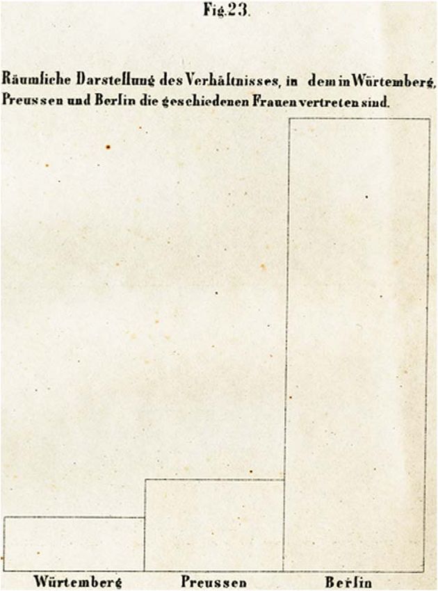
DATAFICATION AND SPATIAL VISUALIZATION | 569

and explosive growth in both the general use of graphic methods and the range
of topics to which they were applied.2

                                                                                                    Downloaded from http://online.ucpress.edu/hsns/article-pdf/48/5/568/377926/hsns_2018_48_5_568.pdf by Max Planck Institute for the History of Science user on 15 June 2021
   Using German censuses as case studies, I claim that the explosion of visual
graphics in nineteenth-century population statistics was closely linked to a shift
in statistical epistemologies and practices of data collection. These in turn
opened new possibilities for the spatial projection of data onto graphical
representations. I call this process datafication, because the change toward
compiling multivariable tables and creating graphical representations in new
ways went hand in hand with the explicit use of the term “data.” I argue that
seeing and abstracting the world as data opened new avenues not only for
producing tables with multiple variables, but also for forging such refined
results into visualizations that offered insights going beyond tabular presenta-
tion. The resulting graphics were easier to grasp at first sight, but they were not
just tools to simplify. Rather, they were ways of identifying new phenomena
among the data that would not be observable otherwise. Graphical representa-
tions of data thus yielded novel and unexpected insights. They were part and
parcel of turning population statistics into a data-driven undertaking, which
made empirical relationships in the social order evident and thus modifiable
through intervention and reform.
   German census statisticians were not the first or the only experts to resort to
data in this way. Rather, the nineteenth century witnessed a new, innovative
reflexivity toward cumulative, quantifying scientific methods in many disci-
plines, a development that rested not only on a ubiquitous trust in numbers,
but equally on a trust in data.3 This trust in data and the practices built on it
could take quite different orientations: Whereas naturalists like Alexander von
Humboldt and Heinrich Georg Bronn abstracted the world as data to develop
graphical projections of deep time, this essay illuminates concepts and practices
in German census statistics that referred to data as a category of the here and
now, enabling spatial representations of current phenomena.

    2. Michael Friendly, “The Golden Age of Statistical Graphics,” Statistical Science 23 (2008):
502–35.
    3. David Sepkoski, “Data in Time: Statistics, Natural History, and the Visualization of
Temporal Data,” in this Issue. On the emergence of quantitative thinking and practice, see
Theodore Porter, The Rise of Statistical Thinking, 1820–1900 (Princeton, NJ: Princeton Uni-
versity Press, 1986); Ian Hacking, The Taming of Chance (Cambridge, MA: Cambridge University
Press, 1990); Alain Desrosieres, The Politics of Large Numbers. A History of Statistical Thinking
(Cambridge, MA: Harvard University Press, 2007); Lorenz Krüger, Lorraine Daston, and
Michael Heidelberger, eds., The Probabilistic Revolution (Cambridge, MA: MIT Press, 1987).
570 | OERTZEN
In scrutinizing the role that data played in redefining German population
statistics, I demonstrate that the explicit usage of the term marked a distinctive
Downloaded from http://online.ucpress.edu/hsns/article-pdf/48/5/568/377926/hsns_2018_48_5_568.pdf by Max Planck Institute for the History of Science user on 15 June 2021
epistemological shift accompanied by methodological and technical innova-
tions to gather and compile enumeration material. At the core of these
denouements was the introduction of a new paper device, the so-called count-
ing card. The practicalities of this moveable compilation tool I have explicated
in detail elsewhere.4 Here, I sketch German statisticians’ attempts to visualize
the newly achieved statistical complexity beyond tabular presentation, in both
theoretical and practical terms. I focus on the work of Hermann Schwabe and
Georg von Mayr, two major proponents engaged in theorizing on statistical
visualization and internationally lauded for their graphical exploration of
census data.
S E E I N G A N D M O VI N G DA T A
The term “data” was used rarely by German census statisticians before the
1860s.5 Even though numerical assessments on the state’s behalf became quite
common during the eighteenth century, these numbers rather referred to
notions such as information or items of interest (Merkwürdigkeiten).6 When
“data” was used at the beginning of the nineteenth century, the term carried
directive weight, signalling an important epistemological convention that
would contribute to the rise of visualization some fifty years later. In 1804,
August Ludwig von Schlözer, a leading statistician and professor at Göttingen
University, made explicit reference to data in his effort to establish statistics as
a science in its own right. Schlözer’s statement describing the specificities of
this new science as “stationary history” (still stehende Geschichte) is well known;
much less attention has been paid to his emphasis that the art of pursuing this
4. Christine von Oertzen, “Machineries of Data Power: Manual versus Mechanical Census
Compilation in Nineteenth-Century Europe,” Osiris 32 (2017): 129–50.
5. This observation mirrors Daniel Rosenberg’s assessment of the linguistic usage of the term
prior to the computer era; see Daniel Rosenberg, “Data Before the Fact,” in “Raw Data” Is an
Oxymoron, ed. Lisa Gitelman (Cambridge, MA: MIT Press, 2014), 15–40. See also Daniel
Rosenberg, “Data as Word,” in this Issue.
6. See Lars Behrisch, ed., Vermessen, Zählen, Berechnen. Die politische Ordnung des Raums im
18. Jahrhundert (Frankfurt/M.: Campus, 2016). In rare cases, such measurements were also
transformed into graphical visualizations; see Sybilla Nikolow, “A.F.W. Crome’s Measurements
of the ‘Strength of the State’,” in The Age of Economic Measurement, eds. Judy L. Klein and Mary
S. Morgan (Durham, NC: Duke University Press, 2001), 23–56.DATAFICATION AND SPATIAL VISUALIZATION | 571
new science was “to see and value statistical data (statistische Daten), and to
collect and arrange them.”7 In 1808, Wilhelm Butte, a theologian and camera-
Downloaded from http://online.ucpress.edu/hsns/article-pdf/48/5/568/377926/hsns_2018_48_5_568.pdf by Max Planck Institute for the History of Science user on 15 June 2021
list trained at the University of Gießen, aligned himself with Schlözer’s dictum
and clarified in more detail what the art of “seeing and valuing data” entailed
epistemologically. In his treatise Statistik als Wissenschaft bearbeitet, Butte
pleaded that at least among statistical experts, the notion of data should
be used consistently, and distinctly be set apart from facts, for the factum,
he maintained, was “historically forged” (historisch erwirkt) and should never be
included in statistics. The datum alone deserved this privilege, as it had the
exclusive capacity to “directly adhere to the present state of being” (sich unmit-
telbar an den Tatbestand des Seienden zu halten).8
Butte explained that “fact” and “datum” could—and often did—refer to the
same object, namely a specific number. But whereas a fact encompassed more
information than just the number itself and explained something, the datum
simply referred to the number itself. To give an example, Butte stated that the
kingdom of Bavaria measured 1,569 square miles. As a fact, this information
implied an historical explanation: how Bavaria had reached its current size. As
a datum however, the number was a numerical value of Bavaria’s present
latitude and nothing more. In other words, the only relationship this datum
had was with other, commensurable numerical data, and any explanations
derived would be from examining the relationships between such data, and
not from any prior information or context lying outside the domain of those
numbers. In this distinction Butte saw a fundamental divide between a histor-
ical account of state affairs (Staatengeschichte) on the one hand and quantifying
numerical statistics on the other, and the latter, based on “data” strictly
de-coupled from causal context, should henceforward be the main effort of
the science of statistics.9
The goal of statistics as Butte proposed it was thus explanatory, but in
a strictly relational sense. Gathering data at a fixed moment defined as now
(Jetztzeit) served as a method of abstraction from time and causal context,
essential to assess how the state’s intended purpose materialized in reality.10
7. Ludwig August Schlözer, Theorie der Statistik. Nebst Ideen über das Studium der Politik
überhaupt (Göttingen: Vandenhoeck und Rupprecht, 1804), § 25.
8. Wilhelm Butte, Die Statistik als Wissenschaft bearbeitet (Landshut: Thormann, 1808), 248–49.
9. Ibid., 249.
10. “Wissenschaftliche Darstellung derjenigen Daten, aus welchen das Wirkliche der Rea-
lisation des Staatszwecks gegebener Staaten, in einem als Jetztzeit fixierten Momente, gründlich
erkannt wird—das ist mir Statistik.” Ibid., 245.572 | OERTZEN
The newness of this procedure, Butte insisted, was to “give the scattered matter
a scientific form, to render a vast amount of heterogeneous yet indispensable
Downloaded from http://online.ucpress.edu/hsns/article-pdf/48/5/568/377926/hsns_2018_48_5_568.pdf by Max Planck Institute for the History of Science user on 15 June 2021
data into a commensurable form and order.” Rather than a randomly accu-
mulated “caboodle of numbers” (Zahlenkram),11 a carefully tailored selection
of data collected at the same moment alone would allow one to gain a truly
thorough understanding of state matters. Distilled from time, the state of
things past, present, and future would consequently be measured and analyzed
by comparison, not as a continuum progressing according to historical theory
popular at the time that effectively ignored particulars in favor of sweeping
claims based on laws.12 Population and state statistics based on data was thus
clearly distinguished from history, but not confined to the present; rather, the
new science perceived temporal change as a sequence of frozen stills.13
How exactly Schlözer’s and Butte’s take on data spread within and beyond
cameralist circles remains an unresolved puzzle. But their approach resonated
with attempts to deploy statistics for more than exhaustive accounting of the
states’ resources. In Heidelberg, cameralists developed what Sepkoski and
Tamborini call an “aggregate statistical approach” vested in data management,
analysis, and visual representation.14 Throughout Europe, statisticians
expanded and standardized census enumeration efforts to establish statistical
regularities on the basis of quantification that would explain causalities
between social and economic conditions of the state.15 By the 1860, statisti-
cians had created a discipline, in which only impartial numerical data were to
be considered in statistical analysis. A growing number of statisticians and
11. Ibid., 272.
12. “Der Akt dieses Fixierens ist eigentlich ein Abstrahieren von aller Zeit. Denn die Zeit ist
ein Strömen, aber hier ist nur Stillstand, und die Gegenwart zieht den Charakter des Zeitlichen
nur durch die Vergleichung an, in welcher sie mit Vergangenheit und Zukunft bemessen wird.”
Ibid., 267.
13. This redefining of the past as a sequence of data-based stills is similar to what Harro Maas
describes as “repackaging” of historical events as “data” in nineteenth-century economics, a pre-
condition for what Maas calls the “timing of history,” which in turn facilitated the development of
visual graphics; see Harro Maas, William Stanley Jevons and the Making of Modern Economics (New
York: Cambridge University Press, 2005), 220. In much the same fashion, paleontologists pro-
jected data as a narrative progression in visual space, see Sepkoski, “Data in Time,” in this Issue.
14. David Sepkoski and Marco Tamborini, “‘An Image of Science’: Cameralism, Natural
History, and the Visual Language of Statistics in the Nineteenth Century,” Historical Studies in
the Natural Sciences 48 (2018): 56–109, on 60. See also, Porter, The Rise of Statistical Thinking
(ref. 3), 5.
15. Theodore Porter, “Statistics and Statistical Methods,” in The Cambridge History of Science,
eds. T. Porter and D. Ross (Cambridge: Cambridge University Press: 2003), 238–50.DATAFICATION AND SPATIAL VISUALIZATION | 573
natural historians used numerical data to produce aggregate summaries, rather
than just collecting numbers in huge lists.16
Downloaded from http://online.ucpress.edu/hsns/article-pdf/48/5/568/377926/hsns_2018_48_5_568.pdf by Max Planck Institute for the History of Science user on 15 June 2021
Longer than almost anywhere else in Europe, Prussian census officials had
adhered to statistics as a “historical science” that rested on eclectic collections
of numerical information in lists and abstained from judgement and interpre-
tation.17 It was not until 1860 that the notion of data fully came to bear in
Prussian census statistics, denoting a change not only in semantic terms, but
also in a fundamental vicissitude regarding the concepts and methods of census
taking. The actual use of the term “data” in Prussian population statistics went
hand in hand with measures to produce scientifically sound depictions of the
population (Volksbeschreibungen), by re-defining the basic unit of recording, by
standardizing enumeration procedures, and by radically revising the tools and
practices of compiling the numerical data. As part of this epistemological shift,
graphical visualization beyond tabular representation emerged as a technique
to see what those numbers had to say.
D A TA, LI ST , T A B L E
The protagonist of such significant conceptual as well as technical changes in
Prussian census work was Ernst Engel, a mining engineer from the Mining
Academy in Freiberg, Saxony, who was appointed director to the Prussian
Statistical Bureau in 1860.18 Among historians of science, Engel’s reputation
has suffered by Ian Hacking’s damning assessment of the Prussian director’s
limited abilities in statistical probability.19 Nonetheless, in his zeal for numbers
Engel was not content in piling up arbitrary particulars. Far from it, Engel was
committed much in line with von Schlözer, Butte, and other proponents of the
turn to data, to systematically choose, acquire, compile, and utilize informa-
tion most relevant to achieve a comprehensive and accurate quantitative
description of present conditions (Zustandsschilderung der Gegenwart):
16. Staffan Müller-Wille, “Names and Numbers: ‘Data’ in Classical Natural History,
1758–1859,” Osiris 32 (2017): 109–28.
17. So Leopold Krug, the first director of the Prussian census bureau, Ideen zu einer staats-
wissenschaftlichen Statistik (Berlin: 1807), ix.
18. For a detailed account of Engel’s work as director of the Prussian Statistical Bureau in
Berlin, see Michael Schneider, Wissensproduktion im Staat. Das Königlich-Preußische statistische
Bureau, 1860–1914 (Frankfurt am Main: Campus, 2014), esp. 223–82.
19. Ian Hacking, “Prussian Numbers, 1860–1882,” in The Probabilistic Revolution. Bd. 1: Ideas
in History, eds. Lorenz Krüger et al. (Cambridge, MA: Cambridge University Press, 1987), 45–68.574 | OERTZEN
a numerical snapshot of society frozen in time, in which the main features of
current social and economic conditions would become evident.20 When
Downloaded from http://online.ucpress.edu/hsns/article-pdf/48/5/568/377926/hsns_2018_48_5_568.pdf by Max Planck Institute for the History of Science user on 15 June 2021
describing the three steps necessary to achieve this goal in mid-nineteenth
century population statistics, Engel made explicit use of the term “data”:
“Statistics are defined by methods. These methods vary depending on whether
they aim at the gathering, the collection, or the utilization of data [Daten].”21
In his attempt to revise Prussian population statistics according to state-of-
the-art standards developed by the International Statistical Congress (of which
he was a founding member), Engel envisioned to gain a multifaceted description
of the populous “composed of the detailed descriptions of each individual.”22
What description and its scientific representation involved in methodological
and practical terms should by no means be underestimated. It entailed an
inductive process of gathering particulars and their classification, numerical
abstraction, sorting, grouping, and re-combination, which allowed carving out
defining structures from the otherwise indiscernible and constantly changing
complexity of social and economic occurrences.
To achieve this data-driven snapshot, the particulars gathered in lists had to
be transformed into statistical information represented in tables. In contrast to
lists, tables contained what Engel called “a condensed result, a summary and
a grouping of information, in which the specimen or individual is no longer
visible.”23 The crucial epistemological difference between list and table was that
in the former, each datum referred to one specific object or category, whereas in
the latter, groupings of different sorts related the data to one another, allowing
for patterns and structures to emerge. In order to morph gathered data from list
to table, each particular datum had to be unlocked from its fixed place in the
list’s grid and moved around freely to eventually be subsumed under more
general categories and—most importantly—various combinations thereof.24
The core technical component in this epistemological shift toward processing
census data was a new paper tool, the so-called counting slip. Inspired by playing
cards, counting slips reflected the belief that data should be understood as objects
20. Emil Blenck, “Zum Gedächtnis an Ernst Engel. Ein Lebensbild,” in Zeitschrift des königlich
preußischen statistischen Bureaus 36 (1896): 231–38, on 235.
21. Ernst Engel, “Die Methoden der Volkszählung. Mit besonderer Berücksichtigung der im
Preussischen Staate angewandten,” Zeitschrift des königlich preußischen statistischen Bureaus 1
(1861): 149–212, on 162.
22. Ibid., 156.
23. Ernst Engel, “Die Methoden der Volkszählung,” 163.
24. Ibid., 163.DATAFICATION AND SPATIAL VISUALIZATION | 575
free of context or associations until they were re-grouped and aggregated in
statistics. The slips made the data move: once all particulars of one individual
Downloaded from http://online.ucpress.edu/hsns/article-pdf/48/5/568/377926/hsns_2018_48_5_568.pdf by Max Planck Institute for the History of Science user on 15 June 2021
were transferred from the list onto a slip, they could be swiftly sorted and re-
sorted according to different combinations of criteria. The moveable data carriers
functioned much in the same way as the later punch cards introduced in Amer-
ican census taking in 1890. They enabled statisticians to speed up the compiling
effort and, at the same time, to greatly enhance statistical complexity, as they
allowed assessing combinations of data from different categories readily.25
TABLES, GRAPHS, MAPS
To Engel and his colleagues in Germany and beyond, the comprehensive
statistical assessments resulting from processing data via slip or, later, counting
card were never meant to be an end in themselves. Quite the contrary, as much
as they were aiming to portray society’s present condition as accurately as
possible, statisticians wanted the results of their efforts to be put to use. For
this reason, Engel produced census results within the tightest possible time
frames; a carefully nurtured workforce including many women working from
home ensured that the tables for the Prussian state were delivered promptly.26
Additionally, a whole flotilla of new publications filled with complex tables and
comments issued by the bureau created what Hacking bashed as a “moraine of
cluttered numbers” for the absence of probabilistic ambition.27
However, what Engel and other European census officials produced were
results derived from the classifying, sorting, combining, and aggregating of
what they saw as numerical objects freed from causal context. To convey how
the data related to one another was the core purpose of the new procedure, and
consequently strategies of spatial visualization took center stage. Whereas
tabular representation remained the prior method to portray the main features
of their analysis, census statisticians experimented with graphical visualization
to communicate and further explore the explanatory potential of data-driven
population statistics.
25. In Prussia, counting slips were replaced by bigger counting cards in 1871 to further
streamline the procedure; see von Oertzen, “Machineries of Data Power” (ref. 4), 164–68.
26. Christine von Oertzen, “Keeping Prussia’s House in Order: Census Cards, Housewifery,
and the State’s Data Compilation,” in eds. Carla Bittel, Elaine Leong, Christine von Oertzen,
Working With Paper: Gendered Practices in the History of Knowledge (Pittsburgh: University of
Pittsburgh Press, forthcoming 2019).
27. Hacking, Taming Chance (ref. 3), 189f.576 | OERTZEN
Engel’s colleague Hermann Schwabe, the director of the census commission in
the city of Berlin, provided a widely acknowledged early example of how this
Downloaded from http://online.ucpress.edu/hsns/article-pdf/48/5/568/377926/hsns_2018_48_5_568.pdf by Max Planck Institute for the History of Science user on 15 June 2021
could be done. Schwabe had introduced counting slips in 1867 to establish
a detailed survey of Berlin’s population structure, as well as the occupational and
housing conditions in the Prussian (and later Imperial German) capital.28 The
results of his efforts were published in two parts. The main part consisted of tables
teeming with numbers in small print to demonstrate the relational complexity
achieved by the new data-processing technology. To these tables Schwabe added
a total of twenty-four carefully crafted graphical visualizations, which yielded at
least as much praise among statistical experts as his multivariable schedules.
Schwabe’s graphical visualizations included a map showing the varying
degrees of population density in each city district, a population pyramid, and
a bar chart showing the age structure in more detail. Each of the graphs was
accompanied with detailed written explanations of what should be immedi-
ately evident but might not be obvious to the untrained eye: the high rate of
childhood mortality, leaving a sharp dent in the age bar chart; the large number
of women (single, married, or widowed) dependent on gainful employment; or
the insufficient supply of gas and water conduit in rear compared to front
buildings. Several detailed area diagrams identified Berlin’s trouble spots, i.e.,
those parts of the inner city that showed the highest percentage of non-related
people living under one roof, combined with the most overcrowded apart-
ments, and the highest percentage of non-resident lodgers.29
As Schwabe emphasized in his 1872 textbook-like treatise on the theory and
methods of visualization commissioned by the International Statistical Con-
gress, such graphical representations were “spatial depictions of statistical
quantities” drawn from numbers.30 Responding to criticism that graphs were
inferior to numbers with regard to statistical accuracy, Schwabe stressed their
efficacy to communicate statistical results. His graphs were not one-to-one
depictions of the tables. Rather, they were further abstractions of the fine-
grained number charts, designed to foreground structures distilled from the
flood of statistical data that he considered most essential. The graphs were
destined to render distinct results of population statistics ascertainable “at first
28. Hermann Schwabe, Die Resultate der Berliner Volkszählung vom 3. Dezember 1867
(Berlin, 1869).
29. Ibid., Figs. 19–22.
30. Hermann Schwabe, Theorie der graphischen Darstellungen. Im Auftrage der k. russischen
Vorbereitungskommission des achten internationalen statistischen Kongresses (St. Petersburg: Trenké
& Fusnot, 1872), 19.DATAFICATION AND SPATIAL VISUALIZATION | 577
Downloaded from http://online.ucpress.edu/hsns/article-pdf/48/5/568/377926/hsns_2018_48_5_568.pdf by Max Planck Institute for the History of Science user on 15 June 2021
FIGURE 1: Spacial depiction of the relation of divorced women in
Württemberg, Prussia, and Berlin. Source: Hermann Schwabe, Theorie
der graphischen Darstellungen. Im Auftrage der k. russischen
Vorbereitungskommission des achten internationalen statistischen
Kongresses (St. Petersburg: Trenké & Fusnot, 1872), Fig. 23.
sight,” an aspiration familiar from efforts in cartography to create panoramic
views of knowledge on one page.31
Schwabe explained that graphics could mediate statistical evidence more
effectively, as they could make certain statistical findings jump into the be-
holder’s eye—an effect rarely achieved with numbers alone. To proof his
point, Schwabe used a simple area diagram (Fig. 1).32 It showed three area
31. Nils Güttler, Das Kosmoskop. Karten und ihre Benutzer in der Pflanzengeographie des 19.
Jahrhunderts (Göttingen: Wallstein 2012), 23; Lorraine Daston, “On Scientific Observation,” ISIS
99, no. 1 (2008): 97–110, on 108.
32. Hermann Schwabe, Theorie der graphischen Darstellungen (ref. 30), Fig. 23.578 | OERTZEN
bars of dramatically different sizes, exhibiting the huge gap in the number of
divorced women depending on whether they lived in rural southwestern
Downloaded from http://online.ucpress.edu/hsns/article-pdf/48/5/568/377926/hsns_2018_48_5_568.pdf by Max Planck Institute for the History of Science user on 15 June 2021
Germany, Prussia, or Berlin, Germany’s fastest growing city. The number of
Berlin’s 2,464 female divorcés alone he considered meaningless; it could only
speak in relation to data from other regions. But even then, the numbers
underlying Schwabe’s diagram seemed much less alarming to him (13, 22,
101 out of 10,000). Brought into spatial scale however, the data could be turned
into arguments with unmitigated moral implications.33
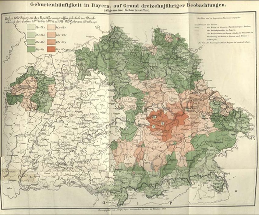
Whereas Schwabe underscored the communication benefits of graphical
methods, his Bavarian colleague Georg von Mayr emphasized their epistemic
value. Having introduced counting slips to compile Bavarian census tables in
1871, Mayr saw the benefits of enhanced statistical complexity for cartographic
visualizations of census data.34 Much like naturalists in the search of patterns for
plant distribution, Mayr mapped his census results onto the Bavarian landscape,
hoping to unearth law-like natural correlations like climatic particulars or differ-
ences in soil and rock formation that would explain the astounding variability of
birthrates across the Bavarian kingdom. His tables, organized from highest to
lowest values or by alphabetical order of the enumeration districts, produced but
random discrepancies. However, by mapping the data onto a cartogram (Fig. 2),
Mayr uncovered distinct regional specificities reaching across administrative
boundaries. What Mayr regarded as proof of a “real triumph” of the geographic
method of statistical visualization was the dark red area north of Munich in his
cartogram, stretching across the cities of Regensburg, Freising, and Ingolstadt.35
This large area had by far the highest birthrates in the whole of Bavaria.
However, combined with other mappings of census data on child mortality, his
cartogram revealed an alarming reality: in the region where the most children
were born, infants also had the least chance to survive their first year of life.36 For
Mayr, the cartograms at first seemed to suggest that the high birth and death
rates were somehow rooted in the soil; but the region in question stretched over
33. Ibid., 72.
34. Georg von Mayr, “Über die Anwendung der graphischen und geopraphischen Methode
in der Statistik,” in Zeitschrift des königlich-bayerischen statistischen Bureau 6 (1874): 36–44.
35. Georg von Mayr, “Die Geburtenhäufigkeit in Bayern. Mit besonderer Berücksichtigung
der geographischen Vertheilung derselben,” in Zeitschrift des königlich-bayerischen statistischen
Bureau 9 (1877): 243–50, on 247.
36. “Kindersterblichkeit in Süddeutschland (Cartogram), 1862–1869,” in Cartogramme und
Diagramme zur Statistik Bayerns (Munich: Königlich bayerisches statistisches Bureau, 1880) 19; see
http://daten.digitale-sammlungen.de/~db/0001/bsb00018090/images/index.html?id¼00018090&
groesser¼&fip¼yztseayaewqxseayaewqqrseayasdasxs&no¼31&seite¼19DATAFICATION AND SPATIAL VISUALIZATION | 579
Downloaded from http://online.ucpress.edu/hsns/article-pdf/48/5/568/377926/hsns_2018_48_5_568.pdf by Max Planck Institute for the History of Science user on 15 June 2021
FIGURE 2: Cartogram of birthrates in Bavaria, compiled over thirteen years. Source: Georg von
Mayr, “Die Geburtenhäufigkeit in Bayern. Mit besonderer Berücksichtigung der geographischen
Vertheilung derselben,” Zeitschrift des königlich-bayerischen statistischen Bureau 9 (1877):
243–50, on 250.
so many different soil formations, as well as ethnic and cultural boundaries, that
Mayr saw himself forced to reject such law-like natural correlations to explain this
phenomenon. Rather, he diagnosed an “endemic fever in the social life of our
people,” which needed further exploration on the ground, namely with regard to
the babies’ nutrition and the conditions of their mothers’ employment.37
C O N CL U SI O N
Early nineteenth-century statisticians like August von Schlözer and Wilhelm
Butte distinguished data from facts, defining the former as a numerical cate-
gory de-coupled from causal context that could only be made to speak in
relation to other data. Put to use in population statistics by Prussia’s and
37. Ibid., 250.580 | OERTZEN
Bavaria’s mid-nineteenth-century census reforms, the concept marked a fun-
damental change in census taking. Moveable paper tools enabled statisticians
Downloaded from http://online.ucpress.edu/hsns/article-pdf/48/5/568/377926/hsns_2018_48_5_568.pdf by Max Planck Institute for the History of Science user on 15 June 2021
to implement the relational, data-driven approach, yielding compellingly rich,
multivariable tabular representations; additionally, the new approach encour-
aged spatial graphical visualizations and the geographical mapping of census
data. Data-driven tabular and graphical visualizations revealed empirical rela-
tionships in social phenomena such as alarmingly high children’s mortality
rates in poverty-stricken regions of Bavaria or in the miserable tenement base-
ments of Berlin’s inner city.
Concepts to see, tools to compile, and methods to visualize were all geared
toward conveying relations among the gathered data. Tabular as well as spatial
graphical visualizations served as tools of spatial analysis to uncover patterns
and structures among population data. Creating statistical facts through graph-
ical visualization yielded new insights in the social structure of Germany’s
quickly changing society. The wave of nineteenth-century statistical graphics
rendering such changes evident was also a manifestation of data-driven modes
of knowledge production.
ACKNOWLEDGEMENTS
I would like to thank the two anonymous reviewers for their thorough reading and
truly helpful suggestions to rethink an earlier version of this paper.You can also read