Disparities in Access to Unemployment Insurance During the COVID-19 Pandemic: Lessons from U.S. and California Claims Data - ALEX BELL, THOMAS J ...
←
→
Page content transcription
If your browser does not render page correctly, please read the page content below
Disparities in Access to Unemployment
Insurance During the COVID-19 Pandemic: Lessons
from U.S. and California Claims Data
  ALEX BELL, THOMAS J. HEDIN, PETER MANNINO, ROOZBEH MOGHADAM,
              GEOFFREY SCHNORR and TILL VON WACHTER

      NOVEMBER 2021
Department of Labor Summer Data Challenge Report
Disparities in Access to Unemployment Insurance During the COVID-19
Pandemic: Lessons from U.S. and California Claims Data
Alex Bell, Thomas J. Hedin, Peter Mannino, Roozbeh Moghadam, Geoffrey Schnorr and
Till von Wachter 1
________________________________________________________________________
Executive Summary
Unemployment Insurance (UI) benefits provided a lifeline to workers who lost their jobs during
the pandemic. However, access to these benefits has been uneven across communities and
states (Edwards, 2020). Identifying and documenting these disparities is an important step to
addressing them and to rendering the UI system more equitable. Utilizing a conceptual
framework of unemployment claims, we developed three metrics to measure access to UI
benefits across the claim lifecycle. We then analyzed these measures to provide insight into
differential access to UI benefits across U.S. states and across counties within California.
The first measure of access is the First Payment Rate and corresponds to the earliest part of
the claim lifecycle. It measures the share of people who file their first claim and who
subsequently receive a UI payment. After the First Payment Rate, the primary measure of
access in the report is the Recipiency Rate. The recipiency rate measures the share of
unemployed or underemployed workers who are actually receiving UI benefits. This is the
traditional measure (Wittenberg et al., 1999) of UI access, and reflects access in the middle of
the claim lifecycle. The final measure of access is the Exhaustion Rate, which corresponds to
the final part of the claim lifecycle. It measures the share of claimants who have exhausted
eligibility for both regular and extended UI benefits.
We calculated these metrics in each state by using publicly available data from the U.S.
Department of Labor reports and by county in California using tabulations based on individual-
level claims data from the California Employment Development Department. The additional
information available in the California claims data allows us to improve and further segment our
measures of access, allowing us to identify new facts and patterns from the data. We generated
these metrics for the year 2020 and focused our analysis from the beginning of the pandemic in
March through December 2020, just prior to the initial rollout of COVID-19 vaccines. In addition,
we compared these to the corresponding values in December 2019 as a pre-pandemic
benchmark.
We use these measures to analyze disparities in access to UI benefits during and before the
pandemic and identify community attributes and policy choices that are associated with

1This report was prepared for the U.S. Department of Labor (DOL), Chief Evaluation Office (CEO) by the
authors. The views expressed are those of the authors and should not be attributed to DOL, nor does
mention of trade names, commercial products, or organizations imply endorsement of same by the U.S.
Government.

                                                                                                     1
differential access. This analysis cannot identify causal relationships, however, across metrics,
there is a pattern of correlations showing that workers in states with more generous labor and UI
policies have greater access to benefits, potentially indicating the importance of policy choices
in shaping UI access. The correlations also show a pattern by which less affluent areas and
areas with a higher share of disadvantaged social groups are associated with lower access to
UI benefits. Additional research is needed to identify the causal mechanisms between policies
and UI access.
Along with research on the effects of rules of the UI and other state and federal programs, we
conclude the report by providing further recommendations on future data collection and
research funding priorities.

Key Research Findings
In what follows, unless stated otherwise, findings from the analysis for the pandemic refer to
December 2020, and findings from the analysis for pre-pandemic refers to December 2019.
   ●   Recipiency Rates
           ○   About 60% of unemployed Americans collected UI benefits during December
               2020, up from 16% of the unemployed in December of 2019. This rate varied
               dramatically across U.S. states but less so across counties in California.
           ○   Across states, the range between the bottom 25% and the top 75% states—also
               called the inter-quartile range (IQR)—was 41% to 71%. If all states had the
               recipiency rate of New York, a high recipiency state, then six million more people
               would have received benefits in December 2020.
           ○   Within California, where all the UI policy parameters are constant across
               counties, the recipiency rate is above the U.S. average, and there is substantially
               less variation across counties with an IQR of 78% to 86%.
           ○   Recipiency rates were higher in states with more generous UI programs (as
               measured by attributes such as the potential duration, and maximum benefit
               levels). Recipiency rates were lower in states with more Black residents and in
               states with lower average incomes.
           ○   Across California, recipiency rates during the pandemic were higher in more
               affluent counties and those with more access to broadband. Recipiency rates
               were lower in counties with more residents of limited English-speaking
               proficiency, as well as those counties with more Black or Hispanic residents.
   ●   First Payment Rates
           ○   Nationally, about 70% of new initial claims filed near the start of the pandemic
               were paid. However, substantial heterogeneity exists across states.
           ○   Payment rates were higher in states with alternative base period eligibility, as
               well as states that are more affluent. States with more Black workers paid lower
               shares of claims.

                                                                                                  2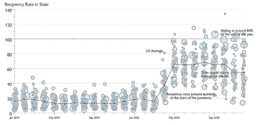
○   For California, using longitudinal UI histories we can calculate payment rates of
               first claims that are more precise than possible based on analyses using publicly
               available data.
           ○   Within California, more claims were paid near the start of the pandemic in
               counties that were more affluent, had a lower share of Hispanic workers, and
               more access to high-speed broadband internet.
   ●   Exhaustion Rates
           ○   Nationally, about 6% of jobless workers claiming UI had exhausted their benefits
               during the first week of December 2020. In some states, this was as high as
               24%.
           ○   Exhaustions as a share of claimants declined to 1% at the beginning of the
               pandemic in March as millions of unemployed workers entered the UI system as
               claimants, and gradually increased through December.
           ○   States with longer potential UI durations and mandatory sick leave or paid family
               leave programs saw lower exhaustion rates during the pandemic. A higher share
               of claimants also exhausted in states with more Black residents.
           ○   Within California, counties with more limited-English speakers and higher rates of
               COVID-19 cases saw higher rates of exhaustion, as did those with higher shares
               of Black and Hispanic residents.
           ○   In California, individual-level claims data allow us to calculate the rate of
               exhaustion among a cohort of UI claimants entering in a given month, which
               more accurately captures the generosity of UI benefits than the standard
               measure. This measure tends to be higher than the typical measure based on
               public data which captures exhaustions among all claimants at a given date.
   ●   Conclusion
           ○   Given these initial results on disparities in access to UI during the pandemic, we
               recommend that the scope of the analysis should be expanded to include more
               current weeks of data, and suggest several ways for improving data collection.
           ○   We conclude with several additional ways that DOL might fund follow-on
               research in this vein.

Overall, the report highlights important disparities in access to UI benefits in the U.S. On all
three measures, reduced access to benefits is correlated with lower socioeconomic status or the
presence of disadvantaged social groups. If lower performing states could improve their access
to UI to the level of high performing states, then millions of additional people would gain access
to vital benefits as they struggle with unemployment. The existing disparities in access to
benefits also mean that reforms that improved access could have a particularly strong impact on
disadvantaged populations.
Comparing California with the U.S. as a whole, California’s UI system performed very well.
California had the fourth-highest recipiency rate in the U.S. and was above the U.S. average on
                                                                                                    3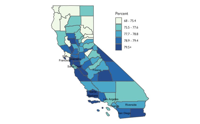
the two other measures of access. The report also shows that disparities in access, when they
exist, exist across the U.S. and are not unique to California. They also often pertain to aspects
of the UI program that are set at the federal level or arise from inequalities in the wider labor
market outside of the reach of the UI system. The light that this report shines on variation in
access to UI benefits can help build support for addressing those differences, which would
benefit Californians and unemployed people across the U.S. as a whole.

                                                                                                    4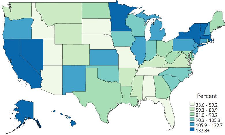
Table of Contents
1. Introduction                                       6
1.1 Defining Access to Unemployment Insurance         6
1.2 Operationalizing the Measures of Access           8
  Measurement of Recipiency Rates                     9
  Measurement of First Payment Rates                 10
  Measurement of Exhaustion Rates                    11
1.3 Descriptive Statistics on Measures of Access     12
  Comparison of DOL and EDD Measures                 12
  Correlations Among Access Measures                 14
2.1: Recipiency Rates Among the Unemployed           16
  Recipiency Rates Across the U.S.                   16
  Insights from Within CA                            19
2.2: First Payment Rates Among Claimants             24
  First Payment Rates Across the U.S.                24
  Insights from within CA                            27
2.3: Exhaustion Rates                                31
  Exhaustion Rates Across the U.S.                   31
  Insights from within CA                            34
3 Conclusion                                         40
  Questions left unanswered                          41
  Other gaps in Knowledge                            42
  New Data Collection Efforts                        43
  Suggestions for DOL Funding Priorities             44
Acknowledgments                                      46
Works Cited                                          47
A1: Figure Appendix                                  50
A2: Data Appendix                                    54
A3: Demographic Differences in Recipiency Rates      62
A4: Demographic Differences in First Payment Rates   66

                                                      5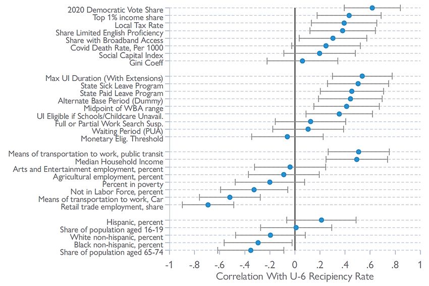
1. Introduction
1.1 Defining Access to Unemployment Insurance
The unprecedented surge in job losses and Unemployment Insurance (UI) claims during the
COVID-19 pandemic, and the surge in unemployment among lower-wage workers from sectors
directly affected by the pandemic, refocused long-standing concerns about equity and access to
the UI system. 2
This report documents key patterns of community-level disparities in access to UI during the
pandemic. To operationalize our notion of access to UI, we rely on a comprehensive conceptual
framework that allows us to track a jobless worker’s access to UI benefits across three discrete
stages in the lifecycle of a potential UI claim. To document the degrees of disparities in access
throughout the lifecycle of a UI claim, the analysis develops and compares measures for each
stage of access both across states and at more local levels within California. We then correlate
these measures of access with state and county characteristics to measure differences in
access across these attributes.
We utilize public data from U.S. Department of Labor Employment and Training Administration
(DOL ETA) and the Current Population Survey (CPS) as well as our team’s unique access to
California’s UI claims micro data, made accessible through a partnership with the state’s
Employment Development Department. We combine these data with detailed state-level
demographic, labor market, and public health characteristics across states for the entire U.S.
and at the county level in California. We also collected information on state-level differences in
the UI programs and states’ tax and benefit systems. State UI programs differ on attributes such
as their maximum Potential Benefit Durations (PBD), their Weekly Benefit Amounts (WBA), and
whether they allow Alternate Base Periods (ABP) to determine program eligibility. For example,
state PBDs ranged from 30 weeks in Massachusetts to 12 weeks in North Carolina and Florida,
maximum WBAs ranged from over $840 in Washington to only $235 in Mississippi, and 38
states offered ABPs for determining UI eligibility.
Conceptual Framework
To study access to UI, this paper relies on the following integrated conceptual model for
measuring community-level access to UI. Figure 1 provides a high-level overview of our data-
driven framework.
Our framework begins at the point at which a jobless worker files a new initial claim, which for
many jobless workers will be their first interaction with the UI system. Reasons for a claim to be
rejected can be either monetary (e.g., insufficient prior earnings) or non-monetary (e.g., claimant
quit their job without good cause). Once a new initial claim has been filed, we define the first
positive measure of access by whether a first payment is issued for the claim. 3 Although for the

2See, for instance, January 21, 2021, Executive Order On Advancing Racial Equity and Support for
Underserved Communities Through the Federal Government.
3Although the focus of this report is whether claims are paid, important questions have arisen during the
pandemic concerning the timeliness of payments. For information on this dimension, see The Century
Foundation’s Dashboard: https://tcf.org/content/data/unemployment-insurance-data-dashboard.
                                                                                                            6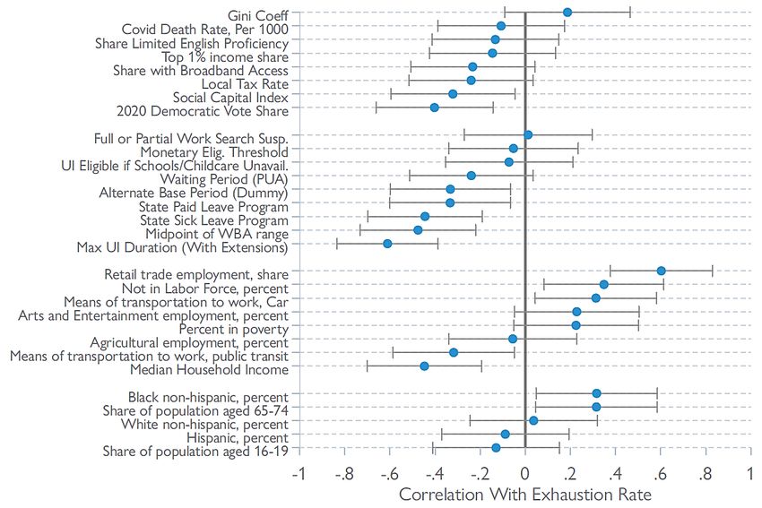
limited scope of this report we refer to the share of claims paid as a measure of access, this
measure can be further refined by removing from the denominator any claimants whose claim
was not paid because the claimant found alternative work. (We return to possible extensions to
the methodology in Section 3.)
Figure 1: Measuring Access in UI Claims Data

Whereas our earliest indicator of access pertains only to people who have applied for UI
benefits, our main measure of access is a point-in-time measure among all unemployed people:
the recipiency rate. For this report, we focus only on measuring the recipiency rate of regular UI,
not including Pandemic Unemployment Assistance (PUA), one of the federal supplemental
programs added in response to the crisis. We define the recipiency rate to be the share of
unemployed (or under-employed) workers in a given week who were collecting regular UI
benefits. We hypothesize that this measure will be lower whenever a jobless worker:
    1. Did not apply for benefits.
    2. Applied for benefits but did not receive them.
    3. Applied for and received benefits, but exhausted all of their benefits.
    4. Applied for and received benefits, but stopped receiving benefits for other reasons,
       including failure of the claimant to recertify or a change in the claimant’s eligibility status.
In this report, we do not attempt to measure the first mechanism. 4 The second mechanism
corresponds to our earliest measure of access, the share of claims paid. The end-stage
exhaustion rate alluded to in the third mechanism is our final measure of access.
Exhaustion rates are a useful measure of access because, to a large degree, they reflect how
fully insured workers were against the length of job loss they experienced (Schmieder et al.,
2012). Still, like first payment rates, exhaustion rates could also diverge from a more ideal
measure of access if claimants who exhaust also find suitable work in the week of exhaustion or
for other reasons related to moral hazard. Future work should examine the reemployment
prospects of workers who exhausted benefits during the pandemic.
Scope of Analysis
The scope of this report is to establish basic descriptive facts on the above three measures of
access. Our analysis is primarily cross-sectional, in that we show how the measures differ

4 Future work could relate the number of new initial claims to data on separations from JOLTS, though
that analysis will be somewhat limited in terms of what can be observed about workers.
                                                                                                        7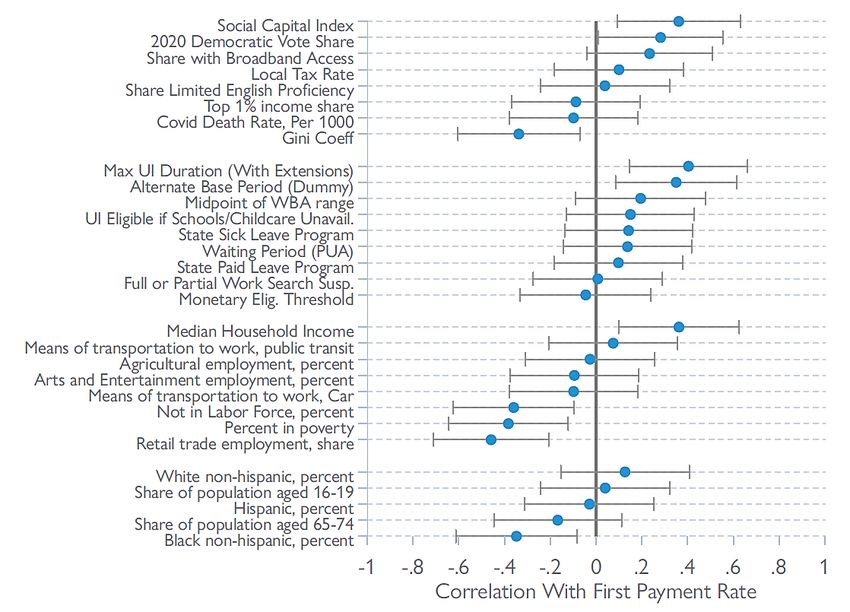
across space. Although time-series analysis is not the present focus, this report also sheds light
on how these measures differed from their pre-pandemic baselines.
The outline for the remainder of this report is as follows. Section 1.2 describes our
methodological approach in greater detail and Section 1.3 presents descriptive statistics.
Sections 2.1, 2.2, and 2.3 present the results of our analysis of access to UI when applied to
rates of recipiency, first payments, and exhaustions, respectively. Section 3 concludes with a
discussion of additional areas for research.

1.2 Operationalizing the Measures of Access
The data for this report stems from the Department of Labor (DOL) and Employment
Development Department (EDD).

Data from the DOL was taken from its Office of Unemployment Insurance through the publicly
available “Data Downloads” portal on the office’s website, which is updated daily. The data
extracted from this portal dates back to the year 1984, and it contains state-level employment
information for all 50 states. The variables in these extracted datasets are reported on either a
weekly or monthly basis. For much of our analysis, we combine or divide various variables
within the DOL data, such as our measure of new initial claims that are paid, which divides the
variable for new payments by the variable for new initial claims.

For our within-California analysis, we use administrative data from EDD on initial and continuing
claims. The initial claims data include micro-level data on all claims filed in the state of
California. The initial claim dataset has information on the date of filing the claim, the beginning
of the benefit year, the maximum benefit amount, and demographics. In this paper, we use new
initial claims to estimate the first payment rates in Section 2.
Another source of data from EDD is continuing claims data which includes payments
information for continuing claimants. An important feature of this data is that we can count
continuing claimants by the week of unemployment, which is the week for which they receive
their payment, rather than the week that the payment is processed, which is how data are
reported by DOL. This is specifically important for measuring the recipiency rate in Section 1
because the unemployment numbers are based on the week of unemployment, and counting
continuing claims based on the week of unemployment improves the accuracy of the results
compared to public data (Bell et al., 2020). Another feature of this data is having information on
the last payment. We observe the last payment of each claim for all available programs,
allowing us to measure exhaustion rates in Section 3.
Table 1 describes at a high level how each of the three measures of access are operationalized
in the DOL and EDD datasets. Below, we discuss each measure in greater detail.

                                                                                                     8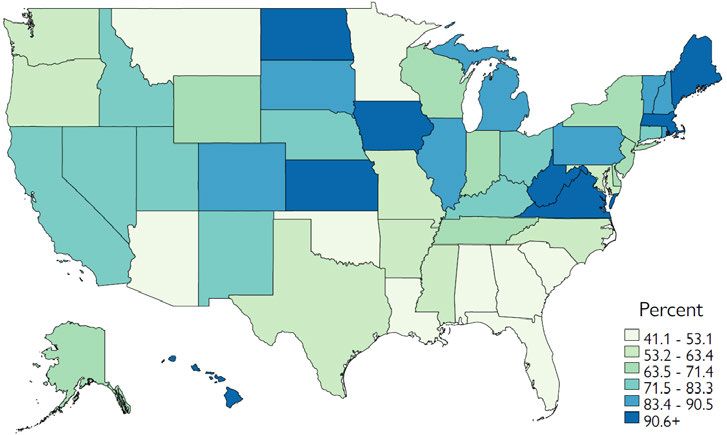
Table 1: Definitions of Key Access Measures, EDD and DOL

Access              Definition in Employment Development         Definition in State Department of
Measure             Department Micro-data                        Labor Aggregates

Initial Claims       Number of regular UI paid claimants         First Payments for regular UI divided
Payment Rate         divided by regular claimants at             by new regular initial claims, at the
                     quarterly level. Drop anyone who filed      monthly level.
                     a PUA claim in that quarter from the
                     sample.

Recipiency           Number of claimants who claimed             Number of weeks paid across
Rate                 regular UI benefits for unemployment        regular UI programs divided by
                     experienced in a given week divided         number of (U6) unemployed people
                     by our U6 estimate.                         in CPS.

Exhaustion           Number of exhausted claimants               The denominator for exhaustions is
Rate                 divided by number of people who             calculated by summing the number
                     claimed UI for unemployment in a            of people paid in a week for regular
                     given week. First, we exclude               UI, including extensions. The
                     claimants who have received only PUA        numerator is equal to the number of
                     payments in the time period of              final payments for the final extension
                     analysis. We code exhaustions when a        in a given time period. During
                     claimant receives a final payment for a     periods when there are no extension
                     program and does not receive another        programs, the numerator is final
                     payment for any UI program for 4            payments for state UI.
                     weeks. For the case of claimants who
                     receive regular and then PUA
                     payments, transitions that occur within
                     4 weeks are not coded as exhaustions.

Measurement of Recipiency Rates
We measure the UI recipiency rate as the number of people collecting regular UI benefits
divided by the number of unemployed workers in an area. In the EDD data, the number of
people collecting benefits in a week is defined as the number of people who were paid for
unemployment experienced in a given week, regardless of when the benefits were paid. This
definition more accurately represents the number of unemployed people receiving UI benefits in
a given week, and is the natural counterpart to the number of unemployed people as measured
in survey data. In contrast, in the DOL data, the number of people collecting benefits in a week
corresponds to the number of payments that were issued that week for regular state UI,
Pandemic Emergency Unemployment Compensation (PEUC), or Extended Benefits (EB). 5
Discrepancies can arise when a large number of individuals file and get paid for multiple weeks
retroactively. During the crisis, this led to large discrepancies between the two measures, but
prior to the crisis, the number of payments issued in a given week was on average similar to the
number of individuals receiving payments for unemployment in a given week. In our series of
policy briefs, we contrast the two measures further (Bell et al., 2020).
Our denominator — an estimate of the number of people who experienced unemployment in a
week — is derived from CPS. At the state level, unemployment is derived from CPS microdata,

5   Georgia and Florida did not report any PEUC claims during 2020.
                                                                                                     9
and is typically referred to as the U-6 measure, which is broader than the typical number of
unemployed published by the U.S. Bureau of Labor Statistics (BLS). As discussed in our series
of unemployment policy briefs (Bell et al., 2020), we use this broader measure to account for the
fact that workers working part-time involuntarily can receive UI benefits, and that during the
crisis, individuals available for work but not actively searching for a job could receive UI
benefits. 6 Our numerator excludes claimants receiving PUA benefits, not only to aid
comparisons prior to the pandemic and to reduce complications related to reports of fraudulent
PUA claims, but also because some PUA claimants may be working reduced hours for non-
economic reasons, and thus would not be included in the denominator. 7 Furthermore, many
business owners would be counted as employed if they worked just a single hour during the
CPS reference week, but would still be eligible to receive PUA benefits if their business was
affected by the pandemic. 8 By focusing just on claimants receiving regular UI benefits, we are
able to form a more “apples-to-apples'' comparison. To construct our denominator at the sub-
state (county) level, we base our estimates of the number of unemployed people off Local Area
Unemployment Statistics (LAU.S.) estimates, adjusted to mirror U-6.
Measurement of First Payment Rates
Whereas our analysis of recipiency rates during the pandemic focused on December of 2020,
when analyzing first payment rates we focus on claimants during the first half of 2020. This
timing better aligns with when the pandemic-driven surge of new initial claims began and
peaked (Bell et al., 2021).
In general, one can divide initial claims into two main categories: new initial claims and
additional claims. New initial claims correspond to “an application for the establishment of a
benefit year,” and an unemployed person who wants to collect UI benefits must file a new initial
claim. 9 Additional claims correspond to claimants who experience an interruption in their benefit
certification for one or more weeks due to being employed. Claimants still must be within their
6 According to the definition of the U.S. Bureau of Labor Statistics, the U-6 measure of unemployment
includes workers who fall under the traditional measure of unemployed (U-3), along with those working
part time for economic reasons and with those marginally attached to the labor force. We supplement the
U-6 measure to include workers the BLS believes may have been misclassified as employed despite not
being at work during the reference week for reasons related to the pandemic (These workers instead
should have been classified as "Unemployed on temporary layoff"). We follow the methodology outlined in
Question 5 of the December Employment Situation FAQ to adjust our unemployment estimate for these
misclassifications https://www.bls.gov/covid19/employment-situation-covid19-faq-december-
2020.htm#ques5. In the text, when we refer to using U-6, we are referencing this adjusted version (called
U-6*) which includes these misclassified workers. The BLS does not publish a monthly estimate of U-6 at
the state level, so the study team generated a measure of U-6 for California based on the CPS micro data
following the definition of the national U-6 measure. Although we use U-6 exclusively for the main
analysis, we also calculate state Recipiency Rates using U-3 unemployment and present the figures in
the Appendix. Results using either measure are typically similar and comparisons will be highlighted in
the footnotes throughout the Recipiency Rate chapter.
7 https://www.bls.gov/cps/definitions.htm#pter
8 See California’s PUA eligibility criteria here: https://edd.ca.gov/about_edd/coronavirus-2019/pandemic-
unemployment-assistance.htm. See the CPS definition here:
https://www.bls.gov/cps/definitions.htm#employed.
9 https://www.edd.ca.gov/uibdg/Miscellaneous_MI_5.htm
10benefit year and have remaining benefits in order to file an additional claim. Since additional
claims only represent re-entries to UI, we exclude them from our analysis, and only focus on
new initial claims.
Two key caveats of this analysis when applied to the DOL data are worth emphasizing, both of
which can be remedied with microdata when the analysis focuses on California.
First, in the DOL data, there are substantial payment timing issues. We are only able to look at
each state’s number of first payments issued in a given month relative to the number of new
initial claims filed in that month. To the extent that not all first payments are paid in the month in
which the claim was filed, we expect this measure to be relatively noisy at the state level, and
this would be a particular problem near the start of the pandemic when long payment lags were
common.
Second, there are likely cases during the pandemic in which a claim does not result in a first
payment under the regular UI program, but the claimant is later able to receive payment under
the PUA program. In the DOL data, we are unable to account for these cases as we cannot
observe whether the same person applied for or was paid under multiple programs. In the
individual-level analysis from EDD, we exclude anyone who ever filed a PUA claim so as to
make this measure comparable across time, given that the PUA program did not exist prior to
the pandemic. An important avenue for future work, which is beyond the scope of this initial
report, will be to document the role the PUA program played in expanding access to UI.
Measurement of Exhaustion Rates
Exhaustion rates have proven particularly difficult to measure, especially in the DOL data.
Whereas the term “exhaustion” has at times been used to refer to claimants who exhausted
their (regular non-extension) state UI benefits and moved on to extension programs, in this
report we aim to define exhaustions as those cases in which a claimant has exhausted state UI
and all available extensions (including PEUC and EB), which is a more meaningful measure of
access given policy changes during the pandemic.
The numerator of our exhaustion rate is an estimate of the number of claimants in a week who
exhausted the final week of (regular) UI benefits available to them. During periods when there
are no extensions available, the number of people exhausting is the number of final payments
issued for the regular UI program.
During periods when extensions are available, we follow different strategies in the two datasets
to count exhaustions. In the DOL data, we infer exhaustions based on the number of final
payments made under the program that was the last extension program available to most
claimants at the time. For instance, since claimants in California were eligible for Extended
Benefits during most of the pandemic, we infer the number of exhaustions based on the number
of final payments for EB processed that week. 10 In the EDD data, we improve on this measure
by counting exhaustions as the co-occurrence of two separate events. The first event is that a
10This is a less-than-ideal approximation, as not all claimants are eligible for EB. For instance, our earlier
work found that approximately 7% of those claimants who would have exhausted regular UI benefits in
December of 2020 had PEUC not been extended then would have not been eligible for EB.
11final payment flag was set for a particular UI program, and the second is that another payment
does not follow within four weeks. 11 Similar to the other access measurements in this analysis,
we only study regular (non-PUA) claimants. However, in the EDD data, in cases where
claimants receive their last regular payment and then transit to PUA within four weeks, we do
not count them as exhausted because they are still receiving payments – just under a different
program. The number of such cases is small with only 384 claimants transitioning in the highest
single week.
In either dataset, counts of exhaustions should be handled with caution. As pandemic-era
extensions have temporarily lapsed and re-started, it is possible that some claimants may be
coded as having exhausted but have in reality been eligible to resume collecting payments after
new policies came into effect. Furthermore, even if a claimant exhausts all of their benefits
available under one benefit year, if their earnings were high enough, they may be able to
establish a new claim. Moreover, the data for exhaustion analysis is up to June 2021. Changes
in extension programs afterwards, such as states voluntarily withdrawing from the extension
programs or the programs expiring, will likely affect our estimates.
Whereas the numerator of our exhaustion rate in either dataset derives from the issuance of
final payments, a question remains about what an appropriate at-risk group should serve as the
denominator. In the DOL data, we use the number of continuing claimants as a denominator
with which to construct an exhaustion rate. This choice of denominator is chosen largely for
convenience. The aggregated nature of the DOL data makes it nearly impossible to relate the
number of claimants who exhaust in a given week to any other group that is plausibly at risk of
exhausting.
In the EDD microdata, we are able to construct two separate measures of exhaustion. In
addition to relating the number of individuals exhausting benefits in a given week to the total
number of individuals receiving benefits in that week (to compare with DOL results), we are also
able to see specifically what share of claimants who established benefit years in a given week
have eventually exhausted benefits. We call this measure the cohort exhaustion rate. In
calculating the cohort exhaustion rate, we count all exhausted claimants within a cohort and
report that number by date of the established benefit year. But in the other measure, we report
the number of exhausted claimants (regardless of their cohort) by the week they experienced
exhaustion.
1.3 Descriptive Statistics on Measures of Access
Comparison of DOL and EDD Measures
Table 2 presents descriptive statistics on our three access measures from the EDD and DOL
datasets for California. We present means of each measure before and during the pandemic, in
the first week of December 2019 and 2020. Since the structure of data in DOL and EDD are
11In the EDD data, both the final payment flag and gap weeks in payment are based on the week of
unemployment.
12different, we did not expect to observe identical estimates, but the estimates are in general
reasonably close.
Table 2: Comparisons of Key Access Measures, EDD and DOL
Measure Period Department of Labor Employment Development
(DOL) Estimate for Department (EDD)
California Estimate
1st Payment Rate Dec 2019 0.8485 0.78
(1st week)
Recipiency Rate Dec 2019 0.2279 0.2098
(1st week)
Exhaustion Rate Dec 2019 0.0287 0.0257
(1st week)
1st Payment Rate Dec 2020 0.8028 0.75
(1st week)
Recipiency Rate Dec 2020 0.9664 0.8500
(1st week)
Exhaustion Rate Dec 2020 0.0022 0.0029
(1st week)
Notes: N = 50 (DOL), 58 (EDD). Each cell represents the mean of the measure of access.
The only case in which the EDD estimate is significantly larger (32% larger) is the exhaustion
rate in 2020. In this case, we suspect our approach in the DOL data underestimates the
exhaustion rate. To calculate the number of claimants exhausting in the DOL data, we use the
number of final payments for the program that would be the last one available to most
claimants, which was EB in December 2020. This likely misses some claimants who exhausted
PEUC and were not eligible for EB. 12
Aside from exhaustion rates, the remaining EDD estimates are generally 6 to 12 percent lower
than DOL. The main differences in estimates for recipiency rates and 2019 exhaustion rates
arise from the fact that the DOL data for continuing claims are reported by the processing week
while in EDD we use the week of unemployment to count continuing claims. Finally, the basis of
discrepancy in the first payment measure is that in the EDD data we link individual-level data for
new claimants to payment information to find the first payment rate; however, in the DOL data,
we must rely on aggregate monthly numbers.
12 For more details on EB (FED-ED) eligibility in California see here.
13Correlations Among Access Measures
Table 3 presents correlations among the three access measures in 2019 and 2020 for both
cross-state and within-California analyses.
The correlations we detect are consistent with the mechanical relationship hypothesized
between recipiency rates and either first payment rates or exhaustion rates. 13 Holding other
factors constant, the more likely a community’s residents are to receive first payments, the
higher the recipiency rate should be. Indeed, we detect a positive correlation between
recipiency rates and first payment rates. Conversely, states or counties with higher rates of
exhaustion have lower recipiency rates. This is also to be expected, because any time a
claimant exhausts UI but remains unemployed, this event mechanically lowers the recipiency
rate. 14
Whereas the two correlations with recipiency rates are consistent with the predictions of our
conceptual model, the model did not offer a clear prediction as to the sign of the correlation
between exhaustion rates and first payment rates. In the data, we typically find this correlation
to be negative. In other words, states or counties where more claims were paid are also those in
which a lower share of claimants exhausted benefits. The only exception is the within-California
correlation for 2020, in which we observe a positive correlation between first payment and
exhaustion rates.
One hypothesis that could be explored in future research is that this correlation may be driven
by policy differences in general UI generosity across states. More generous policies, broadly
defined, may jointly increase both first payment rates and decrease exhaustion, leading to the
negative correlation. However, the fact that similar correlations exist between rates of first
payments and exhaustions across California counties in 2019 is not consistent with the
hypothesis that differences across states reflect different policies. 15
13 These were hypotheses 2 and 3 from Section 1.1.
14 The magnitude of the expected direction within-California for 2020 is very small with a correlation of
only 0.01.
15 Although not supported by our data at present, it is worth noting that alternative theories could have
predicted a correlation between rates of first payments and exhaustions of the opposite sign. For
instance, borrowing from the selection framework of (Nichols & Zeckhauser, 1982), if states differed
substantially in the ordeal costs they chose to impose on UI claimants, one might imagine that states with
the lowest payment rates would have only the most qualified or motivated claimants collecting UI. In the
context of such a model, it might not be surprising to find that in such high-ordeal states, those motivated
claimants who succeed in establishing claims are quicker to find jobs prior to exhausting. However, the
correlations we see in the data are contrary to this prediction.
14Table 3: Correlations Among Key Access Measures
Panel A: Within California (County-level), December 2019
Recipiency Rate 1st Payment Rate Exhaustion Rate
Recipiency Rate 1
1st Payment Rate 0.6231 1
Exhaustion Rate -0.4313 -0.5069 1
Panel B: Within California (County-level), December 2020
Recipiency Rate 1st Payment Rate Exhaustion Rate
Recipiency Rate 1
1st Payment Rate 0.1589 1
Exhaustion Rate -0.0149 0.2353 1
Panel C: Across States, December 2019
Recipiency Rate 1st Payment Rate Exhaustion Rate
Recipiency Rate 1
1st Payment Rate 0.4895 1
Exhaustion Rate -0.3420 -0.1595 1
Panel D: Across States, December 2020
Recipiency Rate 1st Payment Rate Exhaustion Rate
Recipiency Rate 1
1st Payment Rate 0.2884 1
Exhaustion Rate -0.6394 -0.2551 1
Notes: N = 50 (state), N = 58 (county). Each cell represents the correlation between the two measures of access,
weighted by population in 2019.
A potential explanation for the appearance of negative correlation across counties in 2019 that
could be tested in future work could be that differences in both variables are driven in some part
by the composition of workers. For instance, consider a county in which many workers have a
low labor force attachment. We might expect to see low rates of first payment in this county due
to the fact that many jobless workers do not have sufficient prior earnings to successfully
establish a claim. But among those who do establish claims, we might also expect to see a
15higher rate of exhaustion, either because benefit duration has been reduced below California’s
26-week maximum due to low prior earnings, or because the worker continues to have difficulty
finding a job. In 2020 however, we observe a positive correlation. The main change in 2020 is
that due to extension programs, claimants who otherwise would have low benefit durations
instead benefited from longer durations which mechanically lowers exhaustion rates.
2.1: Recipiency Rates Among the Unemployed
Recipiency Rates Across the U.S.
Across the United States, we estimate that 60% of Americans who were unemployed in
December of 2020 collected regular UI benefits. Figure 2 shows that the national average
masks substantial heterogeneity across states. In some states — such as MN, MA, NY, and
CA — the number of UI claimants was essentially comparable to the number of people thought
to be unemployed (with a recipiency rate of at least 90%). In contrast, TN, ID, NE, and FL all
saw recipiency rates of less than one quarter, meaning that even at the height of the pandemic,
over three-quarters of unemployed workers were not collecting benefits. Figure 3 maps
recipiency rates across states. In general, UI recipiency rates tended to be lower in the
Southern and mid-Western parts of the country. 16
Figure 2: Recipiency Rates Across States, Bar Graph
Notes: N = 50. Source = DOL. The blue bars represent the recipiency rates across states for the week of December
5th, 2020. The orange bar represents the US average recipiency rate weighted by population in 2019. The recipiency
rate is the number of continuing claims paid from the DOL divided by the number of U6 unemployed from the CPS.
For more details on the recipiency rate, please refer to Section 1.2 of the text.
16 Figures A1 and A2 plot the same bar graph and map using U3 unemployment instead of U6 in the
Recipiency Rate and show very similar patterns. Although using the U3 measure of unemployment
indicates that many states saw more than 100% of unemployed people receiving UI benefits, a proper
interpretation is more nuanced. The fact that the numerator in some cases exceeds the denominator is
not surprising because eligibility was expanded for UI benefits during the pandemic beyond those who
would normally be considered unemployed under the U3 definition.
16Figure 3: Recipiency Rates Across States, Map
Notes: N = 50. Source = DOL. The colors represent the recipiency rates (in percent) across states for the week of
December 5th, 2020. The recipiency rate is the number of continuing claims paid from the DOL divided by the
number of U6 unemployed from the CPS. For more details on the recipiency rate, please refer to Section 1.2 of the
text.
To better understand the sources of this state-level variation, Figure 4 presents correlations and
95% confidence intervals 17 of recipiency rates with other state-level policy and socioeconomic
factors. 18 On the socioeconomic side, states that experienced higher recipiency rates during
the pandemic tended to be wealthier, as evidenced by a strong positive correlation with median
household income. States that had a higher Democratic vote share in the last presidential
election also had higher recipiency rates. States with higher shares of Black residents had lower
recipiency rates during the pandemic. This pattern sheds light on racial disparities in access to
the American UI system documented by a growing historical and qualitative literature (Edwards,
2020; Fields-White et al., 2020). 19 A number of state-level policies were also highly correlated
with differences in recipiency rates. States that afforded claimants longer Potential Benefit
Duration (PBD) had substantially higher recipiency rates, as did states with alternative base
periods. States with public sick or paid leave programs also had higher rates of recipiency. One
hypothesis for this correlation that could be tested further is that this reflects that states with
generous UI policies also have other generous labor-related policies. Overall, although not
causal evidence, these descriptive correlations are consistent with state-level policies affecting
access to UI during the pandemic. 20
17 All statistically significant results are significant at the 95% confidence level.
18 Figure A3 plots the correlations between each covariate and the U3 based version of the Recipiency
Rate. The results are nearly identical.
19 An original aim of this study was to quantify the extent to which racial and ethnic disparities at the
national level could be explained by low rates of access in states with certain racial and ethnic
demographic compositions. As discussed in Section 3, we were unable to answer this question because
the race and ethnicity information contained in the DOL data turned out to be inconsistent.
20 Figure A3 plots the correlations between each covariate and the U3 based version of the Recipiency
Rate. The results are nearly identical.
17Figure 4: Recipiency Rates Across States, Correlations
Lower Recipiency Rate Higher Recipiency Rate
Note: N = 50. Source = DOL and ACS. Each dot represents the correlation between the covariate and recipiency rate
in December 2020 weighted by population in 2019. All variables are measured at the state level. Error bars represent
the 95% confidence interval. The recipiency rate is the number of continuing claims paid from the DOL divided by the
number of U6 Unemployed from the CPS. For more details on the recipiency rate and the sources of the covariates,
please see Section 1.2 of the text and the data appendix.
Although these findings are correlational, the magnitudes of the correlations of recipiency rates
with policy variables are substantial in many cases. Consider, for instance, the cross-state
relationship observed between state PBD and recipiency rates. In December of 2020, the state
UI maximum PBD in NC was 12 weeks, whereas MA offered up to 30 weeks. 21 Unsurprisingly,
recipiency rates were substantially lower in NC than MA – 44% vs 102%. Suppose for the
purpose of a back-of-envelope calculation that the observational correlation between state
maximum PBD and recipiency were causal. If all states had a PBD of 30 weeks, the national
recipiency rate would grow from 60% to 77% – a 28% increase. This would result in about three
million more jobless workers collecting UI benefits each week, totaling about $1.7 billion in
benefits. While such a calculation should be interpreted with caution as there are many other
factors that differ across states, the magnitude of this difference suggests there was likely great
potential for state-level policies to influence recipiency rates during the pandemic.
21 Massachusetts State UI PBD increases from 26 to 30 weeks when unemployment is high.
18While a causal analysis of these policies is beyond the scope of the present work, 22 we explore
in Figure 5 an analysis of how these state-level correlations have changed around the time of
the pandemic. For each covariate, we contrast the correlation both with recipiency in December
of 2019 and with recipiency in December of 2020. Despite the fact that recipiency rates have
risen substantially during the pandemic, the relative geographic patterns are surprisingly stable.
The types of states that had high recipiency rates before the pandemic also had high recipiency
rates during the pandemic. 23 Although no differences in the correlations are statistically
significant, it is worth noting that the ordinarily high correlation between Weekly Benefit Amount
(WBA) generosity and recipiency rates has fallen considerably during the pandemic. This would
be the direction one would expect based on the common nature of the federal added benefits
supplements across states (which reduces the relative difference in WBAs across states),
combined with the impact of benefit generosity on take-up (P. Anderson, 2020; P. M. Anderson
& Meyer, 1997).
Insights from Within CA
Measuring recipiency rates for regions within California is an important but difficult task.
Although we have precise measures of how many Californians collected benefits from a given
geographic unit, estimating the number of unemployed workers in that place at that time is more
cumbersome. In this analysis, we rely on official county-level estimates from the Bureau of
Labor Statistics Local Area Unemployment Statistics (US Bureau of Labor Statistics, 2021).
However, estimating recipiency rates this way is far from ideal due to the small sample size of
the Current Population Survey (108,000 people) the LAUS estimates for unemployment at the
sub-state level rely on certain measures of UI claims themselves. 24 While we have contrasted
the LAUS county unemployment rates to comparable estimates based on the CPS microdata
and found them to be similar, the fact remains that for many smaller geographic units the
estimates are based on small samples and hence are prone to statistical noise. For this reason,
the county-level estimates of UI recipiency rates presented below should be interpreted with
caution. 25
22 There is scope for additional work to investigate more causal mechanisms that underlie these
correlations. Building on the work of (Gould-Werth & Shaefer, 2013) that studied the role of alternative
base periods in access to UI, more research is needed to leverage the large amount of natural time-
series variations that occur in several of these policies across states.
23 Figure A4 plots each states recipiency rate in 2019 and 2020, and demonstrates that, despite being
noisy, states with higher recipiency rates in 2019 also had higher recipiency rates in 2020.
24 For more information, see the LAU.S. methodology note: https://www.bls.gov/lau/laumthd.htm.
25 In our ongoing series of policy briefs, we have compared geographic patterns of recipiency rates using
the LAU.S. county-level definition of unemployment to the tract-level unemployment estimates near the
start of the pandemic of (Ghitza & Steitz, 2020). We have not detected meaningful differences in the
spatial correlations using either measure of unemployment.
19Figure 5: Recipiency Rates Across States, Correlations, 2019 vs 2020
Lower Recipiency Rate Higher Recipiency Rate
Notes: N = 50. Each dot represents the correlation between the covariate and the recipiency rate in December 2019
and December 2020 weighted by population in 2019. All variables are measured at the state level. Error bars
represent the 95% confidence interval. The recipiency rate is the number of continuing claims paid from the DOL
divided by the number of U6 unemployed from the CPS. For more details on the recipiency rate and the sources of
the covariates, please see Section 1.2 of the text and the data appendix.
Analogous to Figure 2, Figure 6 shows how recipiency rates varied within California. Based on
the comparisons of UI claimants to LAUS unemployment rates (re-scaled to mirror U-6), Los
Angeles County has by far the lowest recipiency rate among large counties in California. Figure
7 maps recipiency rates across each of California’s 58 counties. Figures 6 and 7 also
demonstrate substantially less variation in recipiency rates across counties than across states. 26
This could be a consequence of the UI program parameters being constant across counties, but
substantially different across states.
26Figures A7 and A8 shows how this variation changed over time and demonstrates that the variation
across states and counties increased during the pandemic.
20Figure 6: Recipiency Rates Within California, County-Level Bar Graph
Notes: N = 58. Source = EDD. The blue bars represent the recipiency rates for all the counties in December 2020.
Orange bar represents the California average Recipiency Rate weighted by population. The recipiency rate is the
number of continuing claims paid from EDD divided by the number of U6 unemployed from the CPS and LAUS. For
more details on the recipiency rate, please see Section 1.2 of the text.
Figure 7: Recipiency Rates Within California, County-Level Map
Notes: N = 58. Source = EDD. The colors represent the U6 recipiency rate (in percent) across counties in December
2020. The recipiency rate is the number of continuing claims paid from EDD divided by the number of U6
Unemployed from the CPS and LAUS. For more details on the recipiency rate, please see Section 1.2 of the text.
21Figure 8 shows county-level correlations and 95% confidence intervals of recipiency rates with
socioeconomic indicators. Similar to our findings across states, higher-income counties also
saw higher rates of UI recipiency. Counties with higher rates of COVID-19 deaths saw lower
rates of recipiency, as did those counties with higher shares of Hispanic residents. We find that
counties with more broadband access had substantially higher rates of UI recipiency, which
points to the importance of technological gaps in access to UI during the pandemic. We also
find that counties with more residents with limited English proficiency had lower rates of UI
recipiency, which is consistent with reports that language barriers may also have played a role
in limiting access (Hellerstein, 2020). Many of these correlational findings corroborate the more
qualitative conclusions of Fields-White et al. (2020) on the role that barriers to access during the
pandemic have played in widening racial disparities, including stigma, burdens to produce
documentation, and the digital divide. Although an authoritative dissection of the roots of these
differences is beyond the scope of the current study, a growing body of quantitative and
qualitative evidence (Fields-White et al., 2020; Gould-Werth, 2016; Shaefer, 2010) suggests
that both legal eligibility and more nuanced barriers to accessibility of UI have played important
roles in determining UI recipiency rates.
Figure 8: Recipiency Rates Within California, County-Level Correlations
Lower Recipiency Rate Higher Recipiency Rate
Notes: N = 58. Source = EDD and ACS. Each dot represents the correlation between the covariate and UI recipiency
rate in December 2020 weighted by population in 2019. All variables are measured at the county level. Error bars
represent the 95% confidence interval. The recipiency rate is the number of continuing claims paid from EDD divided
by the number of U6 Unemployed from the CPS and LAUS. For more details on the recipiency rate and the
definitions of the covariates, please see Section 1.2 of the text and the data appendix.
Turning to the time dimension of recipiency rates within California, Figure 9 shows how these
correlations have changed over the course of the pandemic. Whereas correlations across states
22have been relatively stable, correlations across counties have changed. The extent to which this
may be due to differences in how LAUS has imputed unemployment rates should be
investigated further before drawing firm conclusions. Still, taking these available estimates at
face value, our analysis indicates that the strong positive relationship between recipiency rates
and counties’ median income and broadband access may be relatively new phenomena, as
these correlations were not detectable in 2019. As with the state-level analysis, a more carefully
controlled time-series analysis should be conducted prior to attributing a causal relationship
from these cross-sectional correlations.
Figure 9: Recipiency Rates Within California, County-Level Correlations, 2019 vs 2020
Lower Recipiency Rate Higher Recipiency Rate
Notes: N = 58. Source = EDD and ACS. Each dot represents the correlation between the covariate and the recipiency
rate in December 2019 and December 2020 weighted by population in 2019. All variables are measured at the county
level. Error bars represent the 95% confidence interval. The recipiency rate is the number of continuing claims paid
from EDD divided by the number of U6 unemployed from the CPS and LAUS. For more details on the recipiency rate
and the sources of the covariates, please see Section 1.2 of the text and the data appendix.
Given the stark differences across geographic regions in UI recipiency rates, we next turn to
analyzing geographic differences in rates of first payments.
232.2: First Payment Rates Among Claimants
First Payment Rates Across the U.S.
At the national level, we estimate that about 70% of new initial claims filed in the first two
quarters of 2020 resulted in first payments. This measure of access varied dramatically across
states, although it should be noted that there is noise in this calculation in the DOL data
because we are relating first payments issued in a month to new initial claims filed in a month
(which are not necessarily the same claims). Still, Figure 10 shows that states essentially span
the entire range from nearly 40% to approximately 100%. 27 Among the states that paid the
highest share of claims in the first half of 2020 were VA, KS, IA, and HI, whereas MT, AZ, and
GA were among the lowest. Figure 11 maps payment rates across states.
Figure 10: First Payment Rates Across States, Bar Graph
Note: N = 50. Source = DOL. The blue bars represent the first payment rate across states for 2020Q1 + 2020Q2
(January through June). The orange bar represents the US population weighted average. The first payment rate is
the number of first claim payments divided by the number of new initial claims. For more details on the first payment
rate, please refer to Section 1.2 of the text.
27 The fact that some states are above 100% is an artifact of how DOL reports claims filed in a month and
claims paid in a month, but these are not necessarily the same claims. This is a limitation that we face in
our cross-state analysis but not for our within-California analysis relying on microdata.
24Figure 11: First Payment Rates Across States, Map
Notes: N = 50. Source = DOL. The colors represent the first payment rates (in percent) across states for 2020Q1 +
2020Q2 (January to June). The first payment rate is the number of first claim payments divided by the number of new
initial claims. For more details on the first payment rate, please refer to Section 1.2 of the text.
Figure 12 shows how the heterogeneity in first payment rates covaries with our set of state-level
covariates 28. Certain state-level policies appear to relate to first payment rates in the expected
directions. In states that allow claims to be established under alternative base period formulas,
more claimants get paid. Although states with longer UI durations also see a larger share of
claimants paid, we do not detect a significant correlation between the share of claimants paid
and monetary eligibility threshold. This is surprising, since a higher monetary eligibility threshold
implies that (all else equal) fewer claimants are monetary eligible and therefore fewer claims will
receive a first payment. 29 However, there are other reasons for a claim to go unpaid, including
non-monetary eligibility criteria, short unemployment spells, or claimants failing to certify for
benefits for other reasons. These scenarios may be less common in states with higher monetary
eligibility thresholds. In general, states that paid a higher share of claims during the start of the
pandemic tended to be more affluent (as measured by median household income or poverty
rates) and have slightly more economic inequality (evidenced by the negative correlation of first
payment rates with the Gini coefficient). States with a higher share of Black workers paid out a
statistically significantly lower share of claims, though we did not detect a significant correlation
with Hispanic share.
28All statistically significant results are significant at the 95% confidence level.
29A monetary eligibility threshold is the minimum amount of earnings that a jobless worker must have
earned in the base period in order to establish a UI claim. The monetary eligibility threshold in January
2020 ranged from $130 in Hawaii to $7,000 in Arizona.
25You can also read