Effective Graphics Guide - Creating Effective Displays for Models and Maps Technical Service Center Manuals and Standards - Bureau of Reclamation
←
→
Page content transcription
If your browser does not render page correctly, please read the page content below
Effective Graphics Guide
    Creating Effective Displays for Models and Maps

    Technical Service Center Manuals and Standards

U.S. Department of the Interior                       June 2020
Mission Statements
                   The Department of the Interior (DOI) conserves and manages the
                   Nation’s natural resources and cultural heritage for the benefit and
                   enjoyment of the American people, provides scientific and other
                   information about natural resources and natural hazards to address
                   societal challenges and create opportunities for the American
                   people, and honors the Nation’s trust responsibilities or special
                   commitments to American Indians, Alaska Natives, and affiliated
                   island communities to help them prosper.

                   The mission of the Bureau of Reclamation is to manage, develop,
                   and protect water and related resources in an environmentally and
                   economically sound manner in the interest of the American public.

Disclaimer
Links to other websites, trademarks, and notes about products are inserted for convenience and to
provide examples. These mentions do not constitute endorsement, recommendation, or favoring of
material at those sites, or any organization, product, or service. Information about commercial products
or firms may not be used for advertising or promotional purposes. Not listing firms, brands, or products
does not imply they are unsatisfactory.

  Cover image: Use your imagination to visualize your audience and find the right display to convey your results
  (Reclamation/Gray).

                                                                                                                   2
Effective Graphics Guide
Technical Service Center Manuals and Standards
prepared by

Technical Service Center
Deena Larsen, Technical Writer/Editor, Water, Environmental, and Ecosystems Division
Cindy Gray, Graphics Specialist, Water, Environmental, and Ecosystems Division

Acknowledgements
Technical Service Center
Thank you to the Bureau of Reclamation’s Technical Service Center staff who contributed to the
content in this guide and reviewed this guide for accuracy, including:

   •   Merlynn Bender, Civil Engineer, Water Resources Engineering and Management
   •   Ian Ferguson, Civil Engineer, Water Resources Engineering and Management
   •   Todd Gaston, Economist, Economics and Planning
   •   Teri Manross, Technical Writer/Editor, Civil Engineering Services Division
   •   Sharon Leffel, Technical Writer/Editor, Geotechnical Services Division
   •   Kristin Mikkelson, Civil Engineer, Water Resources Engineering and Management
   •   Marketa McGuire, Civil Engineer, Water Resources Engineering and Management
   •   Tyna Petersen, Technical Writer/Editor, Engineering and Laboratory Services Division
   •   Jake Prickett, Physical Scientist, Geographic Applications and Analysis
   •   Connie Svoboda, Hydraulic Engineer, Hydraulic Investigations and Laboratory Services
   •   Bruce Whitesell, Group Manager, Geographic Applications and Analysis
   •   Patrick Wright, Physical Scientist, Geographic Applications and Analysis

External Reviewers
Thank you to the external reviewers who reviewed this guide to ensure its usefulness and
applications for technical displays for a wide range of audiences, including:

   •   Brit Atkins, Technical Communication Specialist, CDC
   •   Sally Rege Carroll, Senior Analyst, Environmental Quality, Massachusetts Water
       Resources Authority
   •   Eleni Giannakopoulos, Visual Information Specialist, U.S. Food and Drug Administration
   •   Mary Jane Nirdlinger, Assistant Town Manager, Chapel Hill North Carolina
   •   Lara Van Nostrand, Senior Associate, Avyance, LLC
   •   J.S. Parker, Technical Communication Specialist, Freelance

                                                                                                 iii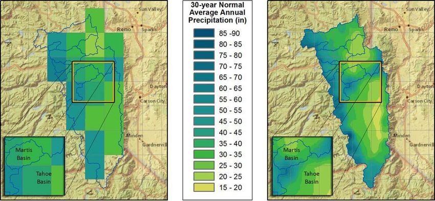
Effective Graphics Guide

Acronyms and Abbreviations
BMP           Bitmap
DOI           Department of the Interior
dpi           dots per inch
GIF           Graphics Interchange Format
GIS           Geographic Information System
JPG or JPEG Joint Photographic Experts Group
IT            information technology
MB            megabyte
pdf           Portable Document files
PNG           Portable Network Graphics
PRMS          Precipitation Runoff Modeling System
ppi           pixels per inch
Reclamation   Bureau of Reclamation
RISE          Reclamation’s Information Sharing Environment
SVG           Scalable Vector Graphics
TIFF          Tag Image File Formats
TSC           Technical Service Center
VI            Visual Identity
VIC           Variable Inflow Capacity
WCAG          Web Content Accessibility Guidelines

                                                                                    iii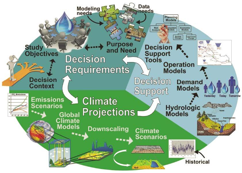
Effective Graphics Guide

Executive Summary
You have collected and analyzed the data and you have the results—the trends, the issues, the
spatial locations for data and engineering designs, etc. Now how do you communicate those
results to the people who will use them? To ensure that all your hard work matters, you need
clear, consistent displays that show your data and results in ways decisionmakers, other analysts,
and stakeholders can understand. Use this manual a thought process, tips, and guides for
developing effective displays for data, particularly geographic and model data.

When determining how to display your data results, begin with the end in mind:

   •   Who is the audience?
   •   What is the purpose?
   •   What information will these displays provide?
   •   What is the format for the end product (e.g., print, online, conference poster)?
   •   How will the display be used (e.g., compare alternatives, make decisions, further analyze)?
Work with the client and team to ensure graphics are consistent across disciplines. Consult with
TSC’s graphic specialists. Coordinate your displays with the other analyses needed for the end
product to ensure consistency and usability, considering Visual Identity requirements, color,
scale, order, and labels. Develop draft graphics and discuss and review them with your end
audience, if possible, as well as the team and client. Ask how they interpret the graphics and
clear up any confusion (Use Section 2. Plan Your Process and Displays).

Use a display type that will convey your data in a compelling and
practical format tailored to your audience and purpose. Your data         “Excellence in statistical
could be displayed in many different ways (e.g., a bar chart, scatter     graphics consists of complex
plot, Sankey diagram) but you need to determine which display type        ideas communicated with
ensures that your message is clear and accurate. Explore Section 3.       clarity, precision, and
Types of Displays to see possible ways to display your data.              efficiency" Tufte 2001.

   •   What is important to show and compare?
   •   Are you showing relative proportions of elements?
   •   Does the data change over time? By location?
Sound decisions and further analysis depend on others being able to understand and interpret
your data and analysis. Therefore, design all displays so that the least technical readers can
understand and interpret them accurately and easily. Plan your displays up front to meet these
needs as simply as possible. Be consistent and simple. Use colors wisely and effectively. Get tips
to ensure your chosen display effectively communicates key results in Section 4. Create Effective
Displays.

Remember that some readers may not be able to distinguish colors or see the display. Always
have another way to get the information across. Refer to Section 5. Accessibility for ways to
reach these audiences. It’s not just a good idea, it is 508 compliance.

                                                                                                   v
Effective Graphics Guide

Contents
                                                                                                                                          Page
1. Introduction ................................................................................................................................1
    1.1. Manual Purpose and Need ..................................................................................................1
    1.2. About this Manual...............................................................................................................1
2. Plan Your Process and Displays ...............................................................................................3
    2.1. Purpose and Message ..........................................................................................................3
    2.2. Audience .............................................................................................................................4
    2.3. Level of Detail ....................................................................................................................4
    2.4. Final Product .......................................................................................................................5
        2.4.1. What Will the Final Product Look Like? ...................................................................5
        2.4.2. How Will the Final Product be Used? .......................................................................6
        2.4.3. What Will the Final Size and Format(s) Be? .............................................................6
        2.4.4. Group All Elements .................................................................................................10
        2.4.5. Where and How Will the Final Products Be Stored? ..............................................10
    2.5. Coordination and Documentation .....................................................................................11
        2.5.1. Comply with Reclamation’s Visual Identity............................................................11
        2.5.2. Coordinate with Other Disciplines...........................................................................11
        2.5.3. Work with Graphics and Writing Specialists...........................................................12
        2.5.4. Document Your Plan................................................................................................12
    2.6. Test Displays and Reviewers ............................................................................................13
        2.6.1. Storyboards and Draft Displays ...............................................................................13
        2.6.2. Reviewers .................................................................................................................13
        2.6.3. Usability Testing ......................................................................................................14
3. Types of Displays......................................................................................................................15
    3.1. Infographics, Schematics, and Flow Charts ......................................................................15
    3.2. Bar Charts .........................................................................................................................17
    3.3. Pie Charts and Treemaps ..................................................................................................18
    3.4. Scatter Plots ......................................................................................................................19
    3.5. Boxplots ............................................................................................................................20
    3.6. Teacup Diagrams ..............................................................................................................21
    3.7. Line Graphs .......................................................................................................................22
    3.8. Sankey Diagrams ..............................................................................................................23
    3.9. Geographical Maps ...........................................................................................................23
    3.10. Heatmaps.........................................................................................................................25
4. Create Effective Displays ........................................................................................................27
    4.1. Explain Your Model Process ............................................................................................27
    4.2. Show Positive and Negative Elements Clearly .................................................................29
    4.3. Compare Relationships .....................................................................................................30
    4.4. Label Clearly .....................................................................................................................32
    4.5. Use Texts and Captions ....................................................................................................32

                                                                                                                                             vii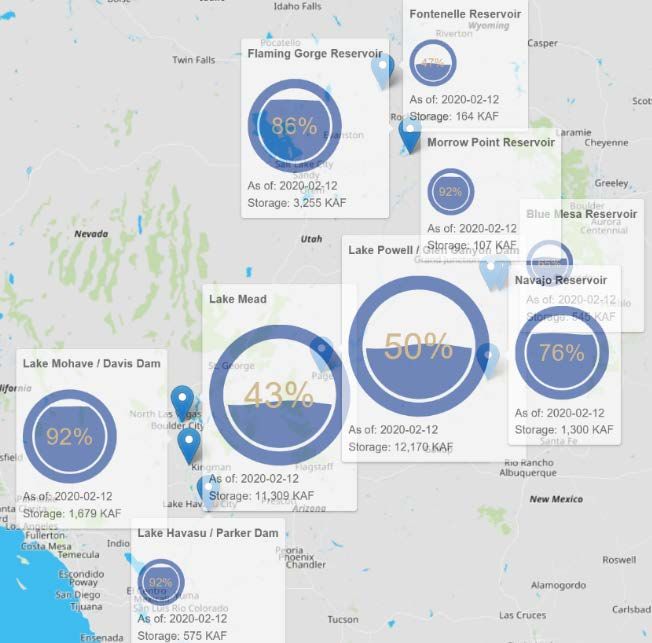
Effective Graphics Guide
4.6. Keep Graphic Elements Consistent ..................................................................................33
4.6.1. Develop and Use Team Crosswalks ........................................................................33
4.6.2. Use Consistent Language .........................................................................................33
4.6.3. Keep Consistent Scales ............................................................................................34
4.6.4. Use the Same Names in the Same Order .................................................................35
4.6.5. Carry Consistency across Projects ...........................................................................35
4.7. Be as Simple as Possible ...................................................................................................35
4.8. Consider Colors Carefully ................................................................................................36
4.8.1. Don’t Depend on Color Alone .................................................................................36
4.8.2. Use Distinguishable Color Scales ............................................................................37
4.8.3. Consider Contrast.....................................................................................................38
4.9. Cite Sources and Get Permissions ....................................................................................39
4.9.1. Citations ...................................................................................................................39
4.9.2. Permissions ..............................................................................................................40
5. Accessibility ..............................................................................................................................41
5.1. Alternative Text (Alt Tag) ................................................................................................41
5.2. Color Blindness.................................................................................................................41
6. Example for Improving a Figure ............................................................................................43
7. References .................................................................................................................................47
8. Glossary ....................................................................................................................................51
Appendix A: Programming Tips and Examples .......................................................................53
Appendix B: Guidance for Development of Maps for Briefing, Presentation,
and External Outreach Materials...................................................................................59
Introduction ..............................................................................................................................59
1. Communication Process.......................................................................................................59
2. Mapping Guidance for Briefing, Presentation, and External Outreach Materials ...............60
3. Review of Maps ...................................................................................................................61
4. Technical Mapping Support .................................................................................................61
5. Existing Symbology .............................................................................................................61
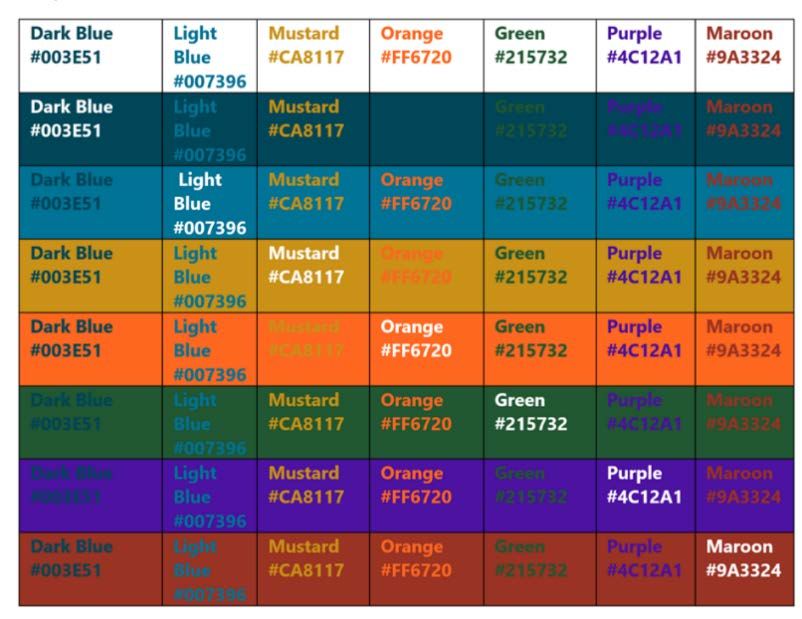
Appendix C. Color Scales for Reclamation’s VI Colors ..........................................................65
Dark Blue (PMS 3035) ............................................................................................................66
Light Blue (PMS 633)..............................................................................................................67
Mustard (PMS 1245)................................................................................................................68
Tan (PMS 468).........................................................................................................................69
Orange (PMS 165) ...................................................................................................................70
Green (PMS 357) .....................................................................................................................71
Red (PMS 484) ........................................................................................................................72
Purple (PMS 2091) ..................................................................................................................73
viiiEffective Graphics Guide
1. Introduction
1.1. Manual Purpose and Need
As the saying goes, a picture is worth a thousand words. Yet
pictures are priceless and irreplaceable when it comes to Take time to plan your displays and
displaying complex information such as monitoring data, work with graphics and writing
model results, and maps. Effective displays 1 (charts, maps, specialists from the outset of your
figures, etc.) convey complex processes, data or model results, project. This will save you time and
important trends and issues, and other concepts to a wide range money in the long run. Make sure
of audiences. The Bureau of Reclamation’s (Reclamation) your displays convey your
analyses produce information that can be shared using graphics information correctly and easily to
and maps. Reclamation subject matter experts work in multi- your audiences—so your readers
disciplinary teams, so displays need to be coordinated between can carry your ideas forward
disciplines so that we can present unified, consistent
communication products that our audiences can understand
and use.
Effective graphics can help audiences:
• Quickly gain the information they need
• Compare results consistently to evaluate alternatives
• Accurately use information for further analyses or to create engineering solutions
• Avoid misinterpretations that could lead to errors in future analyses or decisions.
1.2. About this Manual
Reclamation’s Technical Service Center (TSC) developed this manual to help guide thought
processes to effectively convey analyses assumptions, results, and data in a clear and consistent
manner. We also wanted to share effective techniques for programmers, modelers, engineers,
cartographers, and other data analysts to in model and Geographic Information System (GIS) to
output consistent graphs and maps. This manual is discretionary and provides only a general
overview for programmers and data analysts. Each display process is different and will use
different techniques to produce and use effective displays. The principles, tips, and examples in
this manual will help you effectively communicate the results of your work to audiences who
will act on your analyses.
1
See the Glossary for terms in this manual. The term “displays” is used as the most generic word possible, including
maps, graphs, charts, posters, tables, etc. “Figure” refers to any type of map, chart, or other image, and “table”
refers to any form of information with rows and columns.
1Effective Graphics Guide
2. Plan Your Process and Displays
Planning early and often will save time and effort by making it
easier to produce consistent displays and avoid revising figures Overall Goal:
for presentation or publication. Plan how you will prepare and Readers will be able to get
convey your data and information at the beginning of the analysis the information they need
and make the output (i.e., the display) an integral part of the quickly and easily.
overall analysis and reporting process.
2.1. Purpose and Message
To ensure that every graph, figure, and map conveys the analysis results to the reader clearly and
correctly, the team should work with the client to answer these questions at the beginning of the
project:
• Why are we creating these displays? For example:
o To compare the impacts of a set of water management alternatives under a set of
hydrological and meteorological scenarios
o To show the potential impacts of a particular flood scenario
o To demonstrate how a reservoir’s capacity has changed over time due to
sedimentation
• What is the message? Often, we won’t know this until the analysis is complete, but you
can ask the client—what questions do you want your displays to answer? Incorporate
these answers as program requirements for the level of detail and presentation in the
displays. For example, if analysis is examining what areas contain invasive species, then
maps should include details about these areas.
• What do you want these displays to accomplish? What do you want the readers to
understand or do with your information? For example:
o Determine whether developing alternatives to address an issue is warranted
o Make a balanced decision about which alternative to pursue
o Evaluate whether an action is meeting the objectives
3Effective Graphics Guide
2.2. Audience
Before starting any project, work with the client to determine who the audiences are and what
display’s purpose is. If your audience is comprised mostly of subject matter experts in your
analytical field and has the technical knowledge, then displays can be more complex and
specialized. Technical experts in other fields may need to have information clarified, as they may
make assumptions based on their specialty that may not be accurate. Stakeholders,
decisionmakers, and other lay audiences may need cues on charts, simplified information
displays, infographics etc. to grasp the main concepts effectively. Ask:
• Who will read our report and how will they use the information we present? Reports have
a wide range of audiences and uses. Ask what do x need to know to do y?
• What background information will audiences need? What does my audience already
know about the subject? Someone can have a very high level of education or
reading/analytical skills but still not understand a graphic if their education/skills are not
in the relevant subject matter.
• What is the simplest way to convey the data? If data require more complicated
explanations for a specialized subset of your audience, put the detailed graphics and
explanations in an appendix.
2.3. Level of Detail
Armed with a good understanding of the purpose of the report/map/figure and the audience,
determine what level of detail will be needed. Technical audiences may require more data and
information, while lay audiences need to focus on the most important information related to their
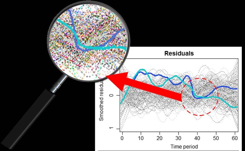
purpose. For example, focus on detail by putting the “noise” (the other less important
information) in as a grayscale (Figure 1).
Figure 1. Prominently
display important
information. In this
example, it is important
to show the range of all
runs, but the text focuses
on just two runs
(Reclamation/Gray).
4Effective Graphics Guide
To determine a consistent level of detail for multi-disciplinary displays, ask questions in a team
planning meeting to:
• Match the level of detail to the purpose. What level of detail is needed to ensure that
the audience can effectively interpret and use the analysis results?
• Be specific. What specific information does your audience need so they can quickly
understand your main point? For example, if roads are needed, what type of road should
be included (e.g., highways only, all dirt roads, service roads to the facility)?
• Be simple. What is the minimal data density needed to convey your results. Delete extra
information. See Section 4.7. Be as Simple as Possible. For example:
o A map may need to only show roads that cross a river or pipeline.
o An overall pipeline drawing showing a general alignment may only need to show
stationing at 1,000 feet rather than 10 feet.
o Model runs could show an average range as a gray background shape or as
grayscale and use thicker or colored lines for the most important runs.
2.4. Final Product
From the very start of a service agreement or project management plan, plan and program your
analysis, modeling, and mapping with the end product in mind. Include the client in all of these
decisions and make sure all of these decisions are approved and understood. If possible, ask a
representative audience member for input (this could be someone who would read the final
report or anyone with a similar background as the target audience). Drafting a figure ahead of
time can help focus the discussion.
Work together. Remember that your professional understanding of how to portray the data
should take precedence for technical decisions, and bear in mind who will use the display and
how they may perceive the display.
2.4.1. What Will the Final Product Look Like?
Data displays should be as simple as possible, without unnecessary elements cluttering and
blurring a viewer’s understanding. Ask:
• Will this display be used on screen for presentations only? Or will it be printed? This will
help determine the resolution and format needed.
• How will it be presented (e.g., poster, report, banner, physical display?) This will help
determine the level of detail you need.
5Effective Graphics Guide
2.4.2. How Will the Final Product be Used?
• Will this display be used in a future analysis, in other words, will others base their
analysis and technical solutions on this display? If so, then displays may need to be
complex and complete enough to provide the needed data. Decisionmakers, analysts from
other fields, and stakeholders will use the display to draw conclusions about trends and
may make recommendations based on these figures. (Note that your data as an end
product could have many uses, from satisfying open data requirements in a database such
as Reclamation’s Information Sharing Environment (RISE) to further analysis of the raw
data.
• Will this be used to analyze similar situations, compare potential actions and make
decisions? Make comparisons should be as consistent as possible to the level of detail
possible—compare Honeycrisp apples to Honeycrisp apples, rather than Macintosh
apples to Honeycrisp apples. For example, if the figure will be used to compare annual
water deliveries to a given irrigation district under two management alternatives, compare
flows at the same gage and under the same conditions.
• Will audiences use the displays to explore relationships between different conditions or
criterial (e.g., compare flood inundation area to the location of critical habitat)? Work
with all subject matter experts involved to determine what relationships need to be
compared and how to best display relationships.
• Will results be presented at a conference as a poster or PowerPoint presentation, online as
an explanation, or in a report that is both printed and online? Different venues and
mediums will require different resolutions, file formats, and planning. For example, you
may need a simple graph for a PowerPoint display, a more complex graph showing more
details in a paper.
• Will this product be used for social media? If so, then using infographics or very
simplified summaries of the data may be needed. You may find it easier to develop these
infographics outside of your map or model program. For example, it might be easier to
export your figure and modify it in PowerPoint.
TSC’s graphic specialists can take your ideas and analysis results and make effective and
interesting infographics for you.
2.4.3. What Will the Final Size and Format(s) Be?
When planning, also note what file formats the figures need to be exported to from your original
program. Files need to be exported in the correct file format to be able to be used in the final
publication software (e.g., Word, InDesign, and PowerPoint).
6Effective Graphics Guide
2.4.3.1 Size Your Display
The final size of the display and corresponding caption must fit within the page margins,
including headers and footers. Note that for figures that span for a full page, the longer the
caption, the less space is available for the figure. For example, a figure to be printed on an 8½ by
11-inch page (the usual U.S. report page) can be a maximum of 6 1/2 inches wide and 8 inches
high for portrait—or 9 inches wide and 6 inches high for landscape). When developing displays,
minimize any unnecessary white space and borders around them. Set the size of your graphics in
your template or your script. For example, most scripting languages will allow you to specify
height and width of your figures (see Appendix A).
2.4.3.2 Use the Correct File Format
Always export your figures into an accepted file format
from your original program so they can be easily inserted Bottom line for data displays:
into a final document program (Microsoft Word, save graphics in TIFF format
PowerPoint, InDesign, etc.). Saving in graphic formats whenever possible to retain
will help export graphics consistently and will make original data. PNG format can
updating them much easier. Save at as high a resolution (as be used if you need to reduce file
sharp and as clear) as possible. How the image looks on sizes. JPG format is least ideal
screen may not be the way that image will show up on a because of the loss of clarity.
hard copy print or on other software. Plan to export and
test the image in its final published format (both on screen
and in print).
• Files to retain clarity and data points (TIFF). Tag Image File Formats (TIFF) retain all
the original data and colors, and they can be resized easily, increasing the number of dots
per inch (dpi) without any loss of quality. You can transfer TIFFs from one application to
another without loss of quality or any compatibility issues. Save as the raw version of
TIFF whenever possible because this preserves the most data in your file and provides the
most flexibility for Photoshop or other image softwares. This is the best practice. Note
that the file sizes in TIFF can become very large. If needed, export the original figure,
save the TIFFs on an archive drive (like the T: drive) and then resave as a smaller file
size to use in reports.
• Files to display online (PNG). Portable Network Graphics (PNG) files support millions
of colors, plus varying degrees of transparency and work well for image files, such as
logos, charts, and infographics. These files are usually smaller sizes than TIFF files.
However, PNGs can lose data and visual clarity and should not be used for subsequent
analyses. This is an acceptable practice if you are concerned with file size and also have
the original display in another format.
• Photos to display online (JPG). Joint Photographic Experts Group (JPG or JPEG) files
are not ideal practice for data displays. Note JPEGs are “lossy” formats, so resaving a
JPEG can compress the file and degrade the image. JPEGs are not suitable for images
with sharp lines, large blocks of color, or text (Chastain, 2020).
7Effective Graphics Guide
Other file formats are usually not used:
• Portable Document files (pdf) will retain data and reduce file size. However, pdfs will
need to be exported as an image to be incorporated into a Word file or PowerPoint.
• Bitmap (BMP) is the native file format for Windows. However, this format does not
allow for image compression or scaling.
• Graphics Interchange Format (GIF) are sometimes used for flat and single tone color
images or animations, as they are limited to 256 colors. GIF files are mostly used for
buttons or banners on websites. (Fisher 2020 [GIF]).
• Scalable Vector Graphics (SVG) are file extensions for a vector 2 image file format to
describe images created from mathematical equations. MicroSoft Word and other
publishing programs do not recognize any file with an SVG extension. If your program
will not export into a TIFF file, you can try to copy the SVG in your program, paste it to
PowerPoint, save as a TIFF file, and then save into Word. You can also use a graphics
program like Adobe Photoshop (Fisher 2020 [SVG]).
2.4.3.3 Save at the Right Resolution
Print resolution is measured in round dots per inch (dpi) for printed raster 3 images or square
pixels per inch (ppi) for digital (on screen) raster images. The larger the dpi or ppi number, the
sharper and clearer the image will be and the better it will be for printing or viewing. Save the
original figure from the original program in the highest resolution that you will ever need—you
can compress and save at lower resolutions more easily, but you may lose data if you try to save
at higher resolutions. If the graphic will ever be enlarged for printing, then save at a minimum of
600 dpi—and preferably 1200 dpi. Then in Word or other publishing programs, save that larger
image with the smallest file size resolution that will still convey your figure’s complexity, allow
for enlargement, and preserve data.
• Small Web graphic: 72 dpi is usually used for websites to keep file sizes smaller, so
pages load faster. However, this same image will vary in detail on different monitor
resolutions. Most monitors have a native resolution of 72 or 96 ppi, and this changes as
technology changes.
• Printing: 300 dpi at the original size is the standard resolution required for printing.
• Detailed printing: 600 dpi ensures that the figure retains a high level of detail; however,
600 dpi file sizes are larger.
2
Vector images use equations to calculate the lines and shapes.
3
Raster images use pixels to show the image on screen or paper.
8Effective Graphics Guide
• Data displays and maps: 1200 dpi is best for figures that may be enlarged or contain a
great amount of detail
• Slide conversion: 3200 dpi is best for converting slide images to enlarge them.
Higher resolutions create larger files. This may be an issue in larger reports with multiple
figures, as many document programs or platforms such as SharePoint or Microsoft Teams do not
handle files larger than 30 MB well.
2.4.3.4 Do Not Link to Program Files in Word
Linking a figure from an original program such as Excel
into a Word document may be tempting, but do not Export your image to a TIFF to create
succumb to temptation—this is not good practice. The files a static image for the Word document.
can easily be moved, leading to broken hyperlinks and error If there are changes to the data or
messages (Figure 2). Moreover, after subsequent saves and figure, then update the figure in the
moves to different drives, so the linked file may not be the original program, re-export, and
current and correct version. Linking files use the entire data reinsert into the Word document. This
file rather than the one image can quickly increase may be a pain—but avoiding
document sizes (for example, one linked display can entanglements and wrong data
increase the size of a Word document from a 10 megabyte versions is well worth the effort!
(MB) document to a 30 MB document) (Figure 3).
Figure 2. Example of potential errors from a linked file (Reclamation/Gray).
9Effective Graphics Guide
Figure 3. Linking images from programs like Excel into Word can make the file size unmanageable
(Reclamation/Gray).
2.4.4. Group All Elements
Group your graphic elements and layers (e.g., arrows, text boxes, legends) in the original
program and import one single display in a Word document. If you pull in separate elements,
they can get lost as more content moves the display from its original position. If this is not
possible, pull the elements into PowerPoint and export the graphic from PowerPoint.
2.4.5. Where and How Will the Final Products Be Stored?
Have a record retention filing and naming convention for each project and use the TSC file
conventions as much as possible. Naming figures consistently minimizes errors and helps find
figures again, as teams have learned through bitter experience:
• Name your figures so someone can quickly identify what the figure portrays. For
example, Project acronym, type of plot, frequency, variable. This would be
ND_timeseries_yearly_swe.tiff.
• Do not name these as figure 1, figure 2 in the file name. Figure numbers will change as
the report progresses and the file names will be wrong.
• Do not use hyphens, periods, or other symbols in the file name. Use underscores rather
than spaces in a file name, as this helps prevent breaking links when sharing files.
10Effective Graphics Guide
2.5. Coordination and Documentation
Readers will compare display series, such as a series of alternatives compared to a baseline or
maps showing different scenarios. Therefore, consistency between all display series in an overall
analysis and report is critical to:
• Be able to quickly scan for a particular item (e.g., scenario, alternative, region)
• Show relationships more easily.
Not only should your displays be internally consistent, they should be consistent with every other
team members’ displays. See Section 2.5.4.1. Consistency Document for more information.
2.5.1. Comply with Reclamation’s Visual Identity
Follow Reclamation’s Visual Identity (VI) Program requirements at https://intra.usbr.gov/
vip/. At this time (2020), fonts are Segoe UI for labels in graphics and Garamond or Times New
Roman for text. Table 1 lists Reclamation’s colors. Appendix C provides color scales for
Reclamation’s VI colors to use in maps or in color bars to show scales of intensity.
Table 1. Reclamation’s Color Conversion Table
Color CMYK RGB HEX
*Dark Blue PMS 3035 C: 97% M: 67% Y: 48% K: 38% R: 0 G: 62 B: 81 #003E51
*Light Blue PMS 633 C: 89% M: 46% Y: 27% K: 4% R: 0 G: 115 B: 150 #007396
*Mustard PMS 1245 C: 21% M: 43% Y: 100% K: 2% R: 202 G: 145 B: 23 #CA9117
*Tan PMS 468 C: 13% M: 17% Y: 38% K: 0% R: 221 G: 203 B: 164 #DDCBA4
**Orange PMS 165 C: 0% M: 74% Y: 96% K: 0% R: 255 G: 103 B: 32 #FF6720
**Green PMS 357 C: 84% M: 40% Y: 91% K:38% R: 33 G: 87 B: 50 #215732
**Purple PMS 2091 C: 85% M: 100% Y: 0% K: 1% R: 76 G: 18 B: 161 #4C12A1
**Red PMS 484 C: 26% M: 90% Y: 96% K: 23% R: 154 G: 51 B: 36 #9A3324
*Primary colors can be used throughout reports for backgrounds and font colors,
** Secondary colors are to be used sparingly and never as a font color.
2.5.2. Coordinate with Other Disciplines
Your displays will usually be a part of an overall analysis effort involving several disciplines.
Therefore, team coordination is vital from the beginning. Determine:
• Who will do what analyses and what displays will be produced?
• What color scheme will be used? (See Section 4.8. Consider Colors Carefully)
11Effective Graphics Guide
2.5.3. Work with Graphics and Writing Specialists
When beginning a project, contact the writing and graphic specialists to determine the most
effective way to set up and plan your displays. Working with graphics and writing specialists
from the outset of your project will save you time and money in the long run. They can:
• Suggest ways to set up your project to create effective displays (e.g., setting up lines,
colors, and contrast)
• Guide you on the latest VI and accessibility requirements
• Suggest ways to make your displays convey your message more effectively
• Help you develop and maintain consistency guidelines
• Improve graphic outputs at the end of the process (e.g., adding labels and images,
removing grid lines, creating color contrasts, and combining graphs into a single display)
2.5.4. Document Your Plan
2.5.4.1 Consistency Document
Study teams should prepare, regularly update, and use a consistency document so all team
members and the client can refer back to these report and display guidelines during the analysis.
This document should include:
• Audience Agree on specific details up front to avoid
changing these details later—and save time
• Purpose and money.
• Consistent styles and terms
o Order (determine the order for alternatives, scenarios, places, criteria, etc.)
o Color assigned to each element (e.g., criteria, alternatives, scenarios) (See how to
use colors in Section 4.8. Consider Colors Carefully)
o Symbol or line type assigned to each element (see Section 4.6. Keep Graphic
Elements Consistent)
o Labels (see labels in Section 4.4. Label Clearly)
o Legend terms and layout (use Reclamation’s VI for font)
• Scales and frequencies (See Section 4.6.3. Keep Consistent Scales)
• Level of detail (See Section 4.7. Be as Simple as Possible)
12Effective Graphics Guide
2.5.4.2 Checklist
Agree on what needs to be included in each figure and create a checklist to ensure all figures
have everything they need so the readers can quickly understand them. Considerations include:
• Signatures. Determine whether each figure needs its own signature for peer review or
whether a single signature sheet will suffice for the entire document. Note that the digital
signature on an Adobe Acrobat will lock a file and should be done as the final step of the
report process.
• Axes labels. Keep these consistent and use the same terms and acronyms as in the text
(e.g., decide on cubic feet per second as cfs or ft3/s). Start from a consistent point for each
display series. Label your start and end points and keep them as consistent as possible
throughout the series. See Section 4.6.3. Keep Consistent Scales.
• Captions. See Section 4.5. Use Text and Captions.
• Legends. Determine if a legend is needed. If the line widths or colors used to denote an
element are not defined in the text or caption, then they should be defined in a legend in
the figure itself (e.g., brown is baseline, orange is alternative 1). Although the same color
is used to denote the same element throughout the report, use a legend on each figure in
case the figure is used independently.
2.6. Test Displays and Reviewers Don’t worry about actual
data at this point as the idea
2.6.1. Storyboards and Draft Displays
is to ensure that the
Changing an entire series of displays after they are developed presentation can be
is costly and time consuming, so it is much better to test a understood easily. You can
display before committing to the entire series. To test, you note that this sample is not
could create a wire frame or a sample graphic output as a correct and is only a test to
“storyboard”—a quick visual outline, a test graphic to show determine if your display will
how a series of graphs or maps will look. These are effective meet its goals.
tools to determine what elements will be contained in the
display and how the display series will tell the overall story.
2.6.2. Reviewers
After a while, your displays will be too familiar to you, and you will know what you want to
convey too well. Get fresh perspectives from others:
• Team members. Show your test displays to others on the team to ensure that they are
compatible with the displays that the other team members are producing.
• Peer reviewers. Peer reviewers can spot mistakes more easily since they are not as
familiar with the display. You need an outside perspective to make sure that others can
13Effective Graphics Guide
see what you have in mind. Peer reviewers can help determine if a display is scientifically
correct, conforms to policy, and is as error-free as possible.
• Test audiences. A test audience are reviewers who
represent the type of audience that your report is prepared You are not the user. You
for. Work with clients to identify stakeholders who may need different perspectives to
volunteer to look at storyboards or sample displays. If these ensure your display is
stakeholders are not available, then ask others who may effective. Pick someone who
have that same perspective. Administrative assistants, represents your intended
information technology (IT) professionals, etc. may be good audience and check your ego
substitutes for the intended audience. at the door!
• Graphics specialists. Consult with graphic specialists to
ensure displays effectively convey their message and comply with graphic requirements
(e.g., VI, accessibility, and consistency).
2.6.3. Usability Testing
Usability testing helps ensure your display is properly understood and
used.
You have to see it to change
it. So see it early to avoid
Create a best-guess draft and consult with the client, other team
changing it later!
members, decisionmakers, and representatives of your audience to
discuss possible revisions (e.g., lines every 1,000 feet versus 500 feet,
different shading, different elements prioritized). Once a client and a
test audience have something to look at, it is easier to show exactly what should change and why.
If possible, provide a couple of alternative presentations and ask the client and team what option
they prefer and why. Asking open-ended questions, such as:
• What insights could you glean from this display? This will elicit answers that may
point to potential areas of confusion or may point out strengths.
• How would you use this display? This will provide insights on possible interpretations
of the data and results.
• How readable is the display? Will the presentation, size, and font work at the scale for
the final product?
14Effective Graphics Guide
3. Types of Displays
You can display data, information, and results from models and maps in various charts and
graphs as described in this section. You can also use tables, text, videos, etc., to display
information. Each type of presentation has its own strengths and weaknesses. Determine your
main point and use a presentation that will convey that point.
3.1. Infographics, Schematics, and Flow Charts
You can use pictures and symbols to convey information and stories. There are various types ofr
drawings that show processes, and terms are used interchangeably. In general:
• Infographics are visual representations of information, usually using pictures to
emphasize a point. Use infographics to help readers understand physical processes or
related concepts (Figure 4). Pictures spark visual interest and help organize presentations
and Figure 5). Laying information on a stylized river (Figure 6) or an actual map can help
orient readers and provide a better sense of where activities or analyses are.
• Schematics show how a system works using symbols. These are often used to show
engineering systems such as a water treatment process or electrical circuit.
• Flow charts help guide a reader through a process or make decisions, which can also
provide a larger context to show how to use your model and map results. Figure 7 shows
an analysis and a decision flowchart to explain how to monitor and use sediment
analyses.
Figure 4. Use
infographics to help
readers understand
processes and
concepts
(Reclamation/Larsen).
15Effective Graphics Guide
Figure 5. Use text and pictures
too organize information.
(Reclamation/Larsen).
Figure 6. Use maps or images to direct your story and add details of the images in the text
(Reclamation/Gray).
16Effective Graphics Guide
Figure 7. Use flow charts or diagrams to direct your analysis story and then explain each important
section in the text (Reclamation/Gray).
3.2. Bar Charts
Bar charts can compare categories of data. A bar graph will always have two axes. One axis will
generally have numerical values, and the other will describe the types of categories being
compared. For example, the bar chart shown in Figure 8 compares potential actions to improve
water supply reliability by overlaying cost with potential water yield and estimates the timing
needed to implement the action. Proportions are shown by bar length and numbers are provided,
making comparisons easier.
17Effective Graphics Guide
Figure 8. Estimated median cost, quantity, and timing for each of the actions. Costs are in dollars
per acre foot, yields in acre feet, and timing in days (Reclamation 2016 [SSJ Basin study]).
3.3. Pie Charts and Treemaps
Pie charts and treemaps are useful for quickly showing relative proportions and work best if
actual numbers are not as important as the percentages shown. If there are more than four slices
or categories and numbers matter, use a bar chart or a line graph. If proportions change over
time, locations, or processes, use a Sankey Diagram (see Section 3.8. Sankey Diagrams).
Portions can also be broken down further to quickly show subportions within a particular
category. For example, Figure 9 uses subportions to illustrate the source and uses for water in the
Pecos River Basin in New Mexico. Use colors and labels consistently to represent different
factors (see Section 4.8. Consider Colors Carefully).
Figure 9. Water supply
and use (Reclamation,
2020 [Pecos]).
18Effective Graphics Guide
If there are more than four elements to compare, or if you want to show proportions for several
alternatives or scenarios at once, consider using a tree map (Figure 10).
Figure 10. Amount of water used by each irrigation district. (Data from Tully and Young, 2016)
(Reclamation/Larsen).
3.4. Scatter Plots
Scatter plots are two-dimensional charts that use dots to represent values plotted on two axes
(e.g., temperature and precipitation). Scatter plots can compare selected model runs to all model
runs (Figure 11).
Figure 11. Total change in modeled average temperatures and precipitation in the study area from
2010-2099 (Reclamation, 2020 [Pecos]).
19Effective Graphics Guide
Scatter plots often show relationships and trends. Scatter plots can also show groupings, such as
climate ensemble scenarios (Figure 12).
Figure 12. Scatter plot showing various global climate model projections. Each quadrant is then
grouped together and analyzed as a scenario.
3.5. Boxplots
Boxplots emphasize the probability distribution of a given metric,
including the median, interquartile range, and outliers. Boxplots
display metrics, along with outlier values, to provide a quick visual
summary of key characteristics of the dataset. These plots are
especially useful for indicating whether a distribution is skewed and
whether there are potential unusual observations (outliers) in the data
set. A boxplot is a graphical method for displaying summary statistics
of a group of numeric values. The distribution of values is
summarized based on five metrics, listed in order from least to
greatest (Figure 13):
• Lower inner fence. The lowest point excluding outliers
• First quartile. The middle value between the dataset
minimum value and the median (25% of the values in the
dataset are less than the first quartile and 75% of the values
are greater than the first quartile)
Figure 13: Schematic illustration
• Median. The middle value in the dataset of a boxplot.
20Effective Graphics Guide
• Third quartile. The middle value between the dataset maximum value and the median
• Upper inner fence. The largest data point excluding any outliers
Side-by-side boxplots are an effective way to highlight and summarize the essential
characteristics of each dataset and the differences between them supplies compared with demand
such as historical values compared with projected values as shown in Figure 14.
Figure 14: Agricultural applied water demand, defined as the volume of irrigation water required to
meet crop water demands (Reclamation/Ferguson).
3.6. Teacup Diagrams
Reclamation commonly uses teacup diagrams to show reservoir surface elevations (Figure 15).
These diagrams are useful for showing the status of reservoir storage relative to reservoir storage
capacity in one or more reservoirs at a given time. Teacup illustrations show a schematic water
level, but this may not accurately represent the actual reservoir storage capacity due to potential
sedimentation issues and unknown bathymetry. Moreover, teacup diagrams can be cumbersome
if you are comparing two or more time periods or other variables.
21Effective Graphics Guide
Figure 15. Teacup diagram examples (Reclamation 2020 [RISE]).
3.7. Line Graphs
Line graphs, such as time plots, can compare metrics over time, such as changing reservoir levels
(Figure 16). Line graphs can also show relationships over distance, elevation (e.g., changes in
elevation along a transect, seepage loss rates along a series of river reaches, and tree density as a
function of elevation). For clarity and easier reading, use various types of lines along with color.
Figure 16. Roswell Artesian Basin groundwater levels: Estimated water footprint at the LFD
observation well in the five storylines, in feet of additional drawdown. Lightly shaded areas
indicate seasonal variations in groundwater levels (Reclamation, 2020 [Pecos]).
22Effective Graphics Guide
3.8. Sankey Diagrams
Sankey diagrams are a type of flow diagram in which the width of the arrows is proportional to
the flow rate. These could be useful for showing the proportions of flows from tributaries into a
watershed, proportional canal flows from a reservoir, or water flows through a wastewater
treatment process. These can also be used for operations to show proportional amounts of water
in a system. Figure 17 shows the relationships between flows and outflows, and readers can
gather that about three times as much water in Lake Tahoe is lost to evaporation than flows out
of the lake. Arrow directions and proportional shapes help convey this message. Figure 18 shows
the flows for the Rio Grande from Colorado to Mexico. The black line indicating that flows to
Mexico come through the system visually emphasizes the importance of meeting international
treaty obligations.
Figure 17. Sankey diagram for the average relationship between inflow, evaporative losses, and
outflow at Lake Tahoe for the Reference Scenario (Reclamation 2015 [Truckee]).
3.9. Geographical Maps
Maps show physical features on a landscape. These can include engineering features
(e.g., pipeline alignments), risk analyses (e.g. flood inundation maps, populations at risk),
measurement locations (e.g., streamgages, weather stations), model extents, gridlines, and other
geospatial features. Appendix B provides Reclamation guidance for developing maps.
Be aware of color contrasts in maps. Tools such as ColorBrewer 2 (http://colorbrewer2.org/
#type=sequential&scheme=Blues&n=3) can help select maps that are colorblind safe. Use
Reclamation colors whenever possible. See Section 5.2. Color Blindness and Appendix C for a
color scale for Reclamation’s VI colors.
Make sure labels are readable and that the text is not obscured by a map feature.
Consider lowering the opacity on regions or features that hold background or less important
information (e.g., watershed boundaries, state boundaries, topographical details) to make these
more transparent. The information priorities will depend on the map purpose. For example,
topography and elevations may be critical in a pipeline alignment but secondary in a habitat map.
23Effective Graphics Guide
Figure 18. Sankey diagram to show the distribution of flows from the Rio Grande (Reclamation 1995).
24Effective Graphics Guide
3.10. Heatmaps
Heat maps (sometimes called datamaps) are a simple and concise Color variations give obvious
way to compare average conditions for a given metric across visual cues to the reader
multiple scenarios. A heatmap shows the magnitude of a metric about how the phenomenon
(e.g., precipitation, temperature, groundwater levels, groundwater is clustered or varies over
rate of withdrawals, etc.) as color. Heatmaps can be: space. Use color scales
(Appendix C) that have
• Spatial (overlaid on a map). Heat maps can illustrate enough contrast for color
values in space, such as gridded datasets of precipitation blindness (Section 5.2).
or temperature. Spatial heatmaps are widely used to plot
raster data, (e.g., digital elevation models, gridded
climate data, and gridded model results).
• Non-spatial (either a table or grid). Color or shading can be added to each cell in the
table to better visualize the data. Color/shading can be added either in lieu of values or as
background behind values.
Heat maps can show relationships between complex processes, both physical and analytical. For
example, Figure 19 not only compares the grid scale of various models, but also shows the
precipitation and topography of the area. Readers can tell at a glance that the finer-resolution
Precipitation Runoff Modeling System (PRMS) model takes into account more variations in
local precipitation than the Variable Inflow Capacity (VIC) model does. Without adding the
climatic and topographic variability, readers may not have understood the need to use finer
model resolutions.
Figure 19. Comparison of Spatial Scale of VIC and PRMS for the Truckee Basin above Farad, Using
Average Precipitation to Demonstrate Resolution in Modeled Subbasins (Reclamation 2015
[Truckee]).
25You can also read