PRACTICES, PITFALLS AND GUIDELINES IN VISUALISING LAGRANGIAN OCEAN ANALYSES - ISPRS Annals of the Photogrammetry ...
←
→
Page content transcription
If your browser does not render page correctly, please read the page content below
ISPRS Annals of the Photogrammetry, Remote Sensing and Spatial Information Sciences, Volume V-4-2021
                                                  XXIV ISPRS Congress (2021 edition)

    PRACTICES, PITFALLS AND GUIDELINES IN VISUALISING LAGRANGIAN OCEAN
                                 ANALYSES

                                                C. Kehl a,b ∗, R.P.B. Fischer a , E. van Sebille a
               a
                Utrecht University, Institute for Marine and Atmospheric Research, Princetonplein 5, NL-3584 CC Utrecht
                                                  {c.kehl; r.p.b.fischer; e.vansebille}@uu.nl
         b
             Utrecht University, Department for Information and Computing Sciences, , Princetonplein 5, NL-3584 CC Utrecht

                                                         Commission IV, WG IV/9

KEY WORDS: Visualisation design, Visual guidelines, Lagrangian analysis, Oceanography, IPCC visual style guide

ABSTRACT:

The Lagrangian analysis of particulate matter, biota and drifters, which are dispersed by turbulent fluid currents, is a cornerstone of
oceanographic studies, covering diverse study objectives. The results of Lagrangian simulations and observations is predominantly
visualised by means of easy-access plotting interfaces and simple presentation techniques. We analysed over 50 publications from
the years 2010-2020 with respect to their visual design to deduce common visualisation practices in the domain. Individual figures
are analysed towards adherence to visualisation best-practices, algebraic visualisation guidelines and the IPCC visual style guide.
In this article, we present the resulting best-practices and common pitfalls in the design of Lagrangian ocean visualisations. Based
on this visual study, we highlight that raising awareness of established visual guidelines may have a higher impact on improving the
visual quality of publications in oceanography than the vigorous development of more general-purpose visualisation tools.

                         1. INTRODUCTION                                   isation tools (Ahrens et al., 2005, Schroeder et al., 2004), the
                                                                           comprised perceptual knowledge on (geo-)visualisation, for ex-
The dispersal and transport of objects by ocean currents, as well          ample (Brewer et al., 2003, MacEachren and Taylor, 2013),
as their physical, biological and chemical response to changing            and the actually applied practices for visualising Lagrangian
environmental conditions, is studied via Lagrangian analysis-              studies in the literature. This paper intends to close the gap
and simulation approaches. Such analysis improves the under-               between the available knowledge, the technical possibilities and
standing of phenomena such as fish migration (Schilling et al.,            their still-limited application in oceanic studies. In this respect,
2020), plankton sedimentation (Dämmer et al., 2020, Noote-                we (a) analyse and structure the (oceanographic) literature re-
boom et al., 2020), nutrient transport (Cetina-Heredia et al.,             cord in a taxonomy of study objectives and intents, visual tech-
2018), the transport of plastics and other micro-particulates as           niques and visual elements, then (b) discuss common practices
well as the source-to-sink interaction between rivers and beaches          and combinations within the taxonomy to highlight advantage-
(Kaandorp et al., 2020), shallow waters, the deep sea and the              ous and disadvantageous visualisation approaches, from which
ocean floor (Nooteboom et al., 2019). This study approach                  best-practice guidelines and visual pitfalls emerge. Further-
is different to Eulerian approaches, which are mainly used to              more, we discuss (c) the methods of algebraic visualisation
study global interactions between the oceans, the atmosphere               (Kindlmann and Scheidegger, 2014) and the IPCC visual style
and the climate, in that its major focus is on the transport pat-          guide (Gomis et al., 2018) as self-evaluation guidelines for re-
terns of individual floating- or submerged groups of objects               searchers for authoring visual material in Lagrangian ocean ana-
(e.g. tracers) within the fluid-flow domain.                               lysis. Lastly, we demonstrate on one examples the impact and
                                                                           change of applying those guidelines for the improvement of
The outcomes of Lagrangian ocean simulations are important                 visualisations in this domain. The focus of this analysis is spe-
for stakeholders, decision-makers, non-governmental agencies               cifically on the perceptual aspects of the visualisation that apply
(NGOs), inter-governmental panels (e.g the Inter-governmental              to almost all Lagrangian ocean visualisations in recent literat-
Panel on Climate Change (IPCC)) and governmental institu-                  ure, neglecting aspects and limitations already imposed on prior
tions to plan and enact policies for environmental protection,             stages of those studies, e.g. the simulation. As such, avail-
fishing, as well as climate change mitigation strategies. As               able data and computational feasibility already impose limits
such, the simulation results need to be visually communicated              on scale, maximum fidelity and specifications of the ocean gen-
to the (potentially) non-expert audience via plots and graph-              eral circulation model (OGCM) on the simulation. Naturally,
ics. Statistical infographics are commonplace and often well-              those aspects carry over to the visualisation, while in fact being
understood due to the semi-standardized structure by the audi-             design choices of prior modelling stages. Additionally, visual-
ence. In contrast, the visualisation of the results in their geospa-       isation aspects such as projection and transformation, sample
tial context quickly become complex and require a good struc-              resolution, as well as data smoothing, filtering and rendering
ture as well as an optimal utilisation of visualisation tools and          interpolation impact the visualisation result. Those aspects are
concepts to convey the intended message of the study.                      of technical rather than perceptual nature, and hence also not
                                                                           specifically discussed in this paper.
In our work, we observe a large discrepancy between the avail-
able plotting interfaces (Hunter, 2007) and dedicated visual-
∗   Corresponding author

             This contribution has been peer-reviewed. The double-blind peer-review was conducted on the basis of the full paper.
                        https://doi.org/10.5194/isprs-annals-V-4-2021-217-2021 | © Author(s) 2021. CC BY 4.0 License.                     217
ISPRS Annals of the Photogrammetry, Remote Sensing and Spatial Information Sciences, Volume V-4-2021
                                             XXIV ISPRS Congress (2021 edition)

 2. STUDY OBJECTIVES IN LAGRANGIAN OCEAN                              insight into the connectivity of different particles types, which
                  ANALYSIS                                            can represent different biota species (Busch et al., 2020).

Lagrangian simulations and analyses are applied to a diversity        Lagrangian models require Eulerian flow fields as input for par-
of study areas and issues in oceanography. Traditionally, phys-       ticle advection in the fluid. In oceanography, those Eulerian
ical oceanography studies the behaviour and responses of oceanic      models refer to OGCMs, which are published at discrete scales
fluids on velocities (Abernathey et al., 2016) and its derivative     (e.g. NEMO (Madec et al., 2017)). Quantifying the effect of
properties, such as vorticity (de Marez et al., 2020, Zhang et al.,   this modelling detail on particle dispersion is a further study
2020), eddy formation (Abernathey et al., 2010, Nooteboom et          focus in Lagrangian ocean analysis (Nooteboom et al., 2020).
al., 2020), turbulence (Zhang et al., 2020), divergence, finite-      A related physical aspect of increasing importance is particu-
time Lyapunov exponent (FTLE) and finite-size Lyapunov ex-            late matter dispersion and diffusive- and stochastic modelling
ponent (FSLE) (Falk et al., 2014). We comprise in our study the       to capture motion uncertainty that takes effect below the dis-
velocity-related aspects under the velocity model, examples of        cretely modelled scale of an OGCM (Berloff and McWilliams,
which are numerous in literature (see overview in (van Sebille        2002, Shah et al., 2011).
et al., 2018)).
                                                                      All the outlined study objectives require appropriate visualisa-
                                                                      tion to communicate the modelled effects, results and insights
As a result of the different velocity- and flow regimes, oceano-
                                                                      to the audience, where the communication goal is either inform-
graphers can detect coherent structures, i.e. large fluid bodies
                                                                      ation, the demand for action or the inclusion of the new know-
with homogeneous flow properties. Examples of those are, on
                                                                      ledge into policies & procedures. The visualisations need to ad-
a small scale, Lagrangian coherent structures (LCSs) (Haller,
                                                                      here to common perceptual guidelines (as provided by the visu-
2015, Wichmann et al., 2021), and oceanic basins on a larger
                                                                      alisation literature body (Tufte, 2001, Brewer et al., 2003, Mun-
scale (Wichmann et al., 2019a, Wichmann et al., 2020). The
                                                                      zner, 2014)), though they are often neglected in current publica-
gain of a Lagrangian approach is the quantification of the con-
                                                                      tion practice. An important aspect in every geo-visualisation is
nectivity between the basins, hence extracting trends between
                                                                      the provision of the spatial context, which relates to the repres-
flow origins- and destinations.
                                                                      entation of adjacent topography or the underlying bathymetry
                                                                      in the plots.
Lagrangian (oceanic) flow simulation thus model the transport
of objects in fluids, hence extracting trajectories of the objects
moved by the fluid (e.g. (van Sebille et al., 2019). Those objects          3. TAXONOMY FOR LAGRANGIAN OCEAN
can represent biota (e.g. fish (Schilling et al., 2020) or plank-                      VISUALISATION
ton (Dämmer et al., 2020, Nooteboom et al., 2020)), plastics
(Duncan et al., 2018, Onink et al., 2019, van Sebille et al.,         In this paper, we propose a visual taxonomy to provide guide-
2020) or real-world analogue drifters (Wichmann et al., 2020).        lines specific to the diverse study objectives explained in sec-
Some of those quantities can be of microscopic scale, referred        tion 2. From the literature outline follows a taxonomy for the
to as particulate, whereas all those transported objects are di-      individual study objectives and their communication intents,
gitally simulated as particles in a particles system. Henceforth,     presented in fig. 1. Here, LCSs and basin analysis is grouped
particles refer to the digital object model whereas particulates      in one, as the goal is communicating clustered structures within
refer to the physical, microscopic objects. An overview of what       the ocean. Secondly, visualising uncertainty within the sim-
Lagrangian ocean particles can represent is given in (van Sebille     ulation results is a distinct topic in literature. Uncertainty in
et al., 2018).                                                        Lagrangian simulations emerges from various sources, of which
                                                                      scale artifacts, particle diffusion, fluid mixing and error margin
Objects and particulates in the ocean are subject to a source-to-     assessments are representative examples. The composition of
sink behaviour (Kaandorp et al., 2020), where objects emerge          the lifetime model and the velocity model is discussed above
from the source (e.g. rivers, antropogenic ejection), move within     (section 2), as is the the use of tracers. While the presenta-
the oceans, and then settle (temporarily- or permanently) in a        tion of particle densities is often intended to quantify a tracer
sink (e.g. ocean floor, beaches). The source-to-sink cycle, on        concentration, e.g. (Schilling et al., 2020) displaying larvae-
the example of plastic litter, is explained in (van Sebille et al.,   particle density, it can also be visualised as trajectory precursor,
2020). Modelling the source-to-sink behaviour is captured in          as in (Van Sebille et al., 2012). In other words, instead of
Lagrangian simulations by what we will refer to as the life-          plotting whole particle trajectories and showing the advection
time model, which encompasses effects such as origin, capture,        process, particle densities simply show the state of a particle
beaching and sediment deposition (Nooteboom et al., 2019).            set P at any time tx , where the trajectory is the integration of
                                                                                     RT
                                                                      all time state t=0 pP of one particle instance. Representative
The modelled Lagrangian particles are more than just motion           examples for particle-particle connectivity, source-to-sink con-
objects, which is why visualising Lagrangian simulations also         nections and inter-structure connectivity are rare in literature.
goes beyond traditional fluid-flow visualisation, as in (Post and
Van Walsum, 1993, Van Wijk, 2002). The particles are com-             3.1   Categorisation of visual tools & techniques
monly used as tracers to quantify the density of a fluid property,
such as litter density (van Sebille et al., 2018), or the concen-     On the overview of the techniques (fig. 1), we first highlight
tration of a physical-, biological- or chemical property, such as     the difference between plotting and actual image composition
nutrients (Cetina-Heredia et al., 2018) and algae (Lobelle et al.,    and appreciate that some elaborate visualisation techniques go
2021) via the particle density, in which case the particle dens-      beyond what simple plotting interfaces (e.g. gnuplot, matplot-
ity is used as precursor for the actual trajectories. Additionally,   lib, and their many derivatives) can offer. This difference leads
tracing the property change along a particle’s modelled lifetime      to the split between common practices by domain experts and
gives insight into the evolution of the property over time. The       the available toolset: domain experts frequently maximise the
property’s evolution over a particle’s trajectory further grants      visual output quality of plotting interfaces due to the interfaces’

         This contribution has been peer-reviewed. The double-blind peer-review was conducted on the basis of the full paper.
                    https://doi.org/10.5194/isprs-annals-V-4-2021-217-2021 | © Author(s) 2021. CC BY 4.0 License.                     218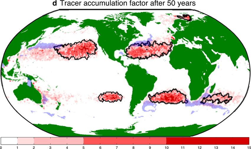
ISPRS Annals of the Photogrammetry, Remote Sensing and Spatial Information Sciences, Volume V-4-2021
                                              XXIV ISPRS Congress (2021 edition)

 Figure 1. Taxonomy for Lagrangian ocean analysis study objectives (left), visualisation techniques (mid-top), graphical dimensions
(mid bottom) and visual channels (right). Info-bubbles attached to individual study objective boxes indicate the sections in this article
                                          in which those subjects are discussed by example.

easy access, whereas actual image composition and associated          oceanographic 3D renderings (e.g. (Raith et al., 2017)).
techniques is required compound plots and renderings of com-
plex data relationships, as well as the representation of multi-
variate data. Open-access course notes on visualisation as base-            4. VISUALISATION PRACTICES FROM THE
articles as (Post and Van Walsum, 1993, Schroeder et al., 2004)                           LITERATURE
provide further details.
                                                                      Using the above-outlined taxonomy, we compare figures from
The elements in this overview are well-known and long-time            the available literature on selected case studies that display com-
demonstrated in fluid-flow visualisation (Post and Van Walsum,        mon intents to show different approaches for visual communic-
1993). Colour maps are adapted for semantic and thematic rep-         ation. Thus, the common intend of the studies is the selecting
resentations, and oceanography-specific, perceptually-guided col-     criterion of the displayed examples.
our maps have been proposed in literature (Thyng et al., 2016).
Glyph-based visualisation (Borgo et al., 2013) is increasingly        To visualise all Lagrangian data in the spatial context, the par-
common for Lagrangian ocean visualisation, be it in form of           ticle trajectories can be shown in their entirety as line plots.
arrows (i.e. hedgehog- or quiver plot), (transparent) circles         Because this large amount of dense information leads to clutter
or pixel blocks (i.e. sprites) for pointsize-adapted particle po-     and occlusion, the main message can often be captured better
sitions. Cross-section plots are still prevalent in Lagrangian        with a compressed, alternative design.
oceanography literature, due to the absence of applying image
composition and 3D rendering. Novel techniques such as tex-           4.1   Connectivity
ture synthesis (Khlebnikov et al., 2012) have been proposed for
(Eulerian) ocean visualisation in the visualisation community,        A first study intent and visual output is to show the basin con-
extending traditional proposals of line-integral convolution (LIC)-   nectivity by connecting the initial and final particle positions
or spot noise maps (Van Wijk, 2002), though they are under-           over the simulation’s timespan. Based on a particle’s lifetime,
utilized in the oceanography community.                               this shows the basin connectivity and the integrated, dispersive
                                                                      characteristics of specific regions in the study area. The ex-
3.2    Categorisation of graphical dimensions, visual vari-           amples of (Wichmann et al., 2020) (fig. 2(a)) and (Wichmann
       ables & visual channels                                        et al., 2019b) (fig. 2(b)) illustrate these connections via sprite-
                                                                      or circular glyphs representing the particle locations, coloured
The above-listed techniques are the tools to maps the digital         by categorical hues to identify the movement between coherent
data to a given layout. The visualisation literature highlights       regions.
that creating a data visualisation via selecting channels and vari-
ables is more appropriate then a straight technique application       The use of circular glyphs reduces the clutter in contrast to
without prior visual design (Munzner, 2014). Hence, the over-         streamline trajectories. Instead, common plotting tools lack
view of visual channels (fig. 1) follows established literature       support for customising glyphs of individual particles, result-
(Tufte, 2001, Brewer et al., 2003, Munzner, 2014). Regarding          ing in glyph occlusion that obscures detailed information. The
the graphical dimensions (fig. 1), we highlight the abundance of      glyph size and transparency can be adapted among the visual
temporal-1D (1D-t) plots (e.g. depth-trajectory cross-sections),      channels to overcome occlusion. Reducing the glyph size al-
2D plots and temporal 2D (2D-t) plots (as multifigure image           lows for a fine-grained plot, at the risk for individual particles
panels) in the oceanography literature. Notable exceptions from       to drop below the printed resolution (i.e. dots per inch (dpi)).
the norm are found temporal 2.5D Paraview plots1 and custom           This effect can be seen in figure 2(b), hence limiting the practic-
1   Uriel Zajaczkovski’s scientific youtube channel - https://www.    ality of glyph size modulation. Introducing transparent glyphs
    youtube.com/user/urielzaja/videos                                 is hence more promising to represent overlapping data. The

          This contribution has been peer-reviewed. The double-blind peer-review was conducted on the basis of the full paper.
                     https://doi.org/10.5194/isprs-annals-V-4-2021-217-2021 | © Author(s) 2021. CC BY 4.0 License.                   219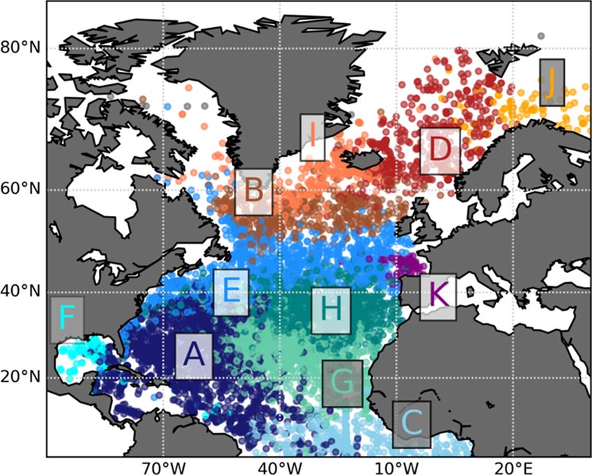
ISPRS Annals of the Photogrammetry, Remote Sensing and Spatial Information Sciences, Volume V-4-2021
XXIV ISPRS Congress (2021 edition)
(a) (b)
(a) (b)
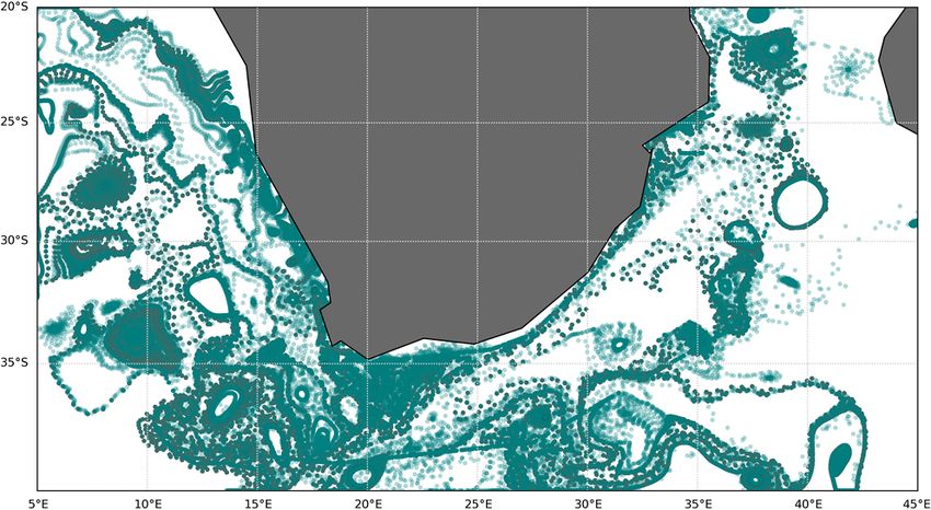
Figure 2. Basin connectivity - mapping initial to final locations. Figure 3. Particle densities. a) (Van Sebille et al., 2012), fig. 1
a) (Wichmann et al., 2020), fig. 6 (adapted), transparent glyphs. (adapted), monochromatic saturation and significant-value dark
b) (Wichmann et al., 2019b), fig. 3c (adapted), dense scatter plot contour highlight. b) (Wichmann et al., 2019a), fig. 1 (adapted),
hues and brightness.
transparent glyphs in figure 2(a) allow overlapping glyphs to
be recognised as more opaque regions. The solid edge of the We can take the argument one step further by looking at the
glyphs reduce the amount of visible overlap. representation of no-data-values. In both figures this is repres-
ented by the white background colour. To follow the logic in
For the geospatial context, the landmasses are shown together the data, the no-data-value value corresponds here to the zero-
with the marine data. Both studies colour the landmass in neut- value, which should coincide with the colour mapping. In figure
ral grey that differs in saturation from the data and in brightness 3(a) this is well done as the lower quantities are desaturated to
from the oceanic background i.e. no data). Both figures in- match the white background.
clude black contours for the coastline, which could have been
omitted since it can distract from the displayed main-feature in- 4.3 Lifetime model - coastal origin and beaching
formation.
As humans occupy the continents, oceanographic processes that
In addition to common caveats of alpha composition (discus- most immediately impact the public take place at the coast. The
sion in sec. 5), the hue composition may lead to issues in fig. waste products that end up in the ocean come from the rivers
2. The coherent regions are distinguished by categorical hues and people in general are most bothered by pollution if it ends
in both figures. Although hue is a strong visual cue, the number up on beaches. Where other oceanographic data require a 2D
of categories in both figures, seven and eleven respectively, are cartographic visualisation, coastal particle data is currently 1D.
the limit of reasonably distinguishable hues per image (Bianco
et al., 2015). To improve the differentiation of the hues, the
adjacent colours should be complementary colours. In figure
2(b), the hues are well distributed to provide contrast, though
orange and yellow sources are hard to distinguish, as are North
Pacific particles entering the Atlantic through the Suez canal.
In figure 2(a), the blue tones in the south are very similar, and
the browns and reds are hard to distinguish in the north. The
reason of the colour distribution is the cluster separation: sim- (a) (b)
ilarly coloured clusters are more closely related in the network.
The major cluster split is between the Subtropical Gyre (blue Figure 4. Coastline data. a) (Wichmann et al., 2019a), fig. 7,
tones) and the Subpolar Gyre (red tones). Here, perhaps the Initial particle positions. b) (Kaandorp et al., 2020), fig. 4,
message of the figure is not to show the integrated movement,
Particles ending their trajectory on the coast.
but highlighting the dissimilarity between individual clusters.
Figures 4(a) and 4(b) show origin- and beached deposition par-
4.2 Particle density ticle counts at the coast. Both figures use colour maps that cycle
sequentially through both hue and brightness. The main differ-
A second commonly mapped particulate quantity of global ocean ence is the visualisation of the actual coastline and the neigh-
studies is particle density, demonstrating their accumulation in bouring domains. In figure 4(a), the coastline itself is depic-
specific regions. These plots can be interpreted as 2D histo- ted with a black contours without further graphical difference
grams, mapping the particle set size to colours. between the oceans and land. In figure 4(b), the coastline is not
depicted, as it is already clear from the beaching data where it is
Figures 3(a) and 3(b) both employ coloured bins to map the located. Co-plotting a secondary dataset (here: amount of sink-
amount of particles on the global surface ocean. The employed ing debris per day) in the oceans domain provides sufficient yet
colour maps differ: Figure 3(a) uses monochromatic saturation subtle visual contrast to separates the ocean and land domains.
whereas figure 3(b) uses both hue and brightness. Since the
spectral sequence of hues does not inherently encode quantitat-
ive values, using only hues prevents the reader from interpreting 5. COMMON VISUAL PITFALLS
the data intuitively. The use of saturation or brightness can en-
code quantities more naturally. The high red-hue saturation in Adherence to perceptual principles of visualisation design is
figure 3(a) can easily be connected to the density of particles. important in order to preserve interpretation coherence between
Similarly, the yellow-hue brightness in figure 3(b) can be asso- the author and the readership. Non-adherence to the perceptual
ciated with a high intensity, leading to high visual-data corres- principles leads to visualisation pitfalls that, in the end, limit the
pondence. interpretability of the visualisation by the reader or contrasts the
This contribution has been peer-reviewed. The double-blind peer-review was conducted on the basis of the full paper.
https://doi.org/10.5194/isprs-annals-V-4-2021-217-2021 | © Author(s) 2021. CC BY 4.0 License. 220
ISPRS Annals of the Photogrammetry, Remote Sensing and Spatial Information Sciences, Volume V-4-2021
                                              XXIV ISPRS Congress (2021 edition)

scientific statements given in-text. Thus, visualisation pitfalls
are an avoidable source of interpretation disagreement between
the author and the readership. In this section, we focus on the
prevalent aspects in visualisations of Lagrangian oceanographic
literature. By analysing 52 oceanographic publications (2010-
2020), certain common pitfalls emerge aside the illustrated ex-
amples above.

Continuous and categorised coloured maps, together with sprite                        (a)                              (b)
scatter plots, form the basis of most visualisations. Whereas
early publications excessively employ jet-map colour scales, we
observe a change toward the viridis- and plasma colour scales in
recent articles2 . Still, employing single-hue colour scales and
thus leaving the hue channel for supplementary data is often
neglected. Generally, hue is over-employed as visual channel,
straining the viewers attention while limiting the potential for                      (c)                              (d)
co-plotting context information.

A specific pitfall of sprite-based scatter plots is the mismatch          Figure 5. Illustration of the alpha-ordering problem: the plot
between the basemap’s background colour and the zero-inform-               shows particle densities similar to fig. 2(a), the individual
ation point of the employed colour map. This fails, according                 particles are stored in random order. Plotting the data
to algebraic visualisation (Kindlmann and Scheidegger, 2014),               sequentially (as stored) can yield a highly-ordered (a) or
visual-data correspondence, which literature states as one of               arbitrary (b) alpha composition that occludes data points.
the most common colour mapping errors.                                    Random permutation of the plotting order (c) only partially
                                                                        alleviates the issue. Ordering the data (d) according to the main
As shown in fig. 2(a) and 2(b), plotting particle locations via        feature (here: start observation season) yields replicable, reliable
solid or semi-transparent glyphs is increasingly utilised for Lag-           plots with minimal alpha-occlusion of the main feature.
rangian ocean visualisations. Their increased application is not
only due to technical improvements of common plotting soft-            any quantitative or qualitative assessment of the figure. Trivial
ware, but also because the glyphs are scale-adapted on print-          solutions are to plot just a constrained subset of trajectories or
outs. Glyph size modulation can reduce occlusion and clut-             a selected timescale, though then shifting the responsibility to
ter in cases where transparency modulation is not possible for         trajectory selection, which is not possible to perform á priori. A
technical reasons. Glyph scatterplots support, in contrast to          better insight into trajectory structure would be gained by bund-
gridded- or meshed base maps, space-adaptive plotting that is          ling spatially-adjacent trajectories (see (Lhuillier et al., 2017)
decoupled from a predefined resolution. That said, a common            for technical details) in a preprocessing step. Alternatively, the
pitfall in visualisations that use adaptive transparency is the        use of animation (snapshots) of particle traces (see (Post and
failure to the invariance principle, saying that the visual de-        Van Walsum, 1993) will gain more prominence in the com-
piction needs to be invariant to the underlying data organisa-         munity. Furthermore, animations are a simple way to prevent
tion. Failures to the principle are commonly back-tracked to an        a common failure to the correspondence principle (Kindlmann
ordering-problem (fig. 5): plotting a list of N particles as semi-     and Scheidegger, 2014) for trajectories: they are often plotted
transparent circle-glyph will result in different plots for (a) a      without start-/end indicator, thus plotting the trajectory front-
sequential traversal order, (b) a random traversal order, or (c) a     to-back leads to the same figure as plotting back-to-front.
longitude-latitude traversal order. The glyph is combined with
another attribute (e.g the basin indicator in fig. 2(a)), and hence    We illustrate the design process of improving Lagrangian ocean
the plot needs to be ordered towards this primary glyph attrib-        visualisations on a recent collaboration with D.M.A. Lobelle,
ute to achieve plot invariance. Additionally, authors should be        who plots in her article (Lobelle et al., 2021) the sinking times-
aware of the interplay between opacity, saturation, brightness         cale of biofouled plastic depending on the particulate size. The
and background. A high opacity fully saturates an image pixel          starting plot (fig. 6) shows the timescales on a value-decreasing
with few overlapping particles . A low opacity makes sparsely-         colour map, whereas the plotted timescale actually increases.
distributed glyphs hardly visible, especially on a bright back-        This contradiction complicates the figure interpretation. Fur-
ground. Better visibility of transparent glyphs on dark back-          thermore, due to the decaying colour value and contrast, vari-
ground is due to the high contrast perception of the human-            ations in the last third of the colour scale hard to distinguish.
visual spectrum (Tufte, 2001). Moreover, modulating transpar-
ency and brightness results in the same tone mapping and thus
should be mutually-exclusive.

On the subject of trajectory plots, also often referred to as spa-
ghetti plots, they contribute particularly to Lagrangian simu-
lations when co-plotting the lifetime- and the velocity model
of the analysis. The major drawback is the rapidly-occurring                          (a)                               (b)
visual clutter with an increased number and length of traject-
ories. It gives a good impression of the overall chaotic nature
                                                                        Figure 6. Initial scatter-plot depiction for sinking timescales of
of the fluid transport, but due to the visual clutter it prevents
                                                                                     biofouled plastics by D.M.A. Lobelle.
2   Named colourmaps illustrated in matplotlib - https://matplotlib.
    org/stable/tutorials/colors/colormaps.html                         We collectively improved the colourmap. First, to increase the

           This contribution has been peer-reviewed. The double-blind peer-review was conducted on the basis of the full paper.
                      https://doi.org/10.5194/isprs-annals-V-4-2021-217-2021 | © Author(s) 2021. CC BY 4.0 License.                    221
ISPRS Annals of the Photogrammetry, Remote Sensing and Spatial Information Sciences, Volume V-4-2021
                                            XXIV ISPRS Congress (2021 edition)

distinctiveness and visibly of higher values (i.e. long sinking
timescales), the colourmap is inverted. This allows a more
fine-grained distinction of high values (see fig. 7(b), southern
Antarctic region) while preserving sufficient contrast for small
sinking timescales (see fig. 7(a), mid-Atlantic area). The result-
ing dark base-tone was counter-acted by compressing the lower
end of the colour scale (see fig. 8(a)) or by switching to a grid-
ded glyph-plot (fig. 8(b)).                                                         (a)                               (b)

                                                                       Figure 9. Final iteration of the visualisation with (i) shortened
                                                                      last-third of the colour scale and (ii) dark base tone to adhere to
                                                                      the invariance principle, reprint from (Lobelle et al., 2021), fig.
                                                                        1 c The sinking timescale Copyright 2020, D.M.A. Lobelle
              (a)                              (b)
                                                                      and (b) what channels are used to represent which data attrib-
                                                                      ute. Those attributes can also be implicit, e.g. the trajectory is
 Figure 7. Inverting the colour map gives more prominence to          an accumulation of particles locations over time, though time
          peak-values in the plot, compared to fig. 6                 may not be explicitly stored. Those defined visual parameters
                                                                      help reviewing the figure in order to minimise amount of visual
                                                                      channels and to use subtle visual cues while avoiding the listed
                                                                      pitfalls.

                                                                      Our main approach is the use of algebraic visualisation as guideline.
                                                                      Algebraic visualisation (Kindlmann and Scheidegger, 2014) not
              (a)                              (b)                    only describes design principles in mathematical, reproducible
                                                                      language, it also describes common problems of element or-
                                                                      dering, colour map choices, glyphs design, and their common
                                                                      resolution. The mathematical structure as well as discussed ex-
   Figure 8. Counter-acting the dark base-tone of the plot for        amples (e.g. hedgehog plots, scatter plots, continuous maps)
 overall short sinking timescales by (a) shrinking the lower-end      make the approach well applicable to studies in physical ocean-
scale of the colour map or (b) plotting a gridded scatterplot with    ography.
                         circular glyphs.
                                                                      Thematically, a further applicable guideline is the IPCC visual
The result gridded, circular-glyph scatterplot iteration conversely   style guide (Gomis et al., 2018). The style guide already com-
decreases the figure contrast again that was attempted to be          prises the knowledge from milestone visualisation literature,
gained. Hence, the compressed colour map can be inverted              such as (Tufte, 2001), (Brewer et al., 2003), (Munzner, 2014)
to counter-act the contrast loss. This then leads to the above-       and (Kindlmann and Scheidegger, 2014), into a comprehensible
described issue of invariance principle failure: the background       guideline for geo-visual authorship of environmental research.
colour (white) is colour-wise closest to lower-end colour map         If further represents the guidelines by which the IPCC selects
values (i.e. small timescales), hinting that all none-plotted areas   and re-authors (if so required) images and articles when includ-
have sinking timescales too small to depict. This contradicts         ing them in the stakeholder- and committee reports. It therefore
simulation results, as none-plotted areas have sinking times-         shows the practical implications of adhering or opposing the ac-
cales far exceeding the simulated timespan. The solution of           cepted visual practices. The style guide itself includes a clear
the design was to (a) using the original colourmap while short-       binary-tree questionnaire guidelines, which is intended as a ref-
ening the colour span of the last-third, resulting in higher dis-     erence for authors when preparing their publishing material.
tinctiveness of long timescales, and (b) choosing a dark (black)
basemap background to correctly express the semantics of no-
date areas. The resulting figures in the article correctly depict                           7. CONCLUSION
the data while avoiding visibility-, contrast- and visual inter-
pretation issues (see fig. 9).                                        This article discussed common practices in the visualisation
                                                                      of Lagrangian ocean analysis, structured around taxonomy of
                                                                      study intents, visual techniques and visual dimensions, vari-
         6. VISUALISATION GUIDELINES FOR                              ables and channels. Using this taxonomy and available guide-
             LAGRANGIAN OCEAN ANALYSIS                                lines for algebraic visualisation, visual design fundamentals and
                                                                      the IPCC visual style guide, best practices and common pitfalls
A guideline for the visual authorship of Lagrangian ocean ana-        were analysed on specific examples from the literature.
lysis results can be used in multiple stages of the process, for
example as sanity checklist before article submission, as refer-      The article demonstrates the variety of visual designs in the tar-
ence for structuring the visual storyline during the writing pro-     get domain. We see from the examples and the analysis that
cess, or even as visual design guide earlier during the analysis      simple permutations and modifications in the visual channels
phases.                                                               and variables can yield an improved understanding of the fig-
                                                                      ure - notably within the already existing software framework of
A first stage of guideline is checking that the common pitfalls       plotting interfaces (e.g. matplotlib). That said, visualising cer-
outlined in section 5 are avoided. Using the proposed taxonomy        tain compound objectives, such as the velocity model together
above helps organising (a) what study objective is being covered      with concentrations or particle densities, can quickly reach the

         This contribution has been peer-reviewed. The double-blind peer-review was conducted on the basis of the full paper.
                    https://doi.org/10.5194/isprs-annals-V-4-2021-217-2021 | © Author(s) 2021. CC BY 4.0 License.                    222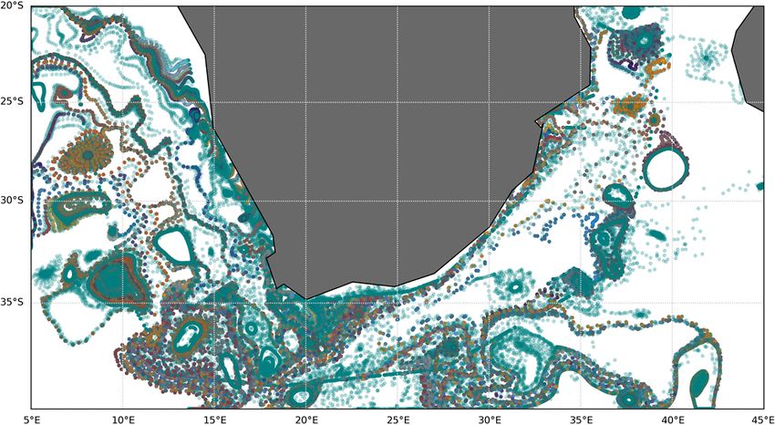
ISPRS Annals of the Photogrammetry, Remote Sensing and Spatial Information Sciences, Volume V-4-2021
                                            XXIV ISPRS Congress (2021 edition)

limit of simple plotting interfaces. In those instances, more ac-    Cetina-Heredia, P., van Sebille, E., Matear, R. J., Roughan, M.,
cessible software that allows custom (layered) image composi-        2018. Nitrate Sources, Supply, and Phytoplankton Growth in
tion or custom rendering is required to create clean, unambigu-      the Great Australian Bight: An Eulerian-Lagrangian Modeling
ous visualisations. Prototype examples of such techniques are        Approach. Journal of Geophysical Research: Oceans, 123(2),
listed in the literature overview, though currently remain hard      759-772.
to access for the oceanographic community.
                                                                     Dämmer, L. K., de Nooijer, L., van Sebille, E., Haak, J. G.,
Conversely, reviewing the available practices, it may not be the     Reichart, G.-J., 2020. Evaluation of oxygen isotopes and trace
development of novel software and tools that significantly im-       elements in planktonic foraminifera from the Mediterranean
prove Lagrangian ocean visualisations, but rather the raising of     Sea as recorders of seawater oxygen isotopes and salinity. Cli-
awareness of existing visual design principles and guidelines        mate of the Past, 16(6), 2401–2414.
within the community, which will boost the clarity of published
visualisations among domains experts as well as its compre-          de Marez, C., Carton, X., Corrard, S., L’Hgaret, P., Morvan,
hension by the target audience outside the physics- and ocean-       M., 2020. Observations of a Deep Submesoscale Cyclonic Vor-
ographic domain.                                                     tex intheArabian Sea. Geophysical Research Letters, 47(13),
                                                                     e2020GL087881. e2020GL087881 10.1029/2020GL087881.
                 ACKNOWLEDGEMENTS
                                                                     Delandmeter, P., van Sebille, E., 2019. The Parcels v2.0
The two head authors created the taxonomy and its application        Lagrangian framework: new field interpolation schemes.
in tandem, with continuous iterative feedback of E. van Sebille.     Geoscientific Model Development, 12(8), 3571–3584.
All authors thank the OceanParcels group of Utrecht Univer-
sity’s IMAU and its close, related partners for their graphics       Duncan, E. M., Arrowsmith, J., Bain, C., Broderick, A. C., Lee,
contribution. The research is supported by the ”Tracking Of          J., Metcalfe, K., Pikesley, S. K., Snape, R. T., van Sebille, E.,
Plastic In Our Seas” (TOPIOS) project (grant agreement no.           Godley, B. J., 2018. The true depth of the Mediterranean plastic
715386) and partly by the IMMERSE project (grant agreement           problem: Extreme microplastic pollution on marine turtle nest-
no. 821926), both funded by ERC’s Horizon 2020 Research and          ing beaches in Cyprus. Marine Pollution Bulletin, 136, 334 -
Innovation program. A majority of the outlined studies were          340.
performed in the Parcels framework (Delandmeter and van Se-
                                                                     Falk, M., Seizinger, A., Sadlo, F., Üffinger, M., Weiskopf, D.,
bille, 2019).
                                                                     2014. Trajectory-augmented visualization of lagrangian coher-
                                                                     ent structures in unsteady flow. International Symposium on
                       REFERENCES                                    Flow Visualization (ISFV14), Daegu, Korea.
Abernathey, R., Marshall, J., Mazloff, M., Shuckburgh, E.,           Gomis, M. I., Pidcock, R. et al., 2018. Ipcc visual style guide
2010. Enhancement of Mesoscale Eddy Stirring at Steering             for authors. techreport, IPCC WGI Technical Support Unit.
Levels in the Southern Ocean. Journal of Physical Oceano-
graphy, 40(1), 170 - 184.                                            Haller, G., 2015. Lagrangian coherent structures. Annual Re-
                                                                     view of Fluid Mechanics, 47, 137–162.
Abernathey, R. P., Cerovecki, I., Holland, P. R., Newsom, E.,
Mazloff, M., Talley, L. D., 2016. Water-mass transformation by       Hunter, J. D., 2007. Matplotlib: A 2D graphics environment.
sea ice in the upper branch of the Southern Ocean overturning.       IEEE Annals of the History of Computing, 9(03), 90–95.
Nature Geoscience, 9(8), 596–601.
Ahrens, J., Geveci, B., Law, C., 2005. Paraview: An end-user         Kaandorp, M. L. A., Dijkstra, H. A., van Sebille, E., 2020. Clos-
tool for large data visualization. The visualization handbook,       ing the Mediterranean Marine Floating Plastic Mass Budget:
717(8).                                                              Inverse Modeling of Sources and Sinks. Environmental Science
                                                                     & Technology, 54(19), 11980-11989. PMID: 32852202.
Berloff, P. S., McWilliams, J. C., 2002. Material transport in
oceanic gyres. Part II: Hierarchy of stochastic models. Journal      Khlebnikov, R., Kainz, B., Steinberger, M., Streit, M., Schmal-
of Physical Oceanography, 32(3), 797–830.                            stieg, D., 2012. Procedural Texture Synthesis for Zoom-
                                                                     Independent Visualization of Multivariate Data. Computer
Bianco, S., Gasparini, F., Schettini, R., 2015. Color coding         Graphics Forum, 31(3pt4), 1355-1364.
for data visualization. Encyclopedia of Information Science and
Technology, Third Edition, IGI Global, 1682–1691.                    Kindlmann, G., Scheidegger, C., 2014. An Algebraic Process
Borgo, R., Kehrer, J., Chung, D. H., Maguire, E., Laramee,           for Visualization Design. IEEE Transactions on Visualization
R. S., Hauser, H., Ward, M., Chen, M., 2013. Glyph-based             and Computer Graphics, 20(12), 2181-2190.
visualization: Foundations, design guidelines, techniques and
                                                                     Lhuillier, A., Hurter, C., Telea, A., 2017. State of the Art
applications. Eurographics (STARs), 39–63.
                                                                     in Edge and Trail Bundling Techniques. Computer Graphics
Brewer, C. A., Hatchard, G. W., Harrower, M. A., 2003. Col-          Forum, 36(3), 619-645.
orBrewer in print: a catalog of color schemes for maps. Carto-
graphy and geographic information science, 30(1), 5–32.              Lobelle, D., Kooi, M., Koelmans, A. A., Laufkötter, C., Jon-
                                                                     gedijk, C. E., Kehl, C., van Sebille, E., 2021. Global modeled
Busch, K., Taboada, S., Riesgo, A., Koutsouveli, V., Ros, P.,        sinking characteristics of biofouled microplastic. Journal of
Cristobo, J., Franke, A., Getzlaff, K., Schmidt, C., Biastoch,       Geophysical Research: Oceans, 126, e2020JC017098.
A., Hentschel, U., 2020. Population connectivity of fan-shaped
sponge holobionts in the deep Cantabrian Sea. Deep Sea Re-           MacEachren, A., Taylor, D., 2013. Visualization in Modern
search Part I: Oceanographic Research Papers, 103427.                Cartography. ISSN, Elsevier Science.

         This contribution has been peer-reviewed. The double-blind peer-review was conducted on the basis of the full paper.
                    https://doi.org/10.5194/isprs-annals-V-4-2021-217-2021 | © Author(s) 2021. CC BY 4.0 License.                 223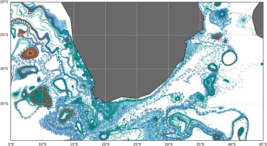
ISPRS Annals of the Photogrammetry, Remote Sensing and Spatial Information Sciences, Volume V-4-2021
                                             XXIV ISPRS Congress (2021 edition)

Madec, G., Bourdallé-Badie, R., Bouttier, P.-A., Bricaud, C.,         van Sebille, E., Delandmeter, P., Schofield, J., Hardesty, B. D.,
Bruciaferri, D., Calvert, D., Chanut, J., Clementi, E., Coward,        Jones, J., Donnelly, A., 2019. Basin-scale sources and pathways
A., Delrosso, D. et al., 2017. NEMO ocean engine.                      of microplastic that ends up in the Galápagos Archipelago.
                                                                       Ocean Science, 15(5), 1341–1349.
Munzner, T., 2014. Visualization analysis and design. CRC
press.                                                                 Van Sebille, E., England, M. H., Froyland, G., 2012. Origin, dy-
                                                                       namics and evolution of ocean garbage patches from observed
Nooteboom, P. D., Bijl, P. K., van Sebille, E., von der                surface drifters. Environmental Research Letters, 7(4), 044040.
Heydt, A. S., Dijkstra, H. A., 2019. Transport Bias by Ocean
Currents in Sedimentary Microplankton Assemblages: Im-                 van Sebille, E., Griffies, S. M., Abernathey, R., Adams, T. P.,
plications for Paleoceanographic Reconstructions. Paleocean-           Berloff, P., Biastoch, A., Blanke, B., Chassignet, E. P., Cheng,
ography and Paleoclimatology, 34(7), 1178-1194.                        Y., Cotter, C. J., Deleersnijder, E., Döös, K., Drake, H. F., Drijf-
                                                                       hout, S., Gary, S. F., Heemink, A. W., Kjellsson, J., Koszalka,
Nooteboom, P. D., Delandmeter, P., van Sebille, E., Bijl, P. K.,       I. M., Lange, M., Lique, C., MacGilchrist, G. A., Marsh, R.,
Dijkstra, H. A., von der Heydt, A. S., 2020. Resolution depend-        Mayorga Adame, C. G., McAdam, R., Nencioli, F., Paris, C. B.,
ency of sinking Lagrangian particles in ocean general circula-         Piggott, M. D., Polton, J. A., Rühs, S., Shah, S. H., Thomas,
tion models. PLOS ONE, 15(9), 1-16.                                    M. D., Wang, J., Wolfram, P. J., Zanna, L., Zika, J. D., 2018.
                                                                       Lagrangian ocean analysis: Fundamentals and practices. Ocean
Onink, V., Wichmann, D., Delandmeter, P., van Sebille, E.,             Modelling, 121, 49 - 75.
2019. The Role of Ekman Currents, Geostrophy, and Stokes
                                                                       Van Wijk, J. J., 2002. Image based flow visualization. Proceed-
Drift in the Accumulation of Floating Microplastic. Journal of
                                                                       ings of the 29th annual conference on Computer graphics and
Geophysical Research: Oceans, 124(3), 1474-1490.
                                                                       interactive techniques, 745–754.
Post, F. H., Van Walsum, T., 1993. Fluid flow visualization.           Wichmann, D., Delandmeter, P., Dijkstra, H. A., van Sebille,
Focus on Scientific Visualization, Springer, 1–40.                     E., 2019a. Mixing of passive tracers at the ocean surface and
                                                                       its implications for plastic transport modelling. Environmental
Raith, F., Rber, N., Haak, H., Scheuermann, G., 2017. Visual           Research Communications, 1(11), 115001.
Eddy Analysis of the Agulhas Current. K. Rink, A. Middel,
D. Zeckzer, R. Bujack (eds), Workshop on Visualisation in              Wichmann, D., Delandmeter, P., van Sebille, E., 2019b. Influ-
Environmental Sciences (EnvirVis), The Eurographics Associ-            ence of Near-Surface Currents on the Global Dispersal of Mar-
ation.                                                                 ine Microplastic. Journal of Geophysical Research: Oceans,
                                                                       124(8), 6086-6096.
Schilling, H. T., Everett, J. D., Smith, J. A., Stewart, J., Hughes,
J. M., Roughan, M., Kerry, C., Suthers, I. M., 2020. Multiple          Wichmann, D., Kehl, C., Dijkstra, H. A., van Sebille, E., 2020.
spawning events promote increased larval dispersal of a pred-          Detecting flow features in scarce trajectory data using networks
atory fish in a western boundary current. Fisheries Oceano-            derived from symbolic itineraries: an application to surface
graphy, 29(4), 309-323.                                                drifters in the North Atlantic. Nonlinear Processes in Geophys-
                                                                       ics, 27(4), 501–518.
Schroeder, W. J., Lorensen, B., Martin, K., 2004. The visual-
ization toolkit: an object-oriented approach to 3D graphics.           Wichmann, D., Kehl, C., Dijkstra, H. A., van Sebille, E., 2021.
Kitware.                                                               Ordering of trajectories reveals hierarchical finite-time coher-
                                                                       ent sets in Lagrangian particle data: detecting Agulhas rings in
Shah, S. H. A. M., Heemink, A. W., Deleersnijder, E., 2011.            the South Atlantic Ocean. Nonlinear Processes in Geophysics,
Assessing Lagrangian schemes for simulating diffusion on non-          28(1), 43–59.
flat isopycnal surfaces. Ocean Modelling, 39(3-4), 351–361.
                                                                       Zhang, W., Wolfe, C. L., Abernathey, R., 2020. Role of
Thyng, K. M., Greene, C. A., Hetland, R. D., Zimmerle, H. M.,          Surface-Layer Coherent Eddies in Potential Vorticity Trans-
DiMarco, S. F., 2016. True colors of oceanography: Guidelines          port in Quasigeostrophic Turbulence Driven by Eastward Shear.
for effective and accurate colormap selection. Oceanography,           Fluids, 5(1), 2.
29(3), 9–13.

Tufte, E., 2001. The Visual Display of Quantitative Information.
Graphics Press.

van Sebille, E., Aliani, S., Law, K. L., Maximenko, N., Alsina,
J. M., Bagaev, A., Bergmann, M., Chapron, B., Chubarenko,
I., Cózar, A., Delandmeter, P., Egger, M., Fox-Kemper, B.,
Garaba, S. P., Goddijn-Murphy, L., Hardesty, B. D., Hoffman,
M. J., Isobe, A., Jongedijk, C. E., Kaandorp, M. L. A., Khat-
mullina, L., Koelmans, A. A., Kukulka, T., Laufktter, C., Lebre-
ton, L., Lobelle, D., Maes, C., Martinez-Vicente, V., Maqueda,
M. A. M., Poulain-Zarcos, M., Rodrı́guez, E., Ryan, P. G.,
Shanks, A. L., Shim, W. J., Suaria, G., Thiel, M., van den
Bremer, T. S., Wichmann, D., 2020. The physical oceanography
of the transport of floating marine debris. Environmental Re-
search Letters, 15(2), 023003.

         This contribution has been peer-reviewed. The double-blind peer-review was conducted on the basis of the full paper.
                    https://doi.org/10.5194/isprs-annals-V-4-2021-217-2021 | © Author(s) 2021. CC BY 4.0 License.                       224
You can also read