Research on the Visual Design of Data Charts Based on the COVID-19 Epidemic
←
→
Page content transcription
If your browser does not render page correctly, please read the page content below
E3S Web of Conferences 257, 02034 (2021)                                                            https://doi.org/10.1051/e3sconf/202125702034
AESEE 2021

         Research on the Visual Design of Data Charts Based on the
         COVID-19 Epidemic
         Qiu Feng1, Ren Fuchen1
         1Wuhan   Institute of Technology, School of Art and Design, Wuhan 430205

                      Abstract. Purpose The sudden outbreak of the novel coronavirus has caused varying degrees of damage to
                      China and the world. In today’s era of information explosion, data and information are the driving force for
                      decision-making. The improvement of medical treatment and public health systems is the most fundamental,
                      but what a citizen needs is an intuitive and clear “seeing” the development of the epidemic. The correct trend,
                      an accurate view and understanding of the epidemic requires us to use visual design methods to present it to
                      the public, which is helpful to establish a correct understanding of the psychological construction of anti-
                      epidemic at the social level.

                                                                             provide assistance.
      1 Introduction
                                                                             2 data visualization
      Lovecraft once wrote this sentence in "The Supernatural
      Terror in Literature": The oldest and strongest emotion of
      human beings is fear, and the oldest and strongest fear                2.1 The concept of data visualization
      comes from the unknown. In the face of the sudden
                                                                             Data visualization originated from computer graphics in
      outbreak of the new coronavirus epidemic spreading to the
                                                                             the 1960s. People use computers to create graphs and
      world, almost everyone's life and destiny have been
                                                                             charts, visualize the extracted data, and present various
      affected to varying degrees. In addition to the super
                                                                             attributes and variables of the data. With the development
      infectiousness of the epidemic, the new coronavirus also
                                                                             of computer hardware, people create more complex and
      appeared in a new way, such as "undocumented
                                                                             larger digital models, and develop data acquisition
      infections", "individuals with ultra-long incubation period
                                                                             equipment and data storage equipment. Similarly, more
      infections", and "nucleic acid reexaminations after being
                                                                             advanced computer graphics techniques and methods are
      cured and discharged." "Positive patients" and so on have
                                                                             needed to create these large-scale data sets. With the
      brand-new features that infectious bacteria and viruses did
                                                                             expansion of the data visualization platform, the increase
      not have in the past. The emergence of new bacteria and
                                                                             in application fields, the continuous changes in the form
      viruses will face new challenges, which will not only
                                                                             of expression, and the addition of real-time dynamic
      increase the cost and difficulty of their prevention and
                                                                             effects, user interaction, etc., the boundaries of data
      treatment, but also bring more to the general public. The
                                                                             visualization, like all emerging concepts, continue to
      fear is caused by the unknown. With the continuous
                                                                             expand.
      development of the epidemic, relevant government
                                                                                 The pie charts, histograms, scatter charts, and
      departments collect daily domestic and foreign epidemic
                                                                             histograms that we are familiar with are the most primitive
      data visualization information from major media or
                                                                             statistical charts. They are the most basic and common
      institutions to grasp the development trend of the epidemic,
                                                                             applications of data visualization. As a statistical tool, it is
      and continuously optimize the content and methods of
                                                                             used to create a shortcut to quickly understand the data set
      visual presentation. We should collect, analyze and
                                                                             and become a convincing means of communication.
      summarize the visual design plan of the epidemic, and
                                                                             Convey the basic information that exists in the data. So we
      discover the visual characteristics and deficiencies of the
                                                                             can see statistical graphics in a large number of PPT,
      epidemic data, so as to help improve and optimize the
                                                                             reports, programs, and news.
      visual design of the epidemic data in the future, and use
                                                                                 But the most primitive statistical charts can only
      more accurate and intuitive methods for relevant
                                                                             present basic information, discover the structure in the
      departments. In the future, it will provide scientific
                                                                             data, and visualize quantitative data results. In the face of
      reference for disease surveillance, medical resource
                                                                             complex or large-scale heterogeneous data sets, such as
      allocation, and personnel flow management, so that the
                                                                             business analysis, financial statements, population status
      public will not blindly follow or listen to rumors in order
                                                                             distribution, media effect feedback, user behavior data,
      to cooperate with relevant government departments to

         Email: 08091401@wit.edu.cn
© The Authors, published by EDP Sciences. This is an open access article distributed under the terms of the Creative Commons Attribution License 4.0
(http://creativecommons.org/licenses/by/4.0/).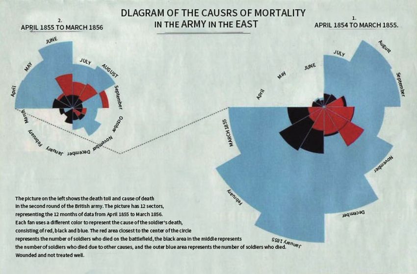
E3S Web of Conferences 257, 02034 (2021)                                                        https://doi.org/10.1051/e3sconf/202125702034
AESEE 2021

      etc., the situation of data visualization will be much more         2.2.3 Subjective satisfaction
      complicated.
          Generally, a series of complex data processing,                 Subjective satisfaction refers to the user's subjective
      including data collection, analysis, intelligence,                  experience of using the product. There are many factors
      management, and mining, is designed by the designer to              that affect the user's subjective experience, which can be
      design a form of expression, whether it is three-                   roughly divided into three parts: information architecture,
      dimensional, two-dimensional, dynamic, real-time, or                interactive experience, and visual design. The level of the
      allows interaction. Then the engineer creates the                   information structure affects the user's operation logic. It
      corresponding visualization algorithm and technical                 is necessary to rationally arrange the information level,
      implementation means. And the technical implementation              clearly display the logical relationship between the various
      means include modeling methods, processing large-scale              levels of data, and distinguish between primary and
      data architecture, interactive technology, zoom-in and              secondary. In the interactive experience stage, users
      zoom-out methods, etc.                                              change from passively receiving data to actively
                                                                          controlling data and exploring information. The principle
                                                                          of aesthetics is an important criterion that cannot be
      2.2 Design principles of data visualization                         ignored in the design of information transmission. All
                                                                          design works will be displayed in visual form. The visual
      2.2.1 Usefulness                                                    communication theory is used to present the epidemic
                                                                          information in the process of disseminating information,
      One of the design principles of data visualization is               which will make the warning information more eye-
      usefulness, which means that the products and product               catching, allowing users to grasp the data information
      functions designed by designers should be able to meet the          more clearly and intuitively, and improve the public's
      basic original needs of users. The needs of users come              awareness of prevention through different color matching,
      from many aspects, such as desires, moods, beliefs, etc. In         graphics matching, and material matching. Reduce the
      the epidemic data visualization works, most of the users'           people's fear and anxiety, so that the people can see the
      needs are derived from social cognitive orientation, that is,       direction of the epidemic more intuitively.
      to understand the world correctly and see the development               When evaluating and comparing two infographics of
      trend of the epidemic. Wait. In the early stages of the             data content, task-based evaluation research can be used
      outbreak, most of the epidemic information obtained by              to objectively measure and compare whether their
      the masses came from intermittent and fragmented news               functions are effective, as well as the appropriateness,
      reports. The work of epidemic data visualization should be          attractiveness, aesthetics and visual effects of visual
      comprehensively sorted and classified from multiple                 expressions. Epidemic visualization works need to convey
      dimensions of data, mainly based on various nouns, such             objective information more rigorously and accurately, so
      as the number of newly diagnosed cases, the cumulative              the trade-off between function and form is particularly
      number of confirmed cases, the cumulative number of                 important.
      cured cases, the cumulative number of deaths, etc., and the
      sub-sections are clearly expressed Data to meet the
      original needs of users.                                            3 Early classic cases
                                                                          As early as the early 19th century, William Playfair
      2.2.2 Ease of use                                                   (WIlliam Playfair) used a stream graph similar to what
                                                                          people have reduced to today, listing layers representing
      The design principles of data visualization usability               different categories of information on the timeline. This
      include scientificity, memorability, bottom fault, fault            form is called a stacked graph. (Stackedgraph).
      tolerance and efficiency. It must be easy to understand.                In the early days, Playfair’s import and export map for
      Data visualization tools usually have generated charts and          the United Kingdom (Figure 1) can be intuitively opened
      tables full of text. The awakening data visualization design        to the extent that the United Kingdom is intended to gain
      is to make the visual effect better, and the design results         profits in foreign trade. In the picture, one layer is for
      must be very easy to understand, so that you don’t                  British exports, and the other is for British imports. When
      understand. Data analysis technology and IT technology              the UK's import curve is much higher than the import
      can be understood by people who do not know anything                curve, this area of the difference between imports and
      about sales and business departments. In many cases, data           exports is marked as a "balance in favor of the UK." The
      visualization results are used for reporting. These reports         creation of this kind of graphics has its advantages. The
      may be internal or external. It is also important to make           advantage is that we can obtain knowledge directly from
      the data visualization report easy to understand. For the           the graph, and decision makers can more quickly grasp the
      visual design of the epidemic, what we need to do is to             changes in market conditions across multiple data sets. Its
      accurately grasp the psychological needs of different types         disadvantage is that it is still difficult for decision makers
      of users, conform to the user's operating habits, and make          to understand, because some methods of stacking layers
      it easier for users to understand the different levels of           will make people's visual focus focus on the height
      information brought about by different operations.                  difference between the layer and the layer, which is
                                                                          difficult when the width of multiple layers is close.
                                                                          Recognition; each layer must be transparent, otherwise

                                                                      2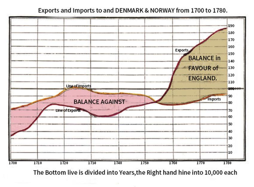
E3S Web of Conferences 257, 02034 (2021)                                                        https://doi.org/10.1051/e3sconf/202125702034
AESEE 2021

      some layers may be completely hidden by the previous                the picture, representing 12 months of data, from April
      layer. Its most fundamental feature is that the overall width       1855 to March 1856. Each fan uses a different color, and
      and length ratio of the river will strongly affect the              the different colors represent the cause of the soldier's
      steepness of the curve in the graph. It may be because of           death. They are composed of red, black, and blue. The red
      the above reasons that flow graphs have not been widely             area closest to the center of the circle represents the
      used in the past 200 years.                                         number of soldiers who died on the battlefield, the middle
                                                                          black area represents the number of soldiers who died
                                                                          from other causes, and the outermost blue area represents
      3.1 Nightingale Rose Chart
                                                                          the number of soldiers who died of injuries and did not
      The famous British nursing pioneer Florence Nightingale             receive good medical treatment; and the right one The rose
      (Florence Nightingale), she not only has high attainments           map shows the number of deaths and causes of death in
      in nursing, but also has her own unique insights in the field       the first round of the British army. It lasted for 12 months
      of visual and statistical graphics.                                 from April 1854 to March 1855. The color of each sector
          From 1854 to 1856, the Crimean War broke out                    in the picture represents the same meaning as the picture
      between the British and French coalition forces and Tsarist         on the left. The largest blue area in the picture on the right
      Russia. Nightingale served as a British army nurse. During          is the outbreak of the Kostai War in January 1855, and the
      the war, she used the form of a pie chart to count and              blue area represents not the number of people who died in
      present the soldiers' casualties. Because it looked like a          the war, but the number of soldiers who were injured but
      rose, it was also called the "Nightingale Rose Chart" (also         were not effectively treated. Nightingale replaced the
      known as the "Celosia Chart", Figure 2). The rose diagram           lengthy text report form with this concise and clear chart
      drawn by Nightingale is based on the center of the circle,          form, and reported the real "murderer" of the war to the
      and each fan shape extends from the center of the circle.           military's high level through this heterogeneous
      The size of the fan shape represents the size of the data. In       explanation. After the petition, the death toll of soldiers
      1807 Playfair invented the pie chart. But this picture is           dropped sharply, and half a year later, the death toll of the
      obviously different from the pie chart drawn by Playfair.           wounded and sick dropped from 42% to 2%. The victory
      The length of each sector is not exactly the same. Different        of this British war cannot be said to be won by drawing a
      colors are used in each sector, and different colors                rose diagram alone, but he saved many soldiers' lives in
      represent different types. In Figure 2, the left image shows        this way. This two-point presentation of data can make
      the number of deaths and the cause of death in the second           readers understand and impress the current war situation
      round of British soldiers. There are a total of 12 sectors in       at a glance, and many cases later followed this form of
                                                                          expression.

           Figure 1. A map of Britain’s imports and exports to Denmark and Norway in the 18th century, drawn by William Playfair

                                                                      3
E3S Web of Conferences 257, 02034 (2021) https://doi.org/10.1051/e3sconf/202125702034
AESEE 2021
Figure 2. Nightingale rose diagram
The analysis of epidemic data visualization chart types is
shown in Table 1, which lists the representative classic
4 Case Analysis of Contemporary Data chart types used in ten epidemic data visualization cases,
Visualization including histograms, graphs, maps, word clouds,
barometers, square inch charts, etc. From the four
Entering the 20th century, especially after entering the perspectives of data information, usage, limitations and
information age, the visual presentation of information applications, longitudinally compare and analyze the
and content have also undergone earth-shaking changes, regular characteristics of the chart in the information
and the speed of update iterations is also increasing. presentation process. It is not difficult to see that the curve
Through this epidemic, we will find that infographics are graph shows the trend change of the fluctuation over time
the main manifestation of this epidemic data visualization or the orderly category, which can reflect the change trend
design. Through the visual design, the massive and of the epidemic situation in various provinces, cities, the
complex epidemic data information can be efficiently and whole country, and overseas. The map uses the shade of
clearly expressed to users. The human brain is easier to the color to indicate the numerical value of the display area,
receive graphics. Information charts integrate and which visually displays the spatial growth trend of the
objectively describe information through graphic elements national and overseas epidemics, and can be used to
such as charts, illustrations, and charts, which greatly analyze the spatial spread of the epidemic and the control
improves the readability and legibility of data information. of the source of infection. The word cloud displays text
The main presentation form of the epidemic data information, visually highlighting keywords that appear
visualization design is an information chart, which frequently, and can be used for visual analysis of social
efficiently and clearly transmits a large amount of media. A mulberry chart is a specific type of flow chart
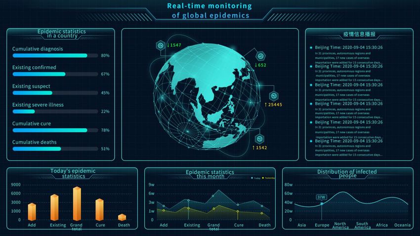
complex epidemic data to users. Figure 3 shows an excerpt used to represent data flow, which can be used to analyze
of the information chart in the epidemic data visualization the movement trajectory of the infected population during
design case, which shows the information charts used in the epidemic, so as to effectively control the spread and
the epidemic data visualization design case. Among them, deterioration of the epidemic. Scatter plots are mainly
the daily epidemic data, monthly epidemic data, and the used to discover the relationship between variables and
distribution of infected people are presented in those can be used for media attention analysis. Different types
simple charts, which are concise and easy to understand. of icon applications provide a variety of forms and
In order to understand the relationship between the methods for the display of data information. Different
various charts applied to the data and information, the types of charts have different applicable scenarios and
different types of charts used in the visualization cases are various local limitations. Designers need to synthesize
classified and compared to understand how the data is information and data, combine design purposes, and select
presented in the various epidemic data visualization appropriate charts. Type to present the data information
process to make it easier for users to understand, analysis. you want to display.
4E3S Web of Conferences 257, 02034 (2021) https://doi.org/10.1051/e3sconf/202125702034
AESEE 2021
Figure 3. Global Epidemic Data Monitoring Chart
Table 1. Analysis of the characteristics of various types of charts
Types of Data information Be applicable Limitations Application
Show data changes in Too many
multiple categories classifications can
For categorical
Histogram and comparisons not show the Epidemics in key countries
data
between variables in characteristics of
the same category the data
City/Province/National/Overseas
Show the trend of Unorganized
Ordered Epidemic Trend; Hubei/Non-Hubei
data fluctuations over categories cannot
Graph categories, such Comparison; China/Overseas
time or ordered show data
as time Comparison; Cure Rate/Case
categories characteristics
Fatality Rate/Severe Case Rate
Asymmetry in data Hubei/national/global epidemic
Use the shade of the Display data
distribution and situation; zero-growth map; entry
map color to show the that is planar but
geographic area control measures of various
value of the area distributed
size countries;
Display text
Extract Not suitable for
information and
keywords from text with too little
Word cloud visually highlight the Social media visual analysis
large amounts of data or low data
"keywords" that
text discrimination
appear frequently
A specific type of
flow chart. The width
of the extended
Not applicable to
branch in the figure
scenarios where Analysis of District (County) Data
Mulberry corresponds to the Used to indicate
the start and end Analysis of Action Tracks in
Chart size of the data flow. the flow of data
traffic of an edge Chongqing
The sum of the start
are different
flow is always in
balance with the sum
of the end flow.
There are a large
number of data
Used to discover the points, the Small amount of
Scatter plot relationship between results are more data will be more Media attention analysis
variables accurate, such as confusing
regression
analysis
Organize through the Emphasize the You can only
Circle The Flow of the Epidemic: Cases
logical relationship of comparison of roughly compare
diagram and Places
cities, provinces, data under the the size
5E3S Web of Conferences 257, 02034 (2021) https://doi.org/10.1051/e3sconf/202125702034
AESEE 2021
countries, and structural relationship
international organization between the
administrative regions relationship various data based
from small to large, on the user's
using the structure of feeling
a circle
The data of Approximately
Show the trend of the multiple reflect changes in
fluctuation of the data elements the overall data, New daily cases of new coronavirus
Flow graph
over time, the width fluctuates over not conducive to pneumonia
reflects the quantity time, with comparisons
liquidity between elements
Focus on incremental
data and present the Help reveal the Can only reflect The number of new diagnoses in the
Sunny and
development trend of turning point of the increase, not country/world every day and its
rainy map
the epidemic in a the epidemic the total change changing trend
macro view
Focus on accumulated The general
Macroscopically
data and show the response level, the
Square inch show the
development trend of comparison Epidemic situation
map development of
the epidemic in a between the data is
the epidemic
macro view not intuitive
Criticism.J.02:46-53.
5 Conclusion 4. Wei J.(2018).Aesthetics,Cognition and Emotion in
information Visualization Design. Popular
Since the outbreak of the new crown pneumonia, we have literature.J.07:79-81.
been able to see real-time data released by various 5. Wei Z.(2013).A classic case of data information
provinces, institutions and mainstream media almost visualization. China Statistics.J.05:22-23
every day. This information plays a vital role in improving
residents' awareness of self-protection and doing a good
job in epidemic prevention and control. I have to mention
that in the Internet age, the speed of acquiring big
information has been greatly improved, and the limitation
of time and space has been broken. However, the moral
information and the presentation of the secretaries we are
exposed to are actually different. Text + number is one of
the main forms in the release of the epidemic. It is the most
common in mainstream media reports and on social
platforms. Qi usually includes the cumulative number of
confirmed cases, new suspected cases, new deaths, and
new cured cases across the country. Important key data is
shown in Figure 4. This type of data often appears in
conjunction with news releases. It has the characteristics
of timely and rapid news dissemination, which can satisfy
the public's rapid grasp of the situation of the epidemic
throughout the day. However, it is often limited by the text
form, resulting in a strong sense of "stacking" of the data,
difficult to highlight the key points, and the audience will
have a certain pressure on the reading experience.
References
1. LI T(2020).Information visualization : design
methods for the public to “see” the epidemic.
Decoration Journal.J.02-38-45.
2. HUA R.(2020).Visualization design and
dissemination of information on new crown
pneumonia epidemic prevention in a new media
environment. Sound screen world.J.
3. Xiang F.(2020).Research on Visual Art from the
Perspective of visual Design. Literary Theory and
6You can also read