TEACHING PRODUCT DESIGN THROUGH AN ONLINE ILLUSTRATED INTERFACE
←
→
Page content transcription
If your browser does not render page correctly, please read the page content below
INTERNATIONAL CONFERENCE ON ENGINEERING AND PRODUCT DESIGN
                                                                              Introduction
EDUCATION                                                                     Designers tend to communicate through sketches. Yet our online teaching
9-10 SEPTEMBER 2021, VIA DESIGN, VIA UNIVERSITY COLLEGE, HERNING,             environments are typically linear structures, based on databases, with
DENMARK                                                                       limited visual expression. Is it possible to have an online ‘textbook’ for
                                                                              Product Design that is illustrative in style, non-linear in organization,
                                                                              intuitive, and visually compelling?
                                                                                       At E&PDE 2020, I presented a visual paper culminating in a single
TEACHING PRODUCT DESIGN                                                       graphic that attempted to depict the whole of the Product Design field, and
THROUGH AN ONLINE ILLUSTRATED                                                 all considerations that go into designing a product [1]. This was based on
                                                                              an Introduction to Product Design course I developed and taught for the
INTERFACE                                                                     past ten years. In 2020, that course shifted to an online class, and like so
Richard Elaver1                                                               many instructors had to do in a rush, the content from the live class was
Appalachian State University
1
                                                                              simply redirected to an online environment. It has become clear that there
                                                                              are better strategies for teaching online, rooted in the digital environment,
                                                                              and the fluidity and flexibility it provides.
                                                                                       Based on feedback from colleagues in the 2020 E&PDE confer-
                                                                              ence, the goal for this paper is to visualize how the illustration from the
                                                                              2020 paper could become an interactive graphic interface for teaching
                                                                              product design. More specifically, the intention is to make the Product
                                                                              Design in Context graphic into the landing page for a new type of online
                                                                              course, in which each graphic icon becomes a dynamic link to the content
                                                                              related to that subject. In this model, the class content is more organically
                                                                              presented, as students navigate through interlinked content, always return-
                                                                              ing to the central graphic as the home page. Students will move at their
                                                                              own pace, and assessment will be competency-based through online quizzes
                                                                              in each subtopic.
                                                                                       To do this well and complete would be a multi-year project. The
                                                                              purpose of this visual paper is to explore the flow of that information
                                                                              through illustrations, as a simulation of the online experience. This is
                                                                              intended to be a first draft of one section of the class, covering one of the
                                                                              six Key Functions in the radial arrangement of the main graphic. This paper
                                                                              explores how to navigate the hierarchy of content, how to show intercon-
                                                                              nections to related content, and how to maintain the same illustrative visual
                                                                              language throughout the online experience.
         Figure 1. Visualization of online/digital interface for ‘textbook’
E&PDE2021/1233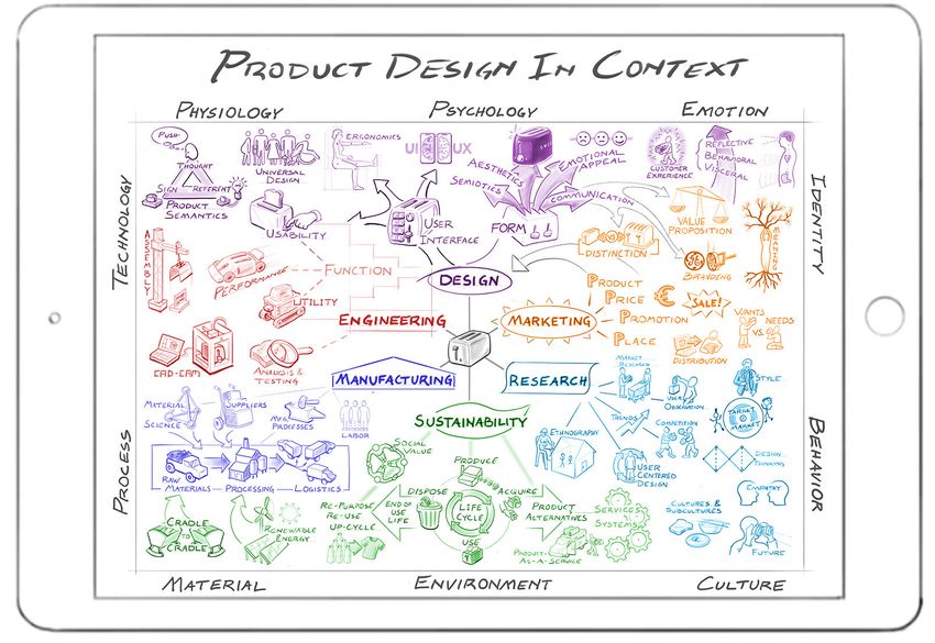
1) Landing Page                                     2) Topic Navigation                                 3) Major Topic Isolation
   •   Graphic Table of Contents                       •   Highlights 6 Major Topics at center            •   Selected topic isolated and centered
   •   From here, can click on any icon for            •   Select one to isolate that topic and sub-      •   Can select sub-topics
       more information                                    topics of same color                           •   Major Topic navigation remains in lower
   •   Or, click center to start topic navigation                                                             left corner

4) Sub-topic Selection                              5) Expanded Graphic on Sub-topic                    6) Detailed Content and Text
   •   0RXVHRYHUDQLPDWLRQPDJQL¿HVLFRQ              •   Graphic depicting more info about subtopic     •   This page mimics a printed textbook, with
   •   Select icon for more information                •   Link to Major Topic remains in lower-left          scroll-through of multiple pages of text
   •   Major Topic navigation remains in lower         •   Link for detailed content in lower right       •   Includes more detailed info-graphics
       left corner                                                                                        •   Added info, quiz, and links on right side
                                                    Figure 2. Proposed work-flow for online interface
E&PDE2021/1233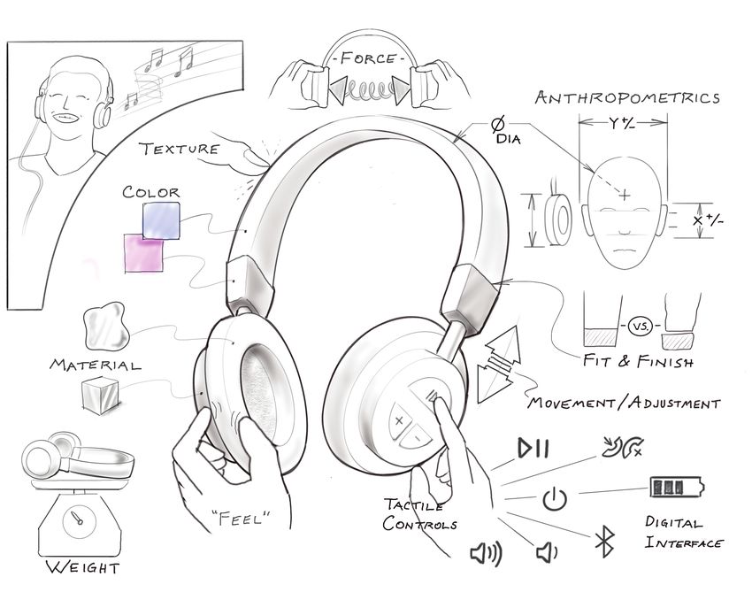
Web Interface and Information Hierarchy                                            It would be relatively simple to make this text accessible for differently
The 2020 graphic, Product Design in Context is structured in a radial pattern,     abled users, because the interface from here is a standard infinite scroll.
with six ‘Key Functions of Product Development’ at the center. In Figure 1,        Alternatively, this text and infographics could be exported as a printed
color has been added to that graphic (previously black & white) to give each       textbook.
of those six areas a distinct identifying feature. This has been done to                    The right side of the page for each sub-topic (Step 6 of Figure 2) is
organize the hierarchy of the image and make it easier for the user to orient.     populated with additional links to access further information:
         Figure 2 outlines a potential work-flow for the web-based interface           1. Related topics in the ‘textbook’. This would provide a collection of
of a kind of ‘textbook’ for teaching product design. It uses the Product               links to other icons from the visual Table of Contents that are closely
Design in Context graphic as the main landing page, and as a visual                    related to the current subject.
Table-of-Contents (Step 1 in Figure 2).                                                2. Links to additional materials: This would provide a collection of
         The goal is to have each icon in the Table of Contents be a section of        links to outside resources, online articles, and reference materials for
the text. So, each icon is a link to a multi-page write-up on that specific            anyone wanting to learn more on the current topic.
sub-topic, with additional infographics to expand on the sub-topic. In this            3. Link to a quiz. For students using the text for a class, this would be a
model, it would be possible to link to any graphic directly from the home              place for an assessment of their understanding of the topic. Through
page. Alternatively, in order to work through the content in a more organized          such quizzes, students can move through the material in a self-paced
way, the user would first move the mouse over the center of the graphic to             manner until they pass the quiz for each section.
highlight the 6 Key Functions (Step 2 in Figure 2). These would be the six             4. Link to bibliography and sources used for the current topic.
‘sections’ or chapters of this online textbook. From there, the user would be      To maintain the visual nature of the interface, a handful of navigational
able to click on any one of the six labels/icons to isolate that section of the    tools have been integrated into this proposed interface. These are intended
Table of Contents (Step 3 in Figure 2). This is intended to clarify and simpli-    to keep the organizational hierarchy visible at all times and create a more
fy the user experience, so they have fewer sub-topics in scope from which to       intuitive flow of information.
choose.                                                                                1. All pages would have a ‘home’ and ‘back button’ on the top left.
         Next, the user would select a specific icon/sub-topic to delve into.          ‘Home’ would always return to the Product Design in Context main
(Step 4 in Figure 2). That icon would link to a more expanded graphic on the           graphic, or Table of Contents.
topic, visualizing a more in-depth depiction of the subject, and mapping out           2. When navigating any one of the 6 ‘Key Functions’ (Steps 3 & 4 in
the detailed content for that section (Step 5 in Figure 2). This graphic could         Figure 2), the central wheel with all 6 would remain in the lower left
be used as a refresher or study-guide to review the topic, or the user can click       corner. The user can click on any one of those icons to shift to another
a link for ‘more detailed information’ in order to get the full text (Step 6,          section.
Figure 2). The full text would mimic a physical textbook, with a combination           3. While viewing any specific sub-topic (Steps 5-6 in Figure 2), the icon
of infographics, photographs, and text.                                                for the current section (e.g. Design) would replace the 6-part ‘Key
         At this level (Step 6 of Figure 2), the text on each topic will be            Functions’ links in the lower left corner, so the user could return to the
approximately 1-3,000 words in length (or 2-6 printed pages). The reader               overview of the current section at any time.
would access the content by scrolling down, and continue to the end of the             4. The graphic/icon from the table of contents for a subtopic would be
topic. There are 55 icons in the current Table of Contents graphic, so the             visible on the information page for that subtopic, as a visual reminder of
total text length would be approximately 100k words, or 200 printed pages.             the link, making it easier to re-find the information at a later time.
E&PDE2021/1233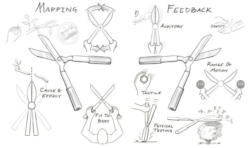
Figure 3. Icon from the home page
that linked to the current sub-topic,
Emotional Design
Key Subtopics in Section 1, Design
The following pages visualize the graphics that
might be used to elaborate on key sub-topics in the
Design section of the text. Design is one of the
Six Key Functions of Product Development, or
one of the six ‘chapters’, and the central subject
for the proposed ‘textbook’. The Design topic has
14 unique icons/sub-topics, while the other sections
have 6-12. Similar to the Product Design in Context
graphic, each of these infographics is intended to
convey a great deal of information in an organized and
intuitive way. The text below each graphic would be
explanatory and use the graphic for reference. That text is
not included in this document because it is too long to fit,
and this ‘visual paper’ is intended to present the visual aspects
of a possible online interface.
1.1 Emotional Design
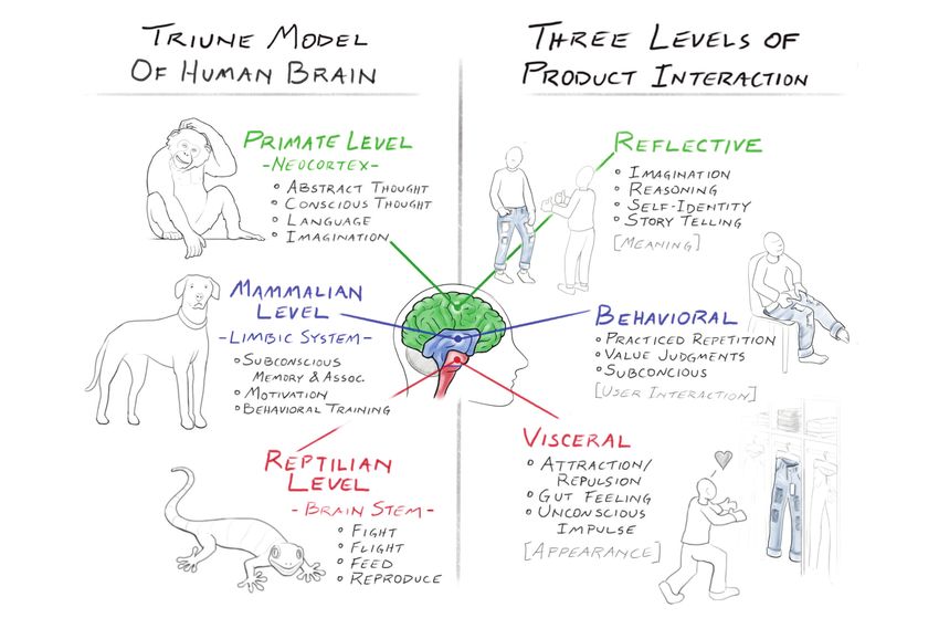
This sub-topic outlines some key concepts from Donald Norman’s book, Emotional Design. Figure 4. Graphic Outlining the key concepts from Donald
It also aligns Norman’s 3-tiered interaction with MacLean’s [2] Triune model of the human Norman’s Psychopathology of Design, aligned with
brain, giving physiological parallels for Norman’s psychological concepts. MacLean’sTriune model of the brain
E&PDE2021/1233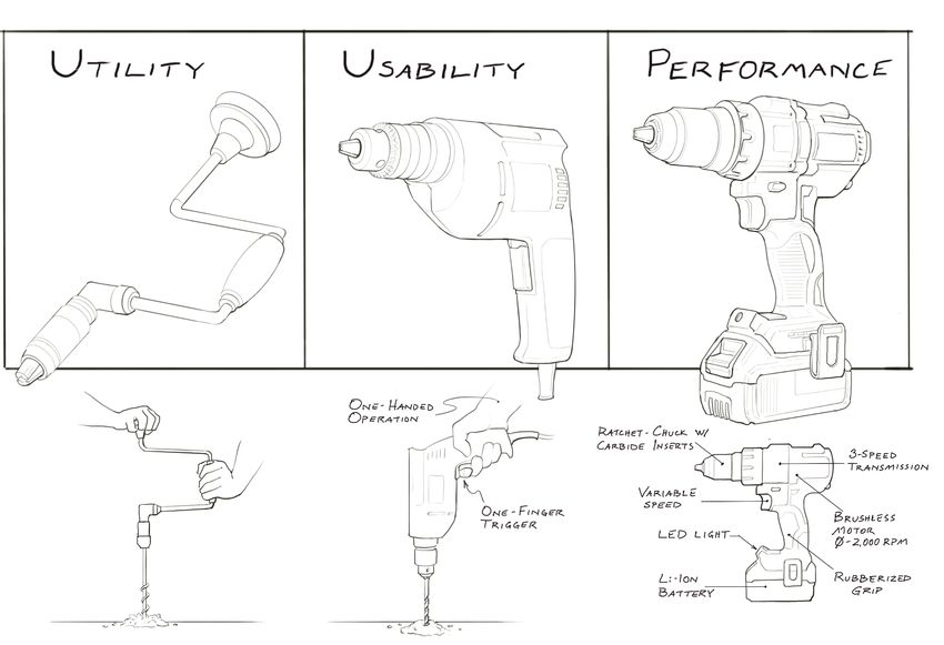
Figure 5. Icon from the home page
that linked to the current sub-topic,
           User Interface

1.2 User Interface
This sub-topic outlines some of the key concepts from Donald
Norman’s book, The Design of Everyday Things. The structure
organizes how users make sense of products by ascertaining the
attributes through visibility, affordances, mapping and feedback, in
order to develop a conceptual model of the product [3].
         Users tend to do this subconsciously, and very quickly. And it
can be difficult to slow down that perceptual process to witness ‘how’
we see and know things, noting observations that precede our
already-established conceptual models. This graphic and section of
the text is intended to break down a few simple product examples
(e.g. a pair of garden shears) using the terms/concepts developed by
Norman, in order to give readers practice in applying those terms and
slowing down their own perception of the world around them.
         A key learning outcome here is to develop a better under-
standing of the work that underlies intuitive design. Strangely, when
design is done well, and a product is successful in its usability, it is
because the necessary clues have been effectively communicated
subconsciously, and the design work is undervalued because it isn’t
overtly apparent.

                 Figure 6. Graphics Outlining the key concepts from Donald
                         Norman’s Psychopathology of Design, aligned with
                                       MacLean’sTriune model of the brain

E&PDE2021/1233
Figure 7. Icon from the home page
that linked to the current sub-topic,
                UI/UX

1.3 UI/UX
User Interface and User Experience
Design are professions unto them-
selves. At the same time, they are
central aspects of any product’s
design. This sub-topic will focus on
the multi-sensory experience of how
users interface with products, and
how we engage with and understand
products and their attributes.
The learning outcome is to gain a
broader definition of UI as involv-
ing any point of interaction between
the user and the product, not just
buttons on flat screen. Similarly,
UX design involves a diversity of
product attributes that facilitate a
specific kind of experience, and this
goes well beyond the logic diagram
of inputs and outputs.

                                          Figure 8. Graphic outlining the many different points of
                                        interface between a user and a product, and the different
                                           sensory perceptions used to understand the product
E&PDE2021/1233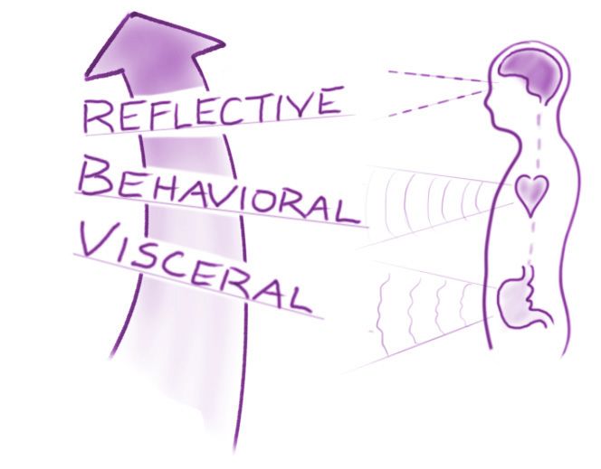
Figure 9. Icon from the home page
that linked to the current sub-topic,
          Universal Design

                                                                                     Figure 11. Graphic outlining the many different points of
                                                                                    interface between a user and a product, and the different
                            Figure 10. Drawing of Oxo Good-Grips                       sensory perceptions used to understand the product
                                Peeler design by Smart Design

 1.4 Universal Design
This sub-topic explores the subject of ‘universal design’ as an extension of      higher cost-per-unit, and this resulted in specialty products that were often
User Interface Design. Universal Design has come to mean design that is           cost-prohibitive and/or difficult to bring to market.
usable by all people, regardless of ability, and might also be called inclusive            With Universal Design, the intention is to create products and
design. The central concept is that a product that is useful for someone with     experiences that are accessible to more people, while also benefiting from
atypical abilities, then it can be designed to be more useful for everyone. A     economies-of-scale in their production and distribution, making the product
classic Product Design example is the potato peeler designed by Smart             move readily available - a double-meaning for accessible.
Design for Oxo - the beginning of the ‘Good Grips’ product line (Figure 10).               The example depicted above (Figure 11) is for curb cuts (a.k.a.
By redesigning the handle of the peeler to be more usable for people with         dropper kerbs in the UK), which were initially intended to aid people in
arthritis, they designed a tool that was more usable by everyone.                 wheelchairs [ref]. The innovation turned out to be useful for many different
          In the past, designing for people of different abilities was more       people, from cyclists to those in high-heeled shoes, so it became a ‘univer-
commonly focused on creating a specialty product for that subgroup, e.g.          sal design’ more widely implemented.
harness for guide dogs. However, low-volume production tends to mean a
E&PDE2021/1233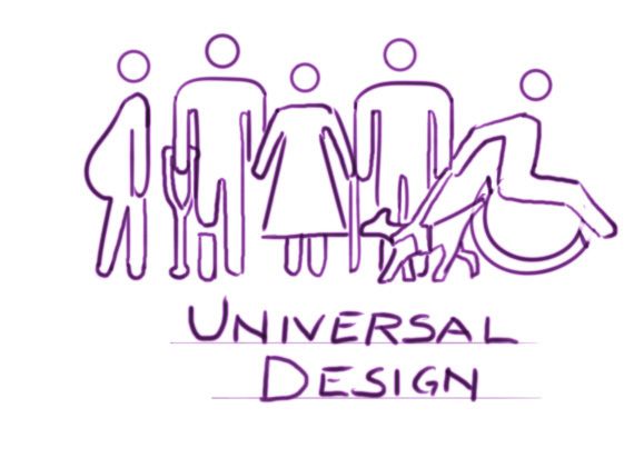
Figure 12. Icon from the home
   page that linked to the current
         sub-topic, Function

1.5 Function
Function, regarding products, is
often thought of in a binary way:
does it work, or doesn’t it. From a
design perspective, and considering
user experience, ‘function’ has three
main aspects: utility, usability, and
performance.
This sub-topic explores those three areas,
defining each, and giving examples of
product variations that are more or less
successful in each area, helping the
reader differentiate the three aspects.
Here, a drill is used as an example: the
brace drill as an example of pure utility;
an electric drill, with a pistol grip, is a
contrasting example of increased usabili-
ty; and a high-power, high-tech cordless drill as an example of
‘performance’.
This topic bridges the Design and Engineering section, and these     Figure 13. Graphic outlining the three different aspects of
aspects of function tend to be addressed by both professions, with          ‘function’: utility, usability, and performance
product designers more focused on ‘usability’ and engineers more
focused on ‘utility’.
E&PDE2021/1233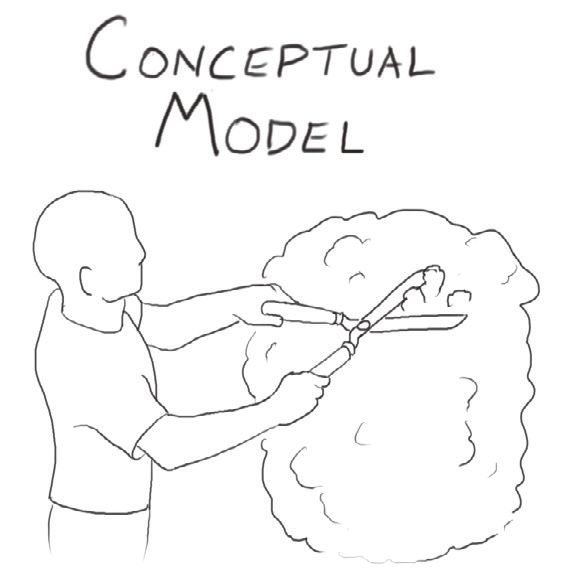
Outcomes                                                                               - Develop more of the infographics and test them by using them in
  - This paper has depicted a possible visual interface for an online version of       teaching in my future classes. This will provide opportunities for
  the proposed ‘textbook’, using the Product Design in Context graphic as the          feedback on the efficacy of the infographics, and if they help students to
  home page and visual Table of Contents. This has not been finalized, but             better grasp the concepts.
  the visualization will help to convey the concept and solicit collaborators.         - Seek collaborators to further the project. Specifically, web and/or
   - Five of the info-graphics for the Design section/chapter have been illus-         interaction designer(s) to help explore the web interface and how that
   trated, mapping out key concepts to be communicated in the text.                    might appear and function. Also, potential collaborators in creating text
   - A publisher has been contacted for this textbook proposal and has                 and/or visual content. This project may be more likely to happen if it is
   expressed interest in this idea. This paper will serve as an example of the         generated by multiple authors.
   kind of content that will be contained in the ‘textbook’, and how it will be
   shown online.
                                                                                    Conclusions
   - The written text is a work-in-progress. It was through writing a draft of        The ultimate goal for this effort is to use the web-based interface of the
   that text that key concepts emerged for the above info-graphics. The               proposed ‘textbook’ as a primary teaching tool for my Introduction to
   exchange between text and image will be essential for the further develop-         Product Design course, and to make it available to others teaching
   ment of this ‘textbook’, as the writing helps determine what needs to be           similar classes. Ideally, the text, images, and digital interface can be
   visualized, and the infographics help elaborate the writing.                       created in ways that are also appealing and useful to others in, or related
   - The colored version of the Product Design in Context graphic was                 to, the field of product design. This kind of visual introductory text
   reviewed with a group of 4th-year undergraduate Product Design students            could become a useful tool for practicing designers to share with
   and received encouraging feedback. The students thought the home page              potential clients in order to communicate what designers do and how
   infographic would be useful for current and future projects as a reference.        they add value to a project. Similarly, it could be used by students and
   By reviewing the Product Design in Context graphic, with a project                 young professionals as a learning tool, with accessible reminders of
   in-mind, they were led to consider specific aspects of their project that were     more diverse considerations in a design project.
   not previously considered. Their suggestion was to use this in more                 For now, this paper serves as a useful incremental step in visualizing the
   advanced classes for students, or young professionals, to think more                more complete ‘textbook’ concept. And it has already been useful in
   broadly about projects, and to spurn them into specific areas and subtopics         testing some of the infographics contained.
   they may have forgotten about.
                                                                                    References
Next Steps                                                                          [1] Elaver, R. Product Design in Context. Visual Paper presented at E&PDE,
  - Continue to work on text portion and assemble a complete sample ‘chap-              2020, location??
  ter’ with full text, infographics, supporting images/photos, and reference        [2] Komninos, A. The Concept of the Triune Brain, Interaction Design Foundation.
  materials to share with publisher(s).                                                 Available: https://www.interaction-design.org/literature/article/ the-con
                                                                                        cept-of-the-triune-brain [Accessed on 2021, 8 March]
   - Gather feedback from colleagues, both in academia and practicing profes-       [3] Norman, D. The Design of Everyday Things, 2013, (Basic Books, NY)
   sionals, on the concept and content.
E&PDE2021/1233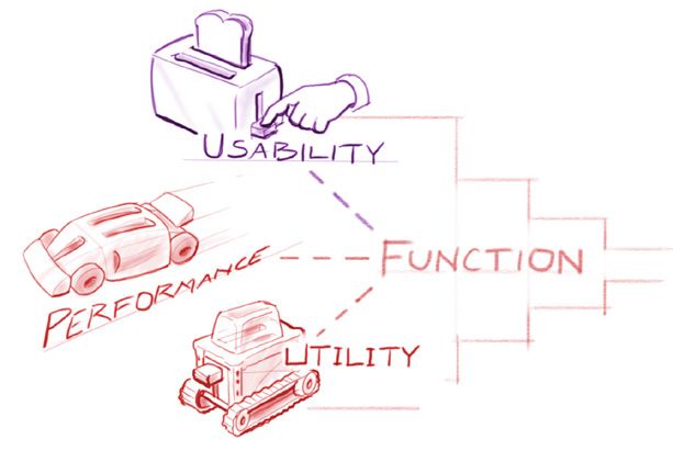
You can also read