The visual design of a websites user interface - Nina Aro - International business 2014 - Theseus
←
→
Page content transcription
If your browser does not render page correctly, please read the page content below
The visual design of a websites user interface

Nina Aro

                                     International business
                                     Förnamn Efternamn2014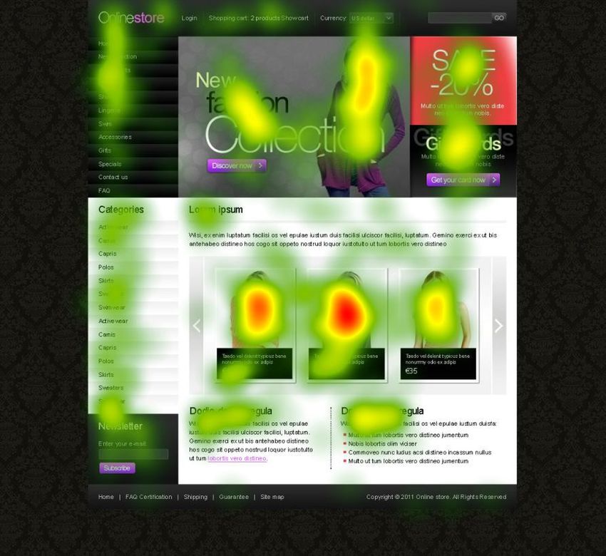
DEGREE THESIS
Arcada

Degree Programme:       Internatinal business

Identification number: 3651
Author:                Nina Aro
Title:                 The Visual design of a websites user interface

Supervisor (Arcada):    Peter Mildén

Commissioned by:        Arcada

Abstract:

This study examines web design interface. In the theory part the main aspects and prin-
ciples of web design will be described. The main principles that are introduced in the
study are: balance, rhythm, emphasis and unity. Improvement suggestions for web pag-
es with a bad interface will be done and also the end result and changes will be shown.
The study goes deeply into detail looking at the structure of a webpage. The signifi-
cance of colors and the use of them in design will also be focused on. A short explana-
tion of each color will be explained in the concept of using them in web design. The
eye-tracking machine Tobii will be used in the empirical part. Eye tracking is the pro-
cess of measuring either the point of gaze or the motion of an eye relative to the head.
Six webpages will be tested. Each site is very similar, small changes have been done to
the coloring and product pictures. They are all e-commerce web pages that sell clothing
as their main product. The webpages are done by the author, by making a realistic look-
ing appearance. The purpose of the study is to examine the use of different colors and
whether using human models or just pictures of the products are recommended. A con-
joint analysis will be presented based on a questionnaire. The result of the test will be
introduces by showing heat maps, time duration graphs and tables. The aim of the study
is to figure out a common pattern for web design, more precisely where to place the dif-
ferent elements and what background color is recommended to

Keywords:               User interface, Eye-tracking, Balance, Rhythm, Emphasis, Uni-
                        ty, Webpage structure, Web design, Conjoint analyses

Number of pages:        70
Language:               English
Date of acceptance:

                                           2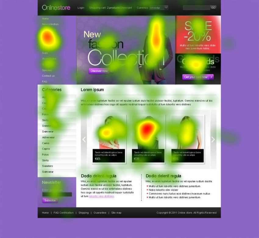
DEGREE THESIS
Arcada

Utbildningsprogram:           International business

Identifikationsnummer:        3651
Författare:                   Nina Aro
Arbetets namn:                Den visuella utformningen av webbsidor

Handledare (Arcada):          Peter Mildén

Uppdragsgivare:               Arcada

Sammandrag:

Denna studie undersöker webbdesign. I teoridelen kommer de viktigaste aspekterna och
principerna för webbdesign att beskrivas. De huvudprinciper som introduceras i studien
är: balans, rytm, betoning och enhet. Förbättringsförslag på webbsidor med dålig design
kommer att ske och även slutresultatet och ändringar kommer att visas. Studien går djupt
in i detalj och tittar på strukturen av webdesign. Innebörden av olika färger och använd-
ningen av dem i design kommer också att fokuseras på. En kort förklaring av varje färg i
begreppet visuell design kommer att finnas samt hur de kan användas inom webbdesign.
Eye-tracking maskinen Tobii kommer att användas i den empiriska delen. Eye-tracking är
en process för mätning av antingen blickens punkt eller rörelsen hos ett öga i förhållande
till huvudet. Sex webbsidor kommer att testas och gemföras. Varje sida är mycket lika
och de är alla e -handel webbsidor som säljer kläder som sin huvudprodukt. En conjoint
analys kommer att presenteras på basen av frågeformuläret. Syftet med studien är att un-
dersöka användningen av olika färger och om att använda mänskliga modeller eller bara
bilder av produkterna rekommenderas. Resultatet av testet kommer att introducerar ge-
nom att visa värmekartor. Syftet med studien är att räkna ut ett gemensamt mönster för
webbdesign, mer exakt var placeringen de olika elementen är lönsam och vilken bak-
grundsfärg rekommenderas att använda. Resultatet av studien visar att respondenterna
föredrog naturlig bakgrunds färg och att använda modeller som visar kläder rekommen-
deras också.

Nyckelord:                    Användargränssnitt, Eye-tracking, Balans, Rytm, Betoning,
                              Enhetlig, Webbsida struktur, Web design, Conjoint analys

Sidantal:                     70
Språk:                        English
Datum för godkännande:

                                             3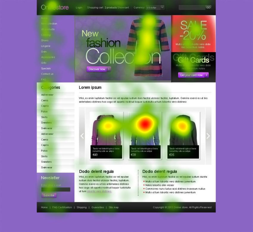
Contents
1     Introduction.......................................................................................................... 7

    1.1       Problem area ................................................................................................................. 8
    1.2       Purpose ......................................................................................................................... 8

2     Methodology ........................................................................................................ 8

    2.1       Approach ....................................................................................................................... 9
    2.2       Technology .................................................................................................................... 9

3     Litterature review ............................................................................................... 10

    3.1       Explanation of the principles of web design ................................................................ 10
      3.1.1          Balance ................................................................................................................ 10
      3.1.2          Rhythm ................................................................................................................ 12
      3.1.3          Emphasis ............................................................................................................. 15
      3.1.4          Unity (proximity) ................................................................................................... 18
    3.2       Main characteristics of a web page ............................................................................. 21
      3.2.1          Appearance ......................................................................................................... 22
      3.2.2          Webpage appearance guidelines ........................................................................ 22
      3.2.3          Content ................................................................................................................ 23
      3.2.4          Webpage content guidelines ............................................................................... 23
      3.2.5          Functionality ........................................................................................................ 24
      3.2.6          Usability ............................................................................................................... 24
    3.3       Webpage structure ...................................................................................................... 25
    3.4       How to make successful e-commerce images ............................................................ 29
      3.4.1          Background colouring and theme ........................................................................ 30
      3.4.2          Introducing primary and secondary colours ........................................................ 30
      3.4.3          What do we know about consumer behaviour and the use of colours? .............. 31
    3.5       Introducing good webpages ........................................................................................ 32
    3.6       How to makeover a bad webpage into a good one? ................................................... 35
    3.7       Example of a before and after webpage ..................................................................... 36
      3.7.1          Suggestions for improvement .............................................................................. 37
      3.7.2          Introducing the changes ...................................................................................... 39
      3.7.3          Redesign summary .............................................................................................. 39
    3.8       Summary of literature .................................................................................................. 42

4     Empirical Research: eye-tracking study .......................................................... 43

                                                                      4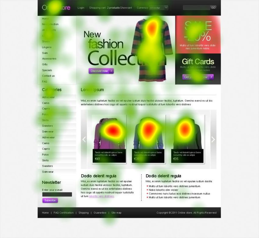
4.1        Presentation of the 6 tested pictures ........................................................................... 45
    4.2        Results of the eye-tracking study ................................................................................ 48
       4.2.1           Test picture A ...................................................................................................... 48
       4.2.2           Test picture B ...................................................................................................... 50
       4.2.3           Test picture C ...................................................................................................... 50
       4.2.4           Test picture D, E and F........................................................................................ 51
       4.2.5           Gaze plots ........................................................................................................... 51
       4.2.6           Summary of the test pictures ............................................................................... 52

5      Conjoint analysis ............................................................................................... 53

    5.1        Planning of the analyse ............................................................................................... 54
    5.2        Presentation of the conjoint analyse ........................................................................... 54
       5.2.1           Sample - Defining the average respondent ......................................................... 54
       5.2.2           Buying experience ............................................................................................... 55
       5.2.3           Ranking (1-6) ....................................................................................................... 56
       5.2.4           Points (1-100) ...................................................................................................... 61
       5.2.5           Comparing female and male results .................................................................... 65

6      Discussion ......................................................................................................... 67

7      Conclusion ......................................................................................................... 68

8      References ......................................................................................................... 69

9      Appendix ............................................................................................................ 71

List of figures
Figure 1. The home page of: Biltmore Co. ................................................................................................. 12
Figure 2. Sitemap, Brown, 2011 p. 97 ........................................................................................................ 13
Figure 3.Screen shot, Nizo ......................................................................................................................... 15
Figure 4. Wireframe, Brown 2011 p.172 .................................................................................................... 15
Figure 5. Inverted pyramid of the presentation style, McKay, 2013 p.140 ................................................ 17
Figure 6. Human Perceptions of color, McKay p.19.................................................................................. 18
Figure 7. IMB logo, Johnson 2010 p. 16 .................................................................................................... 20
Figure 8. Factors of distinguished colors, Johnson, 2010 p.57 ................................................................. 21
Figure 9. Web page elements, Web style guide 3 rd edition ......................................................................... 25
Figure 10. Canonical page layout, Web style guide 3 rd edition.................................................................. 27
Figure 11. Screen shot, Mint 2013 ............................................................................................................. 33
Figure 12. Screen shot, Evernote 2013 ...................................................................................................... 34

                                                                          5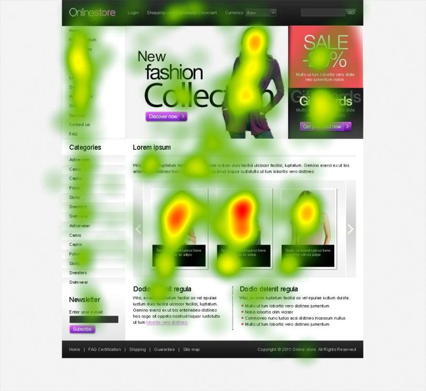
Figure 13. Screen shot Apple 2013 ............................................................................................................ 34
Figure 14. Blog Hubspot: Before and after 2012 ....................................................................................... 37
Figure 15. Blog Hubspot: Before and After 2012 ...................................................................................... 38
Figure 16. The sections used in the average duration measurement.......................................................... 44
Figure 17. Test picture A ............................................................................................................................ 45
Figure 20. Test picture D ........................................................................................................................... 46
Figure 21. Test picture E ............................................................................................................................ 47
Figure 22. Test picture F ............................................................................................................................ 47
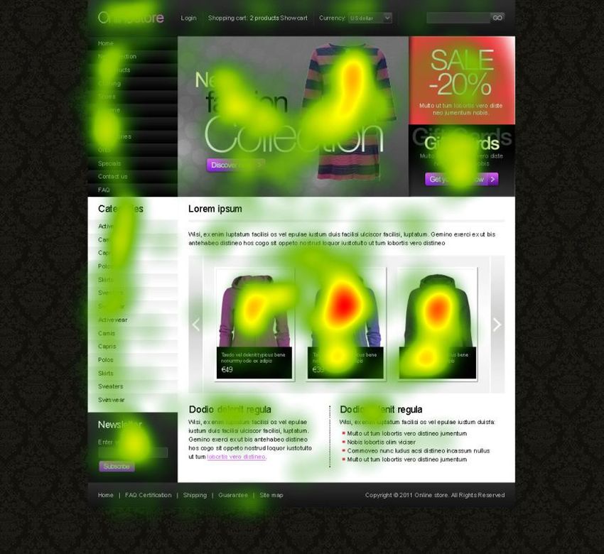
Figure 23. Heat map picture A (Tobii Studios 2014) ................................................................................. 48
Figure 24. Graph picture A (Tobii Studios 2014) ...................................................................................... 49
Figure 25. Average duration table; picture A (Tobii Studios 2014) ........................................................... 50
Figure 26. Graph picture C (Tobii Studios 2014) ...................................................................................... 51
Figure 27. Gaze plots test pictures E & D (Tobii Studios 2014) ................................................................ 52
Figure 28. Average duration table of all test pictures (Tobii Studios 2014) .............................................. 53
Figure 29. Classification of respondents buying experience ...................................................................... 56
Figure 30 . Utility: colours (female) .......................................................................................................... 57
Figure 31 . Utility: pictures with models vs. without (female) ................................................................... 58
Figure 32 . Utility: color vs. pictures ......................................................................................................... 58
Figure 33. Utility: colours (male) .............................................................................................................. 59
Figure 34. Utility: Pictures models vs. without (male)............................................................................... 60
Figure 35. Utility: color vs. picture (male) ................................................................................................ 60
Figure 36 . Utility: colors (female) ............................................................................................................ 62
Figure 37. Utility points 1-10, models vs. without (female) ....................................................................... 62
Figure 38. Utility: points 1-100, colors vs. pictures (female) .................................................................... 63
Figure 39. Utility: point 1-100, colors (male) ............................................................................................ 64
Figure 40. Utility: points 1-100, models vs. without (male) ....................................................................... 64
Figure 41. Utility: points 1-100, colors vs. pictures (male) ....................................................................... 65
Figure 42. Overall comparison female vs. male ......................................................................................... 66
List of tables
Table 1. Sex of respondents............................................................................................ 55
Table 2. Mean, minimum, and maximum age of the sample ......................................... 55
Table 3. Utility: ranking 1-6 (female) ............................................................................ 57
Table 3. Utility: ranking 1-6 (female) ............................................................................ 59
Table 4. Utility: points 1-100 (female) ........................................................................... 61
6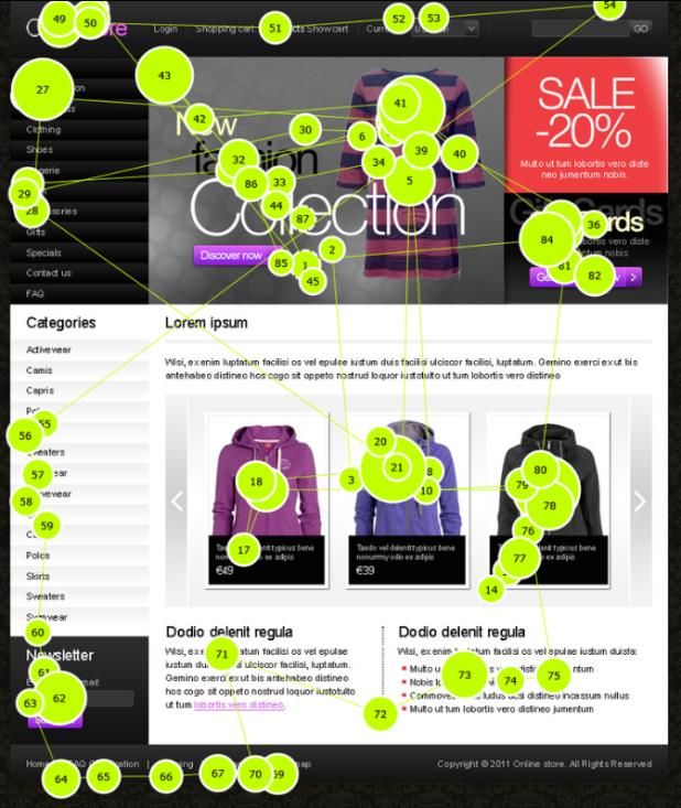
Table 5. Utility: points 1-100 (male) .............................................................................. 63

   1 INTRODUCTION

Developers and software programmers nowadays mostly build Website interfaces. Of-
ten collaborations between graphics designs and user interface have been done when
looking at the principle in building an interface. The main focus is on creating a design
that is international and functional to the user. The most important principles when de-
signing a webpage are: balance, harmony, rhythm, contrast and repetition.

All these important elements must be well contrasted with each other, but still it’s im-
portant to remember to keep the harmony towards the design flowing. Often a visual
hierarchy of importance is made in order to be able to reflect the relationship between
the different elements. Colour management and typography also play an important role
when creating exclusive design. An important aspect is also focusing on research and
analysis of user requirement. This method is called User-Interface design. Some suc-
cessful sites often reveal navigation and usability experience when they combine visual
design with experience design.

Different web pages from different sectors will be introduced in the work. Examples of
pages that have done mistakes in their design in some way will be presented as well as
successful ones. The author will point out the main errors and give suggestions for im-
provement proposals.

The work will also focus on the content of a webpage, because this aspect plays an im-
portant role. The value of the content often differs. The displaying of the content will
be prioritized depending on the value.

The research section will focus on e-commerce web design, more specific the clothing
business. The aim is to study, compare and reflect thought on six different e-commerce
web pages that sell clothing as their main product. The participant will be presented
with different web pages and the idea is that small changes have been done to the pages;
in order to find out with type of interface design is user-friendly.
                                              7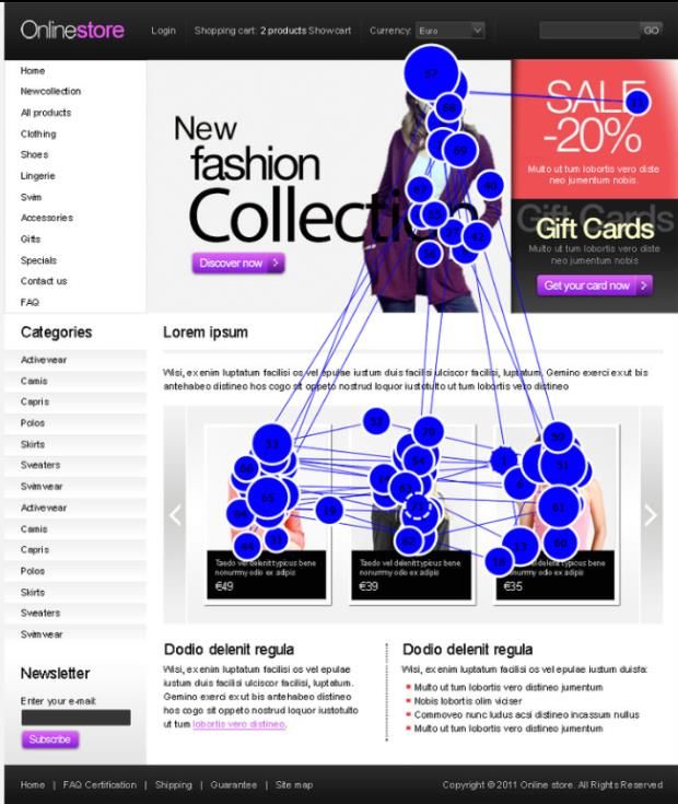
Using a design methodology based on graphic design and usability principles often pro-
duce client-centric and user-centric experience.

An Eye-tracker machine will be used as a research tool when measuring the visual ap-
pearance of the six different e-commerce web pages. A conjoint analysis will introduce
the empirical part.

1.1 Problem area

The problem area is to study the effect of using different website elements as well as
finding out the best location for the elements. The intention is to examine with the eye-
tracking machine how the gaze of the eye attaches themselves to the element in a web
design. The focus is on getting qualitative measurement results by knowing where the
eye moves on a webpage and what area is the best and most attractive for situating the
main product that is being sold. As well as measuring the importance of specific ele-
ments.

1.2 Purpose

The exact purpose with this study is to find out if colour and picture elements have an
effective pattern in the context of web page design. The consumers buying decision can
depend on the colouring and the placement of the different design elements. The study
can also be used as a guidebook for companies that are planning to start their e-
commerce business online.

   2     METHODOLOGY

The method of research includes both secondary research and primary research. The
author has chosen to use both methods in order to gain a variety of facts and infor-
mation.

                                            8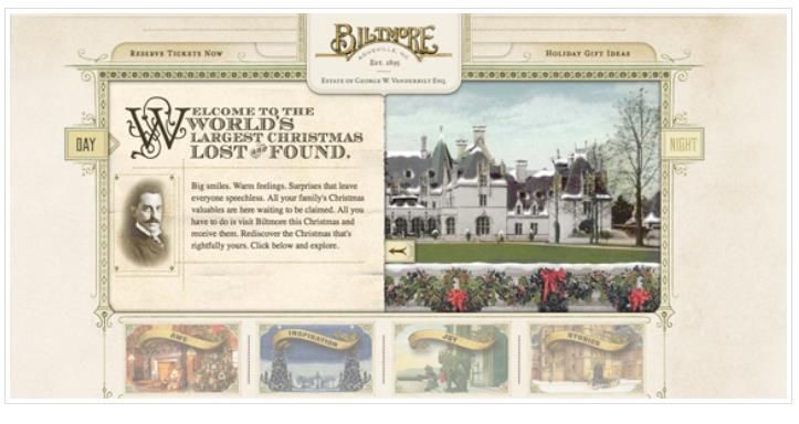
Secondary research was used in order to find theoretical facts about the subject. Primary
research was conducted in order discover similar pattern in the consumer behaviour.
The problem area will be resolved by performing an Eye-tracking study with Tobii eye-
tracker (see technique p.) in order to investigate people's behaviour.
The study was started by reading previous studies in the same field and by examining
corresponded behaviour. These earlier studies represent the frame of reference and are
the theoretical background that the study is based on.

2.1 Approach

Quantitative method is the method that will be applied in this study. A conjoint analysis
will be presented by the help of questionnaire data.

All together 13 persons were tested. The respondents were randomly chosen from the
corridors at Arcada University of Applied Science. There were no limitations set for the
respondents. When the respondents arrived to the test room, which was located in the
school library, a small description of the overall test was done orally. The participants
were asked to focus on the main product in the picture, which in this case meant the
clothing. Six pictures of e-commerce webpages were shown and the participant could
choose himself or herself how much time they needed to watch each picture. Buy press-
ing a button on the key board the picture changed. After showing the different images
on the eye-tracker machine a short questionnaire was asked to be answered. Also imag-
es of the size A4 of the webpages were available looked at.
The questionnaire consisted pf the following questions of: point 1-100 question, rating
1-6 questions, gender, age and a question where the experience of buying clothes was
asked.

2.2 Technology

The actual study was conducted with a Tobii eye-tracker model 7120. The machine rec-
ords the eye movement by measuring the point of gaze, meaning where someone is

                                             9
looking at. The program Tobii Studios was used to create the test and to analyse the col-
lected data.

   3 LITTERATURE REVIEW

The literature review involves different areas of web design. The main focus will be on
the visual aspect of user interface. This chapter will show and describe different
webpages. The literature review is mainly based on literature found on the web, such:
web articles and blogs.

3.1 Explanation of the principles of web design

 3.1.1 Balance

The visual interest of a webpage depends on what colours have been used, shapes and
sizes. The pages should be designed so that the viewer’s interest is held without causing
distraction away from the main elements. Every single element should be considered in
a layout and the “visual weight” should be thought about carefully. The “visual weight”
depends on the size, shade and thickness of lines.

The elements of a design should be placed evenly in order to achieve symmetrical bal-
ance. Centring is the easiest way to achieve symmetrical balance.

According to the web article Universal web design principles you should know (Peep
Laja 2012) balance is created as following:

“In order to achieve symmetrical balance, it’s better to create the balance with the help
of the different elements- an image on the left as well as a large block of text to the
right, for example. Then again a symmetrical balance is an arrangement of different un-

                                              10
like objects that have equal on both sides of the webpage. Different balance elements
are: colour, value, texture and shape”
The book Designing interface (Tidwell, 2010 p.130) describes page layout as the art of
manipulating the user’s attention. The most important aspects of graphics according to
the book are: layout of pages, screens, dialog boxes, visual hierarchy, visual flow and
focal points. The book also enhances the importance of implementing a short and good
visual hierarchy that gives immediate clues about the relative importance of page ele-
ments and the relationship amongst them. The most important part of a webpage can be
pointed out by concentrating on the following: density, background colour, position and
rhythm. The book also points out the most important gestalt principles, they are: prox-
imity, similarity, continuity and closure. (Tidwell, 2010 p.130)
Jenny Kyrnin an experienced web design author explains balance well in her web article
Balance-basic principle of design:
“Balance in design is the distribution of elements across the design. Balance is a visual
interpretation of gravity in the design. Large, dense elements appear to be heavier while
smaller elements appear to be lighter.”
Web design blogger Stephanie Hamilton described the concept of balance as following
in her web article The concept of balance in web design (2012):
“In design, balance is the notion that elements are symmetrical. This function creates
harmony, order and cohesion to the webpage”
This picture below is an example of a webpage that uses asymmetrical layout. Balance
is achieved in the navigational column by using border. This type of layout creates con-
trast from the main text, which is dominant.
11Figure 1. The home page of: Biltmore Co.
As a conclusion the author would point out that the use of balance in design is a very
powerful tool. It can also be used to help showcasing point of interest in design.
3.1.2 Rhythm
In design rhythm can also be known as repetition. Repetition is a pattern that is created
by repeating different elements that are diverse. It allows your design to develop intern
stability that makes the understanding process easier. Once a human brain understands
patterns in a certain rhythm in can relax and understand the whole design. Repetition
and variation are the most important aspects of visual rhythm. On order to achieve a
smooth, even rhythm one should use consistent intervals when placing elements in a
layout. Using sudden changes in the size as well as spacing of different elements can
create are more exciting mood to the webpage.
The book Communicating design describes the importance of using site maps. Accord-
ing to the book sitemaps shows the hierarchy of information on a webpage, as well as
the nature. It also increasingly represents page types of templates in addition to specific
pages. The purpose of using sitemaps is to show how everything on a webpage fits well
together. It also helps clarifying the hierarchy, establish a navigational backbone as well
as facilitate content migrations. Sitemaps are very common artefacts in the design pro-
12cess and often used by designers, developers, project managers and stakeholders.
(Brown, 2011 p.94-122)
Below is an example of a sitemap. The picture shows three levels of hierarchy after the
homepage. The emphasis in this sitemap is on different classifications. The reader gets a
sense of how different products are categorized.
Figure 2. Sitemap, Brown, 2011 p. 97
13Patrick Cox who is a famous UX designer describes in his web blog Creating visual
rhythm in web design (2012) that there are many ways to create visual rhythm. He
points out the three main points. These are: regular rhythm, progressive rhythm and
flowing rhythm. Each of these patterns is a simple pattern. A regular pattern repeats el-
ements that are timed or predictable by intervals. The progressive patterns repeat ele-
ments but can also change in size or colour in order to create progressive steps. Then
again flowing patterns are often organic and have a feeling of nature and often they also
create some kind of movement.
Many different variables can be used when creating regular rhythm. When the goal is to
repeat elements it’s good to change the distance between different elements. In this way
the overall interval can become bigger or longer or the actual elements can become
smaller or larger. (Cox, 2012. Creating visual rhythm in design)
The blog explains that progressive rhythm can be seen when an elements patterns
change to some extant over time in order to create progressive sequence of different
steps. There are a few ways to achieve visual progressivity: An example is to adjust the
size and colour of the repeated elements as letting the visual hierarchy of the elements
determines the focus of the design. Progressive rhythm can be a great tool when visual
enjoyment is wanted as well as for directing the user to a specific location on a web de-
sign.
Below an example of a webpage that uses progressive rhythm in their web design.
14Figure 3.Screen shot, Nizo
The book Communication design mentions the importance of using wireframes while
designing web pages. This is a very common tool amongst the design culture. A
wireframe describes the content of a web page and their relative priorities.
This method can be very helpful for envision the functionality and behaviour of differ-
ent screens and different screen templates. The purpose of using wireframes is to help
the web design project team to establish functionality. Also the behaviour of different
screens and templates can be improved. (Brown, 2011, p.167)
This is an example of a simple wireframe that shows page regions. Using labels identi-
fies the different regions.
Figure 4. Wireframe, Brown 2011 p.172
3.1.3 Emphasis
Having emphasis in a design brings out the significant points of a piece. It also helps the
most important element to stand out. Having focal points in each layout can create em-
phases. Letting one key element stand out from the others can create focal points. In or-
15der to maximize the emphasis it’s important to avoid using too many focal points. If all
the elements have an equal emphasis than the design can easily be seen as busy and hec-
tic. Emphasis can be achieved in many different ways; here are a few to mention: using
mark-up, changing the size of different fonts or images, using bold or black type of
heading as well as subheads and lighter text for the rest of the content in the design, us-
ing contrasting colours, placing the most significant of text on a curve or an angle and
by using coloured type or unusual fonts for the most important part of the text.
Jennifer Kyrnin whose is a famous web design blogger explains in her web article Em-
phasis in Web Design that the biggest mistakes a designer can make is to try making
everything in one design stand out. The design easily becomes boring if the emphasis is
divided equal. Focusing in creating a visual hierarchy is very important.
Patrick Cox who has been introduced earlier already writes about dominance and subor-
dination in the following way in the web article Developing emphasises in web design
(2011). The dominant and the subordinate part of the design have to be figured out in
order to achieve emphasizes successfully. The article describes dominance as the im-
portant part or in other word the point of view. Then again secondary elements function
is to capture some of the user’s attention and to guide the user to the dominant elements
of the design. It’s important that these two elements support the focal point of a design.
Patrick explains that it often happens that designers get lost in their own designs and
have a hard time figuring out how to create emphasis. The three main components ac-
cording to Patrick are: proportion, contrast and physical relationship. (Kyrnin, Emphasis
in Web Design)
Focusing on contrasting elements can be the key to create focal points as well. But then
again using too much contrast can be distracting in the viewer’s eye and can easily over
shadow the subordinate elements altogether. So adding too much contrast between dif-
ferent elements should be avoided.
The book UI is communicating concentrates on visual design. According to the book
common visual design elements should communicate the following aspects: layout, ty-
pography, icons and glyphs. The term layout means; the placements of the design, spac-
ing and emphasis of the user interface elements and contents within a page. Having an
effective layout is extremely important when helping users or viewers to find what they
16are looking for on a specific webpage. It also makes the pages appear visually more ap-
pealing. Many designers consider the layout design being the most challenging par, spe-
cially the mechanical part. (McKay, 2013 p.130)
This inverted pyramid presentation style contracts users to stop reading once they have
the information required.
Figure 5. Inverted pyramid of the presentation style, McKay, 2013 p.140
The book also describes the attributes of an effective layout as following: focus, flow,
termination, order, control sizing and spacing and emphasis. Also affordance is a vital
tool in order to achieve consistency.
The same chapter points out that the colouring in a design play one of the biggest parts.
Colouring is the most subjective visual interface elements that can create emotion and
passion to a design.
17An introduction of the most typical human perceptions of colour those are independent
of status or cultural type.
Figure 6. Human Perceptions of color, McKay p.19
3.1.4 Unity (proximity)
In order to get the entire element in a design to look alike there should be a focus on
unity or in other word proximity.
18The viewer of a webpage needs visual clues in order to understand that the layout is one
unit. The text, the headline, photographs, graphic images and captions should all go well
together. When elements are located close to each other they become related, and when
they are further from each other the opposite.
Using the following methods can create unity. The font size, style and heading should
always be steady. Concentrating on the positioning so that the elements that are close to
each other are related, and elements that are farther are part have less relationship. Re-
peating colours, shapes and textures in different areas is recommended. Choosing visu-
als that share a similar colour, theme and shape should also be considered.
Jennifer Kyrnin, who has been introduces earlier describes the use of unity as following
in her web article Unity-Basic principles of design. Unity in design is achieved primari-
ly by placing objects in the layout. Focusing on the margin and padding of the design
can also attain it. Kyrnins also mentions that by separating the text into groups using
different headlines can approve the achievement of proximity. The headline often adds
visual contrast to designs. By grouping the headline with the text below its clear to the
viewer that everything is related to the content. (Kyrnin, Unity-Basic principles of de-
sign)
A blog called Pixelhaven.com explains the use of unity well in their writing (Harbaugh,
2010)
“Unity means that congruity or agreements exists among elements of a design”
When visual unity is wanted one should primarily concentrate on overlooking the whole
pattern after that move towards smaller individual elements. Each item has a meaning
and adds something to the total effect. (Harbaugh, 2010)
The technique of using proximity can be used well when working with the navigational
elements of a web page. As mentioned before the elements should be placed near each
other so that a hierarchy can be created, it helps the viewer digest and interact while
looking at the webpage. Using proximity is a very effective method that is often used
among web designers.
Our vision is optimized to see structure. Our visual system automatically imposes struc-
ture and visual inputs. The visual system is wired to observe shapes, figures and objec-
19tives instead of disconnected edges, lines and certain areas. For webpage purpose the
most important principles according to the book are: proximity, similarity, continuity,
closure symmetry and common fate. (Johnson, 2010 p. 11)
This IMB logo uses the continuity principle to in order to form letters from disconnect-
ed patches.
Figure 7. IMB logo, Johnson 2010 p. 16
The book Designing with the mind in mind discusses the matter how to seek and use
visual structure. With the help of visual hierarchy people can focus on the most relevant
information that a web page has to offer. It also helps to arrange the information that
breaks the information into separate sections. Visual structure helps organizing and pri-
oritizing what is the most relevant and important content of a page by the help of size,
prominence and content relation. The book explains the key elements in a clear visual
hierarchy, these are: size, content relationship and prominence. (Johnson, 2010 p.25-30)
The human eye is optimized detect contrast. Our ability to distinguish colours depends
on how colours are presented. Also the viewer’s display and the viewing conditions af-
fect colour perception. A human eye has rods and three types of cones in their retinas.
The rods are sensitive to overall brightness while the tree types of cones are sensitive to
different frequencies o light. Each type of cones is sensitive to a wider range of light
20frequencies. There are three types: low frequency, medium frequency and high frequen-
cy. Ability to discriminate colours depends on how colours are presented. Three presen-
tation factors affect our ability to distinguish colours from each other: paleness, colour
patch size, separation. (Johnson, 2010 p.53-54)
The picture below shows factors that will affect the ability to distinguish colours.
A (paleness), B (Size), C (separation)
Figure 8. Factors of distinguished colors, Johnson, 2010 p.57
External factors that influence the ability to distinguish colours are: variation among
displays, greyscale displays, display angle and ambient illumination. The colours should
be distinguished by saturation and brightness. It’s recommended to use distinctive col-
ours. Colour pairs should be avoided, because colour-blind people cannot recognize
them. Colours should also be used redundantly with other cues meaning that there
should be separation between strong opponent colours. (Johnson, 2010 p.60-61)
3.2 Main characteristics of a web page
A company that already has an existing website and that plan to develop it further in the
future should understand what the main characteristics are. The changes should grow
the effectiveness to the online investment. A webpage that is done unwell will do more
harm to the business than benefits.
21An article written on www.spritz.com s webpage introduces the five general compo-
nents involved in making a website successful.
According to the article the five main elements are: appearance, content, functionality,
website usability, search engine optimization. (www.spritzweb.com/resources/good-
website-characteristics.html)
The most successfully web pages are able to reflect all these different elements in their
design. Next the author will explain more in detail theses five elements mentioned be-
fore.
3.2.1 Appearance
A website should always be visually appealing and have a professional look to it. A
company should always remember that the page reflects the business and can have a lot
of visibility. A business in smaller and larger size should always try to populate the
web. The challenge is to attract and keeps users attention. Often in business the PR pro-
fessionals are the ones responsible over the web pages appearance. (Spritz web)
3.2.2 Webpage appearance guidelines
Good uses of colour: a well-suited colour scheme contains 2-3 primary colours that
blends well together and also create a proper mood to the webpage. One should not
overdo the colouring; otherwise it can easily distract the viewer from the written content
of the page. (Spritz web)
Text should be easily read: the easiest combination of colouring and text is black text
and white background. Other colour combinations can also be used as long as it’s within
a suitable range. A font that is easy to read and that can be used in most computer sys-
tems is recommended to use. The font size should be for paragraph text between 10 and
12 pts. (Spritz web)
22Meaningful graphics: Graphics are always important. They provide the visual variety
and can make an otherwise boring page look more attractive. Overusing them should be
avoided, the graphics should always mean or context to the page. The maximum amount
of images on page should be 3-4 images. (Spritz web)
Quality photography: using high quality photography can increase visual appearance.
Especially online retailers should focus on this. (Spritz web)
Simplicity: The overall outlook should be simple and also have some white space. Un-
cluttered layouts allow the viewers to focus on the main message. The webpage should
not be overloaded with designs, animations or other effects. (Spritz web)
3.2.3 Content
Even though the style is important one should not forget to focus on the essence. The
viewers are looking for information that will help them make the decision. The infor-
mation shown on the webpage should always be informative and relevant. Having a
webpage gives a great opportunity to increase visitor’s confidence in the company’s
knowledge and competence. (Spritz web)
3.2.4 Webpage content guidelines
The text should be divided into small paragraphs and clear label topics should be used.
The viewer can easily be overwhelmed with text and then the viewer can be bored. The
content should be updated regularly. So called dead or static text content will not bring
visitors back to the site. It important to try to speak to the visitors, meaning that repeat-
ing the same word as much as possible is recommended. Using a professional writer or
copywriter can be needed unless there’s no one at the company that is a very gifted
writer. (Spritz web)
233.2.5 Functionality
Each component of a webpage should work together quickly and correctly. The viewer
will get frustrated if the components are poorly constructed. (Spritz web)
3.2.6 Usability
Usability is a critical and often overlooked component of a successful website. The page
always needs to be easy to read, easy to navigate and easily understood.
The most important usability elements include the following.
Simplicity: The best way to keep the viewer’s attractions is to have valuable content,
good organization and attractive design. The site should be as simple and well organized
as possible.
Fast loading pages: A well working webpage should load in 20 seconds or less. I the
time is longer than the page will most probably lose more than half of its potential visi-
tors.
Minimal scroll: This is particularly important on the homepage. Using links from the
main page to read more about the particular topic is often done. Minimizing the scroll-
ing will also be helpful when using a search engine.
Consistent layout: The layout plays the most important role in order to achieve usabil-
ity. Consistent layout should be used and repetition throughout the site should be done.
Screen Resolution: By time the screen resolution for a typical computer monitor contin-
ues to increase. The average resolution of a web surfer is 1024 x 768 pixels. It’s im-
portant to make sure that the webpage looks good in every setting. (Spritz web)
243.3 Webpage structure
Web pages are individual linked and share the same graphic, navigation an overall at-
mosphere. Most pages share a similar structure and the main elements are the same.
There is an automatic unit of websites and everything that characterizes the webpage
must appear in the page template. The web design field has developed rapidly during
the past years. The text-driven information web pages have become more constant and
predictable. Not all web pages share the exact same layout but still they incorporate the
same basic mechanism. (Web style guide 3rd edition)
All the main webpage elements are shown in this figure. The type of design is called
conical.
Figure 9. Web page elements, Web style guide 3rd edition
Page headers
25Page headers are on top of each page and the function is similar to the homepages, the
space is just more limited. Page headers deliver the identity as well as global navigation,
such as searching and other similar tools. The placement of the location can vary even
though the overall pattern has become constant. The page header is the most visible
component of site identity structure. (Web style guide 3rd edition)
Home link
The most used format is placing the organization logo in the upper left corner of the
page, as well linking the logo to the home page. If the webpage provider does not have a
logo that can be used than placing home link near the upper left corner is recommended.
The majority of webpage users expect to find the logo at his specific place. (Web style
guide 3rd edition)
Global navigation
The header area is most often used for global navigation links. The most common and
effective way is to use html list of links that are styled with css. This helps to spread
horizontally across the whole section of the header. This technique improves the follow-
ing aspects: usability, semantic logic, and accessibility and.
Also tabs are often used in order to improve global navigation. Tabs can easily be im-
plemented by styling ordinary html list with a more decorative css treatment. (Web style
guide 3rd edition)
This figure shows a canonical page layout. Horizontal bands dominate the headers. The
overall placements of characteristics are consistent.
26Figure 10. Canonical page layout, Web style guide 3rd edition
Breadcrumb navigation
This type of navigation is mostly used in larger sites with deeper level of content organ-
ization. Breadcrumbs are often integrated into the header and more specific at the top
header. Also placing it above the main page content can sometimes appear. (Web style
guide 3rd edition)
Search box
A search box should appear if the site includes a wide range of pages. It helps the view-
er to find what they are looking for faster and easier. The most popular placement for
the search box is the upper right area of the main header. The design of the search box if
recommended to be simple so that it can fit in the area, it’s not supposed to take plenty
of space. (Web style guide 3rd edition)
Check out baskets and online shopping carts
This is a tool that is adapted to most the e-commerce related web pages. Amazon.com
started this phenomenon by placing their cart in the upper right of the header and after
Amazon.com did this, soon after all other similar pages started to do the same. And the
same pattern is used nowadays as well. If a webpage is supported by advertisement,
27than they often reserve a large area above the header for banners. It has been researched
that viewers there is a phenomena called banner blindness meaning that the viewer often
ignore this specific area, just because they are just to ads being places there. Avoiding
graphic contents that have similarity to banner ads is recommended in order to avoid
this. (Web style guide 3rd edition)
Scan columns
In modern wed design it’s common to subdivide the page fields into more functional
regions. This is a central characteristic of successful and up to date design. Research
that has been done in order to study the effectiveness of scans columns placements
shows common practice of navigational links is highly supported and recommended.
Web design search boxes and contract information as well as other minor but necessary
elements of page elements can also be placed in the scan column area. Studies have also
shown that this specific area secondly most looked at feature that viewers tend to look
at. The most looked at area is the right header area.
The article also tells that a large eye tracking and user research has shown that it does
not actually matter whether the left or right navigations columns is being used. Viewers
are used to using both sides as long as the overall appearance is consistent. The most
common place for the navigations columns is the left side. (Web style guide 3rd edition)
Contact information
It’s important for the viewer to easily find the contact information on the webpage. Of-
ten well-designed pages have hidden this information, so that the viewer can find it frus-
trating to find what they are looking for. Especially if the main function of the page is to
sell products, then the contact information should be easily found. The display of the
contact information should be on a logical location. For example the scan column is a
recommended place for the contact information. (Web style guide 3rd edition)
The content area
28In this area general rules and principals do not apply. The reason for this is that the con-
tent area is very complex. The following common practices can make the content area
more useful and practical.
It’s important to use visible names for each page. This will help the users to know that
the contents of the page are about.
If breadcrumb navigation is used than the top of the context is the most recommended
placement are.
If a page is long than jump- to-top links can be used in order to help the navigation. This
are placed on top of the page. (Web style guide 3rd edition)
To help the page navigation overall it’s recommended to have simple text links at the
top and bottom of each page. This will help the viewer to move easily to the previous or
next page in the right order. Also providing information about the exact location of the
whole sequence is help. (Web style guide 3rd edition)
3.4 How to make successful e-commerce images
It’s very important to present the products in the best way possible; it has a significant
impact on the overall sales. First of all a proper professional camera is needed in order
to avoid pictures looking like an amateur would have done them. Next up comes the
lightening which plays a crucial part of a successful picture. Lights that operate in con-
tinuous mode are preferable. The background colour should always be continuous as
well, meaning that the same pattern is used in order to prevent a messy look. It’s im-
portant to avoid strict backlighting and similar setups that cast shadows on the surface.
The clothing presented should always be realistic and without any wrinkles and other
malformations. If real models are used in the images than at least a small text saying the
actual size of the model should be included. Also an introduction text of the actual ma-
terial and its contents should be mentioned.
293.4.1 Background colouring and theme
E-commerce companies often put the main focus on their products and the styling,
meaning that they forget about the overall framework such as background colour. These
aspects are as important as the ones mentioned before; they serve as the final push. It’s
recommended to do research in order to get the best theme possible, the theme can often
be the key to success. Designers are all the time trying to find the most eye-catching de-
signs. The trick is to make a beautiful design that is still usability friendly. A combina-
tion of elegant and innovative design is the most wanted theme. (Evans, 2012)
According to an article written a web design article What your w-commerce colours say
to you written by Clare Evans the colour scheme of the website can make a big differ-
ence looking at sales volume as well as the image of the company. Specially focusing
on the outlook is important, when making profit and sales is the main function. Colours
often have the power to induce certain emotions in humans. Behind each colour there’s
a psychology and also in different cultures colours symbolize different things. The same
applies to ecommerce website design. Colour is one of the most important elements in
web design. Colouring is categorized as even more important than usability, content and
even the product itself. (Evans, 2012)
3.4.2 Introducing primary and secondary colours
The primary and secondary colours will be presented according to Clare Evans. An ex-
planation of colours meanings to the Western world’s web users will be included.
Red reflects danger, anger and romance. The color is also high in energy
and can reflect urgency.
Orange can evoke different emotion in humans. Often used to create
“buy it now” reaction.
30 Yellow can be seen as an optimistic and youthful. Does not translate very
well in web. Can be seen as a deceitful color in the field of e-commerce.
Green has plenty of different meanings in web design. Reflect nature
(where selling beauty products). One of the easiest colors for the eye to
process.
Blue is seen as cool and calm. Often used in e-commerce in order to cre-
ate sensation of trust and brad loyalty.
Purple is often related with royalty wealth. Commonly used in retail and
beauty business.
Pink can be described as fun, exciting and fun looking. In e-commerce it
is often used in commercials aimed for younger people. Expresses ro-
mantic and feminine emotions
White is a very neutral color. Not often used in e-commerce. Expresses
purity and cleanliness. Seen as fresh, open and ad friendly.
Black is a very common color and symbolizes plenty of things.
Grey is seen as a neutral color and often considered formal and con-
servative. High standard of products can be shown by the help of the col-
or.
Brown is trustworthy, stable and natural. Can portray a company as
wholesome and reliable.
3.4.3 What do we know about consumer behaviour and the use of col-
ours?
The company should put focus on the colouring on their e-commerce site; depending on
the products that are being sold in the ecommerce business, the colours used can make a
big difference looking at the consumer behaviour aspect. As an example an ecommerce
site can appeal to the customers as more attractive when using colours. Reds and orang-
es as well as royal blues and blacks are recommended. It is the sales aim is to target
budget shoppers than then green could be the choice of colour. Green is the same colour
as money and for the viewer it can reflect a feeling that the company is valuable. Same
kind of buyers can also be attracted my using colours dark and navy blue. Retailers that
31sell clothing often choose paler and softer colours. Traditional colours used are: differ-
ent shades of pink and blue. These colours give a sense of calm and serenity. (Evans,
2012)
3.5 Introducing good webpages
First impression can only be done once, that’s why it’s so important to focus on a good
homepage. The homepage is the most important page of a website and can be looked as
a virtual front door. If the viewer’s do not like what they see then they will leave the
page immediately. The look of the webpage is the most important element, and second-
ly comes the functionality.
Next up I will introduce some elements that can be used in order to achieve an attractive
webpage. A blog written by Nate Archer reflects on Steven Krugs bestselling book
“Don’t make me think,” mentions good and functional points. The homepage should
clearly give and answer to the viewer regarding the service and the brand that is repre-
sented. A well-known company or brand does not have to focus that much on describ-
ing what they actually do. But in reality most businesses still needs to answer these
questions so that each visitor knows that they are in the right place. If the visitor will not
immediately in a few seconds time identify the meaning of the webpage they will leave.
The web pages should always resonate with the target audience. The page needs to be
closely focused, meaning that it speaks the same language as the target audience. Com-
pelling value-positions is also important. When the visitor arrives to the homepage, it
needs to be compelling enough so that they will not leave the page. For a company to
get the best possible value position the website is an excellent channel to do so. Usabil-
ity and mobility makes the webpage more usable and makes the navigation better. It
recommended, avoiding flashy objects that can get in the way of the browsing, as well
as banners and animation should be limited, they are often unnecessary elements. In to-
day’s world it’s also important that the webpage is mobile-optimized, meaning that the
viewer can open the page on the phone with a more suited view. Mobile phones that
have good Internet functionality are becoming more common, so these aspects should
32You can also read


