D02. Study on informed public policy-making on base of policy modelling and simulation - Joinup.eu
←
→
Page content transcription
If your browser does not render page correctly, please read the page content below
D02. Study on informed public policy-making on base of policy modelling and simulation | Error! No text of specified style in
document.

 D02. Study on informed public policy-
 making on base of policy modelling and
 simulation
 Data analytics for Member States and Citizens
 – ANNEX Special study: Predictive Models
 Tackling the COVID-19 Epidemics
 18 May 2020 (Final draft)
PREDICTIVE MODELS TACKLING THE COVID-19 EPIDEMICS ...................... 1

1.1   Introduction ...................................................................................................................................................... 1

1.2   Overview of the models............................................................................................................................... 3

1.3   In depth Analysis.......................................................................................................................................... 41

1.4   Policy Take-Outs ........................................................................................................................................... 55

1.5   APPENDIX – Aggregators and Data Sources................................................................................... 58
Predictive Models Tackling the
COVID-19 Epidemics

 1.1    Introduction
One of the unexpected effects of the lockdown was the widespread attention dedicated to
epidemiological curves and exponential models. Topics which looked like obscure, boring and highly
specialistic became popularized under concept like “flattening the curve”. Indeed, predictive models
about the spread have become a strategic asset for understanding and managing the crisis. Having
accurate estimates of how the epidemics is evolving, and more importantly, predictions about how
it will evolve in the future under different types of lockdown measures, became a fundamental asset
not only for ensuring public health, but also for saving the economy. Their importance became clear
when the update to the model produced by the Imperial College (as new data became available) led
to a complete reversal of policy in the UK and the US. Indeed, accurate models are necessary to
move beyond a open/closed model towards a smarter and more nuanced policy approach, or as one
popular social media post put it, to move from the “hammer” to “the dance. Every country is using
different models to manage the crisis, and many research departments are producing theirs. But
how are these models developed, concretely? What predictions do they offer? What data do they
use? How influential are they in defining policy choices, and most importantly, are best performing
countries using better models? This piece provides an overview of the different models adopted
across countries, and tries to extract lessons to be learnt for the future. The findings show that
different models have been used for different purposes. For instance, agent based models can be
used to assess the impact of mitigation measures, while fitting curve can be used to estimate the
magnitude of epidemic dimensions such as the number of deceased and the number of infected
individuals. As the saying goes, all models are wrong, but some are useful. And useful they were
indeed, as the more data are available, the better are the estimates. Further, several models are
able to predict the extent to which mitigation measures affect epidemic and healthcare dimensions,
thereby providing tools to the policy makers. On the other hand, having more advanced and
sophisticated models is not the magic wand that decides the fate of a country. Indeed, many experts
declare that “The mathematical side is pretty textbook”. Other related measures are at least as
important. First, high quality data. Models are built on estimates, and early stage models were wildly
wrong because of the incorrect estimated data put in stemming from assumptions driven by
necessity. In fact, when scarce data was available for a single location, models had to be calibrated
using data from locations where the epidemics was ongoing. For instance, for the series of Imperial
College models, critical assumptions concerned the value of R (reproduction rate), the rate of death,
the length of incubation, and the period in which infected and asymptomatics can be infectious. As
for a model developed by the University of Oxford, a critical assumption was the suggestion that the
infection has reached the UK by December or January, and the figure that only one in 1,000
infections will need hospitalization is removed from reality. This is questionable, as on March 24 (at
the time of release of the model) more than one in 1,000 people have already been hospitalised in
the Lombardy region of Italy, despite stringent control measures being implemented. But the crucial
info hidden from both teams of modellers regards the number of people that have been infected
without showing symptoms, and for which a reliable test would be a game changer for modellers as
it might significantly alter the predicted path of the pandemics. In fact, it appears that the mortality
rate is much lower than official numbers suggest, as many people are infected without knowing it
and they do not get tested. By the same token, some countries have better data because of their
existing data infrastructure. For instance, Germany has a register of ICU which updates occupancy
data on a daily basis. And the main limitations underlying all models is that we don’t know how
many people are infected in the first place. Secondly, models need to be used properly. They are
not commodity that provide a number which the policy makers use to take decisions. There needs
to be a full understanding of the subtleties involved, the levels of uncertainty, the risk factors. In
other words, you need in-house data and model literacy embedded in the policy making process, in
house. You can’t outsource that. Indeed, a recent report for the US highlighted the limitations of a
process that involved experts on an ad hoc, on demand basis, leaving much arbitrariness to the
process: “Expert surge capacity exists in academia but leveraging those resources during times of
crisis relies primarily on personal relationships rather than a formal mechanism.” On a similar token,
in the UK, a recent article pointed out that experts involved in the SAGE were too "narrowly drawn
as scientists from a few institutions". By the same token, there was insufficient in house capacity to
manage this input: In the US, “there is currently limited formal capacity within the federal
government”, while in the UK, “the criticism levelled at the prime minister may be that, rather than
ignoring the advice of his scientific advisers, he failed to question their assumptions”.1 Further, it is
important to ensure transparency in the modelling assumptions, as using models based on
assumptions in absence of hard data can lead to over interpretation and exaggeration in the
magnitude of the outbreak. Therefore, assumptions must be transparent and clear to the reader and
the policy maker in order to be aware of the caveats. Moreover, researchers should perform
extensive validation and sensitivity analysis exercises by using different modelling and estimation
techniques. By the same token, models should be developed in collaboration with policy makers and
practitioners, as in the case at hand, the joint elaboration of simulations and scenarios by policy
makers and scientists helps in producing models that are refined to tackle the containment policies
adopted. And the researchers/ IT vendors should develop easy to use visualization to help policy
makers and citizens to understand the impact of containment policies: interactive visualization is
instrumental in making evaluation of policy impact more effective. A final point is to consider
carefully the sources of uncertainty in the model, whether statistical (e.g. confidence intervals),
parametrical (e.g. the rate of transmission), concerning measurements (e.g. data on fatality), or of
a more conceptual level (e.g. assuming a representative agent).

But we must not forget perhaps the most important variable: the quality of the health service itself.
For instance, Germany has by far the largest number of ICU beds per head.

1
 The quotes come from https://mobile.reuters.com/article/amp/idUSKBN21P1VF?__twitter_impression=true and
https://www.centerforhealthsecurity.org/our-work/publications/2020/modernizing-and-expanding-outbreak-science-to-support-better-
decision-making-during-public-health-crises
1.2   Overview of the models
Several countries are making extensive use of predictive models to forecast the severity of the
COVID-19 outbreak and its impact in terms of population affected and strain over the healthcare
system. Computer simulations are becoming an increasingly important part of policymaking.
However, as they are based on information that is oftentimes estimated or assumed, it is important
to be aware of the limitations and possible lack of robust forecasts. The simplest epidemics models
(called SIR2) aim to understand how an individual passes from being susceptible (S) to the virus,
have become infected (I); and then either recover (R) or die. A bit more advanced modelling
technique (see the flow in Figure 1) adds the individuals exposed (E) to the virus34.
Figure 1 – Flow of SEIR Model

Some information can be merely assumed at the start of an epidemic, such as the proportion of
infected people who die, and the basic reproduction number (R0), which is the number of people to
whom one infected person will transmit the virus. In the same way, also some other parameters
have to be assumed, such as the presence or not of natural immunity inside a population. More
advanced models make use of stochastics rules, for instance attributing a probability lower than one
that someone in the I group infects an S person when they meet, and also the behaviour of agents
is modelled in different ways. Most models make use of equations to sort individuals into strata,
while others adopt an agent based approach in which each individual moves around and acts
according to their own specific rules, and therefore are able to include in the analysis social factors
(such as social distancing and travelling), as well as healthcare resources. Further, there are
epidemiological models based on mobility matrices (origin-destination) and demographic profiles to
understand the extent and direction of the spread of the epidemic, thanks to which it can help to
make decisions on the distribution of resources and on hospital logistics, as well as displacement
analysis models between municipalities and between geographic areas of the country to identify
groups of users with similar displacement patterns, and effectiveness models of lockdown measures,
aimed at monitoring the behavior of groups of users before and after the adoption of restrictive
measures for mobility. The choice of the model depends on the specific issue at hand: for instance,

2
  https://www.nature.com/articles/d41586-020-01003-
6?fbclid=IwAR0WqP_6AH7myk9YJGFeqw0lXlD2KiBPScEX_WQdzrW67n41krXaZYkTV0Q#ref-CR1
3
  https://www.thelancet.com/journals/lancet/article/PIIS0140-6736(20)30260-9/fulltext
4
  https://cmmid.github.io/topics/covid19/current-patterns-transmission/wuhan-early-dynamics.html
when testing the effects of social distancing on infection rates, there is no need to use an agent
based model as everybody is compelled to behave in the same way, i.e. staying at home.

In total, our analysis depicts a total of 28 different models, 19 of which are used in policy making
as reported by the general press as well as by the fact that authors are members of the teams of
advisors working for several governments. Further, almost all of the models are published and
available for scrutiny (apart from 4, more on that below), while obviously the results of all models
are public and available. The study of the models focusses on 6 European countries plus the US:
France, Germany, Italy, Spain, United Kingdom, and United States. Most of the models use data
collected from the same country, while other integrate the dataset with data from international
repositories (e.g. ECDC, WHO, Johns Hopkins CSSE). Interestingly, the models introducing mobility
of citizens across regions and countries re-use data on citizens movement collected for other
purposes, such as daily origin-destination traffic flows from the Official Aviation Guide (OAG) and
International Air Transport Association (IATA) databases, ground mobility flows collected from
statistics offices, and mobility data provided by Cuebiq, a location intelligence and measurement
company.

From the analytical point of view, the relative majority of models are Susceptible-Exposed-Infected-
Recovered (SEIR) models, while there are some spatial epidemic models and some pure statistical
models based on maximum likelihood methods and Monte Carlo Markov Chains. Finally, there are
strategic models that encompass multiple scenarios assessing the impact of different interventions
are able to capture some uncertainty underlying the epidemic outbreak and the behaviour of the
population and are the foundation for policy making activity.

As regards the topic of the models, we can distinguish four of them:

     •    Estimating epidemic variables, such as numbers of infected individuals, number of deceased,
          and reproduction number (17 models);
     •    Estimating healthcare variables, such as number of Intensive Care Units Necessary (12
          models);
     •    Assessing the impact on mitigation actions, such as enforcement of lockdowns and social
          distancing (16 models);
     •    Assessing the spread of the epidemic model and/or the extent of the mobility of the
          population (9 models).

A brief illustration of the surveyed models is presented in Table 1.

Table 1 – Brief illustration of the surveyed models
Country         Total        Published        Officially   Estimating   Est.         Mitigation   Mobility
                                              used in      epidemic     healthcare   actions
                                              policy       variables
US                    6              6              5            2           2            1            4
UK                    5              5              5            3           3            4            1
DE                    4              4              3            2           0            4            2
IT                    6              4              1            4           2            3            1
ES                    4              4              2            3           3            2            1
FR                    3              3              3            2           3            2            0
Total                28             26              19          16           13           16           9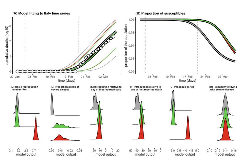
1.2.1 Predictive Models used in US and the UK
A number of leading scientists are supporting the decision making process of the White House
Coronavirus Task Force by providing results analysis based on predictive epidemic models. One of
the primary models used by the White House response team is provided by the Institute for Health
Metrics and Evaluation University of Washington (IHME)56. As already mentioned, most
epidemiological models look at different populations that interact in an outbreak, which are the
people susceptible to infection (S), those who are infectious (I) and those already infected who go
on to die or recover (R). The IHME model embraces an entirely different statistical approach, taking
the trending curve of deaths from China, and “fitting” that curve to emerging death data from US
cities and counties to make its forecasts. The first release of the model predicted a bed excess
demand of 64,175 and 17,380 of ICU beds at the peak of COVID-19. Further, the peak ventilator
use is predicted to be 19,481 in the second week of April, while the total estimated deaths were
81,114 over the next 4 months. Then, the estimates were amended downwards by predicting the
death of 60.400 individuals by August, with a peak on the 12th of April. As for the UK, the model
predicted 66,314 fatalities, more than Italy (a total of 23,000) and Spain (19,209).7 These numbers
are consistently lower than other estimates. As transparently recognized by the authors, only one
location (Wuhan) has had a generalized epidemics, and therefore modelling the US fitting curve on
such location is difficult, especially because the timing and extent of social distancing is difficult to
mimic. When more US data will be available, the more will become more precise. Further, even
though the model takes into account age structure, some other factors are not modelled, such as
the prevalence of multi and co-morbidities, chronic lung disease, use of public transport, pollution
and population density. On the top of that, the reduction in healthcare quality due to overload is not
explicitly taken into account. Other experts consider the estimations to be overly optimistic8. In fact,
it is argued that actions taken in the US are less drastic than in China, and that while most models
assume that social distancing will only slow or reduce transmission, the IHME model assumes that
policies such as social distancing are extreme effective at stopping transmission and put the
epidemics under control.

Along the same lines, as argued by Siegenfeld, Shen and Bar-Yam9, the interventions in the US are
basically of four typologies: school closures, non-essential business closures, travel restrictions
including public transportation closures, and stay-at-home recommendations. It is unlikely that
implementing even all four of these measures will yield results like those reported by China, given
the multiple steps taken in China’s lockdown, many of which have not yet been implemented in the
US, such as mandatory masks in public places and quarantine of all suspected cases collectively.

Summarizing, the precision of the IHME model depends a lot on the availability of data as well as on
the assumption regarding the extent of interventions. The IHME is planning to continually update its
model using new data, so the model will become more accurate over time. In some countries like

5
  https://covid19.healthdata.org/united-states-of-america
6
  https://www.medrxiv.org/content/10.1101/2020.03.27.20043752v1.full.pdf
7
  IHME uses data from the Data Repository by Johns Hopkins CSSE https://github.com/CSSEGISandData/COVID-
19
8
  https://www.vox.com/future-perfect/2020/5/2/21241261/coronavirus-modeling-us-deaths-ihme-pandemic

9
    https://necsi.edu/comment-on-forecasting-covid-19-impact-on-hospital-bed-days
Italy, for which there is a large amount of data on fatality rates for COVID-19 over time, the accuracy
of IMHE is higher. On the other hand in countries such as UK there is a limited timeframe of COVID-
19 fatalities and so less data with which to estimate future trends, and therefore the IHME has a
widest range of possible outcomes (14,572 to 219,211 deaths in the UK at the time of writing).

At any rate, as of May 6th 2020, examples of projections based on IHME are depicted in the following

Figures Figure 2, Figure          3 and Figure 4.
Figure 2 - Hospital Resource use

Source: https://covid19.healthdata.org/united-states-of-america

Figure 3 – Deaths per day in US

Source: https://covid19.healthdata.org/united-states-of-america
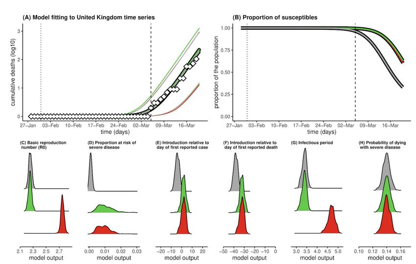
Figure 4 – Total deaths in US

Source: https://covid19.healthdata.org/united-states-of-america

Based on the IHME, other historical model projections for a given country or region (based on data
scraping from the John Hopkins dashboard10 and the IHME website11) are produced by the Los
Alamos National Labs1213. Specifically, they estimate at US state level the number of cases and
deaths elaborating two processes: the first process is a statistical model of how the number of
COVID-19 infections changes over time, while the second process maps the number of infections to
the reported data. Regarding the first process, they model the growth of new cases as the product
of a dynamic growth parameter and the underlying numbers of susceptible and infected cases in the
population at the previous time step, scaled by the size of the state's starting susceptible population.
To model new deaths in the population, they assume that a fraction of the newly generated cases
will die and get that fraction from observations. The model can be used to produce short- and long-
term forecasts that can help guide situational awareness about what may happen in the near-future.
In the model there are two main sources of uncertainty: the primary source of forecast uncertainty
is how the growth parameter might change in the future; the second is measurement uncertainty,
assumed to scale with the number of reported cases and deaths.

Another leading team stems from the collaboration between Northeastern University and ISI
Foundation building on the Global Epidemic and Mobility Model (GLEAM) project, an individual-based,
stochastic, and spatial epidemic model used to analyze the spatiotemporal spread and magnitude of
pandemic outbreaks. The modeling effort produced is based on data on incubation period, methods
of transmission, contagiousness and virulence, transportation, human behaviour and social
interactions, availability of medical resources in different areas. As for transportation, the model also
includes mobile phone data to track changes in people’s movement to better understand the effects
of various social distancing policies. Further, simple models typically show the start of an epidemic
as an exponential curve based on the basic reproductive number, which in reality is not constant
and depends on social networks, such as workplaces, households, and communities, and layered

10
   https://coronavirus.jhu.edu/map.html
11
   http://www.healthdata.org/covid/data-downloads
12
   http://www.covid-projections.com/
13
   https://covid-19.bsvgateway.org/#link%20to%20forecasting%20site
them into a larger model. Based on their model, the research team has developed a tool, EpiRisk,
aimed at investigating the effectiveness of travel bans. Specifically, the model has been used to
achieve situational awareness, then it has been applied to understand how interventions like travel
restrictions affect the transmission of the disease. An example of the map of COVID-19 Epidemics
as depicted by the EpiRisk Models is provided in Figure 5.

Figure 5 – Map of COVID-19 Epidemics as depicted by the EpiRisk Model

Source: www.epirisk.net

Based on the number of infected, the computational model estimates two quantities:

        ●    The probability of “exporting” a given number of cases n from the origin of the disease
             outbreak;

        ●    Probability that a single infected individual is traveling from the index areas to that specific
             destination.

As for the data, the airline transportation ones are based on origin-destination traffic flows from the
database of the air travel intelligence company OAG.14 Furthermore, commuting flows are derived
by the analysis and modeling of data of over 78,000 administrative regions worldwide and 5,000,000
commuting patterns.

Another application of the GLEAM models stems from the collaboration between Northeastern
University, Fred Hutchinson Cancer Research Center, University of Florida, NIH Fogarty Center, ISI
Foundation, and the Bruno Kessler Foundation.15 The model generates an ensemble of possible
epidemic projections described by the number of newly generated infections, times of disease arrival
in different regions, and the number of traveling infection carriers. The model points to the days
around April 8, 2020 as the peak time for deaths in the US. Based on the last projections, a total of
89795 COVID-19 deaths (range of 63719 to 127002) are currently projected through May 18, 2020.
The model uses real-world data where the world is divided into subpopulations centered around

14
      https://www.oag.com/
15
     https://covid19.gleamproject.org/
major transportation hubs (usually airports). The airline transportation data encompass daily origin- destination traffic flows from the Official Aviation Guide (OAG) and International Air Transport Association (IATA) databases (updated in 2019), whereas ground mobility flows are derived from the analysis and modeling of data collected from the statistics offices of 30 countries on five continents. The unmitigated and social distancing projections of the model are available in the following figure Figure 6. Figure 6 - Unmitigated and social distancing projections Source: https://covid19.gleamproject.org/ Some other models investigate the effectiveness of social distancing. For instance, Bakker et al.16 make use of mobility data from January 1st 2020 to March 25th 2020 to figure out how has social distancing policy changed mobility and social behavior, how social distancing behavior differs across the physical space of New York City, and how social distancing behavior differs across demographic groups. Mobility data is provided by Cuebiq, a location intelligence and measurement company, and they consist in supplied anonymized records of GPS locations from users who opted-in to share their data anonymously across the U.S. The researchers find that the instance travelled everyday dropped by 70 percent, the number of social contacts in places decreased by 93%, and that the number of people staying home the whole day has increased from 20% to 60%. Very interestingly, they found that the relative differences between different demographic groups for what concerns mobility and social contacts have been dramatically reduced. Finally, they found that supermarkets and grocery stores came to be the most common locations where social contact takes place. A similar model has used data from Cuebiq to build a preliminary understanding of the effect of work from home policies, mobility restrictions, job loss, and shelter-in-place orders on urban and inter- urban mobility.17 Very interestingly, the model provides an estimation of the decrease in mobility across the U.S. Census Bureau Combined Statistical Areas of Boston, New Orleans, New York city, San Francisco and Seattle (see Figure 7). 16 http://curveflattening.media.mit.edu/Social_Distancing_New_York_City.pdf 17 https://www.mobs- lab.org/uploads/6/7/8/7/6787877/assessing_mobility_changes_in_the_united_states_during_the_covid_19_outbr eak.pdf
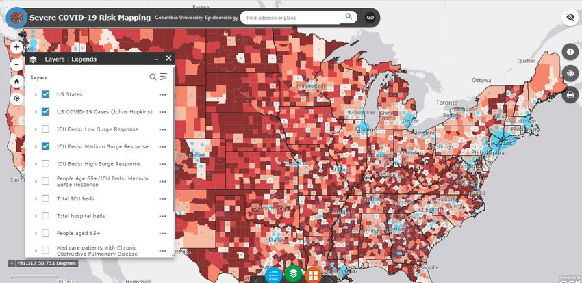
Figure 7 – Decrease in mobility across US Census Areas

Source: https://www.mobs-
lab.org/uploads/6/7/8/7/6787877/assessing_mobility_changes_in_the_united_states_during_the_covid_19_ou
tbreak.pdf
A final series of models by Columbia University in collaboration with Charles Branas in the
Department of Epidemiology and colleagues from Patient Insight, the Mount Sinai Health System
and MIT, has been used to provide an estimation of the stress on the healthcare system at county
level due to the COVID-19 epidemics. Specifically, the team provides an estimate of the number of
hospital critical care beds, including ICU beds and other hospital beds used for critical care purposes,
that could be made available by hospitals in response to patient surges. Three scenarios of intensity
of hospital response were created, taking into account existing ICU bed availability, currently
occupied ICU beds that can be made available, other beds such as post-anesthesia care unit bed,
operating room beds, and step-down beds that could be converted to critical care beds for COVID-
19 patients and the possibility of having two patients use one ventilator in ICU. All civilian acute
medical-surgical tertiary care hospitals and long-term acute care hospitals hospitals for which data
were available in the US are included. The mapping tool can also display high risk groups such as
individuals 65 years and older, Medicare patients with chronic obstructive pulmonary disease,
Medicare patients with diabetes, Medicare patients with coronary artery disease and Medicare
patients with chronic kidney disease. Specifically, an example of the risk mapping is provided below
(Figure 8).

Figure 8 – Example of risk mapping

Source:
https://columbia.maps.arcgis.com/apps/webappviewer/index.html?id=ade6ba85450c4325a12a5b9c09ba796c

An online interactive COVID-19 mapping tool is also available on the Columbia website.18 The
simulations displayed in the mapping tool are based on a model19 simulating the COVID-19
transmission dynamics for all US study counties over the period from February 21, 2020 to April 2,
2020, using an iterated filter-ensemble adjustment Kalman filter framework.202122 This combined
model-inference system estimated the trajectories of susceptible, exposed, documented infected,
and undocumented infected populations in each county while simultaneously inferring model
parameters for the average latent period, the average duration of infection, the transmission
reduction factor for undocumented infections, the transmission rate for documented infections, the
fraction of documented infections, and the previously mentioned travel multiplicative factor. To
account for delays in infection confirmation, the research team employed a time-to-event
observation model using a Gamma distribution with a range of reporting delays and different

18
   https://columbia.maps.arcgis.com/apps/webappviewer/index.html?id=ade6ba85450c4325a12a5b9c09ba796c
19
   http://www.columbia.edu/~jls106/branas_etal_preprint.pdf
20
   E. L. Ionides, C. Bretó, A. A. King, Inference for nonlinear dynamical systems. Proc. Natl. Acad. Sci. U.S.A.
103, 18438–18443 (2006).
21
   A. A. King, E. L. Ionides, M. Pascual, M. J. Bouma, Inapparent infections and cholera dynamics. Nature 454,
877–880 (2008).
22
   S. Pei, F. Morone, F. Liljeros, H. Makse, J. L. Shaman, Inference and control of the nosocomial transmission
of methicillin-resistant Staphylococcus aureus. eLife 7, e40977 (2018)
maximum seeding. Finally, the log-likelihood was used to identify the best fitting model-inference
posterior.2324

The model shows that an estimated 77,588-278,850 total critical care beds were available in the
US, depending on the level of hospital surge response preparations. Maps of the US showed
differences between the 21-day and 42-day projections as more counties outside the Northeast and
urban areas, such as in the South, began to exceed their critical care bed capacity limits. Further,
the model shows that 185,192 deaths in the Northeast and 33,986 deaths in the Midwest could be
averted by reducing contact with actions such as social distancing, as well as that as many as
104,120 deaths could be averted through an aggressive critical care surge response. Such response
includes high clearance and preparation of ICU and non-ICU critical care beds and extraordinary
measures like using a single ventilator for multiple patients.

The datasets used include:

     •   The 2020 Centers for Medicare & Medicaid Services (CMS), Health Care Information System
         (HCRIS) Data File, Sub-System Hospital Cost Report (CMS-2552-96 and CMS-2552-10);
     •   The 2018 American Hospital Association (AHA) Annual Survey;
     •   The 2020 US DHHS Health Resources and Services Administration, Area Health Resources
         Files (AHRF);
     •   The 2017-2019 CMS Medicare Provider of Services file, Medicare Cost Report, Hospital
         Compare Files.

Another set of models that has been used both by the UK and the US governments as a basis for
policy making has been developed by Neil Ferguson and his team at Imperial College London.
Specifically, the Imperial College Response Team released on March 16 an individual-based
simulation model2526 in which individuals reside in areas defined by high-resolution population
density data and get into contacts with other individuals in the household, at school, in the workplace
and in the wider community. Data on distribution size of households and age are taken from the
census, while a synthetic population of schools distributed proportional to local population density is
derived from data on average class sizes and staff-student ratios.

The model uses commuting distance to locate workplaces, and general data on the distribution of
workplace size. In the model the transmission occurs through contact between infected and
susceptible individuals randomly or at work/school/in the household. According to their model, there
are two main policy strategies: mitigation, aimed at slowing the epidemic spread in order to reduce
peak healthcare demand while protecting those most at risk of severe disease from infection; and

23
   Hick, J.L., Einav, S., Hanfling, D., Kissoon, N., Dichter, J.R., Devereaux, A.V., Christian, M.D. and Task
Force for Mass Critical Care, 2014. Surge capacity principles: care of the critically ill and injured during
pandemics and disasters: CHEST consensus statement. Chest, 146(4), e1Se16S.
24
   Branas CC, Nance ML, Elliott MR, Richmond TS, Schwab CW. Urban–rural shifts in intentional firearm
death: different causes, same results. American journal of public health. 2004 Oct;94(10):1750-5.
25
  https://www.imperial.ac.uk/media/imperial-college/medicine/sph/ide/gida-
fellowships/Imperial-College-COVID19-NPI-modelling-16-03-2020.pdf
26
   The analysis is based on an agent-based model built in 2005 to see what would happen in Thailand if H5N1
avian flu mutated to a version that could spread easily between people available at
https://www.ncbi.nlm.nih.gov/pubmed/16079797?dopt=Abstract
suppression, which is aimed to reduce case numbers to low levels and maintaining that situation
indefinitely. The model shows that social distancing measures applied to the population as a whole
have the largest impact, and that has the potential to suppress transmission (below the threshold
of R=1) if combined with other intervention such as home isolation of cases and school and university
closure.
The model considers five main scenarios:
● Case isolation at home;
● Voluntary home quarantine;
● Social distancing of those over 70 years;
● Social distancing of the entire population;
● Closure of schools and universities.
As already mentioned, forecasts are affected by assumptions and data availability27. In March 16
2016 update the model by the Imperial College reported up to 500K deaths in the UK and up to 2.2
million deaths in the US in case of no action by the government nor population. Further, the
estimated figure that 15% of hospital cases would need to be treated in an ICU was then updated
to 30%, arguing that the British ICU capacity (4K beds) would be overwhelmed. This prompted the
policy response of the UK government, which initiated social distancing measures. But, as already
mentioned, the model is based on a series of assumptions. For instance, it was assumed in the 16
March release that 0.9% of patients affected would die, that R0 was between 2 and 2.6, and that
incubation was 5.1 days. Further, it was assumed that an individual is infectious for 4.6 days after
being infected, and that asymptomatic can be infectious for 12 hours. However, as researchers
discover more about the virus, they are updating many key variables, including R0. For instance, in
the models released by the Imperial College on the 26th and 30th of March the value of R0 has been
updated respectively between 2.4 and 3.3 and between 3 to 4.7. And in any case, the worst case
scenario would take place only if the governments would not implement any mitigating action. In
fact, in the best case scenario of a reproduction number of 2 and isolation of people with symptoms,
home quarantine, and early implementation of school closures, together with social distancing,
deaths in the UK will be just 5,600, so much that on the 25th of March Ferguson declared to be
“reasonably confident” that total deaths in the United Kingdom will be held below 20,000.2829 But
how does R0 change? The first value of R0 considered was based on fits to the early growth-rate of
the epidemic in Wuhan. However, Ferguson observed a rate of growth of the epidemics in Europe
faster than expected looking at the early data from China, and therefore revised the estimate of the
reproduction number, implying that the virus has spread more quickly than expected. This boosts
the evidence to support intensive social distancing measures, because the higher the reproduction
number is, the more intensive the controls need to be to mitigate the epidemic. The difference might
27
https://nucleardiner.wordpress.com/2020/03/21/the-imperial-college-modeling-of-the-coronavirus/
28
https://media.nature.com/original/magazine-assets/d41586-020-01003-6/d41586-020-01003-6.pdf
29
https://parliamentlive.tv/Event/Index/2b1c71d4-bdf4-44f1-98fe-
1563e67060eehttps://parliamentlive.tv/Event/Index/2b1c71d4-bdf4-44f1-98fe-1563e67060eebe due to the fact that the true number of infections in UK and the rest of Europe is much larger than the official numbers reflect, because many people with mild or nonexistent symptoms will not seek medical treatment or testing. In this regard, a reliable test to see who has been infected without showing symptoms would be a game changer for modellers, and might significantly alter the predicted path of the pandemic. Other assumptions that can be contested are the rate of death, the length of incubation, and the period in which infected and asymptomatics can be infectious. An example of the forecasts of the critical care bed occupied per 10,000 of population provided by the model based on the March 16 update is depicted in Figure 9, in which the red line is the estimated surge ICU bed capacity in UK, the black line shows the unmitigated epidemic, the orange one shows a containment strategy (i.e. case isolation, household quarantine and social distancing), and the green shows a suppression strategy (closure of schools and universities, case isolation and social distancing) beginning in late March 2020. Figure 9 - Suppression strategy scenarios for GB showing ICU bed requirements Source: https://www.imperial.ac.uk/media/imperial-college/medicine/sph/ide/gida-fellowships/Imperial- College-COVID19-NPI-modelling-16-03-2020.pdf An example of the forecasts provided by the model based on the March 16 update for UK is depicted in Figure 10.
Figure 10 - Suppression strategy scenarios for UK showing ICU bed requirements

Source: https://www.imperial.ac.uk/media/imperial-college/medicine/sph/ide/gida-fellowships/Imperial-
College-COVID19-NPI-modelling-16-03-2020.pdf

On the other hand, the global projections released on March 26 are based on an equation based
approach.30 There the population is divided into four groups: susceptibles (S), infected (I), either
recover (R) or die, and those who have been exposed, but who are not yet infectious (E), postulating
the mpact of an unmitigated scenario in the UK and the USA for a reproduction number R0 of 2.4
up to 490,000 deaths and 2,180,000 deaths respectively, , and estimate that in the absence of
interventions, COVID-19 would have resulted in 7.0 billion infections and 40 million deaths globally
this year.

Finally, on the March 3031 release the modellers adopted a semi-mechanistic Bayesian hierarchical
model to attempt to infer the impact of policy interventions across 11 European countries. They
assume that the reproductive number is an immediate response to the interventions being
implemented rather than broader gradual changes in behaviour. It is important to notice that one
of the key assumptions of the model is that each intervention has the same effect on the
reproduction number across countries and over time. In this way the researchers are able to leverage
on a higher amount of data. Their estimate that the intervention has averted 59,000 deaths up to

30
   https://www.imperial.ac.uk/media/imperial-college/medicine/sph/ide/gida-fellowships/Imperial-College-
COVID19-Global-Impact-26-03-2020v2.pdf
31
   https://spiral.imperial.ac.uk:8443/handle/10044/1/77731
31 March across all 11 countries, that between 7 and 43 million individuals have been infected, and
that the proportion of the population infected to date is the highest in Spain followed by Italy and
lowest in Germany and Norway, reflecting the relative stages of the epidemics. Specifically, they
estimated that in Italy and Spain, respectively 38,000 and 16,000 deaths have been avoided. More
in depth, the Imperial College team has estimated the estimated impact of interventions on the
reproductive number, as displayed in Figure 11.

Figure 11 – Impact of the policy intervention on the reproductive number

Source: https://spiral.imperial.ac.uk:8443/handle/10044/1/77731

Another model that has been discussed at length is the one developed by the university of Oxford
(UO)32. Specifically, the researchers calibrated a susceptible-infected-recovered (SIR) model to data
on cumulative deaths from the UK and Italy, building on the assumption that such deaths are well
reported events that occur only in a vulnerable fraction of the population. The authors also assume
estimates of critical epidemiological parameters such as the basic reproduction number (R0),
infectious period and time from infection to death, probability of death in the vulnerable fraction of
the population. This with the aim to assess the sensitivity of the system to the actual fraction of the
population vulnerable to severe disease and death. The estimations of the model for the UK and
Italy are reported in the figures below. Results are given for three scenarios: R0 = 2.25 and p=0.001,
R0 = 2.25 and p= 0.01 (green), and R0 = 2.75 and p=0.0133 (red). In the part (A) the model shows
reported (diamonds) and model (lines) cumulative death counts. In part (B) the model shows the
mean proportion of the population still susceptible to infection. In parts (A-B) the vertical lines mark
the date of the first confirmed case (dotted) and date of first confirmed death (dashed). The chart
shows that in R0 scenarios, by the time the first death was reported (05/03/2020), thousands of
individuals would have already been infected with the virus. By 19 March, approximately 36%
(R0=2.25) and 40% (R0=2.75) of the population would have already been exposed. Running the
same model with R0=2.25 and the proportion of the population at risk of severe disease p being

32
     https://www.medrxiv.org/content/10.1101/2020.03.24.20042291v1
33
     Proportion of the population at risk of severe disease
distributed around 0.1%, states that places the start of transmission at 4 days prior to first case detection and 38 days before the first confirmed death and suggests that 68% would have been infected by 19 March (see Figure 12 and Figure 13). Figure 12 – Results for UK Source: https://www.medrxiv.org/content/10.1101/2020.03.24.20042291v1.full.pdf Figure 13 – Results for Italy Source: https://www.medrxiv.org/content/10.1101/2020.03.24.20042291v1.full.pdf In summary, the model suggests that the new coronavirus may already have infected far more people in the UK than scientists had previously estimated (maybe half of the population), and that thereby the mortality rate from the virus is much lower than what is generally thought to be, as the vast majority of infected individuals develop mild symptoms or not at all. The model suggests that the infection has reached the UK by December or January, and that therefore people started to be infected in huge numbers before the first official case was reported. Clearly the model presents a very different view from the one produced by the Imperial College one. In fact the Oxford model puts the focus on herd immunity, and concludes that the country had already acquired substantial herd immunity through the unrecognised spread of Covid-19 over more than two months. In any case, the Oxford team is not critic with the measures of social distancing put into place by the UK government, which will reduce the number of people becoming seriously ill and relieve severe pressure on the NHS during the peak of the epidemic. And the UK has abandoned the herd immunity policy after its scientific advisers said this would swamp the National Health Service with critically ill patients.
However, also this model is criticized as far as its assumptions are concerned. First of all, the
assumption that the infection has reached the UK by December or January it is not shared by most
epidemiologists. Further, the figure that only one in 1,000 infections will need hospitalization is
removed from reality, as on March 24 (at the time of release of the model) more than one in 1,000
people have already been hospitalised in the Lombardy region of Italy, despite stringent control
measures being implemented (population of Lombardy: 10,060,574; hospitalised: 10,905;
hospitalisation rate per 1,000 population: 1.08; deaths: 4,178; deaths per 1,000 population:
0.42).34

As we have seen, the results of the model forecasts are influenced by the underlying assumption
and data availability. But the crucial info hidden from the modellers regards the number of people
that have been infected without showing symptoms, and for which a reliable test would be a game
changer for modellers as it might significantly alter the predicted path of the pandemics. In fact, it
appears that the mortality rate is much lower than official numbers suggest, as many people are
infected without knowing it and they do not get tested. As suggested by three federal public health
officials the “overall clinical consequences of COVID-19 may ultimately be more akin to those of a
severe seasonal influenza (which has a case fatality rate of approximately 0.1 percent) or a pandemic
influenza (similar to those in 1957 and 1968) rather than a disease similar to SARS or MERS, which
have had case fatality rates of 9 to 10% and 36%, respectively."35 This view was also argued by a
study estimating that in China that 86 percent of all infections were undocumented in the early
stages of the epidemics, and therefore the actual number of infections was roughly six times as high
as the official number.36 This would imply lower estimates for mortality also in case of the US.

Another modelling team consulted by the UK government works at the London School of Hygiene
and Tropical Medicine.37 The team used population contact patterns for United Kingdom based
self-reported contact data from over 36,000 volunteers that participated in the citizen science project
BBC Pandemic. The team leveraged on the data collected to generate fine-scale age-specific
population contact matrices by context (home, work, school, other) and type (conversational or
physical) of contact. The matrices have then been used to evaluate social distancing and population
mixing reduction strategies (e.g. school closures and smart working). The analysis of the team have
also focussed on the impact of social distancing and travel restrictions, as well as on the necessity
to focus on risk groups, i.e. those are the ones who get the vaccines or the expensive treatments.
In this regard, a potential strategy for COVID-19 is to try to cocoon those most affected, meaning
complete isolation of the elderly population from our society as much as possible.38 The same team
has also assessed the effect of control strategies to reduce social mixing on outcomes of the COVID-
19 epidemic in Wuhan39. Specifically, the research team has built an age-specific and location-
specific transmission model to assess progression of the Wuhan outbreak under different scenarios
of school and workplace closure, showing that changes to contact patterns are likely to have

34
  https://www.ft.com/content/ebab9fcc-6e8d-11ea-9bca-bf503995cd6f
35
   https://www.nejm.org/doi/full/10.1056/NEJMe2002387
36
   https://science.sciencemag.org/content/early/2020/03/24/science.abb3221
37
   https://www.medrxiv.org/content/10.1101/2020.02.16.20023754v2.full.pdf
38
   https://www.dw.com/en/coronavirus-code-computer-modeling-could-help-fight-the-virus/a-52795025
39
   https://www.thelancet.com/action/showPdf?pii=S2468-2667%2820%2930073-6
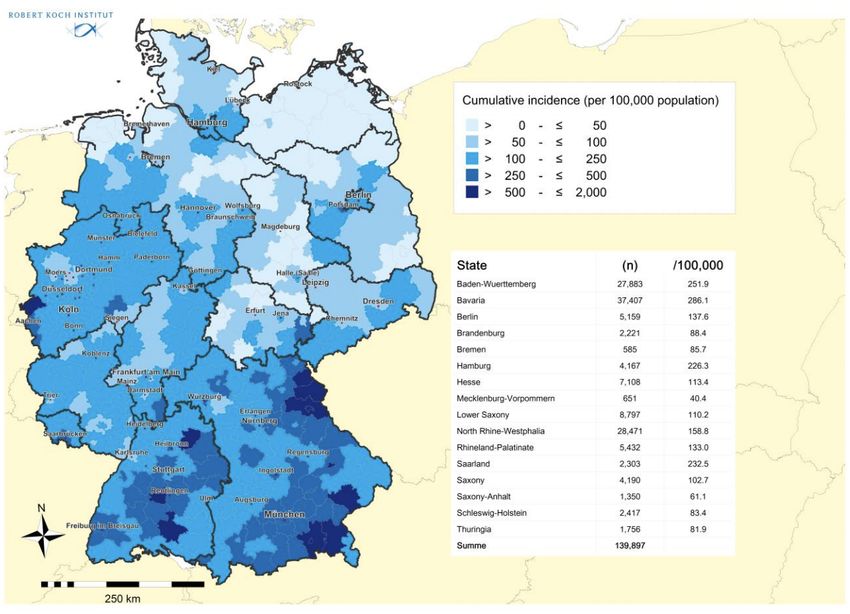
substantially delayed the epidemic peak and reduced the number of COVID-19 cases in Wuhan.
Furthermore, the authors show that if these restrictions are lifted in March 2020, a second peak of
cases might occur in late August 2020, and if the restrictions were to be delayed by 2 months, also
the peak would be delayed. In summary, the research shows that the measures put in place to
reduce contacts in school and work are helping to control the COVID-19 outbreak by affording
health-care systems time to expand and respond, and especially that authorities need to carefully
consider epidemiological and modelling evidence before lifting these measures to mitigate the impact

of a second peak.

1.2.2
1.2.3 Predictive Models used in Continental Europe
The German disease and epidemic control is advised by the Robert Koch Institute (RKI) within
the scope of a national pandemic plan. RKI is a German federal government agency and research
institute responsible for disease control and prevention. The RKI is a federal government agency
and research institute responsible for disease control and prevention, subordinate to the Federal
Ministry of Health. The RKI provides daily updates on the situation of the COVID-19 outbreak, as
well as projections and predictions on the future development of the epidemics. Specifically, the RKI
provides a dashboard with the number and geographical distribution of active cases, critical cases,
deaths and recovered patients, as well as a daily report. As the RKI is public, the common barrier
to data innovation stemming from the difficulty in getting modelers to speak to policy makers is
mitigated. This is a major factor in the success of German mitigation strategy. An example of the
charts produced by the dashboard is depicted in Figure 14.
Figure 14 – Cumulative incidence of COVID-19 by lander

Source: https://experience.arcgis.com/experience/478220a4c454480e823b17327b2bf1d4

What is very interesting, the RKI makes available on an almost daily basis the estimation of the
reproduction number, R, which is the mean number of persons infected by a case.40 The current
estimate is R= 0.8 and is based on current electronically notified cases (18/04/2020, 12:00 A.M.)
and an assumed mean generation time of 4 days. The development of the effective reproduction

number R for an assumed generation time of 4 days is depicted in   Figure 15.

40
  https://www.rki.de/DE/Content/Infekt/EpidBull/Archiv/2020/Ausgaben/17_20_SARS-
CoV2_vorab.pdf?__blob=publicationFile
Figure 15 - Development of the effective reproduction number R

Source:
https://www.rki.de/DE/Content/Infekt/EpidBull/Archiv/2020/Ausgaben/17_20.pdf?__blob=publicationFile

The vertical lines represent the policies carried out by the Federal Government, i.e. the cancellation
of major events in different federal states (with more than 1,000 participants) on March 9 2020, the
Federal-State Agreement on guidelines against the spread of the coronavirus on March 16 2020,
and the nationwide extensive ban on contacts on March 23 2020. There is a clear decrease in the
number over time.

Another interesting aspect is the Intensive Care Register, which to the best of our knowledge is a
case unique to Germany. The German Interdisciplinary Association for Intensive and Emergency
Medicine (DIVI), the RKI and the German Hospital Federation (DKG) have established the register
to document the capacities for intensive care as well as the number of COVID-19 cases treated in
participating hospitals. Specifically, the DIVI intensive care register documents the number of
available intensive care beds in the reporting hospitals on a daily basis. What is very interesting
about the register, and what makes it very precise, is the fact that a hospital location can have
several reporting areas: this gives the hospital locations the opportunity to report directly from
individual wards / departments.41 A map view with the number of free and occupied intensive care
beds & share of free beds in the total number of intensive care beds (Figure 16).

41
     https://www.intensivregister.de/#/intensivregister
Figure 16 – ICU capacity in Germany
Source: https://www.intensivregister.de/#/intensivregister
Another interesting collaborative effort is carried out by RKI together with the the Research on
Complex Systems Group (ROCS) at the Institute for Theoretical Biology and IRI Life Sciences at
Humboldt University of Berlin. The core of the data used come from RKI together with data from the
worldwide air transportation network (WAN).42 This network has 3893 nodes (airports) that are
connected by 51476 directed links (flight routes). Each link is weighted by the traffic flux between
42
http://rocs.hu-berlin.de/corona/docs/analysis/importrisk/nodes, i.e. the average number of passengers that travel each route per day.43 Specifically, the team employs a SIR-X model, in which the transmission rate changes over time, inspired by the assumption that susceptible individuals are continuously removed from the transmission process due to interventions such as social distancing, public shutdowns, quarantines, and curfews.44 This is complemented by an import risk model, which displays the likelihood of importing a case from an affected location to an airport or country distant from the outbreak location. This model is used to assess the If an infected individual boards a plane at airport A in an affected region, the relative import risk P(B|A) at airport B quantifies the probability that airport B is the final destination for that individual (irrespective of non-direct travel routes). Say, 1000 infected individuals board planes at Hangzhou Airport. An import risk of 0.2% in Germany means that, of those 1000 individuals, only 2 are expected to have Germany as their final destination. By mean of the model it has been possible to describe the situation at the start of the pandemic (see Figure 17). 43 The underlying network theoretic model is based on the concept of effective distance and is an extension of a model introduced in the 2013 paper The Hidden Geometry of Complex, Network-Driven Contagion Phenomena, D. Brockmann & D. Helbing, Science: 342, 1337-1342 (2013). 44 SIR-X model is described in detail here: Effective containment explains sub-exponential growth in confirmed cases of recent COVID-19 outbreak in China, B. F. Maier & D. Brockmann, Science, eabb4557, DOI: 10.1126/science.abb4557, (2020)
Figure 17 – Import risk at the beginning of the pandemics

Source: http://rocs.hu-berlin.de/corona/docs/analysis/importrisk/
Current import risk estimates for the top 50 countries (excluding Mainland China) at highest risk of
importation. The national import risk is the cumulative import risk of all airports in that country.
Countries with confirmed cases of COVID-19 at the time are depicted in red; the current number of
cases per country are listed on the right-hand side. The import risk model also provides information
on the most probable spreading routes from a location in the affected region, i.e. root node in the
air transportation network. Figure 18 provides an understanding of the distribution of import risk
and the most probable spreading routes from a selected set of airports in affected regions in Mainland
China.
Figure 18 - Distribution of import risk and most probable spreading routes

Source: http://rocs.hu-berlin.de/corona/docs/analysis/importrisk/

The tree represents the most probable spreading routes from the root node to all other airports in
the network, while the vertical length between nodes represents the effective distance between
airports.

Along the same line the COVID Mobility Project45 provides a general picture of mobility reduction in
Germany due to Covid-19 mobility restrictions. Specifically, the model depicts three phases:

        •    Initial drop in mobility: mobility fell to -39% below normal in mid-March 2020, after the
             majority of restrictions in Germany took effect.
        •     Slow recovery of mobility: in late March mobility slowly increased and finally plateaued at -
             27% in the second week of April. As restriction policies hardly changed during this time, this
             increase might be attributed mostly to a relaxing of self-imposed, individual mobility
             restrictions, paired with increased mobility due to warmer weather.
        •    Beginnings of an opening: starting April 20th, some mobility restriction policies have been
             lifted. We observe an immediate increase in mobility to -21% in the week starting April 20th.

Mobility flows of this kind are collected by many mobile phone providers. The team uses data from
the German Telekom, which is distributed by the company Motionlogic, as well as data from
Telefónica, which is analyzed and aggregated by the company Teralytics. This kind of data is
commercially available and is used, for example, by public transportation companies, for predicting
traffic or to improve road infrastructure. The live mobility monitor is depicted in Figure 19.

45
     http://rocs.hu-berlin.de/covid-19-mobility/mobility-monitor/
Figure 19 – Change in mobility due to COVID-19 Source: http://rocs.hu-berlin.de/covid-19-mobility/mobility-monitor/ Finally, a team of researchers (Hartl et al.) has measured the impact of the German public shutdown on the spread of COVID-19 by making use of data from Johns Hopkins University (2020), which links data from the Robert Koch Institute, the World Health Organization, and the European Centre for Disease Prevention and Control. Specifically, the researchers tested for a trend break in the cumulated confirmed Covid-19 cases by means of maximum likelihood.4647 They carried out a first estimation finding a trend break around 20 March.48 Their finding is that confirmed Covid-19 cases in Germany grew at a daily rate of 26.7% until 19 March. From March 20 onwards, the growth rate drops by half to 13.8%, which is in line with the lagged impact of the policies implemented by the German administration on 13 March and implies a doubling of confirmed cases every 5.35 days. Before 20 March, cases doubled every 2.93 days. In their update of the model they test the impact 46 Bai, J (1997), "Estimation Of A Change Point In Multiple Regression Models", The Review of Economics and Statistics 79(4): 551–563. 47 Bai, J and P Perron (1998), "Estimating and Testing Linear Models with Multiple Structural Changes", Econometrica 66(1): 47–78. 48 https://cepr.org/sites/default/files/news/CovidEcon1%20final.pdf
You can also read