Developing Visualisations to Enhance an Insider Threat Product: A Case Study
←
→
Page content transcription
If your browser does not render page correctly, please read the page content below
arXiv.org version of paper accepted at VizSec 2021

                                          Developing Visualisations to Enhance an Insider Threat Product: A Case
                                                                          Study
                                                            Martin Graham*                      Robert Kukla†                  Oleksii Mandrychenko‡                 Darren Hart§
                                                        Edinburgh Napier University       Edinburgh Napier University                   FortiNet Ltd                   FortiNet Ltd
                                                              & FortiNet Ltd
                                                                                                          Jessie   Kennedy¶
                                                                                                     Edinburgh Napier University
arXiv:2109.08445v1 [cs.HC] 17 Sep 2021

                                                Figure 1: Detail of a grid sub-view component of the insider threat visualisation. 24 hours of alerts subdivided by the policy violations
                                                that caused the alerts. Peak activity was at 2pm and primarily caused by the Monitor Suspicious Application Usage policy.

                                         A BSTRACT                                                                      accounts to their financial benefit. The sums stolen were relatively
                                         This paper describes the process of developing data visualisations             small (around $120,000 in Bitcoin), but temporarily knocked nearly
                                         to enhance a commercial software platform for combating insider                $1Bn off Twitter’s market value, and caused embarrassment and
                                         threat, whose existing UI, while perfectly functional, was limited in          inconvenience to the company and the figures whose accounts were
                                         its ability to allow analysts to easily spot the patterns and outliers         compromised. This type of attack is on the rise and estimated to
                                         that visualisation naturally reveals. We describe the design and               currently be the biggest single source of loss to cyber-criminality,
                                         development process, proceeding from initial tasks/requirements                coupled with ever-increasing penalties for the after-effects of losing
                                         gathering, understanding the platform’s data formats, the rationale            or leaking personal information. To this end it is necessary for
                                         behind the visualisations’ design, and then refining the prototype             organisations to be able to better monitor and control for potential
                                         through gathering feedback from representative domain experts who              insider threats, and we present work that utilises the strengths of
                                         are also current users of the software. Through a number of example            interactive data visualisation to help accomplish this goal.
                                         scenarios, we show that the visualisation can support the identified
                                         tasks and aid analysts in discovering and understanding potentially            1.1   Insider Threat
                                         risky insider activity within a large user base.                               Historically, the biggest challenges in the cybersecurity domain were
                                         Index Terms: Human-centered computing—Visualization—Visu-                      external in nature such as viruses in downloaded files or portable
                                         alization application domains—Visual Analytics; Security and                   media, denial of service attacks on networks, or hacks that took
                                         privacy—Human and societal aspects of security and privacy—                    advantage of hardware or software flaws. However, now an ever
                                         Usability in security and privacy                                              increasing share of threats come from insider sources, actions by in-
                                                                                                                        dividuals within an organisation that either purposely or unwittingly
                                         1 I NTRODUCTION                                                                compromise digital assets. A recent market report by Gartner [7]
                                                                                                                        indicates that an average insider threat incident costs over $11M for
                                         Last year’s Twitter attack [12] showed the potential severity of
                                                                                                                        the company impacted, a cost that has risen 31% in just 2 years, and
                                         insider threat when cyber-criminals coerced insiders to alter user
                                                                                                                        the number of such incidents has grown by an even greater amount,
                                            * e-mail: m.graham@napier.ac.uk                                             47%, over the same period.
                                            † e-mail: r.kukla@napier.ac.uk                                                 The first line of defence against insider threat is acknowledged to
                                            ‡ e-mail: omandrychenko@fortinet.com                                        be user education e.g. don’t accept files or click on URLs from un-
                                            § e-mail: dhart@fortinet.com                                                verified sources, and use strong authentication methods on accounts
                                            ¶ e-mail: j.kennedy@napier.ac.uk                                            and portable equipment etc, so that third parties cannot obtain cre-
                                                                                                                        dentials and misuse legitimate accounts. This, however, only covers
                                                                                                                        the risk of negligent and compromised exposure but not malicious
                                                                                                                        or coerced behaviour. This differentiation of ‘insider type’ is a
                                                                                                                        fundamental classifier in insider threat taxonomies, as seen in the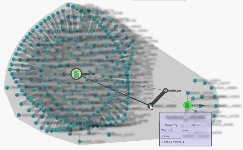
arXiv.org version of paper accepted at VizSec 2021

majority of surveys on the subject [22, 26, 31, 43] - though in the       Haim et al. [21] displayed a typical dashboard of ‘top tens’ of users
earliest work insider threat was seen solely as the act of purposeful     for current and cumulatively risky behaviour – this both aggregates
individuals [44].                                                         (events rolled up by user) and filters the data (top 10) such that the
   Further differentiation on malicious insiders can be made by as-       visualisation is not overwhelmed. Here, risk is a quantity calculated
cribing motivation to financial, personal or political ends – people      from the user’s triggering of numerically rated rules, the underlying
who are leaving an organisation (or who have already left without         engine being signature based.
having their credentials revoked) are seen as a particular risk, as           Visual analytic solutions aim to both improve the analysis and
acknowledged by Homoliak et al. [22] in their 5W1H framework.             visualisation of data, with the ambition being that together they can
Here, as in most frameworks regarding insider threat, it is the user,     be more than the sum of their parts. Recent work has looked at
their psychology and their actions which are the focus of attention       general event analytics and event sequences in particular as a worth-
rather than the technology - all the surveys referenced here with the     while avenue [6, 30, 39], with Adnan et al. [2] exploring methods for
exception of Salem at al. [31] consider psychological drivers for         identifying both sequences and unordered sets of events. The focus
at least malicious behaviour, and for some work [18, 42] it is the        on event sequences both in the analysis and visualisation phases
primary focus. Recently, work [19] has also looked at various meth-       indicates that the temporal ordering of events is seen as important
ods of ingraining mitigation strategies into corporate culture, such      – accessing a sensitive file and then removing a pen drive is not as
as double-checking work and pair programming, but this obviously          noteworthy as the other way round. Arendt el al. [3] built a visu-
comes at a larger cost in human resources.                                alisation over the CERT insider threat dataset [48] that displayed
   Technical approaches as used in UEBA (User and Entity Be-              compressed (and hence aggregated) event sequences, which them-
haviour Analytics) systems are a vital, complementary element in          selves emanated from a guided machine learning analysis of event
tackling this risk. The two main technical methods used for detecting     data. Their visualisation combined glyphs and co-ordinated multi-
insider threats are signature/misuse and anomaly-based detection.         ple views with sorting, filtering, and searching capabilities to help
The first uses rules that are triggered when actions meet certain         analyse the compressed sequences.
thresholds, e.g. they occur outside normal working hours or access            The most ambitious body of work relevant to insider threat visu-
particularly sensitive resources. An immediate advance on this is to      alisation is associated with the EU DiSiem Project [2, 9, 10, 35–37].
have rules triggered on given sequences of actions. Almost from the       Here, researchers explored novel avenues of user behaviour analy-
technique’s conception, it has been acknowledged to produce over-         sis such as sequence mining with subsequent clustering [37], topic
whelming numbers of false positives [11], thus looking for the truly      modelling of event sequences [9], and topic modelling fused with
dangerous event is a needle in a haystack operation. The second           hierarchical user profiles (user roles/groups) [36]. Each has an as-
method works on the assumption that potentially dangerous insider         sociated and detailed visual interface with multiple views including
activity is indicated by actions outside the norm for a user or their     overviews and timelines, and the ability to drill-down/aggregate,
role or account [29] - though malicious insiders will try to cover        filter, search and re-analyse data. All are designed to fulfil tasks
their tracks. Knowing this, the aim is then to efficiently find that      elicited first-hand from cybersecurity professionals. Here the data
activity that is outside the norm, by comparing actual to ‘normal’        was not insider threat data as such, but events generated on a single
activity either through rules or structures of increasing complexity      login and security server by whoever accessed it.
or, latterly, data mining [2], machine learning and deep learning             Further to this research, it is notable that other commercial insider
techniques [51]. Still, the vast amount of this anomalous activity        threat products tend to be unadventurous in the types of visualisation
also turns out to be benign.                                              employed - pie charts and bar charts abound in a typical dashboard.
   As both patterns of violation and one-off violations can be indica-    This is not automatically a bad thing, keeping it simple is a sound
tive of real insider threats and, when appropriately designed, one        strategy but these visualisations tend also to focus on high-level pat-
of the great strengths of data visualisation is to reveal patterns and    terns and revert to text-hunting for details. A few do employ more
outliers in data, then visualisation becomes a natural technique to ex-   advanced visualisations, and while some of these have a tendency
plore and analyse insider threat. While academic research prototypes      towards being marketing visuals (i.e. 3D networks) and chart junk,
have investigated advanced visualisations for insider threat datasets,    Securonix [45] and Splunk [49] in particular have both shown exam-
commercial software has been slower to adopt requirements-based           ples of techniques such as Sankey Charts, treemaps and radial charts
visualisations beyond the standard dashboard of pie and bar charts.       within their products. Both though tend towards being fully-fledged
This paper thus describes the work involved in introducing visual-        SIEM products and it is hard to tell how and why they arrived at
isation techniques into FortiInsight [16] - a commercial software         using these particular visualisations.
application that allows cybersecurity analysts to monitor and detect
                                                                              It must be noted that the visualisation work surveyed here focuses
potentially dangerous user actions.
                                                                          almost 100% on event data emanating from user actions - the other
                                                                          strands such as social mitigation or education aren’t integrated. Haim
2   BACKGROUND                                                            et al. [21] do mention sharing information with other organisational
Specific work on insider threat visualisation has progressed from         departments such as Human Resources (with the assumption being
early work by Colombe and Stephens [11], through applications             to increase a user’s risk if they are under disciplinary action or is
of data visualisation for specific insider threat detection methods       due to leave shortly), but little or no mention is ever made of a user’s
[21, 34], examination of the further challenges [28], and onto full-      psychological state, primarily because that is much harder to capture
bodied visual analytic approaches that take fresh approaches to the       and evaluate, both ethically and technically.
data analysis as well as the visual representations [10, 36, 37].             In summary, the documented work closest in nature to ours is that
   Data visualisations are obviously dependent on the type of data,       of the DiSiem Project, but there are several important distinctions.
which in turn is decided by the type of insider threat detection          Firstly, we are not re-analysing the data but interpreting it as is from
employed and the raw data it in turn works upon. Nance and Marty          a source database, where events have already been judged against
[34] used role-based data to build a bipartite graph composed of          criteria to determine their elevation to alert status or not, and we
users and resources, and by visualising the graph can reveal those        are focusing on the policy alerts only. Secondly, the dataset we
combinations of user and resource interaction that are rare and/or        use derives from not just one server but from many thousands of
unexpected for a given user’s role. The graph visualisation is a          endpoints - roughly the same number as we have users. Thirdly,
natural aggregation such that each edge can represent multiple events     we have a larger array of possible event combinations compared to
and scales much more elegantly than displaying individual events.         DiSiem’s higher-level vocabulary of roughly 300 possible operations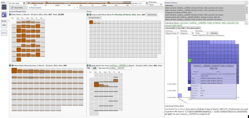
arXiv.org version of paper accepted at VizSec 2021

on a login server - ignoring users and timestamps, each of our events      a commercial setting where well-intended barriers are established
is still a combination of any resource (file or drive), any particular     between development and sales, and the purchasing customers are
application, any of thousands of endpoints, and a CRUD operation.          often not the same people as end-users, or even in different organisa-
This differentiation also holds with the work by Arendt et al. [3],        tions if sold via software resellers.
who acknowledge that in practice real datasets are likely to contain
many more unique actions than the CERT dataset they employed.                 Fortunately, cybersecurity literature exists that elucidates tasks
In practical terms, this means our data is much less amenable to the       and Kerracher and Kennedy [24] show that it is acceptable to derive
sequence mining those approaches utilise.                                  tasks from literature if the domain terminology is understood and a
                                                                           similar problem is being tackled (in this case, detecting / assessing
3 D ESIGN                                                                  insider threat). With that in mind, we reviewed papers that covered
3.1 Glossary                                                               cybersecurity visualisation, insider threat analysis and event ana-
                                                                           lytics that specified appropriate tasks we considered amenable to
To aid comprehension, in Table 1 we give terminology which we              visualisation [3, 13, 15, 21, 27, 28, 36–38, 40, 46] to collate a list of
aim to use consistently throughout the paper.                              candidate tasks. This gave us over 80 tasks, many of which were
                                                                           going to obviously overlap, eg. Legg [28] had ’Find user perform-
                          Table 1: Glossary
                                                                           ing activity at unusual time’, and Arendt et al [3] had ’Do events
    Term           Meaning                                                 occur outside normal working hours’. Often the difference was
    User           Or more correctly, a user account. An actual            merely terminology - ’See alerts that occur around the same time
                   human can have access to more than one user             as a specific alert’ v. ’Study antecedents or sequelae of an event of
                   account, and more than one person could ac-             interest’. Therefore, we used Brehmer and Munzner’s [5] abstract
                   cess the same user account (a possible insider          visualisation task typology to classify them by what each task did
                   threat!). Typically though it is a one-to-one           (the why typology) to aid finding replica tasks, and then merged
                   relationship between accounts and users.                these similar tasks into a single item described with a consistent
    Event          An action performed by a user such as open-             vocabulary, which then placed them into natural categories such as
                   ing or copying a file, or inserting a USB stick         View, Compare, Find, Generate and Summarise. At the end of this
                   that is registered by the software. An event            process we had roughly 20 visualisation-amenable tasks along with
                   generally contains the endpoint, user, time,            a few more general usability-oriented tasks such as history, report
                   application, resource and CRUD action - i.e.            generation and extracting data for further processing.
                   user account Bill on endpoint WORKPC1
                   used Word to create file top.docx at 11:03.                To explore which of these were considered relevant by analysts
    Policy         A pre-defined rule that an event can be judged          we made contact with the cybersecurity group of a large customer
                   against. May contain multiple (AND) and                 of the product and obtain permission to send them a short survey
                   disjoint (OR) clauses.                                  and an interview with the group leader. The survey simply asked
    Anomalous      An event that is markedly different to normal           respondents to rank the tasks on a scale of 1-5 for perceived use-
                   given a user’s past activity as assessed by an          fulness and, while there weren’t enough responses (eight) for any
                   AI component.                                           rigorous statistical validation, some patterns did emerge. Firstly, it
    Alert          An event that is anomalous or satisfies a               was noted that the comparison tasks were ranked bottom across all
                   policy definition is upgraded to alert status.          the responses. The group leader explained this: the bulk of their
                   Multiple closely timed events that meet this            work was watching for users triggering their policy settings on a
                   threshold may be aggregated into one alert.             day-to-day basis and they were interested in which users did this,
    Endpoint       A device on which event capturing software is           when, and what they were doing. It was interesting to see who was
                   installed. Typically a PC, but also can encom-          causing the most alerts as that is obviously an indicator of where
                   pass servers and printers. Users and endpoints          more risk can occur, but this was seen in an absolute rather than
                   are generally one-to-one but not always.                comparative sense. Only in limited circumstances would they be
    Analyst        A person who analyses and explores the event            interested in specifically comparing user behaviour, though seeing if
                   and alert data sets. Analyst is used in this text       a user triggered more alerts than normal was rated slightly higher.
                   to distinguish this role against the user who is
                   the person whose actions are being monitored.              The interviewee also stated that they valued the policy alerts over
                                                                           the AI alerts. The policies had been set up at least partly by the
                                                                           analysts themselves so they understood why and what triggered
                                                                           them, whereas the AI alerts appeared as a black box - it was difficult
3.2 Methodology
                                                                           to understand why the AI engine was flagging certain events as alerts
We proposed to develop the visualisation using a tried and tested          and not others.
methodology that had worked previously. Firstly, collate the ana-
lysts’ tasks/requirements, understand the data and get a feel for how         Of the non-comparison tasks, it appeared that the View and Find
the analysts worked. From this we could design specific visualisa-         categories were held in highest regard (see Table 2), and none apart
tions to accomplish specific tasks and confidently expect to construct     from ”View role-orientated or task-orientated visualisations” gained
an interface that fulfilled the analysts’ needs. Iterative feedback and    less than an average score of 4.0 or were outside the top half of the
interaction with real analysts would keep the work on track and stop       rankings. Again though it must be stated that this was a very small
the development moving off at a tangent to real needs.                     sample. Extracting data tasks were also rated in the top half, as the
                                                                           analysts explained that after potentially risky alerts / users / activity
3.3 Requirements                                                           were identified and explored the next steps tended to require passing
Collecting analyst tasks that the visualisation should fulfil was ini-     on this data to other tools or people including Human Resources.
tially planned as a direct user-facing exercise, but this had to be        This however is an operation that the existing software can do already.
dropped in the face of Covid restrictions. We already faced the prob-      Of these we decided to concentrate on the View and Find tasks as
lem of access described by Grudin [20] who decades ago established         they were particularly amenable to visualisation and we label them
the difficulties of attempting to engage actual end-users from within      as T1-8.
arXiv.org version of paper accepted at VizSec 2021

       Table 2: Top rated tasks extracted from previous literature
                                                                            the analysts, and after this a hard limit of 100 events per alert had
  Score     Task                                                     ID     been enforced.
  4.63      View details of specific user, event or alert            T1        Later, and using the prototype itself, we found one particular user
  4.63      Find user performing anomalous activity                  T5     account had caused over 100,000 alerts just by itself. This turned
  4.57      Extract a specific user’s typical activity                      out to be a pseudo account that was firing the same alert repeatedly
  4.50      View events/alerts ordered by selected attribute         T2     on the same application, starting after a particular date.
            (time, type, user etc)                                             It was agreed that the problematic date ranges and the pseudo-
  4.50      Understand extracted anomalous events                           account could be excluded from the visualisation using a set of
  4.50      Find events of interest (by time, type, user etc)        T6     appropriate clauses that were applied to all queries. This eliminated
  4.38      View relationships between users / events                T3     both the extreme spikes in weekly activity and the overloaded alerts.
  4.33      Understand extracted frequency of events                           Data Shape Following this cleaning we re-analysed the data,
  4.25      Find proximal events to a specific event for the         T7     and saw that over 13,500 users had caused at least one alert over the
            same user                                                       course of the dataset, but there was an obvious long tail distribution.
  4.25      View different data facets (users, events, alerts,       T4     Even within just the top 100 users, the top user had triggered 30
            locations etc)                                                  times more alerts (14,000 vs. 500) than the 100th placed user. The
  4.25      Combine different data facets (users, events,                   general pattern of a roughly logarithmic distribution of events per
            alerts, locations etc)                                          alert was also observed, even after excising alerts with 1000+ events,
  4.25      Find deviations from required/typical pattern of         T8     and most alerts (66%) contained only a single event. Also, when
            activity                                                        multiple events were bundled into the same alert they always con-
  4.25      Summarise a specific user’s current or past ac-                 cerned the same user, endpoint and application, while actions and
            tivity                                                          resources could vary. It was also noted that most of the alert/event
                                                                            properties were categorical in nature, only a few such as the temporal
                                                                            attributes and severity/confidence scores were naturally continuous
3.4     Dataset                                                             or numerical.
The dataset in this paper was used with permission from an existing         3.5   Interface & Visual Design
product customer with a userbase of over 15,000 individuals. It
comprises of an ElasticSearch [17] database with nearly 900,000             The final interface for viewing the policy alerts has a number of
policy alerts collected through a period of eventually over 2 years         related sub-views as shown in Fig. 2, in a division that roughly
(27 months). Each alert contained the array of raw events that              fulfils operations according to Shneiderman’s mantra [47]. We
had triggered the policy, along with the time it was triggered, and         deliberately tried to keep the visual design and properties simple
policy-specific information such as the name and id of the policy and       and not introduce visualisations simply for the wow factor, as the
associated severity (a pre-determined measure of how dangerous the          analysts were used to the product’s current interface of bar and line
analysts considered triggering the policy to potentially be). As this       graphs and trying to keep some familiarity was viewed as helpful.
is a confidential data set it unfortunately cannot be openly shared.
                                                                               Overview - High Level The top view (Fig. 2A) shows a his-
                                                                            togram of the entire 2+ year dataset, aggregated by week, which acts
              Table 3: Common event and alert attributes
                                                                            as an overview. A user-defined brush within this histogram acts as a
      Event Attributes                                                      control to set a sub-range of dates for the rest of the interface, effec-
      Who                User                                               tively acting as a zoom on the overview. This view itself indicates
      What               Application, Resource & Activity                   particular weeks that are outliers in terms of number of alerts (T8) -
      When               Start & End Time                                   on one of the revised data snapshots, it helped reveal a policy / user
      Where              Endpoint                                           combination that was generating 90% of all alerts after a given date.
      Alert Attributes
      What               One or more Events                                    Overview - Aggregated Views Below this top view are sub-
      When               Alert Time                                         views showing data that falls within the zoomed date range (Fig. 2B).
                                                                            At this scale the number of alerts is still large so aggregated counts
      Why                Policy (Policy Breach) or Tag & Confi-
                                                                            of alerts are represented rather then individual alerts. Grid views
                         dence (AI Detection)
                                                                            comprise of a number of squares - each square representing a unit
                                                                            of aggregation, the unit depending on the particular make up of the
                                                                            grid, with a particular ordering. Within each grid a redundant visual
3.4.1    Data Profile                                                       encoding of bar size and colour saturation is used, both increasing
Initial analysis of the alert database with Elastic’s interactive Kibana    with the number of alerts. Each grid can have restrictions in that it
[25] GUI revealed both data quality issues and some global features         may be limited to a certain time range or just one day, or report on
of the data:                                                                alerts for just one user rather than all users. The current combinations
                                                                            that are employed are detailed in Table 4.
   Data Quality Firstly, there were large spikes in alert totals in            The design can be considered simply as a bar chart that wraps
the first weeks of the dataset and around October 2020 - one week           columns rather than continuing as a single horizontal line - this
alone accounted for 140,000 (20%) of all alerts. Discussions with           allows weekly or day of the week patterns to be observed when set
an analyst revealed this to be caused by issues setting up the policies     up as a calendar-like view, and a space saving device when showing a
initially and later with introducing a new policy.                          grid ordered by alert count. The ’Daily Top Users by Policy’ and ’24
   Secondly, a few of the alerts contained over a thousand events           Hours by Policy’ combinations show the data in a manner analogous
each, again all occurring within the first few weeks of the data            to a stacked bar chart, but ’exploded’ such that each row/series can
set, which again was put down to the same teething difficulties -           be judged by a baseline rather than the trickier comparison of trying
most were caused by long-playing video files which caused events            to compare sub-parts of the stack by length [50]. In this manner the
to repeatedly fire as the user continued to watch it and were then          analysts can see the worst days, the worst users (T2, T5 and T8) and
bundled up into the same alert. This had been previously noticed by         particular combinations thereof.
arXiv.org version of paper accepted at VizSec 2021
A
B
C
D
Figure 2: The FortiInsight visualisation explorer. Some details have been redacted for customer confidentiality. The top bar (A) shows a weekly
aggregate of alerts, the three grids in the top left (B) show varying aggregations of the current day’s alert activity, the right-hand side (C) shows
individual alerts from a chosen aggregation element and the bottom left (D) shows a grid and network view of past user and resource interactions.
Table 4: Grid view combinations
View Name Agg. Unit Order Filter
Calendar Day Day Day Range
Daily Top User Alert Count Single Day
Users
Historic Top User + Alert Count Day Range
Users Day
Single User Day Day Day Range &
Calendar Single User
Daily Top User + Alert Count & Single Day
Users by Policy Policy Severity
Policy
24 Hours by Hour + Alert Count & Single Day
Policy Policy Policy Severity
Targeted Day Day Day Range,
Calendar Selected Users
& Resources
Details-on-demand - Facetplot Selecting a grid square will
then retrieve the individual alerts that aggregation represents and
show them in the facet plot (Fig. 2C), which acts as a detail view. Figure 3: Calendar grid, showing alerts per day for the selected date
This is essentially a categorical scatterplot where two selected prop- range.
erties from the alerts and their bundled events can be used to plot
the alerts on the X and Y axis in groups. This approach was chosen
as the majority of data attributes were categorical and a traditional
scatterplot would have displayed a lot of overlapping elements at with another scale showed people attached a ’danger’ meaning to
a few discrete points. We did consider the use of N-dimensional anything marked in that colour. An attempt at utilising the facetplot
visualisation techniques such as parallel coordinates [23] and scat- as a UMAP-based [33] Multi-Dimensional Scaled plot was rebuffed
terplot matrices, but the mostly categorical nature of the data would by the analysts (see 4.1).
have had led to the same drawbacks as with the single scatterplot. A This view fulfils T1, T4, T6 and T7 - the analyst can segment the
third property can be selected to colour the alerts with a graduated data by different attributes (T4) and then find alerts of interest by
saturation of a single hue (blue) for continuous properties and a de- those attributes (T6). Finding proximal alerts is simply a matter of
saturated colour scale for categorical properties - this last was chosen seeing which other alerts are grouped with, or grouped nearby to a
to avoid a bright red option, because an early internal demonstration given alert (T7). A tooltip can reveal exact details of an alert, and aarXiv.org version of paper accepted at VizSec 2021
small text panel underneath shows details for a selected alert (T1). to be a rich source of information. Each group generally had up to
three analysts, plus a researcher leading the group, and occasionally
Relate - Node-Link View Selecting an individual alert will also
a developer who helped with context and terminology.
send the alert details to a node-link view (Fig. 2D), which reveals
which other users were involved in alerts with the same resource, 4.1 First Focus Group
and in turn which other resources were involved in those alerts. As
this view was specifically meant to show relations, a node-link view The first focus group used a dataset of 130,000 AI alerts covering
was a natural fit to this information. a single month - these are similar to policy alerts with, instead of
Nodes are distinguished by type using a redundant combination of a policy name and severity, a tag string indicating what aspect of
colour and icons and sized on a logarithmic scale by the number of the event caused the AI to trigger an alert, and a confidence rating
alerts the user or resource is involved in. Edges are drawn as simple as to how sure it was that the event is anomalous. The focus group
lines with thickness correlating to the number of alerts between a reported that using date and user as the initial units of investigation
user and resource. Hovering over a node will highlight related edges was a correct thing to do - it is after all users that are the ultimate
and nodes, and hovering over an edge will highlight related nodes. source of insider threat, not applications or CRUD operations. They
Direct selection of a node will populate a final grid view with the also noted that temporal patterns in the grid widgets were easier to
daily history of alerts for that user or resource. If an edge is selected spot than in the regular product interface.
only alerts involving both the user and resource are plotted in the “It’s useful to see a person has triggered this on multiple oc-
grid view. This grid view in turn can be used to select aggregations casions, across different days, because that could lead to patterns
to send back to the facet plot. Trying to find a particular node in a – in aggregate might not see user has been up to stuff on multiple
general node-link view is often a laborious task, so there is also the different days and what the pattern is”
option to regiment the layout - here the nodes are laid out in rows
and columns by type in alphabetical order, as in Fig. 2D. “that’s what the system’s meant to do, absolutely should be the
The view satisfies T3, as analysts can now see the relationships focus of it – you could filter on just certain types of event too on top
between users and resources - the main attribute of further interest of users” (Focusing on the individual)
when dealing with alerts (see Section 4.3 for the discussion on why
They also stated their wish to quickly select a specific individual
resource acquired this status, rather than endpoint or application).
which reflected task T1.
History - History View A history of actions within the interface
is recorded and shown as a list. Selecting an entry within the list will “We could be investigating a particular user and the ability
return the visualisation to the state those settings represent. Branched to enter that person’s id and see on a page what has that person
histories are also supported: items from which divergent exploration doing for the past 24 hours / 7 days / 30 days example and tailored
paths are started are shown as tabbed selections - selecting a tab towards that specific user, rather than the overall picture of our
reveals the list of actions continuing on from that point. We also whole estate”
designed the application as a single page app - panels could be “What *** suggested, just drill down to one user and see quickly
hidden or expanded if needed for more detail - and between this and have they written anything to usb and then deleted it, or used a usb
the history view, returning to a previous point in exploration became in general, things like that if you suspect a specific user”
much easier than in the products’ existing UI.
However it was at this point we discovered their underlying con-
Filter While the brushed range in the overview acts as a zoom, it
cerns about the AI alerts - they were not sure exactly why they were
can also be considered a temporal filter. The ability to select subsets
being fired and the overwhelming number of them was also a con-
of alerts from the aggregate views to forward onto the facet plot
cern. 130,000 alerts over a single month was roughly 5-6,000 per
are also implicit filters. Further to this, it is also possible to filter
working day, and shared between 3-4 analysts was 1,500-2,000 each
on individual policies if only some are currently of interest, and to
per day - it was easy to see that for each analyst investigating 200
select one particular user to focus on. In this sense, these filters help
alerts an hour, or 3 a minute, wasn’t feasible. Even if the confidence
satisfy T6 as they enable the analyst to focus on alerts of interest by
rating was used as a filter (there were many more low-ranked con-
user, time or policy.
fidence than high-ranked confidence alerts) the debate returned to
3.6 Implementation whether they were the truly worrying alerts, or just the most anoma-
lous. It was at this point that they stated their preference for policy
The visualisation was built as a single-page web application using alerts, and the focus groups after this used the policy alert data set
D3 [4] and Angular, with D3 being used within individual sub-views previously described.
to display the data and Angular performing the macro-level commu-
nications and control between the sub-views. The web application “The policy stuff is good because they’re absolutes and if you’ve
obtained data via a bespoke API layer which formed a shim over an created that criteria you obviously want to know about that specific
ElasticSearch database. action happening, whereas the AI’s a bit more black-box kind of
thing – we don’t quite know what’s caused that to happen.”
4 A NALYST F EEDBACK
“Yes, because that’s what (other colleagues) spend their time
We have been in touch regularly with the customer’s analysts to investigating on a daily basis. The AI is more of a black box.”
run remote focus groups which have proved vital in shaping the
development of the visualisation. Such domain experts are the gold This isn’t due to any peculiar kind of reticence on their part -
standard for evaluation: willing cybersecurity students could be A Gartner Market Report from 2018 [41] states that “Contrary to
employed but lack the experience of employed analysts, and the many vendor claims, UEBA solutions are not ’set and forget’ tools
analysts have the further motivation that they are being presented that can be up and running in days. Gartner clients report that it
with something that could well form part of their day-to-day work takes three to six months to get a UEBA initiative off the ground and
in the future rather than just an interesting diversion. Using Mazza tuned to deliver on the use cases for which they were deployed. This
and Berrè’s [32] focus group template as a guide we gave remote jumps to 18 months for more complex insider-threat use cases in
demonstrations and then asked pertinent questions about how they large enterprises.”
felt the visualisation aspects worked and whether it was doing what Interestingly, when demonstrating the facetplot, we were aware
they expected. General feedback was also solicited, which turned out that trying to find patterns by trialling different combinations ofarXiv.org version of paper accepted at VizSec 2021
alert properties to attach to the axes could be laborious and time- mounted – that’s what we use to create the policy. But I think those
consuming, so we explored using multi-dimensional reduction three, endpoint, user, resource are the things we use more.”
(MDR) to produce a two-dimensional view of alerts over the full
dataset and property range. UMAP (Uniform Manifold Approxi- At this point we had also introduced a small timeline for selected
mation & Projection) [33] is a recent MDR technique which has users showing when in a 24-hour period they had triggered alerts.
proven to be computationally faster than other techniques [14] and However, the analysts stated that it was out-of-hours alerts by policy
was thus chosen to demonstrate the process. The UMAP algorithm they were more interested in. For instance, one policy relating to
would be run over the alerts’ properties and two extra numerical sexual content was viewed as much more noteworthy if it triggered
fields, UmapX and UmapY, were returned which would be used to alerts outside normal working hours - within working hours there
arrange the facetplot visualisation. However, the feedback from the were some staff working on issues around sex education so some
analysts was less than positive as, like the AI alerts, it didn’t explain alerts could be explained at that time but less so at 3am in the
why certain clusters appeared, the result was just given as bald fact. morning. Therefore they said it would be more useful to see an
Setting the colour variable could show how individual properties hourly breakdown of alerts by policy. Essentially though, it was for
were distributed but also still didn’t explain why. Their preference the analyst to examine the details of the alert and decide if it was
instead was to recommend setting up default choices for the axes benign or required escalation.
using the properties they considered the most discriminative. By now, we had a better understanding of the threat-hunting
aspect of the work: find a peculiarity on a particular day, and then go
“In what way are they similar? I can’t see a lot of use for this, back and see if any of the entities involved - user, endpoint, resource
without a lot more explanation of why clustering happens. Unless - had anything interesting to show in their past activity.
we were looking for something very specific – like we knew an
alert for ransomware existed, what was similar – but very specific 4.3 Third Focus Group
circumstances” Taking the previous feedback we developed a node-link graph view
“The tagstring right away, I want to see what caused these spikes, showing which users accessed a selected endpoint, and then in turn
I would leave the configurability in place though people might want which other endpoints they had accessed in their other alerts, and
to use different options depending on situation” showed this as the main point of the third focus group. Here though,
while the effort was appreciated the analysts commented having
4.2 Second Focus Group seen it in the flesh, they would prefer to see resources in such a
view instead. Endpoints were mainly one-to-one with users and only
Overall, the opinion from the first focus group was that the visual- endpoints which were servers would show accesses by multiple users.
isation was a definite improvement over standard commercial UIs It was also explained that while some computers were hotdesked in
for insider threat products. Taking their feedback into account, we offices, Covid guidelines meant people were sitting at home with
re-designed the interface to refocus on the policy alert dataset and to laptops and not sharing PCs.
have a mode that started on a particular day to fit with their dominant
method of working - triaging new alerts on a daily basis. This was “I think it would be more for resources than endpoints, because
demonstrated at a second focus group which concentrated on how usually if an endpoint is used by many people it is a shared computer
useful the visualisation could be for the analysts’ day-to-day work. or a server, usually most people have their own computers, so we
We demonstrated the grid view where the top 50 users were laid would be more interested in seeing for resource, who’s accessing
out in columns and the policies in rows, and explained this showed that resource or who’s doing something with that resource and not
not only which users or policies were the most troublesome but who’s using that endpoint. I mean, sometimes, maybe we would use
also the combinations thereof. The analysts’ opinion was that if this, but it’s more for resources – most of the laptops we have are
one policy is dominant their attitude is that the policy is probably personal”
over-sensitive rather than hundreds of employees are up to no good.
For example, a policy relating to playing mp3/mp4 files was the “There are hotdesk machines, at the moment everyone has their
cause of most alerts on many days, but this was explained as people own machine, I don’t know what will happen to them once we return
listening to their own music while working - especially as the bulk to the office”
of the customer’s office-based employees were working from home The analysts also commented that they didn’t particularly need
due to covid guidelines. The analysts would probably then tighten to know who had accessed a resource or endpoint first. We had
the terms of that policy to reduce the number of alerts it caused. implemented a grid view of days against users that showed when
“For that policy, it shows it maybe triggers too much, everyone users had accessed an endpoint and an alert had occurred, and while
is working from home and playing music or something” one analyst commented it did give more information it was in general
a very sparse matrix with very small individual elements. This hinted
On a visualisation specific note, one analyst noted they would that this view’s space would be better allocated to other information.
expect the policies to be ordered by their assigned severity, rather
than the count of alerts they triggered. This is because they stated 4.4 Fourth Focus Group
they were more interested in policies that fired a few times but were
At this iteration we had taken what the analysts said about see-
ranked as having a high severity, as opposed to a low severity policy
ing the relationships between resources and users into account,
that produced more alerts.
and set up the node-link graph to work with resources. This im-
The analysts said the historical view of the entire dataset was
mediately made for a more interesting view of the data as users
interesting, but when they went looking for historic policy data it
alerted on many more individual resources than endpoints, including
would be with a specific target in mind, such as a user or resource,
the fact that each alert could involve multiple resources. Unlike
rather than for an overview of general patterns - and that specific
endpoint IDs though, which are short consistent alphanumerical
target would be because of something revealed in the current day’s
strings, resources were typically filepaths that caused problems with
data. In that sense, historical data would be useful if restricted to
naive searching e.g. ’C:/Users/John/wscript.exe’ wouldn’t match
a specific user - or in a list of decreasing probabilities: a specific
’C:/Users/Janet/wscript.exe’. We introduced a ’permissive’ mode
resource, endpoint or application.
where the search query matched just on the filename segment of
“The useful ones for us would be user, endpoint, application, the filepath so users who had accessed a resource with the same
resource. Activity sometimes because it tells us when a USB is filename would be included in the network.arXiv.org version of paper accepted at VizSec 2021
Secondly, we demonstrated a history function that showed the has alerts involving that resource, which over the time period 1st
ability to detail and restore past states in the visualisation. Thirdly, March - 26th April involves nearly 200 users on wscript.exe (T3)
and finally following up the final bits of feedback from the second (see Fig. 5), the permissive toggle has been set on the filepath so
focus group, we dropped the small user timelines and introduced a system32 / win64 etc versions all report back). In summary, it shows
further grid view of hours of the day versus policies for alerts - this that wscript.exe triggering an alert is not an uncommon activity.
showed the 24-hour pattern of alerts by policy the analysts had said
they’d be more interested in than by user.
The reaction to all was much more positive than in the previous
meeting, especially for the user-resource graph and the history func-
tionality. This was especially pleasing for the node-link graph, as
we had wondered at the start of the project about how the analysts
would respond to novel (to them) visualisations.
Figure 4: A grid view showing the top 50 alerting users (identifiers
“I think the resource thing could be really useful, because basi- redacted) for a given day, sub-divided by policy. The most severe
cally I think where we told you last time that we would need – that policies are at the top, and the top row and left column show totals.
many times someone asks us like, who has accessed these and we
will have to like do the search and threat-hunting and it takes a long
time, so I think seeing it like this - and also seeing the same person,
like the same people, are using that resource, what other resources
are they like using, maybe they’re related, I think that one’s useful,
yeah”
The reaction to the history function was also markedly positive.
”Yes, it would be useful sometimes, because you start doing an
investigation and maybe 20 minutes later you’re still doing the same
but you don’t remember how you got there so I think it’s useful to
know this led me to that other thing and that’s how I got here. I think
that would be yeah. . . ”
Finally, the analysts said that the use of alert IDs in the interface
wasn’t useful, unsurprisingly as they are random hexadecimal strings.
This was most obvious in the history view as alerts were described by
id, so after the focus group they were quickly replaced by username
and alert time. An option for a user to annotate important history Figure 5: Node-link view showing the other users who have triggered
items with their own descriptions may also be beneficial. alerts on versions of wscript.exe. One user sits between the obvious
clusters having triggered alerts on two versions.
5 C ASE S TUDY
To show how the visualisation as designed can support the tasks
identified earlier, we present three example scenarios: 5.2 USB Stick Use
One of the scenarios that the analysts said they were particularly
5.1 Daily Activity interested in were low occurrence but high severity events. In the
The most common scenario for our analysts would be to login in the last scenario, it can be seen in the 24 Hours by Policy View (Fig. 1)
morning and see what activity had occurred in the previous day. For that while the number of alerts is dominated by two or three policies,
this we constructed an interface that was setup with three grid sub- the most severe policy category - someone of interest using a USB
views: Daily Top Users, Daily Top Users By Policy and 24 Hours stick - triggers only three times, all for the same user.
By Policy. The first two differed in that the second sub-divided user Selecting this grid item produces just three alerts in the facetplot,
alerts by policy at the expense of needing more space and thus being so no slicing or dicing is possible here, but the tooltip reveals that
able to show less users (50 compared to 300 for Daily Top Users). the resource is now a descriptor containing USB volume GUIDs
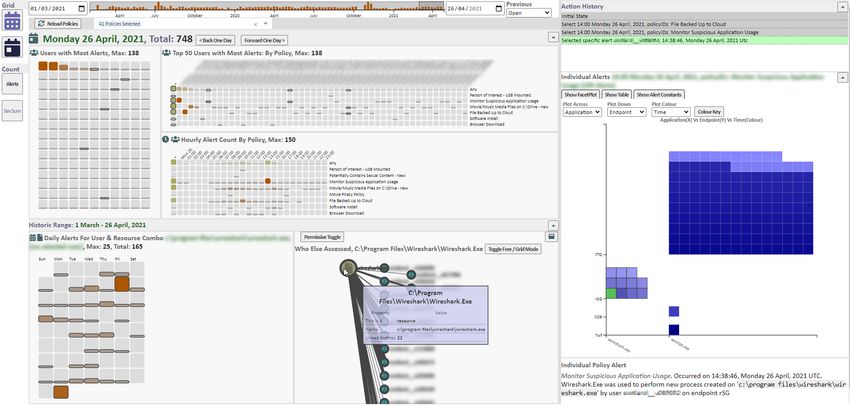
Taking as an example the last day we have data for, the 26th April, rather than a filepath. The analyst will now want to know how
we can see there are three users who immediately stick out as the often this user has been accessing this USB stick so selects the first
leading causes of alerts (T5) in the Daily Top Users, shown top left. facetplot item: this reveals a simple node-link graph of the user
What’s interesting is that the Daily Top Users by Policy (Fig. 4) connecting to three resource descriptors, one for each of the three
shows these three users to have each triggered different types of alerts, containing between them three different USB GUIDs. This
policy - suspicious application usage, backing up to cloud, and using doesn’t tell us anything extra, but by selecting the ’permissive toggle’
media files (T2) which is not revealed in the more compact view. we now tell the query that brings back the data for the node-link
Selecting the user with the suspicious application usage alerts graph to match just on the GUIDs rather than the entire string. This
sends those to the facetplot view. Here, the alert constants tab says now reveals more resource descriptors in the graph that show the
these are all triggered by the application and resource wscript.exe same GUIDs involved in alerts for the original user (T7), but more
on the same endpoint. Setting the facetplot to alert hour shows most interestingly, it introduces two new users who have been involved
of these alerts occurred between 2 and 3pm, a fact backed up by the in alerts where the resource descriptor included at least one GUID
Hourly Grid view. involved in the original user’s alerts (T3) - see Fig. 6. This is possibly
There’s not a lot more information to be gleaned from the evidence of a USB stick being passed around which is suspicious
facetplot, there’s 100+ alerts involving wscript.exe that have oc- when shared drives are the accepted way of sharing data.
curred in a short period of time, so it would be useful to see if this is
typical for this user or any user. Selecting one of the alerts populates 5.3 Policy Sanity Checking
a small textbox with details of that alert (T1) and sends that resource Much of the noise in the dataset that we discovered in 3.4.1 was due
to the node-link view. Here a query is ran to show every user that to misfiring policies. For instance, we saw after one particular weekarXiv.org version of paper accepted at VizSec 2021
6 C ONCLUSION
The work here acts as a case study in introducing visualisation
capabilities into a commercial product, with a real world dataset
providing a realistic foundation for data typing, scale and qualities
and with practising security analysts providing feedback.
The final interface provides a multiple view visualisation that
can support support the identified tasks T1-8, and also demonstrates
how the current product will improve from incorporating more well-
designed and appropriate visualisations features into the UI. It also
drills deeper into a typical insider threat workflow in that rather than
just present filtered sets or instances of events, it allows analysts to
find items of interest, then find related users or resources and in turn
discover what they are related to.
Figure 6: Users who have been involved in alerts with USB sticks with There are limitations in that this application has been used on
the same GUIDs. a single dataset which leads to the fundamental question ’are the
patterns within it typical’ e.g. is this a typical number of alerts
per user, a typical number of rules established by the analysts, a
that alerts shot up 5-fold and the Historic Top Users grid showed typical distribution of alerts per day and per rule? However, this is
that the top 24-hour periods of alerts by user all concerned a system also a real world dataset that has been gathered over 2 years from
user account that was constantly triggering one policy (T5). a large organisation whose userbase and needs are likely to be a
superset of a smaller customer. It also focuses on signature-based
One of the modes available to the analysts is to see a historic
alerts rather than more contemporary AI generated alerts, as the
view of the data as shown in Fig. 7. This consists of a visualisation
analysts we interviewed said they trusted their own judgement over
showing four grid views - a Calendar, Daily Top Users, Historic
a black-boxed algorithm as to what insider actions were potentially
Top Users and Single User Calendar (see Table 4). The Calendar
damaging to their organisation.
and Historic Top Users are immediately populated - an analyst can
instantly see who caused the most alerts in any 24-hour period over It was interesting that while the tasks we gathered from the re-
the selected date range (T5), which turns out to be a user with 265 quirements proved useful, talking to the analysts provided insight
alerts on the 15th March. Selecting this user populates the Single over and above these - most importantly how these tasks were re-
User Calendar - here we can see that this day is the central peak of lated and connected - for example finding relationships between
around a week’s (Wed - Wed) worth of alert triggering (T8). Outside users or resources always followed on from finding a suspicious user
this time they never register more than 2 alerts per day. or resource. In effect the tasks we had gathered were pieces of a
jigsaw and the analysts feedback helped us recognise how to put
Selecting the grid item also sends that item’s alerts to the facetplot them together, further evidence of how involving real users is the
where organising the plot can reveal if these alerts share a common most crucial aspect in building an interactive system.
trigger (T4). The ’Show Alert constants’ tab reveals these are all
related to a cloud-based policy, and selecting attributes ’Resource 7 F UTURE W ORK
Type’ and ’Resource’ reveals all but one of these 265 alerts to be
It is clear that the analysts appear wary of AI generated alerts, and
backing up the same powerpoint file to the cloud. In effect, this
some method of overcoming this is necessary. Explainable AI (XAI)
appears to be someone working on an important file which they have
[1], is the practice of increasing trust in and transparency of AI
set up to autosave as they work on it. Setting the third facetplot axis,
systems by demystifying how decisions are arrived at, and often
colour, to alert time confirms this - it has been backed up repeatedly
specifically uses visualisation to do so as seen in the emerging topic
between 8:30 am and 3pm (T2). For completeness, we select Friday
of machine learning visualisation [8]. Our premise is that if the AI
12th March and Tuesday 16th March from the Single User Calendar
alerts can be displayed alongside their nearest rule-based alerts -
and the same pattern and file is shown in the facetplot. In summary,
rules which are configured by the analysts - and show meaningful
these alerts were all triggered by one policy on the same file, perhaps
correlations, it could aid analysts in understanding why AI alerts are
a case of over-sensitivity on the policy’s part.
fired when they are, and thus increasing their confidence in them.
The successful fusing of both signature-based and understandable
AI-based detection would be a marked step forward.
ACKNOWLEDGMENTS
The authors wish to thank the customer who allowed their data to be
used anonymously for the purpose of annotating the screenshots in
this paper and for their analysts’ co-operation in supplying feedback
to visualisation prototypes. Also, we’d like to thank colleagues at
FortiNet who helped with setting up back end infrastructure for the
visualisation and aided in the understanding of the source data and
the FortiInsight product. This work was supported and funded by
UK Knowledge Transfer Partnership (KTP) Grant 1025012 along
with Edinburgh Napier University and Fortinet Ltd.
Figure 7: Historic Data View, showing the calendar view top left and R EFERENCES
the worst (most alerts) 24-hour periods for individual users bottom left.
The worst user period has been selected and the concerned user’s [1] A. Adadi and M. Berrada. Peeking inside the black-box: A survey on
historic daily activity is shown bottom middle. Inspection in the facet explainable artificial intelligence (xai). IEEE Access, 6:52138–52160,
plot shows these alerts were all triggered by one policy on one file. 2018. doi: 10.1109/ACCESS.2018.2870052
[2] M. Adnan, P. H. Nguyen, R. A. Ruddle, and C. Turkay. Visual analytics
of event data using multiple mining methods. In EuroVis Workshop onarXiv.org version of paper accepted at VizSec 2021
Visual Analytics (EuroVA), pp. 61–65. The Eurographics Association, Boca Raton, 1st ed., 1993. doi: 10.1201/9780203744338-6
2019. doi: 10.2312/eurova.20191126 [21] B. Haim, E. Menahem, Y. Wolfsthal, and C. Meenan. Visualizing
[3] D. L. Arendt, L. R. Franklin, F. Yang, B. R. Brisbois, and R. R. insider threats. In Proceedings of the 22nd International Conference
LaMothe. Crush your data with vic2es then chissl away. In IEEE on Intelligent User Interfaces Companion - IUI ’17 Companion, pp.
Symposium on Visualization for Cyber Security (VizSec), pp. 1–8. IEEE 39–42, 2017. doi: 10.1145/3030024.3038264
Computer Society Press, 2018. doi: 10.1109/vizsec.2018.8709212 [22] I. Homoliak, F. Toffalini, J. Guarnizo, Y. Elovici, and M. Ochoa. Insight
[4] M. Bostock, V. Ogievetsky, and J. Heer. D3 : Data-driven docu- into insiders and it: A survey of insider threat taxonomies, analysis,
ments. IEEE Transactions on Visualization and Computer Graphics, modeling, and countermeasures. ACM Computing Surveys, 52(2):1–40,
17(12):2301–2309, 2011. doi: 10.1109/TVCG.2011.185 2019. doi: 10.1145/3303771
[5] M. Brehmer and T. Munzner. A multi-level typology of abstract visual- [23] A. Inselberg and B. Dimsdale. Parallel coordinates: A tool for vi-
ization tasks. IEEE Trans Vis Comput Graph, 19(12):2376–85, 2013. sualizing multidimensional geometry. In A. E. Kaufman, ed., IEEE
doi: 10.1109/TVCG.2013.124 Visualization, pp. 361–378. IEEE Computer Society Press, 1990. doi:
[6] B. C. M. Cappers and J. J. van Wijk. Exploring multivariate event 10.1109/VISUAL.1990.146402
sequences using rules, aggregations, and selections. IEEE Transactions [24] N. Kerracher and J. Kennedy. Constructing and evaluating visualisation
on Visualization and Computer Graphics, 24(1):532–541, 2018. doi: task classifications: Process and considerations. Computer Graphics
10.1109/tvcg.2017.2745278 Forum, 36(3):47–59, 2017. doi: 10.1111/cgf.13167
[7] J. Care, B. Predovich, and P. Furtado. Market guide for insider risk [25] Kibana. Kibana website, 2021. https://www.elastic.co/kibana.
management solutions. Market report, Gartner Inc., 29 December [26] A. Kim, J. Oh, J. Ryu, J. Lee, K. Kwon, and K. Lee. Sok: A systematic
2020. https://www.gartner.com/en/documents/3994931/market-guide- review of insider threat detection. Journal of Wireless Mobile Networks,
for-insider-risk-management-solutions. Ubiquitous Computing, and Dependable Applications, 10(4):46–67,
[8] A. Chatzimparmpas, R. M. Martins, I. Jusufi, and A. Kerren. A survey 2019. doi: 10.22667/JOWUA.2019.12.31.046
of surveys on the use of visualization for interpreting machine learning [27] J. Landstorfer, I. Herrmann, J.-E. Stange, M. Dork, and R. Wettach.
models. Information Visualization, 19(3):207–233, 2020. doi: 10. Weaving a carpet from log entries: A network security visualization
1177/1473871620904671 built with co-creation. In IEEE Conference on Visual Analytics Science
[9] S. Chen, N. Andrienko, G. Andrienko, L. Adilova, J. Barlet, J. Kinder- and Technology (VAST), pp. 73–82. IEEE Computer Society Press,
mann, P. H. Nguyen, O. Thonnard, and C. Turkay. Lda ensembles for 2014. doi: 10.1109/vast.2014.7042483
interactive exploration and categorization of behaviors. IEEE Trans Vis [28] P. A. Legg. Visualizing the insider threat: challenges and tools for
Comput Graph, 26(9):2775 – 2792, 2019. doi: 10.1109/TVCG.2019. identifying malicious user activity. In 2015 IEEE Symposium on Visual-
2904069 ization for Cyber Security (VizSec), pp. 1–7, 2015. doi: 10.1109/vizsec.
[10] S. Chen, S. Chen, N. Andrienko, G. Andrienko, P. H. Nguyen, 2015.7312772
C. Turkay, O. Thonnard, and X. Yuan. User behavior map: Visual [29] P. A. Legg, O. Buckley, M. Goldsmith, and S. Creese. Automated
exploration for cyber security session data. In 2018 IEEE Symposium insider threat detection system using user and role-based profile assess-
on Visualization for Cyber Security (VizSec), pp. 1–4. IEEE Computer ment. IEEE Systems Journal, 11(2):503–512, 2017. doi: 10.1109/jsyst.
Society Press, 2018. doi: 10.1109/vizsec.2018.8709223 2015.2438442
[11] J. B. Colombe and G. Stephens. Statistical profiling and visualization [30] C. Li, X. Dong, W. Liu, S. Sheng, and A. Qian. Ssrdvis: Interactive
for detection of malicious insider attacks on computer networks. In visualization for event sequences summarization and rare detection.
ACM workshop on Visualization and data mining for computer security Journal of Visualization, 23(1):171–184, 2019. doi: 10.1007/s12650
- VizSEC/DMSEC ’04, pp. 138–142. ACM Press, 2004. doi: 10.1145/ -019-00609-x
1029208.1029231 [31] L. Liu, O. De Vel, Q.-L. Han, J. Zhang, and Y. Xiang. Detecting
[12] L. Columbus. Dissecting the twitter hack with a cybersecurity evange- and preventing cyber insider threats: A survey. IEEE Communications
list. Forbes Magazine, 2020(21st July), 18 July 2020. Surveys & Tutorials, 20(2):1397–1417, 2018. doi: 10.1109/comst.2018
[13] A. D’Amico, L. Buchanan, D. Kirkpatrick, and P. Walczak. Cyber .2800740
Operator Perspectives on Security Visualization, In Advances in Human [32] R. Mazza and A. Berrè. Focus group methodology for evaluating
Factors in Cybersecurity, chap. 7, pp. 69–81. Advances in Intelligent information visualization techniques and tools. In IEEE Conference on
Systems and Computing. 2016. doi: 10.1007/978-3-319-41932-9 7 Information Visualisation, pp. 74–80. IEEE Computer Society Press.
[14] M. Espadoto, R. M. Martins, A. Kerren, N. S. Hirata, and A. C. Telea. doi: 10.1109/IV.2007.51
Toward a quantitative survey of dimension reduction techniques. IEEE [33] L. McInnes, J. Healy, and J. Melville. UMAP: Uniform Manifold
transactions on visualization and computer graphics, 27(3):2153–2173, Approximation and Projection for Dimension Reduction. ArXiv e-
2019. doi: 10.1109/TVCG.2019.2944182 prints, 2020. https://arxiv.org/abs/1802.03426.
[15] F. Fischer, J. Davey, J. Fuchs, O. Thonnard, J. Kohlhammer, and [34] K. Nance and R. Marty. Identifying and visualizing the malicious
D. A. Keim. A visual analytics field experiment to evaluate alternative insider threat using bipartite graphs. In 2011 44th Hawaii International
visualizations for cyber security applications. In EuroVis Workshop Conference on System Sciences, pp. 1–9, 2011. doi: 10.1109/hicss.
on Visual Analytics. The Eurographics Association, 2014. doi: 10. 2011.231
2312/eurova.20141144 [35] P. H. Nguyen, S. Chen, N. Andrienko, M. Kamp, L. Adilova, G. An-
[16] FortiNet Ltd. Fortiinsight. Computer program, 2021. drienko, O. Thonnard, A. Bessani, and C. Turkay. Designing visu-
https://www.fortinet.com/products/ueba. alisation enhancements for siem systems. In 2018 IEEE Symposium
[17] C. Gormley and Z. Tong. Elasticsearch: the definitive guide: a dis- on Visualization for Cyber Security (VizSec) (Poster). IEEE Computer
tributed real-time search and analytics engine. O’Reilly Media, Inc., Society Press, 2018.
2015. [36] P. H. Nguyen, R. Henkin, S. Chen, N. Andrienko, G. Andrienko,
[18] F. L. Greitzer, M. Imran, J. Purl, E. T. Axelrad, Y. M. Leong, D. Becker, O. Thonnard, and C. Turkay. Vasabi: Hierarchical user profiles for
K. B. Laskey, and P. J. Sticha. Developing an ontology for individual interactive visual user behaviour analytics. IEEE Trans Vis Comput
and organizational sociotechnical indicators of insider threat risk. In Graph, 26(1):77–86, 2020. doi: 10.1109/TVCG.2019.2934609
Semantic Technologies for Intelligence, Defense, and Security, pp. [37] P. H. Nguyen, C. Turkay, G. Andrienko, N. Andrienko, O. Thon-
19–27. CEUR-WS. nard, and J. Zouaoui. Understanding user behaviour through action
[19] E. Grosse, F. B. Schneider, and L. L. Millett. Implementing insider sequences: From the usual to the unusual. IEEE Trans Vis Comput
defenses. Communications of the ACM, 64(5):60–65, 2021. doi: 10. Graph, 25(9):2838–2852, 2019. doi: 10.1109/TVCG.2018.2859969
1145/3418296 [38] C. L. Paul and K. Whitley. A Taxonomy of Cyber Awareness Questions
[20] J. Grudin. Obstacles to Participatory Design in Large Product Develop- for the User-Centered Design of Cyber Situation Awareness, In Human
ment Organizations, In D. Schuler and A. Namioka, eds., Participatory Aspects of Information Security, Privacy, and Trust, chap. 16, pp. 145–
Design - Principles and Practices, chap. 6, pp. 99–119. CRC Press, 154. Lecture Notes in Computer Science. 2013. doi: 10.1007/978-3You can also read