Effects of light map orientation and shape on the visual perception of canonical materials
←
→
Page content transcription
If your browser does not render page correctly, please read the page content below
Journal of Vision (2020) 20(4):13, 1–18                                                                                                                           1

          Effects of light map orientation and shape on the visual
          perception of canonical materials
                                                                             Perceptual Intelligence Lab, Faculty of Industrial Design
                                                                                  Engineering, Delft University of Technology, Delft,
          Fan Zhang                                                                                                  The Netherlands

                                                                             Perceptual Intelligence Lab, Faculty of Industrial Design
                                                                                  Engineering, Delft University of Technology, Delft,
          Huib de Ridder                                                                                             The Netherlands

          Pascal Barla                                                                 INRIA, University of Bordeaux, Bordeaux, France

                                                                             Perceptual Intelligence Lab, Faculty of Industrial Design
                                                                                  Engineering, Delft University of Technology, Delft,
          Sylvia Pont                                                                                                The Netherlands

          We previously presented a systematic optics-based
          canonical approach to test material-lighting interactions                                 Introduction
          in their full natural ecology, combining canonical
          material and lighting modes. Analyzing the power of the                                     One of the aims of material perception research is
          spherical harmonics components of the lighting allowed                                   to understand how human beings perceive materials
          us to predict the lighting effects on material perception                                 in varying lighting environments. The endless
          for generic natural illumination environments. To further                                combinations of materials and lighting environments
          understand how material properties can be brought out                                    pose a difficult challenge on this matter in two important
          or communicated visually, in the current study, we                                       ways, namely, (a) same material under different lights
          tested whether and how light map orientation and                                         and belonging to different shapes can have a different
          shape affect these interactions in a rating experiment:                                   appearance, and (b) same appearance can be the result
          For combinations of four materials, three shapes, and                                    of different combinations of lightings, shapes, and
          three light maps, we rotated the light maps in 15                                        materials (image ambiguities). The appearance of
          different configurations. For the velvety objects, there                                   materials varies enormously depending on the lighting
          were main and interaction effects of lighting and light                                   and shape (Olkkonen & Brainard, 2010), and human
          map orientation. The velvety ratings decreased when                                      observers were found not to be “material constant”
          the main light source was coming from the back of the
                                                                                                   if the shape (Nishida & Shinya, 1998; Vangorp,
          objects. For the specular objects, there were main and
          interaction effects of lighting and shape. The specular                                   Laurijssen, & Dutré, 2007) or the lighting varies (Dror,
          ratings increased when the environment in the specular                                   Willsky, & Adelson, 2004; Pont & te Pas, 2006). A
          reflections was clearly visible in the stimuli. For the                                   well-known lighting effect for glossy surfaces that has
          glittery objects, there were main and interaction effects                                 been found in many studies is that glossy surfaces are
          of shape and light map orientation. The glittery ratings                                 perceived as rather matte under very diffuse lighting
          correlated with the coverage of the glitter reflections as                                and glossier under directed lighting (Dror, Willsky, &
          the shape and light map orientation varied. For the                                      Adelson, 2004; Pont & te Pas, 2006; Zhang, de Ridder,
          matte objects, results were robust across all conditions.                                Fleming, & Pont, 2016; Zhang, de Ridder, & Pont,
          Last, we propose combining the canonical modes                                           2015, 2018) or perceived to have different levels of
          approach with so-called importance maps to analyze the                                   glossiness under different artificial or natural lighting
          appearance features of the proximal stimulus, the                                        environments (Adams et al., 2018; Doerschner, Boyaci
          image, in contradistinction to the physical parameters as                                & Maloney, 2010; Fleming, Dror, & Adelson, 2003;
          an approach for optimization of material                                                 Olkkonen & Brainard, 2010; Motoyoshi & Matoba,
          communication.                                                                           2012; Wendt & Faul, 2017; Zhang, de Ridder, Barla, &
                                                                                                   Pont, 2019). In a recent study on textiles, the textiles
          Citation: Zhang, F., de Ridder, H., Barla, P., & Pont, S. (2020). Effects of light map orientation and shape on the visual perception
          of canonical materials. Journal of Vision, 20(4):13, 1–18, https://doi.org/10.1167/jov.20.4.13.
          https://doi.org/10.1167/jov.20.4.13                Received December 28, 2018; published April 23, 2020                    ISSN 1534-7362 Copyright 2020 The Authors

                            This work is
Downloaded from jov.arvojournals.org  onlicensed under a Creative Commons Attribution-NonCommercial-NoDerivatives 4.0 International License.
                                           05/28/2020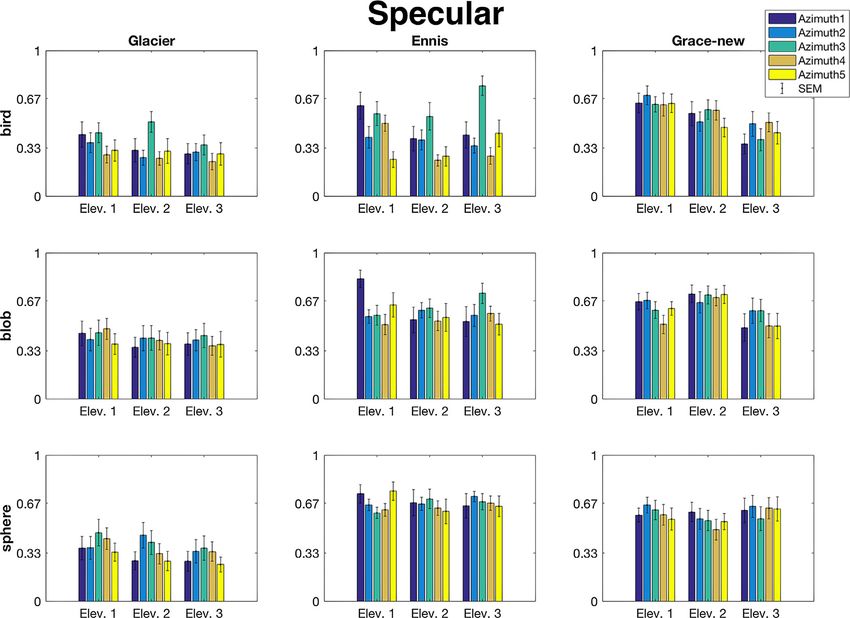
Journal of Vision (2020) 20(4):13, 1–18           Zhang, de Ridder, Barla, & Pont                                              2

         were analyzed optically and categorized into canonical               best: Glacier for ambient lighting (dominated by the
         modes, then combined with two canonical lightings                    zeroth-order SH component), Ennis for focus lighting
         (diffuse lighting and collimated lighting), and in a                 (dominated by the first-order SH component), and
         perception experiment found to have a systematic                     Grace-new for brilliance lighting (dominated by the
         influence on the perception of six material qualities,               sum of the higher-order SH components). Rendering
         namely, textured, metallic, silky, shiny, glittery, and soft         the four canonical material modes under these three
         (Barati et al., 2017).                                               selected light maps resulted in a “rendered stimuli”
            In one of our former studies (Zhang, de Ridder,                   set, comparable to the “real stimuli” set created by
         Barla, & Pont, 2019), we asked observers to judge                    illuminating the four canonical materials (real objects)
         material qualities for a variety of material-lighting                under the three canonical lightings. We evaluated
         combinations. To this end, a system was developed using              the perception of a range of material qualities for
         optics-based models of canonical material and lighting               both stimuli sets and found the results to be mutually
         modes that span a wide range of natural materials and                consistent. Thus, using an optics-based canonical
         lighting. The four material modes employed (matte,                   approach, we showed that material perception could
         velvety, specular, and glittery) were based on optical               be varied in a systematic and predictable manner. For
         models that describe the bidirectional reflectance                   example, brilliance lighting (the controlled real light
         distribution functions (BRDFs) of opaque materials                   condition and also its virtual metrics-based best match
         (Barati et al., 2017; Koenderink & Pont, 2003; Ward,                 of the natural luminance maps) evoked perceived
         1992), representing, respectively, diffuse scattering,               glossiness, hardness, and smoothness for specular
         asperity scattering, forward scattering, and meso-facet              material the most, while focus lighting (again, the
         scattering modes (Zhang, de Ridder, Fleming, &                       real and also the metrics-based best match) evoked
         Pont, 2016), spanning a large part of the BRDF                       perceived roughness and softness for velvety material
         space. The three canonical lighting modes employed                   the most.
         (ambient, focus, and brilliance light) were based on                     So far, our research into light-material interactions
         a mathematical description of the local light field,                 has been confined to one shape (bird) illuminated
         representing, respectively, the mathematical zeroth-,                under a fixed light direction per lighting (Zhang, de
         first-, and higher-order contributions to the spherical              Ridder, & Pont, 2015, 2018; Zhang et al., 2016; Zhang
         harmonic (SH) decomposition of the local light field                 et al., 2019). In everyday experience, however, one
         (Mury, Pont, & Koenderink, 2007). The mathematical                   occasionally observes subtler lighting effects on material
         basis of this three-component framework for light                    appearance, even when the lighting environment
         descriptions, which we use as canonical modes, has a                 remains unchanged. For example, the gloss of an
         physical meaning as the three components correspond                  object may not be visible until one moves to a certain
         to fully diffuse light (the ambient or zeroth-order SH               location with respect to the direction of the main
         component, a monopole), directed light from a single                 light source in the room. In this case, changing the
         direction (the focus or first-order SH component, a                  viewing angle does not change the global illumination
         dipole), and the fine structure or texture of the light              environment, yet the appearance of the object in the
         field (the brilliance or sum of the third and higher-order           image projected to our eyes becomes different due to
         SH components), respectively. These modes represent                  direction-dependent forward scattering (i.e., specular
         properties of light that human observers can distinguish             reflection) of the material and thus triggers a different
         (Doerschner, Boyaci, & Maloney, 2007; Kartashova                     material perception. Changing viewing or illumination
         et al., 2016; Morgenstern, Geisler, & Murray, 2014;                  direction to trigger a different percept is often used
         Schirillo, 2013; Xia, Pont, & Heynderickx, 2017).                    by lighting designers and photographers to make
         Moreover, they are known in perception-based lighting                certain features prominent in the same environment.
         design as the basic components of an integral lighting               Marlow and Anderson (2013) found that by varying
         plan (Ganslandt & Hofmann, 1992; Kelly, 1952; Pont,                  the light direction of a quite directed lighting, perceived
         2009, 2013; Pont, & de Ridder, 2018). They thus span                 glossiness for specular bumpy objects and surfaces
         the space of natural light conditions.                               changes significantly. They explained the results using
            In one experimental condition of the abovementioned               image features, such as contrast, coverage, sharpness
         study (Zhang et al., 2019), we employed computer                     of the highlights, and so on. In addition, changing
         renderings of three generic natural lighting                         the shape of an object while keeping the material and
         environments approximating the ambient, focus,                       the lighting environment (illumination map) the same
         and brilliance lighting modes. On the basis of                       can also influence material perception. For example, it
         quantitative metrics of the relative power of their                  was found that shape can affect material perception
         SH decomposition components, the following three                     (Vangorp, Laurijssen, & Dutré, 2007). Specifically,
         lighting maps from the high-resolution USC database                  using a blob-shaped object resulted in a more veridical
         (http://gl.ict.usc.edu/Data/HighResProbes/) were                     judgment of glossiness than the usual spherical object.
         selected to represent the three canonical lightings the              So, although a single glossy sphere can be modeled

Downloaded from jov.arvojournals.org on 05/28/2020
Journal of Vision (2020) 20(4):13, 1–18          Zhang, de Ridder, Barla, & Pont                                              3

         and rendered easily (without the need for complex                   implemented, next to our bird shape (Zhang et al.,
         self-shadowing and interreflection computations),                   2016), a blob shape (Vangorp, Laurijssen, & Dutré,
         and it conveniently represents all possible visible                 2007) and a sphere shape. We chose these shapes,
         surface orientations in one visualization, its global               since they were used in previous material perceptions
         convexity was shown to eliminate certain image features             studies and they represent variations from the simplest
         (highlights and lowlights) that are important triggers              smooth (sphere), to a complicated smooth (blob), to a
         for perceptual qualities. A blob-shaped object, for                 roundish object with sharp edges (bird). To vary only
         instance, might thus be a visually more informative                 the light map orientations for each combination of
         shape for a material probe, in other words, a more                  shape, illumination, and material, the position of the
         visually intelligent shape for material communication.              object was kept fixed relative to the camera during the
            In the current study, we applied our optics-based                rendering process.
         canonical approach for the four materials and three
         lighting modes (Zhang et al., 2019) and looked into
         the effects of light map orientation and shape in
         order to further investigate how to bring out the
         physical material best—which is an important issue for               Method
         disciplines and applications involving lighting design
         and material communication (e.g., computer graphics,
         design visualizations, webshops, and material selection             Stimuli
         interfaces). Specifically, we tested the visual perception
         of our four canonical materials (matte, velvety, specular,          Lighting environments and light map orientations
         glittery) under three metrics-matched natural lighting                 From USC’s high-resolution re-creations of
         maps best representing our canonical lighting modes                 Debevec’s light probe images (http://gl.ict.usc.edu/
         (ambient, focus, and brilliance), namely, the lighting              Data/HighResProbes/), we selected three light maps
         maps Glacier, Ellis, and Grace-new (from the USC                    (Glacier, Ennis, and Grace-new) that best represent
         database http://gl.ict.usc.edu/data/HighResProbes/).                our canonical lighting modes (ambient, focus, and
         This test was confined to one perceptual quality per                brilliance, respectively). The selection was made by
         material, namely, the corresponding material quality                using a combination of a diffuseness metric (Xia, Pont,
         (matte, velvety, specular, or glittery) for each material           & Heynderickx, 2017) and a brilliance metric (Zhang
         mode. The lighting modes are expected to give main                  et al., 2019), both based on the relative power of their
         effects that are material dependent (Zhang et al., 2019).           SH decomposition components, and both metrics range
         The variation of lighting direction is expected to result           from 0 to 1. Specifically, the Glacier map represents
         in no or minor effects for the Glacier illumination, since          the ambient lighting (DXia = 1) the best, as it scores
         that is the best match to ambient illumination, which               highest for Xia’s diffuseness metric (DXia = 0.83; B =
         in its purest form is fully diffuse and nondirectional.             0.42); the Ennis map represents the focus lighting (DXia
         The Ennis lighting or best match to focus lighting                  = 0) the best, as it scores lowest on Xia’s diffuseness
         has one clear average direction and thus is expected                metric (DXia = 0.17; B = 0.71); the Grace-new map
         to affect material perception, based on the literature.             represents the brilliance lighting (B = 1) the best,
         The Grace-new as the best match to brilliance light is              as it scores highest on our brilliance metric (DXia =
         expected to result in medium effects, since it is more              0.40; B = 0.79). Each light map was rotated vertically
         directed and structured than ambient but less directed              and/or horizontally such that the light map orientations
         than focus. These results are expected to be material               varied over three vertical levels (original and ± π /4)
         dependent. With respect to lighting directions, the                 and five horizontal levels (original, ± π /5 and ± 2π /5)
         effects were expected to be significant for specular and            (see Figure 1). Note that in this article, we label the
         glittery material—since for those materials, the image              vertical levels as elevations and the horizontal levels as
         features (highlights) are strongly dependent on the                 azimuths, although they do not represent the direction
         directions of illumination and viewing, due to the steep            of the main light source in one light map. At the bottom
         variations of their BRDFs (see Nicodemus et al., 1992).             of the original USC’s Glacier map, there was a large
         In contradistinction, we expected the lighting direction            area of black pattern due to the occlusion of a tripod
         effects to be much subtler for the matte material than              base. To make it more ambient and natural, we removed
         for specular and glittery materials, as its BRDF is                 the occlusion with Photoshop’s “content-aware fill”
         rather flat (in the ideal case constant) and the shading            tool (see Figure 1A). Also, the Grace-new environment
         gradients smooth (considering only smoothly curved                  was blurred (see Figure 1C) to reduce noise issues
         shapes). In the case of velvet, the key feature concerns            in rendering, due to the presence of very small light
         its bright contour, which "sticks" to the silhouette,               sources of very high intensity. After blurring, the map
         such that the velvety appearance is also expected to                still contains many light sources, but noise in rendering
         be more robust. To investigate the effect of shape, we              is greatly decreased.

Downloaded from jov.arvojournals.org on 05/28/2020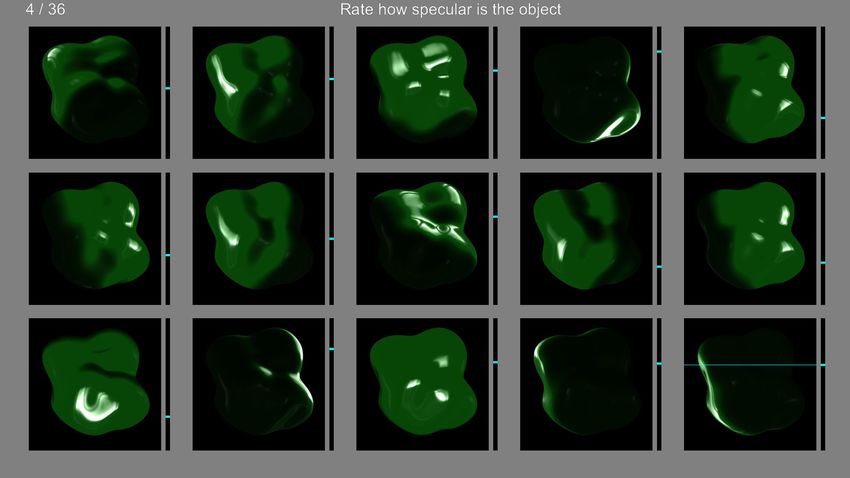
Journal of Vision (2020) 20(4):13, 1–18 Zhang, de Ridder, Barla, & Pont 4
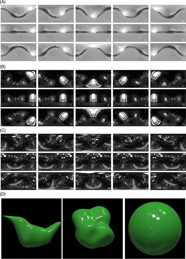
Figure 1. (A–C) Three light maps rotated vertically for three levels and horizontally for five levels (also see supplementary documents,
Supplementary Figure S7). (A) The Glacier map, (B) the Ennis map, and (C) the Grace-new map, representing ambient, focus, and
Downloaded from jov.arvojournals.org on 05/28/2020 →
Journal of Vision (2020) 20(4):13, 1–18                  Zhang, de Ridder, Barla, & Pont                                                     5

        ←
         brilliance lighting, respectively. Note that in this article, we label the vertical levels as elevations and the horizontal levels as azimuths,
         although they do not represent the direction of the main light source in one light map. From left to right: the azimuths are –2 π /5,
         –π /5, 0, π /5, and 2 π /5. From top to bottom: the elevations are –π /4, 0, and π /4 (i.e., the number 8 of each light map was the one
         with no rotation). These parameters were arbitrarily selected. Also, note that the Grace-new environment was blurred to reduce
         noise issues in rendering, due to the presence of very small light sources of very high intensity. After blurring, the map still contains
         many light sources, but noise in rendering is greatly decreased. (D) Examples of the three shapes used in the experiment, rendered
         with the specular material and the Grace-new light map. From left to right: the bird, the blob, and the sphere.

         Rendering process: shapes and material modes                                of the Ward model to speed up convergence (Walter,
             The three-dimensional (3D) model of the bird shape                      2005). We have also included a Fresnel term in the
         was created in Blender and is the same as the 3D model                      model to improve physical plausibility, using an index
         we used in former studies (Zhang et al., 2016). The                         of refraction of 1.5, which yields a reflectivity of 4% at
         blob shape was taken from Vangorp et al. (2007). The                        normal incidence (typical of dielectrics). For the glittery
         usual sphere shape was added as a comparison to                             mode, we used four times more samples (8,000 spp) to
         the bird and the blob shapes, as shown in Figure 1D.                        capture the fine spatial variations in the flake texture.
         The matte material mode was simulated to resemble                              For the velvety mode, we relied on standard
         a (hypothetical) material with a Lambertian BRDF.                           cosine-weighted importance sampling to evaluate the
         The velvety material mode was implemented with                              asperity scattering model of Koenderink and Pont
         the asperity-scattering BRDF model of Koenderink                            (2003), which required longer rendering times.
         and Pont (2003). The specular material mode was                                In Supplementary Figures S1 to S4, we show all
         implemented with an isotropic Ward BRDF (Ward,                              stimuli per material, lighting, and shape. The numbers 1
         1992). The glittery material mode was implemented by                        to 15 correspond to the oriented light maps in Figure 1.
         mimicking the occurrence of multifaceted flakes at the
         surface of the object (Zhang et al., 2019).
             Rendering was performed in Gratin version 0.3                           Procedure
         for Apple Mac OS (Vergne & Barla, 2015) to code
         and compile the computer rendering program in                                   At the beginning of the experiment, observers were
         OpenGL shading language (GLSL) version 410 (see                             first shown all of the stimuli (540 computer-rendered
         Supplementary Figure S6).                                                   images in total; see supplementary materials) twice in a
             Irrespective of the choice of material, rendering was                   randomized order, to give them an idea about the range
         performed in RGB (float 32 bits precision), with an                         of the stimuli and their scale for the rating. They were
         orthographic camera, without tone mapping. Rendering                        instructed that in each trial, a question “rate how [..]
         was done through ray tracing at 2,000 samples per pixel                     is the object?” was shown on top of the screen, with
         (spp) unless specified otherwise and considered only                        [..] displaying one of the four names, namely, matte,
         direct lighting, a reasonable approximation for the                         velvety, specular, or glittery.
         object shapes we consider. We used the same material                            In each trial, 15 stimulus panels were shown to the
         models as in our previous work (Zhang et al., 2019); we                     observers below the question, with a slider next to each
         thus refer the reader to our previous study for a detailed                  image (Figure 2). The 15 stimulus panels had the same
         description.                                                                material, shape, and light map but only differed in light
             In order to simulate the matte material, an                             map orientations (three elevations and five azimuths).
         environment prefiltering approach was implemented as                        The observers were explicitly instructed that the task
         it completely removes noise coming from the rendering                       was to rate the same material using the same range in
         process of the diffuse component. Specifically,                             different trials, instead of using the full scale in each trial
         assuming that the shadowing and interreflection                             per 15 stimulus panels. This was done to allow analysis
         effects can be neglected, the diffuse component                             per material instead of only per 15 stimuli. Panels were
         of the materials may be represented equivalently                            randomly positioned, and all slider bars were initially
         using a diffuse-filtered version of the illumination                        set at the bottom. The task of the observers was to
         environment, as provided on the USC website                                 rate each image by moving the slider bar, representing
         (http://gl.ict.usc.edu/Data/HighResProbes/). Rendering                      “not [..] at all” (or “0” within a “0” to “1” range) at the
         the diffuse component then simply consists of                               bottom of the slider to “extremely [..]” (or “1” within a
         evaluating the diffuse-filtered environment in the                          “0” to “1” range) at the top of the slider. When clicking
         direction of the surface normal and multiplying the                         the mouse button within the panel of a stimulus image,
         result by the colored diffuse albedo.                                       a horizontal bar would appear superpositioned on the
             For the specular and glittery modes, we employed                        stimulus, which was slightly thinner than the slider bar
         Monte Carlo integration using importance sampling                           attached to the right. When dragging the mouse cursor

Downloaded from jov.arvojournals.org on 05/28/2020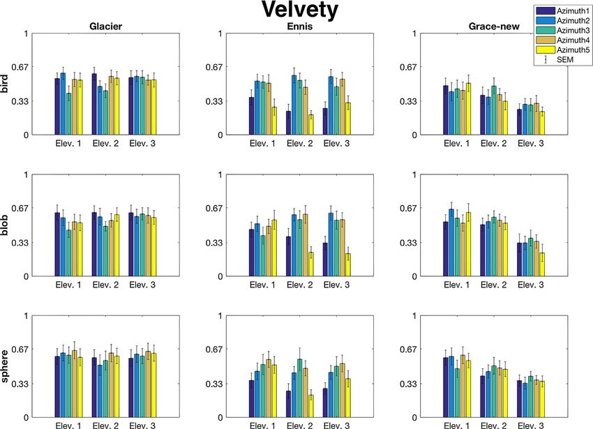
Journal of Vision (2020) 20(4):13, 1–18                Zhang, de Ridder, Barla, & Pont                                                  6

         Figure 2. The user interface of the experiment developed with the Psychophysics Toolbox. In this screenshot of an example trial, the
         stimulus is the same specular blob-shaped object rendered using the Ennis map for 15 light map orientations. The resulting 15
         stimulus panels were randomly positioned in each trial. The question “rate how [..] is the object” was positioned above the stimuli,
         with [..] displaying one of the four material names, in this case, specular. A slider bar was positioned on the right-hand side of each
         stimulus panel, initially set at the bottom of the slider. Observers were told before the experiment that the vertical slider scales from
         “not [..] at all” at the bottom to “extremely [..]” at the top. If a slider was moved, an additional horizontal bar was superimposed on
         the stimulus image to display the current rating value, as demonstrated in the stimulus at the bottom-right corner. The slider bar next
         to the stimulus image was attached to the thinner horizontal bar, moving vertically to indicate the ratings when dragging the mouse
         cursor. When releasing the mouse button, only the slider bar was shown, while the thinner bar would disappear. Observers could
         freely go back and forth to rate any one of the 15 images until pressing the “Enter” key to go to the next trial. The number of the
         current trial and the total number of trials were shown in the top-left corner of the screen. Note that the settings shown in this figure
         are not from any of the observers but are generated for demonstration purposes only, and the stimuli appeared different as shown in
         supplements due to the process of taking the screenshot.

         within the panel, both bars moved vertically together.                    Psychophysics Toolbox extensions (Brainard, 1997;
         When releasing the mouse button, only the slider bar                      Kleiner et al., 2007; Pelli, 1997) in MATLAB R2016b
         was shown to indicate the rating, while the thinner bar                   and presented on a linearly calibrated EIZO ColorEdge
         would disappear. Observers could freely go back and                       CG277 (27-in. class calibration color LCD) display. The
         forth to rate any one of the 15 images until pressing the                 viewing distance was around 30 cm.
         “Enter” key to go to the next trial.
            For each canonical material mode, only the
         corresponding material term [..] was tested, that is, we                  Observers
         asked “rate how matte is the object?” for the stimuli
         rendered using the matte material mode only. So, for                         Twelve paid observers participated in the experiment.
         each observer, the experiment contained altogether                        All participants had normal or corrected-to-normal
         4 materials × 3 illuminations × 3 shapes = 36 trials                      vision and were inexperienced in psychophysical
         of 15 stimulus panels, in total 36 × 15 = 540 ratings.                    experiments. Participants read and signed the consent
         The experiment took between 40 minutes and an hour                        form before the experiments. The study was approved
         per observer. The interface was developed with the                        by the Human Research Ethics Committee at Delft

Downloaded from jov.arvojournals.org on 05/28/2020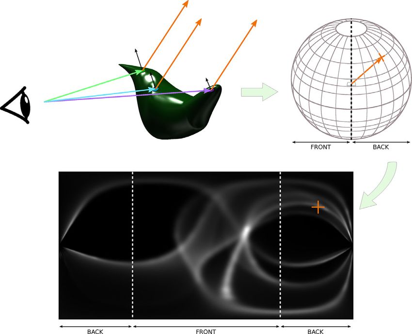
Journal of Vision (2020) 20(4):13, 1–18               Zhang, de Ridder, Barla, & Pont                                                7

         Figure 3. The averaged matteness ratings of 12 observers per shape (subplot rows), illumination (subplot columns), elevation (x-axis in
         each subplot), and azimuth (bars for each elevation in each subplot). The error bars indicate ± 1 SEM.

         University of Technology and conducted in accordance                     consider those too complicated to be meaningful. In the
         with the Declaration of Helsinki and Dutch law.                          supplementary materials, we plotted the ratings next to
                                                                                  the corresponding stimuli, allowing visual inspection of
                                                                                  the stimuli and data (Supplementary Figures S1–S4).
                                                                                  Note that since light sources within the three light maps
          Results                                                                 may be located anywhere (e.g., on the side or at the top),
                                                                                  it is only meaningful to directly compare the effects of
            Here we present the general results per material mode                 azimuth and elevation within but not across light maps.
         and, thus, per material quality. We analyzed the rating
         data per material using a four-way repeated-measures
         analysis of variance (ANOVA) with three lightings,
         three elevations, five azimuths, and three shapes being                  Matte
         the independent variables. We assumed that each
         observer used one constant perceptual scale for the                         We did not find any significant main effect (lighting:
         same material despite the changes of lightings and                       F(2, 22) = 1.38, p = 0.27; shape: F(2, 22) = 0.39,
         shapes across all trials (presented in randomized order)                  p = 0.69; azimuth: F(1.58, 17.37) = 1.36, p = 0.28;
         and rescaled the 135 data points (3 shapes × 3 lightings                 elevation: F(1.27, 14.00) = 1.10, p = 0.33) or any
         × 15 directions) per material per observer such that                     first-order interaction effect for the “matte” ratings
         the ratings ranged from 0 to 1. For the interpretation                   of the matte material (M = 0.46, SEM = 0.01 for all
         of the results, the analysis was confined to the main                    ratings). This suggests that perceived matteness was
         effects and the first-order interaction effects. We do                   independent of the light maps, lighting directions, and
         not present higher-order interactions because we                         shape of the object. This is confirmed in Figure 3,

Downloaded from jov.arvojournals.org on 05/28/2020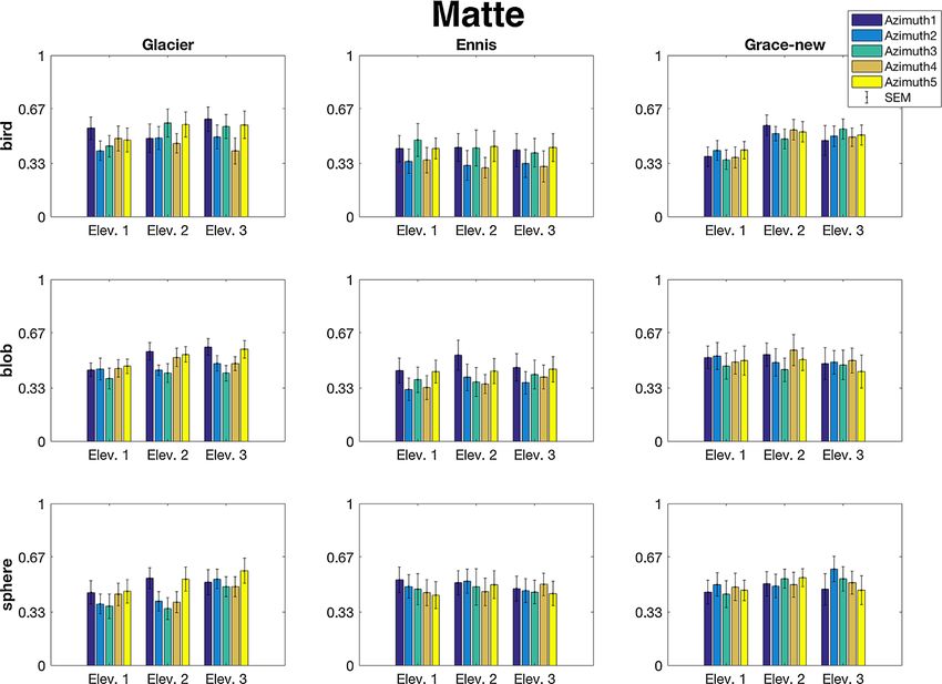
Journal of Vision (2020) 20(4):13, 1–18               Zhang, de Ridder, Barla, & Pont                                                    8

         Figure 4. The averaged velvetiness ratings of 12 observers per shape (subplot rows), illumination (subplot columns), elevation (x-axis
         in each subplot), and azimuth (bars for each elevation in each subplot). The error bars indicate ± 1 SEM.

         showing that the averaged ratings for the matte material                  88) = 11.80, p < 0.001). Figure 5A confirms the
         mode were robust across all conditions.                                  abovementioned trend by showing that it can be seen
                                                                                  for Ennis while the azimuth has hardly any impact on
                                                                                  the ratings for Glacier and Grace-new. Note that the
         Velvety                                                                  ratings for Grace-new were lower than for Glacier.
                                                                                  Third, for Grace-new, the averaged ratings appear to
            Figure 4 presents the averaged velvety ratings for                    decrease systematically from elevation 1 via elevation 2
         the velvety material mode. A number of trends can be                     to elevation 3, which cannot be seen for Glacier and
         discerned. First, the overall mean of the velvety ratings                Ennis. The statistical analysis indicated a significant
         for Glacier map (0.57 ± 0.02) is higher than that for the                main effect for elevation (F(1.21, 13.34) = 6.63, p =
         Ennis map (0.44 ± 0.02) and Grace-new map (0.44 ±                        0.019; the assumption of sphericity had been violated:
         0.02), a difference that is substantial as confirmed by a                χ 2 (2) = 10.482, p = 0.005, and hence the degrees of
         significant main effect for lighting environment (F(2,                   freedom were corrected using the Greenhouse-Geisser
          22) = 5.48, p = 0.012). Second, there appears to be                     estimate of sphericity ε = 0.61). In addition, there was
         an effect of azimuth, in particular for Ennis, in that                   a significant interaction effect between the lighting and
         the means of the ratings for azimuth1 and azimuth5                       the elevation (F(4, 44) = 11.72, p < 0.001) in that,
         were lower than for azimuth 2, azimuth 3, and azimuth                    going from elevation 1 to elevation 3, the ratings drop
         4. This is in line with the observation that there is a                  for Grace-new only (Figure 5B). Finally, we did not
         significant main effect of azimuth (F(4, 44) = 9.13,                     find any significant differentiating effect of shape on the
          p < 0.001) combined with a significant interaction                      velvety judgments for the velvety material (main effect
         effect between lighting environment and azimuth (F(8,                    of shape: F (2, 22) = 1.14, p = 0.34). To summarize, the

Downloaded from jov.arvojournals.org on 05/28/2020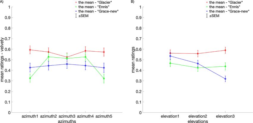
Journal of Vision (2020) 20(4):13, 1–18               Zhang, de Ridder, Barla, & Pont                                               9

         Figure 5. (A) The mean velvety ratings, averaged across observers, shapes, and elevations, as a function of azimuth and per light map.
         (B) The mean velvety ratings, averaged across observers, shapes, and azimuths, as a function of elevation and per light map. The error
         bars represent ± 1 SEM.

         perceived velvetiness of velvety material was affected                   bird via the blob to the sphere, while for the Glacier
         by the lighting environments (light maps) and light                      and Grace-new maps, the ratings were rather flat with a
         map orientations, with the Ennis and Grace-new maps                      small peak for the blob shape (Figure 7). To summarize,
         reducing perceived velvetiness the most, while perceived                 the perceived specularity of specular material was
         velvetiness was found to be robust for the shape of the                  affected by the lighting environments (light maps) but
         object.                                                                  not by the light map orientations, with the Glacier
                                                                                  map reducing perceived specularity the most. Similarly,
                                                                                  perceived specularity depended somewhat on the shape
         Specular                                                                 of the object with bird under the Glacier map reducing
                                                                                  specularity the most and sphere under the Ennis map
            Figure 6 presents the averaged specularity ratings                    highlighting specularity the most.
         for the specular material mode. When comparing the
         columns in Figure 6, we found that the averaged ratings
         of specularity were relatively lower for the Glacier map                 Glittery
         (0.36 ± 0.02) than for the Ennis (0.56 ± 0.02) and
         Grace-new maps (0.58 ± 0.02). This was confirmed by                         Figure 8 presents the averaged glittery ratings for the
         a significant main effect for light environment (F(2,                    glittery material mode. Two trends can be discerned.
          22) = 14.05, p < 0.001). When comparing the rows                        First, the overall mean of the glittery ratings for the bird
         in Figure 6, we found that the averaged ratings of                       shape (0.31 ± 0.02) is lower than that for the blob (0.52
         specularity were relatively lower for the bird shape (0.43               ± 0.02) and the sphere (0.52 ± 0.02) shapes, a difference
         ± 0.02) than for the blob (0.54 ± 0.02) and the sphere                   that is substantial as confirmed by a significant main
         (0.54 ± 0.02). This was also confirmed by a significant                  effect for shape (F(2, 22) = 28.42, p < 0.001). Second,
         main effect for shape (F(2, 22) = 8.50, p = 0.002).                      unlike the light map itself, light map orientations
         We did not find any significant differentiating effect of                play a role in perceiving glitteriness as confirmed by
         light map orientations on the specularity judgments                      significant main effects for azimuth (F(4, 44) = 48.81,
         for the specular material (main effect of azimuth: F                      p < 0.001) and elevation (F(2, 22) = 21.62, p < 0.001)
         (1.25, 13.74) = 2.70, p = 0.12; main effect of elevation:                and a nonsignificant main effect for light map (F(2,
         F (1.10, 12.13) = 3.35, p = 0.089). The significant                       22) = 2.06, p = 0.15). Specifically, the ratings of
         interaction effect between light maps and shapes (F(4,                   azimuth 2 (0.51 ± 0.02) and azimuth 3 (0.51 ± 0.02)
          44) = 2.82, p = 0.036) was mainly due to the ratings                    were significantly higher than those for azimuth 1 (0.41
         for the Ennis map systematically increasing from the                     ± 0.02), azimuth 4 (0.44 ± 0.02), and azimuth 5 (0.38 ±

Downloaded from jov.arvojournals.org on 05/28/2020
Journal of Vision (2020) 20(4):13, 1–18 Zhang, de Ridder, Barla, & Pont 10
Figure 6. The averaged specularity ratings of 12 observers per shape (subplot rows), illumination (subplot columns), elevation (x-axis
in each subplot), and azimuth (bars for each elevation in each subplot). The error bars indicate ± 1 SEM.
0.02) which was mainly due to the ratings for the bird shown in Figure 1. The stimuli images are shown on
shape (Figure 9). The latter is confirmed by a significant the right, with the numbers on the bottom-right corner
interaction effect between the shapes and azimuths (F(8, of each stimulus image corresponding to the oriented
88) = 9.63, p < 0.001). To summarize, the perceived light maps. The rows represent the three elevations. In
glitteriness was affected by the shape of the objects, these figures, we could make observations about which
with the bird shape reducing perceived glitteriness the image features might have triggered the perceptual
most, as well as the light map orientations, particularly effects that triggered the quality assessments. Note that
the azimuths. tonemapping was used only for presentation in this
article but not for the stimuli in the experiments. In the
following sections, we will describe our observations in
detail per material mode and connect the observations
Perceptual effects, quality ratings, to our results and previous findings in literature.
and image features
In Supplementary Figures S1 to S4, we show the Matte
rating data per material as a function of the azimuth
next to the stimuli images per material, from (A) to (C) For matte materials, the diffuse shading gradients
under the Glacier map, (D) to (F) under the Ennis map, vary smoothly and do not show sudden (dis)appearances
and (G) to (I) under the Grace-new map. At left, we of highlights or other salient features, which can explain
show the corresponding ratings. The numbers 1 to 15 that the perception of matteness is quite constant
on the x-axis correspond to the oriented light maps as (Supplementary Figure S1). This kind of robustness
Downloaded from jov.arvojournals.org on 05/28/2020Journal of Vision (2020) 20(4):13, 1–18 Zhang, de Ridder, Barla, & Pont 11
confirming our expectations. Supplementary Figure S2
reveals that, for the other two lightings, all stimuli
with relatively low ratings have other image features
in common. When using the Ennis environment map,
we observe relatively low ratings for stimuli Nos. 1, 5,
6, 10, 11, and 15 of the bird shape (Supplementary
Figure S2D), as well as Nos. 6, 10, 11, and 15 of
the blob shape (Supplementary Figure S2E) and
the sphere shape (Supplementary Figure S2F). This
corresponds to the results shown in Figure 5A, which
might be due to an ambiguity caused by the directed
light source: When the directed light source is behind
the object, the asperity-scattering mode’s luminance
gradient might be confounded with the diffuse- or
specular-scattering mode’s gradients. In other words,
the bright contour due to asperity scattering in isolation
(without diffuse shading over the body) cannot be
distinguished from the bright rim that occurs for
the combination of backlighting and diffuse and/or
specular scattering. The material may then be perceived
Figure 7. The mean specularity ratings, averaged across as matte or even as somewhat specular, rendered using
observers, azimuths, and elevations, per shape and per light rim lighting. This could also explain the results using
map. The error bars represent ± 1 SEM. the Grace-new environment map under elevation 3
(Supplementary Figure S2G–I and also see Figure 5B).
The significant drops in the ratings as a function of
implies that its invariants can be used to infer shapes elevation correspond to backlighting configurations.
based on the shading patterns (Belhumeur, Kriegman, To conclude, velvetiness seems to require not only
& Yuille, 1999; Koenderink & van Doorn, 1980; bright contours due to the surface scattering but also
Kunsberg & Zucker, 2013, 2018; Narasimhan, Ramesh, the co-occurrence of diffusely scattered luminance or
& Nayar, 2003). Simultaneously, knowing the shape can smooth gradients over the body. Simply presenting only
help observers with judging the characteristics of the a “bright contour” on an otherwise dark object will not
local light field and material (Kartashova et al., 2016; trigger the perception of velvetiness but instead may
Koenderink et al., 2007; Xia, Pont, & Heynderickx, trigger the perception of matteness. This corresponds to
2014,2016). As an exception, illusory gloss effects results from our abovementioned former work (Zhang
were found for matte materials on bumpy surfaces et al., 2019), in which we found strong interactions
under collimated lighting (Wijntjes & Pont, 2010), between the matte and velvety material modes.
where second-order shading effects were confused with
specular highlights. Such effects only appear for quite
nongeneric lighting and only in specific cases form
a real problem, for instance, endoscope lighting, for Specular
which the viewing (camera) and lighting directions
coincide (Wu et al., 2010). The main visual cues for specular materials are
the specular highlights. When using the Glacier
environment map, the overall ratings for the specular
Velvety materials were relatively lower (Supplementary Figure
S3A–C), corresponding to the results shown in Figures
The main effect we found for the velvety materials 6 and 7. This was within our expectations as it
was that velvetiness was sometimes rated low for the confirmed previous findings in glossiness perception
Ennis and Grace-new lightings, especially when the literature indicating that perceived glossiness reduces
main light source was coming from the back of the under diffuse lighting (Dror, Willsky, & Adelson, 2004;
objects. The chief visual cue of velvet appearance is a Pont & te Pas, 2006; Zhang, de Ridder, & Pont, 2015;
thin but very steep luminance gradient at the silhouette, Zhang et al., 2016, 2019), because the highlights will
that is, the bright contours along the surface due to be diffused. Meanwhile, perceived glossiness is also
surface scattering by the asperities (Koenderink & affected by negative contrast of reflections caused
Pont, 2003). The cue is invariant to lighting directions by dark parts of the environment generating dark
when using the Glacier environment map (shown in specular reflections or lowlights (Kim, Marlow, &
Supplementary Figure S2A–C), as are the ratings, Anderson, 2012). The combination of fine-structured
Downloaded from jov.arvojournals.org on 05/28/2020Journal of Vision (2020) 20(4):13, 1–18 Zhang, de Ridder, Barla, & Pont 12
Figure 8. The averaged glitteriness ratings of 12 observers per shape (subplot rows), illumination (subplot columns), elevation (x-axis
in each subplot), and azimuth (bars for each elevation in each subplot). The error bars indicate ± 1 SEM.
bright highlights and dark lowlights might explain the texture and thus could increase perceiving glossiness
perceived glossiness in Supplementary Figure S3A–C. (Fleming, Dror, & Adelson, 2003).
When using the Ennis environment (Supplementary When using the Grace-new environment map
Figure S3D–F), the most notable image cues are (Supplementary Figure S3G–I), the ratings in general
contrast and coverage of specular highlights. The were relatively high as the highlights are quite visible
interaction effects show increased ratings for the in most of the stimuli, as expected, and reflect the
sphere under Ennis lighting (i.e., the averaged ratings fine structure of the brilliance lighting. Coverage and
for specularity were highest when combining the contrast of the highlights were mainly varying as a
sphere shape and Ennis lighting) (Figure 7). This function of the elevation, and the effects of azimuth are
might be due to a clear reflection of the illumination. not as salient as for the other two light maps, due to
The window-shaped specular highlight patterns the angular structure of the brilliance lighting in the
are particularly clearly reflected on the sphere Grace-new environment (primarily many tiny hotspots
(Supplementary Figure S3F). As a comparison, from above).
highlights on the bird (Supplementary Figure S3D) Unexpectedly, we did not find significant effects of
and the blob (Supplementary Figure S3E) deformed light map orientations for the perception of specularity
in a more complex manner. This confirmed previous in this study (unlike, for example, in Marlow, Kim, &
findings on glossiness perception, namely, that the Anderson, 2012). However, we did find higher-order
shape of highlights may influence glossiness perception interaction effects between light map orientation, shape,
(van Assen, Wijntjes, & Pont, 2016). It also shows and the choice of lighting environment. This was not
that when highlights reveal real-world illumination mentioned in the results since the interpretation of
properties, they are less likely to be misperceived as these higher-order effects is usually very complex. In the
Downloaded from jov.arvojournals.org on 05/28/2020Journal of Vision (2020) 20(4):13, 1–18 Zhang, de Ridder, Barla, & Pont 13
Glacier (ambient) Ennis (focus) Grace-new (brilliance)
Bird R2 = 0.67, p < 0.001 R2 = 0.40, p = 0.01 R2 = 0.67, p < 0.001
Blob R2 = 0.64, p < 0.001 R2 = 0.67, p = 0.22 R2 = 0.01, p = 0.80
Sphere R2 = 0.91, p < 0.001 R2 = 0.26, p = 0.05 R2 = 0.37, p = 0.02
Table 1. The correlations between the numbers of glitters (top 1% brightest pixels in the stimuli) and the perceptual ratings for
glitteriness per shape and lighting.
ratings per shape and lighting, except for the blob under
the Ennis and Grace-new lighting.
General discussion
The main question we pose in this article is how
light map orientation and object shape influence the
perception of materials in addition to the material
reflectance itself and the main modes of the lighting
environment. To answer this question, an experiment
was set up in which we combined four canonical
material modes, three shapes, and three illumination
environments and then oriented the illumination
environments in 15 different directions (varying
across three elevations vertically and five azimuths
horizontally). In our rating experiment, we found the
following main results:
• For matte materials, perceived matteness was robust
Figure 9. The mean glittery ratings, averaged across observers, and constant across all variations (i.e., no effect was
light maps, and elevations, as a function of azimuth and per found for light map orientation, shape of the object,
shape. Note that the azimuth variation is confounded with a or lighting mode).
change of the lighting elevation. The error bars represent ± 1 • For the perceived velvetiness of velvety materials,
SEM. there were significant effects of light map
orientation, which were lighting dependent but
shape independent. Such effects were evoked the
stimuli images, we could observe subtle variations in the most under the Ennis light map and hardly under
specular ratings as the light map orientations varied. the Glacier and Grace-new light maps. The Glacier
Some of these variations might be due to the changes light map highlighted velvetiness the most.
of the contrast and coverage of the high/lowlights with • For specular materials, we found no significant
respect to the diffuse shading, possibly in combination effect of light map orientation (for both elevation
with the effect of clipping highlights in some stimuli of and azimuth). The perception of specularity was
the Ennis light map due to the high dynamic range of influenced by light mode and shape, with the
the lighting environment. Glacier light map as well as the bird shape reducing
perceived specularity the most.
• For the perceived glitteriness of glittery materials,
Glittery the effects of direction and shape were significant,
with the bird shape reducing glitteriness the most.
The main visual cues for glitteriness also seemed Lighting mode had only an interaction effect,
to be the features of the highlights on the glitters reducing perceived glitteriness the most for the
(see Supplementary Figure S4). With simple image Glacier light map for all elevations and Grace-new
processing—namely, thresholding the top 1% brightest for elevation 3.
pixels (as the glitters) in each stimulus—we could count
the number of glitters as a coarse evaluation of the In a former work (Zhang et al., 2019), we investigated
coverage of the highest intensity glitters. As shown the interaction between material and light modes for
in Table 1, significant correlations were found between one shape only, namely, the bird shape, and for one
the numbers of glitters in the stimuli and the glittery lighting direction. In that study, we combined the four
Downloaded from jov.arvojournals.org on 05/28/2020Journal of Vision (2020) 20(4):13, 1–18 Zhang, de Ridder, Barla, & Pont 14
We again found a difference between the matte and
velvety material modes, on the one hand, and the
specular and glittery materials, on the other hand,
when considering the effects of shape on the perceived
qualities. No systematic effects were found for the
matte and velvety materials, whereas both specular
and glittery materials showed a reduction in their
corresponding perceived qualities for the bird shape
with respect to the other two shapes. An explanation
for this systematic finding is probably that the BRDFs
of specular and glittery material are more peaked than
those of velvety and matte materials. If the lightings or
shapes vary, the appearances of specular and glittery
materials then will change more than those of matte
and velvety materials.
Interestingly, another differentiation was found in
the current study, namely, between matte and specular
materials, on the one hand, and velvety and glittery
materials, on the other hand. This was based on the
Figure 10. A schematic demonstration of importance map (in)sensitivity for lighting direction where velvety
construction, taking a specular bird and its importance map as and glittery materials showed systematic changes in
an example. Top left: rays are traced from the viewpoint toward the quality ratings as a function of azimuth and/or
the object, hitting the object surface at different locations; elevation, effects that were absent for the other
depending on the material’s BRDF, new outgoing rays are materials. In Zhang et al. (2019), such a differentiation
emitted from these locations. Please note that the way we could also be observed, but there it was based on the
trace light rays is opposite to how light rays transmit from the judgments of roughness and smoothness. In that study,
sources in lighting environments to object and form an image. the matte and specular material modes were assessed to
Top right: multiple outgoing rays from different positions on the be more smooth and velvety and glittery material modes
object may have the same direction (in orange); they are then to be more rough. Since image texture (gradients) due
accumulated in the same direction in the distant spherical to 3D surface corrugations are extremely sensitive to
environment (that is, a single point on the spherical map). lighting variations (Pont & Koenderink, 2008), these
Bottom: performing this accumulation for all outgoing rays findings might well be related.
results in an importance map that we store using a The main question we addressed in this article
latitude-longitude projection. The central portion of the is how different material and shape and lighting
importance map corresponds to rays that have been projected combinations affect perceived material appearance.
toward the frontal half of the spherical environment (front), Endless combinations of materials, shapes, and
while the sides (where the orange cross is located in our illuminations may cause a similar appearance while
example) corresponds to rays projected toward the rear half of small variations of one of those factors can sometimes
the spherical environment (back). Note that the frontal half of cause large variations in appearance. A major challenge
the environment is actually located behind the is to find a way to predict the appearance within this
observer/camera. Brighter regions of the importance map endless space of possibilities. In order to do so, we
correspond to directions for which more rays have need to get a grip onto the proximal stimulus, the
accumulated, due to shape, material, or both. image, and its features, in contradistinction to the
basic physical parameters that determine them (and
in the end we also will understand the relationships
canonical material modes (matte, velvety, specular, and between the physics and image features). To this end,
glittery) with three canonical lighting modes (ambient/ we want to bring up the notion of the importance
Glacier, focus/Ennis, and brilliance/Grace-new) and map, which characterizes the contribution of different
found material-dependent lighting effects for nine lighting directions depending on surface reflectance
qualities (matte, velvety, specular, glittery, glossy, rough, (material) and geometry (shape). When we trace the
smooth, hard, and soft), which were similar to the main light rays from the viewpoint to the surface back to the
lighting effects found in the current study. In particular, environment, we find that more light rays accumulate in
the impact of the Glacier light map with respect to the some directions than in other directions. An importance
other two light maps was similar: reducing perceived map records this accumulation: Brighter points in the
specularity and glitteriness for the specular and glittery map correspond to directions where more accumulation
materials, respectively, and highlighting velvetiness has occurred.
and, to a lesser extent, matteness for velvety and matte Specifically, we show in Figure 10 how multiple
material, respectively. light rays are traced back to the same direction of an
Downloaded from jov.arvojournals.org on 05/28/2020Journal of Vision (2020) 20(4):13, 1–18 Zhang, de Ridder, Barla, & Pont 15
the final image, which we call “importance,” whereas
darker regions in the importance map correspond to
directions in the light map that will hardly be reflected
to the viewer (i.e., they are less “important”). Since the
importance map only depends on shape, material, and
viewing direction, it is independent of the light map
(and its variation after rotation). Hence, if we rotate the
light map such that the light sources match the brightest
regions in the importance map, the imaged object
surface brightens at corresponding locations, depending
on its shape and material. Rotating the object (which
we did not do in the current study) would also impart
a change in the importance map, as the surface shape
visible from the viewpoint would change as well.
The 12 importance maps corresponding to the
four canonical materials and the three shapes we
implemented are shown in Supplementary Figure S5.
We can immediately see that the importance maps of
matte objects are robustly diffused and quite symmetric
in all shapes, which can explain why perceived matteness
was found to be constant across all lightings and light
map orientations. The importance maps of the velvety
material are similar to those of the matte material as
they are quite diffused too, but different in that they
show some fine structures for the blob and bird. On
the contrary, the importance maps of specular and
glittery materials are clearly different for each shape
and show mutually similar asymmetric structures. The
importance maps for glittery are more diffuse than
those for specular, due to the broadening of the specular
peak caused by the distribution of flakes that compose
glitter. The (lack of) variations of the importance maps
for the shapes explain some of the main effects found in
our experiment, namely, that perceived specularity and
glitteriness were influenced by shape, while perceived
matteness and velvetiness were not. It also directly
shows that the importance maps for specular and
glittery materials varied in a more fine-grained way than
those of velvety or matte materials, which corresponds
to the fact that effects were stronger for materials with
peaked BRDFs.
In future work, we would like to explore the use of
importance maps to predict how lighting affects image
features and thus permits solving problems such as
optimizing lighting for material and shape perception.
Figure 11. An example of the predictive power of the product
For example, in combination with metrics, they could
between an importance map and a light map. From top to
be used for predicting the strength of image cues such
bottom, we show the importance map for the specular bird, the
as the sharpness, the contrast, and the coverage of the
Ennis environment map for two orientations, the product
highlights that trigger glossiness perception (Marlow,
between light and importance maps, and the corresponding
Kim, & Anderson, 2012). In supplementary materials,
renderings.
we illustrate the potential of this approach by showing
the product between light maps and importance maps.
importance map from the surface of a specular bird An example is given in Figure 11, where we show
(not only from the highlights but also the rest of the the product of the importance map of the “specular
surface), appearing as a bright spot in the importance bird” with the Ennis lighting environment for two
map due to the accumulation. It suggests that that orientations. When the main light source is oriented
spot in the light map has a strong contribution to such that it matches the brightest spot in the importance
Downloaded from jov.arvojournals.org on 05/28/2020Journal of Vision (2020) 20(4):13, 1–18 Zhang, de Ridder, Barla, & Pont 16
map (left column in Figure 11), large and bright illumination statistics, and tone mapping. Journal
specular highlights appear in the rendered image. When of Vision, 18(13), 4, https://doi.org/10.1167/18.13.4.
the main light source is oriented such that it matches a Barati, B., Karana, E., Sekulovski, D., & Pont, S. C.
less bright spot on the back side of the importance map (2017). Retail lighting and textiles: Designing a
(right column in Figure 11), we observe a small specular lighting probe set. Lighting Research & Technology,
highlight on the silhouette of the object. 49, 173–194.
Belhumeur, P. N., Kriegman, D. J., & Yuille, A. L.
(1999). The bas-relief ambiguity. International
Conclusions journal of computer vision, 35(1), 33–44,
https://doi.org/10.1023/A:1008154927611.
In this study, we primarily investigated how light map
Brainard, D. H. (1997). The psychophysics toolbox.
orientation and shape influence the visual perception of
Spatial Vision, 10, 433–436.
four canonical materials (matte, velvety, specular, and
glittery). Specifically, we performed a rating experiment Doerschner, K., Boyaci, H., & Maloney, L. T.
in which, in each trial, we presented observers 15 (2007). Testing limits on matte surface color
stimuli images that differed in 15 orientations (three perception in three-dimensional scenes with
vertical levels and five horizontal levels) of the complex light fields. Vision Research, 47, 3409–
lighting environment, while having the same material, 3423.
shape, and lighting environment (lighting mode), and Doerschner, K., Boyaci, H., & Maloney, L. T. (2010).
instructed them to evaluate the corresponding material Estimating the glossiness transfer function induced
quality. Effects of light map orientation were found by illumination change and testing its transitivity.
for velvety and glittery materials but not for matte Journal of Vision, 10(4), 8.
and specular materials. Effects of shape were found Dror, R. O., Willsky, A. S., & Adelson, E. H.
for specular and glittery materials but not for matte (2004). Statistical characterization of real-world
and velvety materials. Effects of lighting mode were illumination. Journal of Vision, 4(9), 11.
found for velvety and specular materials but not for
Fleming, R. W., Dror, R. O., & Adelson, E. H. (2003).
matte and glittery materials. Hence, the perception of
Real-world illumination and the perception of
matte for matte materials was found to be the only
surface reflectance properties. Journal of Vision,
material quality that is robust across all manipulations
3(5), 3.
of lighting and shape. The results confirmed key image
features triggering perceived specularity, glitteriness, Ganslandt, R., & Hofmann, H. (1992). Handbook of
velvetiness, and matteness. interior lighting. Germany: ERCO, Lüdenscheid.
Kartashova, T., Sekulovski, D., de Ridder, H., Pas,
Keywords: material perception, lighting, light
S. F., & Pont, S. C. (2016). The global structure
map orientation, shape, canonical modes, material
of the visual light field and its relation to the
communication
physical light field. Journal of Vision, 16(10), 9,
doi:10.1167/16.10.9.
Acknowledgments Kelly, R. (1952). Lighting as an integral part of
architecture. College Art Journal, 12, 24–30.
This work has been funded by the EU FP7 Marie Kim, J., Marlow, P. J., & Anderson, B. L. (2012). The
Curie Initial Training Networks (ITN) project PRISM, dark side of gloss. Nature Neuroscience, 15, 1590.
Perceptual Representation of Illumination, Shape and Kleiner, M., Brainard, D., Pelli, D., Ingling, A.,
Material (PITN-GA-2012-316746). Murray, R., & Broussard, C. (2007). What’s new in
Psychtoolbox-3. Perception, 36, 1.
Commercial relationships: none.
Corresponding author: Fan Zhang. Koenderink, J. J., & van Doorn, A. J. (1980).
Email: vanzh89@gmail.com. Photometric invariants related to solid shape.
Address: Delft University of Technology, Delft, Optica Acta: International Journal of Optics, 27,
Netherlands. 981–996.
Koenderink, J., & Pont, S. (2003). The secret of velvety
skin. Machine Vision and Applications, 14, 260–
268.
References Koenderink, J. J., Pont, S. C., van Doorn, A. J.,
Kappers, A. M. L., & Todd, J. T. (2007). The
Adams, W. J., Kucukoglu, G., Landy, M. S., & Mantiuk, visual light field. Perception, 36, 1595–1610,
R. K. (2018). Naturally glossy: Gloss perception, https://doi:10.1068/p5672.
Downloaded from jov.arvojournals.org on 05/28/2020You can also read