Emissions metrics: Australia's carbon footprint in the G20 - Supported by Origin Energy Ltd November 2014
←
→
Page content transcription
If your browser does not render page correctly, please read the page content below
Emissions metrics: Australia’s
              carbon footprint in the G20

               Supported by Origin Energy Ltd
               November 2014

Liability limited by a scheme approved under Professional Standards Legislation.

© 2014 Deloitte Touche Tohmatsu Pty Ltd
Contents
Executive summary ................................................................................................................... 1
1        Introduction .................................................................................................................... 7
2        Carbon emission metrics ................................................................................................. 8
         2.1      Alternative metrics ........................................................................................................... 9
3        The benchmark sample ................................................................................................. 12
         3.1      The G20 countries........................................................................................................... 12
4        How does Australia compare to the G20? ...................................................................... 14
         4.1      GDP and total carbon emission benchmarks.................................................................... 14
         4.2      Energy carbon emission benchmarks .............................................................................. 15
         4.3      Sectoral analysis ............................................................................................................. 21
         4.4      The role of technology .................................................................................................... 24
5        Comparative analysis..................................................................................................... 26
         5.1      Methodologies ............................................................................................................... 26
         5.2      Fixed baseline emissions measure ................................................................................... 27
         5.3      Emissions production frontier measure ........................................................................... 28
         5.4      Economic production frontier measure ........................................................................... 29
         5.5      Summary ........................................................................................................................ 30
Appendix A - Model specification ............................................................................................ 33
         Fixed Effects Regression ............................................................................................................ 33
         Stochastic Frontier Model .......................................................................................................... 34
         Structural Model ....................................................................................................................... 35
         GDP Stochastic Frontier ............................................................................................................. 35
Appendix B.............................................................................................................................. 36
         CO2-e/GDP metrics using GDP based on Purchasing Power Parity (PPA) ..................................... 36
         CO2-e/GDP metrics using GDP based on current prices............................................................... 36

                                                                                                                                              2
Executive summary
CO2-e/GDP provides a different way of looking at Australia’s
emissions performance
National emissions comparisons are commonly cited on the basis of a carbon dioxide
equivalent (CO2-e) per capita metric, which has the benefit of being a simple and easy to
understand scaled measure.1
However, this measure has some shortcomings. These shortcomings are primarily due to
the fact that while emissions themselves are related to productive activity, the relationship
between productive activity and population of an economy can vary based on a number of
factors unrelated to the generation of emissions. If emissions are to be expressed on a per
capita basis, a country’s carbon emissions should, at the very least, account for imported
and exported emissions.
Some of these shortcomings with the use of CO2-e /capita can be addressed through the
use of Gross Domestic Product (GDP), rather than population, as the normalising factor
when making comparisons of emissions between countries.
However, CO2-e/GDP measurement favours more developed, services-sector driven
economies as opposed to developing economies, which has led us to investigate how we
can identify the relationship between the structure of economies and emissions.
Ideally, countries should seek to reduce emissions while maintaining economic growth, by
reducing the emissions intensity of their economies. Historically, there has been a close link
between GDP and emissions, however, in some countries this link is in the early stages of
decoupling.2
The purpose of this paper is to look at carbon emissions in a different light, to help
understand the economic drivers of carbon emissions and better reflect the relationship
between economic activity and carbon emissions. To this end, we have conducted
econometric analysis which models the relationships between country characteristics and
emissions.
Benchmarking the G20 countries
We have compared Australia’s CO2-e/GDP to other G20 countries. The G20 countries
represent 66% of the global population, 85% of global GDP and 76% of global carbon
emissions and therefore represent a substantial benchmark sample. The G20 countries
1
CO2-e is a commonly used quantity measure which describes, for a given mixture and amount of different
greenhouse gases, the amount of carbon dioxide that would have the same global warming potential.
2
In this context decoupling means that the amount of negative environmental impact per unit of economic
activity is reducing. ABS, 4655.0.55.002 - Information Paper: Towards the Australian Environmental-Economic
Accounts, Chapter 1 Integrated Accounts, 2013.
1include the top five carbon emitters (China, US, India, Russia and Japan) and the large
emerging and growing economies of China, Russia, India and Brazil.
Without the collective action and agreement of the G20 countries, and in particular the top
five emitters, it will be difficult to achieve the necessary reductions in global emissions. At
present, committed reductions from UNFCCC signatories will not deliver the reductions
required to constrain warming to 2 degrees.3
Overview – total emissions
Australia’s total equivalent carbon emissions (kilotonnes) per million dollars of GDP are
below the average of the G20 countries and are similar to Canada. This result differs
markedly from per capita emissions, in which Australia is often shown to be the worst
performing country in the G20.
Figure 1 –Total kilotonnes of equivalent carbon emissions per million dollars of GDP (real
$US) and total emissions (Gigatonnes (GT)) - where Australia sits in the G204
Total
Energy CO₂-e
CO₂-e (kilotonnes)/GDP
(tonnes)/GDP (millions,
(thousands, US$real $US),
2005), 2011
2011 data
data Total
CO₂-eCO₂-e
from(GT), 2011
energy data
(GT), 2011 data
Indonesia Indonesia
Russia Russia
China China
India India
Argentina Argentina
South Africa South Africa
Saudi Arabia Saudi Arabia
Brazil Brazil
Mexico Mexico
Korea Korea
Canada Canada
Australia 0.66 Australia 0.60
Turkey Turkey
US US
Germany Germany
G20
G20 average
avergage = 1.18
= 1.18 G20
G20avergage
average==
1.72
1.72
Italy Italy
Japan Japan
UK UK
France France
0 1 2 3 4 5 0 2 4 6 8 10 12
Source: World Resources Institute data, IEA data, Deloitte analysis
Note: Includes emissions from land use and land use change and forestry
In recent years, Australia’s carbon emission productivity has been improving in both
absolute terms and relative to the average of the G20. From 2009 to 2010 Australia’s
emissions per unit of GDP fell 4.4% and a further 3.1% from 2010 to 2011.
3
United Nations Environment Program, The Emissions Gap Report 2013, November 2013.
4
In this paper we have used real GDP in $US 2005, sourced from the IEA, as we consider this represents the
latest published, best measure of output in constant terms to enable comparisons. We refer to this as real $US.
The IEA also presents GDP data in current $US and Purchasing Power Parity (PPA). We present all benchmarking
results using GDP expressed in current $US and PPA in the Appendix.
2Energy carbon emissions
Energy is one of the most significant contributors to carbon emissions. According to the IEA,
in the 43 developed and transitioning economies listed as Annex I under the UN Framework
Convention on Climate Change, on average energy use accounts for 83% of carbon
emissions resulting from human activity. Historically and today, the majority of the world’s
energy needs have been met by burning fossil fuels.5 In 2013, 67% of Australia’s emissions
were from the energy sector.
Accordingly, in the rest of our analysis we have focused on energy carbon emissions
produced by fuel combustion, which includes:
Electricity and heat production
Other energy industry own use
Manufacturing industries and construction
Transport - including road transport
Other sectors - including residential.
In figure 2, we present data on total emissions from energy for the G20. We note that
Australia’s ranking is similar to the results in figure 1 for total emissions, and in line with
Canada and the US.
Figure 2 –Equivalent carbon emissions from energy (kilotonnes) per million dollars of GDP
(real $US) and total energy emissions (GT) - where Australia sits in the G20
Energy
EnergyCO₂-e
CO₂-e(tonnes)/GDP (thousands,
(kilotonnes)/GDP US$
(millions, 2005),
real $US),2011
2011data
data CO₂-efrom
CO₂-e fromenergy
energy(GT),
(GT),2011
2011data
data
China China
Russia Russia
India India
South Africa South Africa
Saudi Arabia Saudi Arabia
Indonesia Indonesia
Argentina Argentina
Korea Korea
Turkey Turkey
Mexico Mexico
Australia 0.44 Australia 0.4
Canada Canada
US US
Brazil Brazil
Japan Japan
Germany Germany
G20 average = 0.6 G20 average = 1.3
Italy Italy
UK UK
France France
0.0 0.5 1.0 1.5 2.0 0 2 4 6 8
Source: IEA data, Deloitte analysis
5
BP, Energy outlook 2013, January 2014.
3Carbon intensity or CO2-e/GDP can be broken down into the key drivers of energy intensity
(energy/GDP) and the carbon intensity of energy (CO2-e/energy). Australia’s energy
intensity is in the lowest quartile of the G20 countries. This means that Australia uses
energy efficiently to produce GDP. However, Australia’s carbon emissions per unit of energy
produced are high, reflecting the dominance of coal fired electricity generation.
Nevertheless, this combination of low energy intensity and high carbon intensity places
Australia below the G20’s average CO2-e/GDP metric.
Further, IEA data shows that over the 10 year period from 2001-11, Australia has managed
to achieve moderate per capita economic growth (1.6% on average) that has outpaced its
growth in total carbon emissions (1.2% on average), meaning its carbon intensity has been
improving.6
Australia’s CO2-e/GDP is comparable to G20 countries with economies that have a similar
economic structure such as Canada and the United States.
Australia performs as expected under our econometric analysis
Simple, easy to understand metrics such as CO2-e/GDP or CO2-e/capita do not fully capture
the drivers of underlying emissions within an economy. Therefore, we have developed an
econometric analysis that attempts to explain some of the drivers.
Our econometric models have tested the relative level of Australia’s carbon emissions,
taking into account GDP, population, urbanisation, weather, choice of energy fuel and other
factors. Recognising that policy can influence the choice of energy fuel, we have evaluated
emissions both with and without the choice of fuel as a parameter.
If we include fossil fuel as an explanatory variable in our model, our econometric analysis
suggests that Australia’s carbon emissions based on its economic characteristics are as
expected – that is Australia’s actual carbon emissions are close to our predictive models,
ranking around the middle of the G20 countries.
If fossil fuels are removed as an explanatory variable Australia’s ranking does not
substantially change, moving from 10th to 11th in the G20 countries.
G20 countries’ action on climate change
In February 2014, the G20 committed to developing new measures with the aim of raising
the level of G20 economic output by at least 2% above the currently projected level in the
next five years. The Brisbane Action Plan aims to put in place short and medium-term
actions to help achieve this economic growth ambition.
Given the link between GDP and carbon emissions, policymakers should be consistent in
their targets for economic growth and carbon emissions reductions.
6
IEA data, Deloitte analysis.
4G20 members are taking action. Over the last few years many countries have either set
carbon emission reduction targets for themselves and / or have emission reduction targets
under the Kyoto protocol. Some examples are listed below:
The EU leaders have recently agreed upon a greenhouse gas reduction target of at
least 40% on 1990 levels by 2030, and developed a proposed policy to deliver this
target which includes emissions trading, renewable energy and energy efficiency
targets.7
In June 2014, the Obama Administration announced its Clean Power Plan which is
underpinned by an EPA regulatory target to reduce carbon pollution from existing
US power plants by 30% from a 2005 baseline by 2030.8 This is in addition to the US
Government’s commitment under the UNFCCC to an economy-wide target of a 17%
reduction on 2005 levels by 2020.9
At the UN Climate Summit in New York in September 2014, China announced its
intention to set its total emissions peak and post-2020 targets ‘as soon as possible.’
China also reiterated its existing plan to cut carbon intensity by 40-45% by 2020,
based on 2005 levels, and announced that its 2013 emissions intensity levels
reflected a 28% reduction on 2005 levels, suggesting it is already more than
halfway towards meeting its 2020 target.10
Australia’s 2020 target, which is part of its current Kyoto Protocol commitment, is
to reduce emissions by 5% on 2000 levels. However, Australia is yet to announce a
post-2020 target and this will be the subject of a review in 2015. 11
Countries have considered the impact on GDP of adopting targets and in many cases have
made higher targets conditional on other countries reducing their emissions. However,
most carbon emission targets have not been set with direct reference to GDP.
A key solution to delinking carbon emissions from energy production (and GDP growth) is
the development of commercially viable low emissions or zero emissions technology. While
there has been some progress such as onshore wind, large scale solar generation and
geothermal, there are limited examples of zero carbon generation technologies that are
commercially viable without the need for subsidies or a significantly high price on carbon
emissions.
Further and more substantial technological breakthroughs on several fronts will minimise
the impact of carbon reductions on economic growth and living standards.
7
European Commission Media Release, EU leaders agree 2030 climate and energy goals, 24 October 2014.
Available at:
8
Barak Obama http://www.barackobama.com/climate/plan/. United States Department of State Office of the
Special Envoy for Climate Change Washington, D.C. 20520, 28 January 2010
9
UNFCCC, Appendix I - Quantified economy-wide emissions targets for 2020, available at:
10
UN Climate Summit Statements – China – New York, 23 September 2014. Available at: <
http://statements.unmeetings.org/media2/4628014/china_english.pdf>
11
Australia’s Foreign Affairs minister Julie Bishop’s address at the United Nations Climate Summit, September
2014.
5The G20 countries might consider further encouraging research and development in energy
to foster and expedite the commercialisation of new technology. This is important as the
nine wealthiest countries of the G20 spent only 0.05% of GDP in 2012 on energy research
and development.12
12
International Energy Agency, OECD iLibrary. R&D expenditure includes R&D on Energy Efficiency, Fossil Fuels,
Renewable Energy Sources, Nuclear, Hydrogen and Fuel Cells, Other Power and Storage Technologies and Other
Cross-Cutting Technical Research. Data for Australia, Canada, France, Germany, Italy, Japan, Korea, United
Kingdom and United States.
61 Introduction
Carbon emissions per capita (CO2-e/capita) is commonly used as a benchmark to compare
the carbon intensity of countries. Although widely used, CO2-e/capita is a simplistic
benchmarking metric, as it fails to adequately capture the complexities of the underlying
drivers of carbon emissions such as the structure of a country’s energy and economic
systems.
The purpose of this paper is to look at carbon emissions in a different light, to help
understand the economic drivers of carbon emissions and better reflect the relationship
between economic activity and carbon emissions. To this end, we have conducted
econometric analysis which models the relationships between country characteristics and
emissions, which is presented in Section 5.
The analysis aims to build a platform for shifting the debate towards more sophisticated
and explanatory metrics.
72 Carbon emission metrics
Carbon emissions are predominantly measured on the basis of the emissions generated
within a country from the production of goods and services within its borders. Given that
the absolute level of emissions produced by a country can vary vastly by size, carbon
emission metrics are often quoted on a per capita basis for the purpose of comparisons and
benchmarking.
This approach is seen to provide a reasonable ‘like-for-like’ comparison between the
respective performance of countries in terms of contribution to global emissions. However,
when carbon emissions are measured on the basis of production, metrics including
population do not account for important differences between economies such as:
Links to the global economy and the extent to which emissions are ‘traded’
between one country and another. Trade flows in the globalised world economy
mean that a significant proportion of a country’s emissions may be generated in
producing goods and services that are not consumed domestically. For countries
that import the majority of their emissions-intensive goods, emissions will appear
relatively low because the goods consumed by their population are not
contributing to national carbon emissions. However, countries such as Australia,
which in 2013 derived 20% of its GDP from exports,13 will tend to perform relatively
poorly on metrics that do not account for these linkages in the global economy.
This is especially so for Australia, because the goods it exports are relatively
emissions intensive, although we note that imports and exports are only one driver
of emission performance.
The carbon intensity of production and the production output achieved for a given
level of emissions. For example, two countries that generate the same amount of
emissions and with the same population will be equivalent in terms of CO2-e/capita,
even if one of the countries produces twice as much output per tonne of CO2-e
generated and is therefore less emissions intensive.
These shortcomings are primarily due to the fact that while emissions themselves are
measured on the basis of productive activity, the relationship between productive activity
and population of an economy can vary based on a number of factors unrelated to the
generation of emissions.
13
The World Bank, Exports of goods and services (% of GDP)
http://data.worldbank.org/indicator/NE.EXP.GNFS.ZS>
82.1 Alternative metrics
2.1.1 Consumption-based emissions metrics
If emissions are to be expressed on a per capita basis, a country’s carbon emissions should
account for imported and exported emissions to reflect a true measure of carbon emissions
that are caused by the consumption of the population.
Several international studies have attempted to quantify the emissions embedded in
international trade to estimate a country’s consumption based emissions. However, the
process of doing so is complex and there is not yet an accepted methodology or standard
for calculating and reporting consumption based carbon emissions.
The Australian Bureau of Statistics has made experimental estimates of Australia’s
consumption based carbon emissions in its information paper on the development of a set
of Environmental-Economic Accounts for Australia. The ABS estimated consumption based
emissions by netting off exported emissions and assuming that imported products were
produced using production functions that were identical to those used for locally produced
products of the same type (i.e. imported products result in the same amount of emissions
that purchasing the same product domestically would). Overall, it found Australia’s
consumption based emissions in 2008-09 were approximately the same as the production
based estimates. The ABS analysis provides valuable insights into the link between domestic
economic activity and emissions, but is limited in relation to providing a foundation for
making comparisons between countries due to the fact that the different emissions
intensity of production in different countries is not taken into account. In particular, we
note that the ABS considered that its approach may overstate imported emissions for
Australia.14
Research by Davis and Calderia presents consumption based emissions (from energy) for
113 countries. Davis and Calderia note that 23% of global carbon emissions were traded
internationally, mainly as imports from China and the developing world to consumers in the
developed world.15 According to their analysis (2004 carbon emission data sourced from the
Energy Information Administration), consumption based emissions for many European
countries were much higher than their emissions measured on a production basis. While
the reasons for this vary between countries, it is due in large part to these economies being
heavily service-based, with low emissions intensity in relation to domestic productions,
while imported products and services are more likely to come from higher emitting
countries. For example, the United Kingdom’s consumption based emissions were 46%
higher than its production based emissions, Italy’s were 25% higher, France’s were 43%
higher and Germany’s were 28% higher. Australian consumption based emissions were 2%
lower that its production based emissions, while China’s were 23% lower and India’s were
7% lower. Overall, this research demonstrates that benchmarks based on consumption
based emissions per capita are significantly different to benchmarks based on production
based emissions per capita.
14
ABS 4655.0.55.002 - Information Paper: Towards the Australian Environmental-Economic Accounts, 2013,
Chapter 5 Greenhouse Gas Emissions.
15
Steven J. Davis and Ken Calderia, Consumption-based accounting of CO2-e emissions, Department of Global
Ecology, Carnegie Institution of Washington, Stanford, CA 94305
9Multi-region input-output models (MRIO) have been used in measuring carbon emissions,
incorporating consumption based measures, because they provide an appropriate
framework for this type of analysis. However, many researchers have concluded that to
deal with the uncertainty in MRIO modelling, improvements in data availability, quality and
modelling techniques are needed.16
The OECD published estimates of consumption and production based emissions for
member countries, using an MRIO approach.17 Its estimates suggested that consumption
based emissions in 2009 were on average 15% higher than production based emissions, and
more than 40% higher in seven countries (Belgium, Switzerland, Denmark, Greece, Ireland,
Italy, Norway and Sweden). For Australia, the OECD’s consumption based estimate was
around 10% lower than its production based estimates in the period 1995-2000, but that by
2008, Australia’s consumption based estimates were around 8% higher than production
based estimates. It observed that the gap between production and consumption based
estimates are affected by global trade and economic activity and therefore fluctuated
during the Global Financial Crisis period. We note that the OECD’s methodology
incorporated adjustments to deal with measurement issues, such as re-exports, unspecified
partners and commodities and missing data, particularly for trade in services.
The research on measuring carbon emissions based on consumption continues, but until
such time that an internationally accepted framework and methodology is adopted and
implemented, production based emissions provide a better starting point for benchmarking
countries on their emissions performance.
2.1.2 Use of GDP as a normalising factor
Under production based measures of emissions, some of the shortcomings with the use of
CO2-e/capita can be addressed via the use of Gross Domestic Product (GDP), rather than
population, as the normalising factor when making comparisons of emissions between
countries.
GDP is defined by the World Bank as the sum of gross value added by all resident producers
in the economy plus any production taxes and minus any subsidies not included in the value
of the products. Therefore, CO2-e (kilotonnes)/GDP (millions, real $US) provides a measure
of the emissions generated by an economy related back to the value of the goods and
services produced in generating those emissions – i.e. it is a measure of carbon intensity
and carbon efficiency of a country’s economy. This metric explicitly recognises the
relationship between emissions and productive activity, and therefore provides a starting
point for understanding trade-offs between economic growth and emission reduction
targets.
However, CO2-e/GDP measurement favours more developed, services-sector driven
economies as opposed to developing economies, which has led us to investigate how we
can identify the relationship between the structure of economies and emissions.
16
Thomas Wiedmann, A review of recent multi-region input–output models used for consumption-based
emission and resource accounting, Ecological Economics 69 (2009) 211–222
17
OECD, Carbon Dioxide Emissions Embodied in International Trade, available at:
10Our analysis seeks to provide further detail on the drivers of differences between countries
in terms of CO2-e/GDP, by examining:
Emissions intensity of energy production (carbon emissions per unit of energy
produced) together with how much energy is used for economic activity. This
provides insights into how countries differ in the production of energy and carbon
emissions, based on their energy fuel mix.
The components of GDP, by breaking GDP down into ‘service’, ‘industrial’ and
‘agricultural’ sectors to determine how countries with similar GDP structures
compare to one another on emissions.
Finally, we compare the emissions of G20 countries relative to a baseline that normalises
differences between countries such as the structure of their economies and resource
endowments.
In our analysis, we have focused on presenting carbon emissions produced by fuel
combustion for energy (unless stated otherwise), which includes:
Electricity and heat production
Other energy industry own use
Manufacturing industries and construction
Transport - including road transport
Other sectors - including residential
Energy emissions are the focus of this paper because energy is one of the most significant
contributors to carbon emissions. Historically and today, the majority of the world’s energy
needs have been met by burning fossil fuels.18 This has resulted in energy accounting for
the greatest portion of countries’ carbon emissions. In 2013, around 67% of Australia’s
emissions were from the energy sector.
The world’s energy needs are increasing rapidly and primary energy demand is forecast to
grow, by 41% between 2012 and 2035, with 95% of that growth expected to come from
emerging economies such as China and India.19
18
BP, Energy outlook 2013, January 2014.
19
Ibid.
113 The benchmark sample
3.1 The G20 countries
Our analysis is based on the G20 countries, which consists of the world’s largest advanced
and emerging economies. The G20 countries compared to the OECD countries are
demonstrated in the figure below.
Figure 3 – How the G20 fits within the global context*
G20 OECD
Belgium
Austria Chile
Czech
Saudi Arabia
United States Republic Denmark
Indonesia Luxembourg
France Switzerland
China
Australia Estonia
Italy Finland
India
BRICS South Africa Canada Greece Israel
(five major emerging Japan Hungary
Korea Ireland
economies) Brazil
Mexico Iceland
Turkey Luxembourg
Russia
United Kingdom Slovak Republic Spain
Netherlands Norway
Argentina Germany
New Zealand Poland
Portugal
Source: G20 Members About the OECD
EA CO2-e from fuel combustion, 2013.
* The analysis in this paper does not include the European Union, although the major European countries are
separately included in the G20 countries.
We have selected G20 rather than OECD countries because the G20’s membership
represents 66% of the global population, 85% of global GDP and 76% of carbon emissions.
By comparison, the OECD countries represent a significantly lower share of global
population (18%), global GDP (51%) and carbon emissions (39%).20
The G20 also covers diverse economies, which allows us to examine how different stages of
economic advancement influence carbon emissions. A number of high carbon emitting
countries such as China and India are not included in the OECD.
20
Population and GDP are from 2010, carbon emissions from 2013. OECD iLibrary, OECD Factbook 2013:
Economic, Environmental and Social Statistics. OECD, Perspectives on global development
EIA, International Energy Outlook 2014.
12Figure 4 demonstrates that non-OECD countries are expected to account for the majority of
future carbon emissions.
Figure 4 – G20 and OECD carbon emissions comparison
World Energy Related Carbon Dioxide Emissions, 1990-2040
billion metric tonnes
35.0
History Projected
30.0
25.0
Non-OECD countries
20.0
OECD countries
15.0
10.0
5.0
0.0
2008
2016
1990
1992
1994
1996
1998
2000
2002
2004
2006
2010
2012
2014
2018
2020
2022
2024
2026
2028
2030
2032
2034
2036
2038
2040
Source, International Energy Outlook, 2013
134 How does Australia compare to
the G20?
4.1 GDP and total carbon emission benchmarks
In this section we examine total CO2-e (kilotonnes) /GDP (millions, real $US) to present an
overview of how Australia compares internationally on this metric. This provides an
indication of Australia’s carbon ‘productivity’ compared to other G20 countries. In other
words, it demonstrates how much economic output Australia achieves for each unit of
carbon emissions. This is presented, along with each country’s total emissions (including
land use and land use change and forestry) in the figure below.
Figure 5 – Total kilotonnes of equivalent carbon emissions per million dollars of GDP (real
$US) and total emissions (GT) - where Australia sits in the G20
Total
Energy CO₂-e
CO₂-e (kilotonnes)/GDP
(tonnes)/GDP (millions,
(thousands, US$real $US),
2005), 2011
2011 data
data Total
CO₂-eCO₂-e
from(GT), 2011
energy data
(GT), 2011 data
Indonesia Indonesia
Russia Russia
China China
India India
Argentina Argentina
South Africa South Africa
Saudi Arabia Saudi Arabia
Brazil Brazil
Mexico Mexico
Korea Korea
Canada Canada
Australia 0.66 Australia 0.60
Turkey Turkey
US US
Germany Germany
G20
G20 average
avergage = 1.18
= 1.18 G20
G20 average
avergage = 1.72
= 1.72
Italy Italy
Japan Japan
UK UK
France France
0 1 2 3 4 5 0 2 4 6 8 10 12
Source: World Resources Institute data, IEA data, Deloitte analysis
Note: Includes emissions from land use and land use change and forestry
Australia’s total carbon emissions per unit of GDP are well below the average of the G20
countries and are similar to Canada. This result differs markedly from per capita emissions,
in which Australia is often shown to be the worst performing country. The right hand side of
the chart also highlights that Australia’s emissions are relatively small at 1.8% of total G20
emissions.
144.2 Energy carbon emission benchmarks
Similar to the analysis above, we have compared Australia’s energy carbon emissions per
unit of GDP to the average of the G20, however, in this case the emissions used are those
related to energy from fuel combustion. This, along with each country’s total energy
emissions is shown in the figure below.
Figure 6 – Equivalent carbon emissions from energy (kilotonnes) per million dollars of
GDP (real $US) and total energy emissions (GT) - where Australia sits internationally
Energy
EnergyCO₂-e
CO₂-e(tonnes)/GDP (thousands,
(kilotonnes)/GDP US$
(millions, 2005),
real $US),2011
2011data
data CO₂-efrom
CO₂-e fromenergy
energy(GT),
(GT),2011
2011data
data
China China
Russia Russia
India India
South Africa South Africa
Saudi Arabia Saudi Arabia
Indonesia Indonesia
Argentina Argentina
Korea Korea
Turkey Turkey
Mexico Mexico
Australia 0.44 Australia 0.4
Canada Canada
US US
Brazil Brazil
Japan Japan
Germany Germany
G20 average = 0.6 G20 average = 1.3
Italy Italy
UK UK
France France
0.0 0.5 1.0 1.5 2.0 0 2 4 6 8
Source: IEA data, Deloitte analysis
The left hand side of figure 6 shows that Australia’s carbon emissions per unit of GDP is
below the average of the G20 countries and is similar to Canada and the US. The right hand
side demonstrates that Australia’s total energy carbon emissions are relatively small
compared to other G20 countries.
In the figure below we have also compared Australia’s energy carbon emissions per unit of
GDP to the average of the G20 over seven years to 2011. The figure below demonstrates
how the G20 countries’ energy carbon emissions per unit of GDP have been changing over
time.
15Figure 7 – Energy carbon emissions per unit of GDP over time
Energy CO2-e (kilotonnes) /GDP (millions, real $US)
0.7
0.6
0.5
0.4
0.3
0.2
0.1
0
2005 2006 2007 2008 2009 2010 2011
Average of the G20 Countries Australia
Source: IEA data, Deloitte analysis
The results in figure 7 demonstrate that Australia’s carbon emissions productivity has been
improving in both absolute terms and relative to the average of the G20. From 2009 to
2010 Australia’s emission per unit of GDP fell 4.4% and a further 3.1% from 2010 to 2011.
Figure 8 compares Australia’s carbon emissions productivity to the top five carbon emitters
in the G20.
16Figure 8 – Energy carbon emissions per unit of GDP over time – top five carbon emitters
and Australia
6.0 kt of CO2 per million GDP ($US 2005)
Energy CO₂-e (kilotonnes)/GDP (millions, real $US), 2011 data
5.0
4.0
China
3.0 Russia
2.0
India
1.0
Australia
US
0.0 Japan
China, the largest carbon emitter has achieved significant improvements in its carbon
intensity (as measured by CO2-e/GDP) over the 20 year period. In September 2014 at the
UN Climate Summit, China announced that in 2013 its carbon intensity was down by 28.5%
from the 2005 level.21 However, China’s emission intensity has been relatively flat over the
last five years.
Russia has also made significant improvements – but like China its emissions intensity has
shown little improvement over the last five years.
India unlike China and other developing economies has shown only marginal improvements
over the last 20 years.
It is expected that the developing economies will improve their emissions intensity as they
transition to more service based economies and economic growth enables the adoption of
less carbon intensive and more energy efficient technologies. China and Russia have
followed this transition to a less carbon intensive economy.
The developed economies of the US and Japan have achieved marginal improvements over
the 20 year period. Australia’s performance is in line with the US and Japan.
The drivers of Australia’s performance are examined in the following sections.
21
Address by H.E. Zhang Gaoli Special Envoy of President Xi Jinping and Vice Premier of the State Council of
China at the UN Climate Summit, Build Consensus and Implement Actions For a Cooperative and Win-Win
Global Climate Governance System, 3 September 2014.
174.2.1 The drivers of carbon emissions per GDP
The energy intensity of the economy (energy (Petajoules (PJ))/GDP (millions)) and the
emissions intensity of energy (CO2-e/energy) are the two main drivers of carbon emissions
per GDP. Energy intensity is a measure of how much energy a country uses to produce a
unit of GDP. The emissions intensity of energy measures how much carbon is released for
each unit of energy produced.
These measures are shown in the figure below. The size of each bubble in the figure below
represents the country’s carbon emissions per unit of GDP (also presented in Figure 6
above).
Figure 9 – Energy intensity and emissions intensity
Source: IEA data, Deloitte analysis
Figure 9 highlights that while Australia’s CO2-e (GT)/energy (PJ) is relatively high, its low
energy intensity (energy/GDP) means Australia’s CO2-e/GDP is lower than the G20 average.
Australia’s emissions intensity of energy can largely be explained by the dominance of coal
fired electricity generation. Australia has an abundance of coal, with around 9% of the
world's economically recoverable black coal, predominantly located in Queensland and
New South Wales.22 Australia ranks fourth in terms of world coal reserves behind USA,
Russia and China.23
Similarly, Australia has about 23% of the world's brown coal economic resources
(predominantly in Victoria) and ranks first in terms of world reserves.24 At 2012 production
levels, accessible brown coal will support 510 years of production.25
22
Australian Government; Department of Industry, Geoscience Australia, BREE, Australian Energy Resource
Assessment, 2014.
23
Ibid.
24
Australian Government; Geoscience Australia,
25
Department of Industry, Geoscience Australia, BREE, Australian Energy Resource Assessment, 2014.
18The figure below demonstrates the percentage of electricity generated from fossil fuels.
Figure 10 – Electricity produced from fossil fuels, 2011
Electricity generation using fossil fuels
100% 94%
89% 87%
81% 81% 80%
80% 74% 74% 71% 70% 69% 68% 68% 67%
60%
60%
40%
22%
20% 11% 8%
0%
Source: IEA data, Deloitte analysis
The extent of Australia’s coal resources has provided it with a comparative advantage in
terms of being able to generate cheap and reliable energy. Australia relies more heavily on
fossil fuels than most of the G20 countries. In 2011 (which is the latest data available from
the IEA), fossil fuels accounted for 89% of Australia’s electricity generation, with coal-fired
power stations located in every mainland state.26
In the years since 2011, fossil fuels have continued to dominate Australia’s fuel mix,
however, its reliance on them has been declining gradually. In 2012-13, Australia’s
dependence on fossil fuels for electricity generation fell to 87%.27 However, coal continues
to be the major fuel source for electricity generation and comprises of around 64% of the
fuel mix, although this is down from 77% in 2003–04. In contrast, gas fired generation has
increased, accounting for around 20% of electricity production, or double its 2004-05
share.28
Australia’s renewable energy sector is also increasing. By the end of 2013, about 1.25
million small scale solar systems were installed accounting for 1.62% of Australia’s total
electricity.29
Canada, Brazil and France rely less on fossil fuels than the rest of the G20. Electricity
generation in Brazil relies heavily on hydropower, accounting for 81% of its total electricity
generation in 2011.30 Similarly, Canada’s main source of electricity is hydropower,31 while
the main source of electricity generation in France is nuclear power, accounting for 83% of
its total generation in 2012. France also produces a significant amount of electricity from
renewable resources and after Germany; France is the second-largest producer of biofuels
in Europe.32
China, the world’s largest carbon emitter, used coal to produce 69% of its energy needs in
2011. Oil was the second-largest source, accounting for 18% of energy generated. Other,
cleaner fuel sources used in China include hydropower (6%), natural gas (4%), nuclear
26
Ibid.
27
BREE 2014 Australian Energy Update July 2014; data file.
28
Ibid.
29
Clean Energy Council website, available at:
30
IEA statistics, CO2 emissions highlights, 2013 edition.
31
US Energy Information Administration, Canada
32
US Energy Information Administration, France
19power (nearly 1%), and other renewables (1%). According to the US Energy Information
Administration, the Chinese government plans to cap its coal use to below 65% of total
primary energy consumption by 2017 in an effort to reduce air pollution. Further, the
Chinese government has set a target to raise non-fossil fuel energy consumption to 15% of
its national energy production by 2020.33
4.2.2 Energy carbon emissions and growth in GDP per capita
Examining growth in emissions and GDP per capita over the last decade highlights that
countries which have managed to substantially increase their GDP per capita have also
substantially increased carbon emissions. This finding lends further evidence to our
suggestion that international comparisons of carbon emissions should recognise the
interrelationship between emissions and economic growth.
To analyse this relationship, we have used a 10 year average from 2001-11 of the GDP
growth per capita and carbon emissions growth, presented in the figure below.
Figure 11 – Growth in GDP per capita versus growth in energy carbon emissions – 10 year
average: 2001-11
2001-2011 Growth in CO₂-e emissions
Source: IEA data, Deloitte analysis
Australia has managed to achieve moderate per capita economic growth (1.6%) which has
outpaced its total growth in carbon emissions (1.2%).34 This means that Australia is
improving the carbon efficiency of its economic growth.
We note that the US and European economies have been impacted by the global financial
crisis, which is reflected in their GDP per capita growth rates and growth in emissions.
33
US Energy Information Administration
34
IEA data, Deloitte analysis.
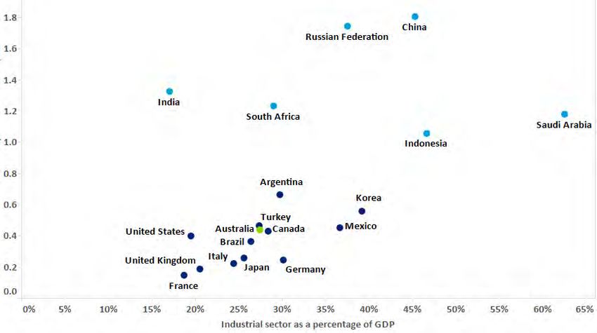
204.3 Sectoral analysis
In the following sections we compare Australia’s carbon emissions to that of other
countries with similar economic structures. To do this, we have separately identified GDP
associated with the services, industrial, and agriculture sectors as a proportion of overall
GDP. More specifically, we have examined each country’s overall carbon emissions from
energy against the proportion of GDP derived from each sector.
We have not examined how much carbon emissions are derived from each sector of the
economy. Therefore the following analysis can be used to examine how Australia’s energy
emission compare to countries with a similar make-up of GDP, but not the carbon
emissions performance of each sector of the economy.
4.3.1 GDP and energy carbon emission benchmarks—services
sector
The majority of Australia’s GDP (69% in 2011) is derived from the services sector.
In figure 12 we present each G20 country’s carbon emissions per unit of GDP against the
percentage of GDP derived from services.
Figure 12 – Energy carbon emissions per unit of GDP against percentage of GDP derived
from services
CO₂-e (kilotonnes) / GDP (millions, real $US)
Source: IEA data, Deloitte analysis
In figure 12 we have grouped the G20 countries into two broad clusters. The blue cluster
consists of countries with a relatively large services sector and is typically developed
economies with the exception of Brazil, Argentina and Mexico. Brazil’s low emissions
intensity of energy (see section 4.2.1) means its emissions given the size of its services
sector are similar to more developed countries. Argentina has a relatively low energy
21intensity compared to other emerging countries meaning it also has similar emissions
characteristics as more developed countries.
Australia is within the cluster of countries where the services sector represents a high
proportion of GDP.
4.3.2 GDP and energy carbon emission benchmarks—industrial
sector
As with most other more developed countries, Australia’s industrial sector reflects a
moderate proportion of GDP (27% of total GDP in 2011), as compared to its services sector.
In general, we would expect countries with proportionally large industrial sectors to have
higher energy requirements (and carbon emissions) than countries with proportionally
large services sectors.
Figure 13 – Energy carbon emissions per unit of GDP against percentage of GDP derived
from the industrial sector
CO₂-e (kilotonnes) / GDP (millions, real $US)
Source: IEA data, Deloitte analysis
As with the previous analysis we observe that there is a cluster of developed economies, in
which Australia sits.
Figure 13 suggests that countries with low carbon emissions per unit of GDP typically
generate a moderate proportion of their GDP from their industrial sectors. Indonesia and
Saudi Arabia, while emitting more emissions than most of the more developed economies,
have a relatively high proportion of GDP from the industrial sector.
Australia is within the cluster of countries where the industrial sector represents a
moderate proportion of GDP.
224.3.3 GDP and energy carbon emission benchmarks—agriculture
sector
Agriculture accounts for a small proportion of Australia’s GDP (4% in 2011). Compared to
the other more developed countries in the G20, however, this proportion is relatively large.
In the figure below we present countries’ carbon emissions per unit of GDP against the
percentage of its GDP derived from the agriculture sector.
Figure 14 – Energy carbon emissions per unit of GDP against percentage of GDP derived
from agriculture
CO₂-e (kilotonnes) / GDP (millions, real $US)
Source: IEA data, Deloitte analysis
Figure 14 shows that, in general, countries with low CO2-e/GDP derive a low proportion of
their GDP from agriculture. Turkey and Argentina, however, derive a moderate proportion
of GDP from agriculture and also have a reasonably low level of emissions per unit of GDP.
Australia is within the cluster of countries where the agriculture sector reflects a small
proportion of GDP. Australia’s agriculture and emissions characteristics are similar to many
of the more developed G20 countries. When compared to the G20 more broadly, Australia
produces fewer emissions per unit of GDP in total than Russia which also derives a similar
percentage of GDP from the agriculture sector.
We note that, consistent with the analysis in this report, the emissions considered are only
those derived from the energy sector and therefore do not include, for example, methane
directly resulting from agricultural activities.35
35
This analysis examines how Australia’s energy emissions compare to countries with a similar make-up of GDP,
but not to examine the emissions performance of the agricultural sector.
234.4 The role of technology
A key solution to delinking carbon emissions from energy production (and GDP growth) is
the development of low emissions or zero emissions technology. While there has been
some progress such as onshore wind, large scale solar generation and geothermal, there
are limited examples of zero carbon generation technologies that are economically viable
without the need for subsidies or a significantly high price on carbon emissions. Despite
this, global clean energy investment has quadrupled over the past decade and in 2011
peaked at $279 billion.36
Increasingly, the private sector is leading the drive for technological breakthroughs to
transition to low carbon economies:
Tesla Motors is on the path to mass produce competitively priced electric vehicles
in the near future. If successful, this could result in a substantial reduction in
emissions from passenger vehicles.
Khosla Ventures has invested in a portfolio of new energy technologies, including
energy storage (Ambri, QuantumScape, Seeo), carbon capture (Calera), and solar
(Cogenra Solar, Stion).
Large scale carbon capture and store (CCS) projects are being commissioned, with
the Boundary Dam Integrated Carbon Capture and Sequestration Demonstration
Project in Canada (CO2-e capture capacity of 1 Mtpa) commencing operations in
October 2014. The new 582 MW power plant at the Kemper County Energy Facility
in Mississippi, with carbon capture of 3 Mtpa is expected to commence in 2015.
The Petra Nova Carbon Capture Project in Texas entered construction in July 2014
with carbon capture capacity of 1.4 Mtpa. 37
Bill Gates has established TerraPower, a nuclear energy technology company that
could play a key role in addressing the imperative to move to low-carbon or zero-
carbon energy. TerraPower aims to develop a scalable, sustainable,
environmentally friendly, and cost-competitive energy source that would allow all
nations to quicken their pace of economic development and reduce poverty.
Further and more substantial technological breakthroughs on several fronts will minimise
the impact of carbon reduction on economic growth and living standards. The G20
countries might consider further encouraging research and development in energy to foster
and expedite the commercialisation of new technology. This is important as the nine
wealthiest countries of the G20 spend only 0.05% of GDP in 2012 on energy research and
development.38 Incentives for investment in low emissions technology can be generated by
putting a price on carbon emissions.
36
Bloomberg New Energy Finance, ‘Global Trends in Renewable Energy Investment 2013.’
37
Global CCS Institute. We note that CCS is partially subsidised by governments.
38
International Energy Agency, OECD iLibrary. R&D expenditure includes R&D on Energy Efficiency, Fossil Fuels,
Renewable Energy Sources, Nuclear, Hydrogen and Fuel Cells, Other Power and Storage Technologies and Other
Cross-Cutting Technical Research. Data for Australia, Canada, France, Germany, Italy, Japan, Korea, United
Kingdom and United States.
24As these technological breakthroughs occur, there needs to be cooperation and
collaboration between countries so that the benefits are realised in developing, as well as
developed countries. According to the World Bank, in 2011 around 22% of the world’s
population did not have access to electricity, almost all of whom live in developing
countries.39 As more people gain access to electricity, it is important that this is provided via
economically viable and clean methods so as not to entrench past practices.
39
World Bank, Access to electricity (% of population)
. The World Bank, Energy; the
facts.
255 Comparative analysis
The purpose of this section is to use econometrics to test whether, given the relationships
between emissions and certain variables including GDP, population and use of fossil fuels,
Australia’s historical emissions are in line with expectations.
To achieve this, we compiled data for up to 170 countries over a period of up to eleven
years (2001-2011).40 We applied three different statistical methodologies to examine the
robustness of the results, and also averaged the results across the methodologies.
The most prominent result of this exercise is that Australia is consistently a little above the
median of the G20 countries, regardless of the method used.
5.1 Methodologies
The basic models relate the CO2-e emissions of each country to variables describing the size
and composition of the country and its economic activity. The variables are motivated by
the discussion in the previous section and include GDP, population, use of fossil fuels and
the composition of output by sector.
We note that, while we consider these factors are likely to encompass the majority of the
reasons for a country’s emissions, there will be other factors which are not incorporated.
This means that the rankings presented cannot definitively explain emissions performance
but provide a guide as to some of the relative drivers of emissions.
The model parameters are given in Appendix A.
Broadly, the methodologies applied were:
1. Fixed baseline emissions measure
a. Econometrically estimate a model relating CO2-e emissions to the variables
describing the size and composition of the country and its economic activity
b. Parameters in the model give, for each country, the amount by which
emissions vary from the average of the countries (given the characteristics of
the countries). Because the model is explaining emissions, a country with a
large value of the parameter ranks poorly.
2. Emissions frontier measure
a. Return to the central question of how efficiently countries generate GDP,
where efficiency is defined in terms of emissions of CO2-e. For given GDP,
lower emissions means higher efficiency
40
Missing data meant that the estimation samples typically included less than 170 countries and less than the
full eleven years.
26b. The countries that are most efficient (have the highest ratios of GDP to CO2-e,
corresponding to the lowest values of CO2-e / GDP) are considered to be close
to a ‘frontier’
c. Measure all countries relative to that frontier. Countries further from the
frontier generate less GDP per CO2-e or more CO2-e per unit of GDP, and rank
poorly.
3. Economic frontier measure
a. Continuing with the central question, use the frontier method to ask how
efficiently countries produce GDP (per capita) based on their energy use, and
other economic and demographic variables
b. A country that ‘generates’ GDP inefficiently is probably emitting more CO2-e
than would be the case if it generated GDP efficiently. Use the relationship
between CO2-e emissions and GDP to estimate the ‘wasted’ CO2-e emissions.
A country with more ‘wasted’ CO2-e emissions ranks poorly.
Not surprisingly, countries’ scores vary across the three methodologies. We also show an
average ranking.
5.2 Fixed baseline emissions measure
The econometric model relates annual CO2-e emissions of 125 countries over the period
2001-2011 to variables describing the size and composition of each country and its
economic activity.41 Those variables are:
level of output (measured as real GDP in $US)
mix of output (as measured by Gross Value Added Composition by broad sectors)
population
density
urbanisation rate.
In addition, the model controls for the proportion of energy derived from fossil fuels and
the terms of trade. For example, emissions are expected to be higher in countries with
higher output and greater populations.
Included in the model is a set of parameters – the country fixed effects – representing the
‘baseline’ levels of emissions for the countries. Figure 15 below shows the results of this
method for the G20 countries.42
41
Because of missing data, the data for some of the countries covered fewer than the eleven years. The
estimator is the ‘fixed effects’ estimator on the panel of data. Most of the variables in the regressions are in log
form.
42
The values in the figure are the exponentials of the estimated fixed effects.
27Figure 15 – Baseline fixed CO2-e estimated
China
Russian…
Canada
US
Saudi Arabia
India
South Africa
Australia
Indonesia
Korea, Rep.
Germany
Japan
Argentina
France
Turkey
Italy
Brazil
Mexico
UK
0 1 2 3 4 5 6 7
Baseline CO2 factor
Source: IEA data, Deloitte Access Economics 2014
Because the model is explaining emissions, a country with a large value ranks poorly. The
figure illustrates that the level of emissions in China, for example, is greater than Australia’s
(taking into account the control variables). Generally, while controlling for the amount of
goods and services produced in an economy, the model does not control for how they are
produced – with differing levels of production technology and different drivers such as
political and cultural norms.
Australia ranks twelfth amongst the G20 countries.
5.3 Emissions production frontier measure
As described in section 5.1, the methodology involves three basic steps:
1. Define efficiency as in terms of GDP produced per unit of CO2-e emissions. Higher
efficiency means more GDP per unit of CO2-e emissions, or, equivalently, less CO2-e
emissions per unit of GDP.
2. Define a ‘frontier’ based on the countries that are most efficient (have the highest
ratios of GDP to CO2-e).
3. Measure all countries relative to that frontier. Countries further from the frontier
(large values of the relevant parameters) rank poorly.
The methodology uses all the available data over the period 2001-2011.43
The actual frontier is defined implicitly within the econometric evaluation of the data,
although the methodology does produce an explicit measure of inefficiency – the expected
distance each country is from the frontier, on average over the sample period.
43
We use a stochastic frontier analysis.
28You can also read