Failure Modes Making sense of the Polls and Claims of Fraud in Pemilu 2019
←
→
Page content transcription
If your browser does not render page correctly, please read the page content below
Failure Modes
            Making sense of the Polls and Claims of Fraud in Pemilu 2019

                                             Seth Soderborg
                                        soderborg@g.harvard.edu

Figure 1 Polls of the presidential race since 1 January 2019. Jokowi in red, Prabowo in blue, and undecided in
grey. Polls are identified by name.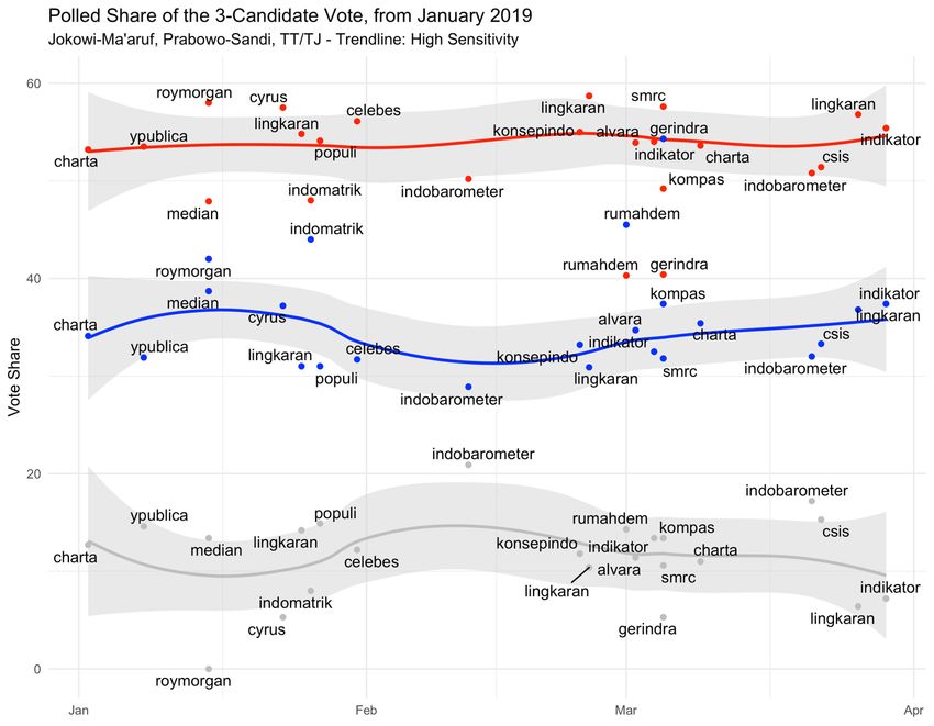
Figure 2 Trends in presidential polling 2014 and 2019 compared. Red is Jokowi, blue is Prabowo, and grey is TT/TJ (undecided). Note the closeness and volatility of the
2014 race and contrast with the stability of the large gap between the candidates in 2019.

                                                                                     2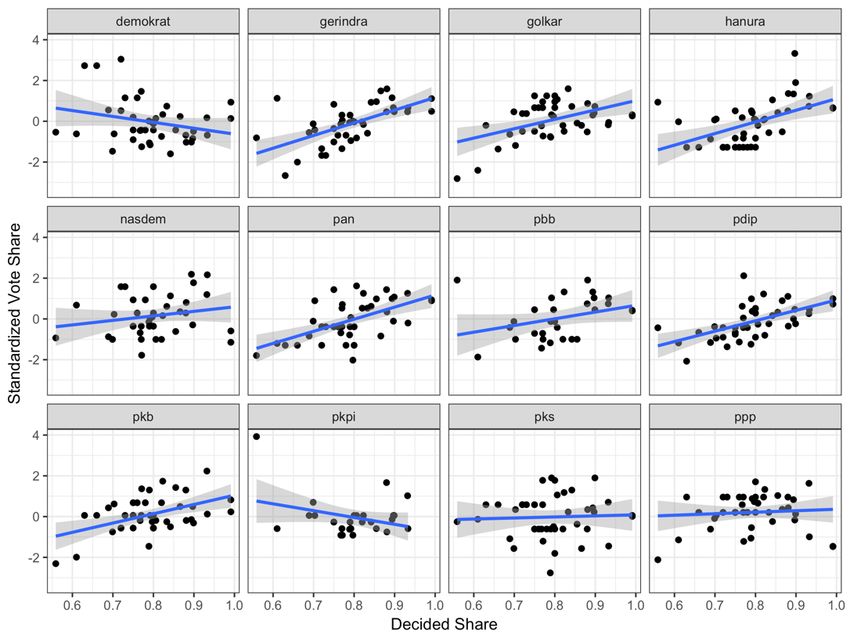
Figure 3 Performance of top four parties in 2014 compared to 2019, relative to minimum threshold (dashed
line) and performance in the previous election (solid line representing 2009 and 2014, respectively). To measure
performance of 2014 polls, compare curve in left graph to solid line in right graph. Note that PDI-P and Golkar
overperformed their polls

                                                       3
Figure 4 Performance of Islamic parties in 2014 compared to 2019, relative to minimum threshold (dashed line)
and performance in the previous election (solid line representing 2009 and 2014, respectively). To measure
performance of 2014 polls, compare curve in left graph to solid line in right graph. Note that all Islamic parties
outperformed their polls in 2014.

                                                        4
Figure 5 Performance of incumbent small and contender new parties in 2014 compared to 2019, relative to
minimum threshold (dashed line) and performance in the previous election (solid line representing 2009 and
2014, respectively). Compare NasDem in 2014 to Perindo—Perindo is performing far worse than NasDem did
in its first year.
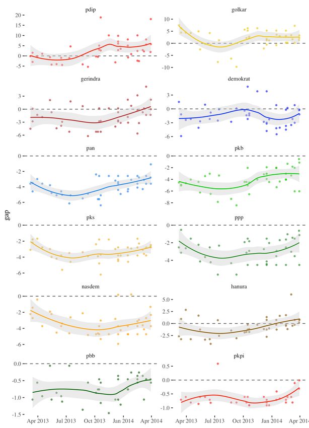
5Figure 6 Gap (difference) between polled support for parties and final vote share in 2014. A gap of zero
indicates that a poll exactly measured support for the party; below zero is an underestimate. Note that PAN,
PKB, PKS, and PPP were underestimated by all polls.
6Figure 7 Relationship between share of decided voters and support for the party. Since “TT/TJ” is normally the
largest “party” in polls, any increase in the share of decided voters should benefit all parties (though not
equally). If there is an especially weak relationship between decided share and a party’s support, it is one sign
that survey respondents who support that party are more likely to reveal—or not to have—a preference for that
party when they were surveyed.
Figure 8 If sample size creates a bias in which a party is systematically underestimated, there should be a
stronger positive relationship between sample size and support for that party. Here, we see a strong relationship
between sample size and measured support for PKS, PKB, and PAN, but not for PBB or PPP.
7Figure 9 Total national seat totals in repeated simulation based on 2014 parliamentary results. Solid lines are a
linear estimate; curved lines allow the effect to magnify at size.
As national vote share passes 15 percent, the gap between seats received under the old largest-remainder system
(the Hare quota) and the new Saint-Laguë method increases, reducing the seats won by the largest party. This is
consistent with the new quota formula, in which the discount for winning a marginal seat increases non-linearly.
Figure 10 Change in seats won in dapil in 2014 under largest-remainder (left) and Saint-Laguë quota (right).
Note that the most common outcome is that PDI-P loses one seat.
8Figure 11 Distribution of village-level vote share won by Jokowi in 2014. Note discontinuities at 0 and 1, and
the minor discontinuity at exactly 0.5. Omitting Papua eliminates the discontinuities. The discontinuities are
driven by villages with 100 percent turnout located in Papua, which indicates they are the result of the noken
block voting system. There are no discontinuities once the noken villages are accounted for.
9Figure 12 Final digits of village-level vote totals (not share) should be uniformly distributed. Non-uniformity is
evidence of a process other than ordinary voting. In the raw vote data, there are far more zeroes in the final digit
of vote returns for Prabowo than would be expected. These excess final-digit zeroes turn out to be located in
places where Prabowo received exactly zero votes—the noken villages in Papua.
Figure 13 Distribution of Jokowi vote percentage in areas listed by Prabowo 2014 campaign court filing as
areas of large-scale fraud.
10You can also read