Remote Sensing: a Closer Look at Bangalore, India
←
→
Page content transcription
If your browser does not render page correctly, please read the page content below
Remote Sensing: a Closer Look at Bangalore, India
        A Training Module for IDRISI Explorer

                              Created By:

 Paul Bendernagel, Matt Cresey, Jordan Lim, Evan Moorman, Caitlin Toner

                     Macalester College – Fall 2013

                                  For:

                 Introduction to Remote Sensing course

    Taught by Hubert H Humphrey Visiting Professor Harini Nagendra
Introduction The goal of this project was to create a guide to help new IDRISI Explorer users learn the basics of remote sensing. Please note that this training module should not be used as a substitute for a traditional remote sensing text. While this module does discuss some of the science and theory behind remote sensing, it does not provide the detailed explanations and graphics needed to understand this amazing technology. This module does not require any additional materials beyond a registered version of IDRISI Explorer, a stable Internet connection, and a working computer with a recent version of Windows operating service. Chapter 1 of this module will overview how to download free satellite images from the U.S. Geological Survey. You will not need to purchase any images to work the exercises in this training module. Completing the chapters in this module will teach and expose you to the following remote sensing skills: Chapter 1 – The Basics of IDRISI File management, downloading and importing images, creating raster groups Chapter 2 – Image Manipulation in IDRISI False color composites, windowing, image stretching, histograms Chapter 3 – Enhancing Images Spatially Multiplicative image resolution, macro modeler Chapter 4 – An Introduction to Spectral Enhancement NDVI, Vegindex, PCA (Principle Component Analysis), Decorrelation Analysis Chapter 5 – Radiometric Calibration Image normalization, vector/raster masks, regression accuracy analysis This training module was developed by Macalester College geography students Paul Bendernagel, Matt Cresey, Jordan Lim, Evan Moorman, and Caitlin Toner for an Introduction to Remote Sensing course in Fall 2013. Special thanks to Visiting Professor Harini Nagendra for teaching the course and guiding us through this project. If you have any questions or have suggestions on how to improve this IDRISI tutorial, feel free to send them to Macalester College’s geography department coordinator, Laura Kigin (kigin@macalester.edu), who will pass the information on the appropriate members of the department.
Chapter 1: The Basics of IDRISI Explorer
Goals:
Learn to navigate within the IDRISI workspace
Create folders and establish and organized workflow
Import files into IDRISI
Displaying and grouping images together
Required Materials and Data:
Access to IDRISI
Access to the Bangalore_Chapters1-5 folder
An up to date web browser with flash and java
We will be working with the Bangalore images for chapters 1-5 of this remote sensing tutorial.
This will make it easier for you to start labs and return to them if you don’t finish in one go.
After this chapter of the lab manual, you won’t have to move any files and create any folders
outside of IDRISI until chapter 5.
Make sure not to delete the Bangalore_Chapters1-5 folder and always keep it backed up to
the server since this is the sole folder you will be working with over the next couple of labs. You
will learn more about creating, accessing, and filling this folder later on in chapter 1.
1.1 Opening IDRISI and Navigating the Workspace
Open IDRISI by double clicking on the desktop shortcut or by searching for the
application in the start menu/search bar.
After the program loads, you’ll be at the main IDRISI workspace (Figure 1.1)
Figure 1.1.1, the IDRISI workspace.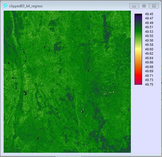
Now let’s go over some vocabulary that will be important for operating in the IDRISI
workspace. Make note of the following components of IDRISI:
o See below in figure 1.1.2
Menu system
Tool bar
Shortcut utility
Status Bar
o See below in figure 1.1.3
Progress Bar
IDRISI Explorer
Composer Dialog Box
Display System
Figure 1.1.2, important features in the IDRISI workspace
The IDRISI menu bar is similar to many other menu systems for other applications and
operating systems. A single click will bring up a list of subsets. Moving your cursor over these
subsets might pull up another set of tools/options. Regardless of how deep into the menu
subsystem the option you are looking for is, the activation is the same—a single click.
The tool bar is home to a variety of crucial functions. We will practice using the tool bar in this
lab and all subsequent ones.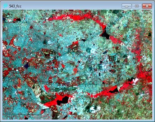
The shortcut utility is every IDRISI users’ best friend. Once you become more familiar with
common operations and tools, you can type them into the shortcut utility and it will pull up the
operating window. This is a lot faster than searching for the tools in the menu bar’s sub layers.

Figure 1.1.3, More important features in the IDRISI workspace

The display system presents images in IDRISI. It is also referred to as the display or the display
window. These display windows are resizable and you can shrink and expand like you would
any other window or webpage in a Windows operating system by dragging in edge or corner.
Displays also include a default legend in IDRISI.

The composer dialog box indicates which images are currently open or are being displayed in
the IDRISI workspace. This window also has many other helpful image manipulations, which we
will cover in future chapters. Not the buttons at the bottom window, these will all be covered in
chapters 1-5 of this IDRISI tutorial.
IDRISI Explorer is the data hub of the IDRISI workspace. It plays a similar role to the table of
contents and ArcCatalogue for those of you who are familiar with ArcMap. You will use this
folder to manage and organize remote sensing data. We will learn more about the IDRISI
Explorer window in the following section of chapter 1.

1.2 IDRISI Online Help

The program comes with a great online help resource that can be accessed in program very easily. This
help section is extensive and includes a variety of detailed explanations and illustrations to help users
navigate the various aspects of the program and understand remote sensing processes in general
(Figure 1.2.1)

         To access the help section, click to the following route: Help—Contents

The on-line help resource can also be reached by clicking on the “Help” button at the bottom of many of
the programs function windows (Figure 1.2.2)

Figure 1.2.1, the IDRISI help page

Figure 1.2.2, the IDRISI help page is available from many different windows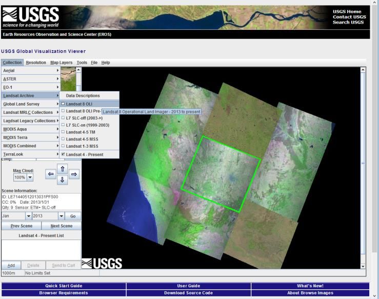
1.3 Managing Files and Folders in IDRISI Explorer

In order to work in IDRISI, it is crucial that we become familiar with IDRISI Explorer. Located on
the left side of the workspace, click on the plus tab to expand the Explorer. The Explorer is
made up of two panes: a project pane and an editor pane. If you think of the workflow as a
pyramid, a project is the tip top of the pyramid and there are often numerous files and file
groups within a project. It’s time to start using the program! Create a project of your own and
call it “Bangalore_Chapters1-5”

    Create a new project file and specify the working and resource folders with the IDRISI EXPLORER
    Menu Location: File - IDRISI EXPLORER
       1. Start the IDRISI EXPLORER from the main menu or toolbar.
       2. In the IDRISI EXPLORER window, select the Projects tab.
       3. Right click within the Projects pane, and select the New Project Ins option.
       4. A Browse For Folder will open. Use this window to navigate to
            C:IDRISI_Tutorial\Bangalore_Chapters1-5 and click OK in the Browse for Folder window.
       5. A new project file BangaloreChapters1-5 will now be listed in the Project pane of IDRISI
            EXPLORER.
Once you are done with the steps in the box above, you should have a project named
Bangalore_Chapters1-5 and working folder with the same file path as step 4. Projects should
have accompanying working and resource folders. This will help the program load the files
associated with the project you are working on.

                                    Right click inside the project
                                    pane to create a new project.

                                 Editor Pane

Figure 1.3.1, IDRISI explorer with Bangalore_Chapters1-5 project and corresponding working and resource folders.

    Create a new project file and specify the working and resource folders with the IDRISI EXPLORER
       6. Right click in the editor pane and select “add folder”.
       7. A new line will appear in the editor pane called “resource folder (1)”.
       8. Click on the “…” in the right hand side of the new resource folder.
       9. Navigate to the C:IDRISI_Tutorial\Bangalore_Chapters1-5 and click OK.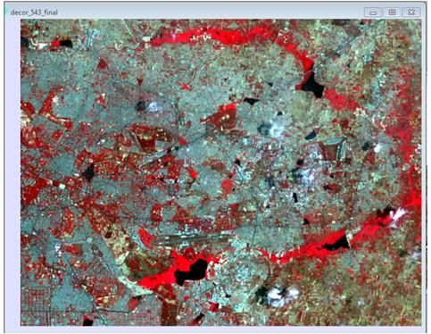
Now we have all the necessary components to start importing and manipulating images in
IDRISI. In the next section we will learn how to import images into the program. The target
location should be the Bangalore_Chapters1-5 folder that we’ve now linked IDRISI working and
resource folders to.

1.4 Downloading images from Landsat

Now that we are familiar with the IDRISI workspace and have created the workflow and folders for
chapters 1-5, it’s time to acquire some images! Follow these steps to download the images we will be
using.

    Determining the coordinates of the Bangalore study area
       1. Go to http://glovis.usgs.gov/, this is where we will download the images from.
       2. The default location will be close to your true location, where you are when working on this
          lab.
       3. Go to Google earth and estimate the latitude and longitude of of Bangalore. You can do
          this by clicking on “Tools” in Google Earth menu bar and then clicking on “options.
       4. In the options window find the “show lat/long” section and click on the radio button for
          Decimal Degrees. From here you can place your cursor on top of any point on the globe and
          get a lat/long readout on the bottom of the program. Search for Bangalore in Google Earth
          and then record what you think the lat/long of the city is.
       5. When you’ve found the lat/long of Bangalore, search for “WRS-2 path/row to
          latitude/longitude converter” in a search engine of choice. Click on the first link (it should be
          a USGS website).
       6. On the WRS-2 path/row to latitude/longitude Converter page, click on the radio button to
          convert lat/long to path row. Now type in the latitude and longitude estimation you got
          form Google Earth.
       7. A map will pop up when you enter your estimation. Does Bangalore look like it’s in the cross
          hairs on the map? If not, go back to Google Earth and recheck your latitude and longitude.
          Also check and make sure that you’ve set the options to decimal degrees (as described in
          step 4). After double checking, re-enter your second estimation into the WRS-2 path/row to
          latitude/longitude Converter.

Figure 1.4.1, typing in an accurate lat/long should produce a locator map similar to this.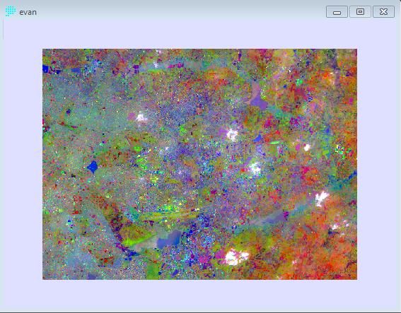
Downloading the Bangalore Images
1. 144/51 is the correct path and row you should have obtained through Google Earth and the
Lat/Long to Path/Row Converter. If you didn’t obtain this value, revisit the “Determining the
Coordinates of the Bangalore Study Area” section above and make sure that you are
zoomed into Bangalore before placing your cursor and recording a latitude and longitude.
2. In your browser of choice, open up http://glovis.usgs.gov/. This is a mapping and image
downloading service hosted by the USGS.
3. Type in 144/51 into the path and row boxes accordingly. Click the go button.
4. The red dot on the locator map should be focused on the Southern part of India, where
Bangalore is. If the locator map isn’t focused on Bangalore, check to make sure you entered
in the correct latitude and longitude.
5. For the highest quality and most recent images we will be using Landsat 8. Navigate to
Collection-Landsat Archive-Landsat 8 OLI and click to set Glovis to Landsat 8 images.
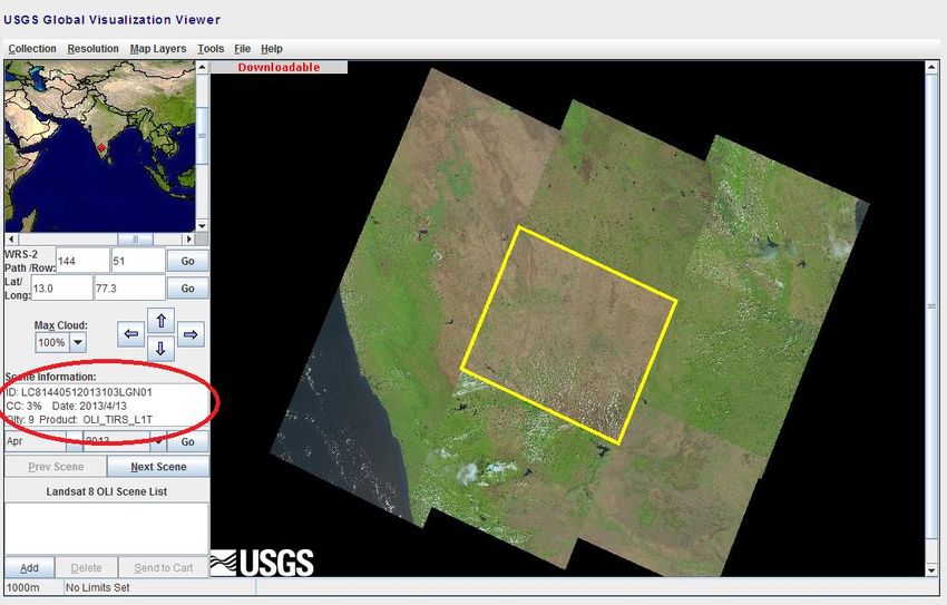
6. Take some time to explore the Glovis online imaging service. Adjust the date (show in the
image below with a red circle) and see what kinds of changes occur in the region.
7. To the right of the date in the information box, circled in the image below in red, is the
percentage cloud cover. This is denoted as “CC: %”. Click through the months in 2013 and
see how the cloud-cover changes. Which months have the highest cloud-cover, which ones
have the lowest?
8. April 13th and November 7th, have cloud-cover percentages of 3. These are the most cloud
free and we will use Landsat 8 Bangalore April 13th, 2013 images for this module.
9. After selecting the April 13th image, click the “Add” button underneath “Landsat 8 OLI scene
List”. The image ID (LC81440512013103LGN01) should appear in the scene list with a
shopping bag icon. Once you see this click on “send to cart”.
10. You’ll get a pop up window asking you for a user ID. In order to download the images, create
an account by clicking the “register” button. Once this is done a “pending scenes” page
should open up.
11. Click on the hard drive icon near the X on the far right of the “Item Basket – Pending Scenes”
page. This will take you to an option window (figure 1.4.5) and select “Level 1 GEOTIFF Data
Product”. This should start the download, but check your browsers “downloads” section.
Figure 1.4.2, Make sure that you download the April, 2013 images for Landsat 8.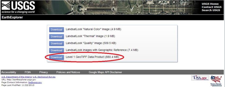
th
Figure 1.4.3, April 13 , 2013 has a very low cloud cover, 3%.

Figure 1.4.4, click on the register button in the upper right to create and account.

Figure 1.4.5, GEOTIFF is an image file type and we want the full “Data Product” for this module.
Decompressing the Downloaded Bangalore Images
       1. While waiting for the download to finish, create a new folder on the C-drive called
          “IDRISI_Tutorial” and a folder inside of that labeled Bangalore_Chapter1-5.
       2. Once the download finishes (it should appear as “LC81440512013103LGN01.tar.gz” unless
          you gave it another name) copy the compressed file over to “Bangalore_Chapter1-5”.
       3. After completing the copy, right click on “LC81440512013103LGN01.tar.gz” and navigate to
          either Winzip, 7-zip, or some other zip file utility of your choosing.
       4. Regardless of what utility you choose, the goal is to “unzip” or decompress the file inside the
          Bangalore_Chapters1-5 folder, the main place of storage for this training module.
       5. “LC81440512013103LGN01.tar.gz” will have to be unzipped twice—first to unpack the .gz
          and then the .tar. Follow the same steps on the second unzip, make sure that files are being
          extracted from the zip and going into the Bangalore_Chapters1-5 folder.
       6. After completing two decompression passes, there should be 10 TIFF images in the
          Bangalore_Chapters1-5 folder. Check to make sure that images have unpacked correctly
          before moving on.

Figure 1.4.6, you should have 10 TIFFs in the Bangalore_Chapters1-5 folder.

1.5 Importing images into IDRISI

Now that we have a folder full of TIFFS, we can work on getting them into IDRISI. The program will not
able to view them until we do this.

    Import the Bangalore images into IDRISI
       12. Navigate to the following, File – import – desktop publishing formats – geotiff/tiff
       13. Click and open up the GEOTIFF/TIFF window
       14. Select “GEOTIFF/TIFF to IDRISI” option.
       15. Click on the “…” on the “GEOTIFF file name” line and navigate to the first band (see figure
            1.5.2 for more details)
       16. Change the name of the image by typing “BangaloreOrig_1” into the “IDRISI image to
            create” line, and then click OK
Figure 1.5.1, open up the GEOTIFF/TIFF window to convert and import
Figure 1.5.2, once you click OK with these settings, IDRISI will import this image and create two files in your
Bangalore_Chapters1-5 folder: a .rst and a .rdc
Import the Bangalore images into IDRISI continued…
17. Import the rest of the bands into IDRISI.
18. Navigate to the _B2 for the “GEOTIFF File name” input.
19. Change the “IDRISI image to create” line to BangaloreOrig_2.
20. Follow the same steps for bands 3-11. Keep the same output naming system.
21. Once you are done, you should have an .rst and a .rdc for bands 1-11—go to the
Bangalore_Chapters1-5 folder and see if this is the case.
22. Now go to IDRISI Explorer pane and click on the “files” tab. You should see all the .rst files
underneath C:\IDRISI_Tutorial\Bangalore_Chapters1-5 (See figure 1.5.3). Hit refresh (by
right-clicking on the yellow folder) if you can’t see them.Figure 1.5.3, you should have .rst and .rdc files in your Bangalore_Chapters1-5 folder after importing.
Right click and click “refresh” if the
images your imported don’t show
This is a screen capture of the IDRISI
Explorer project pane, under the
“files” tab.
Figure 1.5.4, you should be able to access the bands you imported by going to the files tab in the IDRISI Explorer.
1.6 Displaying Images
You can open up images in IDRISI in a number of ways. The first method is the easiest and most
intuitive—just click on an image in the Explorer and it will open up! This window can be resized
by dragging on an edge or corner. You can open up multiple images at once, minimize them,
and basically treat them like any other window you can open in a Microsoft operating system.Images can also be displayed by using the Display tool. You can access this tool by clicking on
the icon in the toolbar (see figure 1.6.1) or by following the directions in the box on the
following page.
Figure 1.6.1, the display launcher is available from the toolbar via this handy icon.
Open an image using the Display Launcher and converting to Greyscale
Menu Location: Display – Display Launcher
1. Start the IDRISI EXPLORER from the main menu: click on Display and then select the Display
launcher option from the pull out menu
2. Enter the Bangalore band you want to display by clicking “…” and selecting the desired band
from the pick list.
3. Choose the Grayscale radial button, leave all other defaults, and click OK.
4. A grayscale version of the band you selected should open in the middle of your workspace.
Each pixel in a grayscale image carries intensity information and are displayed as a shade of
the white to black spectrum depending on the intensity of the original pixel.
Figure 1.6.2, follow these settings to produce a grayscale version of band 1Following these directions should produce an image like the one below (see figure 1.6.3). You
can produce grayscales of any images by following the same process and choosing the desired
image in the “…” pick window.
There are many ways to make this change permanent, however, what we’ve just done will only
make the image grayscale temporarily—we wouldn’t want to make the change permanent to
our originals anyways! You can check this by closing the window and double clicking on
BangOrig_1 in the Explorer pane. You will learn how to make permanent changes to images in
future chapters of this tutorial.
Figure 1.6.3, follow these settings to produce a grayscale version of band 1
1.7 Creating Raster Groups
The last step of chapter 1 is to create an image group, or a raster group in this case. Now that
we have original images uploaded, grouping them will allow us to run processes to all of them
at once. This will become very helpful in later chapters of this tutorial. Follow the directions in
the box below to create a rater group of our Bangalore images.
Create a rater group of the all the Bangalore images/bands
Menu Location: Explorer-Select All-Right Click-Create-Raster Group
1. Click on the first band, BangOrig_1, in the Explorer pane. Make sure that it is highlighted.
2. While holding down shift, move your mouse all the way to the last Bangalore band,
BangOrig_11, and click. All of the bands should be highlighted like in figure 1.7.1 below.
3. Right click on any of the highlighted images and navigate the Create sub header.
4. From Create, find Raster Group, and click.
5. You will get an alert saying that the rows and columns of some of the images don’t line up.
Ignore this warning because we will learn how to adjust rows and columns (the dimensions
or zoom of an image) in chapter 2 of this tutorial.
6. Doing this will create a raster group and you should see it in the explorer (see image 1.7.2).
7. Double click the raster group to see the contained bands.Figure 1.7.1, follow this path to create a raster group
Figure 1.7.2, double click on the raster group folder in Explorer to view nested images
1.8 Checking for Understanding
We covered a lot in the first chapter, so let’s take some time to reflect and make sure that the
basics are covered. In this chapter you learned the following:
How to open up IDRISI
The basics of the IDRISI workspace—including some of the basic functions in the menu bar, tool
bar, and the explorer/editor pane.
Key elements of the IDRISI workflow including project creation, working folders, resource folders,
and the tabs in in the IDRISI Explorer pane
How to import TIFF or GEOTIFF files into IDRISI using the Import tool
Displaying images and grayscaling with the display launcher
Creating a raster group in IDIRISI Explorer pane out of multiple bands
This chapter lays down the foundational skills that you will need to work on future projects in this
tutorial. It also creates the folder, C:IDRISI_Tutorial\Bangalore_Chapters1-5, that we will be working out
of for the rest of the tutorial. Make sure that this folder has the following images: BangOrig_1 through BangOrig_11, excluding band 9
A raster group containing BangOrig_1 through BangOrig_7
If you have these skills and these images in your Bangalore_Chapters1-5 folder, you are ready to move
on to the next section of the tutorial! But before doing so, please complete the following discussion
questions.
Discussion Questions:
City planners in Bangalore have asked you to look at the carbon sequestration potential of the green
cover in the city. In order to do this you’ll need to have an understanding of the current green cover
distribution in the city, a geographic area totaling about 800 square kilometers (about 300 square miles),
in order to estimate the current carbon storage potential of the city.
Draw upon your BangOrig_band# images in IDRISI, Google Earth, the course text, and lecture notes to
help you respond to the following questions:
1. What type of spatial resolution you would prefer to conduct the study—1km resolution (AVHRR),
250 m (MODIS), 30 m (Landsat), 10 m (SPOT) or 1 m (IKONOS)? Keep in mind that your study
area is approximately 800 square km. Support your choice in sensor system range by providing
some pros and cons of the listed options above.
2. What other geographic imaging tools or resources could help you determine the carbon
sequestration capacity of Bangalore (e.g. soil maps, vegetation plots, or digital terrain models)?
Please justify your choices in supplemental resources.
3. How would you share your findings? What kind of outputs would there be?Chapter 2: Image Manipulation in IDRISI
Goals:
In this chapter we will learn about histograms, WINDOW, contrast, saturation, contrast stretching, and
how to make a false color composite. Understanding all of these is critical to a basic working knowledge
of IDRISI.
We’ll start with histograms, which are graphs that display the frequency of certain brightness values
throughout an image. Don’t worry about the vocabulary—it will be explained throughout the chapter!
Then, in order to work with our images we’ll learn more about the WINDOW tool so that we are working
with an appropriate image for our contrast stretching. Some terms throughout the contrast section may
be new. Don’t worry! They will be explained as we go along. We will create three different types of
contrast stretches: linear, histogram equalization, and linear with saturation. Lastly, with all of our new
knowledge, we’ll construct a false color composite of Bangalore. Let’s have some fun!
Required Materials and Data:
C:IDRISI_Tutorial\Bangalore_Chapters1-5
You should have these files for this section of the manual:
BangOrig_3, Bang_Orig_4, and BangOrig_5
2.1 Opening and Examining the Histogram
A histogram is a graph which shows the prevalence of certain brightness values in the image. By
examining the histogram, we can usually get an idea of what values are outliers and how contrast
stretches affect an image.
Opening and examining histograms in IDRISI
Menu Location: Display - HISTO
1. Click the ‘…’ button next to the blank field to the right of “Input File Name”
2. In the Pick List window, select BangOrig_5
3. Change the class width to 200
4. Accept all other defaults and click OK
Figure 2.1.1, Histogram display windowThere seems to be a relatively uniform curve except for a spike close to zero. Speculate as to what that
could be.
Figure 2.1.2, Unclipped Histogram
2.2 Clipping your window and re-examining the histogram
Making sure your windows are the correct size is integral to most features in IDRISI. In order to execute
most functions, images must be the same size—this includes creating false color composites, which we’ll
do later. The numbers we’ll be entering in the ‘WINDOW’ window correspond to a specific row and
column. We will specify a row to be the top of the image, a column to be the left bound, and then
choose another row and column to specify the right bound and the bottom of the image. These
numbers provided will give us a good view of Bangalore to work with.
Clipping your image using WINDOW
Menu Location: Reformat - WINDOW
1. Click in the blank field under the heading Filename
2. Click the ‘ …’ button
3. Select BangOrig_5 from the Pick List window
4. Click OK
5. Enter 4850 into the first blank field, to the right of Upper-left column
6. Enter 3450 into the second field, to the right of Upper-left row
7. Enter 5600 into the third field, to the right of Lower-right column
8. Enter 4000 into the fourth field, to the right of Lower-right row
9. Click the field to the right of Output image:
10. You will now enter a name for your image
11. Enter CLIP_BangOrig_5
12. Make sure your window matches below
13. Click OKFigure 2.2.1, WINDOW display parameters
Now to prepare for making a false color composite and to better understand the window function, we’ll
clip BangOrig_3 and BangOrig_4 to the window size of CLIP_BangOrig_5.
A false color composite is an image created where bands from the outside the visible light spectrum are
assigned a color – either red, green, or blue – in order to perform analysis.
Clipping your images using WINDOW
Menu Location: Reformat - WINDOW
1. Under Number of files: click the up arrow until the number reads 2
2. Click in the blank field under the heading Filename
3. Click the ‘ …’ button
4. Select BangOrig_4 from the Pick List window
5. Click OK
6. Click in the blank field under BangOrig_4
7. Select BangOrig_3 from the Pick List window
8. Click OK
9. Enter 4850 into the first blank field, to the right of Upper-left column
10. Enter 3450 into the second field, to the right of Upper-left row
11. Enter 5600 into the third field, to the right of Lower-right column
12. Enter 4000 into the fourth field, to the right of Lower-right row
13. Click the field to the right of Output prefix:
14. You will now enter a prefix for your image
15. Enter CLIP
16. Click OK
Now we will display the histogram of the clipped band 5 image.
Display the histogram of your clipped band 5
Menu location: Display - HISTO
1. Click the ‘…’ button next to the blank field to the right of Input file name:
2. In the Pick List window, select Clip_BangOrig_5
3. To the right of Maximum value of display: enter 300004. Accept all other defaults
5. Click OK
Figure 2.2.2, Clipped histogram with display max of 30,000
Checking for understanding:
How does this histogram differ from the previous? Explain.
2.3 Applying Contrast Stretches to Your Images
We are now going to apply contrast stretches to your image in order to produce a sharper image for
analysis.
Contrast is defined as the differences between dark and light. High contrast means that there is a
greater range between the light and dark parts of an image. Low contrast are often referred to as “flat”
in photography, because the ranges between light and dark in the image are low. In this case, we are
going to change the display parameters of an image such that all the values are squished closer and
displayed using only 256 values instead of the potentially thousands present in the original image. This
will make the blacks darker and the whites brighter when used in conjunction with greyscale images.
With colors in the visible light spectrum (e.g. red, green, blue), it increases difference in brightness and
darkness.
At the end of this section, you will display a histogram of one of the stretches you’ve made, in order to
better understand this concept. A linear contrast stretch redefines the minimum and maximum of the
values to ones between 0 and a maximum display value, which can vary between satellites. Landsat has
a maximum display value of 255 while earlier satellites, such as Landsat 7, have considerably lower ones.
Creating a linear contrast stretch
Menu location: Display – Stretch
1. Click the ‘…’ button next to the blank field to the right of Input image:
2. In the Pick List window select CLIP_BangOrig_53. Enter the name LinStretch_5 into the Output image: field
4. Accept all other defaults
5. Click OK
Figure 2.3.1, Linear stretch parameters
Compare LinStretch_5 and CLIP_BangOrig_5. Do they look very different? Now return to the Stretch
window to make a histogram equalization stretch!
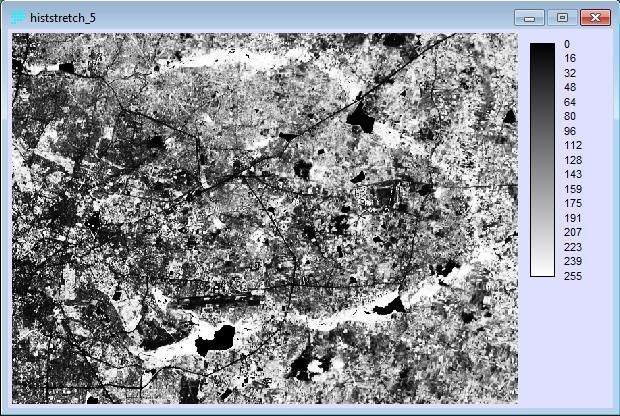
A histogram equalization stretch evenly distributes all values across the values from 0 to 255. Due to the
simplistic nature of this stretch it not only increases contrast in important areas of the image, but also
things such as noise, distortion, and other anomalies that you might not otherwise want in your image.
Creating a histogram equalization stretch
Menu location: Display – Stretch
1. Click the Histogram Equalization radio button
2. Click the ‘…’ button next to the blank field to the right of Input image:
3. In the Pick List window select CLIP_BangOrig_5
4. Enter the name HistStretch_5 into the Output image: field
5. Accept all other defaults
6. Click OKFigure 2.3.2, Histogram stretch
How does this image differ from the others? We will now display the histogram of the histogram
equalization stretch so you will get an idea of how images are stretched.
Display the histogram of your histogram equalization
Menu location: Display - HISTO
1. Click the ‘…’ button next to the blank field to the right of Input file name:
2. In the Pick List window, select HistStretch_5
3. Accept all defaults
4. Click OK
Figure 2.3.3, Histogram of your histogram stretched band 5
Examine where the values fall. You may want to open the histogram of your linear contrast stretch to
compare and better understand the differences between these types of stretches.We will now create a linear contrast with saturation stretch. Saturation determines how much at each
end of the scale will be left out or saturated.
Creating a linear contrast with saturation stretch
Menu location: Display – Stretch
1. Return to the Stretch window, assuming you have not closed it (reopen if you have)
2. Click the Linear with Saturation radio button
3. Click the ‘…’ button next to the blank field to the right of Input image:
4. In the Pick List window select CLIP_BangOrig_5
5. Enter the name LinSatStretch_5 into the Output image: field
6. Choose a value between 1 and 5
7. Enter that value in the field to the right of Percent to be saturated at each end of scale:
8. Accept all other defaults
9. Click OK
Figure 2.3.4, Linear stretch with saturation parameters
Now examine your linear contrast with saturation stretch. It should look something like below. How
does it differ from the other stretches you’ve made? More importantly, however, what is saturation?
Saturation refers to the dominance of the hue in the color. At one end of the spectrum we have the pure
color, and as we move along the spectrum it moves to black—it loses its dominant hue.Figure 2.3.5 Linear stretch with saturation. Does yours appear similar?
2.4 Creating False Color Composites
False color composites are very important to image analysis and remote sensing for a variety of reasons.
To begin, they allow us to both assign colors to the infrared scale and combine bands together. This
means that we can assign infrared an actual color (oftentimes red) and then pick out areas which emit
more infrared than other, e.g. areas with faster growing and/or more vegetation.
We will now create a “543” false color composite. “543” correlates with RGB, meaning that we will
display band 5 or infrared as Red, band 4 or red as Green, and band 3 or blue as Blue—hence RGB.
Remember when we clipped bands 3 and 4 way back in section 2.2? We are finally going to put them to
use!
Creating a false color composite
Menu location: Display – COMPOSITE
1. Click the ‘…’ button next to the blank field to the right of Blue image band:
2. In the Pick List window, select CLIP_BangOrig_3
3. Click OK
4. Repeat steps 1 – 3, while adhering to the steps below
5. Enter CLIP_BangOrig_4 in the Green image band:
6. Enter CLIP_BangOrig_5 in the Red image band:
7. In the Output image field, type FCC_543_Bang
8. Enter a percentage between 1 and 5 in the field to the right of Percent to be saturated at
each end of scale:
9. Accept all other defaults
10. Refer to the image below, and make sure your parameters match the screenshot below
11. Click OKFigure 2.4.1, False Color Composite parameters window Figure 2.4.2 Bangalore - 543 False Color Composite 2.5 Checking for Understanding You have now successfully created a false color composite image of Bangalore! Does it look like the image below? If not, try again. If yes, congratulations! You made it to the end of chapter 2! You might try creating a 742 composite. A 742 is a versatile composite that displays vegetation as green, water as blue, and other dry vegetation and dirt as earth colors. You may also want to look up band combinations on the NASA or ESRI website to get a better idea of what they’re used for. It’s used for geologic analysis, forestry, and agriculture. Remember that the bands correspond to RGB and that the window in IDRISI asks for the bands (in order from top to bottom) blue, green, and then red. After completing chapter 2 of this IDRISI tutorial you should be able to the following:
Display histograms Clip images Create a variety of contrast stretches Explain how their histograms differ Be able to define contrast and saturation Create false color composites Discussion Questions: Now create a 742 false color composite using the Bangalore images. How does it compare to the 543? What are some similarities? What are some differences?
Chapter 3: Enhancing Images Spatially
Goals:
Develop fundamental understanding of Spatial Enhancement
Practice image import and windowing techniques
Complete a successful Multiplicative Resolution Merge to see the effects of incorporating a
panchromatic band to create an image that is high in both spectral and spatial resolution
Image enhancement is an essential process in Remote Sensing that allows for the user to better
recognize patterns contained within the data. There are numerous tools and techniques in Idrisi that
can be employed to help improve both Spatial and Spectral Enhancement. This chapter will deal with
Spatial Enhancement and the processes by which the user can improve the visual quality of the image
by making alterations to and manipulating the spatial properties of an image.
Spatial Enhancement techniques typically involve processes that focus on groups or “neighborhoods” of
pixels. Spatial Enhancement often relies upon spatial filters to perform functions such as reduce noise in
an image or increase image contrast. We will incorporate spatial filtering techniques during this lab
when we incorporate a filter into the model that you will develop.
Another important enhancement technique that you will be called upon to use in this lab is the merging
of data of differing spatial resolutions. This capability of spatial enhancement is important to remote
sensing because many bands of differing spectral values recorded by satellite arrays come in different
spatial resolutions, and being able to effectively merge these images is necessary in order to be able to
use them in conjunction with one another. The most common example of this is the presence of a
single high-spatial resolution band in a sensor array that works with a number of lower-spatial
resolution bands that are all calibrated to detect specific spectral wavelengths. The aforementioned
high resolution band is referred to as the panchromatic band. This name traces its etymology to black
and white aerial film, which was the precursor to modern remote sensing. Multi-spatial resolution
allows for the spatial information obtained by the panchromatic to be integrated with the spectral
information from the lower spatial resolution bands, thereby creating a high-resolution multispectral
image.
In this chapter we will work towards spatially enhancing the Bangalore Landsat images. Using
multispectral bands 4,3,and 2 from Landsat 8 and band 8 from Landsat 8 as our panchromatic, we will
perform a multiplicative resolution merge in order to create a spatially enhanced 4-3-2 false color
composite.
3.1 Convolution
Before we begin with the multiplicative merge, it is important to understand the concept of Convolution.
From taking this class and reading this text, you now have an understanding of the concept of an image
being comprised of units with discrete values know as Pixels. In this chapter, we will explore the idea of
Windows. Windows are local groups of pixels that can occur in any size, but by definition are a subset ofthe overall image. The window is comprised of a central pixel and its immediate neighbors.
Hypothetically, if we were examining a 3x3 window (Figure 3.1.1), the window would be comprised of
one center pixel and eight surrounding neighbor pixels. A window moves sequentially around an image,
allowing each of the image’s pixels to serve as a center pixel to the window at one point.
Convolution combines the DN values of each pixel in the window to create a weighted average of the
brightness values within the designated area of the window. For our purposes, we will be applying
spatial convolution filter know as a High-pass filter. Spatial frequency measures the change in
brightness values per unit distance in any part of the image. A high-pass filter is applied to an image to
enhance detail by enhancing the high-frequency local variations, while simultaneously removing the low-
frequency local variations.
Neighbor Neighbor Neighbor
Neighbor Center Neighbor
Neighbor Neighbor Neighbor
Figure 3.1.1, 3x3 pixel window
3.2 Importing Landsat 8 Band 8 Image of Bangalore to IDRISI
Importing the Landsat Band 8 Image of Bangalore
Menu Location: File-Import-Government/Data Provider Formats-GEOTIFF/TIFF
5. Import the complete Landsat 8 Band 8 image from the class data folder
C:IDRISI_Tutorial\Bangalore_Chapters1-5 following the steps delineated in section
1.5 of the textbook.
6. Make sure that the radio button next to GeoTIFF/Tiff to IDRISI is selected as the
conversion option. (Figure 3.2.1)
7. Enter BangOrig_8 into the text box next to Idrisi image to create.
8. Press OK.
Figure 3.2.1, Import window3.3 Windowing Imported Band 8 image to previously windowed image of Bangalore
Windowing the Imported Band 8 Image
Menu Location: Reformat-Window
1. Follow the steps for windowing an image as delineated in section 2.2 of this textbook
to open the window function.
2. Click on the “…” to open the pick menu and select the BangOrig_8 image.
3. To window the Band 8 image to the same dimensions as the clipped images you made
in the last chapter, select the radio button to the right of An existing windowed
image: in the Window specified by section of the page.
4. Then click the “…” and select one of the Clipped_ (1,2,3,4,5,7) images that you
windowed for chapter 2.
5. Enter the name Clipped_8 in the Output image text box.
6. Check that your window page resembles the one depicted in figure 3.3.1
7. Press OK
Figure 3.3.1, Window settings for imported Band 8 image
3.4 Multiplicative Resolution Merge
MACRO MODELER toolbar keyMultipicative resolution merge with MACRO MODELER
Menu Location: Modeling- Model Deployment Tools- MACRO MODELER
1. Start the Macro Modeler using the icon bar or via the main menu.
2. Click on File and select delete all temporary files in the window for the MACRO
MODELER.
3. Click on file and select Set/Reset temporary file counter in the drop down menu.
4. Click the Reset button in the Set/Reset TMP File Counter window. Change the value in
the Set next counter window to 0 if it is not already 0. Click ok.
5. Use the raster Raster Layer icon to insert data layer Clipped_2, Clipped_3 and
Clipped_4 into the model
6. Insert the expand command module into the model by clicking the Module icon. Add
two more expand modules by following the same steps.
7. Arrange the three expand modules so that they form a parallel column to the
Clipped_2, Clipped_3, and Clipped_4 icons. (Figure 3.4.1)
8. Connect each of the blue rectangles representing Clipped_2, Clipped_3, and
Clipped_4 to the adjacent expand module by using the connect icon.
9. Right-click each expand command module. Set the Expansion factor in the Parameter
window to 2 in all three. We do this because the pan band in Landsat 8 has a 15 m
resolution, while the other bands all have resolutions of 30 m. In order to make them
compatible, it is necessary to use the expand command to standardize the resolution.
(Figure 3.4.2)
Figure 3.4.1, Initial Model with three expand modulesFigure 3.4.2, Setting the Expansion factor to 2
Multipicative resolution merge with MACRO MODELER (con’t)
Menu Location: Modeling- Model Deployment Tools- MACRO MODELER
10. Insert data layer Clipped_8 into the model using the Raster Layer icon.
11. Arrange the Clipped_8 rectangle so that it is directly beneath the other data layers.
12. Insert the Filter command module into the model using the Module icon.
13. Connect the Clipped_8 layer to the filter module using the connect tool.
14. Bring up the Parameters window by right clicking on the Filter module.
15. Change the Filter-type to High-pass by right-clicking in the field to the right of Filter-
type.
16. Click on OK to close the Parameters window. (Figure 3.4.3)
Figure 3.4.3, Setting the Filter type to High Pass
Multiplicative resolution merge with MACRO MODELER (con’t)
Menu Location: Modeling- Model Deployment Tools- MACRO MODELER
1. Insert a Stretch command module in the model via the Module icon.
2. Arrange the Stretch module so that its output is below the Filter module
3. Connect the output of the filtered Clipped_8 image to the Stretch module using the
Connect tool. (Figure 3.4.4)4. Bring up the Parameters window by right-clicking the Stretch icon.
5. Set the Output Data to Real by right clicking in the field to the right and selecting it
form the pop-up menu.
6. Select No for Exclude Background? by right-clicking in the field to the right
7. Enter 0 for the Lowest non-background output value by clicking in the field to the
right.
8. Enter 2 for the Highest non-background output value by clicking in the field to the
right.
9. Leave the all other fields unchanged, and then click OK to close the window. (Figure
3.4.5)
Figure 3.4.4, The model with the Stretch and Filter modules added
Figure 3.4.5, The Stretch module Parameter windowMultipicative resolution merge with MACRO MODELER (con’t)
6. Add an Overlay command module by clicking on the Command module.
7. Arrange the three overlay modules in another column that runs parallel to the columns of
the Expand modules and expand module output temporary files (as seen in figure 3.4.6).
8. Connect the icons for temporary files tmp000, tmp001, and tmp002 to their adjacent
Overlay modules using the connect tool.
9. Connect the stretch output file tmp003 to each of the three overlay modules using the
connect tool.
10. Open the Overlay Parameters window by right-clicking on the Overlay module.
11. Select Multiply from the pop-up menu in the filed to the right of Operations by clicking in th
field. (Figure 3.4.7)
12. Repeat steps 30 and 31 for the two remaining Overlay modules.
Figure 3.4.6, The model with the three Overlay modules connectedFigure 3.4.7, The Overlay module Parameter window
Multipicative resolution merge with MACRO MODELER (con’t)
33. Insert the Composite command module into the model via the Module icon.
34. Connect all three of the temporary raster files created by the three Overlay modules
to the Composite module using the Connect tool. Connect temporary raster files in
descending order, staring with tmp005, then tmp006, and finally tmp007. Your
model should resemble the model depicted in figure 3.4.8.
35. Change the name of the output file from the Composite module from tmp008 to
432_pan_mult_merge by right-clicking on the purple temporary file and entering the
new name in the Change Layer Name dialog box.
36. Click on OK.
37. Click on the Save icon.
38. Specify mult-merge as the model name.
39. Click on OK.
40. Review the model to see that the components are linked, arranged and titled in the
same manor as they are in figure 3.4.8.
41. Click on the Run icon.
42. Click on Yes to all in the window that warns that the files created by the model will
overwrite any existing files of those names.Figure 3.4.8, The Multiplicative resolution merge model
Make a standard 4-3-2 false color composite for comparison
Menu Location: Display-Composite
1. Follow the steps outlined in section 2.4 of the textbook to create a 4-3-2 false color
composite.
2. Title the new composite image 432_fcc. (figure 3.4.11)
3. Your output image should resemble figure 3.3.9.Figure 3.4.9, 4-3-2 false color composite settings Figure 3.4.10, 4-3-2 Pan_mult_merge
Figure 4.11, Standard 4-3-2 False color composite
3.5 Checking for Understanding
Develop fundamental understanding of Spatial Enhancement
Practice image import and windowing techniques
Complete a successful Multiplicative Resolution Merge to see the effects of incorporating a
panchromatic band to create an image that is high in both spectral and spatial resolution
This chapter details the basics of spatial enhancement and provides an overview of Multiplicative
Resolution Merging in IDRIS. Over the course of this lab you should have created the image Clipped_8, a
Multiplicative Merge image titled 4-3-2 Pan_mult_merge, and a standard 4-3-2 false color composite
titled 432_fcc.
Discussion Questions:
Examine the 4-3-2 multiplicative merge false color composite and a standard 4-3-2 false color composite
that has not been merged with the Band 8 Panchromatic image. Take a close look at both images and
look for differences between the two. What features stand out as being sharper or clearer? Are these
changes more pronounced in the natural or built environment? Are there any land surface types or
features that seem unchanged? Take note of these specific features. Remember that the high-pass
filter makes areas in which brightness values change relatively more quickly, more pronounced, so
drastic shifts and stark contrast will be accentuated.Chapter 4: An Introduction to Spectral Enhancement
Introduction
In this section, I will be explaining how an IDRISI user can enhance satellite imagery for purposes of
providing better images for visualization and analysis. Spectral enhancements are achieved through
mathematical processes that IDRISI will do; unlike spatial enhancements, spectral enhancement is
focused upon individual pixels with minimum attention paid to the surrounding pixels.
4.1 Displaying and Composing Images
We will first begin this lab with a review of displaying and composing images.
9. Open up the Clipped_BangOrig_5 image of Bangalore using the same technique. This is the
near infrared image.
10. Open up the Clipped_BangOrig_4 image of Bangalore using the “Display” and the “Display
Launcher” tool.
11. Open up the Clipped_BangOrig_3 image of Bangalore under the “display launcher” window.
Once all the images are up, start the composite program (this is initiated by clicking “display” and then
scrolling down to “composite”). Make a 5,4,3 composite, click “linear with saturation points,” and for
“output type, click “create 24 bit composite with stretched values.” Experiment with the “percent to be
saturated.” Essentially, when you change this number, you are determining the amount of pixels –
relative to the total amount of pixels—that you will not include in the image. What differences do you
see between, say, 1 and 3 percent? Then, try a 7,5,4 composite. What images are accentuated in this
area?
4.2 VegIndex with NDVI
Now that we have reviewed compositing images, we will move on to more specific types of spectral
enhancements. One of the most widely used methods is referred to as a normalized difference
vegetation index (NDVI). The creation of an NDVI allows the analyst to look at the amount of vegetation
in a specific area. If the analyst uses multiple images in the creation of an NDVI, he/she can explore how
the vegetation cover changes over time. AN NDVI ratio is found through the equation of:
NDVI= (Near Infrared - Red) - (Near Infrared + Red).
This equation will produce outputs between -1 and 1 (when the output is near 1, vegetation is
predominating and if the output is near 0 or is negative, non-vegetation is dominating).
Before we do this, however, we will need to create a raster group.
1. Click on the Clipped_BangOrig_3 layer, the Clipped_BangOrig_4 layer, and the
Clipped_BangOrig_5 layers. One can highlight all of these by holding the “control” button
and then respectively clicking on each of them.2. Right click on these highlighted layers and click “create” and then “raster group.”
3. Name this raster_group_1 or any other name that is easy to remember and identify.
Now that our raster group is created, navigate to the top of the screen and press “image processing”
and scroll down to “transformation.” Scroll down again to “VegIndex.” Under “vegetation index type,”
click “NDVI.” Our red band is band 4 and our infrared layer is 5, according to the Landsat website:
(http://landsat.usgs.gov/band_designations_landsat_satellites.php).
Thus, we input the Clipped_BangOrig_4 layer for the red band and the Clipped_BangOrig_5 layer for
the infrared band. The screen should look something like this. Name the output image “veg_ndvi_4_5”.
Click “OK.” The screen should look identical to the image below.
Figure 4.2.1The file “veg_ndvi_4_5” should appear identical to the one below. Figure 4.2.2 However, using VegIndex with NDVIs should have a range between -1 and 1. Therefore, we will navigate to “layer properties” and change the “display min” and the “display max” to -1 and 1 respectively. Click “apply,” then “save,” then “OK.” The image should look identical to the image below. Figure 4.2.3 4.3 PCA Analysis PCA (or principle components analysis) is a method in which one can derive uncorrelated variables or band values from an original data set. A PCA essentially rotates the original bands so that they become
linearly uncorrelated with each other (in mathematical terms, they become orthogonal). By doing this,
we ensure that all maximum variance is apparent to the viewer.

         1. Navigate to “image processing,” then click “transformation” and then “PCA.”
         2. In the dialogue box, click “insert a layer group” and insert the layer group you just made
            (raster_group_1).
         3. Change the “number of components to be extracted” to 6.
         4. Make sure that you write in” PCA” into the “prefix for output value” box.
         5. Make sure you click “complete output.”
         6. Leave all other settings as default and click “OK.”

Figure 4.3.1

After you click “OK,” IDRISI will return a screen similar to the one below. Click “save to file” in the
window. Although at first this output seems difficult to make sense of, essentially the computer is
constructing a variance/covariance matrix in which orthogenality is maximized with the addition of each
new band.. When this orthogenality is maximized, it becomes easier to see how new inputs into the
system (bands) actually change the image.
Figure 4.3.2
Now open the “display launcher” and experiment with opening the new files (called PCAcmp.1,
PCAcmp.2, etc.). Display these in greyscale; displaying in greyscale is to be preferred here considering
that when comparing two or more bands with each other, greyscale is better because it is more
consistent across the bands (black always represents areas of lowest intensity, white almost always
represents areas of highest intensity). Moroever, when comparing between different images, colors
sometimes can signify different values. Experiment with the ranges in the layer properties so that
contrast is maximized.
Now, we will display a composite PCA.
1. Click “display” and then “composite.”
2. Input PCAcmp3 for the blue band.
3. Input PCAcmp4 for the green band.
4. Input PCAcmp5 for the red band.
5. Name the file PCAfcc543.
6. Click “OK.”The map should look similar to the one below. Although it looks quite strange right now, we are not
done yet (we will now do a correlation analysis).
Figure 4.3.3
4.4 Decorrelation Analysis
To translate the image above into something more useful, we will conduct a PCA decorrelation stretch.
Essentially what this tool does is it first conducts a traditional PCA and then the data is stretched to
maximize contrast and a reverse PCA is done before the data is reformatted back to the original space.
1. Start the “scalar” program.
2. The input image is PCAcmp3 and the output image you should name PCAcmp3_b.
3. Type a scalar value of two and ensure that this being multiplied.
4. Do the same exact process for PCAcmp4 and PCAcmp5.Figure 4.4.1
Now, we must create a raster group for five different files (“PCAcmp3_b,” “PCAcmp4_b,” PCAcmp5_b,”
“PCAcmp3,” and “PCAcmp6”) using the same method outlined earlier. Call this raster group “raster
group 2.” Rename this file under IDRISI explorer as PCA2.
Figure 4.4.2
Now, we need to find the eigenvector file that we made earlier. However, this is currently not being
displayed because it is not a raster file.
1. Go to IDRISI explorer and click on files.
2. Go to the bottom of the top pane and click on the drop down menu.
3. Click “All Files.”
4. Find the file that we made earlier (PCA.eig) and right click on it to select.
5. Rename the file PCA2.eig
Again, go to the PCA window. In the window, click “Inverse T mode.” Input the raster group made earlier
((RasterGroup (2) ) and the eigenvector file that we just pulled up and renamed (“PCA2”). The “list of
components to be used is 1-4 and the output bands are 1-6. Use a prefix of “décor.” Click “OK.” Nothing
will be immediately displayed.Figure 4.4.3 To display what we have just made, make a composite image, with décor_3 being the blue band, décor_4 being the green band, and décor_5 being the red band. Name the output image 543_decor_final. Click “OK.” This is what the image should look like the first image on the following page. Compare this image with an original 5,4,3 composite made earlier in the lab manual to see how the image has been cleaned. Pay particular focus to the bottom-right side of the image, where the haze now appears weaker in the cleaned up image. To this end, you might want to link the images and zoom in and out (although the improvements are relatively minor because the original image was very good quality). Discussion Questions: Why is it so important to linearly uncorrelate the variables through the PCA analysis? What would happen to the image if the variables were not made orthogenal to each other? Can you explain the concept of eigenvectors?
Figure 4.4.5

Figure 4.4.6
Chapter 5: Radiometric Calibration
Goals:
Compare the image of Bangalore 2003 with the image of Bangalore 2013
Create a multi-temporal false color composite
Digitizing change areas on the multi temporal composite
Conduct a regression analysis
Create an Image Differencing analysis
Materials:
Access to IDRISI
Access to Bangalore2013 and Bangalore 2003 images
Radiometric Calibration is the process of altering images to improve the spectral accuracy. This can help
improve the reflectance, emittance, or back-scattered measurements.
In this lab, we will look at Bangalore images of 2003 and 2013 and compare them. The tasks we will do
are:
Radiometric normalization
Image DN values are adjusted to reduce variation due to atmospheric transmission, and other
scattering properties. This helps compare two images of the same location but different time periods
due to clouds or other atmospheric variables that could affect reflectance.
Radiometric Normalization Methods:
1) Radiance difference: The RADIANCE tool in IDRISI consists of two things. First it takes all the
atmospheric factors based on its date, time, and location and calibrate images with less noise.
Second, the tool puts the image back into radiance units. This will not be performed in this lab.
2) Regression Relationship: The regression analysis compares the DN value of each pixel between
the two images. The value of image A would be on the x axis and the value of image B would be
on the y axis. A regression line that shows no change between the two images would all the
values on a y-x line, because a DN value of 2 for image A would also be a DN image value of 2 for
image B. We will create a regression graph to help find the regression equation. The equation
will then be used to normalize the image. We will then extract our regression formula from this
graph and use it create an image that follows this formula.
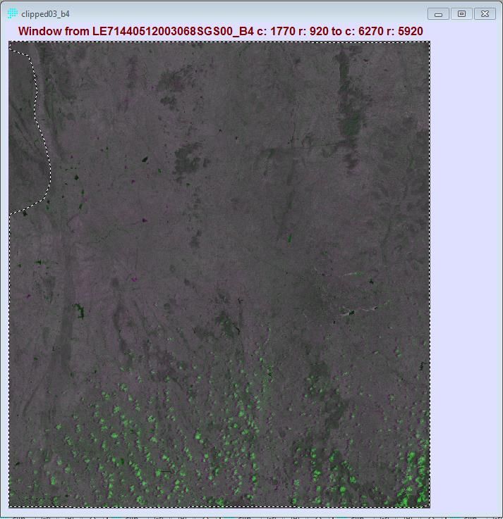
Rasterized Mask: We want a regression line with the least amount of change between the two images.
Less change between the two images will help create a better regression formula to create the
normalized image. That means we will clip out the parts of the image where the most change occurs
between the 2003 and 2013 images. That way the regression analyisis only looks at pixels the haveYou can also read