Instagrammable Data: Using Visuals to Showcase More Than Numbers on AJ Labs Instagram Page
←
→
Page content transcription
If your browser does not render page correctly, please read the page content below
Instagrammable Data: Using Visuals to Showcase More Than Numbers on
                        AJ Labs Instagram Page

Mathias-Felipe de-Lima-Santos, School of Communication, University of Navarra, Spain
mdelimas@unav.es, https://orcid.org/0000-0001-8879-7381

Dr. Arwa Kooli, Institute of Press and Information Sciences, University of la Manouba, Tunisia
arwa.kooli@gmail.com, https://orcid.org/0000-0002-1172-4309

Abstract

News outlets are developing formats dedicated to social platforms that capture audience
attention, such as Instagram stories, Facebook Instant articles, and YouTube videos. In some
cases, these formats are created in collaboration with the tech companies themselves. At the
same time, the use of data-driven storytelling is becoming increasingly integrated into the ever-
complex business models of news outlets, generating more impact and visibility. Previous studies
have focused on studying these two effects separately. To address this gap in the literature, this
paper identifies and analyzes the use of data journalism on the Instagram content of AJ Labs, the
team dedicated to producing data-driven and interactive stories for the Al Jazeera news network.
Drawing upon a mixed-method approach, this study examines the use and characteristics of data
stories on social media platforms. Results suggest that there is reliance on producing visual
content that covers topics such as politics and violence. In general, AJ Labs relies on the use of
infographics and produces its own unique data. To conclude, this paper suggests potential ways
to improve the use of Instagram to tell data stories.

Keywords
data journalism, Instagram, data visualization, social media platforms, visual storytelling, Al
Jazeera

Introduction

The concept of data journalism has matured among news organizations over the last years.
Collecting, filtering, and analyzing datasets are becoming gradually integrated into the ever-
complex business models of news outlets around the world. Thus, data journalism, once
conceived as “fluid and mutable” (Hermida & Young, 2019, p. 45), has shifted from the niche and
innovation spheres “to that of delivery” (Bradshaw, 2021, p.393). That is to say, getting people to
actually use it.

During the COVID-19 pandemic, many news outlets were able to leverage their use of data and
technology to report on the global death toll and infection rates. However, in an age with an
abundance of content and increasing demands upon audience attention, news outlets have to
work symbiotically with tech platforms to capture this attention, resulting in novel news formats
such as Facebook Instant articles and YouTube videos. Thus, we can contend that the attention
economy has affected news production and consumption (Myllylahti, 2020), leading practitioners
to incorporate these platforms as part of the news routine.

Social media platforms have given opportunities to media outlets to reach broader audiences and
engage with them more dynamically (Bucher & Helmond, 2018). Additionally, the advent of
communication technologies has enabled the transmission of cultural ideas across borders, which
has undoubtedly contributed to bridging the gap between media organizations and audiences.
These platforms have also brought challenges and revealed the weaknesses in the business
models of the media companies (Karlsson, 2011). Overall, these changes require a distinct logic
of news production and consumption that the news media industry was used to but publishers are
still struggling to follow up the issue (Sacco & Bossio, 2017).

As far as we know, no previous research has investigated the use of data journalism in social
media platforms, especially on Instagram. The purpose of this study is to investigate how a
particular social media platform (Instagram) has been incorporated by Al Jazeera (AJ), an
important news network in the Arab region. Furthermore, AJ produces content directed toward
the citizens of the Global South, where there is a substantial audience for mobile news (Zayani,
2021). In addition, AJ provides services beyond the Arabic language, relying on English to serve
wider audiences.

Several studies have focused on studying data journalism from a Western perspective (Knight,
2015; Mutsvairo, 2019; Stalph, 2018; Zamith, 2019), but these studies tend to be limited to a
few countries (Appelgren et al., 2019). Conversely, the Arab region has received little attention
despite the important data-driven endeavors that have continuously developed in the region,
such as InfoTimes (Egypt) and Al Jazeera (Qatar). Previous studies have indicated that
journalism in the Arab region is emotive, which challenges the development of evidence-based
reporting (Bebawi, 2019). Furthermore, the access to information is marginal in the Arab region
due to the lack of an open data culture and freedom of information laws—except for Lebanon,
Morocco, Sudan, Tunisia, Yemen, and Jordan (Lewis & Nashmi, 2019; Salimi, 2019). Despite
being an outlier, Al Jazeera suffers from similar challenges to its peers in the Arab region (Lewis
& Nashmi, 2019), such as the lack of open data. This makes AJ an interesting case study.

Drawing on a literature review of data journalism and social media platforms, this study aims to
understand how Instagram can be more than just an afterthought for data journalism. Following
a mixed-method approach that combines content analysis and semi-structured interviews with
members of AJ Labs (Al Jazeera’s data and interactive team) and their collaborators, we propose
to answer the following research questions:

RQ1: What are the features of AJ Labs’ data stories on Instagram?

RQ2: How does AJ Labs use Instagram’s affordances to visualize data?
RQ3: To what extent does AJ Labs abide by the norms and routines of data journalism put forward
by Western literature to produce data-driven content for Instagram? In what manner is AJ Labs
able to develop different (i.e., its own) practices and routines?

RQ4: How can Instagram be used to drive data narratives and become more than a tool to
promote web-based data journalism content?

This project aims to understand how AJ Labs is creating data stories for Instagram, one of the
most popular contemporary platforms for visual content (Vázquez-Herrero et al., 2019).
Additionally, this study explores ways to attract audiences and make data stories more accessible
and understandable to the public. The article concludes by examining several implications of this
approach and proposing new better ways to take advantage of Instagram’s technological
affordances, that is, for “understanding and analysing social media interfaces and the relations
between technology and its users” (Bucher & Helmond, 2018, p. 235).

Theoretical background

Platforms: a symbiotic relationship with news media
Since the advent of the internet and its proliferation through mobile, journalism has increasingly
become entangled with the platform ecosystem. This means that digital technologies have
lowered the barriers for the public to access information, thereby facilitating distribution and
enabling more users to consume media content (Rifkin, 2014). In part, this can be attributed to
the rise of social network sites (SNSs), which provided mechanisms for users to exchange
information and learn from each other. This emerging media ecology has changed users’ roles
from passive consumers of information to active “produsers” (Bruns, 2018) that contribute to
produce news stories. This forced a change in the pattern of production across the industry, which
moved away from a one-to-many model toward a many-to-many approach (Belair-Gagnon et al.,
2019). Media outlets no longer exclusively produce news for the masses, and this shift requires
new forms of communicating and engaging with the public.

Over time, SNSs have evolved from purely personal use to commercial use, exploiting users’ data
as part of their business models (Evens & Van Damme, 2016). In parallel, users have embraced
mobile as the primary way to access the internet in recent years (Dunaway et al., 2018). These
online social networks evolved alongside the rise in mobile devices, seizing new affordances and
possibilities to engage users. Thus, SNSs quickly developed into platforms that offer many more
services than only connecting people, but each social media platform has different affordances
that impact how users interact and engage in different ways; that is, “each platform is adopted by
somewhat different communities for different purposes, developing community-specific norms
and conventional practices” (Yarchi et al., 2021, p. 103). In general, these affordances can be
understood as material artifacts such as media technologies that allow people to interact with
social media platforms (Bucher & Helmond, 2018).
To cope with this new ecosystem, news media outlets had to adapt their business models to these
new parameters while simultaneously dealing with a steadily shrinking advertisement revenue
which was lost to these platforms and the big tech companies behind them (Myllylahti, 2018).
Concurrently, news media organizations had to bring their content to social media platforms,
which have a “monopoly over their audiences and their audiences’ attention” (Myllylahti, 2020, p.
569). News organizations were forced to adopt a mobile-first approach (Westlund, 2013) while
modifying the reporting formats to bring new journalistic outputs to social media platforms.

News organizations' presence on these platforms is important not only to promote content and
increase the traffic to news portals (Sacco & Bossio, 2017) but also as a new form to reach,
communicate, interact, and engage with different audiences (Holton & Lewis, 2011). People are
searching for short up-to-date news stories presented in innovative formats in these settings
(Vázquez-Herrero et al., 2019). Despite these users looking for the same type of content, each
platform has its own audience. Social media platforms like Twitter and Facebook have older user
bases compared to Instagram, which has a younger audience (in general, 30 and under) (Li et
al., 2021). For some news organizations, Instagram is a tool to interact with sources, share stories
and content, or bring behind-the-scenes information to the public, while others use it to enhance
the brand’s visibility and interaction with young audiences (Vázquez-Herrero et al., 2019). This
can be partly explained because of the reliance on media platforms and mobile devices by the
majority of young users to consume news content (Boczkowski & Anderson, 2017). In this sense,
news outlets embraced more interactive, mobile-friendly, and visually enhanced content as a way
to gain audience attention.

Therefore, these platforms require different “know-how” on the part of media outlets to better
understand and engage with the public (Larrondo et al., 2017). For example, Al Jazeera launched
AJ+ in 2014 to produce content that primarily targeted the “young ‘mobile-first’ generation of
intensively connected users whose communication and social habits revolve around mobile
technology” (Zayani, 2021, p. 32). In doing so, AJ+ was built to embed mobile features and
attributes in the content design itself, aiming to “build audiences directly on social media and
across various platforms” (Zayani, 2021, p. 32). The initiative embraced specific mobile-friendly
formats and adopted a multi-platform approach to gain audience attention through short videos
and GIFs. Similarly, there are a few pieces that relied on “visual explainers that use statistics and
data visualization to present issues in a dynamic way” (Zayani, 2021, p. 32). Thus, Al Jazeera
brings an important discussion of the role of data storytelling in other platforms.

Data journalism: a fluid and mutable practice
The reliance on data in journalism is not new. Investigative journalism relied on the analysis of
computer records and government databases to bring checks and balances to established
centers of power, ensuring the difficult equilibrium that forms the core of democracy (Coddington,
2015). Thus, “statistics have long been a staple of daily news” (Nguyen & Lugo-Ocando, 2016, p.
4). In fact, the evolution of computer-assisted reporting to data journalism is much related to the
availability of data and the low-cost technologies, which brought a new level of scrutiny to
journalists (Coddington, 2015). Data journalism brought us the promise of more transparency (S.
C. Lewis & Westlund, 2015), interactivity (Appelgren, 2018), and greater diversity of content. With
its natural evolution as a fluid and mutable practice, there is no generally accepted definition of
data journalism (Loosen et al., 2017). However, data stories that contain “a substantial element
of data or visualisation [sic]” (Knight, 2015, p. 59) or present quantitative elements along with
visual representation (Zamith, 2019) are usually defined as data journalism.

The growing body of the data journalism literature focuses on award-winning journalistic pieces,
which neither represent the day-to-day data journalism nor the daily content consumed by the
public. Aiming to expand this discussion, Stalph (2018) developed an analytic framework to
examine daily data stories of four elite news organizations: Zeit Online, Spiegel Online, The
Guardian, and Neue Zürcher Zeitung. For this, he defined four dimensions of daily data journalism
that include formal characteristics, data visualizations, data sources, and form and content. Stalph
(2018) showed that daily data journalism predominantly covers political topics and more than
three-quarters of all cases contain both discrete text and visualization components. Additionally,
these visualizations were restricted to two items on average, with every third being a bar chart.
Stalph (2018) also cast a spotlight on issues of pre-processed public data as “[e]very fourth
visualisation [sic] explicitly indicates governmental bodies as the data source and every fourth
story uses at least one governmental data source” (Stalph, 2018, p. 1348).

A more recent study brought this discussion to the United States. Zamith (2019) argued that
general data journalism still has a long way to develop, as the data stories consist of simple
visualizations and analyses. In his perspective, the technological opportunities of online
journalism are still restricted, as most articles he surveyed did not include interactive elements or
included quite limited interactivity. In line with Stalph (2018), Zamith (2019) found that the data
sources came from governmental bodies; hence, most of the stories also covered policy and
political topics.

Similarly, Knight (2015) conducted a content analysis of the UK national papers. Her findings led
to the conclusion that data stories covering social issues were the most common. Moreover, there
was a strong prevalence of visual impact through infographics, charts, and maps. In the UK
national papers, the data sources included governments, research institutes, and pan-national
organizations. Knight (2015) pointed out that there was an evolution of data journalism from print
to digital, which offers more options, such as multimedia content, interactivity, searchability, and
sharing.

Scholarly literature has not shown favorable results concerning open data principles and policies
(Bebawi, 2019). In general, journalists face problems with information being provided in formats
that are not machine-readable, such as printed documents or PDF format, which demands
considerable time and effort to use sophisticated recognition capabilities to extract data from
them. These advanced computational methods are not always common in journalists from the
Arab region (Fahmy & Attia, 2021). Similarly, prior studies also pointed out that elite outlets did
little original data collection (Knight, 2015; Stalph, 2018), hampering the ability to produce data
stories.
However, little is known about the use of data journalism on social media platforms, which is
where the digital audiences are located. Retaining individual users’ attention has proven to be a
challenge for news outlets, and many have failed to overcome it (Myllylahti, 2020). Practitioners
argue that several practices can have a better impact on audience engagement with data stories;
for instance, “engaging movement or eye-catching colours [sic]” to shed light on the most relevant
fact or surprising data point (Segger, 2018). Additionally, annotations and labeling are important
tools to help people understand the visual information they are presented with (Segger, 2018).
On the other hand, there is a need to adjust some of the workflows, as every platform has different
features that impact how users interact and engage with content. For example, Deutsche Welle
(DW) experimented with augmented reality (AR) and face filters through Instagram stories to
present data in novel formats to the public (Späth et al., 2021). However, most practitioners are
still using social media platforms to promote their work. With this in mind, this contribution seeks
to expand the literature by presenting the case study of Al Jazeera. It is, therefore, an initial
approach to the subject.

Methodology

The emergence of Instagram disrupted the social media scene more than one decade ago. Since
its creation in 2010, many users have migrated to the photo-sharing platform from other social
media platforms, making it one of the primary modes of communication around the globe.
Instagram has attracted not only users but also brands to produce content and market products
and services (Bozzi, 2020; Salleh, 2014). Media companies slowly adopted this workflow, offering
new channels to communicate with audiences and capture their attention (Mellado & Alfaro, 2020;
Ohlsson & Facht, 2017). As Instagram’s uses grew, it has gradually become a subject of study
for several authors (Highfield & Leaver, 2015; Omena et al., 2020; Vázquez-Herrero et al., 2019).

In this paper, we chose a mixed-method design that included both quantitative and qualitative
components to understand how AJ Labs is making data journalism more appealing. We also
sought to find out which approach fits best on Instagram. First, we collected all posts and
metadata from AJ Labs’ Instagram account (@aj_labs) using CrowdTangle, a public insights tool
owned and operated by Facebook since 2016. Previous studies have used this tool to trace the
dissemination of COVID/5G rumors during the first wave of the coronavirus pandemic (Bruns et
al., 2020). In doing so, the authors highlighted some constraints, such as limited access to fully
public spaces on the wider Facebook or Instagram platforms as well as some incomplete metrics
(Bruns et al., 2020). Despite these shortcomings, CrowdTangle proves to be an important source
of social media data for the scholarly community. Thus, we relied on CrowdTangle's application
programming interface (API) connection to crawl the timeline of @aj_labs, which resulted in 107
posts and their metadata, including photos, videos, and albums. In the present context of this
study, we decided to remove 18 posts that do not represent data-driven content, such as the
celebration of awards or recognition for the team members or photos without a data component.
The final dataset for analysis was composed of 89 entries.
The data were analyzed to determine the posts’ content and identify commonalities and
differences in the data stories. Our analysis was comprised of five dimensions: basic features,
data source, data visualization, audiences as well as form and content. The measures were drawn
from existing frameworks that aimed at classifying data stories in news portals (Stalph, 2018;
Tandoc & Oh, 2017; Young et al., 2018) or Instagram content (Vázquez-Herrero et al., 2019).
Additionally, these measures were refined based on an initial qualitative assessment of the
content. To examine each of these dimensions, we established and operationalized relevant
categories for each. Table 1 presents an overview of the dimensions, categories, and variables
used in this study. Both authors classified the posts. In the event of a discrepancy, both authors
reached a consensus. Our inter-rater reliability was 0.97, exceeding the generally accepted
minimum bond (Zamith, 2019).

 Dimension                       Categories                       Options

 Basic features                  Date of publication              « Month Year »

                                 Type                             Video, Photo, Album (Carrousel)

                                 Authors                          Yes, No

                                 Topic (News beat)                Business
                                                                  Crime
                                                                  Culture
                                                                  Development/Government
                                                                  Education
                                                                  Environment
                                                                  Health
                                                                  Politics
                                                                  Population
                                                                  Science
                                                                  Science
                                                                  Social Issues
                                                                  Sports
                                                                  Technology

                                 Description                      Yes, No

                                 Description length               « Number »
                                 (words/characters)

                                 Use of URLs                      Yes, No

 Data source                     Provision of data source         Yes, No

                                 Number of data source            « Number »

                                 Country of origin                « List »
Data provider National Government
International Government
International Agencies
Civic Society Groups/NGOs
Academic
Multiples
Own data
Data visualization Visualization type Chart
Drawing
Map
Photos
Tiled cartogram
Timeline
Infographic (combination of
charts/maps and visual elements)
Tools used Carto
Infogram
Mapbox
Flourish
Graphic design software
Map4News
Google Maps
Unidentified
NA (Not applied/Not available)
Level of interactivity Play
Scroll right
Zoom in
Incentive to like
No interactivity
Number of visualizations « Number »
Image text « Number »
Ratio text/visualization « Number »
Audiences Likes « Number »
Comments « Number »
Views « Number »
Interactions « Number »
Form and content Purpose Call-to-action
Expand knowledge
Inform the audience
Promote (showcase project)
Traffic (attract the reader to website)Story format Additional information
Explanatory
Informative
Projection
Special
Summary
Text caption to complement the Yes, No
information
Number of Hashtags « Number »
Ratio Hashtags/Post « Number »
Use of URLs Yes, No
Table 1. Categories of evaluation were inspired by the work of Vázquez-Herrero et al. (2019), Tandoc &
Oh (2017), Stalph (2018), and Young et al. (2018).
Next, we triangulated the data that arose from the Instagram data stories with semi-structured, in-
depth interviews with practitioners working at AJ Labs and collaborating with the team. This study
also draws upon interviews with pioneering members of the AJ Labs team who have left the
network and whose insights and testimonies shed light on the formative phase of the deployment
of data stories for Instagram. In total, five practitioners were interviewed in English via Zoom and
Google Meet. This included members who are still part of the AJ Labs team and others who
previously worked at AJ Labs. On average, each interview lasted 50 minutes. To analyze these
interviews, we used thematic analysis using a deductive approach (i.e., the themes were
developed from existing concepts or ideas that emerged from quantitative analysis). This provided
insights into the types of stories posted by AJ Labs and the motivations behind them, which will
be discussed in the following section.
Findings
Basic features
Similar to AJ+, which “led Al Jazeera to experiment with non-traditional formats and launch
programs that capitalized on media convergence” (Zayani, 2021, p. 7), AJ Labs has built a team
that is interested in experimenting with new formats and platforms while exploring and testing the
latest technologies. “Most of the time it's a day-to-day job but there was like 10 or 20 percent that
we would bring in new tools or ideas” (Designer 1). From these experiments, AJ Labs decided to
adopt a digital content strategy: “we cover one subject as simple as this, but it makes its way onto
all of our platforms” (AJ Labs’ Data Editor). This allowed the team to “think of data journalism as
a process across platforms” (AJ Labs’ Data Editor). It also allows these practitioners to learn how
to embrace the ubiquity of social media, and incorporate its use on data-driven content. Thus, “we
think of data journalism as the entire pipeline” (AJ Labs’ Data Editor).However, there are some significant differences in the formal characteristics of data-driven
content produced for Instagram. Contrary to digital and print data stories (Knight, 2015; Stalph,
2018; Zamith, 2019), we did not find authorship in the Instagram posts. This shows that AJ Labs
opts for a distinct strategy in the data-driven social media content that omits traditional author
bylines. In part, this is because the audience’s attention is limited:
On Instagram, the point is that you are going to appear on somebody's feed or someone's
going to view your story. It's the same rule as putting up a billboard. You have somebody's
attention for three or four seconds. How much information can I put into 1000 x 1000 pixels
and make sure that someone's going to immediately get it? So, for Instagram, we tend to
simplify a lot of our information because we don't have an audience for that long (Designer
2).
This can also be explained by the data journalism workflow adopted in Al Jazeera. Our
interviewees mentioned two reasons for working with editorial staff to produce data-driven
content. For example, as shared by one producer, there is no official workflow for the production
of posts. “If I find a new idea, I just go to AJ Labs’ office and we pitch it” (Producer). This
convenience has facilitated cooperation between AJ Labs and other desks. On one hand, the AJ
Labs team size maximizes the utility of its members by working together with journalists. On the
other hand, AJ Labs experiences regular fluctuations in the number of staff members, requiring it
to cooperate with other members in the newsroom. It is essential, therefore, that this collaboration
occurs. In some cases, this involves a large number of professionals, which would use more
space to include authorship than it is available on Instagram.
Another important finding, as shown in Figure 1, reveals that there is no specific period in which
AJ Labs produces more content for Instagram. Instead, there is a series of "peaks and valleys"
that can be associated with a variety of topics covered rather than focusing on agendas or special
events.Figure 1. The number of posts per month.
The description has an average of 179.49 (standard deviation, σ=131.58) characters and about
20 words (mean, μ=19.70; σ=17.96). This demonstrates that AJ Labs relies more on visual
content than on the textual aspect of the stories, although there is some level of variance with an
extreme value of 681 characters and 88 words. Similarly, there is low usage of hashtags in the
posts (μ=0.96; σ=1.73). Hashtags are an important feature of social media platforms in general
and Instagram in particular. By using hashtags, users can make their content more discoverable.
Several studies have shown how news organizations are also using hashtags to reach wider
audiences (Highfield & Leaver, 2015; Vázquez-Herrero et al., 2019).
Type Total Percentage
Album 6 6.74%
Photo 81 91.01%
Video 2 2.25%
Table 2. Type of posts published by AJ Labs.
As Table 2 illustrates, the majority of data-driven Instagram posts were single photos (91.01%),
followed by the album features, which combined more than one image in a single post. Videos,
however, were limited to only two posts. This is in line with previous studies that showed that data
journalism tends to use simple visualization components with discrete texts (Stalph, 2018; Zamith,
2019). Our result also correlates well with previous studies on data journalism wherein political
topics (49.44%) (see Table 3) are predominant (Stalph, 2018). For example, almost half (48.6%)
of data journalism projects nominated for the Data Journalism Awards (DJA) from 2013 to 2016
(a total of 179) discussed political topics (Loosen et al., 2017).However, as shown in Table 3, topics related to violence are the second most popular. It is by
now generally accepted that the current situation in the Arab region, with the deteriorating human
rights situation associated with terrorism and illegal migration, makes this a salient theme in the
media agenda. This is an important venture, as AJ Labs aims to “quantify the human side [of the
events] by contextualizing them through data” (AJ Labs’ Data Editor). Overall, these findings are
in accordance with Bebawi (2019) who describes the emotive nature of Arab journalism, which
frequently focuses on the human element in its coverage. This is interesting because it shows
that data journalism, which is considered to be a form of evidence-based reporting, can “give
voice to the people affected by a public policy to illustrate the data, as a way to humanize the
data” (de-Lima-Santos & Mesquita, 2021, p. 10).
Topic Total Percentage
Politics 44 49.44%
Violence 19 21.35%
Development/Economy 10 11.24%
Science 5 5.62%
Social Issues 3 3.37%
Religion 3 3.37%
Environment 2 2.25%
Population 1 1.12%
Health 1 1.12%
Culture 1 1.12%
Table 3. Main topics covered in Instagram posts.
Although Instagram’s affordances are broad, the use of URLs in posts is currently limited on the
platform (Vázquez-Herrero et al., 2019). Even under this limitation, AJ Labs places links to data
stories on half of their Instagram posts (52.81%). Although this can generate traffic, Instagram’s
restrictions limit the success as the URLs are shown as plain text instead of clickable links.
However, click-throughs are not the main objective. AJ Labs’ Data Editor has an explanation for
this, he underlines the fact that Instagram posts should contain the entirety of the information
being presented, as people do not want to leave the platform to consume information:
[Our Instagram feed] isn’t meant to attract people back to the website. It's meant to put
people on the platforms to consume complete stories, which basically means whether they
consume it on Instagram or they consume it on our website, they still get the essence of
the story. Now, of course, the website gives us much more flexibility. In the written
narrative, we can explain more details. So, we do link to the Instagram article or whenever
possible, link by, all of these kinds of things (Data Editor).Data source
As has been previously reported in the literature, data source is an important component of data
journalism (Fahmy & Attia, 2021; Knight, 2015; Zamith, 2019). AJ Labs embraces this
characteristic of data journalism in its Instagram posts and adds data sources on the majority of
its content (91.01%). On average, 1.6 data sources are mentioned per post. This means that the
AJ Labs team relies on more than one data source in their stories. Indeed, 36 posts contained
more than one data source (40.45%). An interesting fact is that producing its own data comes in
second, as shown in Table 4. These results are not in line with previous data journalism studies
in Western democracies, which showed that news organizations mostly rely on data from
governmental bodies (Knight, 2015; Stalph, 2018; Zamith, 2019).
Type Total Percentage
Multiples 36 40.45%
Own data 13 14.61%
National
Government 11 12.36%
Civic Society
Groups/NGOs 8 8.99%
NA 7 7.87%
Private
Company 4 4.49%
International
Agency 4 4.49%
International
Government 3 3.37%
Academic 3 3.37%
Table 4. Types of data sources found on the AJ Labs’ Instagram posts.
A popular explanation for the reliance on multiple datasets (or building their own datasets) is that
access to information is marginal in the Arab region (Lewis & Nashmi, 2019). Consequently, the
origin of data is also influenced by this factor. Almost 40% of data came from international
sources, followed by the United States (20.48%), as shown in Table 5. We speculate that this
might be because Al Jazeera reaches wider audiences by offering its content in English, which
means that there is a greater public interest in topics from an international perspective. Al Jazeera
also has a large readership base in the United States, which might explain the reliance on
datasets originating from this country. However, few Arab countries appeared to be indicated as
the origin of data sources, with exception of Qatar and Saudi Arabia. The former is because many
datasets were produced by AJ Labs, which we classified as sourced from Qatar.
Data source's country Total PercentageInternational 33 39.76%
USA 17 20.48%
Qatar 12 14.46%
India 7 8.43%
Palestine 3 3.61%
Afghanistan 2 2.41%
Pakistan 2 2.41%
UK 1 1.20%
Switzerland 1 1.20%
Sweden 1 1.20%
Saudi Arab 1 1.20%
Italy 1 1.20%
Israel 1 1.20%
Germany 1 1.20%
Table 5. The origin of data sources.
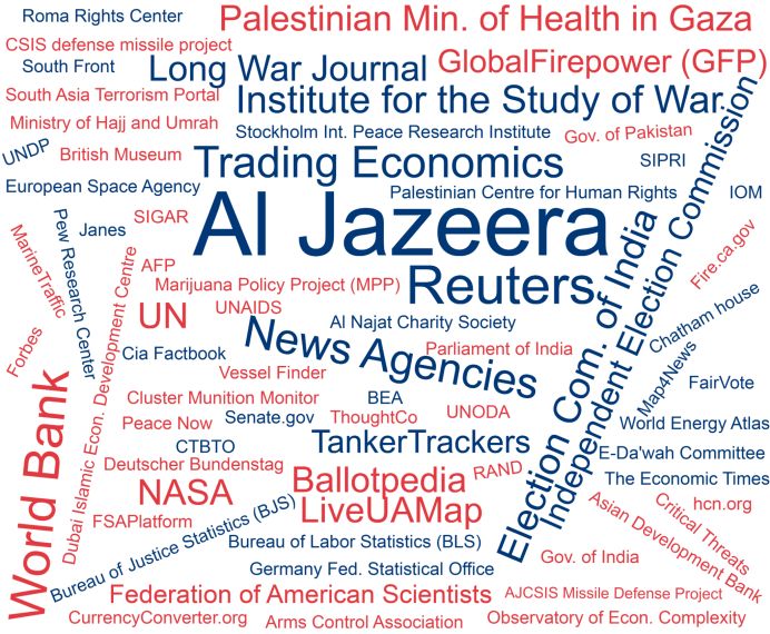
Among the data sources indicated in the Instagram posts, we observed that these multiple
sources combine numerous institutions, ranging from civil society organizations and NGOs to
news agencies, as shown in Figure 2.
Figure 2. Visual representation of data source indicated in the Instagram posts.The lack of open data culture and freedom of information laws in the Arab region (Lewis & Nashmi, 2019) challenged the AJ Labs team to be innovative by collecting its own unique data from unrestricted public datasets using web scraping techniques or by processing data from open sources. For example, “to explain to a global audience how bad the economy of Lebanon is, we produced a series of fairly simple graphics, in which we quantified how bad the situation is by going to two hypermarket chains’ websites, Carrefour and Spinneys, the two very large supermarkets in Lebanon. All we did was we collected a huge database of all the prices of all the items over two years, so anyone can do it technically. It's very simple” (AJ Labs’ Data Editor). The diversification of data methods collection is of particular importance because it provides a variety of sources and topics even in countries where access to information and data culture are given (Borges-Rey, 2016). Data visualization It is generally accepted that visuals play an important role in data journalism. In Western literature, there is a strong prevalence of using visualizations in data journalism to generate visual impact, as these data-driven graphics are didactic elements from which “readers can derive information and knowledge” (Stalph, 2018, p; 1335). To examine data visualization on Instagram data-driven posts, we used CrowdTangle’s computer vision algorithm to determine the presence of text on images. Our analysis revealed that only about 9% of posts from AJ Labs included text. However, this data might not be reliable as there are many posts that the text corpus was not recognized by the algorithm. In general, the Instagram posts relied on more visual content than text, and we were unable to provide a metric for this ratio due to the limitations of CrowdTangle. Scholars have concluded that interactive elements were quite limited in daily data journalism (Zamith, 2019), describing interaction as illusory in most cases (Appelgren, 2018). Similarly, no interactivity is by far the most common characteristic of AJ Labs’ Instagram posts (91.01%). We are aware that Instagram offers few interactivity features in the newsfeed, while offering more interaction through Instagram stories (Vázquez-Herrero et al., 2019). This includes using Augmented Reality (AR) applications to augment the surroundings or interact with virtual objects in real-time. On the other hand, there is the possibility to use the “play” feature (in videos) and “scroll right” feature (in albums), which were limited to, respectively, 2.25% and 6.74% of the posts. Regarding the type of visualization, about three-fifth were infographics, which are a combination of visual elements and typographic resources. Prior works identified infographics as the most commonly used format used in projects shortlisted for data journalism awards (Córdoba-Cabús & García-Borrego, 2020; Young et al., 2018). Another study has shown that infographics are also widely used in ordinary data journalism projects (Knight, 2015). Overall, our findings are in accordance with these studies, as we identified infographics in 61.80% of AJ Labs posts, followed by maps (20.22%) and charts (13.48%). Interestingly, two Instagram posts made use of maps built from tiles that proportionally represent the data, also known as tiled cartograms.
Figure 3 examines the topics covered within the visualizations and demonstrates that infographics
are aesthetically aligned to political topics as well as violence. Unsurprisingly, topics concerning
development and economic issues are more visualized through charts. Similarly, social issues
are also more represented through graphics. This is an interesting finding that can help
practitioners better understand how to best visualize some types of data.

      Figure 3. Visual representation of topics and the most common visualization types for each.

As mentioned above, the AJ Labs team is relatively small, which demands the use of third-party
software to produce some visualizations (see de-Lima-Santos et al., 2020). These out-of-the-box
solutions offer free versions as well as paid associated services, encouraging users to upgrade
for access to the premium features (de-Lima-Santos et al., 2020). For instance, our analysis
revealed that some posts relied on tools such as Carto, Flourish, and Maps4News. This is
explained because the team can analyze the data, work on the story, and easily ingest it into
Flourish: “We use Flourish because it gives us a lot of the tools that we need and the most efficient
way possible” (AJ Labs’ Data Editor). However, the practitioners are aware of the risks posed by
these platforms. For example, “it was a huge disaster for everyone who relied on [Google] Fusion
Tables” (AJ Labs’ Data Editor) when the solution was discontinued. Similarly, one of the most
successful data stories produced by the team was “built on Adobe News, but it became obsolete
and Adobe stopped supporting it” (Designer 1). This shows how these solutions can be a double-
edged sword that facilitates the workflow on the one side, but on the other side results in the
gradual loss of data stories.
Additionally, we identified the use of reusable formats that enable the rapid transfer of information
to new mediums, as explained by the Data Editor:
The graphics themselves are designed so that they could fit into the Instagram screen that
is square [allowing us to reuse it on platforms]. Even the way the graphics are designed,
you might notice that they are intended to be consumed in bite-sized formats. That's why
they always have a title and they're always a one-line summary and then they always have
the links so that you can find more (AJ Labs’ Data Editor).
Audiences
Within the Instagram data, several variables allowed us to measure audience engagement to a
certain extent by extracting the likes and comments in these posts, as well as the interactions.
Overall, our data showed that there is no statistically significant connection between audience
engagement and the posts’ content. While the Instagram posts had an average of 37 likes
(μ=37.41; σ=40.87), the comments reached a mean of less than a post (μ=0.68; σ=2.32). These
low numbers result in a low interaction rate (μ=38.10; σ=42.84). However, this data also shows
that numbers are spread out, indicating that some are outliers.
These outlier posts provided rich information about the type of posts that generated more
engagement. In particular, a story told through a collection of photos (album) describing the
changes in the map of Palestine over the last one hundred years had 355 likes and 21 comments.
Despite the topic being very relevant in the Middle East, the format of the story might also have
influenced its higher engagement. Using Instagram’s affordance, the story is told through a
combination of ten photos that navigates the reader through the evolution of Palestine's history.
This offers a completely different approach to telling the story and feeds the user with a full
narrative, in line with the AJ Labs’ Data Editor’s view: “The graphic has to tell a story. It has to be
those five graphics that should be able to give a reader who isn't ever going to come to our website
because that's not what they're interested in. They want to consume on the platform and don't try
to convince them that they need to leave the platform” (AJ Labs’ Data Editor). This suggests that
the “album” and “scroll right” features should be used more frequently in Instagram posts instead
of single images with no interaction.
Form and content
Looking into the form and content of AJ Labs’ Instagram posts, we were able to extract meaningful
information from the text component. Following what the Data Editor said that the public wants to
“consume on the platform,” About 69.66% of the posts aim to inform the public (see Table 6),
which corresponds with the team’s understanding of what the public wants to “consume on theplatform” (AJ Labs’ Data Editor). This is followed by posts that we identified as having the primary
goal of generating traffic (22.47%). We related a small portion to the idea of expanding the
knowledge of the users and providing extra information (6.74%).
Purpose Total Percentage
Inform the audience 62 69.66%
Traffic (Attract the reader to website) 20 22.47%
Expand the knowledge 6 6.74%
Promote (Showcase project) 1 1.12%
Table 6. Purpose of AJ Labs’ Instagram posts.
AJ Labs relies on three main forms to tell a story in visual format: informative (47.19%), summary
(24.72%), and explanatory (23.60%). The first encompasses posts that bring new information to
the audience, such as introductory stories, while summary aims to tell the whole story in one post
and explanatory brings information that has the purpose to clarify and explain concepts, ideas,
and issues. Overall, these findings are in accordance with the purpose of these posts, as the
majority aims to inform the audience. Interestingly, we identified minor posts (3.37%) that use
data to give readers future insights or projections. For example, a map of the next solar eclipses
around the world.
Story Format Total Percentage
Informative 42 47.19%
Summary 22 24.72%
Explanatory 21 23.60%
Projection 3 3.37%
Additional information 1 1.12%
Table 7. Story format used in AJ Labs’ Instagram posts.
Additionally, we examined the text captions of the posts to determine if there was any additional
relevant information. Our analysis found that only one-third of the posts added extra content to
supplement the visualization. For the rest of the posts (two-thirds), there was no relevant
information. A similar pattern was identified in the use of hashtags (μ=0.97; σ=1.73) and mentions
(μ=0.32; σ=0.56). The low use of hypertextual resources might influence the reach of AJ Labs’
content, as its “usage allows for a story to be linked to other publications tagged by either topic or
location, as well as to connect people involved or organizations related to the content” (Vázquez-
Herrero et al., 2019, p. 7).
Discussion and conclusionIn summary, our study demonstrates the use of data-driven content on social media platforms. We focused on AJ Labs, which is producing content for Instagram, a platform that is known for its visual content (i.e., one of the main characteristics of data journalism) (Knight, 2015). This study adds to the literature by using these empirical results to understand how data journalism can permeate other mediums and reach wider audiences. It is, therefore, an initial approach to the subject. To bring data stories to Instagram, AJ Labs relies on visual content, mainly infographics (RQ1). In part, this is explained by the fact that the main topics covered are politics, in line with Western literature (Stalph, 2018; Zamith, 2019). What is different is the coverage of violence (second most covered topic), reflecting the current context of the Middle East (RQ3). By quantifying the human side of data and using infographics to represent it, AJ Labs brings some characteristics of emotive Arab journalism to its news reporting (Bebawi, 2019). Contrary to the findings of the Western literature (RQ3), our analysis brought important distinctions concerning data sources. Because the Arab world suffers from the lack of open data culture (Lewis & Nashmi, 2019), AJ Labs creates its own data using a combination of methods, such as collecting data from hypermarket chains to show how the economy has evolved in recent years. On the other hand, this requires more advanced computational skills which are not always common in journalists from the Arab region (Fahmy & Attia, 2021). This is a striking difference in Al Jazeera’s technical capacity compared to its counterparts in the Arab region (Fahmy & Attia, 2021; Lewis & Nashmi, 2019). In accordance with prior studies (Stalph, 2018; Zamith, 2019), interactivity is not the main characteristic of AJ Labs' Instagram posts (RQ2). To fully explore Instagram, AJ Labs should adopt some features and affordances offered by the platform (RQ4). For instance, the post that generated the most engagement used the “album” feature to tell a story in parts, helping the public to interact and absorb the information in an engaging format rather than simple images . This “scroll-right-telling” could replicate the future of “scrollytelling” commonly found in contemporary data stories. The same applies to videos, helping news outlets to better connect with young generations found on this platform. Instagram stories are one of the tools used for newsrooms to engage with the audiences in different ways and gain the public’s attention (Späth et al., 2021; Vázquez-Herrero et al., 2019). Academic literature has also shown how the use of hashtags helps news outlets index their content and reach wider audiences (Vázquez-Herrero et al., 2019). This reflects one of the main goals of data journalism: evolve from niche audiences to become mainstream (Stalph & Borges-Rey, 2018). With that in mind, AJ Labs and other media outlets might improve interaction and engagement with their audiences on Instagram if they use more photo albums, videos, and stories. The use of hashtags can also help these posts become indexed, thus making them more search-friendly on Instagram (Späth et al., 2021; Vázquez- Herrero et al., 2019). AJ Labs seems to play it safe by using a couple of static and simple data visualizations; however, by using different and unusual types of visuals, its Instagram page can engage a broader audience.
We acknowledge that this is not easy, as the frequent personnel changes in the AJ Labs team
hamper the continuity of the production process. Scholars have associated the downsizing in Al
Jazeera’s workforce with the sharp drop in oil prices in 2016 (Zayani, 2021). It is for this reason
understandable that there is no pattern associated with the number of Instagram data-driven posts
produced over the past several years. AJ Labs adopted the use of reproducible formats and a
digital content strategy, which allows the team to produce content for different platforms without
using more resources or more time (RQ3). By creating visuals that are in the formats of social
media platforms, the AJ Labs team did not add extra work to its pipeline, optimizing its time and
resources in favor of making its work more efficient. The use of out-of-the-box solutions also helps
in this process (RQ3).

Regarding the limitations of this study, it could be argued that it relies on CrowdTangle to extract
the data and metadata but cannot extract text from images. Future studies could manually
conduct this conversion of text found in the images to understand the ratio between text and
visualizations. As mentioned before, this is an initial approach to data journalism on social media
platforms, specifically on Instagram. Future research could examine other platforms, such as
Facebook and Twitter, which offer different features and affordances.

Acknowledgments

The author(s) disclosed receipt of the following financial support for the research, authorship
and/or publication of this article: Al Jazeera Media Institute’s fellowship and the project JOLT –
Harnessing Data and Technology for Journalism (H2020 – MSCA-ITN-2017; grant number:
765140).

Conflict of Interests

The authors whose names are listed immediately below report the following details of
affiliation or involvement in an organization or entity with a financial or non-financial interest in
the subject matter or materials discussed in this manuscript.

Mathias-Felipe de-Lima-Santos disclosed receipt of the fellowship support for the research from
Al Jazeera Media Institute.

Dr. Arwa Kooli disclosed that she has previously received honoraria from Al Jazeera, such as
consultancies, and financial support for this research.

References

Appelgren, E, Lindén C., & Dalen A. V. (2019). Data Journalism Research: Studying a Maturing
    Field across Journalistic Cultures, Media Markets and Political Environments, Digital
Journalism, 7(9), 1191-1199. DOI: 10.1080/21670811.2019.1685899
Appelgren, E. (2018). An Illusion of Interactivity. Journalism Practice, 12(3), 308–325.
https://doi.org/10.1080/17512786.2017.1299032
Bebawi, S. (2019). Data Journalism and Investigative Reporting in the Arab World: From
Emotive to Evidence-Based Journalism (pp. 193–204). Palgrave Macmillan, Cham.
https://doi.org/10.1007/978-3-030-25177-2_11
Belair-Gagnon, V., Nelson, J. L., & Lewis, S. C. (2019). Audience Engagement, Reciprocity, and
the Pursuit of Community Connectedness in Public Media Journalism. Journalism Practice,
13(5), 558–575. https://doi.org/10.1080/17512786.2018.1542975
Boczkowski, P. J., & Anderson, C. W. (Eds.). (2017). Remaking the news : essays on the future
of journalism scholarship in the digital age (1st ed.). MIT Press.
Bozzi, N. (2020). #digitalnomads, #solotravellers, #remoteworkers: A Cultural Critique of the
Traveling Entrepreneur on Instagram. Social Media and Society, 6(2).
https://doi.org/10.1177/2056305120926644
Bradshaw, P. (2021). Data Journalism with Impact. In J. Gray & L. Bounegru (Eds.), The Data
Journalism Handbook (2nd ed.). https://doi.org/10.5117/9789462989511_ch52
Bruns, A. (2018). Gatewatching and News Curation (A. Bruns (Ed.)). Peter Lang US, New York.
https://doi.org/10.3726/b13293
Bruns, A., Harrington, S., & Hurcombe, E. (2020). ‘Corona? 5G? or both?’: the dynamics of
COVID-19/5G conspiracy theories on Facebook. Media International Australia,
1329878X2094611. https://doi.org/10.1177/1329878X20946113
Bucher, T., & Helmond, A. (2018). The Affordances of Social Media Platforms. In J. Burgess,A.
Marwick, & T. Poell (Eds.), The SAGE Handbook of Social Media (pp. 233–253). Sage
Publications, New York.
Coddington, M. (2015). Clarifying Journalism’s Quantitative Turn. Digital Journalism, 3(3), 331–
348. https://doi.org/10.1080/21670811.2014.976400
Córdoba-Cabús, A., & García-Borrego, M. (2020). Las visualizaciones como parte fundamental
del periodismo de datos. Análisis de la tipología, la interactividad y las funciones. Doxa
Comunicación. Revista Interdisciplinar de Estudios de Comunicación y Ciencias Sociales,
2020(31), 87–105. https://doi.org/10.31921/doxacom.n31a4
de-Lima-Santos, M.-F., & Mesquita, L. (2021). Data Journalism in favela: Made by, for, and
about Forgotten and Marginalized Communities. Journalism Practice, 1–19.
https://doi.org/10.1080/17512786.2021.1922301
de-Lima-Santos, M. F., Schapals, A. K., & Bruns, A. (2020). Out-of-the-box versus in-house
tools: how are they affecting data journalism in Australia? Media International Australia.
https://doi.org/10.1177/1329878X20961569
Dunaway, J., Searles, K., Sui, M., & Paul, N. (2018). News Attention in a Mobile Era. Journal ofComputer-Mediated Communication, 23(2), 107–124. https://doi.org/10.1093/jcmc/zmy004
Borges-Rey, E. (2016). Unravelling Data Journalism: A study of data journalism practice in
British newsrooms. Journalism Practice, 10(7), 833-843, DOI:
10.1080/17512786.2016.1159921
Evens, T., & Van Damme, K. (2016). Consumers’ Willingness to Share Personal Data:
Implications for Newspapers’ Business Models. International Journal on Media
Management, 18(1), 25–41. https://doi.org/10.1080/14241277.2016.1166429
Fahmy, N., & Attia, M. A. majeed. (2021). A Field Study of Arab Data Journalism Practices in
the Digital Era. Journalism Practice, 15(2), 170–191.
https://doi.org/10.1080/17512786.2019.1709532
Hermida, A., & Young, M. L. (2019). Data Journalism and the Regeneration of News (A.
Hermida & M. L. Young (Eds.) (1st ed.). Routledge.
https://doi.org/10.4324/9781315163895
Highfield, T., & Leaver, T. (2015). A methodology for mapping instagram hashtags. First
Monday, 20(1), 1–11. https://doi.org/10.5210/fm.v20i1.5563
Holton, A. E., & Lewis, S. C. (2011). Journalists, social media, and the use of humor on Twitter.
The Electonic Journal of Communication, 21(1–2).
Karlsson, M. (2011). The immediacy of online news, the visibility of journalistic processes and a
restructuring of journalistic authority. Journalism: Theory, Practice & Criticism, 12(3), 279–
295. https://doi.org/10.1177/1464884910388223
Knight, M. (2015). Data journalism in the UK: a preliminary analysis of form and content. Journal
of Media Practice, 16(1), 55–72. https://doi.org/10.1080/14682753.2015.1015801
Larrondo, A., Fernandes, J., & Agirreazkuenaga, I. (2017). Editorial. Teknokultura. Revista de
Cultura Digital y Movimientos Sociales, 14(2), 199–208. https://doi.org/10.5209/tekn.57374
Lewis, N. P., & Nashmi, E. Al. (2019). Data Journalism in the Arab Region: Role Conflict
Exposed. Digital Journalism, 7(9), 1200–1214.
https://doi.org/10.1080/21670811.2019.1617041
Lewis, S. C., & Westlund, O. (2015). Big Data and Journalism: Epistemology, expertise,
economics, and ethics. Digital Journalism, 3(3), 447–466.
https://doi.org/10.1080/21670811.2014.976418
Li, B., Scott, O. K. M., Naraine, M. L., & Ruihley, B. J. (2021). Tell Me a Story: Exploring Elite
Female Athletes’ Self-Presentation via an Analysis of Instagram Stories. Journal of
Interactive Advertising, 1–19. https://doi.org/10.1080/15252019.2020.1837038
Loosen, W., Reimer, J., & De Silva-Schmidt, F. (2017). Data-driven reporting: An on-going
(r)evolution? An analysis of projects nominated for the Data Journalism Awards 2013–
2016. Journalism: Theory, Practice & Criticism, 21(9), 1246–1263.
https://doi.org/10.1177/1464884917735691Mellado, C., & Alfaro, A. (2020). Platforms, Journalists and Their Digital Selves. Digital
Journalism, 8(10), 1258–1279. https://doi.org/10.1080/21670811.2020.1817763
Mutsvairo, B. (2019). Challenges Facing Development of Data Journalism in Non-Western
Societies. Digital Journalism, 7(9), 1289–1294.
https://doi.org/10.1080/21670811.2019.1691927
Myllylahti, M. (2018). Google, Facebook and New Zealand news media: The problem of
platform dependency. (Issue September).
Myllylahti, M. (2020). Paying Attention to Attention: A Conceptual Framework for Studying News
Reader Revenue Models Related to Platforms. Digital Journalism, 8(5), 567–575.
https://doi.org/10.1080/21670811.2019.1691926
Nguyen, A., & Lugo-Ocando, J. (2016). The state of data and statistics in journalism and
journalism education: Issues and debates. Journalism: Theory, Practice & Criticism, 17(1),
3–17. https://doi.org/10.1177/1464884915593234
Ohlsson, J., & Facht, U. (2017). AD WARS - Digital Challenges for Ad-Financed News Media in
the Nordic Countries.
Omena, J. J., Rabello, E. T., & Mintz, A. G. (2020). Digital Methods for Hashtag Engagement
Research. Social Media and Society, 6(3). https://doi.org/10.1177/2056305120940697
Rifkin, J. (2014). The zero marginal cost society: The internet of things, the collaborative
commons, and the eclipse of capitalism. St. Martin’s Press.
Sacco, V., & Bossio, D. (2017). Don’t Tweet This!: How journalists and media organizations
negotiate tensions emerging from the implementation of social media policy in newsrooms.
Digital Journalism, 5(2), 177–193. https://doi.org/10.1080/21670811.2016.1155967
Salimi, M. (2019). The Status of Data Journalism in Iranian Media. In Mutsvairo B., Bebawi S., &
Borges-Rey E. (Eds.), Data Journalism in the Global South (1st ed., pp. 205–237).
Palgrave Macmillan, Cham. https://doi.org/10.1007/978-3-030-25177-2_12
Salleh, S. (2014). Instagram Marketing : A Content Analysis of Top Malaysian Restaurant
Brands 2 Literature Review. Instagram Marketing: A Content Analysis of Top Malaysian
Restaurant Brands.
Segger, M. (2018, June 28). Lessons for showcasing data journalism on social media. Medium -
The Economist. https://medium.com/severe-contest/lessons-for-showcasing-data-
journalism-on-social-media-17e6ed03a868
Späth, D., Lopez, E., & Giefer, A. (2021, February 22). You Draw It AR: Instagram Face Filters
for Data-Driven Journalism | DW Innovation. DW Innovation.
https://innovation.dw.com/you-draw-it-ar-instagram-face-filters-for-data-driven-journalism/
Stalph, F. (2018). Classifying Data Journalism: A content analysis of daily data-driven stories.
Journalism Practice, 12(10), 1332–1350. https://doi.org/10.1080/17512786.2017.1386583
Stalph, F., & Borges-Rey, E. (2018). Data Journalism Sustainability. Digital Journalism, 6(8),You can also read