Olympics History: A Data Visualization Application - Prepared by Team Thundercats
←
→
Page content transcription
If your browser does not render page correctly, please read the page content below

Olympics History:
A Data Visualization Application

      Prepared by Team Thundercats
               Shubhangi Rakhonde
                 David Schechter
                Zayd Hammoudeh

         Date of Submission: May 22, 2015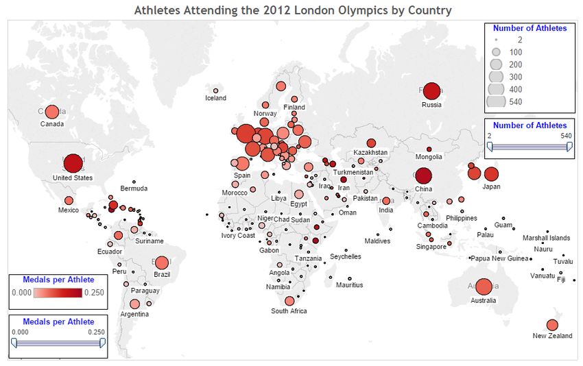
Table of Contents

1.       Summary ................................................................................................................................................................ 1
2.       Application Overview .......................................................................................................................................... 1
3.       Typical Users ......................................................................................................................................................... 1
4.       Application Presentation ..................................................................................................................................... 2
5.       Application Components ..................................................................................................................................... 2
       5.1.      Website Template......................................................................................................................................... 2
       5.2.      Tableau .......................................................................................................................................................... 3
                 5.2.1.      Multiple Visualization Types ........................................................................................................ 4
                 5.2.2.      Data Spotlighting ............................................................................................................................ 4
                 5.2.3.      Data Tips .......................................................................................................................................... 5
                 5.2.4.      Multi‐Y Graphs ............................................................................................................................... 6
                 5.2.5.      Sortable Table .................................................................................................................................. 7
       5.3.      GitHub – The Application Runtime Platform.......................................................................................... 8
6.       Data Sources .......................................................................................................................................................... 8
7.       Webpage Text ...................................................................................................................................................... 10
8.       Data Visualizations ............................................................................................................................................. 11
       8.1.      Total Summer Olympic Medals Won ..................................................................................................... 11
       8.2.      Effect of Geopolitics on Olympic Medal Wins – Charting the Rise and Fall of Global
                 Superpowers ............................................................................................................................................... 11
       8.3.      Dollars for Medals – Relation between a Nation’s GDP and the Number of Medals Won at the
                 London 2012 Olympics ............................................................................................................................. 13
       8.4.      Quantifying the Most and Least Athletic Countries – Country Population per Medal at the
                 London 2012 Olympic Games .................................................................................................................. 14
       8.5.      United States Medal Wins – A Home Advantage ................................................................................. 15
       8.6.      Summer Olympic Games Host Cities ..................................................................................................... 16
       8.7.      Athletes Attending the 2012 London Olympics by Country ............................................................... 17
       8.8.      Growth in the Number of Olympic Events by Type............................................................................. 19
       8.9.      If Michael Phelps were a Country ........................................................................................................... 20
List of Webpage Text References................................................................................................................................. 22

          Team Thundercats                                            CS235 – Final Project
     Shubhangi Rakhonde, David Schechter                                                                                                                  i
                                                                      Data Visualization Report
             Zayd Hammoudeh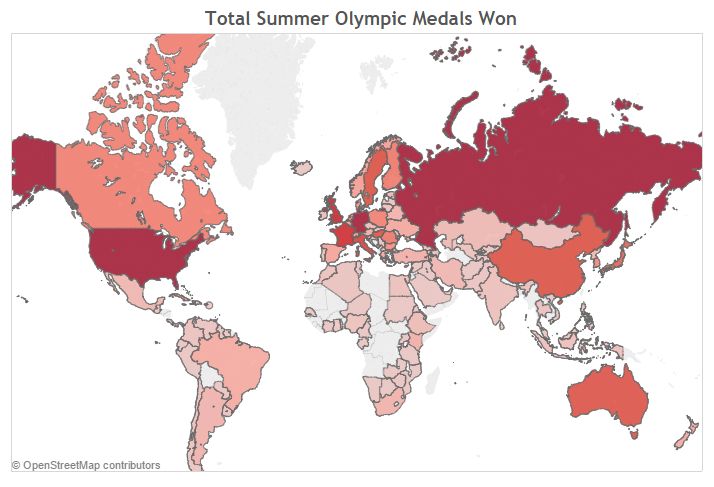
List of Figures

Figure 1 – Persistent Navigation with Embedded Images for Recognition ............................................................ 3
Figure 2 – Olympics History Application Logo .......................................................................................................... 3
Figure 3 – Breadcrumbs in the Application’s “United States” Page ........................................................................ 3
Figure 4 – Olympics Geopolitics Graph Displayed Normally .................................................................................. 5
Figure 5 – Olympics Geopolitics Graph Displayed with Data Spotlighting ........................................................... 5
Figure 6 – Data Tip for the Displaying the Total Number of Medals Won by Poland and How Many were
           Bronze ............................................................................................................................................................. 6
Figure 7 – Multi‐Y Graph Comparing Population per Medal versus Total Medals Won..................................... 6
Figure 8 – Multi‐Y Graph Sorted by Either the Left or Right Y‐Axis ....................................................................... 7
Figure 9 – Filled Map Showing the Total Number of Summer Olympic Medals Won by Country.................. 11
Figure 10 – Line Graph Showing the Effect of Geopolitics on Summer Olympic Medal Counts ...................... 12
Figure 11 – Multi Y‐Axis Bar Graph Contrasting GDP to Medal Ratio and the Total Number of Medals Won13
Figure 12 – Multi Y‐Axis Bar Graph Contrasting Population to Medal Ratio and the Total Number of
          Medals Won ................................................................................................................................................. 15
Figure 13 – Stacked Bar Chart of the Medals Won by the United States at the Summer Olympics .................. 16
Figure 14 – Symbol Map of the Summer Olympic Games Host Cities .................................................................. 17
Figure 15 – Symbol Map showing the Number of Athletes that Attended the London 2012 Olympics and the
          Average Number of Medals per Athlete ................................................................................................. 18
Figure 16 – Line Graph Showing the Growth in the Number of Events at the Summer Olympics .................. 19
Figure 17 – Stacked Bar Graph Comparing Michael Phelps Medal Total to Various Countries ....................... 20

          Team Thundercats                                            CS235 – Final Project
   Shubhangi Rakhonde, David Schechter                                                                                                                ii
                                                                      Data Visualization Report
           Zayd Hammoudeh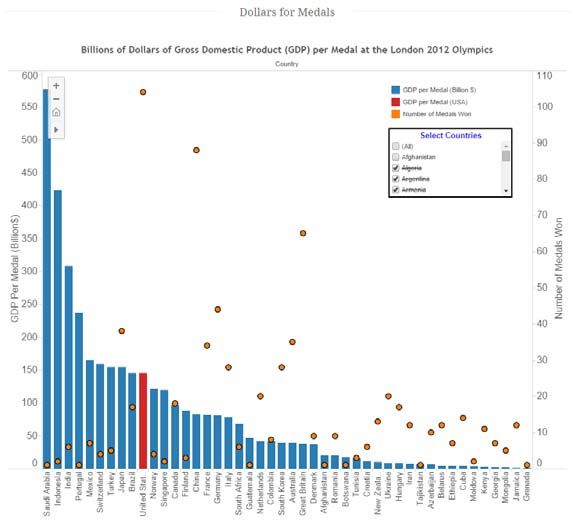
1.           Summary

    On May 12, 2014, Team Thundercats presented our final project for CS235. Our web application uses
various data visualization techniques to provide insight into the history of the summer Olympics. This
document provides an overview of the application including its expected users, architectural components,
as well as a detailed description of the conclusions that can be drawn from each of its data visualizations.

2.           Application Overview

    Every two years, the world gathers to celebrate amateur sports at the Olympic Games. While over 219
million Americans watched the London 2012 summer Olympics and cheered as the United States won more
medals than any other nation, most viewers never understood or appreciated the varied dynamics
associated with the US’ perceived Olympic dominance.

    When ranking a nation’s performance at the Olympic Games, most think solely about the total number
of medals won, but that is overly simplistic. Our application uses Olympic data from all previous games to
enable users to more broadly understand the factors that contribute to a nation’s performance at the
Olympics. The following is a list of the key dynamics we wanted users to more completely understand
when considering a nation’s Olympic performance:

     a.      Geopolitics
     b.      National Economic Output
     c.      National Population
     d.      Games’ Host City
     e.      Number of Participating Athletes
     f.      Event Bias

These guiding concepts/goals served as the core of our thought process when selecting our data
visualizations.

   It is important to note that while this report and our application discusses the Olympics generally, we
chose to focus solely on the summer Olympics because it is a much larger games both in terms of number
events as well as participating nations. What is more, given the scope of the project, comparing and
contrasting summer and winter Olympic Games would have muddled some of the points of discussion.

3.           Typical Users

    The potential user base for our Olympics history application is very broad. It is intended to cover
anyone who is interested in learning more about the Olympics. However, we did focus more on an
American audience in many of our visualizations. While some in the class may not originally come from
this country, the United States has one of the richest and most extensive Olympic histories, which makes it a
prime subject for study and analysis.

          Team Thundercats                 CS235 – Final Project
 Shubhangi Rakhonde, David Schechter                                                          1
                                           Data Visualization Report
         Zayd Hammoudeh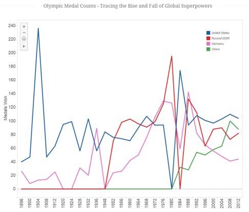
4.             Application Presentation

    All semester, our team has avoided slide‐focused presentations as they can cause the audience to
quickly lose interest and/or become distracted. It was our position that a very short presentation followed
by a longer demonstration would be more engaging and informative to the audience. Given the very
positive feedback we received from both Professor Mak and the class regarding our previous presentations,
we saw no need to change our approach for the final project.

    Despite being the first team to present and the only ones who presented early, we felt our presentation
was very successful (although it ran long). Our application has a clear story, and the dynamic data
visualizations lend themselves well to an interactive presentation.

   We have included our presentation slides with this submission. The file name is: “CS235 ‐ Team
Thundercats ‐ Final Project Presentation.pptx”.

5.             Application Components

   Our application has three primary components, which are described in the following sections. In
addition, we included with our submission our source code, which is in the zip file named “CS235 – Final
Project – Source Code.zip”.

    As a note to any users of our application, we fully populated the navigation menus to give the site an
increased feeling of realism. However, only of a subset of the links take the user to actual pages. For a list
of the application’s working pages, see the section entitled “Data Visualizations” where each subsection
corresponds to a page on our site.

5.1.           Website Template

   Our application adapted an existing HTML5 and CSS template1. We selected this template because it
had a professional appearance and due to its effective use of multiple web design patterns including:

       a.      Visual Framework – Across all pages, our application has a common framework that allows
               users to access all of the application’s features. Providing a persistent and consistent navigation
               platform enables users to build a strong, working base of knowledge on how to access various
               site features.

               What is more, an advanced feature of this template’s navigation structure is that it includes
               embedded images as part of the navigation bar (shown inside blue rectangles in figure 1). This
               allows users to use recognition when identifying the menu item that aligns with their goals and
               not solely recall.

1   For a link to the template, please see: http://themeforest.net/item/alexx‐multipurpose‐html5‐theme/3370259
            Team Thundercats                     CS235 – Final Project
    Shubhangi Rakhonde, David Schechter                                                                2
                                                 Data Visualization Report
            Zayd Hammoudeh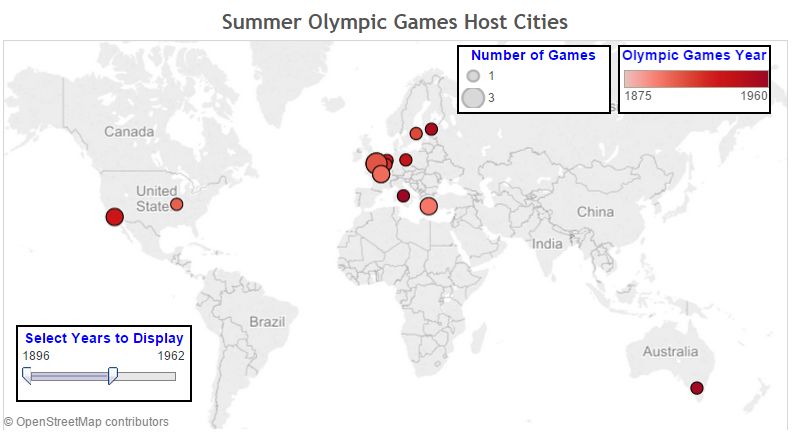
Figure 1 – Persistent Navigation with Embedded Images for Recognition

       b.      Carousel – On the front page, there is a carousel of iconic Olympic images. Most users (in
               particular those who already have some knowledge about the Olympics) will recognize that
               many of these images came from multiple games (as far back as 1936). This recognition will
               assist in the cultivation of the mental modal that this site is focused on Olympic history.

       c.      Escape Hatch – In the upper left corner of each page is our application’s “Olympics History”
               logo (see figure 2). By clicking on the logo, the user is returned to our application’s home page.
               This approach allows users to feel freer when exploring the site as they have reduced fear of not
               being able to return to a known reference point.

                                          Figure 2 – Olympics History Application Logo

       d.      Breadcrumbs – With the exception of the home page, all pages on the site have breadcrumbs
               that allow users to know the current page they are on and to return to parent pages in the
               navigation hierarchy.

                                Figure 3 – Breadcrumbs in the Application’s “United States” Page

5.2.           Tableau

     Since this project is, at its core, focused on data visualization, the software used to visualize that data is
critical. The reasons we chose Tableau as the data visualization tool for our application were:

    a.         Full Version for Students – As part of its “academic program”, Tableau offers the full version of
               its software free to students. For more information on this, please see here:

                                        https://www.tableau.com/academic/students

       b.      Large User Base – A user must spend a non‐insignificant amount of time experimenting with
               Tableau before s/he is able to efficiently create good visualizations. For our team, it generally
               took at least 8 hours before we reached that threshold. If Tableau did not have as large of a user
               base as it does, it would have taken us much longer because we would not have had the

            Team Thundercats                       CS235 – Final Project
  Shubhangi Rakhonde, David Schechter                                                               3
                                                   Data Visualization Report
          Zayd Hammoudeh
opportunity to reference all of the user generated tutorials and YouTube videos that helped us
             learn the tool’s finer details.

    c.       Advanced Feature Set – Different features within Tableau allow users to include multiple data
             visualization design patterns into their applications. The follow subsections enumerate different
             data visualization design patterns we used in our application. Note that this is not a complete
             list. Rather, we focused on those aspects we found could be described effectively in a text
             document.

5.2.1.       Multiple Visualization Types

    The heart of any data visualization tool is the different types of visualizations it can create. The
following is a list of the types of visualizations we used in our application; below each type are the names of
visualizations in which that model was used.

    a.       Standard Bar Chart
             i.    Dollars for Medals – Relation between a Nation’s GDP and the Number of Medals Won
                   at the London 2012 Olympics
             ii.   Quantifying the Most and Least Athletic Countries – Country Population per Medal at
                   the London 2012 Olympic Games

    b.       Stacked Bar Chart
             i.    United States Medal Wins – A Home Advantage
             ii.   If Michael Phelps were a Country

    c.       Line Graph
             i.    Effect of Geopolitics on Olympic Medal Wins – Charting the Rise and Fall of Global
                   Superpowers
             ii.   Growth in the Number of Olympic Events

    d.       Filled Map
             i.     Total Summer Olympic Medals Won

    e.       Symbol Map
             i.   Summer Olympic Games Host Cities
             ii.  Athletes Attending the 2012 London Olympics by Country

    Note that the preceding list of visualization types is only a subset of those supported by Tableau.

5.2.2.       Data Spotlighting

   Data spotlighting allows users to select to emphasize a particular portion of the data without losing its
context with respect to the rest of the data. Figures 4 and 5 show the same graph displayed normally and

         Team Thundercats                   CS235 – Final Project
  Shubhangi Rakhonde, David Schechter                                                         4
                                             Data Visualization Report
          Zayd Hammoudeh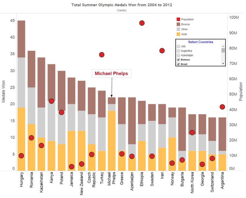
with data spotlighting respectively. Note that in Figure 5, the red line becomes prominent as the rest of the
data is dimmed.

                                  Figure 4 – Olympics Geopolitics Graph Displayed Normally

                           Figure 5 – Olympics Geopolitics Graph Displayed with Data Spotlighting

    Data spotlighting is enabled in all of our application’s data visualizations.

5.2.3.       Data Tips

    In displays where there is a significant amount of data, getting the exact value of a particular entity may
be difficult. Data tips allow users to get more information about a specific portion of the data by hovering
over it. Figure 6 shows a data tip (surrounded by a green rectangle) in our data visualization “If Michael
Phelps were a Country”. Note that the tool tip displays the country name along with the number of bronze
medals and the total number of medals the country (e.g. Poland) won; these types of tool tips make
information readily available to a user which would otherwise be more onerous if not impossible to
determine.

         Team Thundercats                        CS235 – Final Project
  Shubhangi Rakhonde, David Schechter                                                               5
                                                 Data Visualization Report
          Zayd Hammoudeh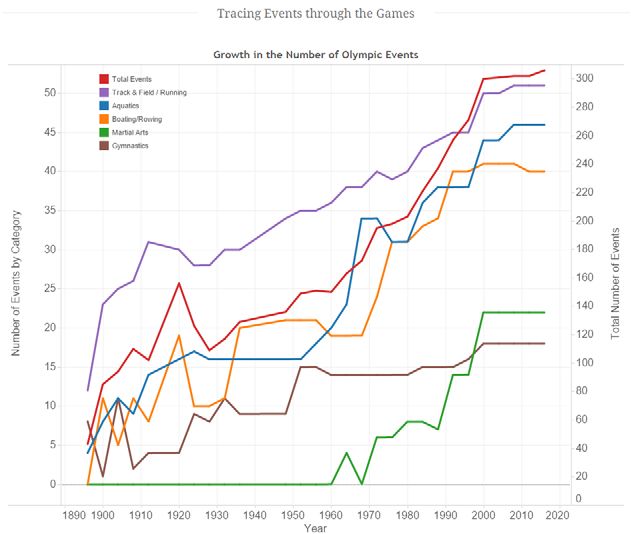
Figure 6 – Data Tip for the Displaying the Total Number of Medals Won by Poland and How Many were Bronze

    Data tips are enabled in all of our application’s data visualizations.

5.2.4.       Multi‐Y Graphs

     When trying to identify a relationship between two distinct but related data variables, it is often not
possible to use the same scale/axis to display them both. In such cases, using multiple Y‐axes is the best
solution. Figure 7 has two Y‐axes; on the left Y‐axis, a country’s population per Olympic medal is displayed
while on the right Y‐axis is the total number of medals won by that country. Note that the common X‐axis
is a set of countries.

                     Figure 7 – Multi‐Y Graph Comparing Population per Medal versus Total Medals Won

         Team Thundercats                       CS235 – Final Project
  Shubhangi Rakhonde, David Schechter                                                                  6
                                                Data Visualization Report
          Zayd Hammoudeh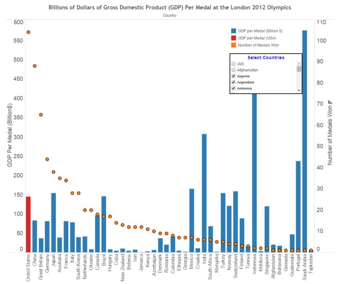
Our application used multi‐Y graphs in the following data visualizations:

         a. Dollars for Medals – Relation between a Nation’s GDP and the Number of Medals Won at the
            London 2012 Olympics

         b. Quantifying the Most and Least Athletic Countries – Country Population per Medal at the
            London 2012 Olympic Games

         c. Growth in the Number of Olympic Events

         d. If Michael Phelps were a Country

5.2.5.       Sortable Table

    The Sortable Table design pattern is something of a misnomer as while it specifically mentions tables by
name, the pattern applies to more than that. As shown in the in‐class lecture material, it can also apply to
bar graphs as well.

    In our application, the default was to always sort data according to the left Y‐axis. However, if the user
wanted to sort according to the right Y‐axis, s/he does so by hovering the mouse over the axis title and
selecting sort ascending or descending. Figure 8 shows the same graph sorted by the left Y‐axis (see left
graph) and by the right Y‐axis (see right graph).

                               Figure 8 – Multi‐Y Graph Sorted by Either the Left or Right Y‐Axis

    Our application supports sortable tables on the data visualizations with multiple Y‐graphs namely:

         a. Dollars for Medals – Relation between a Nation’s GDP and the Number of Medals Won at the
            London 2012 Olympics

         Team Thundercats                         CS235 – Final Project
  Shubhangi Rakhonde, David Schechter                                                               7
                                                   Data Visualization Report
          Zayd Hammoudeh
b. Quantifying the Most and Least Athletic Countries – Country Population per Medal at the
London 2012 Olympic Games
c. Growth in the Number of Olympic Events
d. If Michael Phelps were a Country
5.3. GitHub – The Application Runtime Platform
Throughout the semester, Team Thundercats used GitHub as our revision control repository. One of
GitHub’s lesser known features is that built into every GitHub repository is a free web server. To run our
application, we recommend that you access our GitHub page directly. A link to the application’s home
page is below:
http://rawgit.com/ZaydH/CS235/master/Final_Project/index.html
As a service to future students, we will keep our project live in perpetuity as part of our group’s GitHub
repository. It is our humble recommendation that for subsequent classes, it be a requirement that the
students publish their projects to a course GitHub repository so students may view them easily for
inspiration, ideas, and to better understand the expectations of the assignment.
6. Data Sources
Multiple different data sources/sets were used to generate our application’s data visualizations. Below
is a list of the data sources we used; included with each is a reference to the data visualization where the
data set was used:
1. United States’ Olympic Medals Won by Games
A. Description: This dataset lists the number of gold, silver, and bronze medals won by the United
States at each summer Olympic Games.
B. Data Source: http://www.olympic.org/united‐states‐of‐america
C. Data Visualizations:
a. Effect of Geopolitics on Olympic Medal Wins – Charting the Rise and Fall of Global
Superpowers
b. United States Medal Wins – A Home Advantage
2. China’s Olympic Medals Won by Games
A. Description: This dataset lists the number of gold, silver, and bronze medals won by the
People’s Republic of China (i.e. not China Taipei) at each summer Olympic Games.
B. Data Source: http://www.olympic.org/people‐s‐republic‐of‐china
Team Thundercats CS235 – Final Project
Shubhangi Rakhonde, David Schechter 8
Data Visualization Report
Zayd HammoudehC. Data Visualization: Effect of Geopolitics on Olympic Medal Wins – Charting the Rise and Fall of
Global Superpowers
3. Soviet Union’s Olympic Medals Won by Games
A. Description: This dataset lists the number of gold, silver, and bronze medals won by the Soviet
Union at each summer Olympic Games.
B. Data Source: http://www.pbs.org/redfiles/sports/stry/medals.htm
C. Data Visualizations: Effect of Geopolitics on Olympic Medal Wins – Charting the Rise and Fall
of Global Superpowers
4. The Russian Federation’s Olympic Medals Won by Games
A. Description: This dataset lists the number of gold, silver, and bronze medals won by the Russian
Federation at each summer Olympic Games.
B. Data Source: http://www.olympic.org/russian‐federation
C. Data Visualizations: Effect of Geopolitics on Olympic Medal Wins – Charting the Rise and Fall
of Global Superpowers
5. Germany’s Olympic Medals Won by Games
A. Description: This dataset lists the number of gold, silver, and bronze medals won by Germany
at each summer Olympic Games.
B. Data Source: http://www.olympic.org/germany
C. Data Visualizations: Effect of Geopolitics on Olympic Medal Wins – Charting the Rise and Fall
of Global Superpowers
6. Olympic Medal Wins by Games
A. Description: This dataset lists the number of gold, silver, and bronze medals won by country at
each summer Olympic Games.
B. Data Source: http://chandoo.org/wp/2008/08/06/olympic‐medal‐country‐year‐excel‐bubble‐
chart/
C. Data Visualization: Effect of Geopolitics on Olympic Medal Wins – Charting the Rise and Fall of
Global Superpowers
7. Total Medals by GDP
A. Description: This dataset quantifies the relationship between a nation’s economic output
(measured as GDP – Gross Domestic Product) and the number of medals it won at the 2012
London Olympics.
B. Data Source: http://www.medalspercapita.com/#medals‐by‐gdp:2012
C. Data Visualizations: Dollars for Medals – Relation between a Nation’s GDP and the Number of
Medals Won at the London 2012 Olympics
8. Total Medals Won Per Capita
A. Description: This dataset quantifies the relationship between a nation’s population and the
number of medals it won at the 2012 London Olympics.
B. Data Source: http://www.medalspercapita.com/#medals‐per‐capita:2012
Team Thundercats CS235 – Final Project
Shubhangi Rakhonde, David Schechter 9
Data Visualization Report
Zayd HammoudehC. Data Visualizations: Quantifying the Most and Least Athletic Countries – Country Population
per Medal at the London 2012 Olympic Games
9. Olympic Events by Games
A. Description: This dataset provides a table enumerating the events each summer Olympics. Note
that we excluded the 1906 Intercalated Games since that is no longer considered an official
Olympic Games by the International Olympic Committee (IOC).
B. Data Source: http://en.wikipedia.org/wiki/Olympic_sports
C. Data Visualization: Growth in the Number of Olympic Events
10. Summer Olympic Games Host Cities
A. Description: This dataset provides a list of host cities for each of the summer Olympic Games.
B. Data Source: http://www.olympic.org/olympic‐games
C. Data Visualization: Summer Olympic Games Host Cities
11. Athletes Attending the London 2012 Olympics by Country
A. Description: This dataset provides a list of host cities for each of the summer Olympic Games.
B. Data Source: http://en.wikipedia.org/wiki/2012_Summer_Olympics
C. Data Visualization: Athletes Attending the 2012 London Olympics by Country
12. All Time Olympic Medal Totals by Country
A. Description: This dataset provides a table listing the number of summer Olympics medals won
by each country.
B. Data Source: http://www.olympic.it/english/medal/id_summer.htm
C. Data Visualization: Total Summer Olympic Medals Won
13. Olympic Medals Won by Michael Phelps
A. Description: This dataset provides a list of the Olympic medals won by athlete Michael Phelps
at each of the summer Olympics at which he competed.
B. Data Source: http://www.olympic.org/michael‐phelps
C. Data Visualization: If Michael Phelps were a Country
7. Webpage Text
Since this project is intended to be a user interface design course’s culminating experience, we did not
consider that it would be necessary to write original text for each of the application’s pages. Rather, the
vast majority of the text on our application’s pages is merely a tool to lend realism and context. As such,
other than the headlines for each of the pages and the visualization titles, none of the text in our application
is original. It was all sourced from different web pages.
The section entitled “List of Webpage Text References” enumerates the pages from which we adapted
text content. Any pages missing from this list are an oversight on our part since we fully acknowledge that
all of the text content (excluding the previously mentioned exceptions) is not original.
Team Thundercats CS235 – Final Project
Shubhangi Rakhonde, David Schechter 10
Data Visualization Report
Zayd Hammoudeh8. Data Visualizations
The following subsections enumerate the nine data visualizations included in our application. Each
subsection also describes our motivations when creating the visualization and how the visualization
addresses our original goals.
8.1. Total Summer Olympic Medals Won
Web Page Address: http://rawgit.com/ZaydH/CS235/master/Final_Project/country_profiles.html
Figure 9 – Filled Map Showing the Total Number of Summer Olympic Medals Won by Country
When determining the country that has performed the best at the Olympics, most think only of total
medal count; some may have considered our application would be incomplete without the clichéd
visualization shown in figure 9. However, we deliberately kept the visualization as simple as possible
because while it does clearly show that the nations that have won the most Olympic medals are the United
States, Germany, and Russia, we know it does not tell the whole story; instead this visualization will serve
as a point of contrast to show the user that Olympics performance is much more complex than just who
won the most medals.
8.2. Effect of Geopolitics on Olympic Medal Wins – Charting the Rise and Fall of
Global Superpowers
Web Page Address: http://rawgit.com/ZaydH/CS235/master/Final_Project/geopolitics.html
Team Thundercats CS235 – Final Project
Shubhangi Rakhonde, David Schechter 11
Data Visualization Report
Zayd HammoudehFigure 10 – Line Graph Showing the Effect of Geopolitics on Summer Olympic Medal Counts
Chapter 5 of the Olympic Charter states, “No kind of demonstration or political, religious or racial
propaganda is permitted in the Olympic areas.” While this may technically be true, it somewhat belies the
reality that the entire Olympic movement is often dominated by political propaganda. To illustrate this
point, we have graphed the medal totals at each summer Olympic Games for the 20th Century’s dominant
superpowers. The following list describes how each nation’s medal count is deeply reflective of the on‐
going geopolitical situation.
1. Germany – Leading up to World War II, Nazi Germany was intent on showing the superiority
of the Aryan race, and at the behest of the Nazi propaganda minister Joseph Goebbels, Nazi
Germany pushed its athletes to perform well at the 1936 Berlin games. Due to this pressure,
Germany won more medals in those games than any other nation.
It must also be noted that Germany is the only country to have lost two world wars. Its defeats
are clearly shown in our data visualization as Germany won no medals in 1920, 1924, and 1948.
Once Germany had begun to rebuild after World War II, East Germany wanted to show its
superiority over West Germany and began an extensive doping program. This led to a surge of
Olympic medal wins until the Berlin Wall fell in 1989, after which there was a precipitous drop
in the number of medals won by the united Germany.
2. Soviet Union/Russia: Before 1950, the Soviet Union was very domestic centric and politically
isolated, and only looked outside its borders regarding matters of national security (e.g.
Molotov‐von Ribbentrop Pact, World War II related diplomacy, etc.). This inward focus is
reflected in the fact the Soviet Union never competed in a summer Olympics before 1952.
By 1952, the Cold War had already become hot in places like the Korean Peninsula. What is
more, communist and democratic nations were pitted against each other to show the superiority
of their political systems. Similar to Nazi Germany in the 1930’s, the Soviet Union invested
Team Thundercats CS235 – Final Project
Shubhangi Rakhonde, David Schechter 12
Data Visualization Report
Zayd Hammoudehheavily in athletes at this time, which is reflected in the number of summer Olympic medals it
won. The only exception to this is when it boycotted the 1984 Olympics for the geopolitical
reason that the games were held in Los Angeles.
3. China: Before 1980 when President Richard Nixon visited mainland China, the nation was
politically isolated. The infrastructure had been largely destroyed by Japan in World War II and
civil war. This national isolation is reflected in that China won no Olympics medals before 1984.
However, China, as a nation, is on the rise both economically and at the Olympic Games. It has
steadily won an increasing number of medals, and just like it does economically, China now
only trails the United States in medals won at the summer Olympics.
4. United States: The 20th Century was America’s century. It won two World Wars and is the only
one of the four major superpowers on this graph to not have had any political revolutions.
Rather, the United States has been the hallmark of stability. This political stability is reflected in
US’ comparatively stable medal win count. The only two outliers are the 1904 games, when the
Olympics were still in their infancy, and in 1980‐1984, when the games were dominated by Cold
War politics, which led to alternating boycotts.
8.3. Dollars for Medals – Relation between a Nation’s GDP and the Number of
Medals Won at the London 2012 Olympics
Web Page Address: http://rawgit.com/ZaydH/CS235/master/Final_Project/economics.html
Figure 11 – Multi Y‐Axis Bar Graph Contrasting GDP to Medal Ratio and the Total Number of Medals Won
Team Thundercats CS235 – Final Project
Shubhangi Rakhonde, David Schechter 13
Data Visualization Report
Zayd HammoudehCompeting in the Olympics can be expensive. While some sports like marathon have very low cost
barriers to entry, others like swimming and equestrian events require specialized equipment/facilities that
may be unavailable to many people. Hence, even if an individual has the maximum potential to achieve
greatness, that greatness may be squandered if they cannot afford to utilize that potential. Figure 11
illustrates the relationship between a nation’s economic output and the medals won at the London 2012
games.
To quantify how well a nation translates its economic output to Olympic medals, we used the GDP to
Medal ratio via the simple formula:
Note we only considered the number of medals won at the London 2012 games (i.e. the most recent).
As shown in figure 11, the country that had the best GDP to medal ratio was Grenada at $800M per
medal; however, it only won a single medal. As such, it should be considered an outlier; this type of
outlier necessitated we also include in the visualization the number of medals won. Rather, we would
argue Jamaica’s $1.3B per medal is a much greater accomplishment than Grenada as Jamaica won 12
medals. In contrast, Saudi Arabia had $576B of GDP for the single medal it won.
While this visualization works well for countries with low to moderately sized GDPs, it can be overly
harsh in punishing countries with very large GDPs. For example, if the United States had won every medal
at London 2012, its GDP to medal ratio would have only been $15.7B, which is well behind nations like
Tunisia, Ethiopia, Kenya, Georgia, and Mongolia, much less Jamaica.
8.4. Quantifying the Most and Least Athletic Countries – Country Population per
Medal at the London 2012 Olympic Games
Web Page Address: http://rawgit.com/ZaydH/CS235/master/Final_Project/population.html
Team Thundercats CS235 – Final Project
Shubhangi Rakhonde, David Schechter 14
Data Visualization Report
Zayd HammoudehFigure 12 – Multi Y‐Axis Bar Graph Contrasting Population to Medal Ratio and the Total Number of Medals Won
Concerning the lottery, it is often said that the more tickets one buys, the better the chances of winning.
Some argue that this applies to the “genetic lottery” for Olympic athletes. For example, most people could
never run as fast as Usain Bolt or be as athletic as LeBron James even if they did everything they possibly
could (short of doping).
As shown in figure 12, India and Indonesia are exceptionally poor at cultivating Olympic medal
winning athletes despite having very large populations. What is more, some countries like Pakistan and the
Philippines do not even appear on this graph because they did not win any medals at all despite having
populations of 180 million and 98 million respectively. In contrast, Jamaica won twice the number of
medals as India at the London 2012 Olympics despite India having more than 450 times the population.
Hence, this visualization shows that certain nations are far better at producing Olympic medal winning
athletes than others, which shows the “more chances to win” argument has fundamental flaws.
This visualization does not stray far from the theme that no one statistic can completely quantify a
nation’s Olympic performance. At the Olympic Games, the number of athletes a nation can send is not
proportional to population size. For example, a nation can only send 12 players to represent it in men’s
basketball irrespective of a nation’s population. This cap will make countries with large populations like
China and the United States appear worse despite potentially performing well at the games in particular in
those games where the result has some degree of chance associated with it and where the best athlete does
not always win.
8.5. United States Medal Wins – A Home Advantage
Web Page Address: http://rawgit.com/ZaydH/CS235/master/Final_Project/united_states.html
Team Thundercats CS235 – Final Project
Shubhangi Rakhonde, David Schechter 15
Data Visualization Report
Zayd HammoudehFigure 13 – Stacked Bar Chart of the Medals Won by the United States at the Summer Olympics
When most fans of the Olympics envision their city or nation hosting the games, they think primarily in
terms of national prestige or glory; politicians may even think of the economic benefits. However, few
think of how the selection of the host city affects medal totals. As shown in figure 13, the two summer
Olympics where the United States won its most medals, the games were hosted domestically. In particular,
during the 1904 games, the United States won more than 85% of the medals as it fielded 81% of the athletes.
Similarly in the 1984 games, the United Statesʹ two biggest rivals, the Soviet Union and East Germany
boycotted the games solely because they were held in the US. These two outliers greatly skew the US
medal total much higher. What is more, with the exception of the 1996 Olympics, the United States had
sizeable, one off increases in the numbers of medals won when the games was hosted in the United States
or a neighboring country. As such, these effects contribute to the United States winning more medals in
total than any other nation.
8.6. Summer Olympic Games Host Cities
Web Page Address: http://rawgit.com/ZaydH/CS235/master/Final_Project/previous_games.html
Team Thundercats CS235 – Final Project
Shubhangi Rakhonde, David Schechter 16
Data Visualization Report
Zayd HammoudehFigure 14 – Symbol Map of the Summer Olympic Games Host Cities
Section #8.5 clearly showed that the medal totals for the United States tended to go up when the
Olympics were hosted in the United States or in a neighboring country. What is more, in section #8.2,
China won its most medals when the Olympics were held in Beijing. There is no reason to believe this
phenomenon does not apply to other countries as well. In contrast, obvious factors, including the cost to
travel and local fan support, would lead one to believe this effect applies generally.
Before 1964, all Olympics had been held in developed Western countries with only three being held
outside of Europe as shown in figure 14. This would naturally skew Olympic medal totals toward these
countries. As the Olympics have become more of a truly global events, it has been (and will be) held in
more non‐traditional cities including Moscow, Tokyo (twice), Rio de Janeiro, Mexico City, Beijing, and
Seoul. This increased global participation may lead to a more balanced total medal table in the future.
8.7. Athletes Attending the 2012 London Olympics by Country
Web Page Address: http://rawgit.com/ZaydH/CS235/master/Final_Project/previous_games.html
Team Thundercats CS235 – Final Project
Shubhangi Rakhonde, David Schechter 17
Data Visualization Report
Zayd HammoudehFigure 15 – Symbol Map showing the Number of Athletes that Attended the London 2012 Olympics and the Average Number of
Medals per Athlete
Figure 15 is perhaps the most important visualization in our project. It brings together two important
data sets for the London 2012 Olympics; they are:
1. Number of Athletes from Each Nation
2. Number of Medals Won per Athlete
If two nations sent comparable numbers of athletes to the same Olympics, then one of the ways to
compare the nations’ performances is to look at the medal totals. For example, at London 2012, the United
Kingdom had 540 participating athletes and won 65 medals. In contrast, the United States had 530 athletes
and won 104 medals (note this detailed information is available for this visualization as a tool tip). All other
factors being equal, this would imply the United States did substantially better than the UK at this
particular games.
Using solely the medal count metric, it is not possible to compare for instance the United States to
Jamaica (which sent only 50 athletes yet won 12 medals). One of the ways you can normalize these results
is through the medals per athlete ratio defined by:
When this scale is used, Jamaica significantly outperformed the United States with a medals per athlete
ratio of 0.240 versus 0.196 respectively.
Another important aspect of this visualization is that it supports dynamic queries via sliders. For
example, a user can select a minimum and maximum athletes per medal ratio range to be displayed. One
interesting note is that when the medals per athlete ratio is set just above zero (i.e. the nation had to win at
Team Thundercats CS235 – Final Project
Shubhangi Rakhonde, David Schechter 18
Data Visualization Report
Zayd Hammoudehleast one medal), most of Africa is no longer included on the map. This shows Africa’s generally poor
performance at the games.
It is also worth noting that this visualization does not correct for the fact that for some sports like
basketball, synchronized swimming, field hockey, etc., a team can consist of ten or more players but only a
single medal could be awarded to the entire team, potentially skewing the medals per athlete ratio value
low. However, for countries with large Olympic contingents (e.g. Russia, China, the United Kingdom,
Germany, France, Japan, etc.), we expect that this skew would become a non‐factor as it would affect all of
the nations to about the same degree. To address this concern, we included the second slider to filter
nations based off the number of athletes they sent to the games.
8.8. Growth in the Number of Olympic Events by Type
Web Page Address: http://rawgit.com/ZaydH/CS235/master/Final_Project/events.html
Figure 16 – Line Graph Showing the Growth in the Number of Events at the Summer Olympics
It is only possible to win an Olympic medal in events that actually exist. This may seem like an obvious
statement, but it is not one that can be overlooked. The types of events included in the Olympics were
originally set primarily by Americans and Europeans. As shown in figure 16, while the number of events at
the Olympics has grown substantially since the first Olympics in 1896, the growth has largely been in the
same original core group (with the exception of martial arts).
Team Thundercats CS235 – Final Project
Shubhangi Rakhonde, David Schechter 19
Data Visualization Report
Zayd HammoudehSome argue that the types of events at the Olympics benefit specific countries over others. An example
of this is cricket, which has only ever appeared at a single Olympic games (1900) despite being one of the
most popular games globally. The International Olympic Committee (IOC) decides which events to include
and exclude from each games. In recent years, there has been a shift towards a more global centric event
line‐up by removing games such as softball and baseball and replacing them with more international games
like rugby.
If past trends are an indication, it is unlikely that the Olympics will adopt a significant number of new
events that are more traditionally non‐Western focused. Rather, what is more likely is that the sports
played in different countries will drift towards those that are already popular internationally. Until a more
global uniformity of sports popularity is reached, the types of events at the Olympics will continue to
disenfranchise certain nations.
8.9. If Michael Phelps were a Country
Web Page Address: http://rawgit.com/ZaydH/CS235/master/Final_Project/michaelphelps.html
Figure 17 – Stacked Bar Graph Comparing Michael Phelps Medal Total to Various Countries
The previous visualizations were intended to show some of the nuances associated with describing
Olympic performance. In contrast, the final visualization in figure 17 is intended as a tool to show the
dominating Olympic performance of a single individual: Michael Phelps. It does this by bringing together
three distinct pieces of data, namely:
Team Thundercats CS235 – Final Project
Shubhangi Rakhonde, David Schechter 20
Data Visualization Report
Zayd Hammoudeh1. Total Number of Medals Won by Country
2. Country Population Size
3. Medal Breakdown between Gold, Silver, and Bronze
With the exception of population size, this data applies to only the three Olympic Games at which Michael
Phelps competed (specifically the years 2004, 2008, and 2012).
This visualization shows that no country with comparable medal counts had nearly the ratio of gold
medals to total medals that Michael Phelps had. What is more, despite having millions or even tens of
millions of people, these countries had similar medal totals to Phelps. As an example, the combined medal
output of over 95 million Ethiopians could not match Michael Phelps by himself. This visualization
succinctly, and perhaps a bit entertainingly, shows Phelps’ superior and dominant Olympic performance in
the last three games.
Team Thundercats CS235 – Final Project
Shubhangi Rakhonde, David Schechter 21
Data Visualization Report
Zayd HammoudehList of Webpage Text References
[1] ‘Olympic sports’, Wikipedia, (wiki article). Available at:
. [Accessed 10 May 2015].
[2] ‘United States at the Olympics’, Wikipedia, (wiki article). Available at:
. [Accessed 10 May 2015].
[3] ‘Michael Phelps’, Wikipedia, (wiki article). Available at:
. [Accessed 10 May 2015].
[4] ‘All‐time Olympic Games Medal Table’, Wikipedia, (wiki article). Available at:
. [Accessed 10 May 2015].
[5] ‘2012 Summer Olympics’, Wikipedia, (wiki article). Available at:
. [Accessed 10 May 2015].
[6] ‘All‐time Olympic Games Medal Table’, Wikipedia, (wiki article). Available at:
. [Accessed 10 May 2015].
[7] Boston.com, (2015). Winning golds without gold: an economic analysis of the medal standings. [online]
Available at:
http://www.boston.com/sports/blogs/statsdriven/2012/07/winning_golds_without_gold_an.html
[Accessed 10 May 2015].
[8] Iwallerstein.com, (2015). The Olympics and Geopolitics. [online] Available at:
http://iwallerstein.com/the‐olympics‐and‐geopolitics/ [Accessed 10 May 2015].
[9] Berg, C. (2015). Politics, not sport, is the purpose of the Olympic Games. IPA Review, [online] pp.15‐
18. Available at: https://www.ipa.org.au/library/publication/1213771802_document_60‐3_berg.pdf
[Accessed 10 May 2015].
[ 10 ] Yahoo Eurosport UK, (2015). The Olympic medal ‘per capita’ table. [online] Available at:
https://uk.eurosport.yahoo.com/blogs/london‐spy/olympic‐medal‐per‐capita‐table‐125300447.html
[Accessed 10 May 2015].
[ 11 ] Team USA, (2015). USOC ‐ General Information | United States Olympic Committee. [online] Available
at: http://www.teamusa.org/About‐the‐USOC/Inside‐the‐USOC/History [Accessed 10 May 2015].
Team Thundercats CS235 – Final Project
Shubhangi Rakhonde, David Schechter 22
Data Visualization Report
Zayd HammoudehYou can also read