Aras Innovator 12 Configurable User Interface Admin Guide - Configurable User Interface Administrator Guide
←
→
Page content transcription
If your browser does not render page correctly, please read the page content below
Aras Innovator 12
Configurable User Interface Admin Guide

Document #: 12.0.02020010201
Last Modified: 07/22/2020
Aras Innovator 12
CUI Admin Guide
Copyright Information
Copyright © 2020 Aras Corporation. All Rights Reserved.
Aras Corporation
100 Brickstone Square
Suite 100
Andover, MA 01810
Phone: 978-806-9400
Fax: 978-794-9826
E-mail: Support@aras.com
Website: https://www.aras.com
Notice of Rights
Copyright © 2020 by Aras Corporation. This material may be distributed only subject to the terms and conditions set forth in the
Open Publication License, V1.0 or later (the latest version is presently available at http://www.opencontent.org/openpub/).
Distribution of substantively modified versions of this document is prohibited without the explicit permission of the copyright holder.
Distribution of the work or derivative of the work in any standard (paper) book form for commercial purposes is prohibited unless
prior permission is obtained from the copyright holder.
Aras Innovator, Aras, and the Aras Corp "A" logo are registered trademarks of Aras Corporation in the United States and other
countries.
All other trademarks referenced herein are the property of their respective owners.
Notice of Liability
The information contained in this document is distributed on an "As Is" basis, without warranty of any kind, express or implied,
including, but not limited to, the implied warranties of merchantability and fitness for a particular purpose or a warranty of non-
infringement. Aras shall have no liability to any person or entity with respect to any loss or damage caused or alleged to be caused
directly or indirectly by the information contained in this document or by the software or hardware products described herein.
2020 Aras Corporation All Copyrights Reserved. 2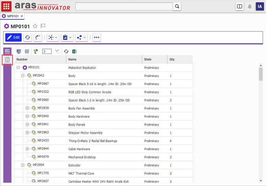
Aras Innovator 12
CUI Admin Guide
Table of Contents
Send Us Your Comments ............................................................................................. 4
Document Conventions ................................................................................................ 5
1 Overview ................................................................................................................... 6
1.1 Introduction................................................................................................................................... 6
1.2 Understanding the CUI Data Model ............................................................................................. 6
1.2.1 Presentation Configurations .......................................................................................... 6
1.2.2 Window Sections ........................................................................................................... 7
1.2.3 Controls ......................................................................................................................... 8
1.2.4 Command Bar Sections ................................................................................................. 9
1.2.5 Command Bar Items .................................................................................................... 10
1.2.6 Common CUI Properties ............................................................................................. 15
2 CUI Examples ......................................................................................................... 16
2.1 Toolbars ..................................................................................................................................... 16
2.1.1 Add a button to an item toolbar ................................................................................... 16
2.1.2 Add a separator to all item toolbars ............................................................................. 17
2.1.3 Remove a button on a relationship toolbar .................................................................. 18
2.1.4 Replace a button on a toolbar ..................................................................................... 19
2.2 Menus ......................................................................................................................................... 21
2.2.1 Add a button to a menu ............................................................................................... 21
2.2.2 Disable a menu ............................................................................................................ 22
2.2.3 Add a submenu to a menu .......................................................................................... 23
2.2.4 Display an icon on a menu button ............................................................................... 24
2.3 Shortcuts .................................................................................................................................... 25
2.3.1 Add an item form keyboard shortcut ........................................................................... 25
2.4 Table of Contents ....................................................................................................................... 26
2.4.1 Change a TOC category label ..................................................................................... 26
2.5 Item Views .................................................................................................................................. 27
2.5.1 Add a tab to the first accordion .................................................................................... 27
2.5.2 Hide a tab from the second accordion ......................................................................... 28
2.5.3 Add a third accordion with a tab .................................................................................. 29
2.6 Item View Sidebar ...................................................................................................................... 31
2.6.1 Display the ad hoc Graph View from an Item View Sidebar button ............................ 31
2.6.2 Display a query-based Graph View from an Item View Sidebar button ...................... 32
2.6.3 Display a Tree Grid View from an Item View Sidebar button ...................................... 34
2020 Aras Corporation All Copyrights Reserved. 3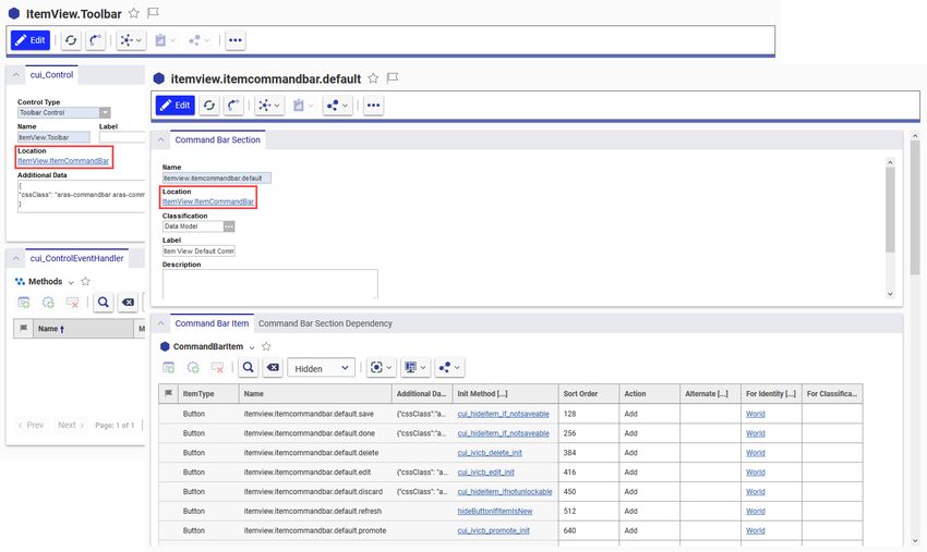
Aras Innovator 12
CUI Admin Guide
Send Us Your Comments
Aras Corporation welcomes your comments and suggestions on the quality and usefulness of this
document. Your input is an important part of the information used for future revisions.
o Did you find any errors?
o Is the information clearly presented?
o Do you need more information? If so, where and what level of detail?
o Are the examples correct? Do you need more examples?
o What features did you like most?
If you find any errors or have any other suggestions for improvement, indicate the document title, and the
chapter, section, and page number (if available).
You can send comments to us in the following ways:
Email:
Support@aras.com
Subject: Aras Innovator Documentation
Or,
Postal service:
Aras Corporation
100 Brickstone Square
Suite 100
Andover, MA 01810
Attention: Aras Innovator Documentation
Or,
FAX:
978-794-9826
Attn: Aras Innovator Documentation
If you would like a reply, provide your name, email address, address, and telephone number.
If you have usage issues with the software, visit https://www.aras.com/support/
2020 Aras Corporation All Copyrights Reserved. 4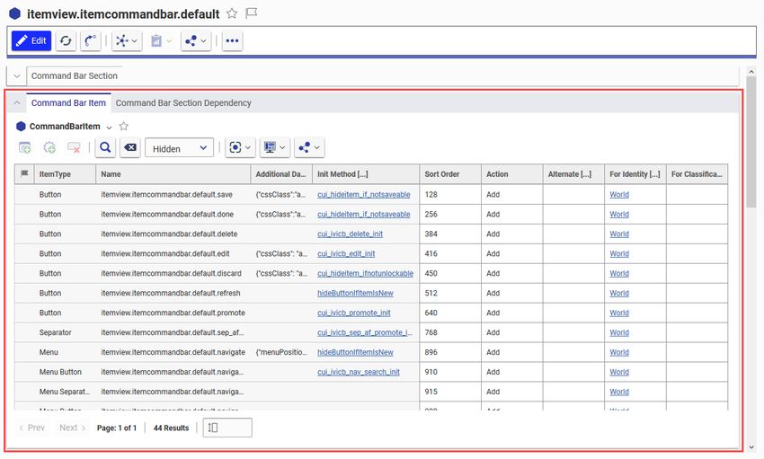
Aras Innovator 12
CUI Admin Guide
Document Conventions
The following table highlights the document conventions used in the document:
Document Conventions
Convention Description
This shows the names of menu items, dialog boxes, dialog
Bold box elements, and commands.
Example: Click OK.
Code examples appear in courier font. It may represent
Code
text you type or data you read.
Code highlighted in yellow draws attention to the code that
Yellow highlight
is being indicated in the content.
Yellow highlight Red text highlighted in yellow indicates the code parameter
with red text that needs to be changed or replaced.
Italics Reference to other documents.
Note: Notes contain additional useful information.
Warnings contain important information. Pay special
Warning attention to information highlighted this way.
Successive menu Successive menu choices may appear with a greater than
choices sign (-->) between the items that you will select
consecutively.
Example: Navigate to File --> Save --> OK.
2020 Aras Corporation All Copyrights Reserved. 5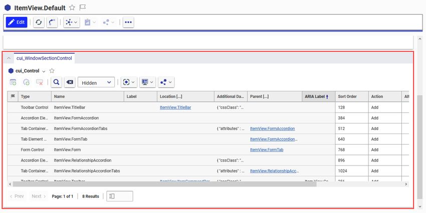
Aras Innovator 12
CUI Admin Guide
1 Overview
1.1 Introduction
The Configurable User Interface, or CUI, is a modeling mechanism in Aras Innovator that allows
administrators to define the layout and behavior of a client application.
Introduced in the early service packs of Aras Innovator 11.0, CUI was initially intended for modeling
toolbars, menus, and keyboard shortcuts.
With the UX/UI enhancements of the Aras Innovator 12.0 web client, CUI has been extended to
implement many areas of the standard web client. Standard features like the table of contents (TOC),
sidebars, toolbars, context menus, and accordion sections within item views are now modeled with CUI
controls.
1.2 Understanding the CUI Data Model
Presentation
Configuration
Window Command Bar
Sections Sections
Command
Controls
Bar Items
Figure 1. A simplified diagram of the CUI data model
1.2.1 Presentation Configurations
Presentation Configurations serve as containers for CUI configurations, defining the scope of the related
CUI items as either global or ItemType-specific.
A global Presentation Configuration is associated with a specific client via the “presentation” item property
on a Client Presentation item. In a standard Aras Innovator database, there is a single Client Presentation
item to identify the global Presentation Configuration that defines the layout and UI elements that are
inherited throughout the Aras Innovator web client.
Note: The CUI data model was architected with the intent that the user interface of any client
application could be defined in the Aras Innovator database. That’s why there’s only one Client
Presentation item in an out of the box Aras Innovator database – only the Aras Innovator web
client is defined by default. However, an admin could create another Client Presentation to define
the UI of a custom client application or connector.
2020 Aras Corporation All Copyrights Reserved. 6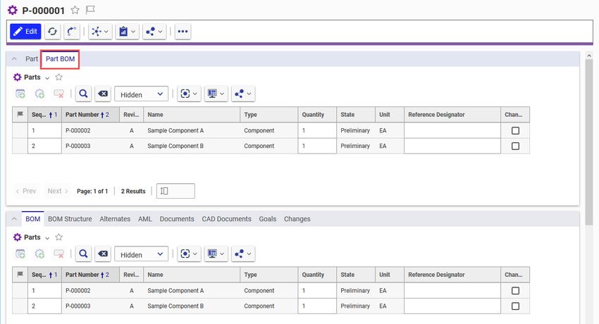
Aras Innovator 12
CUI Admin Guide
The scope of an ItemType-specific Presentation Configuration is determined by relating it to an ItemType
via the Client Style relationship tab. These Presentation Configurations allow administrators to override or
augment the global configuration for a specific ItemType without affecting the UI of every ItemType.
As of Aras Innovator version 12.0, ItemType-specific Presentation Configurations are also used in
conjunction with an ItemType’s TOC Access relationship(s) to determine where – and whether – the
ItemType is displayed in the table of contents (TOC). Admins don’t need to manually create the CUI items
that display ItemTypes in the TOC, however they will need to package the CUI configuration for any
custom ItemTypes.
1.2.2 Window Sections
Window Sections are used to define the layout of a client application screen. Because they’re related to
Presentation Configuration items, Window Sections can be inherited globally or defined for an ItemType-
specific scope to create different layouts.
If we look at the Window Sections related to the global Presentation Configuration in a standard Aras
Innovator database, we can see examples of the two ways to define a Window Section – declaratively
and dynamically.
Figure 2. Globally scoped Window Sections
Declaratively-defined Window Sections are configured by an administrator at “design time” and are
identified with the Data Model classification. At runtime, the client application retrieves the Window
Section and its child Controls to determine how the UI should be displayed. This approach is useful for
defining client screens (or areas of client screens) when the desired layout is known in advance.
On the other hand, dynamically-defined Window Sections are populated by a Builder Method at runtime –
hence the Method classification. This approach is often used for making minor adjustments, like updating
the label displayed on a declaratively-defined element, or completely populating a section based on the
context item, as in the case of the default ItemView.RelationshipTabs Window Section.
2020 Aras Corporation All Copyrights Reserved. 7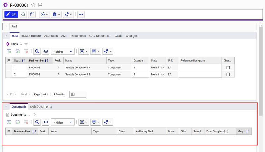
Aras Innovator 12
CUI Admin Guide
1.2.3 Controls
Controls define the layout of the client UI within a parent Window Section. Using the Action property on
the cui_WindowSectionControl, admins can add, remove, replace, or clear all Controls from a Window
Section.
Figure 3. Example Window Section and Controls
See the following list for more details about the different types of Controls. Different classifications will
support different relationship properties and different options in the Additional Data property.
1.2.3.1 Toolbar Control
The Toolbar Control type indicates where a command bar may be rendered in the client UI.
Use the Location property on the Control item to identify the Location that the associated
CommandBarSection item should also use.
The Additional Data property optionally supports cssClass and attributes properties. See the default
ItemView.TitleBar and ItemView.Toolbar items for examples.
1.2.3.2 Accordion Element Control
The Accordion Element Control type indicates where a collapsible accordion element may be rendered.
An Accordion Element Control may be identified as the parent of one or more other controls.
The Additional Data property optionally supports cssClass property. See the default
ItemView.RelationshipAccordion item for examples.
1.2.3.3 Tab Container Control
The Tab Container Control type indicates where a group of Tab Element Controls may be rendered. The
end user can click through the tabs in a single container, alternating between the content of the child Tab
Element Controls.
Use the Parent property on the cui_WindowSectionControl relationship to identify the Accordion Element
Control the Tab Container Control should appear in.
2020 Aras Corporation All Copyrights Reserved. 8
Aras Innovator 12
CUI Admin Guide
The Additional Data property optionally supports cssClass property. See the default
ItemView.RelationshipAccordionTabs item for examples.
1.2.3.4 Tab Element Control
The Tab Element Control type indicates where a single tab may be rendered. A Tab Element Control may
be identified as the parent of one or more other controls.
Use the Parent property on the cui_WindowSectionControl relationship to identify the Tab Container
Control the Tab Element Control should appear in.
1.2.3.5 Form Control
The Form Control type indicates that a Form definition may be rendered in the client UI.
Use the Parent property on the cui_WindowSectionControl relationship to identify the Tab Element
Control the Form content should appear in.
1.2.4 Command Bar Sections
On the surface, Window Sections and Command Bar Sections appear very similar – they’re both related
to Presentation Configurations, they can be defined either declaratively or dynamically, and they have
many of the same properties. However, the two types serve different functions. While Window Sections
and Controls define the layout of the client application screens, Command Bar Sections define the
content.
Figure 4. ItemView Toolbar Control and corresponding Command Bar Section
Consider this example based on the standard global CUI configuration. The ItemView.Default Window
Section declares that the Aras Innovator web client has an “ItemView” screen, and one of the related
Controls indicates that the ItemView has a toolbar element with the ItemView.ItemCommandBar Location.
To determine the content of the layout defined by the Window Section and its Controls, we just need to
find the Command Bar Section with the same Location and check out its related Command Bar Items.
2020 Aras Corporation All Copyrights Reserved. 9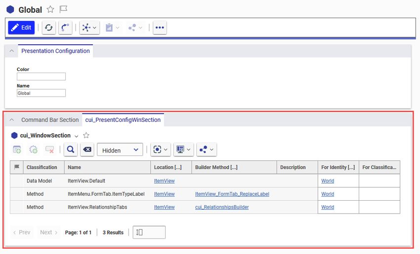
Aras Innovator 12
CUI Admin Guide
1.2.5 Command Bar Items
So far, we’ve defined the layout of the client UI (Window Sections and Controls) and we’ve defined the
content of the UI (Command Bar Sections and their relationships to Command Bar Items), but we haven’t
defined the behavior of the UI. That’s where Command Bar Items differ from the rest of the data model
we’ve reviewed so far – they provide the ability to execute logic based on user interaction, client state,
and item context in addition to the add, remove, replace, and clear all actions on the relationship.
Figure 5. Default ItemView Command Bar Items
Command Bar Items are also implemented differently. While Window Sections, Controls, and Command
Bar Sections all used classifications to differentiate items, the CommandBarItem ItemType is
implemented as a polymorphic ItemType.
See the list in the following section for more details on the various ItemTypes that are implemented as
sources of the CommandBarItem poly ItemType.
1.2.5.1 Button
A CommandBarButton item represents an element that triggers an action. It can be single state, where a
click executes the same action every time, or it can have two states – active and inactive.
Buttons support multilingual labels, multilingual tooltips, images, and the following properties:
Additional Data: supports cssClass
Init Method: a Method, often used to show, hide, enable, or disable an element when initialized
Click Method: a Method used to execute some logic when the element is clicked by a user
Include Events: state change events that should trigger the item’s initialization method
2020 Aras Corporation All Copyrights Reserved. 10Aras Innovator 12
CUI Admin Guide
See the default itemview.itemcommandbar.default.save item for an example.
1.2.5.2 Checkbox
A CommandBarCheckbox represents a single, atomic item in any non-menu container that can be
toggled on/off. Can be styled as a checkbox or radio button.
Checkboxes support multilingual labels, multilingual tooltips, and the following properties:
Additional Data: supports custom parameters
Init Method: a Method, often used to show, hide, enable, or disable an element when initialized
Click Method: a Method used to execute some logic when the element is clicked by a user
Include Events: state change events that should trigger the item’s initialization method
1.2.5.3 Dropdown
A CommandBarDropDown item represents a combobox element. The element’s options are populated
from the Additional Data property merged with the result of the Init Method.
Dropdowns support multilingual labels, multilingual tooltips, images, and the following properties:
Additional Data: supports cui_items, an array of objects each containing an id and name or label
Init Method: a Method, often used to show, hide, enable, or disable an element when initialized
Click Method: a Method used to execute some logic when the element is clicked by a user
Include Events: state change events that should trigger the item’s initialization method
Note: If the Init Method returns false or an empty array, the dropdown control will not be created.
1.2.5.4 Separator
A CommandBarSeparator represents a divider to visually separate items in any non-menu container.
Separators support the following properties:
Additional Data: supports custom parameters
Init Method: a Method, often used to show, hide, enable, or disable an element when initialized
Include Events: state change events that should trigger the item’s initialization method
See the default itemview.itemcommandbar.default.sep_af_promote item for an example.
1.2.5.5 Menu
A CommandBarMenu represents a hierarchical menu that can contain CommandBarMenuButton items or
other CommandBarMenu items.
Menus support multilingual labels, multilingual tooltips, images, and the following properties:
Parent Menu: the parent CommandBarMenu item, if this item is a sub-menu
Additional Data: supports menuPosition
Init Method: a Method, often used to show, hide, enable, or disable an element when initialized
Click Method: a Method used to execute some logic when the element is clicked by a user
Include Events: state change events that should trigger the item’s initialization method
See the default itemview.itemcommandbar.default.navigate item for an example.
2020 Aras Corporation All Copyrights Reserved. 11Aras Innovator 12
CUI Admin Guide
1.2.5.6 Menu Button
A CommandBarMenuButton represents a single, atomic button in a menu with some associated logic.
Menu Buttons support multilingual labels, multilingual tooltips, images, and the following properties:
Parent Menu: the parent CommandBarMenu item
Additional Data: supports custom parameters
Init Method: a Method, often used to show, hide, enable, or disable an element when initialized
Click Method: a Method used to execute some logic when the element is clicked by a user
Include Events: state change events that should trigger the item’s initialization method
See the default itemview.itemcommandbar.default.navigate.structurebrowser item for an example.
1.2.5.7 Menu Separator
A CommandBarMenuSeparator represents a divider to visually separate items in a menu.
Menu Separators support the following properties:
Parent Menu: the parent CommandBarMenu item
Additional Data: supports custom parameters
Init Method: a Method, often used to show, hide, enable, or disable an element when initialized
Include Events: state change events that should trigger the item’s initialization method
See the default itemview.itemcommandbar.default.navigate.aftersearch item for an example.
1.2.5.8 Menu Checkbox
A CommandBarMenuCheckbox represents a single, atomic item in a menu that can be toggled on/off.
Can be styled as a checkbox or radio button.
Menu Checkboxes support multilingual labels, multilingual tooltips, and the following properties:
Parent Menu: the parent CommandBarMenu item
Additional Data: supports custom parameters
Init Method: a Method, often used to show, hide, enable, or disable an element when initialized
Click Method: a Method used to execute some logic when the element is clicked by a user
Include Events: state change events that should trigger the item’s initialization method
1.2.5.9 Shortcut
A CommandBarShortcut item represents a keyboard shortcut that triggers an action. It can only be used
with specific Locations intended for shortcuts.
Shortcuts support the following properties:
Additional Data: supports stopPropagation, useCapture, preventDefault, preventBlur, and context
o stopPropagation: Boolean property, prevents further propagation of the current event
o useCapture: Boolean property, set to true if the “this” pointer must point to the context item
o preventDefault: Boolean property, cancels the default event if it’s cancelable, without
stopping further propagation
2020 Aras Corporation All Copyrights Reserved. 12Aras Innovator 12
CUI Admin Guide
o preventBlur: Boolean property, prevents the blur event if set to true and a domNode has the
focus
o context: Object property, the “this” pointer references this object if useCapture is true
Click Method: a Method used to execute some logic when the shortcut is keyed in by a user
Shortcut: the key combination for triggering the shortcut
The following combinations are valid shortcuts:
Ctrl+ Shift+ Ctrl+Shift+ Button on keyboard
Supported Supported Supported a-z
Supported Supported Supported 0-9
Supported Supported Supported Num0-Num9
Supported Supported Supported ~
Supported Supported Supported tab
Supported Supported Supported enter
Supported Supported Supported insert
Supported Supported Supported delete
Supported N/A N/A pageup, pagedown, home, end
Supported N/A N/A F1-F12
Supported N/A N/A arrows, Num-arrows
Supported N/A N/A
Supported N/A N/A [, ]
Supported N/A N/A -, +, Num-, Num+
See the default com.aras.innovator.cui_default.mws_delete item for an example.
1.2.5.10 Edit
The Edit ItemType enables you to create a text box control and use it in a Command Bar to capture data
relevant to a particular command. The following screenshot shows an example using the Class Structure
dialog box:
2020 Aras Corporation All Copyrights Reserved. 13Aras Innovator 12
CUI Admin Guide
Figure 6.
In this example, entering “pr” in the search box displays only those documents that start with the letters
“pr” enabling you to create a class structure for particular documents.
The Edit ItemType enables you to create a text box control which can be placed in a command bar to
capture data relevant to a command. The following figure shows an example using the CommandBarEdit
ItemType.
Figure 7.
2020 Aras Corporation All Copyrights Reserved. 14Aras Innovator 12
CUI Admin Guide
1.2.6 Common CUI Properties
The following properties occur on most or all CUI ItemTypes.
1.2.6.1 Location
The Location property indicates the intended location or purpose of the CUI item. In Aras Innovator 11.0,
this property was based on a List of predefined values. As part of the UX/UI enhancements included in
Aras Innovator 12.0, the property was changed to an Item property with data source cui_Location. This
update improves the ability for admins to define their own custom locations for client applications.
1.2.6.2 For Identity
The For Identity property indicates that the members of the identity will be affected by the CUI
configuration item.
For example, if a Command Bar Section has a relationship to a Button with the Add action and the For
Identity property is set to World, all users will see the button.
If a Command Bar Section has another relationship to the same Button with the Remove action and the
For Identity property is set to All Suppliers, all users except members of the All Suppliers identity will see
the button.
1.2.6.3 For Classification
The For Classification property indicates that the CUI configuration item will be evaluated when the
context item has the specified classification.
For example, if a Command Bar Section has a relationship to a Button with the Add action and the For
Classification property is set to Component, all users will see the button only when the context item has
the Component classification.
2020 Aras Corporation All Copyrights Reserved. 15Aras Innovator 12
CUI Admin Guide
2 CUI Examples
Warning Because many of the standard UI elements in the Aras Innovator web client are defined via
CUI, it’s important to back up your database before changing any of the out of the box
controls.
2.1 Toolbars
2.1.1 Add a button to an item toolbar
“I want to add a button to the Part item toolbar for all users.”
Figure 8. A custom button appears in the Part item toolbar
Note: This section demonstrates how to add a Command Bar Item to the Item View toolbar for a
specific ItemType. See the “Add a separator to a toolbar” section for steps to add a Command
Bar Item to the Item View toolbar for all ItemTypes.
1. Open the Part ItemType and select the Client Style relationship tab.
2. Right click the entry in the grid and select Open to open the Presentation Configuration for the
Part ItemType.
3. Click the Edit button.
4. Click the New button in the Command Bar Section grid to create a new section with the following
properties:
2020 Aras Corporation All Copyrights Reserved. 16Aras Innovator 12
CUI Admin Guide
a. Classification: Data Model
b. Name: Part_Custom_Buttons
c. Location: ItemView.ItemCommandBar
d. Sort Order: 256
e. For Identity: World
5. Click the Save button, then right click the new Command Bar Section and select Open.
6. Click the Edit button.
7. Click the New button in the Command Bar Item grid, then select Button > OK in the dialog to
create a new button with the following properties:
a. Name: My_Button
b. Sort Order: 2000
c. Action: Add
d. For Identity: World
8. Click Save, then right click the new Button and select Open.
9. Click the Edit button.
10. Set the following properties on the item form:
a. Label: enter the label you want to appear on the button
b. Click Method: choose a Method you want to execute when the button is clicked
c. Image: choose an icon to display in the button
11. Click Save, then navigate to Design > Parts in the TOC.
12. Open a Part item to see the new button in the toolbar.
2.1.2 Add a separator to all item toolbars
“I want to add a separator before the Refresh button in the toolbar for all ItemTypes and users.”
Figure 9. A custom separator appears before the refresh button in all item toolbars
2020 Aras Corporation All Copyrights Reserved. 17Aras Innovator 12
CUI Admin Guide
Note: This section demonstrates how to add a Command Bar Item to the Item View toolbar for all
ItemTypes. See the “Add a button to a toolbar” section for steps to add a Command Bar Item to
the Item View toolbar for a specific ItemType.
1. Navigate to Administration > Configuration > Client Presentation in the TOC.
2. Click the Search button to run the Client Presentation search.
3. Click the Global item property in the single search result.
4. In the Command Bar Section grid, open the itemview.itemcommandbar.default item.
5. Click the Edit button.
6. Click the New button in the Command Bar Item grid, then select Separator > OK in the dialog to
create a new separator with the following properties:
a. Name: My_Separator
b. Sort Order: 500
c. Action: Add
d. For Identity: World
7. Click the Save button.
8. Open any item to see the new separator appear before the Refresh button in the toolbar.
2.1.3 Remove a button on a relationship toolbar
“I want to hide the Share button on the Part BOM relationship toolbar for members of All Suppliers.”
Figure 10. The default “share” button does not appear on Part BOM for All Suppliers
1. Open the Part BOM ItemType and click the Edit button.
2. In the Client Style relationship tab, click the New button to create a new Presentation
Configuration with the following properties:
2020 Aras Corporation All Copyrights Reserved. 18Aras Innovator 12
CUI Admin Guide
Name: Part_BOM
3. Click the Save button, then right click the new Presentation Configuration and select Open.
4. Click the Edit button.
5. Click the New button in the Command Bar Section grid to create a new section with the following
properties:
a. Classification: Data Model
b. Name: Part_BOM_Custom
c. Location: ItemView.RelationshipsCommandBar
d. Sort Order: 128
e. For Identity: All Suppliers
6. Click the Save button, then right click the new Command Bar Section and select Open.
7. Click the Edit button.
8. Click the Add button in the Command Bar Item grid, then search for the
commonitems.commandbar.sharemenu item. Click OK in the search dialog to add the item to
the Command Bar Items grid.
9. Set the following properties for the Command Bar Item:
a. Action: Remove
b. For Identity: All Suppliers
10. Click Save, then logout of Aras Innovator.
11. Login to Aras Innovator as a member of the All Suppliers group identity.
12. Open a Part item to see that the Share button no longer appears in the Part BOM relationship
toolbar.
2.1.4 Replace a button on a toolbar
“I want to replace the default “New” button with a custom button on the Part search toolbar for all users.”
Figure 11.
The default “new” button is replaced with a custom button in the search toolbar.
1. Open the Part ItemType and select the Client Style relationship tab.
2020 Aras Corporation All Copyrights Reserved. 19Aras Innovator 12
CUI Admin Guide
2. Right click the entry in the grid and select Open to open the Presentation Configuration for the
Part ItemType.
3. Click the Edit button.
4. Click the New button in the Command Bar Section grid to create a new section with the following
properties:
a. Classification: Data Model
b. Name: Part_Search_Custom_Buttons
c. Location: SearchView.CommandBar
d. Sort Order: 512
e. For Identity: World
5. Click the Save button, then right click the new Command Bar Section and select Open.
6. Click the Edit button.
7. Click the Add button in the Command Bar Item grid, then search for the
searchview.commandbar.default.new item. Click OK in the search dialog to add the item to the
Command Bar Items grid.
8. Set the following properties for the Command Bar Item:
a. Sort Order: 2000
b. Action: Replace
c. For Identity: World
9. Click Save, then right click the Button and select Open.
10. Click the “…” button in the toolbar and select Create New Button to create a new Button with the
following properties:
a. Name: My_New_Button
b. Label: New
c. Tooltip Template: New {0}
d. Init Method: cui_svcb_new_init
e. Click Method: cui_ivicb_more_new_click
f. Image: choose an icon to display in the button
11. Click Save, then navigate back to the Part_Search_Custom_Buttons Command Bar Section
tab.
12. In the Alternate property of the searchview.commandbar.default.new Command Bar Item
relationship, enter My_New_Button.
13. Click Save, then navigate to Design > Parts in the TOC to see the custom “New” button in the
search toolbar.
2020 Aras Corporation All Copyrights Reserved. 20Aras Innovator 12
CUI Admin Guide
2.2 Menus
2.2.1 Add a button to a menu
“I want to add an action to the global user menu for all administrators.”
Figure 12. A new action appears in the user menu for administrators
1. Navigate to Administration > Configuration > Client Presentation in the TOC.
2. Click the Search button to run the Client Presentation search.
3. Click the Global item property in the single search result.
4. In the Command Bar Section grid, open the
com.aras.innovator.cui_default.mwh_header_user_menu item with the MainWindowHeader
location.
5. Click the Edit button.
6. Click the New button in the Command Bar Item grid, then select Menu Button > OK in the dialog
to create a new menu button with the following properties:
a. Name: My_Custom_Admin_Action
b. Sort Order: 3100
c. Action: Add
d. For Identity: Administrators
7. Right click the new button row and select Open.
8. Enter the following properties for the new Menu Button:
a. Label: My Admin Action
b. Parent Menu: com.aras.innovator.cui_default.mwh_user_menu
c. Click Method: select a Method you want to run when the button is clicked
9. Click the Save button and close the Menu Button tab.
2020 Aras Corporation All Copyrights Reserved. 21Aras Innovator 12
CUI Admin Guide
10. Click the Save button in the Command Bar Section tab.
11. Logout of Aras Innovator and log back in as a member of the Administrators identity.
12. Click the global user menu button in the top right corner of the window and select My Admin
Action to run your custom action.
2.2.2 Disable a menu
“I want to disable the Share menu button for items that are not yet released.”
Figure 13. The default “share” menu is disabled for non-released items
1. Navigate to Administration > Configuration > Client Presentation in the TOC.
2. Click the Search button to run the Client Presentation search.
3. Click the Global item property in the single search result.
4. In the Command Bar Section grid, open the itemview.itemcommandbar.default item.
5. In the Command Bar Item grid, open the itemview.itemcommandbar.default.share item.
6. Click the Edit button.
7. Replace the Init Method with a custom Method that contains the following code:
2020 Aras Corporation All Copyrights Reserved. 22Aras Innovator 12
CUI Admin Guide
if (!options.eventState) {
options.eventState = aras.evalMethod('cui_reinit_calc_tearoff_states');
}
// get the release state of the context item
var contextItem = aras.getItemById(options.itemTypeName, options.itemId);
var isReleased = aras.getItemProperty(contextItem,'is_released','0');
// disable the menu when the item is not released
return {
'hidden': options.eventState.isNew,
'disabled': (isReleased === '0')
};
8. Click Save and close the Menu item.
9. Open any non-released item to confirm that the Share menu button is disabled. The button will be
enabled for any released item.
2.2.3 Add a submenu to a menu
“I want to move ‘Structure Browser’ and ‘Where Used’ to a submenu of the main grid context menu.”
Figure 14. The default structure browser and where used actions appear in a new submenu
1. Navigate to Administration > Configuration > Client Presentation in the TOC.
2. Click the Search button to run the Client Presentation search.
3. Click the Global item property in the single search result.
4. In the Command Bar Section grid, open the
com.aras.innovator.cui_default.popup_menu_for_item_grid item.
5. Click the Edit button.
6. Click the New button in the Command Bar Item grid, then select Menu > OK in the dialog to
create a new menu button with the following properties:
a. Name: My_Nav_Menu
b. Init Method: initPopupItemInItemsGrid
2020 Aras Corporation All Copyrights Reserved. 23Aras Innovator 12
CUI Admin Guide
c. Sort Order: 1300
d. Action: Add
e. For Identity: World
7. Right click the new button row and select Open.
8. Set the following properties:
Label: Navigation
9. Click Save and close the new Menu tab.
10. Move the Structure Browser action to the new submenu:
a. On the Command Bar Section form, open the
com.aras.innovator.cui_default.pmig_Structure Browser Menu from the Command Bar
Item grid.
b. Click the Edit button.
c. Set the Parent Menu property to My_Nav_Menu.
d. Save and close the Structure Browser Menu item tab.
11. Move the Where Used action to the new submenu:
a. On the Command Bar Section form, open the
com.aras.innovator.cui_default.pmig_Where Used Menu from the Command Bar Item
grid.
b. Click the Edit button.
c. Set the Parent Menu property to My_Nav_Menu.
d. Save and close the Where Used Menu item tab.
12. Click the Save button for the Command Bar Section.
13. Open any search grid from the TOC and right click on a row to see the new “Navigation”
submenu.
2.2.4 Display an icon on a menu button
“I want to show an icon next to the ‘Delete’ action in the main grid context menu.”
Figure 15. An icon appears next to the delete action in the main grid menu
1. Navigate to Administration > Configuration > Client Presentation in the TOC.
2020 Aras Corporation All Copyrights Reserved. 24Aras Innovator 12
CUI Admin Guide
2. Click the Search button to run the Client Presentation search.
3. Click the Global item property in the single search result.
4. In the Command Bar Section grid, open the
com.aras.innovator.cui_default.popup_menu_for_item_grid item.
5. Click the Edit button.
6. In the Command Bar Item grid, open the com.aras.innovator.cui_default.pmig_Delete item.
7. Click the Edit button.
8. Use the Image property to choose the icon you want to show in the menu.
9. Click Save and close the Menu item.
10. Click Save and close the Command Bar Section item.
11. Open any search grid from the TOC and right click on a row to see your selected icon appear
next to the “Delete All Versions” action.
2.3 Shortcuts
2.3.1 Add an item form keyboard shortcut
“I want a shortcut to allow users to create a new item from an item form.”
1. Navigate to Administration > Configuration > Client Presentation in the TOC.
2. Click the Search button to run the Client Presentation search.
3. Click the Global item property in the single search result.
4. In the Command Bar Section grid, open the
com.aras.innovator.cui_default.itemWindowShortcuts item.
5. Click the Edit button.
6. Click the New button in the Command Bar Item grid, then select Shortcut > OK in the dialog to
create a new keyboard shortcut with the following properties:
a. Name: New_Item
b. Sort Order: 1024
c. Action: Add
d. For Identity: World
7. Right click the new button row and select Open.
8. Set the Shortcut property to alt+ctrl+n.
9. Set the Handler property to a custom Method containing the following code:
var itemtype = window.itemTypeName;
if (itemtype) {
aras.uiNewItemEx(itemtype);
}
10. Click Save and close the new Shortcut tab.
11. Save and close the Command Bar Section tab.
2020 Aras Corporation All Copyrights Reserved. 25Aras Innovator 12
CUI Admin Guide
12. Open an item, like a Part, and enter the keyboard shortcut CTRL+ALT+N. A new Part item will
open in a new tab.
2.4 Table of Contents
2.4.1 Change a TOC category label
“I want to change the ‘Documents’ TOC category to ‘Document Center’.”
1. Navigate to Administration > Configuration > Client Presentation in the TOC.
2. Run the Client Presentation search.
3. Click the Global property in the single search result.
4. In the Command Bar Section grid, open the com.aras.innovator.cui_default.toc item with the
location TOC.
5. In the Command Bar Item grid, open the com.aras.innovator.cui_default.toc_Documents item.
6. Click the Edit button.
7. Set the Label property to Document Center.
8. Click the Done button and log out of Aras Innovator.
9. Login to Aras Innovator again, and the TOC category label will now say Document Center.
2020 Aras Corporation All Copyrights Reserved. 26Aras Innovator 12
CUI Admin Guide
2.5 Item Views
2.5.1 Add a tab to the first accordion
“I want to display the Part BOM tab in the top accordion for all users.”
Figure 16. The Part BOM tab is added to the top accordion on the Part item view
1. Open the Part ItemType and select the Client Style relationship tab.
2. Right click the entry in the grid and select Open to open the Presentation Configuration for the
Part ItemType.
3. Click the Edit button.
4. Select the cui_PresentConfigWinSection tab.
5. Click the New button in the grid toolbar to create a new window section with the following
properties:
a. Classification: Data Model
b. Name: Accordion1
c. Location: ItemView
d. For Identity: World
6. Click the Save button, then right click the new window section and select Open.
7. Click the Edit button.
8. Click the New button in the grid toolbar to create a new control with the following properties:
a. Type: Tab Element Control
b. Name: Acc1_BOM_Tab
2020 Aras Corporation All Copyrights Reserved. 27Aras Innovator 12
CUI Admin Guide
c. Label: Part BOM
d. Additional Data: {"relTypeId": "159C6D88795B4A86864420863466F728"}
e. Parent: ItemView.FormAccordionTabs
f. Sort Order: 1024
g. Action: Add
h. For Identity: World
9. Click Save, then navigate to Design > Parts in the TOC and open a Part item to see the new
Part BOM tab in the top accordion.
Note: The default BOM tab will still appear in the relationship accordion. See the next section for steps
to hide the default BOM tab from the second accordion.
2.5.2 Hide a tab from the second accordion
“I want to display the Part BOM tab in the top accordion instead of the relationship accordion.”
Figure 17. The Part BOM only appears in the top accordion on the Part item view
1. Follow the steps in the previous section to add the Part BOM tab to the top accordion. The
following steps outline how to hide the default BOM tab from the relationship accordion.
2. Navigate to Administration > RelationshipTypes in the TOC.
3. Search for the Part BOM RelationshipType and open the item.
4. Click Edit.
5. Check off the Hide In All box to prevent the default tab from appearing in a relationship
accordion.
6. Click Save, then navigate to Design > Parts in the TOC and open a Part item to confirm the
default BOM tab doesn’t appear in the relationship accordion.
2020 Aras Corporation All Copyrights Reserved. 28Aras Innovator 12
CUI Admin Guide
2.5.3 Add a third accordion with a tab
“I want to show the Documents and CAD Documents tabs in a third accordion.”
Figure 18. A third accordion is added displaying the Document and CAD Document tabs
1. Open the Part ItemType and select the Client Style relationship tab.
2. Right click the entry in the grid and select Open to open the Presentation Configuration for the
Part ItemType.
3. Click the Edit button.
4. Select the cui_PresentConfigWinSection tab.
5. Click the New button in the grid toolbar to create a new window section with the following
properties:
a. Classification: Data Model
b. Name: Accordion3
c. Location: ItemView
d. For Identity: World
6. Click the Save button, then right click the new window section and select Open.
7. Click the Edit button.
8. Click the New button in the grid toolbar to create a new control with the following properties:
a. Type: Accordion Element Control
b. Name: Acc3_Container
c. Additional Data: {"cssClass": "aras-item-view__relationship-accordion"}
2020 Aras Corporation All Copyrights Reserved. 29Aras Innovator 12
CUI Admin Guide
d. Sort Order: 2000
e. Action: Add
f. For Identity: World
9. Click Save.
10. Click the New button in the grid toolbar to create a new control with the following properties:
a. Type: Tab Container Control
b. Name: Doc_Tab_Container
c. Additional Data: {"attributes" : {"slot": "header"}}
d. Parent: Acc3_Container
e. Sort Order: 2050
f. Action: Add
g. For Identity: World
11. Click Save.
12. Click the New button in the grid toolbar to create a new control with the following properties:
a. Type: Tab Element Control
b. Name: Document_Tab
c. Label: Documents
d. Additional Data: {"relTypeId": "09CBB0294FAB477AA7300906DC035462"}
e. Parent: Doc_Tab_Container
f. Sort Order: 3000
g. Action: Add
h. For Identity: World
13. Click the New button in the grid toolbar to create a new control with the following properties:
a. Type: Tab Element Control
b. Name: CAD_Tab
c. Label: CAD Documents
d. Additional Data: {"relTypeId": "C65FB7DC8C3A4EFC97A6EE8196C0B448"}
e. Parent: Doc_Tab_Container
f. Sort Order: 3050
g. Action: Add
h. For Identity: World
14. Click Save, then navigate to Design > Parts in the TOC and open a Part item to see Document
and CAD Document tabs appear in a new accordion at the bottom of the page.
2020 Aras Corporation All Copyrights Reserved. 30Aras Innovator 12
CUI Admin Guide
2.6 Item View Sidebar
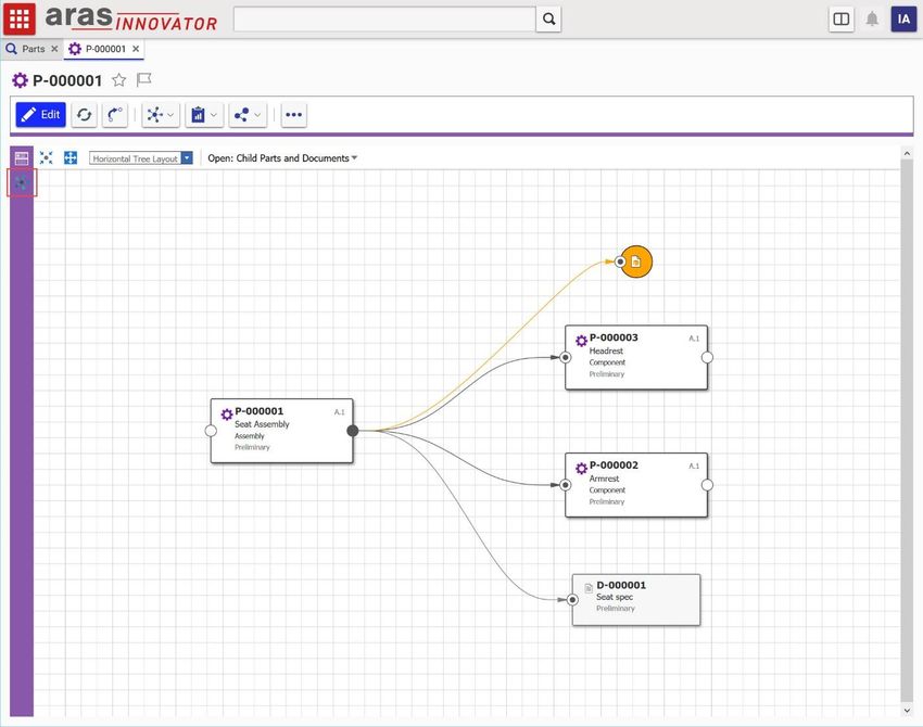
2.6.1 Display the ad hoc Graph View from an Item View Sidebar button
“I want to add a button to the sidebar of all items that will show an ad hoc Graph View in the item view.”
Figure 19. A sidebar button for displaying the ad hoc graph is added to the global Item View definition
1. Navigate to Administration > Configuration > Client Presentation in the TOC.
2. Click the Search button to run the Client Presentation search.
3. Click the Global item property in the single search result.
4. In the Command Bar Section grid, open the Global Sidebar item.
5. Click the Edit button.
6. Click the New button in the Command Bar Item grid, then select Button > OK in the dialog to
create a new button with the following properties:
a. Name: My_Ad_Hoc_Graph_Button
b. Sort Order: 256
c. Action: Add
d. For Identity: World
7. Right click the new button row and select Open.
8. Enter the following properties for the new Menu Button:
2020 Aras Corporation All Copyrights Reserved. 31Aras Innovator 12
CUI Admin Guide
a. Click Method: sidebar_default_gv_click
b. Image: choose the icon you want to show when the sidebar button is inactive
c. Additional Image: choose the icon you want to show when the button is active
9. Click the Save button and close the Button tab.
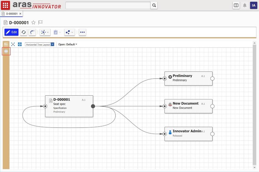
2.6.2 Display a query-based Graph View from an Item View Sidebar button
“I want to display the Part BOM Graph View when the user clicks a sidebar button on a Part.”
Figure 20. A sidebar button for displaying a specific graph is added to the Part form
1. Open the Part ItemType and select the Client Style relationship tab.
2. Right click the entry in the grid and select Open to open the Presentation Configuration for the
Part ItemType.
3. Click the Edit button.
4. Click the New button in the Command Bar Section grid to create a new section with the following
properties:
a. Classification: Data Model
2020 Aras Corporation All Copyrights Reserved. 32Aras Innovator 12
CUI Admin Guide
b. Name: Part_Custom_Sidebar
c. Location: ItemWindowSidebar
d. Sort Order: 256
e. For Identity: World
5. Click the Save button, then right click the new Command Bar Section and select Open.
6. Click the Edit button.
7. Click the New button in the Command Bar Item grid to create a new item with the following
properties:
a. Type: Button
b. Name: My_Graph_Button
c. Sort Order: 1100
d. Action: Add
e. For Identity: World
8. Click Save, then right click the new Button and select Open.
9. Click the Edit button.
10. Set the following properties on the item form:
a. Additional Data: { "gvdId": "" }
b. Click Method: sidebar_default_gv_click
c. Image: choose the icon you want to show when the sidebar button is inactive
d. Additional Image: choose the icon you want to show when the button is active
11. Click Save, then navigate to Design > Parts in the TOC.
12. Open a Part item to see the new button in the sidebar.
13. Click the new sidebar button to view the specified Graph View.
2020 Aras Corporation All Copyrights Reserved. 33Aras Innovator 12
CUI Admin Guide
2.6.3 Display a Tree Grid View from an Item View Sidebar button
“I want to display the BOM as a Tree Grid View when the user clicks a sidebar button on a Part.”
Figure 21. A sidebar button for displaying a Tree Grid View is added to the Part form
1. Open the Part ItemType and select the Client Style relationship tab.
2. Right click the entry in the grid and select Open to open the Presentation Configuration for the
Part ItemType.
3. Click the Edit button.
4. Click the New button in the Command Bar Section grid to create a new section with the following
properties:
a. Classification: Data Model
b. Name: Part_Custom_Sidebar
c. Location: ItemWindowSidebar
d. Sort Order: 256
e. For Identity: World
5. Click the Save button, then right click the new Command Bar Section and select Open.
6. Click the Edit button.
2020 Aras Corporation All Copyrights Reserved. 34Aras Innovator 12
CUI Admin Guide
7. Click the New button in the Command Bar Item grid to create a new item with the following
properties:
a. Type: Button
b. Name: My_TGV_Button
c. Sort Order: 1200
d. Action: Add
e. For Identity: World
8. Click Save, then right click the new Button and select Open.
9. Click the Edit button.
10. Set the following properties on the item form:
a. Additional Data: { "tgvdId": "", "startConditionProvider":
"ItemDefault({\"id\":\"id\"})" }
b. Click Method: sidebar_default_tgv_click
c. Image: choose the icon you want to show when the sidebar button is inactive
d. Additional Image: choose the icon you want to show when the button is active
Note: The startConditionProvider property in Additional Data is optional. The view will use the
context item’s id as the starting condition if this property is not provided. It’s only
necessary to include the startConditionProvider property if your Tree Grid View has a
start condition that is not the id of the context item.
11. Click Save, then navigate to Design > Parts in the TOC.
12. Open a Part item to see the new button in the sidebar.
13. Click the new sidebar button to view the specified Tree Grid View.
2020 Aras Corporation All Copyrights Reserved. 35You can also read


