Learning A Stroke-Based Representation for Fonts - Vova Kim
←
→
Page content transcription
If your browser does not render page correctly, please read the page content below
Volume 0 (1981), Number 0 pp. 1–13                                                                          COMPUTER GRAPHICS forum

                       Learning A Stroke-Based Representation for Fonts

             Elena Balashova1 , Amit H. Bermano1 , Vladimir G. Kim2 , Stephen DiVerdi2 , Aaron Hertzmann2 , Thomas Funkhouser1
                                                  1
                                                    Princeton University 2 Adobe Research

          Examples:                                   Consistency:          Manifold Learning:                             Retrieval:

                                                                                        ]
                                                                                                                         Completion:

                                                                                                                        Interpolation:

Figure 1: We learn style variations from existing typeface collections by representing them using a consistent parameterization, and projecting
onto a low dimensional manifold. We start with a set of glyph examples that are not consistently parameterized, and use our fitting method to
produce a part-based template parametrization consistent across same glyphs. We project the parametrization features into a low dimensional
manifold and thus produce a missing-data-aware generative model. The resulting manifold can be used for exploratory applications to
understand collections of fonts: topology-aware font retrieval, completion, and interpolation.
        Abstract
        Designing fonts and typefaces is a difficult process for both beginner and expert typographers. Existing workflows require the
        designer to create every glyph, while adhering to many loosely defined design suggestions to achieve an aesthetically appealing
        and coherent character set. This process can be significantly simplified by exploiting the similar structure character glyphs
        present across different fonts and the shared stylistic elements within the same font.
        To capture these correlations we propose learning a stroke-based font representation from a collection of existing typefaces.
        To enable this, we develop a stroke-based geometric model for glyphs, a fitting procedure to re-parametrize arbitrary fonts to
        our representation. We demonstrate the effectiveness of our model through a manifold learning technique that estimates a low-
        dimensional font space. Our representation captures a wide range of everyday fonts with topological variations and naturally
        handles discrete and continuous variations, such as presence and absence of stylistic elements as well as slants and weights. We
        show that our learned representation can be used for iteratively improving fit quality, as well as exploratory style applications
        such as completing a font from a subset of observed glyphs, interpolating or adding and removing stylistic elements in existing
        fonts.

1. Introduction                                                            tools are not available to support these edits, font customization is
                                                                           generally inaccessible to all but a few expert font designers.
Font collections are ubiquitous in design tools ranging from word
processors to graphics editors. Although professional typographers
perpetually create new and diverse families of fonts, it is not always        The goal of our work is to describe a part-aware font represen-
possible to find a font with desired visual features, and thus design-     tation and show how it can be integrated with machine learning
ers often have to compromise by selecting a font that does not fit         techniques to automate font manipulation. The described system
with their graphic message.                                                is designed as a first step to assist non-experts in the design of cus-
                                                                           tomized fonts, it is not intended to compete with carefully designed
   Designing glyphs that have desired style, aesthetic appeal, co-         high-quality fonts. We observe that priors on glyph structure and
herence, and follow good typographic practices requires substantial        stylistic consistency are implicitly encoded in existing typefaces.
expertise and time investment. Even a small edit to one glyph (e.g.,       We therefore hope to capture this knowledge in a generative model
make the base of the ‘t’ a little wider) can require subtle updates        and use it to facilitate font editing, completion, interpolation, and
to many other glyphs to maintain coherence within the font. Since          retrieval.

 c 2018 The Author(s)
Computer Graphics Forum c 2018 The Eurographics Association and John
Wiley & Sons Ltd. Published by John Wiley & Sons Ltd.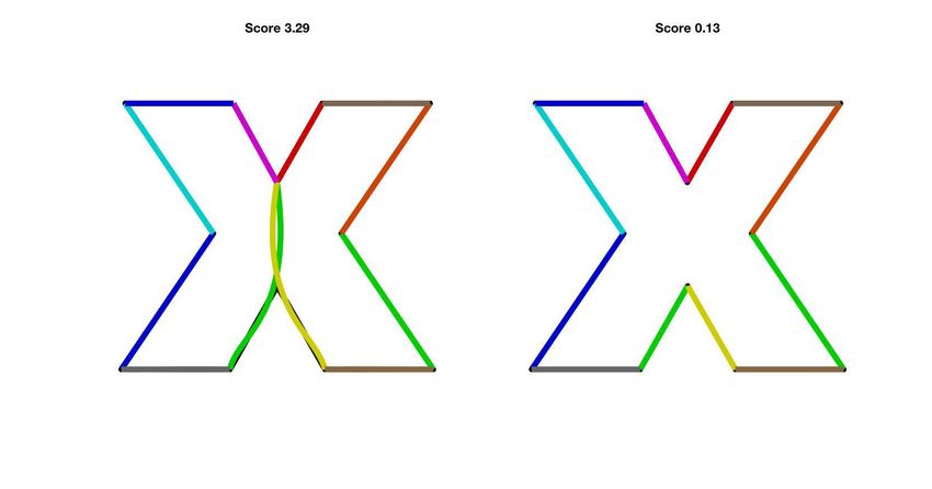
E. Balashova et al. / Learning A Stroke-Based Representation for Fonts

   The first challenge in learning from existing typefaces is that they        from a latent font space that can be used for manipulation, interpo-
do not share a common structure. Glyphs are typically represented              lation, and generation of fonts.
by closed outline curves composed from primitives such as lines
                                                                                  We use a dataset of publicly available fonts to benchmark the
and Bezier curves with no consistency across different fonts even
                                                                               quality of fitting our stroke-based representation to unstructured
for the same character.
                                                                               outlines and evaluate the reconstruction quality from the learned
   One approach to achieve a consistent representation would be                manifold. We demonstrate that we can consistently parametrize
to rasterize the glyph to a fixed-size image [USB16], however, this            many existing fonts with our template, and use this parametriza-
representation loses the advantages of vector graphics and does not            tion to learn a common representation for fonts. We leverage our
allow preserving sharp features of the original glyph geometry.                learned model for topology-aware font retrieval and for completing
                                                                               missing glyphs from a subset of outlines.
   Another option is to represent each glyph’s outline with a poly-
line such that endpoints of each line segment are in correspondence
across all glyphs [CK14]. Outline-based representation makes it                2. Related Work
difficult to reason about decorative elements such as serifs that are          Located at the intersection of graphics and information design, font
present only in a subset of glyphs. It also ignores the stroke-based           design has been a well-studied field for decades [Zap87, Car95,
structure of characters which is often consistent across glyphs and            Tsc98, Tra03, OST14, as8]. Our work is therefore informed by rich
can be used to facilitate analysis. Phan et al. [PFC15] proposed               prior research on representation, analysis, and synthesis of fonts
a stroke-based glyph representation, however, this method still re-            and shape collections. The most influential and relevant previous
quires significant human interaction during the learning step to con-          work is described below.
vert given outlines to the proposed representation, which hinders
non-expert usage.                                                              Font Representations Font glyphs are examples of complex 2D
                                                                               shapes that convey both meaning and appearance. There are gener-
   In this work we represent a glyph as a set of strokes and outline           ally three common ways to represent fonts: bitmaps, strokes, and
segments, where the latter are defined with respect to the coordi-             outlines. Bitmap representations are easy to use and compatible
nate system of their respective stroke. Many fonts are constructed             with computer code, but do not scale without introducing artifacts.
with the appearance of brush strokes, to varying degrees; we be-               Stroke representations capture glyph essence well and are gener-
lieve they are better modeled by a spine and profile curves. A better          ally more compact [Gon98] (which is extremely advantageous to
model means more appealing interpolation and synthesis of charac-              fonts with thousands of glyphs such as Chinese, Japanese, Korean
ters as compared to raster or polyline representations. Consistency            (CJK) fonts [LZX16]), but are generally less expressive [JPF06].
in stroke structure and low variance in profile offsets are among the          Outline-based representations are more expressive [JPF06], but re-
key ingredients in our parametrization which make it easier to learn           quire hinting to counteract rendering artifacts [hin, HB91, Her94].
correlations between different parameters. This representation can             Still, outline fonts are a prevalent for representing Latin script type-
also naturally handle discrete topological variations (i.e., addition          faces in popular scalable computer formats [Mic16].
and removal of strokes, such as serifs).
                                                                                  Typically, customizing a font requires tedious outline or
   We take advantage of consistency in stroke structures of letters            stroke-editing, which is addressed by parametric font representa-
to create a common template for each letter. We propose an opti-               tions [Knu86]. In industry, a popular approach is to use master
mization procedure to align the template to the input outline, en-             fonts, which enable high-level parametric control by interpolation
abling re-parametrizing of any input glyph consistently with the               with consistently placed control points [Ado97]. A recent Open-
other glyphs of the same letter. Unlike previous work on outline               Type format [Mic16] allows more elaborate parametrization during
alignment [CK14], our method does not require joint analysis of                font design, for example, by continuously varying width or weight.
the entire dataset, which makes our method scale linearly with re-             The main limitation of these techniques is that they require type-
spect to the number of fonts and allows us to process a collection             face designers to provide a parametrization of the font. This might
of fonts an order of magnitude larger.                                         be possible within a small family of related fonts (i.e., a typeface),
                                                                               but these parametrizations are still inconsistent across typefaces. In
   We formulate our representation as a concatenation of glyph de-
                                                                               contrast, we aim to achieve similar expressiveness while imposing
scriptors for the entire font. Since there are co-dependencies in the
                                                                               minimal effort on typographers, simply by analyzing existing fonts.
concatenated glyph descriptors, due to stylistic similarities within
a font and global structural similarities across fonts, it is possible            To simplify the process of creating parametrized fonts, several
to learn a reduced-dimensionality representation that captures the             systems have been proposed that prescribe a mapping between
salient shape variations within a font collection. However, data is            a few high-level font parameters and the control points of every
not always available for all glyphs (if only certain letters have been         glyph. For example, the Metafont system [Knu86] was used to cre-
created by a designer for some font, or if the template fitting algo-          ate Computer Modern typeface families governed by a small set of
rithm produces a poor fit). Therefore, we employ an EM-PCA algo-               parameters. These control continuous attributes, such as width and
rithm [Row98] that is robust to missing data to learn the reduced-             height of glyphs, as well as discrete variations, such as presence of
dimensionality representation. This model is a linear form of the              serifs. Hersch and Bétrisey [HB91] described a set of rules to fit a
more general Variational Auto-Encoder (VAE) [KW13] (we also                    topological model to outlines to enable automatic hinting. Shamir
experiment with nonlinear VAEs, and find that the linear EM-PCA                and Rappoport [SR98] proposed a visual tool for designing para-
model works better for our cases). The result is a projection to and           metric fonts with constraints, and Hu and Hersch [HH01] provided

                                                                                                                                                   c 2018 The Author(s)
                                                                                  Computer Graphics Forum c 2018 The Eurographics Association and John Wiley & Sons Ltd.
E. Balashova et al. / Learning A Stroke-Based Representation for Fonts

a richer set of geometric components to define a parametric type-                        set and that the user provides at least several hundred characters,
face. Shamir and Rappoport [SR99] describe a procedure to repre-                         while our system does not have these requirements. Suveeranont
sent outline-based oriental fonts using a hand-designed parametric                       and Igarashi [SI10] propose a weighted blend of outlines and skele-
font model and a procedure to compact the resulting representation                       tons to model new fonts as a linear combination of existing fonts.
using quantization. This work is different from our method in sev-                       As they observe in their paper, linearly combining good fonts does
eral ways: first, their parameterization requires manual assistance;                     not always yield a plausible result, since it does not capture co-
second, their system fits deformable primitives to glyphs and does                       dependencies between different parameters. Their solution is to
not aim for a consistent primitive set; it cannot be used for learn-                     limit the synthesis to a small set of the most similar examples, re-
ing a manifold of fonts and for reasoning about part relationships                       quiring a dense sampling of font space.
within each glyph.
                                                                                         Analyzing 3D Shape Collections Our method is also related to
Learning Font Representation The first step in learning a font                           existing work on analyzing 3D shape collections. In that domain,
representation is establishing consistency across glyphs. One sim-                       boundary-based consistent parametrization techniques [PSS01]
ple approach is to rasterize a glyph to a fixed-size image. This is                      were initially used to analyze similar surfaces with little topologi-
effective for recognition [WYJ∗ 15], but poses challenges for font                       cal variations. Part-based templates have been developed to handle
synthesis. Current image synthesis methods yield blurry results,                         more complex shapes [KCKK12,KLM∗ 13], which enables a better
omit small features, and fail to enforce shape and curve continuity                      analysis of topological variations [AXZ∗ 15]. As with font analysis,
in the resolutions required for most fonts [USB16] (see Figure 11b).                     they provide means to analyze relationships between objects that
                                                                                         share only a subset of parts, and provide effective priors on global
   Early work in this direction [Ada89] proposed decomposing                             structure. Recently, several techniques have been proposed to an-
glyphs into parts and deriving rules that share design attributes                        alyze stylistic compatibility between objects [LKS15, LHLF15],
across glyphs to encourage consistency. In this system, all control                      aiming to separate content (i.e., object class) and style. Lun et
glyphs have to be prescribed to create the complete font, and all re-                    al. [LKWS16] also propose a non-parametric method for transfer-
lationships between prescribed and synthesized glyphs are defined                        ring style by curve-based deformation, addition, and removal of
manually. Campbell and Kautz [CK14] introduce a vector represen-                         parts. These approaches can be viewed as analogues to the problem
tation for learning font shapes, and learn a manifold of fonts. Their                    of synthesizing fonts by transferring style from designer-created
method is based on correspondences between glyph outlines. They                          glyphs. The main advantage of our setting is that we can lever-
jointly optimize for all control points by sliding them along the in-                    age a vast amount of data where the same content (i.e., letters) is
put outline while matching geometric features (e.g., normals and                         presented in various coherent styles (i.e., each font is stylistically
curvature) and preserving the original spacing (i.e., arc-length via                     coherent). Of course, we provide a parametric model for glyph ge-
elasticity objective). This approach does not explicitly recognize                       ometry, which is less challenging than arbitrary 3D shapes.
parts, and hence causes distortions in features like serifs when in-
terpolating serif and sans serif fonts. In addition, this approach does
not lend itself to learning the common shapes in different glyphs.                       3. Overview
For example the upper loop of ‘g’ and ‘g’ are very similar, even
                                                                                         Typographers invest significant effort into designing glyphs that
though the overall outline is not. Similarly, decorative elements,
                                                                                         maintain a consistent style and adhere to good design principles.
such as serifs, need to be consistent in style, and together influence
                                                                                         Thus, a well-designed font encompasses many implicit structural
attributes of the glyph, such as its width. Please see [Ada86,Ada89]
                                                                                         and stylistic relationships between the glyphs or their parts. The
for extended discussion of common aesthetic principles. We al-
                                                                                         goal of this work is to learn these relationships from existing fonts
low glyphs with different topological structure to share a subset
                                                                                         and use them to simplify the design process of new ones. In partic-
of strokes. This enables us to learn, for example, the shape of the
                                                                                         ular, given a collection of fonts, we learn a low-dimensional repre-
upper loop in ‘g’ regardless of the shape of the bottom, and learn
                                                                                         sentation that can be used to complete partial designs, interpolate
the shape of serifs only from glyphs that have the them. The result-
                                                                                         between existing fonts, and provide easy controls to add and re-
ing stroke-based template with potential topological variations can
                                                                                         move different stylistic elements, such as serifs.
be matched to each glyph independently which enables us to avoid
joint analysis and process an order of magnitude more fonts.                                To achieve this goal, a low-dimensional manifold of fonts needs
                                                                                         to be learned across a variety of fonts. Since it is challenging to per-
   Phan et al. [PFC15] also propose to leverage stroke-based rep-
                                                                                         form manifold learning on a general (inconsistent) font representa-
resentation, modeling a glyph with brushes and caps aligned to
                                                                                         tion, we propose a two-step iterative process (Iterative Manifold
canonical strokes. However, their method requires manual labeling
                                                                                         Evolution, Section 7) to overcome these challenges: we parameter-
of glyphs, limiting its applicability. It also represents each glyph as
                                                                                         ize fonts consistently by fitting the font model to all glyphs, and
a set of stroke curves with profile offsets, a representation which
                                                                                         then we update the model using the newly parametrized fonts. This
suffers from artifacts in high curvature regions. Similarly, Lian et
                                                                                         two-step process iterates until convergence to learn a font represen-
al. [LZX16] relies on a stroke/profile representation to generate
                                                                                         tation for all glyphs in a lower dimensional space.
hand-written fonts. Their proposed fitting procedure only focuses
on stroke fitting and is very similar to our initialization [MSCP∗ 07],                     We propose a stroke-based model that is concise, expressive, and
but our contribution lies in optimization for Bezier control points                      is semantically driven — enabling us to factorize a glyph shape into
which comes after stroke initialization. Finally, their system as-                       meaningful elements. In particular, we represent each glyph with
sumes that each type of stroke appears at least once in the input                        a set of strokes, where each stroke consists of a skeleton curve,

 c 2018 The Author(s)
Computer Graphics Forum c 2018 The Eurographics Association and John Wiley & Sons Ltd.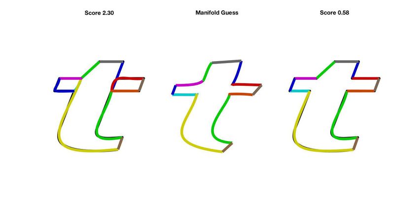
E. Balashova et al. / Learning A Stroke-Based Representation for Fonts

two outline curves on both sides of the skeleton, and a single cap                                                        θt
                                                                                                          θo
curve for every endpoint. We represent all curves with Bezier con-                                   θs                          (1,1,1,0,1,0)
trol points. The skeleton control points of one skeleton segment               oac              oa
                                                                                                 +
                                                                                                           oa-            Connectivity Constraints
are defined in the global coordinate system, while the other parts,
the outlines and the cap are defined relative to that base curve or
                                                                                     oa+
                                                                                                                           o+a o+a oac oa- ...
                                                                                                                                                                     sa,b
other skeleton segments in a tree-like manner (see Figure 2 right).              sa        oa
                                                                                            -
                                                                                                               Outline    Other topology
This naturally separates profile features (e.g., width) from stroke                                            Skeleton

features (e.g., slant), which facilitates learning relationships; out-
                                                                                                                 Cap
line control points will have a larger offset from the skeleton in a
bold font and skeleton strokes will have a slope in an italic font.
The stroke-based representation also naturally handles topological             Figure 2: Deformable template representations. An example for the
variations in glyphs. For instance, the glyphs ‘g’ and ‘g’ can share           letter ‘a’. Our model is described by parameters of strokes (θs ), out-
parameters for the control points of the upper loop, but have dif-             lines (θo ), and caps (left), as well as topological parameters (θt ),
ferent strokes to represent the tail. Similarly, decorative elements,          indicating which strokes need to be present, and outline connec-
such as serifs, can be represented with optional strokes. Thus, our            tivity constraints (middle). Multiple topologies are prescribed for
consistent representation is defined with respect to a set of strokes,         the same letter (middle, bottom). In each topology, one base skele-
which we call a deformable glyph template, where template param-               ton segment (sa,b ) is represented in image space coordinates, while
eters include topological (which strokes are included) and geomet-             all other segments are offsets from it, or from other segments in a
ric (control points of Bezier curves) ones (see Section 4).                    tree-like manner (right).

   To represent existing font outlines with our stroke-based model
we propose a fitting procedure of the deformable template. Our fit-
ting process takes advantage of the fact that stroke skeletons do not          by Tc (Θ). Our template is described by a set of skeleton segments
vary significantly across fonts, since letters are recognized by spe-          Sc and outline segments Oc , as shown in Figure 2 for example
cific stroke structures. Thus we start by fitting the strokes of the           case when c = ‘a’. A single skeleton segment, named the Base-
template to the input glyph, followed by outline fitting, deforming            Segment sc,b , is represented by the curve location in image space.
the template Bezier curves to align with the boundaries of the input           The other skeleton segments are represented as offsets from sc,b or
(see Section 5). Our template fitting process eliminates the need              from another segment in a tree manner. Furthermore, every stroke
for joint analysis of all fonts, and is trivially parallelizable, which        corresponds to one skeleton segment s ∈ Sc , and each such seg-
enables us to process 570 fonts, an order of magnitude more than               ment corresponds to two outline segments on opposite sides of it:
                                                                                        −
previous techniques (such as Campbell and Kautz [CK14]). We fo-                {o+ s , os } ∈ Oc . We represent a cap as a special case skeleton stroke
cus our analysis on lowercase letters, as prior work highlighted that          that has only one outline (ocs ) associated with it. This dependency
their design is more differentiated [Ada89], however, the system               structure ensures consistent part and outline positioning during the
can be extended to uppercase letters and other characters by gener-            fitting process, without the need to locally (or globally) align parts
ating more templates.                                                          across different fonts. Note that one could also encode the template
                                                                               using angle relationships between segments, however we found po-
   To represent the entire font we concatenate individual glyph
                                                                               sitional differences to be more robust (as a slanted f still consists of
representations across all letters, generating a vector in a high-
                                                                               horizontal wings), and produced better results for the learning step
dimensional feature space. Since glyphs share a lot of stylistic and
                                                                               (see Section 6). Lastly, the template also prescribes the ordering of
structural attributes, we expect this representation to be overcom-
                                                                               the outline segments on the generated outline and their connectivity
plete, and learn a lower-dimensional font representation. For any
                                                                               constraints, as depicted in Figure 2 (middle). The connectivity con-
given font, there will be missing entries: the feature vector includ-
                                                                               straints ensure the we always reconstruct a continuous outline, and
ing separate entries for different forms of ‘g’ and ‘g’ (only one of
                                                                               practically remove redundancies from our representation. When a
which will appear in any given font), and serif parameters that do
                                                                               stroke is missing (e.g., a serif stroke in a sans-serif font), it creates
not occur for sans serif fonts. Thus, we will not have the entire fea-
                                                                               a gap in the outline, which is trivially closed by connecting the two
ture vector during training or testing time. In addition, at test time,
                                                                               adjacent segments based on the ordering. In addition, Figure 2 (left)
reasoning about the font representation by observing only a sub-
                                                                               also demonstrates an example skeleton, its corresponding profile
set of the glyphs can give rise to many applications, such as font
                                                                               curve, and caps.
completion (see Section 9). We chose the Expectation Maximiza-
tion Principal Component Analysis (EM PCA) approach [Row98],                      All curves in our framework are cubic Bezier, parametrized by
which provides a simple linear map for dimensionality reduction,               their control points. Most skeletons and outlines are represented by
and generalizes PCA to allow for missing feature values at test and            a single curve, but long or more complex strokes are represented
training time (see Section 6).                                                 by two (which are enforced to be C1 at the seam). The connectiv-
                                                                               ity and smoothness constraints render some of the 4 Bezier control
                                                                               points redundant and thus they are removed from the representa-
4. Stroke-Based Deformable Template
                                                                               tion. We denote the control points coordinates by θs ∈ Θs for skele-
Description We use a parametric deformable template Tc (Θ) to                  ton strokes and θo ∈ Θo for outline curves. The control points of the
represent each letter c in the set of glyphs, where Θ are the de-              outline curve are defined relative to the skeleton points, and skele-
formation parameters that define the shape of the glyph generated              ton points are defined relative to points on sc,b or other segments

                                                                                                                                                      c 2018 The Author(s)
                                                                                     Computer Graphics Forum c 2018 The Eurographics Association and John Wiley & Sons Ltd.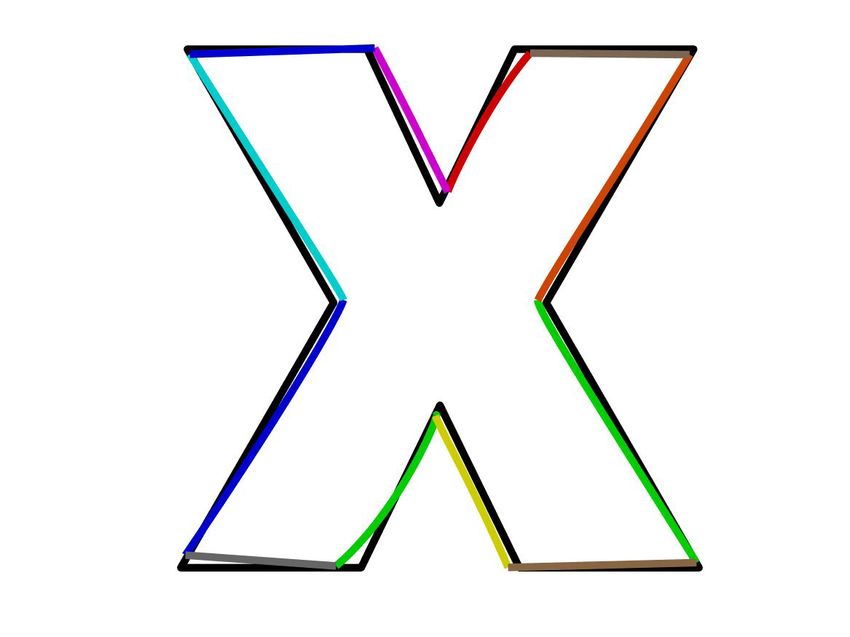
E. Balashova et al. / Learning A Stroke-Based Representation for Fonts

                                                                                         5.1. Fitting Quality
                                                                                         In the following, we describe the objective function that evaluates
                                                                                         the quality of a template fit. Our function favors shape correspon-
                                                                                         dence between the input and the deformed template, alignment of
                                                                                         feature points (sharp turns and corners), and avoids undesired local
                                                                                         minima through regularization.
Figure 3: For each letter template, we provide a set of example
layouts. Some depict topological variation (e.g. for the letter ‘a’,                     5.1.1. Correspondence
Figure 2). Some distinguish between decorative and sans-serif ex-
amples (e.g. ‘u’, left). Some templates include only one example                         First, we penalize dissimilarities between the deformed template
(e.g. ‘e’, middle). These examples adhere to the connectivity and                        and the glyph:
smoothness constraints defined by the template, for example the
                                                                                          Ecorr (Gc, f , Θ) =
strokes of ‘c’ are constrained to be C1 continuous (right). See the
supplemental material for all template examples.                                                   ∑      hσcorr (D(x, Oc (Θ))) +       ∑     hσcorr D(y, Gc, f ) ,
                                                                                                x∈P(Gc, f )                         y∈P(Oc (Θ))
                                                                                                                                                                (1)
                                                                                         where Oc (Θ) is the outline generated by the current configuration
in a tree structure, as depicted by arrows in Figure 2 (left). This                      (Θ) of the deformable template, P(Γ) is a dense sampling of a curve
coordinate frame directly relates to meaningful properties such as                       Γ, and D measures point-to-curve distance. In practice, we sample
brush width profile, and so is the natural choice for outline repre-                     100 points per outline segment and use a KD-tree for nearest neigh-
sentation. Additionally, our template deformation parameters also                                                                                    x 2
                                                                                         bor queries. We use a Gaussian kernel hσ (x) = 1 − e( σ ) of size
allow discrete topological changes, which we denote by a vector of
                                                                                         σcorr to reduce the influence of outliers and to better control the op-
binary values, Θt . Each value corresponds to presence or absence
                                                                                         timization behavior. The effects of this term is depicted in Figure 6
of a single stroke. Thus, the shape of a deformed template is de-
                                                                                         (bottom left).
fined by the vector Θ = (Θs , Θo , Θt ). To facilitate fitting, we also
provide a set of example topologies and geometries for each tem-
                                                                                         5.1.2. Normal Consistency Regularization
plate, as demonstrated in Figure 2 (right bottom) and Figure 3.
Number of Templates For each character, we generally have two                            Measuring the overall bi-directional distance between the two
templates - for the serif and the sans-serif versions. Some charac-                      curves, in Euclidean space, can attract incompatible regions, some-
ters (such as ‘k’) present significant variations in topology between                    times as far as from the opposite side of the outline. Thus, we rem-
fonts and hence warrant another template in order to be captured                         edy this issue by favoring similar normal directions of the deformed
well, while others were successfully represented using one template                      template and the target outline it is projected onto. In particular,
only (such as ‘o’). A general rule is to capture sufficient glyph vari-                  we augment our point representation with normal directions, lift-
ation to be used by the learning algorithm (see Section 8.1). The                        ing the 2D point p = [px , py ] on the target outline to 4D space:
template generation process involves annotating junctions and part                       [px , py , wn nx (p), wn ny (p)], where wn is a constant weight, and n(p)
connectivity. We provide precise templates for every letter in the                       is the normal at point p. Specifically, for our deforming template
supplemental material.                                                                   outline, we lift each point q to become [qx , qy , wn nx (q), wn ny (q)],
                                                                                         and do the same for the target glyph Gc, f . With this augmented
                                                                                         representation, we estimate the point-to-curve correspondence, and
5. Template Fitting                                                                      evaluate Ecorr according to the 2D Euclidean distance of each point
                                                                                         on P (Oc (Θ)) from the one most relevant to it on the glyph in this
We now describe the template fitting procedure that finds the opti-                      combined position-and-normal space. Matching and regularizing
mal deformation parameters for an input glyph Gc, f of the letter c                      normal directions is especially useful for avoiding local minima
from a font f . Our fitting process is an optimization procedure in                      at outline corners, as it helps two sides of the outline to roughly
which we optimize for the parameters Θ such that the outlines of                         preserve their original orientations while aligning to the input, in-
Gc, f and Tc (Θ) become as similar as possible, in a consistent man-                     stead of collapsing into one of the sides. This notion also further
ner. The template Tc provides structure and geometric model for                          facilitates consistency, as it encourages the outlines to be similar to
the glyph as well as an example for every possible topology of the                       the skeletons, which are more similar to one another over different
glyph with approximate stroke shape: Ec = {Θc,i       c,i
                                                 t , Θs : i = 1..Kc }                    fonts.
(see Figure 3 for examples and all details in supplemental mate-
rial). A demonstration of our process’ consistency can be seen in
                                                                                         5.1.3. Feature points alignment
Figure 4. In the following, we describe what are the considerations
we account for when searching for a good fit (see Section 5.1), de-                      Feature points, i.e. points of a large change in outline directions,
scribe the iterative optimization procedure (see Section 5.2), and                       are important for glyph appearance and provide a useful cue in the
provide an initialization procedure for the template deformation                         fitting process. Thus, aligning these points is essential in construct-
process (see Section 5.3). Note that this fitting procedure is fur-                      ing a consistent database. We denote as F(Gc, f ) the set of points
ther refined through iteratively leveraging and evolving a manifold                      which are the centers of such large direction changes. That is, if the
of the learned fonts, as described in Section 7.                                         curve changes its direction by an angle greater than π6 over a short

 c 2018 The Author(s)
Computer Graphics Forum c 2018 The Eurographics Association and John Wiley & Sons Ltd.
E. Balashova et al. / Learning A Stroke-Based Representation for Fonts

Figure 4: Consistency evaluation. Our template fitting process is focused on consistent semantic annotations of the input glyphs. The geo-
metric and topological variety of three letters are depicted in each row, along with the optimization’s successful capturing of the correct and
consistent stroke arrangement for them.

distance, we mark the middle of this region as a feature point. Ex-                  every iteration by modifying parameter wn . In particular, the op-
amining regions instead of point-wise changes in direction induces                   timization parameters start with σcorr = 20, wn = 25, rft = 0.3 and
detecting both sharp and round corners.                                              end with σcorr = 5, wn = 0.01, rft = 1. We optimize for Niter = 70
                                                                                     iterations and update the weights at every iteration by interpolating
   To define these points on the template, we observe that sharp
                                                                                     them linearly with respect to iteration count. Figure 6 demonstrates
turns are more likely to occur at the boundary of two different
                                                                                     an initial guess and optimized fitting result with some terms of the
strokes, thus we only consider junctions of outline segments as
                                                                                     objective function omitted.
template feature points and denote them as J(Oc (Θ)). This ensures
that a specific outline segment does not undergo unnecessary turns
in some glyphs compared to others, as demonstrated in Figure 6                       5.3. Initializing Template Deformation
(bottom right). To avoid foldovers in cases when feature points in                   Starting with initial example strokes in Ec we now obtain initial
G are close to one another in Euclidean space, but far-away along                    guess for our fitting procedure, Θ0 . See Figure 3 for an example of
the curve, we measure the distances intrinsically rather than extrin-                a stroke structure in Ec . These approximate examples lack outline
sically for this term. Specifically, we define an intrinsic distance                 geometry and often are too dissimilar from input glyphs to serve as
between a point x ∈ J(Oc (Θ)) and feature point in F(Gc, f ) as:                     our initial guess for the outline optimization. Instead, we start by
                                                                                     extracting a skeleton from an input glyph and fitting every example

   Dcurve x, F(Gc, f ) = min Arclength Proj(x, Gc, f ), y , (2)
                          y∈F(Gc, f )                                                stroke structure to it. These stroke structures exhibit far less vari-
where x is first projected to the glyph outline to be able to measure                ance than the full outline, which naturally simplifies this step. Once
arclength:                                                                           we fit the stroke, it is simple to estimate a uniform width initial out-
                                                                                     lines around the strokes. We then pick the parameters that yield the
                 Proj(x, Gc, f ) = arg min D(x, y).                       (3)        best energy to define the initial state for the outline optimization,
                                            y∈Gc, f
                                                                                     Θ0 .
Since we do not expect J(Oc (Θ)) to be in perfect correspon-
dence with the set F(Gc, f ) we only match a subset of junction                      5.3.1. Stroke Initialization, Θ0s
points that have a feature point nearby (i.e., Dcurve < τft , τft =                  To fit the stroke parameters to an input glyph Gc, f we first estimate
0.15 · average segment length). Denoting this set as Fτft (Oc (Θ)) ⊂                 its skeleton Sc, f . We use a method based on shape diameter func-
J(Oc (Θ)), we can quantify feature alignment as:                                     tion [SSCO08] to extract the major stroke skeletons defined by the
          Eft (Gc, f , Θ) =                 Dcurve (x, Fτft (Gc, f )),    (4)        outline. We then connect these regions by tracing a shortest path
                                  ∑                                                  between them via medial axis points, forming a connected graph
                              x∈F(Oc (Θ))
                                                                                     of skeleton paths, where most vertices have degree 2. This proce-
                                                                                     dure provides a single connected curve network for the skeleton,
5.2. Optimization                                                                    which unlike the medial axis, captures only the main strokes, re-
                                                                                     ducing sensitivity to small outline perturbations. See Figure 5a for
Starting with an initial template deformation Θ0 we use gradi-
                                                                                     an example output of this procedure.
ent descent optimization to find the optimal deformation param-
eters. We found that directly optimizing the entire objective E =                       Our next step is to fit the template strokes to the extracted skele-
Ecorr + Eft is prone to local minima issues and slow convergence.                    ton. We found that directly deforming the template skeletons is
Thus, we opted for a procedure that alternates between optimizing                    prone to failure, so instead we segment and parametrize the ex-
Ecorr and Eft . We rely on correspondence matching in early gradi-                   tracted skeleton consistently with the template. Since strokes are
ent descent iterations and slowly increase the influence of feature-                 continuous and smooth curves, and their junctions typically occur
point compatibility term. This is controlled via rft parameter, the                  at sharp skeleton features, or at intersections with other strokes (or
ratio of distance the feature points are allowed to be moved rela-                   skeleton curves). We formulate the segmentation of the stroke ac-
tive to their projected targets, which increases with every iteration.               cording to the template through a CRF-based objective, where the
Similarly, we emphasize the weight of the normal matching with                       nodes are skeleton points, the unary term is defined by registration

                                                                                                                                                         c 2018 The Author(s)
                                                                                        Computer Graphics Forum c 2018 The Eurographics Association and John Wiley & Sons Ltd.
E. Balashova et al. / Learning A Stroke-Based Representation for Fonts

(a)                    (b)                    (c)                    (d)

Figure 5: We illustrate our skeleton fitting pipeline. Given an input                               Input                    Initial Width           Initial Guess
glyph, we first extract its skeleton (a). We then register this skele-
ton to a template (b) to obtain an initial segmentation (c). We then
use CRF-based segmentation to obtain the final consistent segmen-
tation of the skeleton with respect to the template (d).

of the skeleton to the template, and the pairwise term favors cuts at
                                                                                                    Only Ecorr          With Normal Reg              With Feature
sharp features and intersections. In particular, we optimize:                                                                                        Alignment
       E=      ∑ Wu ·U(x, L(x)) +                   ∑         Wb · B(x, y),          (5)
              x∈V                          x,y∈V,L(x)6=L(y)                                Figure 6: Outline optimization. Given an input glyph and its cal-
where the unary U(x, l) term is a penalty for assigning a point x a                        culated skeleton (top left), we use its segmented version (see Sec-
label l and the binary term B(x, y) is a penalty for a pair of adjacent                    tion 5.3.1) to generate uniform width outlines around it (top mid-
skeleton points to have different labels. These are formulated as:                         dle). Our initial guess Oc (Θ0 ) is the latter, after incorporating the
                                                                                           template’s connectivity constraints (top right). Our fitting proce-
          U(x, l) = hσu (Dl (x))                                                     (6)   dure takes three considerations into account. Optimizing using only
                    (
                      1 − hσa (A (x, y)) , (x, y) ∈ E ∧ x ∈
                                                          /J                               Ecorr (see Section 5.1.1) can attract incompatible regions, as can be
          B(x, y) =                                                                  (7)   seen in the red box (bottom left). Considering normal directions
                      0,                   otherwise
                                                                                           (see Section 5.1.2) mitigates this issue (bottom middle). Finally,
To define the unary term, we use Dl (x), a distance between the                            incorporating feature point alignment (see Section 5.1.3) is crucial
template and the extracted skeleton after it is registered onto the                        for a semantically meaningful fitting, inducing consistent represen-
template skeleton using Coherent Point Drift method [MSCP∗ 07],                            tation across different fonts. This is highlighted in the red circles
where the distance is measured to the l th skeleton segment. To de-                        (bottom right).
fine the binary term we use the angle between the normals of adja-
cent points A(x, y), where E denotes adjacency and J denotes junc-
tions - points where more than 2 skeleton paths meet. Both terms                           catenate per-glyph parameters to create a feature vector represent-
are smoothed with the aforementioned Gaussian kernel hsigma , and                          ing a font: Fi = [Θ‘a’ , Θ‘b’ , ...Θ‘z’ ]. In this representation each font
                        √
we set σu = 0.25, σa = 3,Wu = 1,Wb = 4.                                                    becomes a point in high-dimensional feature space: Fi ∈ RDfont ,
   After the skeleton is consistently segmented with the template,                         where Dfont = 3998 (the number of parameters required to repre-
we parametrize every segment according to the template Tc (θ), i.e.                        sent all glyph parts in a font, after enforcement of continuity and
we fit a Bezier curve to match each stroke sc, f . Once the strokes of                     template part-sharing constraints). We expect this representation to
the glyph are fitted, we turn to initialize the outlines next.                             be redundant due to stylistic and structural similarities in fonts:
                                                                                           glyphs in the same font will share stylistic elements, and glyphs
5.3.2. Outline Initialization, Θ0o                                                         that correspond to the same letter will have similar stroke structure.
                                                                                           We propose to learn these relationships by projecting all fonts to
We represent the outline in the coordinate system of the extracted                         a lower-dimensional embedding. The main motivation behind this
skeleton segment (see Figure 2). To create an initial outline esti-                        is to create a space where important correlations between different
mate, we first generate a profile curve at a constant distance that                        attributes are captured implicitly, and thus, any sample point X in
fits closely to the input outline for every stroke (i.e., such that the                    this representation will implicitly adhere to common design prin-
average distance between the curve and the closest point on the out-                       ciples and font structures in the training data F. For this we need
line is minimized) (see Figure 6). The resulting outline is typically                      an embedding function M that projects a font to a low-dimensional
not continuous since the curve parameters are estimated indepen-                           feature space, i.e. M(F) = X, where X ∈ RD , and an inverse func-
dently for each stroke. We enforce C0 continuity at junctions of                           tion C that can reconstruct a font from the embedding C(X) = F.
outline segments by snapping the corresponding points to their av-                         To enforce learning correlations in the data we set the latent dimen-
erage position. Sometimes this averaged control point can flip sides                       sionality D = αDfont = 39 with α = 0.01, which was determined
of the skeleton, which leads to inferior optimization performances.                        experimentally to work best for our setup.
We detect these cases and project the average control point back to
the correct side of the corresponding skeleton segment.                                       In addition to capturing important correlations, we want the em-
                                                                                           bedding function to handle missing entries in the input feature vec-
                                                                                           tors Fi because most fonts do not have glyphs with all possible
6. Learning
                                                                                           topologies (i.e., decorative elements and stroke structures). In addi-
Given a collection of fonts F = {F1 , F2 , ..., FN } we use our glyph                      tion, in many applications in order to help the typeface designer we
fitting techniques to represent all letter glyphs consistently. We con-                    need to be able to reason about the whole font before it has been

 c 2018 The Author(s)
Computer Graphics Forum c 2018 The Eurographics Association and John Wiley & Sons Ltd.
E. Balashova et al. / Learning A Stroke-Based Representation for Fonts

completed. To satisfy this requirement, we pick a linear embed-                           Initial Fit                             Manifold Guess                      Improved Fit
ding, with a slight abuse of notation: M ∈ RDfont ×D , and compute
it from data points F via expectation-maximization principal com-
ponent analysis (EM-PCA) method [Row98]. This generalization
of PCA easily scales to large datasets and can handle missing data
at train and test time. This method alternates between the E-step
that optimizes for X = [X1 , ..., XN ], embedding coordinates of all
fonts F, and the M-step that optimizes for linear maps M,C. In
this case C spans the space of first D principal components, and we
can compute M = (CT C)−1CT . To find an optimal linear map, the
optimization starts with a random matrix M. In the E-step, we set
X = MF, however, in case with missing data, each Xi and Fi are
optimized for to minimize the norm: kCXi − Fi k, where missing
entries of Fi and entire vector Xi are free variables, this problem is
then solved to find a least squares solution. In the M-step, we com-
pute Cnew = F X T (X X T )−1 . This process then iterates between
the E-step and M-step K times to estimate the matrix M and all
projections X (in all our experiments K = 100).
   While some existing non-linear manifold learning algorithms
also have variants that address missing data issues (e.g., GP-
LVM [NFC07] and autoencoders [SKG∗ 05]), we perform an em-                     Figure 7: Sample fit improvements using iterative manifold evolu-
pirical comparison and show that a simpler linear model works bet-             tion. Starting with a manifold-generated initial guess reduces the
ter with our dataset (see Section 8.1 for discussion).                         final fitting significantly in many cases.

7. Iterative Manifold Evolution                                                            Percentage of fits below the learning threshold T .
                                                                                                            0.72

The initial manifold is learned by starting the fitting optimization                                         0.7

using skeleton-based initialization (see Section 5.3.2), measuring                                          0.68
                                                                                       Learning Threshold
                                                                                       % of Glyphs Below

                                                                                                            0.66
the fitting error (see Section 8.1), and retaining only those fits with
                                                                                                            0.64
err(Θ) < T to estimate a manifold. Given this manifold, we project
the font to the manifold and reconstruct it: M −1 (M(Fi )). We then                                         0.62

                                                                                                             0.6
use the resulting parameters to initialize the optimization procedure
                                                                                                            0.58
for every glyph with err(Θ) > T (i.e. completing the style of glyphs
with high error). For example, in Figure 7, we show an example of a                                           Start           1         2                     3   4           5
                                                                                                                                              Iteration
failed fit from a skeleton-based initial guess (template fitting com-
                                                                                                                   Mean fitting score after every iteration.
monly fails because the skeleton-based initialization for template                                  1.5

parameters is too far from global minima), and the improved guess
                                                                                                    1.4
after manifold re-projection.
                                                                                       Mean Error

                                                                                                    1.3
   We iteratively estimate the manifold and re-project remaining
high-error glyphs in each iteration. As can be seen in Figure 8,                                    1.2
the overall fitting error decreases, and fraction of successful fits
increases. All results presented in this paper correspond to the fifth                              1.1

iteration of this procedure.
                                                                                                     Start                1         2                     3       4           5
8. Evaluation                                                                                                                               Iteration
                                                                               Figure 8: Iterative manifold evolution gradually increases the per-
8.1. Fitting Evaluation
                                                                               centage of fits accepted for learning and reduces the mean fitting
We test our method on 570 fonts obtained from online                           error.
database [Fon17]. Although more fonts are available, we restricted
ourselves to normal monospace, sans serif, serif, and slab serif
fonts, which still provides a data-set that is an order of magnitude
larger and more diverse than what has been used in previous work.
                                                                               template and accuracy of our fitting procedure we compare the out-
We fit our stroke-based representation to every glyph in this font
                                                                               line generated by our template and the outline of the input glyph.
collection, providing a consistent representation across all fonts.
                                                                               To compare two curves we densely sample each curve so that the
Figure 4 shows some example fits that result from the iterative fit-
                                                                               distance between consecutive points is 0.3 pixels (each glyph is
ting procedure.
                                                                               scaled and represented to resolution of 200 × 200 pixels), and then
  To quantitatively evaluate the expressiveness of our deformable              for each sample we compute the distance to the closest point on

                                                                                                                                                   c 2018 The Author(s)
                                                                                  Computer Graphics Forum c 2018 The Eurographics Association and John Wiley & Sons Ltd.
E. Balashova et al. / Learning A Stroke-Based Representation for Fonts
             100
                                                               a
                                           b
                                               c
                                                   d
             80                    e
                                           f
                                                                     g
                       h
                                               i                                                                                            Part-based Representation
             60                        j
Percentile

                               k
                           l
                       m
                       n
                         o
             40          p
                                       q
                   r
                        s                                                                                                                       Campbell [CK14]
                               t
             20    u
                 v
                 w
                x
                 y
              0z
               0                   1               2   3   4           5        6    7      8     9      10
                                                                   Error (px)
                                                                                                                                                     Raster-based
Figure 9: Fitting results by glyph. For all glyphs except for ‘g’, over                                           (a) Interpolations between fonts of different topology (TimesNewRomanPSMT
70-80% can be fitted well enough to be used for learning. ‘g’ is the                                              and TrebuchetMS fonts). Interpolation between serifed and non-serifed fonts
hardest case to fit due to high variation in both topology and shape.                                             yields interpolations only between corresponding parts. Decorative elements,
                                                                                                                  such as serifs, that are present only in one font are purposely not interpolated
                                                                                                                  in our method, and the Bezier-based representation avoids the blurry artifacts
                                                                                                                  seen in the raster-based approach.
the other curve. We then average these distances, in a root-mean-
square manner. We report these results in Figure 9, where the x-axis
is an average fitting error threshold, and the y-axis is the fraction of
glyphs that their average error is below the threshold. We observe
                                                                                                                                            Part-based Representation
that errors vary depending on glyphs, for example, ‘g’ poses the
most challenges due to significance variance in its topology (e.g.,
the lower tail can be attached at various places on the upper loop
and might have very diverse shapes). Figure 10 provides some rep-
resentative visualizations of glyph appearance under different fit-                                                                             Campbell [CK14]
ting errors.
   To learn a manifold of fonts, we pick a conservative threshold
of T = 1.0 pixels average error to ensure that we learn only mean-                                                                                   Raster-based
ingful correlations. At test time, however, we can still project any
glyph to the manifold. Of course, the projection and reconstruction                                               (b) Interpolations between fonts of similar topology (TimesNewRomanPSMT
quality will suffer as the quality of fits degrades.                                                              and Georgia fonts). Quality of interpolation between same topology fonts is the
                                                                                                                  same. Since our method enforces corner constraints during fitting, corners are
                                                                                                                  better preserved during the interpolation process (seen on the sharp corners at
                                                                                                                  the edges of the serifs).

                                                                                                                           Figure 11: Comparison of different representations.

Figure 10: Glyph Fits at Different Degrees of Fitting Error. The
threshold of T = 1.0 is picked as acceptable for learning purposes.
                                                                                                                  qualitative changes in consistency as one transitions from one style
During test time, worse fits might also be successful projected onto
                                                                                                                  to the other. Interpolation is the most direct way to measure consis-
the manifold.
                                                                                                                  tency, while evaluation on other tasks, such as style prediction, will
                                                                                                                  be confounded by properties of the learning algorithm.
   In the supplementary material, we provide an extended version
of all our experiments over many of the fonts: We show the fitting                                                   For both our approach and that of Campbell and Kautz [CK14],
result visualizations for a randomly selected sample of fonts, and                                                we employ the same interpolation scheme in a PCA space learned
the three application results ran over a larger set of fonts.                                                     from the same set of 12 fonts. We investigated whether results for
                                                                                                                  the latter approach differ when performed without PCA reduction,
8.2. Comparison to Prior Work                                                                                     and found that the results are similar (see Supplementary Mate-
                                                                                                                  rial). For the raster-based approach, we learn a variational auto-
We evaluate both the representation and the learning component of
                                                                                                                  encoder [KW13] manifold on 64 × 64 rasterizations of glyphs with
the method in comparison to previous work.
                                                                                                                  two fully connected layers of sizes 256 and 10, where the last
   Representation Comparison We compare our method to the                                                         layer performs sampling (as in [KW13]). Typically, neural net-
state-of-the-art method of Campbell and Kautz [CK14] and a                                                        works require more training data, so to provide a fair comparison,
raster-based approach. The goal of all three methods is to produce                                                we augment the training dataset with rasterizations from our full
a consistent font representation, thus we evaluate each of the three                                              font dataset, since the datasets contained different fonts (to a total
representations using interpolation, which allows one to visualize                                                of 582 fonts). While results of the raster-based method will differ

 c 2018 The Author(s)
Computer Graphics Forum c 2018 The Eurographics Association and John Wiley & Sons Ltd.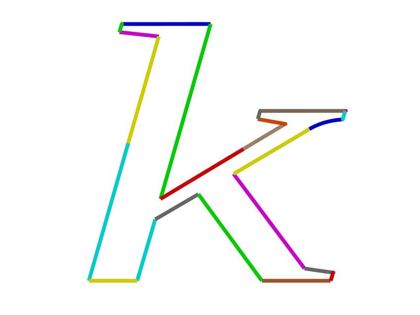
E. Balashova et al. / Learning A Stroke-Based Representation for Fonts

with a different choice of training data or architecture, they still will
exhibit blurry artifacts, as demonstrated in Figures 11a, 11b.

    Unlike Campbell and Kautz [CK14], our model does not require                                                EM-PCA [Row98]
that outline vertices on two glyphs of different styles but the same
character have a bijective correspondence. This correspondence is
ill-defined when comparing distinct topologies, as demonstrated in
Figure 11a. This allows our method to explicitly interpolate be-                            Denoising Nonlinear Variational Autoencoder (VAE)
tween corresponding parts, which may be preferred to gradually
                                                                                (a) Interpolations between fonts of different topology (TimesNewRo-
degenerating serifs present only in one of the interpolants. In ad-
                                                                                manPSMT and TrebuchetMS fonts).
dition, explicit enforcement of corners from the fitting procedure
often yields better preservation of sharp features in the resulting in-
termediate representations, as can be seen by the sharp corners of
the ends of the serifs. On the other hand, the explicit correspon-
                                                                                                                EM-PCA [Row98]
dence aids in producing better quality results where this correspon-
dence is indeed meaningful: for example, the intermediate interpo-
lations of Campbell and Kautz [CK14] between two glyphs of the
same topology better respect parallel constraints of the stems of ‘h’
(in Figure 11a) and generate slightly better width/curvature varia-                         Denoising Nonlinear Variational Autoencoder (VAE)
tion (in Figure 11b), compared to our method. Finally, both vector-
based approaches outperform the raster-based method, which in-
herently produces blurry intermediate interpolations.                                         Vanilla Nonlinear Variational Autoencoder (VAE)

   Generative Model Comparison To evaluate our generative                       (b) Interpolations between fonts of similar topology (TimesNewRo-
model, we empirically compare it to a nonlinear variational autoen-             manPSMT and Georgia fonts).
coder (VAE) [KW13] learned directly on the font representation
                                                                                Figure 12: Comparison of different generative models. Our method
from the fitting step. We implemented two variants: a vanilla ver-
                                                                                is able to produce meaningful interpolations between glyphs of
sion that learns on examples with consistent topology (no missing
                                                                                same topology as well as glyphs of different topologies. The VAE
parts) and a denoising nonlinear VAE [VLBM08] that can handle
                                                                                method is only able to produce meaningful interpolations between
different topologies and missing parts (please see supplementary
                                                                                glyphs of same topology (known as vanilla VAE). When applied to
material for training and architecture details). The vanilla nonlin-
                                                                                multi-topology data (denoising VAE), it introduces unnatural part
ear VAE produced smooth interpolations on examples in its domain
                                                                                variations.
(see Figure 12b). However, the denoising nonlinear VAE failed
to produce meaningful interpolations between examples, introduc-
ing unnatural part deformations. This is likely due to the high-
dimensionality of our model and the lack of training data samples               casing a variety of qualitative experiments that demonstrate various
(even after extensive data augmentation), which hinders the net-                applications of our method.
work from capturing the correct posterior distribution and learn-
ing a more complex model without overfitting. This phenomenon
is often referred to as the curse of dimensionality [Bel15]. Ad-                9. Applications
ditionally, learning on a cross-topology dataset requires imputing
                                                                                Our font representation can be used in a variety of applications for
missing values (which are a form of noise), and, as has been high-
                                                                                modeling, organizing, and analyzing fonts. In this work, we focus
lighted [EHN∗ 98,PPS03], linear methods may be preferable in low
                                                                                on three applications that demonstrate the benefit of our method.
signal-to-noise ratio scenarios over non-linear models. Finally, the
                                                                                First, our part-aware model enables the user to use topological con-
missing values in our case are “missing not at random” (MNAR),
                                                                                straints when retrieving the most similar font in a database (e.g.,
which is known to be challenging for existing methods [TLZJ17].
                                                                                find a font that is most similar to this sans-serif font, but with ser-
As a result, we found that for the considered scenario of MNAR and
                                                                                ifs). Second, we demonstrate font completion results enabled by
signal-to-noise ratio, a linear model is preferred. We thus use the a
                                                                                the use of an EM-PCA model that can handle missing data and the
simpler linear model (EM-PCA) to demonstrate proposed applica-
                                                                                effective factorization of fonts into strokes and outlines in our rep-
tions, and leave analysis and development of more complex gener-
                                                                                resentation.
ative models (such as generalized nonlinear VAE [WHWW14] that
additionally considers data relationships to mitigate dimensionality               To ensure that our results are representative of real-world use
issue) for future work.                                                         cases, we split the database into training (370) and testing (200)
                                                                                sets, where we learn our manifold on the training data, and use the
   A parametrized font database and a low dimensional manifold                  test data as query either for retrieval or completion. For visualiza-
enable a variety of exploratory applications that aim to browse and             tion, each glyph outline is drawn in its scaled unit box representa-
predict consistent glyph styles. Since it is challenging to quantita-           tion used for training (scale parameters may not be known during
tively evaluate style, we follow the approach of prior work in show-            testing time).

                                                                                                                                                    c 2018 The Author(s)
                                                                                   Computer Graphics Forum c 2018 The Eurographics Association and John Wiley & Sons Ltd.
E. Balashova et al. / Learning A Stroke-Based Representation for Fonts
Query Font: Ubuntu-Light (1) MerriweatherSans-Light
Nearest Neighbor: Ubuntu (2) Nobile-BoldItalic
Farthest Font: RussoOne-Regular (3) Junction-Light
Nearest Serifed Font: Arvo (4) MinionPro-It
Nearest Font With Topology 1 of a: Inder-Regular (5) DoppioOne-Regular
(6) EkMukta-Light
Query Font: OpenSans-Italic
(7) Ubuntu-Italic
Nearest Neighbor: OpenSans-SemiboldItalic
(8) Exo-Light
Farthest Font: RussoOne-Regular
(9) Cabin-Italic
Nearest Serifed Font: LiberationSerif
(10) Amethysta-Regular
Nearest Font With Topology 2 of a: Roboto-LightItalic
(11) Adamina-Regular
Figure 13: Font Retrieval. We project the query (testing) font into
the manifold and search for existing fonts in the manifold. It can
(12) Oldenburg-Regular
be seen that the nearest font is stylistically very similar, while the
farthest font is quite distinct. We also demonstrate topology based
queries, which take advantage of our part-based glyph representa- (13) Neuton-Light
tion. The style of the nearest fonts under these topology constraints
also nicely matches the query font style. (14) Neuton-Regular
Figure 14: Completion of fonts in different styles. The input glyphs
are colored blue and the predicted glyphs are colored yellow.
Topology-aware Retrieval By consistently parametrizing a large
variety of fonts and embedding them in a low dimensional manifold
we implicitly organize font database and learn their similarities in
context of the entire data-set. As was demonstrated before [CK14],
The system is able to infer the correct variation of extremely thin
this can facilitate font retrieval. In addition, our topology-aware
styles such as (3) and (8), and thicker styles such as (2) and (5).
representation enables us to constraint the retrieved results to have
Finally, notice that our system correctly predicted the existence of
certain features (e.g., serifs, or particular stroke structure). In Fig-
decorative elements in glyphs ‘f’ and ‘n’ examples (11-14), based
ure 13 we present two queries of the database. For each query font
on their presence in the the input glyphs.
(top row), we retrieve the most similar (second row) and dissimilar
(third row) ones. We can also impose additional constraints on the An interesting completion question to ask is to see how many
retrieved font, such as it must have serifs (fourth row) or a different glyphs are needed to be designed in order to predict the rest. For
topology for some glyphs (fifth row). example, one might want to design a subset of the most repre-
sentative glyphs (such as the word ‘handglove’), and complete the
Font Completion Since our learning method allows projecting rest. In Figure 15, we complete the fonts UbuntuMono-Italic and
a partial font vector to the manifold, we can reconstruct the full AveriaSansLibre-BoldItalic, based on different numbers of given
font from this a partial projection and thus complete the remaining letters. As more and more letters are given, the prediction qual-
glyphs. In this experiment, we hold out a subset of glyphs and use ity of some glyphs that generally exhibit a lot of variation improves
the manifold to predict it. In Figure 14 we visualize some sample (such as ‘f’ and ‘m’), while the prediction quality of simpler glyphs
completion predictions. Given a font consisting only of the glyphs such as ‘x’, ‘y’ and ‘z’ is correctly inferred even for only a small
in the word ‘hamburgefon’, we use the first seven letters to predict subset of provided glyphs. While the predicted glyphs are generally
the style of the last three. It can be seen that our system correctly below the quality of manually designed fonts, the predictions sug-
predicts the slant and part widths, italics, and decorative elements. gest that the model does capture stylistic co-occurences necessary
Specifically, notice the consistency in slant in Figure 14(2,4,7,9). for generating a stylistically compatible set of glyphs.
c 2018 The Author(s)
Computer Graphics Forum c 2018 The Eurographics Association and John Wiley & Sons Ltd.You can also read