Modelling the Second Covid-19 Wave in - arXiv
←
→
Page content transcription
If your browser does not render page correctly, please read the page content below
1

                                                Modelling the Second Covid-19 Wave in
                                                                                           Mumbai
                                                                    TIFR Covid-19 City-Scale Simulation Team
                                                                               Sandeep Juneja, Daksh Mittal
                                                                                            May 2, 2021
                                                                                             I. S UMMARY

                                             India has been hit by a huge second wave of Covid-19 that started in mid-February 2021.
arXiv:2105.02144v1 [q-bio.PE] 5 May 2021

                                           The wave first arose in the state of Maharashtra, and within it, Mumbai was amongst the first
                                           cities to see the increase. Was this wave caused by increased laxity in the population around
                                           December and January? Or by the opening up of the economy and public transportation on
                                           February 1, particularly in Mumbai? Did variants of the SARS-CoV-2 virus that have emerged
                                           in Maharashtra and other parts of India play a role in the sharpness with which the virus has
                                           spread? Very likely all three played a role, and especially the variants. While the significance
                                           of the role of variants remains to be confirmed by researchers, it appears that the double
                                           mutant variant B.1.617 [1] may have played a key role in Maharashtra. Unfortunately, we
                                           currently lack the data to firmly establish infectiousness, prevalence and virulence of B.1.617,
                                           or that of other variants that may be active, compared to the strains that were prevalent in
                                           Mumbai last year.
                                             Fortunately, vaccinations have started in India since mid-January and are being administered
                                           with some urgency in Mumbai since mid-March and are likely to reduce infections and
                                           fatalities in the coming months.
                                             In this report, we use and enhance the IISc-TIFR city simulator [2] to computationally
                                           study the second wave in Mumbai. We build upon our earlier analysis [3], where projections
                                           were made from November 2020 onwards. Given the inherent uncertainty in the role of
                                           the variants, and other important infection spread determining factors, we use our simulator
                                           to conduct an extensive scenario analysis - we play out many plausible scenarios through
                                           varying economic activity, reinfection levels, population compliance, infectiveness, prevalence
                                           and lethality of the possible variant strains, and infection spread via local trains to arrive at
                                           those that may better explain the second wave fatality numbers.

                                            Daksh Mittal is supported through the IDFC Institute
                                             Source code available at https://github.com/dasarpmar/epidemics-simulator-mumbai/releases/tag/v5.0
2

  While realistically there may be multiple variants operating in Mumbai, in our scenario
analysis, to maintain simplicity, we assume that there is a single variant.
  We observe and highlight certain outcomes that occur across all the scenarios considered.
This robustness suggests that they are likely to be accurate projections for Mumbai. These
include:
  1) The Mumbai second wave of fatalities will likely peak around the first week of May
      (First reported by us on March 31 [4]). Again, this appears largely invariant under
      many plausible scenarios. Since cases typically lead fatalities by two to three weeks,
      this in turn suggests that the cases will peak a few weeks before first of May, as indeed
      appears to be the case.
  2) In the scenarios that loosely match Mumbai’s vaccination drive (age based vaccinations
      of the order of 15 to 20 lac new people a month; 75% efficacy), the fatalities reduce
      to Jan. and Feb. levels by June 1. This again suggests that the reported cases will
      substantially decrease in Mumbai by early to mid May (reported by us on April 15 [5]).
      We also observe that if the extensive vaccination drive continues, and the vaccines show
      the promised efficacy (of around 75%), without the virus escaping the vaccine immunity,
      Mumbai may be in a position to open schools by July 1 or soon thereafter. See [6]
      for recommendations for opening schools in India. Of course, as in any forecasting
      exercise, further off the horizon, more error prone are the projections. So closer to July
      would be the right time to make this evaluation.
  During the second wave, the observed fatalities were low in February and mid-March and
saw a phase change or a steep increase in the growth rate after around late March (see Fig
1 and Fig 2). We conduct extensive experiments to replicate this observed sharp convexity.
This is not an easy phenomena to replicate, and we find that explanations such as increased
laxity in the population, increased reinfections, increased intensity of infections in Mumbai
transportation, increased lethality in the virus, or a combination amongst them, generally do
a poor job of matching this pattern.
  We find that the most likely explanation is presence of small amount of extremely infective
variant on February 1 that grows rapidly thereafter and becomes a dominant strain by Mid-
March. The scenario where the variant is 2.5 times more infective than the dominant strain
last year, and accounts for 2.5% of the infected population on Feb 1, appears to match the
data well. This variant increases to over 60% by mid March. Another scenario where the
variant is 2 times more infective and the compliance is less than the earlier scenario, also
explains the data reasonably well. Given the large uncertainty in model parameters, the above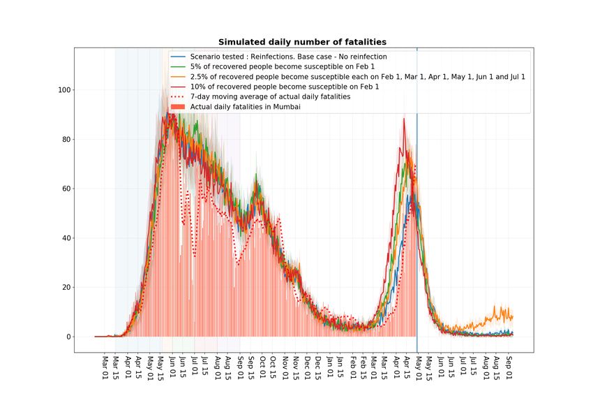
3

specific numbers may be far off from the truth. However, the observation that Mumbai had
highly infective variants that grew to have substantial presence in March is likely to be true.
From a prescriptive view, this points to an urgent need for extensive and continuous genome
sequencing to establish existence and prevalence of different virus strains in Mumbai and in
India, as they evolve over time. This may help better manage infections that may result from
new strains in future.
  Since, other larger districts of Maharashtra such as Pune, Thane, Nashik and Nagpur are
closely synchronised with Mumbai in this second wave in terms of reported cases (see Fig 3)
and other regions in the state typically lag Mumbai, this suggests that much of Maharashtra
may see a similar trend to Mumbai with a small lag.
  As is well known, R0 denotes the expected number of individuals a single randomly
selected exposed person infects in a city where everyone else is susceptible. It captures the
infectivity of the virus. Later in Section III we also discuss the value of R0 for the virus
strain present last year as per our model, and its value under more infectious variants.
  Given that early this year, none of the models anticipated the severe second wave that we
see in India, the above claims should be accepted with caution. The key caveats that may
affect our projection and to watch out for include a large proportion of population infected
last year becoming susceptible to severe reinfections. The virus showing significant capacity
to escape the vaccine induced immunity. Rise of new strains that may be more infectious
and lethal. Of course, the city population needs to continue to guard against laxity in the
distancing precautions. Furthermore, while we have conducted extensive time demanding
simulations, due to time paucity, we have not been comprehensive. Nor have we been able
to implement more sophisticated stochastic optimization techniques. We cannot entirely rule
out scenarios where reinfections carefully combined with population laxity may explain most
of the observed fatality curve, even though that appears unlikely.
4

Figure 1: Daily reported cases and fatalities in Mumbai. Fatalities start rising around March
15 signalling a second wave. The rise becomes particularly steep around April 1. Cases start
rising around mid-February signaling the second wave. They show a steep increase starting
mid to late March. (Source : BMC Dashboard)

  Figure 2: Daily reported cases and fatalities (log scale) in Mumbai. (Source : BMC Dashboard)
5

Figure 3: Daily reported cases in some of the larger districts of Maharashtra. While these
districts were somewhat synchronised in the August-September wave, they seem much more
so March onwards this year. (Source : https://api.covid19india.org/)

             II. A NALYZING THE SECOND WAVE THROUGH SCENARIO ANALYSIS

  First case in Mumbai was detected on 11 March 2020. By February 9, 2021 when the
reported cases started rising and the second wave started, Mumbai had seen 313,419 reported
cases. During the ongoing second wave, these have sharply increased to 649,395 as of April
30, 2021 . See Fig 1, While the reported cases never exceeded 1,500 a day up till July
2020 due to low testing, they remained close to or below 2,500 between mid September and
October during the minor wave that started in the wake of Ganpati Festival related crowding
in late August 2020. In comparison, the reported cases have been over 8,000 for most of the
days since April 1, 2021. Thus, the cases are dramatically higher this time around compared
to any time in 2020, a fact that agrees with the all India trend.
  The Covid-19 reported fatalities in Mumbai (Fig 1) on the other hand have increased less
aggressively. They equalled 11,396 on Feb. 9, 2021 and have increased to 13,161 as of April
30, 2021. While the data suggests that the cases have peaked for Mumbai around second week
of April, the fatalities are likely to continue to rise and peak in early May. For perspective
on rising fatality numbers, note that In January, February and till mid-March, daily fatalities
were essentially in single digits. Since then as a result of the second wave, they have been
rising to over 60 a day during April 21-25.
Case Fatality Rate (CFR): Could the steep increase in fatalities seen in April be largely due
6

to avoidable deaths due to stretched medical infrastructure? Avoidable deaths mean deaths
that could have been avoided if patient had access to reasonable medical care. This appears
unlikely as the cases showed a similar steep increase mid-March onwards. In Fig 4, we shed
further light on the relationship between cases and fatalities in Mumbai. CFR is a popular
measure of severity of disease. It equals observed number of fatalities divided by observed
number of cases during a specified time window. This can be a poor measure when the cases
are rising as fatalities typically lag cases by close to 3 weeks. As per [7], the average time
between a person getting exposed and the person not surviving is around 28 days. Also,
a person typically develops symptoms around 5 to 6 days after getting exposed. It is then
reasonable to assume that an exposed person reports positive around 8-9 days later. With these
numbers in mind, in Fig 4, we also report the Shifted Case Fatality Rate (SCFR) measured
over a thirty day window where the cases in the denominator are an average 20 days earlier
than the fatalities in the numerator. Thirty days are chosen to be large enough to provide a
stable estimator, while small enough to capture time varying trends. For Mumbai we see that
while this number was over 3% in September 2020, it is currently around 1%. The figure
also illustrates that SCFR may be a better measure of disease severity compared to CFR that
behaves poorly due to the lag between cases and fatalities. The fact that SCFR is taking
reasonably small values suggests that Mumbai has not seen many avoidable deaths.
  Apart from increased testing (see Fig 7), key factor that explains the discrepancy in SCFR
in September 2020 and April 2021 may be that the population segment getting exposed now
is more likely to get tested compared to some months ago. Other possible reasons include
improved medical care, presence of more infectious strain (s) that maybe less deadly, and
presence of mild reinfections that get reported as cases but lead to reduced fatalities compared
to the first time infections. As an interesting digression, in the appendix (section V), we show
SCFR graphs for other districts in Maharashtra, for India, as well as for some of the states
with the largest number of people infected in the second wave. The current SCFR of over
6% for Delhi and UP is particularly worrying. In addition to suggesting significant reporting
issues, this also suggests presence of a more fatal strain (perhaps the UK Variant), and of
many avoidable fatalities. The SCFR for India is around 2.5%, while interestingly, the CFR
is less than 1%.

Second Wave: An important aim of this report is to develop insights into the second wave
in Mumbai through playing out various scenarios and see the ones that better explain the
Mumbai fatality data from February to April 2021, with its peculiar late escalation. As in
7

Figure 4: Comparison of Shifted Case Fatality Rate and Case Fatality Rate for Mumbai.
SCFR appears to be a much better measure of disease severity. (Source : BMC Dashboard)

our previous reports, we avoid trying to match observed cases because they are much less
predictable - they rely on administrations’ testing policy that can vary with time and location.
The observed cases also rely heavily on the segment of population getting tested. For instance,
a slum dweller, for the same symptoms, is much less likely to get tested compared to someone
living in a high rise.
  Before we conduct scenario analysis, lets understand the observed fatality numbers a little
better: Recall that by late January 2021, the reported Covid-19 cases in India, in Maharashtra
(see Fig 5), and in Mumbai (see Fig 1), were well below their peak from last year. Earlier
Serosurveys in Mumbai [8] had shown a high prevalence of the disease especially in the dense
slum areas, and it was expected that if the city fully opened by November, then by January
it would approach some form of herd-immunity [3]. Serosurveys in other metropolitan cities
also showed high prevalence, and even all of India was seen to have a significant proportion
of population already exposed to the disease, see [9] and [10]. The general mood was that,
given the relatively high prevalence, the young and largely rural population that may have
some form of prior immunity, the pandemic was over in India. This reflected in the increased
population mobility, increased social gatherings and increased laxness in observing social
distancing. The Google Mobility Report [11] in Fig. 6 underscores this increase.
  Around late January, cases started to increase in Amravati and Nagpur in Maharashtra
(see Fig 8). The city of Mumbai substantially opened up on February 1 [12], where the
8

Figure 5: Daily reported cases in Maharashtra and India. The cases begin to rise from mid-
February in Maharashtra. While the cases in India begin to rise from mid-March. (Source :
https://api.covid19india.org/)

Figure 6: Google Mobility Report for Mumbai. This graph shows the percentage change in
mobility from the base line in different categories. After a steep fall in April last year, a
steady increase is seen across categories starting April 2020 up till January 2021. Thereafter,
the mobility is somewhat stable till March 2021, and again reduces in April 2021. (Source :
https://datastudio.google.com/u/0/reporting/a529e043-e2b9-4e6f-86c6-ec99a5d7b9a4/page/yY2MB?s=ho2bve3abdM)
9

Figure 7: Daily tests in Mumbai and the case positivity. Testing is much higher in April
2021 compared to August and September 2020, although the positivity is similar. (Source : BMC
Dashboard)

restrictions on the people travelling by local trains, the lifeline of the city in normal times,
were reduced. Initially, from February 9 onwards, the cases in Mumbai increased at a slow
rate (see Fig 1), however, by early-March there appeared to be a phase change and the rate
of growth increased substantially. Similarly, the observed fatalities were low in February and
mid-March and saw a steep increase in the growth rate after around late March (see Fig 1).
   As we discuss later in Section IV, projections from our October report [3] match the
observed fatality graph quite well till December with some underestimation in January and
February (with January opening in Figure 11 shifted by a month to roughly depict the Feb.
opening). Recall that in Mumbai, restrictions on train travel was substantially relaxed on
Feb. 1. The report was written under the assumption that the population compliance to social
distancing remains unchanged through early 2021. With the adjustment for population laxity
in December and January, the projected fatality data matches the observations reasonably well
till early March. However, it completely misses the sharp rise in fatality numbers thereafter.
   In this report, we conduct an extensive scenario analysis to try and explain the much larger
fatalities observed from mid-March to end April. We fix a base case that appears to match
the fatality data well, and consider many scenarios that are perturbations to the base case.
Our key conclusions - that the Mumbai second wave of fatalities will likely peak around the
first week of May, and that the fatalities reduce to Jan. and Feb. levels by June 1 can be seen
10

Figure 8: Daily reported cases in Nagpur and Amravati. Cases in Nagpur show an increasing
trend from early February 2021. While the cases in Amravati show an increasing trend starting
January 26, 2021. (Source : https://api.covid19india.org/)

to roughly hold across all the scenarios that we consider.

A. Base case

Mobility: As in the January opening scenario of [3], we assume that the mobility of the
Mumbai population is at 50% of the pre-covid times in the months from September to
December, and extend this level to January as well. This increases to 65% on February
1 when the city further opened up [12] and stays at that level till the ‘Break the Chain’
lockdown on April 15, 2021 (see [13]). To see that this approximation is in the correct ball
park, we observed that the data on average passenger counts travelling daily by buses and
local trains between January 13 to January 31, 2021 equals 4.7 million, while this average
between February 1 to February 14, 2021 equals 5.8 million (source: MCGM). Given that in
normal times travel by train is around 8 million passenger counts daily [14], and by BEST
buses, it is order 2 million [15], are selected mobility percentages appear reasonable. These
percentages are also in rough consonance with the Google Mobility Report in Figure 6. One
could fine tune these numbers and also account for slight slowing down in late March and
early April in the view of rising cases, but this is unlikely to impact the model fatality profile
significantly.
11

  Maharashtra government imposed the ‘Break the Chain’ lockdown restrictions from April
15 to May 1, that were later extended to May 15 (see [16]). Google Mobility Report suggests
that mobility in late April was similar and slightly higher than in June 2020. We impose
restrictions in our model similar to those in June 2020, with fraction travelling to work
increased from 15% in June 2020 to 20% during the new lockdown.

Compliance: In our October report, we had assumed that compliance levels was 60% in
non-slums (NS) and 40% (S) in slums throughout the period (except for the festival periods
where compliance is reduced to 40% NS and 20% S). The reduction in cases and fatalities
likely led to increased laxity in the population in December and January. The increased
mobility as seen in Google Mobility Report for retail and recreation, workplaces, transit
stations, parks and groceries suggests that population mixing had increased and people likely
became more lax in social distancing, wearing masks, etc. in December 2020 and January
2021. We account for this laxity by changing the compliance from 60% NS and 40 % S to
to 50% NS and 30% S in December and 40% NS and 20% S in January. In February, till the
18 th, the compliance is assumed to be 20% NS and 10% S but from February 19 onwards,
it is increased to 40% NS and 20% S till April 14. This increase in compliance was based
on the order from MCGM for compulsory masks [17]. During the lockdown (April 15 - May
15), the compliance is assumed to be 60% NS and 40% S.

Reinfection level: While some cases of reinfection have been reported in the literature, the
phenomena does appear to be limited so far. Further, if the reinfections are mostly mild, they
have little affect on the fatality numbers. We keep the reinfection level to zero in the base
case. Other levels do not improve the fit to data. Later, we conduct extensive perturbations
of reinfection levels to assess their impact.

Variants: We assume that there exists a single variant that accounts for 2.5% of all the
infected population on Feb. 1 in our model. These are randomly chosen amongst all the
infected on Feb 1. Further we assume that this variant is 2.5 times more infected compared
to the original strain. Technically, this means that the transmission rates in our simulation
(see [2]) corresponding to transmission at home, at workplaces, in communities and in local
trains is increased by 2.5 when an infected person, infected by the new variant, encounters a
susceptible one. This is the transmission rate assigned to all who are thereafter infected by
the new variant.
12

Vaccination: The elderly (above 60 years of age) were given the first vaccination dose in
Mumbai from March 1 onwards. Vaccines were made available to 45 years and older from
April 1. The vaccine starts to provide immunity many weeks later. In the month of March
around 5 lac people were vaccinated. Since then the number is closer to 18 lac a month and
is expected to become higher provided the supply continues. In our model, we assume that
vaccine once administered is immediately effective. Further, to capture vaccine’s efficacy of
around 75%, we assume that 75% of the people vaccinated have complete protection, while
randomly chosen 25% of the vaccinated get no protection. The specific vaccination schedule
that we implement in our model is:
  •   40% (appx. 5 lakh) people above the age of 60 years are vaccinated in month of
      April (quarter of these numbers are vaccinated during the month at four equally spaced
      instances).
  •   15 lakh people above the age of 45 years (this includes 40% above age of 60) are
      vaccinated in month of May for the first time (again four times each month).
  •   20 lakh people above the age of 18 years are vaccinated for the first time in each month
      from May to July. ( four times each month).

Impact of trains: In our earlier report [18] we propose a methodology to model infection
spread in local trains. The train transmission rate (βT ) based on some reasonable approxima-
tions corresponding to contact rates is set to 0.4 times βH , where βH denotes the transmission
rate at home . We continue with this setting in the base case.

Variant virulence: In the base case, we keep the virulence at the level of the original variant.

Opening of schools: In the base case, we assume that the schools open on July 1, 2021.

  See Figures 9, 10, 11 and 12 for the results associated with the base case. Recall that the
base scenario includes both the benefits of the vaccination effort and the ongoing lockdown.
In the graphs, the base scenario is compared with the following 4 scenarios:
  •   Scenario without the infectious strain and without the lockdown. This is the contra-
      factual setting where the mild wave is caused in Mumbai only due to the opening of
      the economy on February 1, and increased laxity in population before that.
  •   Scenario without vaccination and without lockdown. This helps us estimate the combined
      benefits of the lockdown and the vaccination effort.
  •   Scenario without lockdown and with vaccination. This helps isolate the benefits of the
      lockdown.
13
• Scenario with lockdown and without vaccination. This helps isolate the benefits of the
vaccination effort.
The following configurations match those in [3] and are common to all the figures hereafter
unless the perturbation is specified: Workplace opening schedule is 5% attendance from May
18 to May 31st, 2020, 15% attendance in June, 25% in July, 33% in August, 50% from
September 2020 to January, 2021 and 65% from February, 2021. Schools open from July 1,
2021.
Compliance levels are 0.6 (NS), 0.4 (S) before December and outside festivals. These
change to (0.5,0.3) in December, (0.4,0.2) in January, (0.2,0.1) in February 1-18 and (0.4,
0.2) from Feb 19 to April 14. Train scaling is set to 0.40.
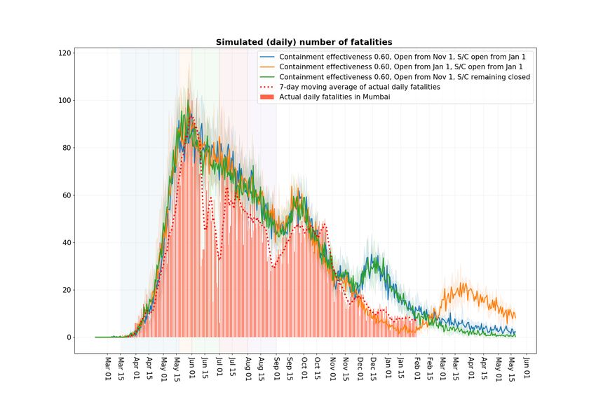
Some observations suggested from the base case: Figure 9 suggests that the
lockdown substantially speeds up the return to normalcy. Under the blue curve one sees that
daily fatalities return to Jan-Feb levels by June 1 due to the lockdown and vaccinations. The
red curve corresponds to no lockdown and vaccinations and in this scenario the normalcy
is delayed by a month. Importantly, vaccines make this normalcy lasting. Else, as the green
curve shows, the fatality numbers would have started to increase from mid July onwards.
Comparing the violet and the blue curve in Figure 10 suggests that the more infectious strain
may have cost the city from 1,500 to 2,500 extra fatalities by September 2021. Figure 11
maps the projected daily infections in different scenarios. It suggests that even under the blue
curve base case, we may see a few thousand new infections each day in September. Various
sero-surveys suggest in Indian metropolitan cities roughly that 15-30 infections result in one
reported case, so that we may still see a few hundred cases daily in September. Figure 12
illustrates the speed with which a highly infective variant can come to dominate once the
economy starts to open.14 Figure 9: Blue curve: Scenario with 2.5% of infected people infected with infectious strain on Feb 1 (2.5 times more infectious). With lockdown from Apr 15 - May 15. And with vaccination effectiveness 0.75 (40% above 60 yrs in Apr, 15 lakhs above 45 yrs in May, 20 lakh above 18 yrs each in June, July and Aug). Orange curve: Scenario without lockdown and without vaccination. Green curve: Scenario with lockdown and without vaccination. Red curve: Scenario without lockdown but with vaccination. Violet curve : Scenario without infectious strain and without lockdown.
15

Figure 10: Blue curve: Scenario with 2.5% of infected people infected with infectious strain on Feb 1 (2.5
times more infectious). With lockdown from Apr 15 - May 15. And with vaccination effectiveness 0.75 (40%
above 60 yrs in Apr, 15 lakhs above 45 yrs in May, 20 lakh above 18 yrs each in June, July and Aug).
Orange curve: Scenario without lockdown and without vaccination. Green curve: Scenario with lockdown and
without vaccination. Red curve: Scenario without lockdown but with vaccination. Violet curve : Scenario without
infectious strain and without lockdown.
16

Figure 11: Blue curve: Scenario with 2.5% of infected people infected with infectious strain on Feb 1 (2.5
times more infectious). With lockdown from Apr 15 - May 15. And with vaccination effectiveness 0.75 (40%
above 60 yrs in Apr, 15 lakhs above 45 yrs in May, 20 lakh above 18 yrs each in June, July and Aug).
Orange curve: Scenario without lockdown and without vaccination. Green curve: Scenario with lockdown and
without vaccination. Red curve: Scenario without lockdown but with vaccination. Violet curve : Scenario without
infectious strain and without lockdown.

        Figure 12: Fraction amongst the infected with the highly infectious strain in the base case.
17
Scenario tested Cases considered
Economy opening on Feb 1 65%, 75%
Compliance Base Case, weaker compliance (2.5x and 2x infectious strain)
Reinfection 0%, 5%, 10%, 2.5% each month (Feb-Jul)
Reinfection without infectious strain 20%, 5% each month (Feb-Jul)
Initial fract. of infected people with new strain 1.5%, 2.5%, 5%, 10%
Infectiousness of new strain 1.5x, 2x, 2.5x, 3x
Trains scale 0.19, 0.40, 0.80
Vaccine effectiveness 75%, 55%, No vaccination
Virulence of New Strain Same as original strain, 1.3 times the original strain
Schools Opening from July 1, Remain closed
Figure 13: Different scenarios considered around the base case.
B. Perturbed scenarios around the base case
The scenarios around the base case that we consider include (these are summarized in
Table 13):
1) Economy opening up: Figure 14 shows the fatality curve when the city opened up
to level 75% on February 1 (red curve) instead of the base case (blue curve) where it
opened at a level 65%. This leads to an increase in fatality levels from around March 1
onwards and somewhat earlier peak time for the fatalities. This illustrates the broader
phenomena that increasing or reducing economic activity would lead to a shift in the
fatality curve that does not help align the base curve with the steepness of the observed
curve. A variable shift, where we first reduce the economic activity and later increase
it may help in a better curve fit, but that does not match with our experience of the
city situation.
2) Compliance: In Figure 15, we show a lower compliance scenario (red curve) and
compare it to the base scenario (blue curve). Again, the red curve leads to an increase
from March 1 onwards in the fatality curve. Its not clear how to reduce or increase
compliance in a realistic manner that would achieve the steepness of the observed
fatality data.
In Figure 16 we consider a more promising scenario where the compliance is lowered
as before, however the variant virus infectiousness is reduced to 2 times from 2.5 times.
This matches the data equally well except at the peak. Further lowering compliance18
Figure 14: Scenario: Opening up of the city. Blue curve: 65% economy opening on Feb
1. Red curve: 75% economy opening on Feb 1.
levels however may be an unrealistic match to reality. Nonetheless, this example il-
lustrates that infectiousness of the new variant of order 2 is also consistent with the
data. Matching any curve too closely leads to over fitting and is not desirable. Further,
peak fatality data around mid to end April may be high due to avoidable fatalities as
Mumbai medical infrastructure was quite stretched around mid-April, so we do not
look for a close match there.
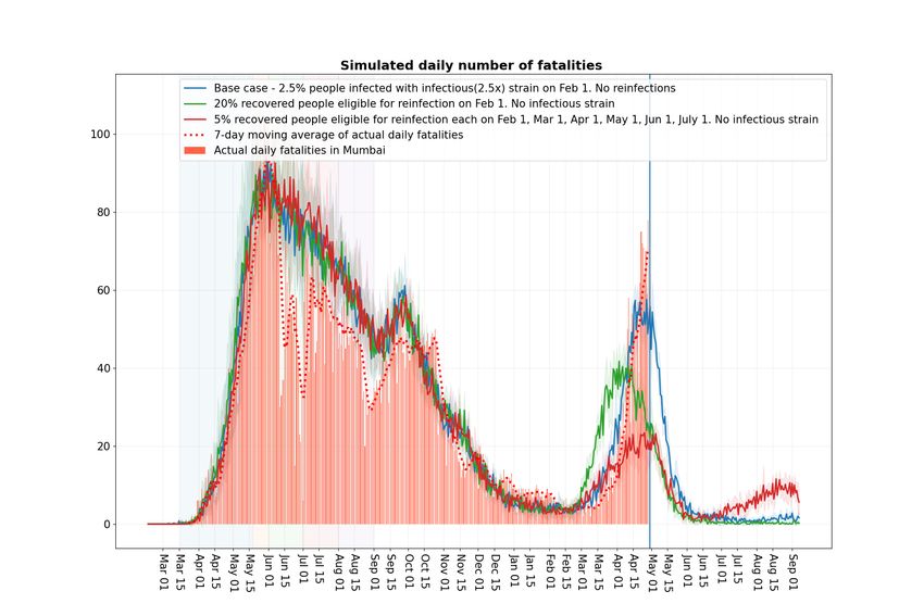
3) Reinfection: In Figure 17 we consider the cases where reinfection is 5% (green curve)
on February 1. Technically, this means that we convert randomly chosen 5% of the
recovered population on February 1, and treat it thereafter as susceptible. Red curve
captures the case where the reinfection is set to 10% on February 1. As Figure 17
shows, increase in reinfection as specified simply leads to higher fatality numbers that
more-or-less increase linearly from March 1 with a high slope. In the orange curve we
consider a case where reinfections are introduced gradually at 2.5% each month from
February 1 to July 1. The curve again increases very steeply. While these are some
ad-hoc numbers, its clear that reinfections would need to increase in a very specific19
Figure 15: Scenario: Variable compliance. Blue curve: Compliance in this scenario is 0.4
in non slums and 0.2 in slums Feb 19 onward and 0.6,0.4 in the lockdown. Red curve: 0.2,
0.1 from Feb 19 to Apr. 14. In the lockdown (Apr 15 - May 15) it is set to 0.4, 0.2 .
manner and combine with appropriate compliance and variant evolution to result in a
curve that matches the observed fatality curve.
In Figure 18 we assume that the variant does not exist and play only with the reinfection
scenarios. The green curve corresponds to 20% reinfection amount on February 1. The
red curve considers the case where reinfections are introduced gradually at 5% each
month from February 1 to July 1. These curves belabour the point that the fatality data
can be explained using only reinfections in a very specific manner, involving much
large number of infections closer to late March compared to those in early March.
A pattern of that sort does not appear natural and does not suggest itself from the
anecdotal reports of reinfected cases, and thus appears unlikely.
Another way to interpret converting the recovered population to susceptible on February
1 in our model is that it directionally accounts for the possible underestimation of the
susceptible population on February 1 by the model. The fact that even in these settings,
the fatality numbers come down to earlier January and February levels on June 1 is20
Figure 16: Scenario: Lower compliance and (2x) infectious strain. Blue Curve: Compliance
in this scenario is 0.4 in non slums and 0.2 in slums Feb 19 to Aprl 14 and 0.6, 0.4 in
the lockdown. Infectiousness of new strain is 2.5 times the original strain. Green curve:
Compliance 0.2, 0.1 from Feb 19 to April 14. In the lockdown (Apr 15 - May 15) it is set
to 0.4, 0.2. Infectiousness of new strain is 2 times the original strain.
reassuring for our projections.
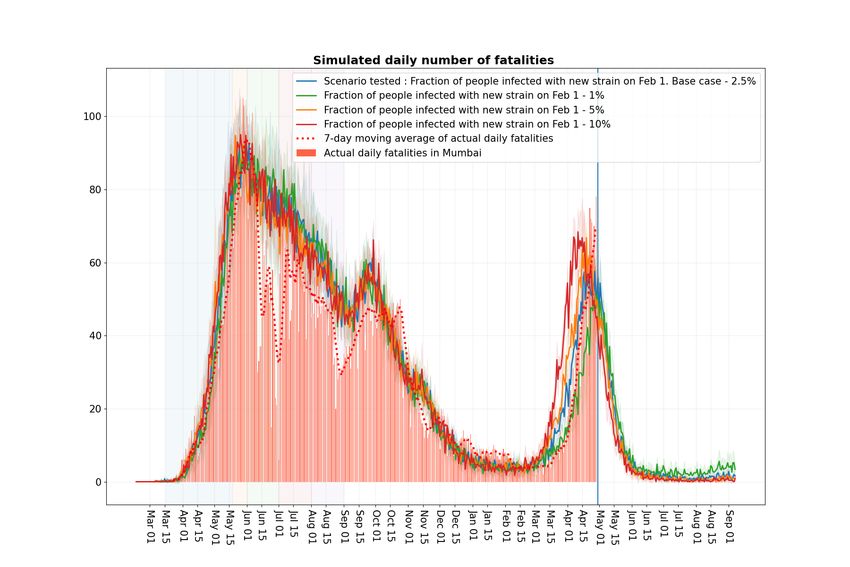
4) Fraction of Infected people infected with the new strain on Feb 1 :
In Figure 19, the red curve corresponds to the case where the new strain is assigned
10% of the infected on Feb 1. The orange curve corresponds to 5% , the green curve
corresponds to 1%, and blue curve with 2.5% denotes the base case. These curves
suggest that values close to but smaller than 2.5% on Feb. 1 perhaps with slightly higher
infectivity may match the observed data a little better than the base case. However, our
broad conclusions are unchanged by this.
5) Infectiousness of new strain : In the base scenario we considered that the new strain
was 2.5 times more infectious than the original strain. In Figure 20, we compare this
base scenario with the scenarios where new strain is 1.5 times (green curve), 2 times
(orange curve) and 3 times (red curve) more infectious than the original strain. The21
Figure 17: Scenario: Reinfections. Blue curve: No reinfections. Red curve: 10% of recovered
people eligible for reinfection on Feb 1. Green curve: 5%. Orange curve: 2.5% each on Feb
1, Mar 1, Apr 1, May 1, Jun 1, Jul 1.
curves reaffirm that 2.5 times infectiousness (blue curve) is a good fit compared to the
neighbouring values.
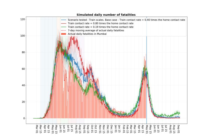
6) Trains: To capture the varying levels in infection spread through trains, in Figure 21, we
consider the scenarios of low βT = 0.19βH (green curve) and high 0.8βH (red curve).
Both the curves provide a similar fit compared to the base case. The high infection
rate red curve matches the steepness of observed fatalities better, however, it results
in much higher fatalities in July and August 2020 than were actually observed. These
curves generally support the idea that an infective variant grew quickly in February
and March, and that trains may have played a role in the infection spread and in its
growth pattern.
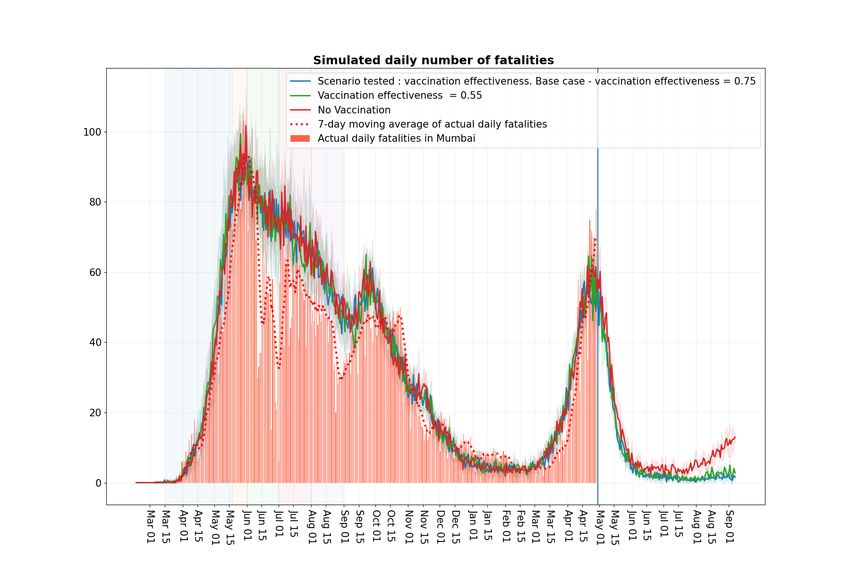
7) Vaccination: To capture the scenario the vaccines may have lower effectiveness, as
well to indicate the effect of the vaccination drive not being as extensive as in the
base case, in Figure 22, we consider the case where vaccine efficacy is 55% (green
curve) and where it is zero (red curve). Recall that in the base case the schools open in22
Figure 18: Scenario: Reinfections. The more infectious strain is absent.
July. Figure 22 suggests that even a moderately successful vaccination drive will help
keep the fatality numbers low in August and September from the ‘third wave’ that may
otherwise result from school opening. Again, as we noted earlier, the decision to open
the schools on July 1 or later is best made closer to those times, when one has a better
idea of the infections resulting from the opening.
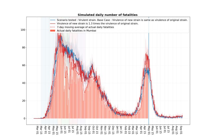
8) Variant virulence: Figure 23 shows the scenario where the new strain virulence or
fatality rate is set to 1.3 times that of the original strain (red curve). This appears to
better match the observed fatality data compared to the base case (blue curve) around
the peak values in late April (when the effect of the new strain is more pronounced as
it becomes dominant around late March). Again, since some of those high values may
be due to avoidable deaths, it is difficult to claim from the experiments that the new
strain maybe more virulent. This is also not suggested by the current Mumbai SCFR
graph.
Implementation: Technically, due to lack of medical data, the increased virulence is
implemented in our model by increasing the probability of an individual transitioning
from symptomatic state to hospitalised state, from hospitalised to critical state, from23
Figure 19: Scenario: Fraction of infected people infected with new strain. Blue curve:
2.5% of infected people infected with infectious strain on Feb 1. Red curve: 10% . Orange
curve: 5% . Green curve: 1% .
critical state to fatality, each by a factor of cube root of 1.3.
9) Schools: In Figure 24, we compare the base case (blue curve) where the schools open
from July 1 to the case where they remain closed (red curve). While the fatalities show a
very minor difference between the two curves, Figure 25, shows that the daily infections
under the base case may be of the order of 2,000 to 4,000. Again, given that typically
15-30 infections lead to a single reported case, this suggests that opening of schools may
lead to a few hundred reported cases each day. Since most of the vulnerable population
would be vaccinated by then, assuming that vaccines are effective, this would translate
to very few fatalities daily.
So were Mumbai trains the key reason for the severe second wave in Mumbai? It appears
that while they certainly contributed to the increasing infections in the city, if they had led
to a dramatic increase, that would have shown up in the fatalities observed in March (given
that fatalities lag exposure by roughly a month). Since, fatalities had a phase change around
end of March, this suggests that trains may not have been the key reason. Opening up of24 Figure 20: Scenario: Infectiousness of new strain. Blue curve: 2.5 times the original strain. Red curve: 3 times . Orange curve: 2 times . Green curve: 1.5 times . Figure 21: Scenario: Train infectivity. Blue curve (base): 0.40. Red curve (high): 0.80. Green curve (low): 0.19.
25

Figure 22: Scenario: Vaccination effectiveness. Blue curve: Vaccination effectiveness =
0.75. Green curve: 0.55 . Red curve: No vaccination.

Figure 23: Scenario: Variant virulence. Blue curve: Virulence is same as original strain.
Red curve: Virulence is 1.3 times the original strain.
26

Figure 24: Scenario: Schools opening. Blue curve: Schools open from July 1. Red curve:
Schools remain closed in July and August.

Figure 25: Scenario: Schools opening. Blue curve: Schools open from July 1. Red curve:
Schools remain closed in July and August.
27

the economy at any nearby time before or after February would likely have led to growth in
variants (since its unlikely that a large proportion of population would have been vaccinated
any time soon), and that is the suggested key reason for the severe second wave as per our
computational experiments. Mumbai trains certainly played an important role in expediting
their spread.

           III. T HE R0     IN OUR MODEL AND OTHER TECHNICAL ENHANCEMENTS

  Recall that R0 denotes the expected number of individuals a single randomly selected
exposed person infects in a city where everyone else is susceptible. It captures the infectivity
of the virus. All else being equal, a higher R0 implies a more infective virus. Below, in
Figure 26, we report the R0 for our model when it is fitted to the fatality data last year, the
base case. See [2] for details of how our model was fit to data. We also report the R0 from
a variant that in our model is two times or two and half times more infective in terms of the
transmission rates compared to the base case.
  The R0 for overall city corresponds to the case where the exposed individual is randomly
selected from across the whole city. We also report R0 when the exposed individual is
randomly selected from a non-slum area as well as from a slum area. It is higher in the latter
case, because in a more dense setting, an individual is likely to interact with more people
and infect more of them.
  Since the current infections in Mumbai are largely in non-slums, the increase in R0 from
non-slums is a better measure of the impact of more infective variants to the city.
  Figure 26 suggests roughly that in the non slum areas the R0 has increased from around
2 to 2.5 for the base case to over 3 under the variants with transmission rates increased by
a factor from 2 to 2.5.

 Relative infectiousness w.r.t. base case   R0 for non slums   R0 for overall city   R0 (inferred) for slums
                    1                        2.17 ± 0.108         4.02 ± 0.27                 5.66
                    2                        3.135 ± 0.15         5.56 ± 0.28                 7.71
                   2.5                        3.55 ± 0.17         6.56 ± 0.31                 9.24

Figure 26: R0 values for non slum areas, overall city and slum areas. The confidence intervals
capture the 95% statistical error from our simulation sampling.

  Below we recall our simulation dynamics. These help illustrate the R0 estimation procedure
as well as the methodology to incorporate more infective variants in our simulation model.
28
A. Simulation dynamics
Recall that our simulation model works as follows (see [2]):
• At a well chosen start time for our simulation, a fixed number of exposed individuals
are seeded in the city where every one else is susceptible.
• The simulation proceeds iteratively over time, incrementing it by ∆t at each time step.
In our simulation ∆t corresponds to 1/4 of a day, or six hours. At each time t, for every
susceptible individual n, its infection rate λn (t) is the sum of infection rates coming
from all the infected individuals in his interaction spaces including home (h), workplace
(w), school (s), community spaces (c) and transport (T ). There are other categories in
0
our model and they may be similarly handled. Thus, if λnn ,a (t) denotes the rate at which
individual n0 in the interaction space a ∈ (h, w, s, c, T ) infects individual n at time t
(this would be zero if n0 is not infective or not interacting with n), we have
0
X
λn (t) = λnn ,a (t).
n0 ,a∈(h,w,s,c,T )
• Then at time t + ∆t, each susceptible individual moves to the exposed state with
probability 1 − exp (−λn (t)∆t), independently of all other events. With the remaining
probability it continues to be susceptible.
• Individuals once exposed, follow a disease progression probabilistic dynamics as spec-
ified in [2]. Some exposed become asymptomatic or symptomatic and they may in-
fect others in the coming time periods. Asymptomatics recover after a short duration.
Symptomatics may either recover or a small age dependent fraction may be hospitalised.
Hospitalised may recover or a small age dependent fraction may become critical. Critical
cases may recover or a small age dependent fraction may pass away.
• Time is then incremented to t + ∆t and the condition of individuals are updated. The
simulation iteratively continues till some large specified terminal time.
Above, if a susceptible individual becomes infected at time t, there remains an issue
of identifying the individual who infected this individual. In our algorithm, this blame is
assigned uniquely to one individual n0 . And this assignment happens with probability
0
X
λnn ,a (t)/λn (t).
a∈(h,w,s,c,T )
This appears to be a fair blame allocation that can be shown to probabilistically asymp-
totically valid as ∆t → 0.
Estimating R0 : At day zero, a randomly selected individual is marked as exposed to the
disease, while all others are marked as susceptible. The selected individual follows the disease29
progression dynamics. When in an infective state, he may infect others. We count the total
number of individuals infected by the selected individual until he is no longer infective. The
above specified allocation rule helps in arriving at this number uniquely. This is a random
quantity. This experiment is repeated independently many times to arrive at an estimator for
R0 .
Modelling the more infectious strain: At a well chosen time, in our case February 1,
2021, a randomly selected fraction of the infectious are selected and marked as having a
variant. Their infection rates to other individuals are accordingly bumped up by the infective
factor. So if the virus is two times more infective, the corresponding rate increases by a factor
2. Our simulation algorithm then proceeds over time with small changes. For each infected
individual we keep track of whether it is infected with an old or a new strain. Further, suppose
that at time t when a susceptible individual n gets infected, we need to decide whether the
infection is from the original strain or from the new one. If λnew
n (t) denotes the overall rate
of infection to person n from the new strain and λold
n (t) denotes the same quantity from the
old strain, so that
λn (t) = λnew old
n (t) + λn (t).
Then, this person is assigned a new strain with probability
λnew
n (t)
.
λn (t)
and old strain with the remaining probability. Else, the algorithm proceeds as before.
IV. O CTOBER REPORT RESULTS
Figure 27 reproduces the fatality projections from our October Report [3] where the
scenario of the economy opening up on November 1, green curve, and the economy opening
up on January 1, orange curve, are considered. Figure 28 shows the same curve with the
observed fatality numbers updated till February 1. Since opening up on January 1 does not
impact the fatalities till the end of January, the projections are valid till that time although the
major opening up in Mumbai happened on February 1. While the projections hold quite well
till mid-December, Figure 28 shows that they underestimate thereafter. As the violet curve in
Figure 9 shows, this is significantly corrected once we assume increased laxity in population
in December and January. In fact, that does a pretty good job of explaining fatalities right
up to the first week of March. Of course, as we mentioned earlier, the subsequent increase
in cases and fatalities were difficult to explain simply by assuming laxity in the population,
and are best explained by assuming highly infective variants.30
Figure 27: Simulated number of daily fatalities projections for Nov, Dec, Jan under the workplace opening
schedule 5% attendance, May 18 to May 31st, 15% attendance in June, 25% in July, 33% in August, 50%
in September and October and fully open November onwards with School/Colleges opening from January 1.
This schedule is overlaid with scenarios of 1) workplace attendance of 100% and school/colleges opening from
January 1, 2) Workplace fully open from November 1 and school/colleges remaining closed. All the scenarios
include the three festival relaxations.
Figure 28: Figure 27 specifications with observed fatality data till January end.31
V. A PPENDIX
The contact rates used for experiments (see Fig 29) are same as in our earlier report [3].
Interaction space Comment β value
Home (calibrated) 1.93651
Workplace (calibrated) 0.26862
Community (calibrated) 0.02152
School 2 · βworkplace 0.53723
Project 9 · βworkplace 2.41758
Class 9 · βschool 4.83507
Neighbourhood 9 · βcommunity 0.19368
Close friends 9 · βcommunity 0.19368
Figure 29: Interaction spaces, subnetworks and contact rates
Following are the SCFR graphs for India (Fig 30), for other districts in Maharashtra (Fig
31) as well as for some of the states (Fig 32, 33) with the largest number of people infected
in the second wave.
Figure 30: Comparison of Shifted Case Fatality Rate (Red curve) and Case Fatality Rate
(Blue curve) for India. Given the current level of infection spread in India, clearly SCFR is
a better measure of disease severity compared to CFR32 Figure 31: Comparison of Shifted Case Fatality Rate (Red curve) and Case Fatality Rate (Blue curve) for different districts of Maharashtra (Nagpur, Nashik, Pune and Thane). Nagpur has a SCFR nearing 2, while all the other districts are around 1, with Pune having the smallest SCFR value. Figure 32: Comparison of Shifted Case Fatality Rate (Red curve) and Case Fatality Rate (Blue curve) for different states of India ( Delhi, Kerala, Maharashtra and Punjab ).
33

Figure 33: Comparison of Shifted Case Fatality Rate (Red curve) and Case Fatality Rate
(Blue curve) for different states of India (Uttar Pradesh and West Bengal).

  We refer the reader to our October Report [3], Page 5 for additional caveats associated
with this report.

                                            ACKNOWLEDGMENTS

  We thank our colleagues Prahladh Harsha, Ramprasad Saptharishi and Piyush Srivastava
for many useful suggestions that helped our analysis. We thank them as well as our IISc
collaborators R. Sundaresan, P. Patil, N. Rathod, A. Sarath, S. Sriram, and N. Vaidhiyan for
their tireless efforts in developing the IISc-TIFR Simulation model [2] and their key role in
our earliers report on Mumbai. We thank IDFC Institute for sponsoring Daksh Mittal’s work
with the TIFR COVID-19 City-Scale Simulation Team.
  We thank Mrs. Ashwini Bhide, AMC, MCGM for her insights and for her crucial data in-
puts. We also thank Shri Saurabh Vijay, Secretary, Higher & Technical Education Department,
Government of Maharashtra for his insights and data inputs.
  We acknowledge the support of A.T.E. Chandra Foundation for this research. We further
acknowledge the support of the Department of Atomic Energy, Government of India, to TIFR
under project no. 12-R&D-TFR-5.01-0500.

                                                 R EFERENCES
[1] “Explained: B.1.617 variant and the Covid-19 surge in India,” https://indianexpress.com/article/explained/
    maharashtra-double-mutant-found-b-1-617-variant-and-the-surge-7274080/.
[2] S. Agrawal, S. Bhandari, A. Bhattacharjee, A. Deo, N. Dixit, P. Harsha, S. Juneja, P. Kesarwani, A. Swamy,
    P. Patil, N. Rathod, R. Saptharishi, S. Shriram, P. Srivastava, R. Sundaresan, N. K. Vaidhiyan, and
    S. Yasodharan, “City-scale agent-based simulators for the study of non-pharmaceutical interventions in the
    context of the covid-19 epidemic,” Journal of the Indian Institute of Science, Nov. 2020. [Online]. Available:
    https://link.springer.com/article/10.1007/s41745-020-00211-3
[3] P. Harsha, S. Juneja, D. Mittal, and R. Saptharishi, “Covid-19 epidemic in Mumbai: Projections, full economic
    opening, and containment zones versus contact tracing and testing: An update,” Oct. 2020. [Online]. Available:
    https://arxiv.org/abs/2011.02032
34
[4] S. Juneja, “Projections for fatalities in second Covid-19 wave for Mumbai (reported on March 31, 2021).” [Online].
Available: https://twitter.com/sandeepjuneja66/status/1377228683614711809
[5] ——, “Projections for cases in second Covid-19 wave for Mumbai (reported on April 15, 2021).” [Online]. Available:
https://twitter.com/sandeepjuneja66/status/1382688189287182355
[6] “Reopening Schools After COVID-19 Closures; THE LANCET COVID-19 COMMISSION INDIA TASK FORCE,”
https://covid19commission.org/regional-task-force-india, 04 2021.
[7] R. Verity, L. C. Okell, I. Dorigatti, P. Winskill, C. Whittaker, N. Imai, G. Cuomo-Dannenburg, H. Thompson, P. G.
Walker, H. Fu et al., “Estimates of the severity of coronavirus disease 2019: a model-based analysis,” The Lancet
Infectious Diseases, 2020.
[8] A. Malani, D. Shah, G. Kang, G. Lobo, J. Shastri, M. Mohanan, R. Jain, S. Agrawal, S. Juneja, S. Imad, and U. Kolthur-
Seetharam, “Seroprevalence of SARS-CoV-2 in slums and non-slums of Mumbai, India, during June 29-July 19, 2020,”
The Lancet Global Health, 2020.
[9] “Delhi’s 5th sero survey: Over 56% people have antibodies against Covid-19,” https://www.hindustantimes.com/cities/
delhi-news/delhis-5th-sero-survey-over-56-people-have-antibodies-against-covid19-101612264534349.html.
[10] “21 per cent seroprevalence across India, shows survey, ICMR says prevention key,” https://indianexpress.com/article/
india/21-per-cent-seroprevalence-across-india-shows-survey-icmr-says-prevention-key-7175117/.
[11] “Covid-19 Google Mobility Report.” [Online]. Available: https://datastudio.google.com/u/0/reporting/
a529e043-e2b9-4e6f-86c6-ec99a5d7b9a4/page/yY2MB?s=ho2bve3abdM
[12] Brihanmumbai Mahanagarpalika, “Mumbai’s lifeline back on track! local trains to resume services w.e.f 1st Feb,
2021.” [Online]. Available: https://twitter.com/mybmc/status/1355129314069635075?lang=en
[13] Government of Maharashtra, “Break The Chain Order, 13 April 2021.” [Online]. Available: https://www.maharashtra.
gov.in/Site/Upload/Government%20Resolutions/English/202104131835496719.pdf
[14] “Mumbai suburban railway.” [Online]. Available: https://en.wikipedia.org/wiki/Mumbai Suburban Railway
[15] “BEST’s daily ridership climbs to 23 lakh, back to 2018’s average,” https://timesofindia.indiatimes.com/city/mumbai/
bests-daily-ridership-climbs-to-23-lakh-back-to-2018s-average/articleshow/79120094.cms.
[16] Government of Maharashtra, “Break The Chain Order, 29 April 2021.” [Online]. Available: https://www.maharashtra.
gov.in/Site/Upload/Government%20Resolutions/English/202104291928342619.pdf
[17] “BMC issues fresh guidelines as cases rise in Mumbai,” https://indianexpress.com/article/cities/mumbai/
bmc-issues-fresh-guidelines-as-cases-rise-in-mumbai-7195097/.
[18] P. Harsha, S. Juneja, P. Patil, N. Rathod, R. Saptharishi, A. Sarath, S. Sriram, P. Srivastava, R. Sundaresan, and
N. Vaidhiyan, “COVID-19 Epidemic Study II: Phased emergence from the lockdown in Mumbai,” Jun. 2020.
[Online]. Available: https://arxiv.org/abs/2006.03375
[19] World Health Organisation, “Pulse survey on continuity of essential health services during the COVID-
19 pandemic: interim report, 27 August 2020,” https://www.who.int/publications/i/item/WHO-2019-nCoV-EHS
continuity-survey-2020.1, 08 2020.You can also read