CUSTOMIZER Installation and User Manual - Kanardia.eu
←
→
Page content transcription
If your browser does not render page correctly, please read the page content below
CUSTOMIZER
Installation and User Manual
        © Kanardia d.o.o.
           April 2021

          Revision 2.0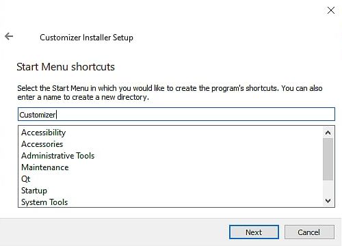
Customizer — Manual
Contact Information
Publisher and producer:
Kanardia d.o.o.
Lopata 24a
SI-3000
Slovenia
Tel: +386 40 360 512
Email: info@kanardia.eu
A lot of useful and recent information can be also found on the Internet.
See http://www.kanardia.eu for more details.
Copyright
This document is published under the Creative Commons, Attribution-ShareAlike 3.0 Un-
ported licence. Full license is available on http://creativecommons.org/licenses/by-sa/
3.0/legalcode web page and a bit more human readable summary is given on http:
//creativecommons.org/licenses/by-sa/3.0/. In short, the license gives you right to
copy, reproduce and modify this document if:
you cite Kanardia d.o.o. as the author of the original work,
you distribute the resulting work only under the same or similar license to this one.
Credits
This document was written using TeX Live (LATEX) based document creation system using
Kile running on Linux operating syseeetem. Most of the figures were drawn using Inkscape.
Photos and scanned material was processed using Gimp (GNU Image Manipulation Program).
All document sources are freely available on request under the licence mentioned above and
can be obtained by email. Please send requests to info@kanardia.eu.
Revision History
The following table shows the revision heistory of this document.
Rev. Date Description
1.0 March 2020 Initial release
1.1 April 2020 Third Party Software section
1.2 May 2020 Minor fixes
2.0 April 2021 Revision for Customizer v2.0
2 © Kanardia 2021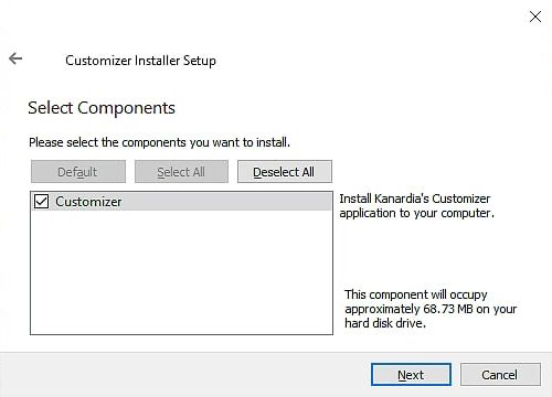
Customizer — Manual                                                                   CONTENTS

Contents

1 Introduction                                                                                    5
  1.1   General Description . . . . . . . . . . . . . . . . . . . . . . . . . . . . . . . .        5
  1.2   Supported Instruments . . . . . . . . . . . . . . . . . . . . . . . . . . . . . . .        5

2 Installation                                                                                     6
  2.1   Download . . . . . . . . . . . . . . . . . . . . . . . . . . . . . . . . . . . . . .       6
  2.2   Installation . . . . . . . . . . . . . . . . . . . . . . . . . . . . . . . . . . . . .     6
        2.2.1   Linux . . . . . . . . . . . . . . . . . . . . . . . . . . . . . . . . . . . .      6
        2.2.2   MacOS . . . . . . . . . . . . . . . . . . . . . . . . . . . . . . . . . . .        6
        2.2.3   Windows . . . . . . . . . . . . . . . . . . . . . . . . . . . . . . . . . .        7
  2.3   Uninstall   . . . . . . . . . . . . . . . . . . . . . . . . . . . . . . . . . . . . . .    8
        2.3.1   Linux . . . . . . . . . . . . . . . . . . . . . . . . . . . . . . . . . . . .      8
        2.3.2   MacOS . . . . . . . . . . . . . . . . . . . . . . . . . . . . . . . . . . .        9
        2.3.3   Windows . . . . . . . . . . . . . . . . . . . . . . . . . . . . . . . . . .        9
  2.4   Support . . . . . . . . . . . . . . . . . . . . . . . . . . . . . . . . . . . . . . .      9

3 Tools & Features                                                                                10
  3.1   Toolbar . . . . . . . . . . . . . . . . . . . . . . . . . . . . . . . . . . . . . . .     10
        3.1.1   New . . . . . . . . . . . . . . . . . . . . . . . . . . . . . . . . . . . . .     10
        3.1.2   Open    . . . . . . . . . . . . . . . . . . . . . . . . . . . . . . . . . . . .   10
        3.1.3   Save & Save As . . . . . . . . . . . . . . . . . . . . . . . . . . . . . . .      10
        3.1.4   Zoom Options . . . . . . . . . . . . . . . . . . . . . . . . . . . . . . .        11
        3.1.5   Unit Settings . . . . . . . . . . . . . . . . . . . . . . . . . . . . . . . .     11
        3.1.6   Screenshot    . . . . . . . . . . . . . . . . . . . . . . . . . . . . . . . . .   11
        3.1.7   Engines . . . . . . . . . . . . . . . . . . . . . . . . . . . . . . . . . . .     11
        3.1.8   Clear   . . . . . . . . . . . . . . . . . . . . . . . . . . . . . . . . . . . .   11
        3.1.9   Close   . . . . . . . . . . . . . . . . . . . . . . . . . . . . . . . . . . . .   11
        3.1.10 About . . . . . . . . . . . . . . . . . . . . . . . . . . . . . . . . . . . .      12
  3.2   Layout . . . . . . . . . . . . . . . . . . . . . . . . . . . . . . . . . . . . . . . .    13
        3.2.1   Element Lists . . . . . . . . . . . . . . . . . . . . . . . . . . . . . . . .     13
        3.2.2   Design Area . . . . . . . . . . . . . . . . . . . . . . . . . . . . . . . . .     13
        3.2.3   Tools   . . . . . . . . . . . . . . . . . . . . . . . . . . . . . . . . . . . .   15
        3.2.4   Properties . . . . . . . . . . . . . . . . . . . . . . . . . . . . . . . . . .    16

                                                3                                   © Kanardia 2021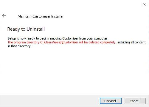
Customizer — Manual                                                                   CONTENTS

4 Digi I                                                                                          17
  4.1   Elements    . . . . . . . . . . . . . . . . . . . . . . . . . . . . . . . . . . . . . .   17
  4.2   Properties . . . . . . . . . . . . . . . . . . . . . . . . . . . . . . . . . . . . . .    24
        4.2.1   Engine Defaults . . . . . . . . . . . . . . . . . . . . . . . . . . . . . . .     24
        4.2.2   Colors . . . . . . . . . . . . . . . . . . . . . . . . . . . . . . . . . . . .    25
        4.2.3   Limits . . . . . . . . . . . . . . . . . . . . . . . . . . . . . . . . . . . .    26
        4.2.4   Test Value . . . . . . . . . . . . . . . . . . . . . . . . . . . . . . . . . .    27
        4.2.5   Alarms . . . . . . . . . . . . . . . . . . . . . . . . . . . . . . . . . . .      29
        4.2.6   Text Alignment . . . . . . . . . . . . . . . . . . . . . . . . . . . . . . .      29

5 Indu                                                                                            32
  5.1   Elements    . . . . . . . . . . . . . . . . . . . . . . . . . . . . . . . . . . . . . .   32
  5.2   Scales . . . . . . . . . . . . . . . . . . . . . . . . . . . . . . . . . . . . . . . .    33
        5.2.1   Properties . . . . . . . . . . . . . . . . . . . . . . . . . . . . . . . . . .    33

6 Updating the Instrument                                                                         37

                                                4                                   © Kanardia 2021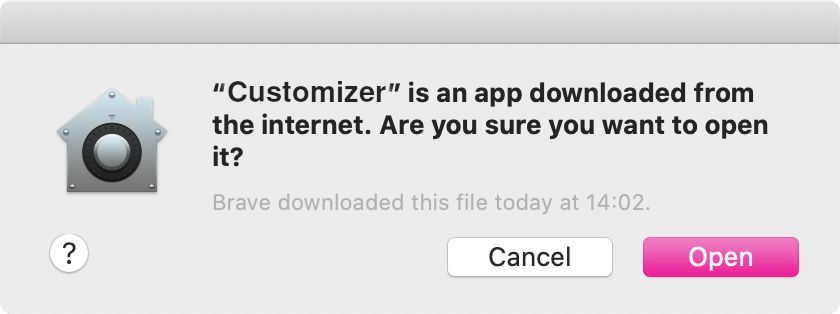
Customizer — Manual                                                                1. Introduction

1        Introduction
First of all, we would like to thank you for choosing Kanardia.
Customizer offers a quick way to customize your Instruments’ display. This manual describes
the installation process, instructions for use and connection to your device.
Customizer is used in combination with BLU and KANJA. They are necessary for data
transfer from the PC on which you are running Customizer to your Kanardia instrument.

1.1        General Description
Customizer is a desktop application for our instruments’1 display customization. It lets the
user choose what information you wish to display and how you wish to display it. It is simple
and intuitive to use.
Customizer features more than 40 engine functions and a dozen different graphical elements
for function values display. You can choose the units you prefer, customize value limits and
set alarm warnings. And most importantly, your display layout is completely up to you.

1.2        Supported Instruments
The following table shows supported instruments.

                      Version     Date             Instruments
                      1.0         March 2020       Digi I, Indu Round Indicators
                      2.0         March 2021       Digi I, Indu Round Indicators

                                 Table 1: Currently supported instruments

    1
        Instruments available for customization can be found in Table 1.

                                                         5                         © Kanardia 2021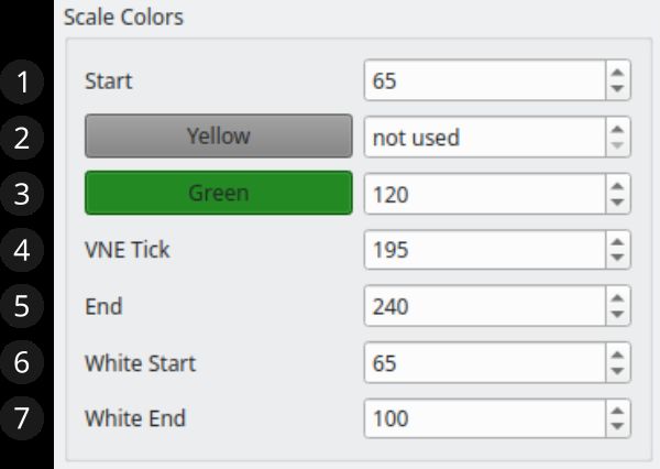
Customizer — Manual                                                           2. Installation

2     Installation
Customizer is supported for Linux, macOS and Windows.

2.1     Download
Go to https://www.kanardia.eu/support/firmware/ and find your operating system. Click
the link to download the application to your computer.

2.2     Installation

2.2.1    Linux

    1. Unzip the archive

    2. Move the Customizer.AppImage file to your Desktop or to another folder of your choice

    3. Right-Click on the Customizer icon, select Properties

    4. Open the Permissions tab

    5. Make sure that ’Is executable’ checkbox is checked

    6. Select OK to close the window

No other installation steps are required. Double click (or single, depending on your OS
settings) to run.

2.2.2    MacOS

    1. Unzip the archive

    2. Open the Installer.dmg file. You will find the Customizer app and a link to the
       Applications folder inside

    3. Drag Customizer to Applications folder

    4. Close the installer and eject it

                                                6                            © Kanardia 2021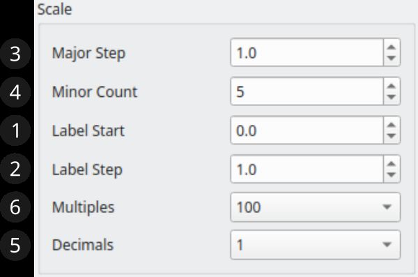
Customizer — Manual                                                        2.2   Installation

  5. Open Launchpad, find Customizer and run it

  6. If a dialog pops-up, asking for permission to run, click Open

2.2.3   Windows

  1. Unzip the archive

  2. Run the CustomizerInstaller.exe

  3. Select the location where you want the application’s data to be installed

  4. Select all components and a shortcut location

  5. Click Install and wait for the installation to complete

  6. Click Finish

                                             7                               © Kanardia 2021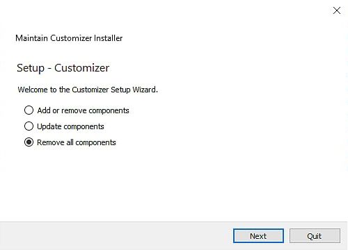
Customizer — Manual                                                         2.3   Uninstall

After completing the installation, find Customizer in the Start menu or on your Desktop.
In case that Windows Defender prevents you from running the application. Follow these
simple steps:

2.3     Uninstall

2.3.1    Linux

Delete Customizer.AppImage:

                                            8                               © Kanardia 2021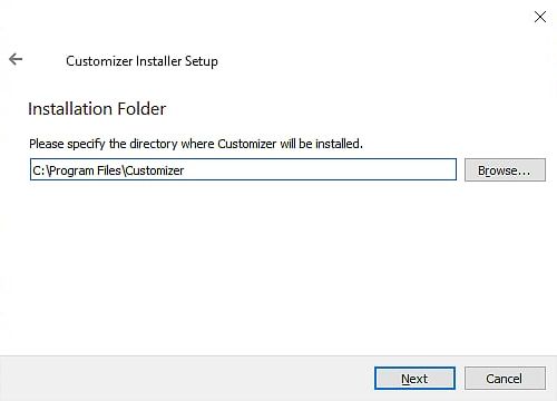
Customizer — Manual                                                          2.4   Support

     1. Left-click on the application icon to select it

     2. Press the DEL key on your keyboard
or
     1. Right-click on the application icon

     2. Select Move to Trash option

2.3.2     MacOS

     1. Open Finder

     2. Find the Applications subfolder

     3. Select Customizer

     4. Press the (CMD + ) Backspace key on your keyboard

2.3.3     Windows

     1. Open Control Panel

     2. Under section Programs click Uninstall a program

     3. Find Customizer on the list

     4. Select it and click Uninstall

     5. Select ’Remove all components’.

     6. To confirm, click Uninstall

2.4     Support
For help, feedback or in case of application errors, please contact: support@kanardia.eu

                                               9                            © Kanardia 2021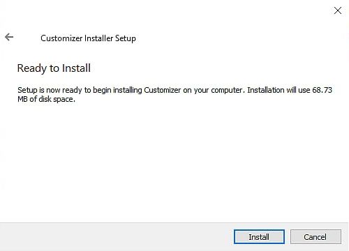
Customizer — Manual                                                        3. Tools & Features

3     Tools & Features

3.1     Toolbar
Figure 1 illustrates the application toolbar with available actions. Action explanations follow.

                                Figure 1: Customizer toolbar

3.1.1    New

This action creates a new project. In the dialog that opens, input the name of the project.
Then, select the instrument you wish to customize and that instrument’s model. Click OK to
confirm your choices. A blank project is opened and ready for you to start customizing.

                                 Figure 2: New Project dialog

3.1.2    Open

Opens a file dialog. Find a project you wish to import and click OPEN. All project files should
have a .iml extension.

3.1.3    Save & Save As

Save your project information to an external file. When prompted by the dialog, input the
file name and location. Click Save.

                                Figure 3: Save Project dialog

Program information is formatted and written into a YourFileName.iml file. This file can
then be used to modify your instrument display or it can be opened by Customizer again.

                                              10                                © Kanardia 2021
Customizer — Manual 3.1 Toolbar
3.1.4 Zoom Options
There are three options for scaling the screen. Zoom-In, Zoom-Out and Default-Zoom. These
functionalities are for ease of use in the Customizer application and will not affect scaling on
your actual device.
3.1.5 Unit Settings
Figure 4 illustrates a dialog with unit preferences.
SAVE saves selected units to the current project.
Next time you open this same project, these
same units will be loaded.
SAVE DEFAULTS sets selected units for the whole
application. Every time you create a new
project, these units will be used as default.
LOAD DEFAULTS overwrites the current options
and loads the units you last saved as defaults.
Element property values are converted accordingly.
3.1.6 Screenshot
Takes a screenshot of your project screen. You can
save a screenshot of the screen.
Figure 4: Unit Settings dialog
A file dialog is opened. Choose the name of the screen-
shot and the file format. The default format is .png,
but you can choose another image format.
3.1.7 Engines
A dropdown menu with a list of commonly used aircraft engines can be found in the toolbar.
Each engine has its own characteristics, which can be useful when editing layout element’s
properties. Read more about engine defaults in section 4.2.1.
Figure 5: Engine selection
3.1.8 Clear
Removes all the elements from the Design Area but does not close the project. This action
is reversible with the Undo action.
3.1.9 Close
Closes current project.
11 © Kanardia 2021Customizer — Manual 3.1 Toolbar
3.1.10 About
You can find your current Customizer software version in the About dialog.
Also listed are:
Contact information,
publisher and
help.
12 © Kanardia 2021Customizer — Manual 3.2 Layout
3.2 Layout
Figure 6 illustrates a general application layout.
Figure 6: General layout of the application
O Element Lists
1 O Design Area
2 O Properties
4
O Tools
3
3.2.1 Element Lists
Lists of all elements for your selected instrument and model. Elements are a graphic repre-
sentation of a function value displayed on the instrument’s screen.
To add a new element to your project, drag it from the list to the Design Area. Drop it
whererever you want. Alternatively, double-click an element and it will be added to the
center of the screen.
More details about specific elements can be found under each instrument’s self-titled section
of this document.
3.2.2 Design Area
A black screen is centered in the Design Area and is a representation of your device’s display.
Overlaying the screen is the instrument’s scale or mask. On the real Kanardia instrument, its
scale or its mask might obscure a small part of the screen. This information is useful when
positioning the elements.
Elements can be added to the screen from the list of elements.
13 © Kanardia 2021Customizer — Manual 3.2 Layout
Working with the elements in the Design Area:
Selection
Left-Click an element in the Design Area to select it. Select multiple elements with
a combination of CTRL2 and Left-Click or with mouse-drag selection. To select all
elements in the Design Area use the shortcut CTRL2 + A. Selected elements are identified
with a dashed border.
Boundaries
Elements not fully positioned inside the screen are colored red. Out of bounds elements
will not be displayed on your device, but can be saved as a part of your project.
Positioning
Selected elements can be moved around in various ways:
– Mouse drag
– Keyboard arrows press (moved by 1 px)
– CTRL2 + keyboard arrows press (moved by 10 px)
– Position from Tools
– Align & Center from Tools
Deletion
To remove selected element(s) from the Design Area use DELETE or BACKSPACE keys on
your keyboard. Alternatively, drag your selection out of the Design Area.
Duplication
The keyboard combination CTRL2 + D duplicates selected elements, including their prop-
erties.
Grouping & Ungrouping
The keyboard combination CTRL2 + G groups selected elements into one entity. This
action can be useful when working on element positioning. The combination CTRL2 +
SHIFT + G ungroups the selected group - returns grouped elements to seperate entities.
Undo & Redo
To undo any element changes use CTRL2 + Z. Then use CTRL2 + SHIFT + Z to redo them.
Copy & Paste Properties
With a right-click on an element, a context menu appears.
– ’Copy Properties’ option copies and saves chosen elements’ properties.
– ’Paste Properties’ overwrites current properties with the ones saved when last
clicking on ’Copy Properties’. If there exist no saved properties, ’Paste Properties’
is disabled. If element types differ, only properties common to both are pasted.
Zoom3
Zoom can be achieved with a combination of CTRL key & mouse wheel or touchpad
pinch for MacOS users. Another option is to use zoom actions from the toolbar.
2
On macOS keyboards use the CMD key instead.
14 © Kanardia 2021Customizer — Manual 3.2 Layout
3.2.3 Tools
Position
Set element’s coordinates. The point (x,y) represents the top left corner of the element.
(0,0) is the top left corner of the instrument’s screen.
Align & Center
Repositions selected elements depending on the selection from the dropdown menu.
– ’To screen’ option: Aligning and centering selected elements relative to the screen’s
geometry (coordinates and size). E.g. pressing ’Align Top’ will align selected
elements to screen’s top edge.
– ’To selection’ option: Aligning and centering selected elements relative to ea-
chother’s geometries (coordinates and sizes). E.g. pressing ’Align Top’ will align
all selected element’s top edges.
Top Bottom Left Right
Vertical Horizontal
Center Center
Distribute
Possible for three or more selected elements. Rearranges selection so that vertical or
horizontal gaps between subsequent elements are all equal.
Vertical Horizontal
Distribution Distribution
Grid3 & Snapping
Grid is a visual helper for the user. Choose how many vertical and how many horizontal
lines you wish to see. Maximum number of grid lines depends on the screen size of the
instrument. Check or uncheck the ’Show grid’ chekcbox to toggle grid’s visibility.
3
For customizing purposes only, it has no effect on your instrument’s actual display
15 © Kanardia 2021Customizer — Manual 3.2 Layout
Check the ’Snap to grid’ checkbox to turn on the snapping functionality. Snapping
works when only one element is selected (including groups). After dragging and releas-
ing the element, if any of its borders is close enough to any of the grid lines, the element
positon will change to align that border to the closest grid line.
3.2.4 Properties
Tables of properties for the selected element. Properties allow you to modify the element’s
behaviour.
When more than one element is selected, the table is shown only if all selected elements are
of the same type. (For example - 3 Horizontal Bars.)
Modifiying a property value when multiple items are selected, updates this property for
the whole selection. If a property value differs for any of the selected elements, *VARIOUS*
keyword is shown as a placeholder.
Here is a list with some generic properties and an explanation of their functionalities.
FUNCTION Gives the element its main function. For example: RPM, fuel pressure,
oil temperature, CHT, ...
TEST VALUE Numeric input for the selected function value.3 Uses units set in the
Unit Settings dialog.
LABEL Text input.
FONT SIZE Changes size of the label or the value.
Other properties are element specific and will be explained in more detail in the next sections.
Property Validation
Some of the properties are additionally validated by the application. An orange banner is
shown at the right bottom corner of the Customizer window.
Figure 7: Validation banner example
Messages in the banner list element’s invalid properties and explanations of the problems.
An example banner is illustrated in Figure 7.
To indicate elements with validation problems, a triangular exclamation icon is posi-
tioned over them.
To hide the banner and the icon, resolve the mentioned problems.
Validation messages are of informative nature and will be ignored when saving your project.
16 © Kanardia 2021Customizer — Manual 4. Digi I
4 Digi I
Digi I is an engine information system. With Customizer you can modify its graphic elements
and their layout.
The next sections describe every Digi element, its properties and how to customize it.
4.1 Elements
Digi’s elements are simple graphical displays of different engine function values.
Elements can be defined and modified with the properties available from the properties tab
on the right hand side of the application. Read about each element’s properties below.
Label
Label is a short text with a 15 character upper limit. No special characters are allowed.
Label displays a short text.
Font Size options vary from tiny to normal.
Value
Value is a simple way to display a function value with its unit.
Test Value displays a numeric value (this is a place holder for the actual value you
will see when using Kanardia instrument).
Function sets the element’s main functionality. Its units can be changed in the Units
Settings dialog. Note that whether or not a function available from Customizer will
work on Digi depends on your CAN connections.
Five Font Size options ranging from tiny to huge.
Alignment modifies text alignment (more in section 4.2.6).
Alarm Low sets the type of warning to be displayed when function value enters the
low range. Read more on alarms in section 4.2.5.
Alarm High sets the type of warning to be displayed when function value enters the
high range. Read more on alarms in section 4.2.5.
Color ranges are set with color limits - Yellow Low, Yellow High, Green Low
and Green High. For more information on how to correctly set the color limits refer
to section 4.2.
This element has no visual color representations, yet stil has the option to set the color limits
as the latter influence alarm behaviour.
17 © Kanardia 2021Customizer — Manual 4.1 Elements
Time
Time element is a simple way to display time-related function values.
Test Value displays a numeric value (this is a place holder for the actual value you
will see when using Kanardia instrument).
Time element is used to display various time Functions: engine total time, flight time,
flight total time and power total time . Note that whether or not a function available
from Customizer will work on Digi depends on your CAN connections.
Five Font Size options ranging from tiny to huge.
Alignment modifies text alignment (more in section 4.2.6).
Box
Box combines properties of both Label and Value in a single element.
Test Value displays a numeric value (this is a place holder for the actual value you
will see when using Kanardia instrument).
Function sets the element’s main functionality. Its units can be changed in the Units
Settings dialog. Note that whether or not a function available from Customizer will
work on Digi depends on your CAN connections.
Label displays a short text.
Alarm Low sets the type of warning to be displayed when function value enters the
low range. Read more on alarms in section 4.2.5.
Alarm High sets the type of warning to be displayed when function value enters the
high range. Read more on alarms in section 4.2.5.
Color ranges are set with color limits - Yellow Low, Yellow High, Green Low
and Green High. For more information on how to correctly set the color limits refer
to section 4.2.
This element has no visual color representations, yet stil has the option to set the color limits
as the latter influence alarm behaviour.
18 © Kanardia 2021Customizer — Manual 4.1 Elements
Throttle Box & Throttle Value
Throttle elements display throttle position value expressed in percent. Note that Customizer
displays the value as a ratio 0.00 ∼ 1.00, but Digi displays it in percent.
Test Value displays a numeric value (this is a place holder for the actual value you
will see when using Kanardia instrument).
Five Font Size options ranging from tiny to huge. Available for Throttle Value.
Throttle Value has the Alignment property. Alignment modifies text alignment
(more in section 4.2.6).
Label displays a short text. Label is editable for Throttle Box.
Throttle elements support two different Engine Types - Rotax 915 iS and Rotax 912
iS.
Arc
Arc combines a graphic display of the function value - an arc and a needle, together with its
numeric value.
Test Value displays a numeric value (this is a place holder for the actual value you
will see when using Kanardia instrument). Also, it influences the needle’s angle.
Function sets the element’s main functionality. Its units can be changed in the Units
Settings dialog. Note that whether or not a function available from Customizer will
work on Digi depends on your CAN connections.
Label displays a short text.
Alarm Low sets the type of warning to be displayed when function value enters the
low range. Read more on alarms in section 4.2.5.
Alarm High sets the type of warning to be displayed when function value enters the
high range. Read more on alarms in section 4.2.5.
Color ranges are set with color limits - Yellow Low, Yellow High, Green Low
and Green High. For more information on how to correctly set the color limits refer
to section 4.2.
Properties Low End and High End set different sequences of color ranges. The former
for the left half of the element and the latter for the right half.
19 © Kanardia 2021Customizer — Manual 4.1 Elements
Arc indicator’s (needle) angle is an interpolation of the Test Value and the color limits
for the chosen color ranges. For more information about colors, limits and alarms refer to
section 4.2.
Horizontal Bar
Horizontal bar combines a graphic display of the function value - a bar and an indicator,
together with its numeric value.
Test Value displays a numeric value (this is a place holder for the actual value you
will see when using Kanardia instrument).
Function sets the element’s main functionality. Its units can be changed in the Units
Settings dialog. Note that whether or not a function available from Customizer will
work on Digi depends on your CAN connections.
Label displays a short text.
Alarm Low sets the type of warning to be displayed when function value enters the
low range. Read more on alarms in section 4.2.5.
Alarm High sets the type of warning to be displayed when function value enters the
high range. Read more on alarms in section 4.2.5.
Color ranges are set with color limits - Yellow Low, Yellow High, Green Low
and Green High. For more information on how to correctly set the color limits refer
to section 4.2.
Properties Low End and High End set different sequences of color ranges. The former
for the left half of the element and the latter for the right half.
Bar indicator’s position is an interpolation of the Test Value and the color limits for the
chosen color ranges. For more information about colors, limits and alarms refer to section
4.2.
Carburetor Bar
Carburetor Bar is a graphic element displaying Carburetor Temperature. It features a Green-
Yellow-Green colored bar. Color limits for Carburetor Bar are distributed differently to the
ones in the Horizontal Bar so please refer to section 4.2.3 for a more detailed color limit
setting instruction.
Test Value displays a numeric value (this is a place holder for the actual value you
will see when using Kanardia instrument). The value is displayed next to the bar.
20 © Kanardia 2021Customizer — Manual 4.1 Elements
Label displays a short text.
Color ranges are set with color limits - Yellow Low, Yellow High, Green Low
and Green High. For more information on how to correctly set the color limits refer
to section 4.2.
Bar indicator’s position is an interpolation of the Test Value and the color limits for the
chosen color ranges. For more information about colors, limits and alarms refer to section
4.2.
As opposed to Horizontal Bar, Carburetor Bar does not have any Alarm properties. When
function output (Test Value in Customizer) enters the yellow range, the displayed value
turns yellow.
Compact Bar
Compact Bar is an element displaying EGT or CHT values. It is composed of multiple bars
and displays the minimum and maximum function values.
Test Value displays a numeric value (this is a place holder for the actual value you
will see when using Kanardia instrument).
Choose between CHT and EGT Functions.
Label displays a short text.
Alarm Low sets the type of warning to be displayed when function value enters the
low range. Read more on alarms in section 4.2.5.
Alarm High sets the type of warning to be displayed when function value enters the
high range. Read more on alarms in section 4.2.5.
Property Count sets the number of bars with options from 2 to 6. If Count is set to
4 or more, the element displays two values. The one on top shows the maximum of all
bar values and the other one shows the minimum. The Customizer application displays
Test Value for both.3
Properties Low End and High End set different sequences of color ranges. The former
for the left half of the element and the latter for the right half.
Color ranges are set with color limits - Yellow Low, Yellow High, Green Low
and Green High. For more information on how to correctly set the color limits refer
to section 4.2.
Indicator’s position is an interpolation of the Test Value and the color limits for the chosen
color ranges. For more information about colors, limits and alarms refer to section 4.2.
21 © Kanardia 2021Customizer — Manual 4.1 Elements
Fuel Bar
Fuel bar elements display the current fuel level value relative to tank’s capacity.
Test Value modifies indicator’s position relative to other properties.
Fuel Bar has two Function options - Fuel Level and Fuel Level 2.
Capacity sets the tank’s maximum capacity.
Alarm Low sets a warning type for when the indicator enters the yellow zone.
Yellow Low and Green Low set the limits for Fuel Bar’s color ranges. For more
information on how to correctly set the color limits refer to Figure 18 in section 4.2.
The triangular indicator’s position is an interpolation of the
Test Value relative to the given Green Low, Yellow Low
and Capacity values.
Horizontal & Vertical Sliders
Figure 8: Fuel Bar
Test Value modifies indicator’s position.
Sliders are elements displaying Pitch Trim, Throttle,
Flaps or Roll Trim position Functions expressed in
ranges -1 to 1 or 0 to 1.
The Slider’s values are expressed in ratios as evident
in Figures 9, 11 and 10.
The Sliders do not have any color, limit or alarm prop-
erties.
Notice Roll and Pitch trim functions ratio distribu-
tion is different to the one of Throttle and Flaps. The
former span from -1.0 to 1.0 and the latter from 0.0
to 1.0.
Pictured are recommended slider types for different
Figure 9: Pitch functions and their value interpretations.
For Digi display compatibility the Horizontal Slider has a 5px offset to the screen’s left
edge and Vertical Slider has a 5px offset to the screen’s top edge.
22 © Kanardia 2021Customizer — Manual 4.1 Elements
Figure 10: Throttle and Flaps Figure 11: Roll trim
Engine Status
As suggested by its name, Engine Status element displays the engine’s status information.
Choose the Engine Type for which you want to display its engine status information
- Rotax 915 iS, Rotax 912 iS or UL Power
Rotax 915 iS & Rotax 912 iS
1. Lane The lights represent Lane A (left) and Lane B (right). A green light indicates the
lane is active and a gray light indicates it is inactive.
2. Stat. stands for “Status”. A short message describes the current status.
UL Power
1. Ign. stands for “Ignition”. The left light represents Ignition 1, and the right one Ignition
2. When the light turns green it indicates the corresponding ignition is active, whereas
the gray light indicates it is inactive.
2. Sens. stands for “Sensor”. A short message describes the current sensor status.
23 © Kanardia 2021Customizer — Manual 4.2 Properties
4.2 Properties
This section describes element properties. Related properties are grouped into subsections.
Each subsections first lists the related properties, then lists the elements that use these
properties and lastly describes the properties in more detail.
4.2.1 Engine Defaults
[ Get Engine Defaults ]
◦ Value ◦ Horizontal Bar ◦ Horizontal Slider
◦ Time ◦ Carburetor Bar ◦ Vertical Slider
◦ Box ◦ Compact Bar ◦ Throttle Box
◦ Arc ◦ Fuel Bar ◦ Throttle Value
Engine defaults offer you a quick way to initialize selected elements’ properties. The defaults
are an unofficial collection of data for some of the more common engines.
Acquired defaults depend on:
element’s Function (set from Properties tab) and
selected Engine type (set from Toolbar).
Note that some of Function - Engine type combinations may not have any predefined
values. In which case, a message ’No data found.’ is displayed.
Figure 12: Message banner example
By pressing the Get Engine Defaults button, default values will overwrite the selected
elements’ current properties (if applicable). Updated properties can be any of the following:
Yellow Low Test Value
Yellow High Low End
Green Low High End
Green High
24 © Kanardia 2021Customizer — Manual 4.2 Properties
4.2.2 Colors
[ Low End, High End ]
◦ Arc ◦ Carburetor Bar4
◦ Horizontal Bar ◦ Compact Bar
Color properties describe the element’s appearance. We can think of it as a sequence of
colors. The sequence is created by combining two properties – the Low End and the High
End.
The following are color sequence options from the Low End dropdown menu:
Green
Red-Green
Yellow-Green
Red-Yellow-Green
High End has the same options, just mirrored. Combining both color sections gives you 16
possible color sequences.
Carburetor Bar element is a special case with only one color sequence option:
Green-Yellow-Green
Color Sequences Abbr.
Green G
Red-Green RG
Yellow-Green YG
Red-Yellow-Green RYG
Green-Yellow-Red GYR
Green-Yellow GY
Green-Red GR
Green-Yellow-Green GYG
Table 4: Color sequence abbreviations
25 © Kanardia 2021Customizer — Manual 4.2 Properties
4.2.3 Limits
[ Yellow Low, Yellow High, Green Low, Green High ]
◦ Value ◦ Horizontal Bar ◦ Fuel Bar
◦ Box ◦ Carburetor Bar
◦ Arc ◦ Compact Bar
Limits are values in function’s units that tell us the boundaries of different color ranges. They
do not change the graphics of the elements.5 Limits influence behaviours of value indicators.
Generally, there are four color limits for each element (see Table 5). Rules for setting these
values can depend on Low End & High End selections and/or element’s type.
Some elements (e.g. Value and Box) do not have Low End and High End properties, and
no visual color representations. They still have the option to set the limits as the latter
influence alarm behaviour.
Color Limits Abbr.
Yellow Low YL
Yellow High YH
Green Low GL
Green High GH
Table 5: Color limits abbreviations
Color limits use units of the selected Function property. Unit changes can be made from
the Units Settings section in the toolbar.
Limits are validated in relation to other properties. For more information on property vali-
dation, please refer to section 3.2.4
Limit Rules & Examples
Please note that for the following image examples, the left column illustrates color options
for the Low End sequence and the right column for the High End sequence. Every image
is a separate entity and the mirrored images do not necessarily have to be used in pairs. See
tables 5 and 4 for the acronyms used in the following examples.
The lowest High End limit value should be greater than the highest Low End limit value.
Figure 13: RYG, GYR
For examples from Figure 13, set yellow and green limits for both ends. The values should
abide by these rules: YL < GL and GH < YH.
5
Fuel Bar is an exception to this rule. See Figure 18 for more information.
26 © Kanardia 2021Customizer — Manual 4.2 Properties
Figure 14: YG, GY
For examples from Figure 14, set yellow and green limits for both ends. The values should
abide by these rules: YL < GL and GH < YH.
Figure 15: RG, GR
For examples from Figure 15, there is no yellow area so set both yellow and green limits as
the same value. YL = GL and YH = GH.
Figure 16: G
For examples from Figure 16, the yellow limit values are ignored. Set green limits GL, GH.
Carburetor Bar
Figure 17: GYG
Example from Figure 17 is Carburetor Bar’s special case. Values should be set as follows:
GL < YL < YH < GH.
Fuel Bar
As illustrated in Figure 18, set limit values as YL ≤ GL < CAPACITY. Fuel Bar’s color
ratios change with limit changes. For red and green combination only, set YL = GL.
4.2.4 Test Value
Test Value simulates the element’s behaviour on the Digi display for the given value.
Test Value uses units of the selected Function property. Unit changes can be made from
the Units Settings section in the toolbar.
27 © Kanardia 2021Customizer — Manual 4.2 Properties
Figure 18: Fuel Bar limits
Test Value and Indicators
Elements such as Arc, Horizontal Bar, Compact Bar, Carburetor Bar and Fuel Bar graphically
indicate the value’s position as an interpolation of the value relative to the limit and color
properties of the element.
Some basic element’s indicators are:
Arc - needle
Bars, Sliders - rectangle indicator
Fuel Bar - triangle indicator
Test Value and Color Ranges
Range In general Carburetor Bar
Red V < YL or YH < V /
Yellow YL < V < GL or GH < V < YH YL < V < YH
Green GL < V < GH V < YL or YH < V
Table 6: Range rules
Values can enter different color ranges: red, yellow or green. The element’s color range
sequence depends on their Low End and High End properties. For elements that do not
have these properties, assume the basic RYG-GYR color distribution.
Value is said to have entered a range when it abides by the rules for that range. See general
rules in Table 6. Read ’V’ as (Test) Value.
Test Value and Alarms
Depending on the Alarm properties of the element, the value entering a certain range may
trigger a warning. Read more in section 4.2.5.
28 © Kanardia 2021Customizer — Manual 4.2 Properties
4.2.5 Alarms
[ Alarm Low, Alarm High ]
◦ Value ◦ Horizontal Bar ◦ Fuel Bar
◦ Box ◦ Carburetor Bar
◦ Arc ◦ Compact Bar
Alarms are visual warnings that flash on screen when function values fall outside the green
range.
Alarm Low handles alarm behaviour for values lesser than GL (Green Low) limit and
Alarm High handles alarm behaviur for values greater than GH (Green High) limit. In
other words they handle values entering yellow or red ranges for Low End and High End
respectively.
There are three alarm options:
None Alarm is disabled
Warning Alarm is enabled
Active Engine Warning Alarm is enabled only when the engine is active
If an alarm is disabled, no visual warnings will be displayed for values outside the green range
on its respective End.
When an alarm is enabled (it is not None) then one of the following might be shown, de-
pending on the range the value is in.
Alarm Low enabled with value in the low end red range.6
Alarm High enabled with value in the high end red range.
Values in yellow ranges of enabled alarms are colored yellow.
Alarm warnings are only displayed on Digi for the actual function values. Warnings are not
shown in Customizer with Test Values.
4.2.6 Text Alignment
[ Alignment ]
◦ Value ◦ Throttle Value ◦ Time
6
Fuel Bar displays LOW warning from both red and yellow ranges (if enabled).
29 © Kanardia 2021Customizer — Manual 4.2 Properties
The width of the Value element depends on the width of its digits.
As the numeric value changes, the width of the element changes as well. If aligned incorrectly,
a wider element can end up positioned partly off the screen. Using the Alignment property,
you can avoid out-of-bounds problems.
Alignment works like an anchor. You can also think of it as a boundary that will not be
crossed when the value gets resized.
(a) Left (b) Center (c) Right
Figure 19: Value alignments. Orange line represents the alignment anchor.
As illustrated in Figure 19, there are three alignment options:
Left,
Center and
Right.
Observe the position changes of the Value element when resized from 4 digits to 3.
a) For left alignment, the left border is the anchor. Widening or narrowing happens on
the right end.
b) For center alignment, the horizontal center of the element is the anchor. The resizing
happends on both ends of the element.
c) For right alignment, the right border is the anchor. Widening or narrowing happens on
the left end.
Example
In the following example, I will show you how to use text alignment on a Standard Indu
Round Indicator.
Figure 20: Starting layout
30 © Kanardia 2021Customizer — Manual 4.2 Properties
Step 1 (Figure 20): First, I added some elements to the screen. In this case, I decided to
have the Value element positioned to the right edge. The current value is 90 km/h and the
default text alignment is Left.
When the value changes, I do not want the element to either move off screen or to move away
from the edge. To achieve that, I need to set the correct Alignment option.
Step 2 (Figure 21): I changed the Test Value to 100 km/h, to see the behavior of the
Left alignment.
The element got wider. Because the left border is the anchor, the right end widened. It is
now hanging off of the screen. This is clearly not the way I want my display to look like.
Figure 21: Incorrect alignment after value change
I go back to beginning and set the value to 90 km/h. The display is the same as in the
starting layout (figure 20).
Figure 22: Correct alignment after value change
Step 3 (Figure 22): Let’s see the behaviour, if I change the alignment to Right, then set
the value to 100 km/h again.
The position is correctly displayed. The element is still perfectly aligned to the right edge of
the screen.
31 © Kanardia 2021Customizer — Manual 5. Indu
5 Indu
Our Indu Round Indicators come in two sizes: 57 mm and 80 mm. Because Indu 80 mm
Altimeter has a unique mask shape, we have split model option into three categories:
1. 57 which contains every 57 mm Indu Round Indicator (including 57 mm Altimeter),
2. Altimeter 80 which contains the 80 mm Altimeter and
3. 80 which contains all the other 80 mm Indu Round Indicators.
All of these categories have the same set of elements with the same set of properties. They
differ in screen sizes and scales. The List of elements is a subset of Digi I’s list. For more
information on element functionalities please refer to section 4.
5.1 Elements
Table 7 illustrates Indu elements, each with a short description. Images are not in scale.
Element properties are described in more detail in section 4.1.
Image Name Description
Label A short text.
Value Function value with a unit.
Time Time values display.
Throttle Value Value displaying Throttle Position.
Table 7: Indu elements
Value
Value element’s behaviour and properties are described in Digi section of this document.
A Copy Scale Data button is shown for Indu instruments’ Value element. Pressing the
button will map from Scale’s properties to Value’s function and limits. This option is useful
for unifying the instrument’s main function displays.
32 © Kanardia 2021Customizer — Manual 5.2 Scales
5.2 Scales
If you wish to create your own Indu scale, you can do so from Customizer, then attach the
Customizer file when placing your order with Kanardia.
The following Indu instruments offer the option of a customizable scale.
Indu Airspeed Indicator
Indu Combo Indicator
Indu Tachometer
If you do not wish to create your own scale or are only using Customizer to edit the instru-
ment’s screen, you can ignore the scale.
The scale’s size and shape depend on the Indu model selection. Other scale properties are
customizable from the Properties tab.
Figure 23: Indu 57 generic RPM scale
Figure 24: Indu 80 generic IAS scale
5.2.1 Properties
Properties define the scale’s appearance. You can modify its range, color sequence, labels,
dash count ... Click on the scale to access its properties. They are shown in the Properties
tab.
Needle
Needle sets the scale’s type. Different needles have different properties and different drawing
algorithms. Read more about each needle’s properties in the following sections.
Get Default Values button resets scale properties to their default state. The default state
is a generic scale for the selected Needle.
33 © Kanardia 2021Customizer — Manual 5.2 Scales
Figure 26: Scale Properties
Figure 25: Indu Scale Properties Illustration
Scale
In the scale properties section you can edit the scale’s main properties: major and minor
dashes arrangement, label values and formatting.
O Label Start Specifies the value of the first label on the scale.
1
O Label Step Difference (step) between subsequent labels.
2
O Major Step Sets the step of major dashes. Major dahses are thick and long dashes.
3
O Minor Count Specifies the number of partitions in between two subsequent major
4
dashes. Minor dashes are thinner and shorter dashes.
O Decimals Number of decimals displayed on the value labels.
5
O Multiples Describes the values set in Scale Colors section as multiples of the label
6
values. Read more in section Multiples.
Multiples
Observe figures 26, 27 and 28. They illustrate a nice example of the Multiples value use.
The scale is limited with values Start = 100 (lower limit) and Red = 1000 (upper limit).
In the aforementioned figures, we wanted Label values to be in the 10s range and Color
values in the 100s range. We achieved that by setting the Multiples value to 100. This tells
the scale that the label to color value ratio is 1:100.
If we wanted the Label values to display scale value exactly as it is (in the 100s range), we
would change the Label Step and Major Step to 100 and Multiples to 1. This would
give us label to color value ratio 1:1.
34 © Kanardia 2021Customizer — Manual 5.2 Scales
Scale Colors
Scale Colors properties set the color sequence of the scale and define its range and limits.
Values set in this section should be multiples of the Multiples value set in section Scale.
List of editable properties may vary depending on the selected Needle function. Read more
about different properties and their functions below.
Engine RPM & Rotor RPM
O Start Specifies the starting value of the colored arc.
O Red The end value of the lower red range.
1
O Yellow The end value of the lower yellow range.
2
O Green The end value of the green range.
3
O Yellow The end value of the higher yellow range.
4
O Red The end value of the higher red range.
5
6
Figure 28: RPM Scale Color
Properties
Figure 27: Indu RPM Scale Properties Illustration
By clicking on the color button you can toggle between adding and removing that color
to/from the scale.
All values should be in ascending order.
IAS
O Start Specifies the starting value of the colored arc.
O Yellow End value of the lower yellow range.
1
O Green End value of the green range.
2
O VNE Tick Value of the red tick, or equally end of the higher yellow range.
3
O End End value of the scale.
4
O White Start Starting value of the white range.
5
6
35 © Kanardia 2021Customizer — Manual 5.2 Scales
O White End End value of the white range.
7
By clicking on the color button you can toggle between adding and removing that color
to/from the scale. Figures 29 and 30 illustrate an example with the lower yellow range
disabled.
Values from Start to End should be in ascending order.
Set both White Start and White End to zero to remove the white range.
Figure 30: IAS Scale Color
Properties
Figure 29: Indu IAS Scale Properties Illustration
Scale Markers
Scale Markers properties are available for IAS Needle only.
Vy A yellow dash marker.
Va A cyan dash marker.
Vref A yellow triangle marker.
Vfe A white triangle marker.
Vfe is shown at the end of the white range (if white range exists and Vfe is checked). Other
markers’ values are editable and will be displayed on the scale according to their inputs.
36 © Kanardia 2021Customizer — Manual 6. Updating the Instrument
6 Updating the Instrument
When you finish customizing your screen layout, it’s time to update your instrument. This
section describes how to do so.
What you’ll need:
KANJA Android application,
BLU,
Kanardia instrument1 ,
a USB cable (optional)
Figure 31 illustrates the three steps needed to update the instrument’s screen. Detailed
instructions follow bellow.
Figure 31: Data transfer steps
If this is your first time using Kanja, please refer to our Blu & Kanja User Manual for instal-
lation instructions and user guide. You can find the manual on our website www.kanardia.eu
under Digi->Manuals or under Support->Manuals.
In the next steps we assume you have Kanja downloaded on your Android device and that it
is updated to the latest version. Also, that your Kanardia instrument is powered on and has
a BLU inserted into one of the ports.
1. Save your project. A *.iml file is created with all your data. We will be using
YourFileName.iml as an example.
2. Transfer the YourFileName.iml file to your Android. A few options on how to do so:
e-mail On your computer, write a new email with
YourFileName.iml as an attachment. Send it to the email you are using on the
Android device (it can be the same one you are using on your computer) or just
save the email as a draft to access it later. On the Android device open the email
and download the YourFileName.iml attachment. In most cases the file will be
saved in the Downloads folder on your device.
37 © Kanardia 2021Customizer — Manual 6. Updating the Instrument
cloud-sharing Open your preferred cloud service (Google Drive, DropBox, iCloud,
...) with a browser or an application. Upload YourFileName.iml to it. Open that
same cloud service on your Android device and download the file. In most cases
the file will be saved in the Downloads folder on your device.
USB cable Connect your Android device to your
computer with the USB cable for file transfer. When prompted, open the folder
containing your Android device files. Copy YourFileName.iml from the a direc-
tory on your computer to a directory on your Android. The fastest option is to
find the Downloads directory on your device and copy the file there.
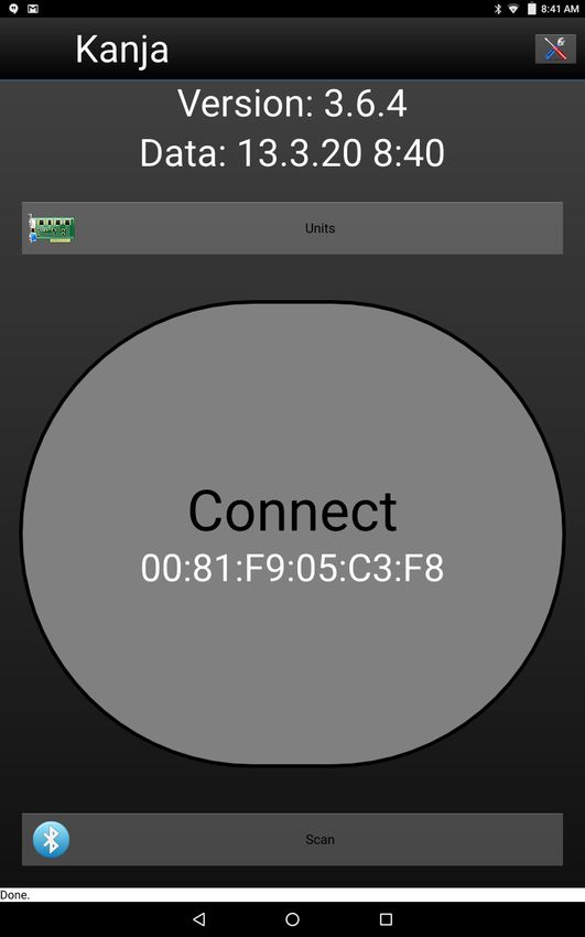
3. (a) Open Kanja and connect it to your Kanardia instrument that supports Customizer
files.1 Refer to the Blu & Kanja User Manual for help.
(b) Under Units select the instrument.
(c) From the menu, open Screen Custom. Listed are the files saved in the Downloads
folder on your device.
(d) Select the file you wish to transfer to your instrument.
38 © Kanardia 2021Customizer — Manual 6. Updating the Instrument
Finally, your instrument’s screen should display the new layout you created using Customizer.
39 © Kanardia 2021You can also read


