Evaluating the Performance of Three Popular Web Mapping Libraries: A Case Study Using Argentina's Life Quality Index - MDPI
←
→
Page content transcription
If your browser does not render page correctly, please read the page content below
International Journal of
           Geo-Information

Article
Evaluating the Performance of Three Popular Web
Mapping Libraries: A Case Study Using Argentina’s
Life Quality Index
Alejandro Zunino 1, * , Guillermo Velázquez 2 , Juan Pablo Celemín 2 , Cristian Mateos 1 ,
Matías Hirsch 1 and Juan Manuel Rodriguez 1
 1    ISISTAN—UNCPBA & CONICET, Tandil B7001BBO, Buenos Aires, Argentina;
      cristian.mateos@isistan.unicen.edu.ar (C.M.); matias.hirsch@isistan.unicen.edu.ar (M.H.);
      rodriguez.juanmanuel@gmail.com (J.M.R.)
 2    IGEHCS—UNCPBA & CONICET, Tandil B7001BBO, Buenos Aires, Argentina;
      gvelaz@fch.unicen.edu.ar (G.V.); jpcelemin@conicet.gov.ar (J.P.C.)
 *    Correspondence: alejandro.zunino@isistan.unicen.edu.ar

 Received: 29 August 2020; Accepted: 28 September 2020; Published: 29 September 2020

 Abstract: Recent Web technologies such as HTML5, JavaScript, and WebGL have enabled powerful
 and highly dynamic Web mapping applications executing on standard Web browsers. Despite the
 complexity for developing such applications has been greatly reduced by Web mapping libraries,
 developers face many choices to achieve optimal performance and network usage. This scenario
 is even more complex when considering different representations of geographical data (raster,
 raw data or vector) and variety of devices (tablets, smartphones, and personal computers). This paper
 compares the performance and network usage of three popular JavaScript Web mapping libraries
 for implementing a Web map using different representations for geodata, and executing on different
 devices. In the experiments, Mapbox GL JS achieved the best overall performance on mid and high
 end devices for displaying raster or vector maps, while OpenLayers was the best for raster maps on
 all devices. Vector-based maps are a safe bet for new Web maps, since performance is on par with
 raster maps on mid-end smartphones, with significant less network bandwidth requirements.

 Keywords: web map;                   raster;     vector;      tiles;   performance test;   software development;
 mobile applications

1. Introduction
      Since the introduction of modern Web maps (https://gistbok.ucgis.org/bok-topics/web-
mapping) that lets users zoom and pan around, there has been a relentless popularization of Web
mapping [1,2]. Nowadays, Web maps are used in many software systems to provide features ranging
from trivial ones, such as helping users to enter addresses in mobile applications (e.g., Uber and
Booking), to complex and rich dynamic maps such as the Earth Wind Map (https://earth.nullschool.
net), an animated map with wind predictions, Nine Point Five (http://www.ninepointfive.org), a 3D
map of earthquakes over the past 30 years or the COVID-19 Dashboard (https://coronavirus.jhu.edu/
map.html), a map of reported cases of coronavirus disease 2019 in real time. The enabler to accomplish
these Web maps is the idea of decomposing large and complex maps into many small tiles [3] that are
downloaded, seamlessly joined together, and displayed on demand by a Web browser such as Google
Chrome or Mozilla Firefox. As a consequence, this has a very positive impact on performance and user
experience, since only tiles covering areas of the map that are visited are downloaded [3,4], as depicted
in Figure 1.

ISPRS Int. J. Geo-Inf. 2020, 9, 563; doi:10.3390/ijgi9100563                                www.mdpi.com/journal/ijgi
ISPRS Int. J. Geo-Inf. 2020, 9, 563 2 of 20
tile server
displayed map
map tiles
Figure 1. Web maps based on tiles.
One of the first Web mapping applications that popularized the idea of using tiles is Google
Maps. Later, as the demand for more rich and interactive maps increased, developers designed
methods for overlaying data over Web maps. Typical ways for doing so was to use a base map of
some map provider such as Google Maps (https://www.google.com/maps), HERE (https://www.
here.com/) or OSM (https://www.openstreetmap.org), and then draw over this map additional
information as markers, lines, or polygons. The practical impact of these technologies has been
important, since they provided a simple way to enrich maps with geographic information from
third parties [5,6], making Web mapping applications more flexible and even more widespread [7].
Accompanying this evolution, standard formats for representing and transferring geographic data
for the Web emerged. Notable examples are GeoJSON [8], an open standard format designed for
representing simple geographical features, along with their non-spatial attributes, TopoJSON (https:
//github.com/topojson/topojson-specification), a variant of GeoJSON that encodes topology stitching
together shared line segments, and the Geography Markup Language (GML), an XML grammar for
expressing geographical features [9].
These advances have fundamentally reshaped the environment in which maps are used and
produced [2]. From the rich, but static maps made popular by Google Maps in 2005, to the fully-fledged
Web-based GIS [1] such as ArcGIS Online or CARTO, Web mapping technologies have significantly
increased their quality and scope [10,11]. Web maps have also evolved from static raster tiles to
highly dynamic, customizable, and open vector tiles enabling a plethora of applications [7], where
multiple sources, including real-time geospatial data sources provided by sensors and crowd-sourcing
are combined, collaboratively processed and analyzed, by relying on technologies such as Web
Services [12,13] and Big Data infrastructures [14,15].
In this evolution, the W3C standards such as HTML5, JavaScript, and WebGL play a prominent
role [2,16]. JavaScript [9,16] provides interactivity and processing capabilities directly in the Web
browser, also called client. These technologies are the cornerstone of modern vector based mapping
solutions, which were later sped up by WebGL [17], a standard for rendering graphics that exploits
the Graphics Processing Unit (GPU) available on modern personal computers and mobile phones.
Vector-based maps and WebGL have moved map styling from the server to the Web browser, not only
decreasing costs in server hardware, but also allowing advanced functionalities such as geoprocessing
and visualization that were reserved to GIS software executing on high-end computers [10,11].
As both end-users and developers take advantage of Web maps, there is an increasing pressure
for increased quality, speed, dynamicity, and information integration that is only possible through
development tools that ease the ever-increasing complexity of Web and mobile mapping. Modern Web
maps are now created on-the-fly from the underlying geographic databases and their style and layout
depend on the user’s preferences.
Several libraries emerged in the last few years to simplify the development of interactive maps
in Web browsers. Examples of such libraries are Leaflet (https://leafletjs.com/), Mapbox GL JSISPRS Int. J. Geo-Inf. 2020, 9, 563 3 of 20
(https://github.com/mapbox/mapbox-gl-js), and OpenLayers (https://openlayers.org/). They offer
simple ways to visualize and stack semi-transparent map layers from heterogeneous sources and
map providers, including static raster and vector layers with different styling methods. Despite these
solutions relying on trustworthy and mature open Web standards, the complexity of the technological
stack involving Web browsers, operating systems, GPUs, and internal design characteristics of each
library make their performance and network usage highly variable. Furthermore, since smartphones
replace personal computers as the most used medium to access Web maps, the scenario becomes much
more challenging considering that the diversity and fragmentation of mobile devices is huge.
Nowadays, as the advantages of vector tiles [18] are slowly making them more widespread,
developers have a hard time figuring out what library to use given their requirements. This is
particularly important in scenarios with heterogeneous devices, including mobile devices with
slow WebGL implementations and personal computers with fast GPUs. Now, the question is no
longer only whether to use raster or vector maps, but also which library to use for rendering Web
maps. While many other factors may be important, such as licensing costs, support for third party
add-ons/maps and integration with mobile operating systems, in the rest of the paper, we focus on
providing an initial answer to this question by empirically assessing the combination of raster/vector
map layers and different devices using either of the three above mentioned libraries. Therefore, we
compared several implementations of a Web map for displaying a Life Quality Index (LQI) designed
for Argentina [19]. This index was mapped at the level of census radius (a higher level of territorial
disaggregation than census tracts), thus there are more than fifty thousand individual areas for the
whole country [20]. For the comparison, we automatically executed common pan/zoom actions a
typical user would, using several mobile devices (tablets and smartphones) ranging from low end to
high end, and a mid-end personal computer. In these tests, we measured network usage and execution
time. We also analyzed a strategy for reducing network usage that relies on lossy data compression
techniques. We aim to provide developers with valuable information to guide their choices when
selecting popular Web mapping libraries, with either raster/vector maps when executing on a variety
of computing devices.
The rest of the paper is organized as follows. In Section 2, we briefly describe the Life Quality
Index for Argentina and discuss the main alternatives for displaying it as a Web map. In Section 3,
we present eight implementations of the application using raster/vector maps with three popular
JavaScript libraries (Leaflet, Mapbox GL JS, and OpenLayers). Section 4 describes the experimental
setting and and analyzes the empirical results. Section 5 describes and discusses related efforts. Finally,
Section 6 concludes the paper and proposes some guidelines for future research and development.
2. The Life Quality Index for Argentina
The work in [20,21] proposed a calibrated compound social indicator of human welfare, LQI from
now on that takes into account groups of socioeconomic and environmental indicators. This LQI has
been successfully applied in many social and geographic studies in Argentina [19,21–23]. The data
associated with the LQI have been processed, analyzed, and applied through traditional GIS software
targeted to geographers and social scientists. The LQI has been calculated and mapped at the level of
census radius for 52,408 units. Each unit has an associated LQI represented as a decimal number in the
range [0, 10], where the higher the value, the better the quality of life in the respective unit.
In an effort to make wider use of the LQI and reach a broad audience, we developed a Web
mapping application (https://icv.netlify.app/) to visualize the LQI data. One of the main requirements
of the application was to support a variety of smartphones, even with slow and unstable 3G/4G data
services, which are typical in rural areas in Argentina [24]. The goal was to draw over a base map of
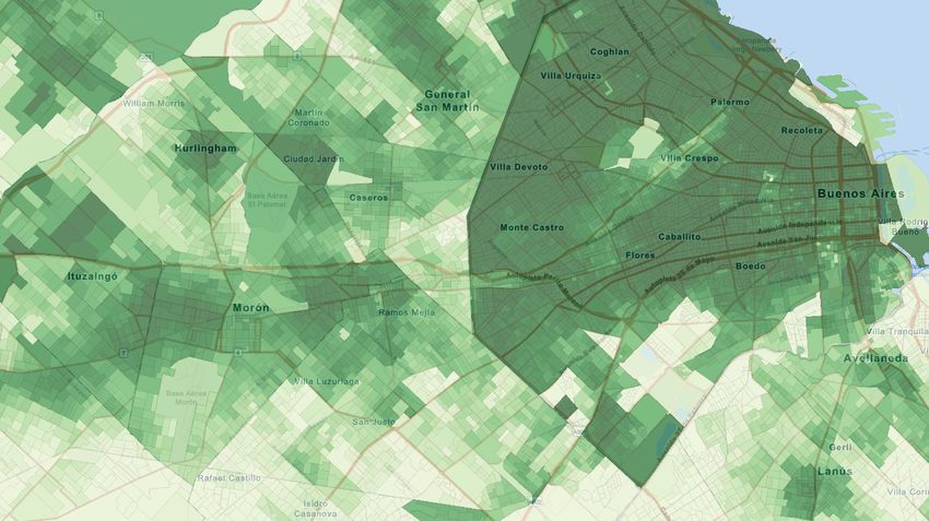
Argentina a representation of the LQI values using some color scale [25]. Figure 2 shows a region of
Argentina with the LQI data overlayed as a choropleth map using a single-hue progression, where
white areas have low LQI values, light green represents mid values and dark green have high values.ISPRS Int. J. Geo-Inf. 2020, 9, 563 4 of 20
Figure 2. Example LQI visualization created in a Desktop GIS.
To build a Web mapping application for displaying the LQI data as a layer over a base map, we
considered three main technological alternatives, which are summarized in Figure 3:
1. Raster tiles: this alternative displays static images or bitmaps that are provided by a server.
These images have a fixed resolution and would not allow for much interactivity, such as changing
the color scale without reloading the map, or showing the LQI value under the mouse pointer.
The hardware requirements for displaying this type of maps on a client Web browser would be low
because there is no need for fast CPUs/GPUs for displaying the tiles. This would enable low-end
smartphones access to the maps. However, raster tiles are known for requiring more network
bandwidth than vector tiles [18]. With respect to the server software, there are many mature and
tested alternatives for serving raster tiles, either pre-rendered or rendered on demand [26–28].
However, we considered that, regardless of the server software, the best choice would be to
pre-render all the LQI map tiles as semi-transparent bitmaps in order to avoid server processing
when the maps are being navigated by the users.
2. Raw data: this alternative consists of storing in a server a file with the 52,408 census radius along
with their LQI values, then transferring it to the Web browser to build and display a graphical
representation of the data. Census radius are represented as non-overlapping closed polygons of
a variable number of sides. This alternative would in fact fully build the LQI layer image on the
Web browser, which implies drawing and filling polygons with a color based on the LQI value,
over a base map. In opposition to raster tiles, this solution would rely on the CPU/GPU power of
the client, while the server would only serve a data file. Typical technological support to draw
geographical data on the Web browser rely on standard formats such as GeoJSON and TopoJSON.
Then, data are processed by using JavaScript and displayed through a combination of HTML5,
Scalable Vector Graphics (SVG) and Canvas [11,16]. While this solution would be ideal in terms
of interactivity, visualization quality, and decreased server costs, network usage would be high,
as the whole LQI data file of 200 MB would have to be transferred through the Internet, even
when viewing a small area of the map. In addition, the requirements for storing and displaying
52,408 polygons on a Web browser would be high, requiring high-end smartphones with powerful
GPUs.
3. Vector tiles: the server provides vector objects that are rendered by the Web browser. This is
similar to transferring raw data, but vector maps are tiled so that only the data, in this caseISPRS Int. J. Geo-Inf. 2020, 9, 563 5 of 20
tiles, required for the displayed area at a specific zoom level are transferred. In addition, typical
data representation formats for vector tiles such as MBTiles or PBF (Protocol buffers) are very
compact, binary-based, and usually compressed, in opposition to the very verbose and text-based
GeoJSON/TopoJSON formats used for raw data. This alternative would mix the best of raster tiles
and raw data. However, the technological stack and production of vector tiles are quite complex
both on the server and on the Web browser, as we will see in the next sections. Furthermore,
while this solution seems less CPU/GPU hungry, it is worth noting that, for displaying the whole
country, the Web browser would have to render 52,408 polygons, without counting the base map,
which may be too much processing for low-end smartphones.
tile server
raster tiles
data server styling + rendering
raw data (GeoJSON)
tile server styling + rendering
vector tiles
Client-side processing
Figure 3. Three alternatives for implementing Web maps.
3. The LQI Web Mapping Application
This section describes the main design decisions and technical aspects of the LQI Web application.
We first describe the server side, which mainly consists of the provision of the LQI map layer. We then
provide details on the development of the client Web application.
3.1. The LQI Layer Server
As discussed in Section 2, we considered three alternatives for building the LQI map layer.
Figure 4 depicts the process followed to build the three map alternatives. The original LQI dataset is
stored as an ESRI ShapeFile, which was then converted to GeoJSON format by using MapShaper [29].
In this conversion, we simplified some shapes in order to reduce the resulting file size. We will analyze
the impact of simplification on map quality in Section 4. The resulting GeoJSON file is stored on a Web
Server for providing raw map data.ISPRS Int. J. Geo-Inf. 2020, 9, 563 6 of 20
styling +
rendering
styles
raster tiles
shape vector tiles
LQI simplification production
shapefile
GeoJSON tile server
Vector tiles
data server
Figure 4. Production of data and tiles for the LQI layer.
The GeoJSON file is then further simplified and converted to vector tiles and stored as a MBTiles
database. For this purpose, we used Tippecanoe (https://github.com/mapbox/tippecanoe), a tool
for building vector tilesets. As a result, we produced a tiled vector map with 12 zoom levels (0–12).
The minimum zoom level covers the whole country with the 52,408 polygons, while the maximum
zoom level is detailed at the level of city blocks. The simplification performed during this stage
only includes removing redundant or non-visible lines at a given zoom level. While the typical
practice is to reduce map complexity by merging adjacent polygons, we did not do so because this
would imply removing census radius and potentially mixing adjacent polygons with different LQI,
which is clearly unacceptable. The resulting vector tiles are stored in a server. We used Tileserver
PHP (https://github.com/maptiler/tileserver-php), an implementation of the Web Map Tile Service
(WMTS) (https://www.ogc.org/standards/wmts) standard for serving vector tiles stored as MBTiles
or pre-rendered raster map tiles. Vector tiles are transferred as Google protocol buffers (https://
developers.google.com/protocol-buffers), a platform-neutral, efficient, and extensible mechanism for
serializing structured data. In addition, the server supports styling maps using the standard Mapbox
format (https://docs.mapbox.com/mapbox-gl-js/style-spec/). A style defines the visual appearance
of a map, including what data to draw, the order to draw it in, and how to paint the data when
drawing it.
For producing raster tiles, we used as a starting point the vector tiles stored in Tileserver PHP
(https://icv.conicet.gov.ar/tileserver-php/icv/) along with a style to paint the polygons of the vector
LQI map layer depending on the LQI value of each census radius. As this is a very time-consuming
process performed at the server, but we are focused on the Web client, we pre-rendered the raster tiles
of the entire LQI layer at all zoom levels. To do so, we developed a crawler that requests to the server
all the tiles covering Argentina at all zoom levels. Each tile is saved as a PNG file, resulting in 4 GB of
images for the LQI layer. Then, these images are stored in a server following the standard XYZ tiled
map filenames.
3.2. The LQI Web Mapping Application
For building the client side of the LQI Web map, we considered JavaScript libraries with support
for both raster and vector map layers. In addition, we only considered libraries with support for
different map providers and the ability to customize vector map styles. As a result, as mentioned
earlier, the three considered libraries were Leaflet, Mapbox GL JS, and OpenLayers. All of them
are very popular, mature, open-source, and well documented libraries that rely on modern Web
standards to display maps. These libraries can be used to build Web maps both for personal computers
and smartphones.ISPRS Int. J. Geo-Inf. 2020, 9, 563 7 of 20
The three libraries are based on the idea of overlaying semi-transparent map layers that are
combined and displayed on a Web browser. Each layer can be a tiled map or a raw data source. In turn,
layers can be stored locally as files on the client or on a server. Finally, tiles can be either raster or vector.
As described in Section 2, we considered three alternatives for implementing the LQI map layer:
1. Raster tiles: in the three JavaScript libraries, raster tiles are well supported, so that the
implementation was straightforward. The tiles were accessed using the standard XYZ tiled
map conventions. As the technologies for transferring and displaying raster tiles on the Web are
very mature and supported on all browsers/platforms, both compatibility and performance are
high.
2. Raw data: similarly to raster tiles, raw data in GeoJSON format are well supported in all libraries.
The LQI data represented as a GeoJSON file occupy almost 200 MB, which is too much data
even for a typical 3G/4G connection. Therefore, we tried reducing the size of the data, which is
discussed in the next section.
3. Vector tiles: both OpenLayers and Mapbox GL JS provide native support for vector
tiles. Leaflet, on the other hand, does not support vector tiles natively, but through the
Leaflet—VectorGrid (https://github.com/Leaflet/Leaflet.VectorGrid) third party plugin. In all
cases, the implementation of the LQI layer involves styling the polygons during rendering. Since
a map area may contain thousands of polygons that have to be painted with a color according
to its LQI value, we carefully optimized this. Mapbox GL JS and OpenLayers rely on WebGL
for displaying vector tiles, while Leaflet uses SVG. As from a user’s perspective WebGL or SVG
rendered layers look the same, there are significant differences. First, WebGL requires a computer
with a supported GPU. Fortunately, while even low-end smartphones have that, their performance
may be poor. On the other hand, SVG is very well supported and can be accelerated by the GPU,
depending on the Web browser and GPU model, but not to the degree of WebGL. This suggests
that, while vector tiles can be probably displayed even on old/low-end smartphones, operations
such as pan and zoom may be sluggish.
We began implementing the Web map by using a raster base layer with overlaid LQI raw data
because this seemed the most straightforward alternative that is well supported on all libraries.
However, this showed severe performance problems because, as discussed before, the LQI data
represented as a GeoJSON file stresses out any typical 3G/4G connection. While this might be a viable
alternative for some applications, in this case, even a marginal reduction on data size caused significant
artifacts on the resulting map, which were unacceptable. This, in addition, the fact that in informal
tests drawing the full GeoJSON data was painfully slow forced us to discard this alternative.
Then, we implemented six variants of the LQI Web mapping application using as a base layer a
raster map, with either a raster or vector LQI layer. In terms of functionality, both types of base layers
are equivalent. However, for the LQI layer, the vector based solution enables interaction so that it is
possible, for example, to show the LQI value under the mouse pointer or customize the color scales for
the LQI values without reloading the map. In addition, for Mapbox GL JS, we also implemented two
variants with a vector base layer. We did not implement these variants with Leaflet/OpenLayers, since
we found out that they provide limited or preliminary support for the complex vector map styles used
in typical vector basemaps. Table 1 summarizes the combinations of library, basemap, and LQI layer
considered for the empirical evaluations.
Table 1. Combinations of library, basemap and LQI layer (“+” supported, “*” supported with a plugin,
“×” not supported).
Library Basemap LQI layer
Raster Vector Raster Vector
OpenLayers (https://icvol.netlify.app/) + × + +
Mapbox GL JS (https://icv.netlify.app/) + + + +
Leaflet (https://alezunino.github.io/icvLL/indexLl.html) + × + *ISPRS Int. J. Geo-Inf. 2020, 9, 563 8 of 20
In the next section, we describe the experiments to assess the performance of the eight variants.
4. Experiments
This section analyzes the performance of different implementations of the LQI mapping
application. In addition, as raw data may require significant network bandwidth, we analyzed
a strategy that relies on lossy data compression techniques [30] for studying the impact of line
simplification on the resulting map quality. Despite it being possible to compress the LQI vector
tiles, we did not do so because the impact of such compression would be marginal considering
that vector tiles are already compressed in protocol buffers using the lossless GZIP algorithm. As a
consequence, as we will see in the results, vector tiles are already very network efficient.
The next section focuses on analyzing the performance of the different variants, while Section 4.2
assesses the compression ratio versus quality trade-off.
4.1. Performance
We compared eight different variants of the LQI web mapping application that combine raster
and vector layers for the basemap and LQI map, implemented with the three mentioned libraries.
These variants are called, for example, LeafletRV, which stands for the application implemented
with Leaflet using a Raster basemap and a Vector LQI layer. We measured network usage and
time required for performing typical activities such as panning and zooming. We executed the
applications on a variety of devices, including a PC, tablets, and smartphones ranging from low-end
to high-end. Table 2 lists the devices used for the experiments in inverse order of performance.
As shown, it includes a wide range of the most popular chipsets present on the market. For executing
the Web mapping application, we used Google Chrome (version 80), the most used Web browser
(https://gs.statcounter.com/browser-market-share/mobile/worldwide). In this way, we avoided
introducing variations in performance due to different JavaScript/HTML implementations, which is
out of the scope of this paper.
Table 2. Devices used for the experiments (inverse order of performance).
Device Chipset
Philips TLE732 MediaTek MT8163
X-View Titanium Rockchip RK3326
Lenovo TB-X103F Snapdragon 210
Google Nexus 7 Nvidia Tegra 3
Motorola Moto G5 Snapdragon 430
Lenovo Yoga Tablet 2 Pro Intel Atom Z3745
Motorola Moto G6 Snapdragon 450
HP Pavilion W2M75UAR Intel Core i5-6200U
Xiaomi A2 Lite Snapdragon 625
Samsung Galaxy A30 Exynos 7904
Xiaomi Redmi Note 3 Pro Snapdragon 650
Motorola Moto G7 Plus Snapdragon 636
Xiaomi Redmi Note 7 Snapdragon 660
Xiaomi Mi Mix 2s Snapdragon 845
To perform a fair comparison, we built a benchmark by using Google Puppeteer (https://pptr.
dev/), a tool to automate most things that users can do manually in a Web browser. In particular, we
automated the actions required for panning and zooming to a location of the map and then waiting
there until the map is fully rendered. This is repeated for six different locations of the map that include
large cities (Avellaneda, La Plata, Palermo, Posadas, Retiro, Capital-San Juan). This benchmark was
executed 10 times on each device connected through WiFi to a 10 Mbit/s Internet connection. In all
cases, we used the default Web browser configuration, which includes caching enabled. The cache was
cleaned before executing the benchmark for each variant.ISPRS Int. J. Geo-Inf. 2020, 9, 563 9 of 20
Figure 5 shows the resulting average execution time measured in Seconds. The graphics x-axis
are ordered according to the device PassMark score (https://www.passmark.com/), increasing from
left to right. Figure 6 depicts a less detailed view of the same data, where blueish colors represent fast
execution times. The time required for executing the benchmark was similar for most devices and
LQI application variants except LeafletRV, which lagged behind all the others. This difference may
be caused by the third party plugin used for supporting vector layers on Leaflet. For the rest of the
variants, an interesting pattern emerges from the results. On low-end devices, raster layers (RR) clearly
outperformed vector based variants, especially VR and VV. This is caused by the slow CPUs/GPUs
of these devices, which have a hard time rendering the complex base map and its associated styles.
Note that this tendency gradually changes as we move to the bottom of the figure, where mid and
high-end devices are, and both vector and raster variants behave similarly in terms of performance.
The exception is Leaflet in its both variants, which did not speed up as the others do on faster devices.
This might be caused by the simple architecture of Leaflet, which does not rely on cutting edge Web
technologies such as WebGL and Canvas, which are accelerated by GPUs and thus take advantage of
powerful hardware available on mid/high-end devices.
Figure 5. Execution time.ISPRS Int. J. Geo-Inf. 2020, 9, 563 10 of 20
Figure 6. Execution time (red is slow, blue is fast).
Figure 7 shows the average network usage of the variants measured in Megabytes, while Figure 8
depicts a less detailed view of the same data, where blueish colors represent less network usage.
We can observe that vector based implementations were the winners in terms of network efficiency,
regardless of the devices. In particular, MapboxVV required significantly less network bandwidth
than all the variants. In addition, more powerful devices tend to have bigger screens, so that variants
using raster layers transferred more data. This explains the lower network usage of raster variants in
low-end devices at the top of the figure. Leaflet used significantly more network bandwidth than the
others on all devices. Again, Leaflet’s simple architecture and compatibility with all Web browsers
impact negatively on efficiency.ISPRS Int. J. Geo-Inf. 2020, 9, 563 11 of 20
Figure 7. Network usage.ISPRS Int. J. Geo-Inf. 2020, 9, 563 12 of 20
Figure 8. Network usage (red is more, blue is less).
In the reported results, it is rather difficult to clearly distinguish the best combination of layers
and libraries in terms of both execution time and network utilization. In fact, there are several variants
that ran fast on some devices but show high network utilization. For example, LeafletRR achieved
competitive execution time on low/mid-end devices such as the Moto G5, G6, or Xiaomi A2 Lite,
but doubled the network usage on these devices compared to the other variants. In order to better
analyze the empirical data, Figure 9 summarizes the results using scatter plots of the generated network
traffic (y-axis) versus benchmark execution time (x-axis), where each marker denotes a single execution
of a variant. In other words, markers near the y-axis are faster, while those near the x-axis use less
network bandwidth. We removed the three slowest devices and the PC (outliers in performance and
network) from the figure to better appreciate the differences.
The scatter plots show that, when aiming for network efficiency, vector maps are clearly the
winners, with MapboxVV is followed closely by MapboxVR. In these cases, the savings in network
bandwidth for using rich and complex but very compact vector based basemaps explain the results.
Moreover, while these variants double the time required to finish the benchmark on low-end devices,
on mid-end devices such as the Moto G6 or Xiaomi A2 Lite, they are just a bit slower than raster
based variants. For high-end devices, both Mapbox GL JS and OpenLayers, either using raster or
vector maps, have shown similar execution times, but the savings in network bandwidth make vector
based variants are preferable. Finally, the two Leaflet variants have struggled to perform competitively,
showing poor execution time and high network usage across all devices.ISPRS Int. J. Geo-Inf. 2020, 9, 563 13 of 20
Figure 9. Execution time and network usage.ISPRS Int. J. Geo-Inf. 2020, 9, 563 14 of 20
4.2. LQI Vector Layer Simplification
Considering the LQI layer based on raw data in GeoJSON format is too large, we tried using lossy
compression to reduce its size. The goal was to achieve an acceptable balance between data size and
map quality. We rely on the MapShaper tool [29] with the well known Visvalingam line simplification
algorithm [30]. This algorithm removes points with the least-perceptible change, which in practice
means removing the vertex which together with its neighboring vertices form a triangle with the
smallest area. We tuned it for preventing polygon features from disappearing. Furthermore, we did
not merge adjacent polygons with different LQI values. We generated nine different GeoJSON files,
retaining from 90% to 10% of the points of the original file. The resulting files sizes were from 126 MB
to 35 MB, which are rather large for a typical mobile data connection. Then, we rendered the GeoJSON
files as a map for five regions that have varied levels of details. All these regions contain a great
number of polygons to properly assess the quality loss of applying the line simplification method.
To measure the quality of the simplified LQI map versus the original one, we used two
sets of metrics:
• traditional signal fidelity measures [31] that compare the differences between corresponding
pixels in the original and the compressed layer:
– Mean Absolute Error (MAE): lower values of MAE indicates high similarity.
– Peak Signal to Noise Ratio (PSNR): the higher the PSNR, the better the quality of the
compressed map.
– Normalized cross-correlation (NCC): a value of 1 indicates maximum match between the
maps, while 0 indicates no match.
• perceptual visual quality metrics that predict quality from an end-user perspective [32]:
– Structural Similarity Index (SSIM) [33]: utilizes structure information to determine image
distortion. SSIM is 1 when the images are identical, while 0 indicates no structural similarity.
– Gradient Magnitude Similarity Deviation (GMSD) [34]: measure the distortions of the image
gradient. The higher the GMSD score, the lower the image perceptual quality.
The resulting metrics shown in Figures 10–14 suggest that discarding more than 40% of the points
degrades the map quality significantly, as measured by all the metrics. In addition, keeping more
than 70% of the points makes almost no difference in quality, but the savings in space are significant
because the compressed GeoJSON file has 100 MB versus 137 MB of the original version. On the other
hand, even with a compressed LQI data file, the worse tiled variant (LeafletRR) requires a third of the
network bandwidth (33 MB).ISPRS Int. J. Geo-Inf. 2020, 9, 563 15 of 20
Figure 10. Mean absolute error.
Figure 11. Peak signal to noise ratio.ISPRS Int. J. Geo-Inf. 2020, 9, 563 16 of 20
Figure 12. Normalized cross-correlation.
Figure 13. Structural similarity index.ISPRS Int. J. Geo-Inf. 2020, 9, 563 17 of 20
Figure 14. Gradient magnitude similarity deviation.
5. Related Work
The inception of map tiles [3] was a key enabler for the widespread use of Web maps.
Many research efforts have studied how to cope with the increasing requirements these maps put on
the whole infrastructure. In particular, intelligent caching of tiles on servers [35] has been proposed
as a way to reduce latency and server load when rendering raster Web maps. Similarly to other Web
applications, mapping apps involve a series of client/server interactions. Ref. [28] aimed at improving
these considering the impact each interaction has on the server side.
As the evolution of Web technologies enabled client side processing, geoprocessing moved from
the server to Web browsers capable of executing code and displaying rich visualizations [7], but also
creating choices for software developers that impact how well the resulting applications work. Ref. [11]
analyzed the impact of such technologies and their trade-offs for geoprocessing spatial data on the
server or on the client side. The transmission of vector maps provides much flexibility compared to
raster tiles, as the former are composed of multiple lines, and these lines can be simplified to save
network bandwidth and improve performance. In this line, [36] proposed a method for progressive
transmission of vector maps that significantly reduces the required network bandwidth.
Recently, rendering vector maps with good performance made them a viable choice to raster
tiles [16]. Ref. [18] compared the performance of raster and vector tiles using Mapbox GL JS and
hosted in different servers. The testing was semi-automatic, as it involved a user performing the
same pan and zoom operations over a map. They analyzed the time, number of requests and network
traffic generated by these operations. In addition, the paper also reports a preliminary experiment
involving a single scenario with four different Web browsers and three different devices (PC, tablet,
and smartphone). In the experiments, the authors observed that vector tiles had a better loading
time, but, on maps with only a few zoom levels, raster tiles appear to be better. The most valuable
contribution of [18] is a deep study of server load patterns on different server technologies (Mapbox
Studio, TileServer PHP, TileServer GL, and plain files) when using raster and vector tiles.ISPRS Int. J. Geo-Inf. 2020, 9, 563 18 of 20
Complementary to our work, [6] measured the performance and ability to cope with a big
number of data points of five JavaScript mapping libraries. The paper shows diverse results in point
rendering performance and severe performance degradation in some libraries when rendering more
than 100,000 points. These results are highly relevant considering the ever increasing volumes of
geographical data being generated that require some sort of visualization.
In this paper, we advance towards better understanding when to use raster or vector maps in
combination with three popular JavaScript libraries for Web maps, and executing on a variety of mobile
devices covering the most widespread chipsets. In addition, we analyzed the trade-off quality versus
compression ratio of raw data in GeoJSON format, which is often used for overlaying geographic data
such as markers [6], lines, or polygons, over a basemap.
6. Conclusions
In this work, we have assessed the advantages of representing geographical information as
vectors over its raster representation, and implemented using three popular JavaScript libraries.
The presented case study application, namely the LQI Web map, was built using HTML5 technology,
which allows it to run on different platforms. This application is data intensive as, in addition to
the map information, it displays an overlay constructed with 52,408 polygons that covers all the
Argentinean continental territory, more than 2.791 million km2 according to IGN (https://www.ign.
gob.ar/NuestrasActividades/Geografia/DatosArgentina/LimitesSuperficiesyPuntosExtremos).
The results presented in this work point out that vector-based representation of geographical
information requires less bandwidth, while being as fast as raster-based representation when rendering
on mid-end and high-end devices for all the libraries but Leaflet. This is a consequence of both Mapbox
GL JS and OpenLayers reliance on WebGL for rendering, while Leaflet does not support WebGL.
Since vector-based representations are well-suited for metered connections, such as 3G or 4G, and can
be efficiently rendered by mid/high end mobile devices, these kinds of representations are well suited
for Web mapping applications.
From the experimental results, we also conclude that Mapbox GL JS has the best overall
performance on mid and high end devices for all map variants, including vector basemap and LQI
layer. OpenLayers surpassed the others for displaying raster basemaps on all devices. From the
perspective of devices, a mid-end device such as the Moto G6 achieved competitive performance
rendering vector maps with Mapbox GL JS. This result is a clear indication that vector-based maps are a
safe bet for new Web mapping applications, since performance is on par with raster maps, but consume
much less network bandwidth.
A limitation of this work is that, although we have evaluated time and network usage for
Web maps, power consumption has not been evaluated. Power consumption is related to both
network usage and processing, but it cannot be directly estimated from these variables because it
depends on several factors, such as hardware architectures, operating system, or wireless signal quality.
Power consumption is a major issue as mobile devices rely on batteries, and overconsumption affects
the user experience. In future work, power consumption would be analyzed. Finally, we will assess
the behavior of Web mapping libraries in other widely used platforms and browsers, such as iOS,
Safari, and Mozilla Firefox.
Author Contributions: Conceptualization, Guillermo Velázquez; Funding acquisition, Alejandro Zunino;
Investigation, Guillermo Velázquez and Juan Pablo Celemín; Methodology, Alejandro Zunino; Project
administration, Guillermo Velázquez; Software, Alejandro Zunino and Cristian Mateos; Validation, Cristian
Mateos, Matías Hirsch and Juan Manuel Rodriguez; Writing—original draft, Alejandro Zunino; Writing—review
& editing, Juan Pablo Celemín, Cristian Mateos, Matías Hirsch and Juan Manuel Rodriguez All authors have read
and agreed to the published version of the manuscript.
Funding: This research was funded by ANPCyT Grant No. PICT-2018-03323, CONICET Grant No.
PUE 22920170100091CO and PIP 2017-2019 GI 11220170100490CO.
Conflicts of Interest: The authors declare no conflict of interest.ISPRS Int. J. Geo-Inf. 2020, 9, 563 19 of 20
Abbreviations
The following abbreviations are used in this manuscript:
OSM OpenStreetMap
JSON JavaScript Object Notation
GML Geography Markup Language
W3C World Wide Web Consortium
WebGL Web Graphics Library
GPU Graphics Processing Unit
GIS Geographic Information System
LQI Life Quality Index
SVG Scalable Vector Graphics
PBF Protocol Buffers
References
1. Neumann, A. Web Mapping and Web Cartography. In Encyclopedia of GIS; Shekhar, S., Xiong, H., Eds.;
Springer: Boston, MA, USA, 2008; pp. 1261–1269. [CrossRef]
2. Köbben, B.; Kraak, M.J. Mapping, Web. In International Encyclopedia of Human Geography, 2nd ed.;
Kobayashi, A., Ed.; Elsevier: Oxford, UK, 2020; pp. 333–337. [CrossRef]
3. Goodchild, M.F. Tiling Large Geographical Databases. In Design and Implementation of Large Spatial Databases;
Buchmann, A.P., Günther, O., Smith, T.R., Wang, Y.F., Eds.; Lecture Notes in Computer Science; Springer:
Berlin/Heidelberg, Germany, 1989; Volume 409, pp. 137–146. [CrossRef]
4. Haklay, M.; Weber, P. OpenStreetMap: User-Generated Street Maps. IEEE Pervasive Comput. 2008, 7, 12–18.
[CrossRef]
5. Huang, C.H.; Chuang, T.R.; Deng, D.P.; Lee, H.M. Building GML-native web-based geographic information
systems. Comput. Geosci. 2009, 35, 1802–1816. [CrossRef]
6. Netek, R.; Brus, J.; Tomecka, O. Performance Testing on Marker Clustering and Heatmap Visualization
Techniques: A Comparative Study on JavaScript Mapping Libraries. ISPRS Int. J. Geo-Inf. 2019, 8, 348.
[CrossRef]
7. Batty, M.; Hudson-Smith, A.; Milton, R.; Crooks, A. Map mashups, Web 2.0 and the GIS revolution. Ann. GIS
2010, 16, 1–13. [CrossRef]
8. Butler, H.; Daly, M.; Doyle, A.; Gillies, S.; Hagen, S.; Schaub, T. The GeoJSON Format; RFC 7946, Internet
Engineering Task Force: Fremont, CA, USA, 2016; [CrossRef]
9. Peng, Z.R.; Zhang, C. The roles of geography markup language (GML), scalable vector graphics (SVG), and
Web feature service (WFS) specifications in the development of Internet geographic information systems
(GIS). J. Geogr. Syst. 2004, 6, 95–116. [CrossRef]
10. Zhao, P.; Foerster, T.; Yue, P. The Geoprocessing Web. Comput. Geosci. 2012, 47, 3–12. [CrossRef]
11. Kulawiak, M.; Dawidowicz, A.; Pacholczyk, M.E. Analysis of server-side and client-side Web-GIS data
processing methods on the example of JTS and JSTS using open data from OSM and geoportal. Comput. Geosci.
2019, 129, 26–37. [CrossRef]
12. Garriga, M.; Mateos, C.; Flores, A.; Cechich, A.; Zunino, A. RESTful service composition at a glance: A survey.
J. Netw. Comput. Appl. 2016, 60, 32–53. [CrossRef]
13. Lizarralde, I.; Mateos, C.; Zunino, A.; Majchrzak, T.A.; Grønli, T.M. Discovering web services in social web
service repositories using deep variational autoencoders. Inf. Process. Manag. 2020, 57, 102231. [CrossRef]
14. Corbellini, A.; Mateos, C.; Zunino, A.; Godoy, D.; Schiaffino, S.N. Persisting big-data: The NoSQL landscape.
Inf. Syst. 2017, 63, 1–23. [CrossRef]
15. Corbellini, A.; Godoy, D.; Mateos, C.; Schiaffino, S.; Zunino, A. An Analysis of Distributed Programming
Models and Frameworks for Large-scale Graph Processing. IETE J. Res. 2020, 1–9. [CrossRef]
16. Boulos, M.N.K.; Warren, J.; Gong, J.; Yue, P. Web GIS in practice VIII: HTML5 and the canvas element for
interactive online mapping. Int. J. Health Geogr. 2010, 9, 14. [CrossRef] [PubMed]
17. Evans, A.; Romeo, M.; Bahrehmand, A.; Agenjo, J.; Blat, J. 3D graphics on the web: A survey. Comput. Graph.
2014, 41, 43–61. [CrossRef]ISPRS Int. J. Geo-Inf. 2020, 9, 563 20 of 20
18. Netek, R.; Masopust, J.; Pavlicek, F.; Pechanec, V. Performance Testing on Vector vs. Raster Map
Tiles—Comparative Study on Load Metrics. ISPRS Int. J. Geo-Inf. 2020, 9, 101. [CrossRef]
19. Celemín, J.P.; Velázquez, G.Á. Spatial analysis of the relationship between a life quality index, HDI and
poverty in the province of Buenos Aires and the autonomous city of Buenos Aires, Argentina. Soc. Indic. Res.
2018, 140, 57–77. [CrossRef]
20. Velázquez, G.A.; Celemin, J.P. Geografía y calidad de vida en la Argentina: Análisis según departamentos y
radios censales. J. Cienc. Soc. 2019. [CrossRef]
21. Velázquez, G.A. A New Index for Study Quality of Life (LQI), Argentina: Combining Socioeconomic and
Enviromental Indicators. In Indicators of Quality of Life in Latin America; Tonon, G., Ed.; Springer International
Publishing: Cham, Switzerland, 2016; pp. 57–77. [CrossRef]
22. Pou, S.A.; del Pilar Diaz, M.; Velazquez, G.A. Socio-Environmental Patterns Associated with Cancer
Mortality: A Study Based on a Quality of Life Approach. Asian Pac. J. Cancer Prev. 2018, 19, 3045–3052.
[CrossRef]
23. Velázquez, G.A. Geografía y cambios en la calidad de vida de los argentinos: una perspectiva territorial a la
luz del siglo XXI. Punto. Sur. 2019, 104–121. [CrossRef]
24. Arroqui, M.; Mateos, C.; Machado, C.; Zunino, A. RESTful Web Services improve the efficiency of data
transfer of a whole-farm simulator accessed by Android smartphones. Comput. Electron. Agric. 2012,
87, 14–18. [CrossRef]
25. Brewer, C.A. A Transition in Improving Maps: The ColorBrewer Example. Cartogr. Geogr. Inf. Sci. 2003,
30, 159–162. [CrossRef]
26. Zavala-Romero, O.; Ahmed, A.; Chassignet, E.P.; Zavala-Hidalgo, J.; Eguiarte, A.F.; Meyer-Baese, A. An open
source Java web application to build self-contained web GIS sites. Environ. Model. Softw. 2014, 62, 210–220.
[CrossRef]
27. Blower, J.D.; Gemmell, A.L.; Griffiths, G.H.; Haines, K.; Santokhee, A.; Yang, X. A Web Map Service
implementation for the visualization of multidimensional gridded environmental data. Environ. Model.
Softw. 2013, 47, 218–224. [CrossRef]
28. Yang, P.; Cao, Y.; Evans, J. Web Map Server Performance and Client Design Principles. GIScience Remote Sens.
2007, 44, 320–333. [CrossRef]
29. Dougherty, J.; Ilyankou, I. Hands-On Data Visualization: Interactive Storytelling from Spreadsheets to Code;
O’Reilly Media: Newton, MA, USA, 2020.
30. Visvalingam, M.; Whyatt, J.D. Line generalisation by repeated elimination of points. Cartogr. J. 1993,
30, 46–51. [CrossRef]
31. Eskicioglu, A.M.; Fisher, P.S. Image quality measures and their performance. IEEE Trans. Commun. 1995,
43, 2959–2965. [CrossRef]
32. Lin, W.; Kuo, C.C.J. Perceptual visual quality metrics: A survey. J. Vis. Commun. Image Represent. 2011,
22, 297–312. [CrossRef]
33. Wang, Z.; Bovik, A.C. A universal image quality index. IEEE Signal Process. Lett. 2002, 9, 81–84. [CrossRef]
34. Xue, W.; Zhang, L.; Mou, X.; Bovik, A.C. Gradient Magnitude Similarity Deviation: A Highly Efficient
Perceptual Image Quality Index. IEEE Trans. Image Process. 2014, 23, 684–695. [CrossRef]
35. Martín, R.G.; Verdú, E.; Regueras, L.M.; de Castro Fernández, J.P.; Verdú, M.J. A neural network based
intelligent system for tile prefetching in web map services. Expert Syst. Appl. 2013, 40, 4096–4105. [CrossRef]
36. Corcoran, P.; Mooney, P.; Bertolotto, M.; Winstanley, A.C. View- and Scale-Based Progressive Transmission
of Vector Data. In Proceedings of the Computational Science and Its Applications—ICCSA 2011, Santander,
Spain, 20–23 June 2011; Murgante, B., Gervasi, O., Iglesias, A., Taniar, D., Apduhan, B.O., Eds.; Springer:
Berlin/Heidelberg, Germany, 2011; pp. 51–62. [CrossRef]
c 2020 by the authors. Licensee MDPI, Basel, Switzerland. This article is an open access
article distributed under the terms and conditions of the Creative Commons Attribution
(CC BY) license (http://creativecommons.org/licenses/by/4.0/).You can also read