Establishing the production chronology of the iconic Japanese woodblock print 'Red Fuji' - OpenScience
←
→
Page content transcription
If your browser does not render page correctly, please read the page content below
Establishing the production chronology of the iconic
Japanese woodblock print ‘Red Fuji’
Détermination de la chronologie de production de l’emblématique
estampe japonaise «Le Fuji Rouge»

Capucine Korenberg1, Michele Derrick2, Lucía Pereira Pardo3, Ryoko Matsuba4
1
  The British Museum, Great Russell Street, London WC1B 3DG, UK, (corresponding author),
ckorenberg@britishmuseum.org
2
  Museum of Fine Arts, Avenue of the Arts, 465 Huntington Avenue, Boston, Massachusetts 02115, US,
mderrick@mfa.org
3
  The British Museum, Great Russell Street, London WC1B 3DG, UK,
Lucia.PereiraPardo@nationalarchives.gov.uk
4
  Sainsbury Institute for the Study of Japanese Arts and Cultures, The Close, Norwich NR1 4DH, UK,
R.Matsuba@uea.ac.uk

ABSTRACT. First printed in 1831, ‘Red Fuji’ by Hokusai is one the most iconic Japanese woodblock prints and
thousands of impressions were printed from its original set of woodblocks, often in different colour schemes and using
different printing effects for different editions. The aim of our research was to systematically study these variations and
determine the chronological order in which they had been introduced. First, we located 93 surviving impressions of
Red Fuji in museums, libraries, private collections and galleries around the world. We carefully studied the breaks in
the outlines caused by woodblock wear, as well as the variations in colour and printing effects. Then, we investigated
how the print was produced using woodblocks: we determined what part of the print was produced by each
woodblock, if a woodblock had been used more than once in specific parts of the print and what printing effects the
printer(s) employed. We also identified the colourants on ten impressions of Red Fuji from different editions using X-
ray fluorescence, multispectral imaging, fibre optics reflectance spectroscopy and excitation–emission matrix
fluorescence spectroscopy. Based on the breaks in the woodblocks, the colour schemes and the printing effects, we
concluded that there were five sequential ‘states’ of Red Fuji. The first state corresponds to the earliest surviving
edition, whose impressions have very little evidence of woodblock wear and were produced using muted colours and
complex printing effects, while the last state is a rare blue variant, ‘Blue Fuji’, for which the printer(s) used a completely
different colour palette and complex printing effects. This research represents the first systematic study of the
production chronology of a Japanese woodblock print, based on woodblock wear, colour scheme and printing effects.
KEYWORDS. Japanese woodblock print, Red Fuji, colourants, woodblock wear, excitation–emission matrix
fluorescence spectroscopy, fibre optics reflectance spectroscopy.

1. Introduction

   First published in 1831 as part of the „Thirty-Six Views of Mount Fuji‟ series, „A Clear Day with
a Southern Breeze‟ by Katsushika Hokusai (1760-1849), more commonly known as „Red Fuji‟ (Fig.
1), is one the most iconic Japanese woodblock prints [1]. It depicts Mount Fuji in the late summer
when the rays of the rising sun colour its slopes red. In the Edo Period (1603–1868) Mount Fuji was
a symbol of immortality and the subject of worship and pilgrimages.

© 2021 ISTE OpenScience – Published by ISTE Ltd. London, UK – openscience.fr                              Page | 1
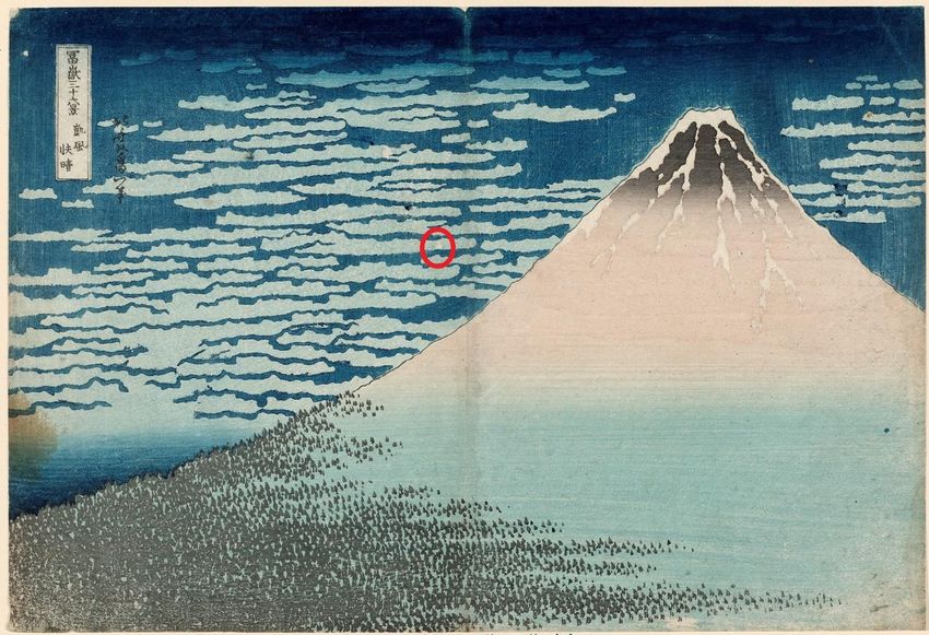
Fig. 1. Red Fuji (The British Museum, London, 1906,1220,0.525, size: 26.1 cm by 38.2 cm). The small
areas left unprinted at the bottom in the red frame correspond to woodblock damage and were observed in
                                 all the impressions of Red Fuji we examined.

   Like other Japanese prints at the time, Red Fuji was mass-produced using a set of carved
woodblocks, one block for the outlines, the „keyblock‟, and several blocks for the coloured areas.
Prints were usually inexpensive: for instance, one could buy a print for the same price as about two
helpings of noodles in the 1830s [2]. The production of prints was a commercial business and a
design was printed as long as there were customers willing to buy impressions. Experts estimate that
a best-selling design such as Red Fuji could have been printed up to 8,000 times [3].

   While the impression in Figure 1 corresponds to the version of Red Fuji most people are familiar
with, not all impressions of this were printed using the same colour scheme and printing effects (the
term „impression‟ here refers to one of a number of printings made from the same set of
woodblocks). The variations between impressions of the same design are of great interest to
Japanese art scholars and collectors. The leading specialist on Hokusai publishing in English, Roger
Keyes (1942-2020), conducted research with Peter Morse (1935-1993) on single-sheet colour
woodblock prints of Hokusai, including Red Fuji, between 1972 and 2007. He compiled their
findings in a catalogue raisonné, which has been digitised and is partially available online [4]. In
addition to description and ascribed date, Keyes proposed a timeline of states for each print. The
term „state‟ is used to distinguish between different impressions made using the same woodblocks
but with a variant degree of woodblock wear or different printing effects.

   Assessing whether an impression is early or late is not straightforward. Just like European prints
made before the 20th century, Japanese prints were not numbered or dated. To establish if an
impression of a given print is early or late, a different approach is needed. Because of the high
number of impressions pulled, the woodblocks eventually started to wear. The thin ridges in the
keyblock for the outlines of the design were particularly vulnerable to damage resulting in small
breaks in the outlines. Comparing impressions made from the same woodblocks and carefully
looking for signs of woodblock wear allows distinguishing between impressions from early and late
© 2021 ISTE OpenScience – Published by ISTE Ltd. London, UK – openscience.fr           Page | 2
editions. To study the different states of Red Fuji, Keyes used primarily small black and white
photographs of impressions taken by Morse and retrieved after his death in 1993. Keyes himself
admitted that establishing a publishing timeline based on these photographs was very difficult and
encouraged other researchers to re-examine his findings. Recently, Vermeulen et al. [5] published a
production chronology of the Thirty-Six Views of Mount Fuji series. They analysed the blue ink of
the outlines in 141 impressions of the series using fibre optics reflectance spectroscopy (FORS).
Following a statistical approach, they identified nine clusters of impressions with slightly different
FORS features, which they ordered chronologically by studying signs of woodblock wear. However,
this was not an extensive study of the production chronology of Red Fuji as only four impressions of
this print were included in their work.

   The aim of our research was to establish the production chronology of Red Fuji, from its earliest
surviving edition to its last, in a systematic and comprehensive way, based on woodblock wear,
colour schemes and printing effects. First, we endeavoured to locate as many original impressions of
Red Fuji as possible and, as much as possible, obtain high resolution colour digital photographs.
While thousands impressions of Red Fuji were originally printed in 1830s, Japanese prints were
ephemera and only a small proportion of them have survived until now. Based on the photographs
we collected, we studied the breaks in the lines and the variations in colour and printing effects to
define a sequence of states for Red Fuji. Japanese woodblock prints from the Edo Period were
printed using a limited and well-documented range of colourants [6-11] and previous research has
shown that non-invasive techniques such as X-ray fluorescence (XRF), FORS, excitation–emission
matrix fluorescence spectroscopy (EEM FS) and multispectral imaging (MSI) are well suited for
their identification [12-16]. To characterise the variations in the colour schemes of Red Fuji, we also
analysed the inks on ten impressions of Red Fuji corresponding to different states of the design
using the techniques just mentioned.

2. Materials and methods

2.1. Photographs of Red Fuji

   Keyes listed 42 impressions of Red Fuji impressions in his catalogue raisonné. However, when
we tried to obtain digital photographs of these impressions, we discovered that their locations were
sometimes missing or inaccurate. To find additional impressions of Red Fuji, we used the Ukiyo-e
Search web engine [17], which listed impressions of Red Fuji from large national institutions. The
Ukiyo-e Search engine also listed impressions of Red Fuji from the websites of several art dealers
but many of these were reproductions, rather than original impressions (i.e. out of the 56
photographs of Red Fuji identified by the search engine, only 25 corresponded to originals). We
obtained photographs of additional impressions from the Google Arts & Culture online platform, the
websites of the auction houses Sotheby’s and Christie’s, books, art dealers and private collectors.
We also identified regional institutions and private galleries holding impressions of Red Fuji in their
collections using the image hosting service website Flickr, the social media websites Pinterest,
Twitter and Instagram and the website TripAdvisor. We then requested good quality photographs
from these institutions. We examined all the photographs of the impressions gathered carefully to
ensure they corresponded to originals rather than reproductions. This was done by comparing the
outlines in the print: as woodblocks are carved by hand, two woodblocks are never identical and
there are always some differences between an original and a reproduction. In the case of Red Fuji,
we noticed that there were two small areas left unprinted at the bottom of the mountain towards the
right in the green grass that were present in originals (these are highlighted in Fig. 1), but absent in
reproductions. In total, we located 93 impressions of Red Fuji including 22 from private collections.
The list of the institutions preserving Red Fuji impressions is given in the supplementary
information section, at the end of this publication.

© 2021 ISTE OpenScience – Published by ISTE Ltd. London, UK – openscience.fr           Page | 3
2.2. Impressions of Red Fuji

   Ten impressions of Red Fuji showing different states of woodblock wear were analysed in this
research, as shown in Table 1. Note that the AA.380 impression of the Guimet Museum, Paris, is a
rare pink variant of the print, „Pink Fuji‟, and the 21.6755 impression of the Museum of Fine Arts
(MFA), Boston, a rare blue variant, „Blue Fuji‟.
2.3. Analytical techniques

   The colourants of the ten impressions of Red Fuji were analysed using the non-destructive
techniques described below as summarised in Table 1.
                         Institution                               Accession number   Analyses performed
                         British Museum, London (BM)               1906,1220,0.525    XRF, FORS, MSI
                         Guimet Museum, Paris (GM)                 AA.380             XRF, FORS, MSI
                         Keio University Libraries, Tokyo (KUL)    200X @ 4-13        FORS
                         Museum of Fine Arts, Boston (MFA)         11.17504           EEM FS
                         Museum of Fine Arts, Boston               21.6754            XRF, FORS
                         Museum of Fine Arts, Boston               21.6755            XRF, FORS, EEM FS
                         Museum of Fine Arts, Boston               21.6757            XRF, FORS
                         Museum of Fine Arts, Boston               34.314             XRF, FORS
                         Museum of Fine Arts, Boston               53.495             XRF, FORS
                         Tokyo National Museum (TNM)               A-11176_1          FORS

                                        Table 1. Impressions of Red Fuji analysed.

2.3.1. Multispectral Imaging

    Multispectral images of the impressions were taken together with a reference grey scale,
comprising a set of Lambertian black, grey and white Spectralon tiles and an Xrite ColorChecker
target using modified commercial cameras (Nikon D7000 or Canon 40D) fitted with band pass
filters. The impressions were illuminated by two radiation sources symmetrically positioned at
approximately 45º with respect to the focal axis of the camera and at about the same height. A filter
was placed in front of the camera lens in order to select the wavelength range of interest. The set of
images acquired included visible-reflected (VIS), infrared-reflected (IRR), ultraviolet-induced
visible luminescence and ultraviolet-reflected images. Infrared-reflected false-colour (IRRFC)
images were produced combining VIS and IRR images, as described in [18]. The combination of
radiation sources and filter used for each MSI technique can be found in a previous publication [19],
as well as details about acquisition and post-processing of the images.
2.3.2. Fibre optic reflectance spectroscopy

   Fibre optic reflectance spectra on the BM‟s and the MG‟s impressions were recorded with an
Avantes AvaSpec-ULS2048XL-USB2 spectrophotometer equipped with an AvaLight-HAL-S-IND
tungsten halogen light source. The detector and light source were connected with a fibre optic
bundle to an FCR-7UV200-2-1.5 × 100 probe. In this configuration, light was sent and retrieved by
the bundle set at approximately 45° from the surface normal, thus excluding specular reflectance.
The spectral range of the detector was 200–1160 nm; nevertheless, due to poor blank correction on
both the extremes of the range, only the range between 400 and 900 nm was considered. The
diameter of the investigated area on the sample was approximately 2 mm, obtained by setting the
distance between probe and sample at approximately 5 mm. The integration time was 100 ms and
each spectrum was the average of five acquisitions. The whole system was managed by the software
AvaSoft 8 for Windows™.

© 2021 ISTE OpenScience – Published by ISTE Ltd. London, UK – openscience.fr                               Page | 4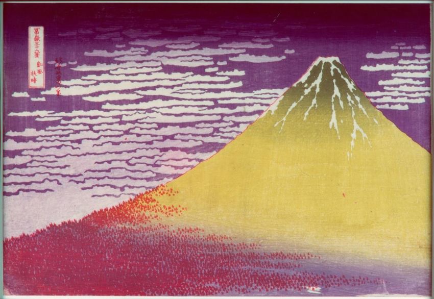
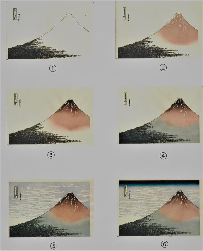
The FORS spectra at the MFA were collected using an Ocean Optics Flame minispectrometer
equipped with an Ocean Optics halogen light source. The Ocean Optics R 400-7-VIS-NIR probe
was connected to the detector and light source with a fibre optic bundle. The analysis spot size of an
approximately 1 mm as obtained by placing the probe at a 90-degree angle directly on a sheet of
Mylar covering the region to be analysed. The integration time was 30 ms. The signal was recorded
from 340-1025 nm but only the range between 400 and 900 nm was considered. The measurement
system was controlled by OceanView software.
  With both FORS systems, spectra were referenced against the area of the paper left white, i.e.
with no ink applied, and corresponding to the snow on Mount Fuji on each impression.
2.3.3. X-ray fluorescence

   The BM and the GM impressions were analysed using a Bruker Artax XRF spectrometer
operating at 50 kV and 500 µA with a collimated beam of 0.65 mm and a counting time of 200
seconds. The MFA impressions were analysed using a Bruker Artax XRF spectrometer with a
collimated beam of 0.65 mm, but operating at slightly different conditions, i.e. 40 kV, 700 µA and a
counting time of 120 seconds. Note that the conditions were not exactly the same at the two
laboratories because of differences in their standard protocols, but these differences were not
expected to affect the results of the XRF measurements. The contribution of the paper and board
behind the impressions were measured in the blank areas (snow on Mount Fuji) and subtracted using
the proprietary Artax software.
2.3.4. Excitation–emission matrix fluorescence spectroscopy

   EEM FS is particularly useful for the identification of organic colourants on Japanese woodblock
prints, especially for safflower -even when it appears as a faded brown colour in a print [16].
Spectra were acquired with a Cary Eclipse fluorescence spectrometer (Agilent Technologies), which
has a 15 W xenon flash lamp source (pulsed at 80 Hz, with a half-height peak width of 2 μs and
power 50–75 kW). Analyses were carried out with an external quartz fiber optic probe on a 2-3 mm
spot and WinFLR software was used for acquisition and data analysis. Operational wavelength
ranges for both excitation (λex) and emission (λem) were 200–900 nm. For the EEM fluorescence
spectra acquired during this project, excitation wavelengths between 250 and 600 nm and emission
wavelengths between 400 and 650 nm were used, with slit widths of 10 nm on both
monochromators. This realistically limited the precision of measured λex and λem maxima to no
better than ± 5 nm. Precision was probably poorer than this in a number of instances, due to the
typically broad shapes of the maxima peaks. During each EEM fluorescence scan, thirty-six
complete emission spectra were acquired at fixed excitation wavelengths, which were stepped at 10
nm intervals over the 250–600 nm range. The gain on the photomultiplier tube was adjusted for each
analysis area in order to keep the most intense bands on scale. A complete EEM fluorescence scan
can be carried out at a large range of selectable speeds. For this study a speed of 4800 nm/s (half the
maximum rate) was chosen, which produced runs lasting approximately 2 min thus minimizing print
exposure to radiation during acquisition, while also providing spectra with reasonable signal to noise
ratios. To identify the colourants, the EEM spectra obtained for the Red Fuji impressions were
compared with EEM spectra of reference samples as described in [16].

3. Results

3.1. Woodblocks and colourants used to produce Red Fuji

   Red Fuji was made using at least four woodblocks. The printing process is illustrated in Fig. 2,
which shows a set of six colour woodblock stage proofs for a facsimile reproduction of Red Fuji.
Japanese printers used only a limited range of colourants in the production of woodblock prints
© 2021 ISTE OpenScience – Published by ISTE Ltd. London, UK – openscience.fr          Page | 5
during the Edo Period and these are listed in Table 2. In particular, green colourants on Japanese
woodblock prints were a mixture of a blue and a yellow colourant. This is because the green
pigments used for paintings were not suitable for woodblock printing as their particles are too coarse
to penetrate the paper (finer particles of these pigments would not produce a sufficiently intense
colour) [20]. The same is true for purple colourants, which were in the vast majority of cases a
mixture of dayflower blue and safflower [21, 22].

   Fig. 2. Set of six colour woodblock stage proofs for a facsimile reproduction of Pink Fuji illustrating the
printing sequence: (1) outlines, title and signature printed with the first woodblock, (2) light brown printed on
 the body of Mount Fuji using the second woodblock, (3) dark brown printed at the top of Mount Fuji using
  the same woodblock as before, (4) green printed at the foot of Mount Fuji using the same woodblock as
 before, (5) light blue printed in the sky using the third woodblock and (6) dark blue printed at the top of the
    impression using the fourth woodblock. These proofs were commissioned by the British Museum and
                                    produced at the Takahashi Studio in Tokyo.
© 2021 ISTE OpenScience – Published by ISTE Ltd. London, UK – openscience.fr                   Page | 6
Colour          Colourants

     Blue            Ai (indigo), bero-ai (Prussian blue), aobana (dayflower)

     Yellow          Kihada (Armur cork tree), sekiō (orpiment), ōdo (earth pigment), tōō (gamboge), ukon (turmeric), zumi
                     (briar or crabapple)

     Red             Bengara (earth pigment), beni (safflower), shōenji (lac), shu (vermillion), suō (sappanwood), tan (red
                     lead)

     Black           Sumi (plant soot)

     White           Enpaku (white lead), gofun (shell white)

  Table 2. Colourants used for the production of woodblock prints in the late Edo Period in Japan (from [7-
  10]). Other colours (e.g. green and purple) were obtained by mixing. When there are several alternative
                names for a colourant, the Japanese name given here is the one listed in [9].

   As highlighted by the IRRFC image (Fig. 3), the outline of Mount Fuji (when present), the title
cartouche, the artist‟s signature and the small trees at the bottom of Mount Fuji were all printed
using the same colour -dark blue or black- and in all likelyhood the same woodblock. This is the
keyblock. Out of the 93 impressions we studied, 76 had dark blue outlines while the rest had black
outlines. We analysed the dark blue ink used for the keyblock in seven impressions of Red Fuji (i.e.
all of the impressions at our disposal, except MFA 21.6755, MFA 53.495 and MFA 11.17504,
which have black outlines) using FORS. The spectra of these impressions had a broad reflectance
peak at 400-450 nm, which is typical of Prussian blue [12] (this is illustrated in Fig. 4). Iron was
also detected using XRF, which confirmed the use of Prussian blue in the outlines (the other two
blue colourants used on Japanese prints in the Edo Period, indigo and dayflower blue, do not contain
iron). The FORS spectra also showed the blue ink contained indigo for six of the impressions (KUL
200X @ 4-13, MG AA.380, BM 1906,1220,0.525, MFA 21.6754, MFA 21.6757 and TNM A-
11176_1) as shown by the asymmetric absorption band at c. 660 nm consistent with published
reference spectra for indigo [11,18, 19] (Fig. 4). Only one impression, MFA 34.314, had its outlines
printed in Prussian blue, without indigo. Similar compositions for the outlines have been reported
for other impressions in the Thirty-Six Views of Mount Fuji series [5] and other Japanese prints
[12,13]. Prussian blue is a synthetic pigment that was recently introduced in Japan and extremely
popular at the time [23]. The black outlines in MFA 21.6755, MFA 53.495 and MFA 11.17504 were
most likely printed using sumi, as reported in the literature [24] and in agreement with the XRF
analyses (no element detected) and FORS measurements (high absorption and no spectral features).

© 2021 ISTE OpenScience – Published by ISTE Ltd. London, UK – openscience.fr                                   Page | 7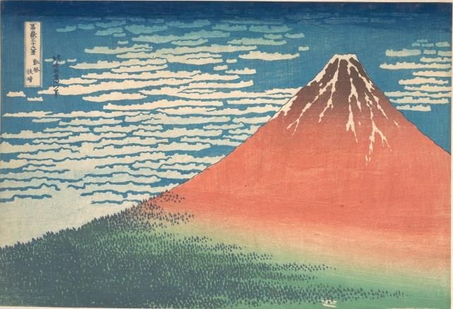
Fig. 3. IRRFC image of Red Fuji (BM 1906,1220,0.525). Indigo appears red in IRRFC images and it was
  used in this impression to print the outline of Mount Fuji, the title cartouche, the artist’s signature and the
                                     small trees at the bottom of Mount Fuji.

  Fig. 4. FORS spectra obtained for the different colours on impression KUL 200X @ 4-13. The inflection
   point at 570 nm, characteristic of hematite, on the reddish and dark brown parts of Mount Fuji and the
   asymmetric absorption band at c. 660 nm, characteristic of indigo, on the outlines are indicated on the
 spectra. Similar spectra were obtained for BM 1906,1220,0.525, GM AA.380, MFA 21.6756, MFA 21.6754
                                            and TNM A-11176_1.
© 2021 ISTE OpenScience – Published by ISTE Ltd. London, UK – openscience.fr                     Page | 8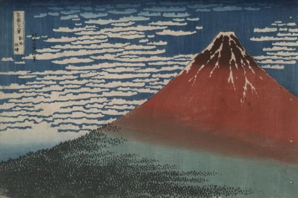
The second woodblock was used for the body of Mount Fuji. Close examination of the
impressions showed that the dark upper part of the mountain applied using a „bokashi’ (i.e.
gradation) technique was overprinted on the red brown colour (Fig. 5a). Printing a bokashi requires
skill and historical records state that a printer could typically print 200-300 sheets in a day, but this
number dropped to 20-30 sheets with a bokashi [10]. This woodblock also included the shape of
small trees along the edge of Mount Fuji that overlap with trees printed from the keyblock (see Fig.
5b where these are printed in orange-brown), creating the illusion of a large number of trees. As
illustrated in Fig. 2 steps 2-4, this woodblock was used three times: for the upper part of Mount Fuji
(usually brown, pink or red), for the lower part of Mount Fuji (usually green) and finally for the top
of Mount Fuji (usually dark brown). On the impressions GM AA.380; BM1906,1220,0.525; MFA
21.6754; MFA 21.6756 and MFA 34.314, the presence of iron on the reddish brown and dark brown
parts of Mount Fuji suggested the use of red and brown ochre. This was confirmed by the
corresponding FORS spectra, which had an inflexion point at 570 nm, typical of hematite [25] (this
is illustrated in Fig. 4).We detected the plant-based dye safflower on MFA 11.17504 on the pale
pink area using EEM FS (Fig. 6). Sumi was possibly used to shade the top of Mount Fuji on this
impression instead of brown ochre as we detected no iron using XRF in this part of the print.

   When the green colourant was analysed using XRF on eight Red Fuji impressions (i.e. all except
KUL 200X @ 4-13 and TNM A-11176_1), we detected arsenic, iron and sulphur, indicating it was a
mixture of Prussian blue and arsenic sulphide. The presence of Prussian blue in the green areas of
the impressions was confirmed by the FORS spectra (Fig. 4), which had a maximum reflectance at
c. 500 nm and a broad minimum reflectance at c. 680 nm and matched published spectra obtained
for mixtures of Prussian blue and a yellow pigment [13]. Arsenic sulphide on Japanese prints from
the 1830s usually corresponds to the yellow mineral orpiment or a synthetic product (most probably
a mixture of crystalline, semi-amorphous and amorphous arsenic sulphide particles) [26]. Orpiment
and crystalline arsenic sulphide fade upon exposure to light [27] and this could possibly explain the
fact that the grass at the bottom of Mount Fuji is blue in several of the surviving impressions of Red
Fuji, rather than green. As a matter of fact, a yellower green edge is sometimes noticeable at the
bottom of impressions of Red Fuji (e.g. see impression MNEMG.TEMP.2016.448 in the collection
of the Maidstone Museums). This is most likely because a frame protected the edges of these
impressions from light, limiting the fading of the yellow colourant present in the green colourant
used for the grass.

                                                                  1 mm              1 cm
                   a.                                                     b.

    Fig. 5. (a) Micrograph of the snow at the top of Mount Fuji. The red brown and the dark brown do not
   overlap perfectly, indicating that the woodblock was used twice; once inked with red brown and another
time with dark brown (BM 1906,1220,0.525). (b) Detail of impression KUL 200X @ 4-13. The outlines of the
                   trees printed in reddish brown overlap with the trees printed in dark blue.

  The third woodblock was used for the intricate design of the clouds in the sky (step 5 in Fig. 2),
which was printed using Prussian blue in all the prints we analysed, as shown by the XRF analysis
© 2021 ISTE OpenScience – Published by ISTE Ltd. London, UK – openscience.fr               Page | 9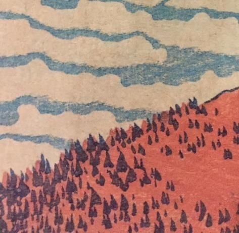
(presence of iron) and FORS spectra (broad reflectance peak at 400-450 nm). Note how the lower
edge of the clouds has been roughened in the woodblock („itabokashi‟ technique, see [24, 28] for
more details on printing techniques), compared to the smooth upper edge of the clouds, producing
visual interest (visible in Fig. 5b). On the Blue Fuji variant, the pattern of the clouds has only been
printed in the top of the impression (Fig. 6), while in other impressions this part is covered by a dark
blue bokashi (Fig. 1).
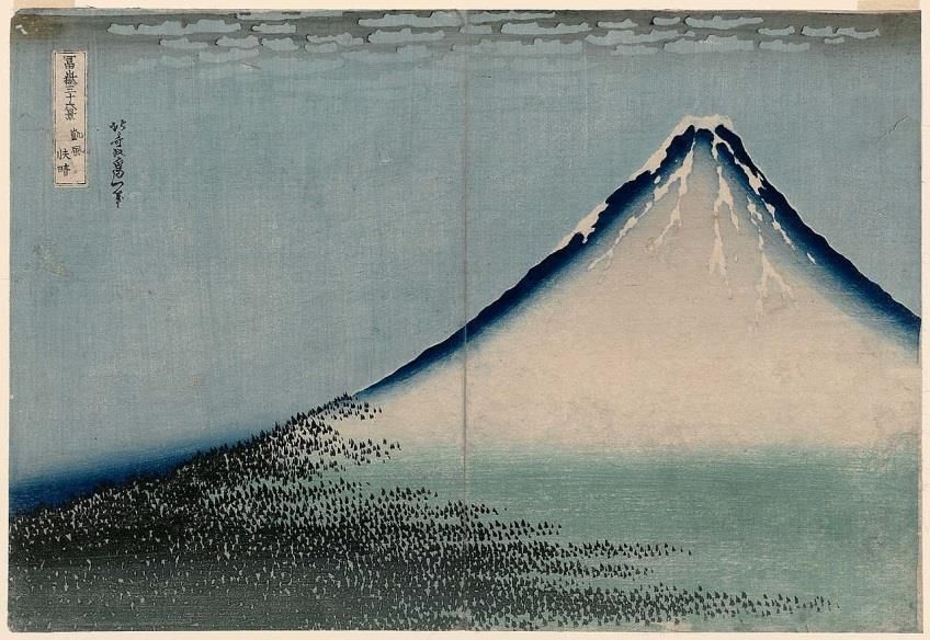
Fig. 6. Blue variant of the Red Fuji print. It is strikingly different from the other impressions of Red Fuji: the
outlines of Mount Fuji have been omitted, a dark blue bokashi delineates the slopes of Mount Fuji and the
top of the sky is light brown. Unlike the other Red Fuji impressions, the clouds are only visible in the top of
the impression (MFA 21.6755).
This deep and intense blue bokashi was produced using the last woodblock (step 5 in Fig. 2). The
printer(s) also used this woodblock to apply a light wash over the sky towards the bottom of all
impressions, except the Pink Fuji variants. The blue wash is visible in the white of the clouds. On
some impressions, there is also a dark blue bokashi in the bottom left hand corner in the sky area,
most likely produced using the same woodblock (Fig. 7). The bokashi and the blue wash were
printed with Prussian blue in all the prints we analysed as shown by the XRF analyses (presence of
iron) and FORS spectra (broad reflectance peak at 400-450 nm).
On all the Blue Fuji impressions we located, including MFA 21.6755, the top of the sky between
the clouds is brown (Fig. 6). On the MFA 21.6755 impression, EEM FS measurements showed the
ink used for this area contains safflower (Fig. 8) and dayflower blue was detected using FORS, as
shown by the absorption bands at 595 and 650nm, consistent with published data [29] (Fig. 9). This
indicates that the sky was originally purple at the top of this impression. It is quite common for
purple to fade to brown on Japanese prints [30]. The rest of the sky and the mountain were printed
using Prussian blue, as identified using XRF (presence of iron) and FORS (broad reflectance peak at
400-450 nm in the corresponding spectra).
© 2021 ISTE OpenScience – Published by ISTE Ltd. London, UK – openscience.fr Page | 10Fig. 7. Impression of Red Fuji printed with a dark blue bokashi in the sky above the trees in the bottom left
corner, as indicated by a yellow arrow. The keyblock was printed using black, rather than dark blue, ink.
Two small triangular areas are circled in red in the sky, which were left unprinted and correspond to
woodblock damage (MFA 11.17504).
Fig. 8. Extracted EEM fluorescence spectra showing an overlay of the excitation curve at the fixed emission
wavelength of 495 nm and the emission curve at the fixed excitation wavelength of 520 nm for the pink in
the mountain (MFA 11.17504) and the brown sky (MFA 21.6755) together with the reference spectra for
safflower (from [16]).
© 2021 ISTE OpenScience – Published by ISTE Ltd. London, UK – openscience.fr Page | 11650
595
Reflectance
Dayflower reference
Brown sky
450 500 550 600 650 700 750 800
Wavelength (nm)
Fig. 9. FORS spectrum obtained for the brown sky on MFA 21.6754, together with a reference spectrum for
dayflower from [31].
Our findings are summarised in Table 3.
Impressions Colourants identified
BM 1906,1220,0.525 Prussian blue (sky, outlines, lower part of Mount Fuji), arsenic sulphide (lower
part of Mount Fuji), red ochre (middle and upper parts of Mount Fuji), brown
ochre (upper part of Mount Fuji), indigo (outlines)
KUL 200X @ 4-13 Prussian blue (sky, outlines, lower part of Mount Fuji), indigo (outlines)
MG AA.380 Prussian blue (sky, outlines, lower part of Mount Fuji), arsenic sulphide (body of
Mount Fuji), red ochre (middle and upper parts of Mount Fuji), brown ochre
(upper part of Mount Fuji), indigo (outlines)
MFA 11.17504 Safflower* (middle part of Mount Fuji)
MFA 21.6754 Prussian blue (sky, outlines, lower part of Mount Fuji), arsenic sulphide (lower
part of Mount Fuji), red ochre (middle and upper parts of Mount Fuji), brown
ochre (upper part of Mount Fuji), indigo (outlines)
MFA 21.6755 Prussian blue (sky, body of Mount Fuji), arsenic sulphide (lower part of Mount
Fuji), safflower (sky at the top of the print), dayflower (sky at the top of the
print), sumi (trees, title and signature)
MFA 21.6757 Prussian blue (sky, lower part of Mount Fuji), arsenic sulphide (lower part of
Mount Fuji), red ochre (middle and upper parts of Mount Fuji), brown ochre
(upper part of Mount Fuji), indigo (outlines)
MFA 34.314 Prussian blue (sky, outlines, lower part of Mount Fuji), arsenic sulphide (lower
part of Mount Fuji), red ochre (middle and upper parts of Mount Fuji), brown
ochre (upper part of Mount Fuji)
MFA 53.495 Prussian blue (sky, lower part of Mount Fuji), arsenic sulphide (lower part of
Mount Fuji), sumi (outlines and upper part of Mount Fuji)
TNM A-11176_1 Prussian blue (sky, outlines, lower part of Mount Fuji), indigo (outlines)
* Only the pink area was analysed using EEM FS
Table 3. Colourants identified on Red Fuji impressions.
3.2. Woodblock wear
When we examined the photographs of the 93 impressions for signs of woodblock wear in the
lines, we concluded that only three breaks appeared consistently. These were in the following areas:
© 2021 ISTE OpenScience – Published by ISTE Ltd. London, UK – openscience.fr Page | 12the slope of the mountain near the trees, the outer line on the left hand side of the cartouche and the
inner line on the right hand side of the cartouche. These breaks are visible in Fig. 1 (overall) and
Fig. 10 (details). Somewhat surprisingly, we observed that the first two breaks were present on all
the impressions studied -except on five impressions, for which the resolution of the photograph was
not sufficiently high to distinguish these very small breaks. This indicates damage had occurred in
the keyblock even before it was used. Out of the 88 impressions for which we could visualise the
breaks in the cartouche, the third break was present in 61.
a. b. c.
Fig. 10. Details of Fig. 1: (a) Break in the outline of the mountain near the trees, (b) break on the left hand
side of the title cartouche and (c) break on the right hand side of the title cartouche (BM 1906,1220,0.525).
Keyes listed eleven states for Red Fuji, corresponding to seven breaks, a break repaired, the
removal of the outline of the mountain and the use of two new woodblocks [32]. The seven breaks
included the two breaks in the cartouche mentioned earlier and five other breaks in the cartouche.
However, we observed that these five other breaks did not appear systematically in the impressions
we examined. They seemed to have been caused by printing effects such as differences in the inking
of the blocks and the pressure applied by the printmaker, rather than block damage.
We also found no evidence for the repair to the keyblock reported by Keyes. The two new
woodblocks Keyes believed had been used were for the green grass and the light blue wash in the
sky respectively. However, our observations convinced us that the printer(s) used the same
woodblocks for all the Red Fuji impressions we studied (except impression CB.EJ.1939.191 in the
Baur Collection, more about this later). The woodblock used to print the grass had some
imperfections, as evidenced by two small areas left unprinted at the bottom of the mountain towards
the right (these are highlighted in Fig. 1). These imperfections were present in all the impressions
we examined, except on three retouched impressions (e.g. see impression 1928.1085 in the Art
Institute of Chicago, whose photograph is available online [33]), which showed that no new block
was used for the green grass. For the light blue wash over the sky, it is unlikely a new woodblock
was carved either as this wash could have been printed using the same woodblock as the blue
bokashi at the top of the print (this is the fourth woodblock shown in step 6 in Fig. 2).
A woodgrain pattern is visible in the body of Mount Fuji below the snow in many impressions of
Red Fuji. The intentional use of a woodblock‟s woodgrain pattern is called „mokume-zuri‟ [28]
(which translates as „wood-eye printing‟). Printers used this effect in areas where the woodgrain
pattern would resemble, for instance, ripples in water or raked lines in sand beds, or they used it
simply to achieve an interesting graphic effect. We observed that the woodgrain pattern was not the
same in all impressions, most probably because the woodblock became increasingly thinner through
use and wear. The examination of the woodgrain pattern, when visible, allows distinguishing
between early impressions and later ones. On early impressions, an ellipsoidal shape or „wood-eye‟
is visible, while in later impressions the woodgrain pattern consists of almost parallel lines. In even
© 2021 ISTE OpenScience – Published by ISTE Ltd. London, UK – openscience.fr Page | 13later impression the woodgrain pattern is discernible (Fig. 6). Table 4 illustrates the evolution of the
woodgrain pattern from early to late impressions.
We noticed that all the impressions printed with black outlines had signs of damage in the
woodblock for the sky used for the bokashi(s) and the light blue wash: these are visible as small
areas left unprinted (Fig. 6). They can be difficult to visualise in some of these impressions as the
sky in these areas is usually printed with a very light blue wash and offers little contrast with the
white of the paper. These defects are more apparent in the blue variants (e.g. the impression
reproduced in [34] or GM MA8149, see photograph online [35]), unless they have been retouched.
Impressions Original Enhanced using Adobe Photoshop
Smith College Museum of
Art, 1968:245
Honolulu Museum of Art,
15583
Metropolitan Museum of
Art, JP9
British Museum,
1906,1220,0.525
Metropolitan Museum of
Art, JP2960
Los Angeles County
Museum of Art, M.81.91.1
Table 4. Photographs showing the proposed evolution of the woodgrain pattern with woodblock wear from
early to late impressions of Red Fuji. The wood-eye is indicated by a yellow arrow.
3.3. Evolution of colour schemes and printing effects
As stated by Keyes [32] and recently confirmed using scientific methods [19], the rare pink
variant of Red Fuji corresponds to the earliest surviving edition. These impressions have more
© 2021 ISTE OpenScience – Published by ISTE Ltd. London, UK – openscience.fr Page | 14muted colours than the bold ones we are most familiar with (compare Fig. 10 and 1). They are
characterised by a dappled light blue sky and a large expanse of green at the foot of the mountain.
Except for the Pink Fuji impression in the collection of the National Museum Krakow, the
delimitation between the green and the brown areas is not straight as in later impressions, but
curved. According to David Bull, a very experienced woodblock carver and printer based in Tokyo,
the two colours of Mount Fuji were printed one after the other using the same woodblock and
achieving a gradual transition between the two colours is technically complex: “This is one of the
images that terrifies young trainee printers when they first try it, because of the difficulty of getting
the two gradations lined up in the same area. Too much overlap and you get a strange colour in the
blend zone… two little overlap and it shows too white …” [36]. Blending the two colours along a
concave arc, such as in Pink Fuji, is even more difficult than blending them along a straight line and
in all later impressions of Red Fuji they meet in an almost straight line. This effect is not always
properly achieved in all impressions as illustrated in Fig. 11.
Fig. 11. Pink Fuji (Smith College Museum of Art, Northampton, 1968:245
(gift of Mr and Mrs James Barker)).
a. b.
Fig. 12. (a) In some impressions, the green and brown areas overlap to some extent (Yale University Art
Gallery, New Haven, 1954.9.25) but (b) in others there is not enough overlap, leaving a white area between
the green and brown areas (Metropolitan Museum of Art, New York, JP2568).
© 2021 ISTE OpenScience – Published by ISTE Ltd. London, UK – openscience.fr Page | 15In all other impressions of Red Fuji -except the blue variants, the blue of the sky is solid and more intense than for Pink Fuji and a light blue wash was applied over the clouds using the woodblock used to apply the dark blue bokashi at the top of the print. In all the impressions we analysed, Prussian blue was used for this blue wash. We observed a dark blue bokashi in the bottom left hand side of the print in the sky (Fig. 5a) in some impressions. The third break in the cartouche was present in all of them, indicating they were late printings. Also, these impressions were printed with black, not blue, outlines. According to published research, sumi, a black ink containing soot, was used for the outlines in the impressions of the Thirty-Six Views of Mount Fuji series when the publisher commissioned ten additional prints to the series as a result of its popularity [37]. In these impressions, the delimitation between the green and the pink areas in the mountain is often horizontal, rather than oblique like in other impressions, and quite toward the top of Mount Fuji (Fig. 6). While we identified red and brown ochre on Mount Fuji in earlier impressions of Red Fuji, we detected safflower on MFA 11.17504 using EEM FS. Also, the grass appears blue on this impression while we detected arsenic and sulphur using XRF, which shows that arsenic sulphide was used and had probably faded due to exposure to light. Safflower is light sensitive [6] and, since the impression was most likely light damaged (as evidenced by the blue appearance of the grass), the light pink colour of the mountain was certainly initially much more intense than it is today. Safflower also has a different hue than red ochre, i.e. pink red compared to orange brown, and Mount Fuji would have looked very different from earlier prints. Sumi was possibly used to shade the top of Mount Fuji on these impressions instead of brown ochre. We came across several blue variant impressions of Red Fuji. These were completely different in their colour palette and the printing effects from other impressions of Red Fuji, earning the nickname „Blue Fuji‟. The keyblock in these impressions was printed in black, not dark blue, and the outline of Mount Fuji was left unprinted with the inside of the mountain filled by a deep dark blue bokashi (Fig. 12a). As irregularly-shaped bokashis are particularly difficult to apply [24, 28], the blue gradation inside Mount Fuji would have required considerable skill from the printer. There is a bokashi in the bottom left corner of the sky as in other impressions with black outlines. Unlike other impressions of Red Fuji, the sky between the clouds is printed only at the top of the print and this was done using an ink that, as explained earlier, used to be purple. 3.4. Proposed production chronology In total, based on our examination of 93 impressions, we concluded there were five states for the Red Fuji print and we have summarised how to identify each state in Table 3. It was possible to assign a definite state for 88 of the impressions. The five remaining impressions were either in state 2 or 3, but the resolution of the photographs available to us was unfortunately not sufficiently high to visualise breaks in the title cartouche clearly. These five impressions were held in private collections and it was not possible to obtain higher resolution photographs. The first state corresponds to the rare pink variant and we managed to locate six such impressions. Apart from their muted colours, the unique characteristic for this state is the absence of a light blue wash over the clouds, so that all the clouds – apart from those just below the dark blue bokashi at the top of the print- are white. In the second state, the colour palette becomes more vivid: in particular, the red-brownish colour of Mount Fuji is more intense than in earlier impressions. The clouds in the bottom part of the sky are no longer entirely white as the printer(s) applied a light blue wash over them. This is the case in all subsequent impressions, especially for the large cloud very low in the sky in the left bottom corner of the print. State 3 is the most common state of Red Fuji and we came across 42 such impressions. It is very similar to state 2 but is recognisable by the third break in the title cartouche. Also, the „wood-eye‟ in © 2021 ISTE OpenScience – Published by ISTE Ltd. London, UK – openscience.fr Page | 16
the woodgrain pattern inside Mount Fuji is absent. In most state 3 impressions, the woodgrain
pattern consists of almost parallel lines.
   In state 4, the keyblock was printed using black ink so that the outlines, the trees, the signature
and the title cartouche are black, instead of dark blue as in earlier impressions. The woodgrain
pattern in the body of Mount Fuji is barely visible, and when present consists of almost parallel
lines.
   The last state, state 5, is very easy to identify as it corresponds to the blue variant, which is
strikingly different from earlier impressions. The outlines of Mount Fuji have been omitted, Mount
Fuji is filled with a dark blue bokashi and the top of the sky is light brown.
         State       Characteristics                                 Impressions
         1           Muted colour palette (Pink Fuji)                MG (AA.380)

                     Dappled light blue sky                          Museum of East Asian Art Cologne

                     Absence of light blue wash over the clouds      National Museum Krakow (MNK VI-491)

                                                                     Smith College Museum of Art (1968:245)

                     Cartouche break on the left hand side,          Museum of Art Atami
                     break near the trees, damage to the green
                     woodblock                                       Private collection (image available in [32])

         2           Light blue wash over the clouds in the          Art Institute of Chicago (1925 32-43)
                     bottom part of the sky
                                                                     Arts and Crafts Museum Hamburg (IE1896.389)
                     Solid medium blue sky
                                                                     Cleveland Museum of Art (1930.189)
                     More vivid colours for the body of Mount
                     Fuji than in state 1                            Edo Tokyo Museum

                                                                     Fitzwilliam Museum (P.3612-R)

                     Same woodblock wear as state 1                  Honolulu Museum of Art (15583)

                                                                     Kawasaki Isago no Sato Museum

                                                                     Lauren Rogers Museum of Art

                                                                     Matsuba Foundation

                                                                     MFA (21-6754)

                                                                     Ota Memorial Museum of Art

                                                                     Philadelphia Museum of Art (1958-49-5)

                                                                     SDK Dresden (A 1898-402)

                                                                     Shimane Art Museum

                                                                     Worcester Art Museum (1926.155)

                                                                     Yamatane Museum of Art
                                                                     Private collection (no image publicly available)
                                                                     Private collections (x2, images available online [38-
                                                                     39])
         3           Cartouche break on the inner line of right      Allen Memorial Art Museum (1950.711)
                     hand side
                                                                     Art Gallery South Australia (768G84)
© 2021 ISTE OpenScience – Published by ISTE Ltd. London, UK – openscience.fr                                        Page | 17
Similar colour scheme as state 2 Art and History Museum Brussels (3182)
Arts and Crafts Museum Hamburg (IE1896.389-1)
Art Institute of Chicago (1952.341 and 1928.1085)
BM (1906,1220,0.525)
Chazen Museum of Art (1980.2387)
Chiba City Museum of Art
Corfu Museum of Asian Art
Fine Arts Museums of San Francisco (54755.456)
Giverny Museum
Harvard Art Museum (1933.4.2699)
Indianapolis Museum of Art (60.12)
Japan Ukiyo-e Museum
KUL (200X @ 4-13)
Los Angeles County Museum of Art (M.81.91.1)
Maidstone Museum (121)
Metropolitan Museum of Art (JP2960, JP2568 and
JP9)
Minneapolis Institute of Art (P.70.148)
Museum of Applied Arts Vienna (KI 10996)
Museum of Asian Art Berlin
MFA (21.6756 and 34.314)
Newark Museum (51.131)
National Library of France (946791 and JB 781)
Rhode Island School of Design Museum (20-1185)
Rijksmuseum (RP-P-1952-183)
Royal Ontario museum (926.18.565)
Sumida Hokusai Museum
Tokyo Fuji Art Museum
TNM (A-11176_1)
Victoria & Albert Museum (E.4813-1916)
Yamanashi Prefectural Museum
Private collections (x3, no image publicly available)
Private collections (x4, images available online [40-
43])
4 Black outlines and rather similar colour Chazen Museum of Art (1984.1032)
scheme as states 2 and 3
Indianapolis Museum of Art (60.12)
Dark blue bokashi in bottom left corner of
the sky Museum of Fine Arts, Boston (53.495)
Museum of Fine Arts, Boston (11.17504)
Horizontal delimitation between the green National Library of France (JB 782)
© 2021 ISTE OpenScience – Published by ISTE Ltd. London, UK – openscience.fr Page | 18grass and the red/brown body of Mount Yale University Art Gallery (1954.9.25)
Fuji, rather than oblique or curved like in
earlier impressions Private collections (x2, images available online [44-
45])
Private collection (no image publicly available)
The red body of Mount Fuji is often very
faded
Damage to sky woodblock
5 Blue colour scheme (Blue Fuji) MG (MA8149)
Inside of the mountain filled by a dark Edoardo Chiossone Museum of Oriental Art
blue bokashi
Museum of Fine Arts, Boston (21.6755)
No outlines for Mount Fuji and no dark New York Public Library (109543)
blue bokashi at the top of the sky
Baur Collection (CB.EJ.1939.191)
Private collections (x2, images available in [33] and
Black ink used for the trees, title and online [46])
signature Private collection (no image publicly available)
Table 3. Proposed states of Red Fuji (the accession number of each impression is given, when available).
3.4. Note on Blue Fuji
Very little is known about the intriguing design of Blue Fuji. The earliest prints of the Thirty-Six
Views of Mount Fuji series were initially printed as aizuri (i.e. blue monochromes) [23] and it has
sometimes been claimed that Blue Fuji is the earliest design of Red Fuji because of its colour
scheme. As we have shown here, this is incorrect and Blue Fuji is the last edition of Red Fuji. Some
impressions (e.g. GM MA8149, a photograph is available online [35]), appear to have been entirely
printed in blue but this is most likely because the green ink used for the grass changed to blue due to
the fading of the yellow pigment upon exposure to light.
a. b.
© 2021 ISTE OpenScience – Published by ISTE Ltd. London, UK – openscience.fr Page | 19Fig. 13. Differences in the title cartouche between (a) the impression of Blue Fuji in the Baur Collection
(CB.EJ.1939.191) and (b) other impressions of Red Fuji (here: BM 1906,1220,0.525).
Late editions of prints in the Thirty-Six Views of Mount Fuji series were often printed in different
colour schemes and there are variations between early and late editions. However, Blue Fuji is the
only print that was re-designed in an entirely different way from the original design. In particular,
the use of a bokashi inside Mount Fuji is unique. There is evidence of selling and buying of
woodblocks in the early 19th century: Margaret Miller Kanada reports the case of the woodblocks of
the book “Famous Sights of the Eastern Capital” carved in 1800, sold several times and printed by
various publishers until 1840 [10]. It is possible that the woodblocks of this famous print were sold
at a later stage to a publisher who decided to produce a completely different version of Red Fuji to
revive the interest of customers.
Finally, we found that the impression of Blue Fuji in the Baur Collection, Geneva, was rather
different from the other impressions of Blue Fuji when examined closely. We observed differences
in the title cartouche (Figures 12b and 12c), the title, the shapes of the snow in the mountain and the
clouds. This was in agreement with Matthi Forrer‟s entry in the catalogue of the Japanese prints of
the Baur Collection: “printed from generally recut blocks [and] probably only the block indicating
the pine-trees on the foot of the mountain corresponds with the original. Why exactly, and when this
reprint in a totally different colour scheme was made, is difficult to say” [47]. The trees were most
likely carved on the keyblock, on which the title cartouche and the signature had also been carved.
To produce the Bauer print, the original keyblock would have been partially inked or parts of it
scraped and four new woodblocks (cartouche and signature, clouds, sky and body of the mountain)
were carved. This raises intriguing questions. Was this done at a much later point when there was a
new demand for impressions of Blue Fuji? Had the other woodblocks been lost?
4. Conclusions
We located 93 surviving impressions of Red Fuji in museums, libraries and galleries around the
world. The careful examination of woodblock wear showed that there were five sequential states of
Red Fuji, not 11 as proposed by Keyes. The first state corresponds to the rare Pink Fuji impressions
printed using muted colours and complex printing effects. Surprisingly, we observed signs of
woodblock wear in two places in the keyblock, suggesting the keyblock had been damaged even
before it was first used. There were also defects in the colour woodblock used for the green of
mountain. The second state of Red Fuji is characterised by a light blue wash applied over the clouds
and the third state by a break in the title cartouche on the right hand side. A dark blue bokashi was
added in the bottom left hand corner in the sky area in state 4 impressions. All state 4 impressions
we located had black outlines and the printing effects used for the body of Mount Fuji were
simplified. In the now faded state 4 impression MFA11.17504, safflower was identified in the body
of Mount Fuji, whereas red ochre had been used in earlier impressions. Impressions in the last state,
Blue Fuji, were entirely re-designed, with very different printing effects from the original design and
a completely new colour scheme. The detection of safflower and dayflower blue colourants in the
now brown sky showed that it used to be purple. In all the impressions we analysed, the blue
gradation in the sky and the light blue wash were printed using Prussian blue, a synthetic pigment
recently introduced in Japan and extremely popular at the time. Our research represents the first
systematic study of the production chronology of a Japanese woodblock print.
Acknowledgements
We thank Tim Clark, former head of the Japanese section at the British Museum, for his support
and the late Roger Keyes for his warm encouragement and contagious enthusiasm. Thanks are due
© 2021 ISTE OpenScience – Published by ISTE Ltd. London, UK – openscience.fr Page | 20to Peter McElhinney who conducted some of the analyses on the impression BM 1906,1220,0.525 while doing a placement at the British Museum and colleagues in Scientific Research at the British Museum for training and providing assistance with the analyses: Joanne Dyer, Aude Mongiatti and Duncan Hook. We are grateful to the staff at Musée Guimet for giving us access to their Pink Fuji impression. Thanks are also due to staff at the Bauer Collection, Chazen Museum of Art, Edoardo Chiossone Museum of Oriental Art, Harvard Art Museums, Honolulu Museum of Art, Museum of Applied Arts Vienna, Rhode Island School of Design Museum, Spencer Museum of Art, Maidstone Museum, National Museum Krakow and Victoria & Albert Museum for sending us digital photographs of their Red Fuji impressions when these were not available online. Finally, Capucine Korenberg thanks the staff at Keio University Libraries and the National Tokyo Museum for allowing her to view their Red Fuji impressions. Notes [1] G. C. Calza, Hokusai, New York: Phaidon Press (2003) [2] J. Ōkubo, On ukiyo-e publishing (in Japanese), Tokyo: Yoshikawa Kōbunkan (2013) [3] T. Clark, Hokusai: beyond The Great Wave, T. Clark (editor), London: Thames and Hudson (2017) 123 [4] http://www.dh-jac.net/db1/booksrske/search.php [5] M. Vermeulen, L. Burgio, N. Vandeperre, E. Driscoll, M. Viljoen, J. Woo and M. Leona, Beyond the connoisseurship approach: creating a timeline in Hokusai prints using non-invasive techniques and multivariate data analysis, Heritage Science vol 8 (2020), Article number: 62. https://doi.org/10.1186/s40494-020-00406-y [6] R. Feller, M. Curran and C. Bailie, Identification of traditional organic colorants employed in Japanese prints and determination of their rates of fading, Japanese woodblock prints: a catalogue of the Mary A. Ainsworth collection, R. Keyes (editor). Oberlin: Allen Memorial Art Museum (1984), 253-266 [7] T. Tokuno, Japanese wood-cutting and wood-cut printing, Report of National Museum (1892) [8] K. Ishii, The engraving and printing of Japanese prints, Kyoto: Geisodo (1929) [9] The Anatomy of Colors: Look closely and read the stories of colors of Edo in Kuniezu & Ukiyoe, Tokyo: The Meguro Museum of Art (2016) [10] M. Miller Kanada, Color woodblock printmaking. The traditional method of ukiyo-e, Tokyo: Shufunotomo (1995) [11] S. Zaleski, Y. Takahashi and M. Leona, Natural and synthetic arsenic sulphide pigments in Japanese woodblock prints of the late Edo period, Heritage Science 32 vol 6 (2018), https://doi.org/10.1186/s40494-018-0195-0 [12] Leona M, Winter J. Fiber optics reflectance spectroscopy: a unique tool for the investigation of Japanese paintings. Stud Conserv. 2001;46:153-62 [13] J. Pérez-Arantegui, D. Rupérez, D. Almazán and N. Díez-de-Pinos, Colours and pigments in late ukiyo-e art works: A preliminary non-invasive study of Japanese woodblock prints to interpret hyperspectral images using in- situ point-by-point diffuse reflectance spectroscopy, Microchemical Journal vol 139 (2018), 94-109 [14] T. Villafana and G. Edwards, Creation and reference characterization of Edo period Japanese woodblock printing ink colorant samples using multimodal imaging and reflectance spectroscopy, Heritage Science 94 vol 7 (2019), https://doi.org/10.1186/s40494-019-0330-6 [15] C.Biron, A. Mounier, J. Pérez Arantegui, G. Le Bourdon, L. Servant, R. Chapoulie, C. Roldán, D. Almazán, N. Díez-de-Pinos and F. Daniel, Colours of the « images of the floating world ». Non-invasive analyses of Japanese ukiyo-e woodblock prints (18th and 19th centuries) and new contributions to the insight of oriental materials, Microchemical Journal vol 152 (2020), 104374, https://doi.org/10.1016/j.microc.2019.104374 [16] M. Derrick, R. Newman and J. Wright, Characterization of yellow and red natural organic colorants on Japanese woodblock prints by EEM fluorescence spectroscopy, Journal of the American Institute of Conservation vol 56 (2017), 171-193 [17] J. Resig, An Ukiyo-Database for Everyone, Impressions vol 38 (2017), 149-152 © 2021 ISTE OpenScience – Published by ISTE Ltd. London, UK – openscience.fr Page | 21
[18] J. Dyer, G. Verri and J.Cupitt, Multispectral imaging in reflectance and photo-induced luminescence modes: a
   user manual (2013). https://www.britishmuseum.org/pdf/charisma-multispectral-imaging-manual-2013.pdf.
   Accessed 21 September 2018
[19] C. Korenberg, L. Pereira-Pardo, P. McElhinney and J. Dyer, Developing a systematic approach to determine the
   sequence of impressions of Japanese woodblock prints: the case of Hokusai‟s „Red Fuji‟, Heritage Science vol 7
   (2019), Article number: 9. https://doi.org/10.1186/s40494-019-0250-5
[20] L. R. Bickford, The pigment story. Impressions vol 7 (1982), 1-5
[21] A. Yamato, Kôki ukiyo-e hanga ni shiyô sareta shikizai no hensen ni kansuru kenkyû (Studies on changes in the
   colorants used in later ukiyo-e prints), Master Thesis, Tohoku University of Art and Design, Japan (2013)
[22] Vermeulen, M., Tamburini, D., Müller, E.M.K. et al. Integrating liquid chromatography mass spectrometry into
   an analytical protocol for the identification of organic colorants in Japanese woodblock prints. Sci Rep 10, 20921
   (2020). https://doi.org/10.1038/s41598-020-77959-2
[23] H. Smith, Hokusai and the Blue Revolution in Edo Prints, Hokusai and His Age: Ukiyo-e Painting, Printmaking,
   and Book Illustration in Late Edo Japan, John T. Carpenter (editor), Amsterdam: Hotei Publishing (2005), 234-69
[24] R. Salter, Japanese woodblock printing, London: A&C Black (2001)
[25] Elias M, Chartier C, Prévot G, Vignaud C. The colour of ochres explained by their composition. February 2006
   Mat Sci and Eng B. 2006;127(1):70-80
[26] M. Vermeulen and M. Leona, Evidence of early amorphous arsenic sulphide production and use in Edo period
   Japanese woodblock prints by Hokusai and Kunisada, Heritage Science vol 7 (2019), Article number: 73.
   https://doi.org/10.1186/s40494-019-0318-2
[27] V. Daniels and B. Leach, The occurrence and alteration of realgar on ancient Egyptian papyri, Studies in
   Conservation vol 49 (2004), 73-84
[28] R. Kruml, The techniques of Japanese printmaking, Ukiyo-E to Shin Hanga: The Art of Japanese Woodblock
   Prints, C. Uhlenbeck and A. Newland (editors), New York: Mallard Press (1990), 28-43
[29] G. Edwards and T. Villafana, Multi-analytic characterization of colorants in two impressions of an Utagawa
   Toyoharu perspective print, Journal of Cultural Heritage vol 45 (2020), 48-58
[30] B. Fiske, Metropolitan Museum of Art Japanese Print Collection: Condition Survey, Computer Cataloging and
   Exhibition Concerns, The Book and Paper Group (1993), 13-19
[31] http://cameo.mfa.org/wiki/File:Dayflower_FORS.JPG
[32] R. Keyes, Pink Fuji: The print Hokusai saw, Impressions vol 29 (2007-2008), 68-75
[33] https://www.artic.edu/artworks/89500/a-mild-breeze-on-a-fine-day-gaifu-kaisei-from-the-series-thirty-six-views-
   of-mount-fuji-fugaku-sanjurokkei (accessed 26/01/2021)
[34] R. Lane, Hokusai: life and work, New York: E. P. Dutton, (1989), 190
[35]
   https://www.photo.rmn.fr/CS.aspx?VP3=SearchResult&VBID=2CMFCIPYX7TEQ&SMLS=1&RW=1280&RH=5
   87#/SearchResult&VBID=2CMFCIPYX7TEQ&SMLS=1&RW=1280&RH=587&PN=1 (accessed 20/01/2021)
[36] D. Bull, e-mail message to Capucine Korenberg, June 12, 2018
[37] M. Forrer, Hokusai Prints and Drawings, Munich: Prestel Verlag; London: Royal Academy of Art (1991)
[38] https://www.christies.com/lot/lot-katsushika-hokusai-gaifu-kaisei-
   6192396/?from=searchresults&intObjectID=6192396 (accessed 20/01/2021)
[39] https://www.christies.com/lot/lot-katsushika-hokusai-katsushika-hokusai-
   5078485/?from=searchresults&intObjectID=5078485 (accessed 20/01/2021)
[40] https://www.christies.com/lot/lot-katsushika-hokusai-gaifu-kaisei-
   6277252/?from=searchresults&intObjectID=6277252 (accessed 20/01/2021)
[41] https://www.christies.com/lot/lot-katsushika-hokusai-fine-wind-clear-weather-
   6047648/?from=searchresults&intObjectID=6047648 (accessed 20/01/2021)
[42] https://www.christies.com/lot/lot-katsushika-hokusai-fine-wind-clear-weather-
   6181653/?from=searchresults&intObjectID=6181653 (accessed 20/01/2021)
© 2021 ISTE OpenScience – Published by ISTE Ltd. London, UK – openscience.fr                      Page | 22
You can also read