STATE OF THE CLIMATE 2018 - Ole Humlum - GWPF
←
→
Page content transcription
If your browser does not render page correctly, please read the page content below

STATE OF THE
  CLIMATE 2018
  Ole Humlum

The Global Warming Policy Foundation
GWPF Report 34
THE STATE OF THE CLIMATE 2018
Ole Humlum

ISBN 978-1-9160700-0-4
© Copyright 2019 The Global Warming Policy Foundation
Contents

 About the author                   vi
 Executive summary: ten key facts   vii
 1    General overview 2018          1
 2    Temperatures                   3
 3    Oscillations                  25
 4    Sea level                     27
 5    The cryosphere                30
 6    Extreme weather               35
 7    Written references            40
 8    Links to data sources         40
About the author
Ole Humlum is former Professor of Physical Geography at the University Centre in Svalbard,
Norway, and Emeritus Professor of Physical Geography, University of Oslo, Norway.

vi
Executive summary: ten key facts
 1. According to temperature records from the instrumental period (since about 1850), 2018
    was one of the warmest years on record, but cooler than both 2016 and 2017.
 2. At the end of 2018, the average global air temperature is continuing a gradual descent
    towards the level characterising the years before the strong 2015–16 El Niño episode. This
    underscores that the global surface temperature peak of 2015–16 was caused mainly by
    this Pacific oceanographic phenomenon. It also suggests that what has been termed ‘the
    temperature pause’, ‘hiatus’, or similar terms, may reestablish itself in the future.
 3. There still appears to be a systematic difference between average global air temperatures
    estimated by surface stations and by satellites. Especially since 2003, the average global
    temperature estimate based on surface stations has deviated from the satellite-based
    estimate in a warm direction.
 4. The temperature variations recorded in the lower troposphere are generally reflected at
    higher altitudes also, and the overall temperature ‘pause’ since about 2002 is recorded
    at all altitudes, including the tropopause and into the stratosphere above. In the strato-
    sphere, however, the temperature ‘pause’ had already commenced by around 1995; that
    is, 5–7 years before a similar temperature ‘pause’ began in the lower troposphere near the
    planet’s surface. The stratospheric temperature ‘pause’ has now lasted without interrup-
    tion for about 24 years.
 5. The recent 2015–16 El Niño was among the strongest since the beginning of the record
    in 1950. Considering the entire record, however, recent variations between El Niño and
    La Niña episodes are not unusual.
 6. Since 2004, when the Argo floats came into operation, the global oceans above 1900 m
    depth have on average warmed somewhat. The maximum warming (between the sur-
    face and 120 m depth) mainly affects oceans near the equator, where the incoming solar
    radiation is at a maximum. In contrast, net cooling has been pronounced for the North
    Atlantic since 2004.
 7. Data from tide gauges all over the world suggest an average global sea-level rise of 1–
    1.5 mm/year, while the satellite record suggests a rise of about 3.2 mm/year. The large
    difference between the two data sets still has no broadly accepted explanation.
 8. Since 1979, Arctic and Antarctic sea ice extent have decreased and increased, respectively.
    Superimposed on these overall trends, however, variations of shorter duration are also
    important. In the Arctic, a 5.3-year periodic variation is important, while for the Antarctic
    a variation of about 4.5-years’ duration is seen. Both these cycles reached their minima
    simultaneously in 2016, which explains the simultaneous minimum in global sea ice ex-
    tent. A new phase, with development towards larger ice extent in both hemispheres, may
    now have begun.
 9. The Northern Hemisphere snow cover extent has undergone important local and re-
    gional variations from year to year. The overall global tendency since 1972, however, is
    for overall stable snow extent.
10. Tropical storm and hurricane accumulated cyclone energy (ACE) values since 1970 have
    displayed large variations from year to year, but no overall trend towards either lower or
    higher activity. The same applies for the number of hurricane landfalls in the continental
    United States, for which the record begins in 1851.

                                                                                              vii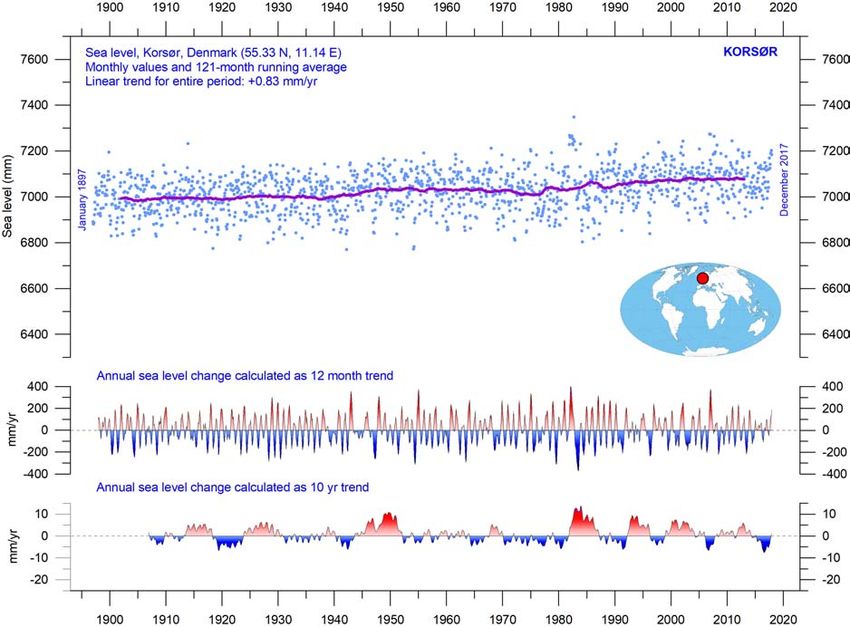
1    General overview 2018
The focus in this report is on observations, and not outputs from numerical models. All ref-
erences and data sources are listed at the end of the report.

Air temperatures
The year 2018 was the second year after the strong 2015–2016 El Niño. Considering the en-
tire temperature record since 1850/1880, it was a warm year, but cooler than both 2016 and
2017. In 2018, the average global temperature continued to fall towards the level charac-
terising the years before this El Niño. Thus the 2015–16 global surface temperature peak
appears to have been mainly caused by this cyclical oceanographic phenomenon.
    Many Arctic regions experienced record high temperatures in 2016, but in both 2017 and
2018 conditions were generally cooler. The Arctic temperature peak in 2016 may well have
been affected by ocean heat released from the Pacific Ocean during the 2015–16 El Niño
and subsequently transported to the Arctic region.
    Many diagrams in this report focus on the period from 1979 onwards – the satellite era
– for which a wide range of observations, including temperature, is available with nearly
global coverage. These data provide a detailed view of temperature changes over time at dif-
ferent altitudes in the atmosphere and reveal that, while the widely recognised lower tropo-
sphere temperature pause began around 2002, a similar stratospheric temperature plateau
began as far back as 1995, several years before the start of the ‘pause’ near the planet’s sur-
face.
    A difference has prevailed between average global air temperatures estimated by sur-
face stations (HadCRUT, NCDC and GISS) and by satellites (UAH and RSS). After the start of
the record in 1979, the satellite-based temperatures were often – but not always – somewhat
higher than the average temperature estimate derived from surface observations. Since
2004, however, the temperature estimate from surface stations has slowly drifted away from
the satellite-based estimate in a warm direction and is now on average about 0.1 ◦ C higher,
even though one of the satellite records (RSS) in 2017 was adjusted towards higher temper-
atures than previously published.
    Air temperatures measured near the planet’s surface (surface air temperatures) are still
at the core of many climate deliberations, but the significance of any short-term warming
or cooling recorded by surface air temperatures should not be overstated. Whenever Earth
experiences warm El Niño or cold La Niña episodes, major heat exchanges take place be-
tween the Pacific Ocean and the atmosphere above, eventually showing up as a signal in
estimates of the global air temperature. However, this does not reflect similar changes in
the total heat content of the atmosphere-ocean system. In fact, global net changes can be
small, and such heat exchanges may chiefly reflect redistribution of energy between ocean
and atmosphere. Evaluating the dynamics of ocean temperatures is therefore at least equally
important as evaluating changes in surface air temperatures.

Oceans
The Argo program has now achieved 14 years of global coverage, growing from a relatively
sparse global array of 1000 profiling floats in 2004, to more than 3000 instruments from late
2007, with the present total standing at about 3900 floats. Deployment of new floats con-
tinues today at a rate of up to 800 per year. Since 2004, the Argo floats have provided a

                                                                                             1
unique ocean temperature data set for depths down to 1900 m. Although the oceans are
much deeper than 1900 m, and the Argo data series is still relatively short, several interest-
ing features are now emerging in the data. Since 2004, the upper 1900 m of the oceans have
experienced net warming, considering the global average. The maximum warming (0.08–
0.15◦ C) affects the uppermost 100 m. This warming mainly affects regions near the equator,
where the greatest amount of solar radiation is received. At greater depths, a small (about
0.02◦ C) net warming has occurred between 2004 and 2018, according to the Argo floats.
These changes in global ocean temperatures since 2004 are reflected in the changes in the
equatorial oceans between 30°N and 30°S, which, due to the spherical form of the planet,
represent a huge surface area. Simultaneously, however, the northern oceans (55–65°N)
have on average experienced a marked cooling down to 1400 m depth, and slight warm-
ing at greater depths. The southern oceans (55–65°S) on average have seen slight warming
at most depths since 2004. However, averages may be misleading, and quite often better
insight is obtained by studying the details, as is discussed later in this report.

Sea ice
In 2018 the global sea ice cover remained well below the average for the satellite era (since
1979), but with a rising trend indicated over the last two years. At the end of 2016, the global
sea ice extent reached a marked minimum, at least partly caused by the distinct cycles of
natural variation of sea ice in the Northern and the Southern Hemispheres. These cycles had
simultaneous minima in 2016, with resulting consequences for the global sea ice extent.
The opposite tendency, towards higher ice extent at both poles, now appears to have been
established.

Snow cover
Variations in global snow cover are mainly caused by changes in the Northern Hemisphere,
where all the major land areas are located. The Southern Hemisphere snow cover extent is
essentially controlled by the Antarctic ice sheet, and is therefore relatively stable. Northern
Hemisphere average snow cover has also been stable since the start of the satellite observa-
tions, although local and regional interannual variations may be large. Considering seasonal
changes since 1979:
    • autumn extent is slightly increasing
    • mid-winter extent is largely stable
    • spring extent is slightly decreasing.
In 2018, Northern Hemisphere seasonal snow cover extent was close to that of the preceding
years.

Sea level
Sea level is globally monitored by satellite altimetry and by direct measurements from tide
gauges along coasts. While the satellite-derived record suggests a global sea level rise of
about 3.2 mm per year, data from tide gauges all over the world suggest a stable average
global sea-level rise of less than 1.5 mm per year. Neither of the two types of measurements

2
indicate any modern acceleration in sea level rise. The marked difference (at least 1:2) be-
tween the two data sets still has no broadly accepted explanation. However, for local coastal
planning purposes it is the tide-gauge data that is relevant, as is detailed later in this report.
Storms and hurricanes
The most recent (2017) data on global tropical storm and hurricane accumulated cyclone
energy (ACE) is well within the range experienced since 1970. In fact, the ACE data series
displays a variable pattern over time, but without any clear trend towards higher or lower
values. A longer ACE series for the Atlantic Basin (since 1850), however, suggests a natu-
ral rhythm of about 60 years’ duration for global tropical storm and hurricane accumulated
cyclone energy. Also, modern data on the number of hurricane landfalls in the continental
United States remain within the normal range for the entire observation period (1851–2017).
2 Temperatures
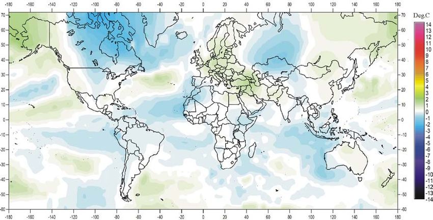
The spatial pattern of surface air temperatures in 2018
On average, the global surface air temperature for year 2018 was near the average of the past
ten years (Figure 1a). The previous two years were affected by an El Niño episode playing
out in the Pacific Ocean, and culminating in early 2016. By 2017, the global surface air tem-
perature was already slowly dropping back towards the pre-2015–16 level, a gradual change
that has continued throughout 2018.
In 2018, the Northern Hemisphere was characterised by regional temperature contrasts.
The most pronounced development was the appearance of a large area of relatively cold
conditions in Canada and Greenland. Also, western Russia was relatively cold in 2018. In con-
trast, most of Europe, Siberia and Alaska had temperatures somewhat above the average of
the previous 10 years. Near the equator, surface air temperatures were generally below or
near the average for the previous 10 years. Only in the western Pacific were temperatures rel-
atively high (Figure 1a). In the Southern Hemisphere, surface air temperatures were near or
below the average for the previous 10 years. In particular, the Indian Ocean west of Australia
and most of the South Atlantic had temperatures somewhat below the average. However,
at about 50°S, temperatures were relatively high in the South Atlantic and part of the Pacific
Ocean, affecting the average 2018 temperature in New Zealand.
In the Arctic, regions in the Canada–Greenland sector in 2018 had below-average tem-
peratures (Figure 1b). The Siberian and Alaska sectors in contrast had above-average tem-
peratures. The Arctic temperature pattern for 2018 is, however, to some degree influenced
by what is probably an artefact of the algorithm used for interpolating Arctic temperatures
from subpolar data. This appears to have given rise to an unnatural circular temperature pat-
tern north of 80°N. Meanwhile, the Antarctic continent was mainly characterised by above-
average temperatures in 2018, with only part of West Antarctica having temperatures below
the average for the past 10 years (Figure 1c). An interpolation artefact has probably affected
the temperature pattern south of 80°S too.
Summing up, for 2018, global average air temperatures are slowly approaching the level
characterising the years leading up to the recent 2015–16 El Niño. Thus the global surface air
temperature peak of 2015–16 appears predominantly to have been caused by this cyclical
phenomenon.
3(a) Global
(b) Arctic (c) Antarctic
Figure 1: 2018 surface air temperatures compared to the average for the previous 10 years.
Green-yellow-red colours indicate areas with higher temperature than the average, while blue
colours indicate lower than average temperatures. Data source: Goddard Institute for Space
Studies (GISS) using Hadl_Reyn_v2 ocean surface temperatures.
Global lower tropospheric air temperature since 1979
The two main satellite records of lower troposphere temperatures both clearly show the
temperature spike associated with the 2015–16 El Niño, and the subsequent gradual drop
towards the level that preceded it (Figures 2 and 3). The annualised data tell the same story
(Figure 4). The effects of the El Niños of 1998, 2010 and 2015–2016 are clearly visible in
Figure 3, as is the tendency for El Niños to culminate during the Northern Hemisphere winter.
A comparison of the latest (December 2018) record and the May 2015 record (red) shows
that only a few small adjustments have been made to the UAH series (Figure 2). In contrast,
in 2017, the RSS series was subject to large adjustments – about +0.1 ◦ C – towards higher
temperatures from 2002 and onwards.
4(a) University of Alabama, Huntsville (b) Remote Sensing Systems Inc
Figure 2: Global monthly average lower troposphere temperatures since 1979.
These records represent conditions at about 2 km altitude. In each case, the thick line is the
simple running 37-month average, approximately corresponding to a running 3-year average.
(a) University of Alabama, Huntsville (b) Remote Sensing Systems Inc
Figure 3: Temporal development of lower troposphere temperatures.
Monthly data, global, 1979–2018. As the different temperature databases are using different
reference periods, the series have been made comparable by setting their individual 30-year
average 1979–2008 to zero.
(a) University of Alabama, Huntsville (b) Remote Sensing Systems Inc
Figure 4: Global mean annual lower troposphere air temperatures since 1979.
5Global mean annual surface air temperatures
All three surface air temperature records clearly show the temperature spike associated with
the 2015–16 El Niño (Figures 5 and 6). At the end of 2018, however, the global temperature
was again slowly dropping towards the general level characterising the period before the
recent El Niño.
(a) HadCRUT (b) NCDC (c) GISS
Figure 5: Global monthly average surface air temperatures since 1979.
The thick line is the simple running 37-month average, nearly corresponding to a running
3-year average.
(a) HadCRUT (b) NCDC (c) GISS
Figure 6: Temporal evolution of surface air temperatures since 1979.
As the different temperature databases are using different reference periods, the series have
been made comparable by setting their individual 30-year average 1979-2008 as zero value.
(a) HadCRUT (b) NCDC (c) GISS
Figure 7: Global mean annual surface air temperatures since 1979.
As the different temperature databases are using different reference periods, the series have
been made comparable by setting their individual 30-year average 1979–2008 as zero value.
Comparison of the most recent (December 2018) record and the May 2015 record (red)
shows that relatively few adjustments have been made to the HadCRUT record, while nu-
merous and relatively large changes have been made to both the NCDC and GISS records
6(Figure 5). All three surface records, however, confirm that the recent El Niño episode culmi-
nated in early 2016, and the subsequent gradual turning back to pre-2015 conditions. This
development is also demonstrated by the annualised data (Figure 7).
All three average surface air temperature estimates show the year 2016 to be the warmest
on record. However, 2016 was highly influenced by the recent strong El Niño episode.
Comparing surface and lower troposphere temperatures
There remains a difference between global air temperatures estimated by surface stations
and satellites, respectively, as illustrated by Figure 8. In the early part of the record since
1979, the satellite-based temperatures were often somewhat higher than the global esti-
mate derived from surface observations. Since 2004, however, the temperature estimate
from surface stations has drifted away from the satellite-based estimate in a warm direc-
tion. The 2017 adjustment of the RSS satellite record has reduced this difference compared
to the situation in previous years.
Figure 8: Comparing lower troposphere and surface temperatures.
Top - the average of the surface records (red) plotted against the average of the satellite records
(blue); bottom, the difference between the two. In each case, the thick lines are the simple
running 37-month averages, nearly corresponding to a running 3-year average. As the base
periods differ for the different temperature estimates, they have all been normalised by
comparing to the average value of 30 years from January 1979 to December 2008.
7Comparing lower troposphere temperatures over land and oceans
Since 1979, lower troposphere temperatures have increased more over land than over oceans.
Especially since about 2006, temperatures recorded over land have been consistently higher
than above the oceans. There may be several reasons for this: variations in insolation, cloud
cover and land use, affecting mainly land areas. This development has apparently taken
place roughly in concert with the above-mentioned drift of surface observations towards
higher temperatures, compared to satellite-based temperatures (see previous paragraph).
Figure 9: Comparing tropospheric temperatures over land and ocean.
Global monthly average lower troposphere temperature since 1979 measured over land and
oceans, shown in red and blue, respectively, according to University of Alabama at Huntsville
(UAH), USA. The thin lines represent the monthly average, and the thick line the simple running
37-month average, nearly corresponding to a running 3-year average.
8Comparing atmospheric temperatures from surface to 17 km altitude
The temperature variations recorded in the lowermost troposphere are generally reflected
at higher altitudes, up to about 10 km (Figure 10).
Figure 10: Temperatures at different altitudes.
Global monthly average temperature in different altitudes according to University of Alabama
at Huntsville (UAH), USA. The thin lines represent the monthly average, and the thick line the
simple running 37-month average, nearly corresponding to a running 3-year average.
The overall temperature plateau since about year 2002 is found at all these altitudes.
At high altitudes, near the tropopause, the pattern of variations recorded lower in the
atmosphere can still be recognised, but for the duration of the record (since 1979) there
has been no trend towards higher or lower temperatures. Higher in the atmosphere, in the
stratosphere at 17 km altitude, two pronounced temperature spikes are visible before the
turn of the century. Both spikes can be related to major volcanic eruptions, as indicated in
the diagram. Ignoring these spikes, until about 1995 the stratospheric temperature record
shows a persistent decline, ascribed by some scientists to the effect of heat being trapped
by CO2 in the troposphere below. However, this temperature decline ends around 1995–96,
and a long temperature plateau has since then characterised the stratosphere. Thus, the
stratospheric temperature ‘pause’ began 5–7 years before a similar ‘pause’ commenced in
the lower troposphere.
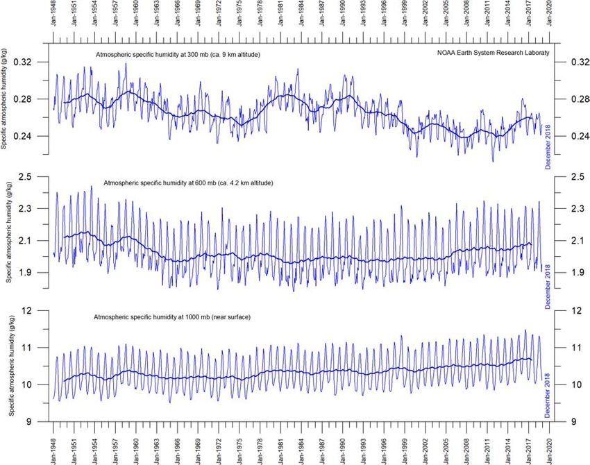
9Atmospheric greenhouse gases: water vapour and carbon dioxide
Water vapour is the most important greenhouse gas in the troposphere. The highest con-
centration is found within a latitudinal range from 50°N to 60°S. The two polar regions of the
troposphere are comparatively dry.
Figure 11: Specific atmospheric humidity at three different altitudes in the troposphere.
The thin blue lines show monthly values, while the thick blue lines show the running 37-month
average (about 3 years). Data source: Earth System Research Laboratory (NOAA).
The specific atmospheric humidity is seen to be stable or slightly increasing up to about
4–5 km altitude. At higher levels in the troposphere (about 9 km), the specific humidity has
been decreasing for the duration of the record (since 1948), but with shorter variations su-
perimposed on the falling trend. A Fourier frequency analysis (not shown here) shows these
variations to be influenced especially by a periodic variation of about 3.7-years’ duration.
The persistent decrease in specific humidity at about 9 km altitude is interesting, as this alti-
tude roughly corresponds to the level where the theoretical temperature effect of increased
atmospheric carbon dioxide is expected initially to play out.
Carbon dioxide (CO2 ) is an important greenhouse gas, although less important than wa-
ter vapour. For the duration of the Mauna Loa record of CO 2 concentrations, an increasing
trend has been visible, with an annual cycle superimposed (Figure 12a). At the end of 2018,
the amount of atmospheric CO2 was slightly below 410 parts per million (ppm). Usually, CO 2
is considered as a relatively well-mixed gas in the troposphere.
10(a) Concentrations since March 1958. (b) Growth rate of concentration
Figure 12: Changes in atmospheric CO 2 levels.
The thin lines are monthly values, while the thick lines are simple running 37-month average,
nearly corresponding to a running 3-year average.
The 12-month change in tropospheric CO 2 has been increasing from about +1 ppm/year
in the early part of the record, to more than +3 ppm/year towards the end of the record
(Figure 12b). A Fourier frequency analysis (not shown here) shows the 12-month change
of tropospheric CO2 to be influenced especially by periodic variations of 2.5- and 3.8-years’
duration, respectively.
It is instructive to consider the variation of the annual rate of change of atmospheric
CO2 together with the annual change rates for the global air temperature and global sea
surface temperature (Figure 13). All three change rates clearly vary in concert, but with sea
surface temperatures leading the global temperature by a few months, and change rates for
atmospheric CO2 by 11–12 months.
Figure 13: Changes in CO2 and temperature.
Annual (12-month) change of global atmospheric CO 2 concentration (Mauna Loa; green),
global sea surface temperature (HadSST3; blue) and global surface air temperature (HadCRUT4;
red dotted). All graphs are showing monthly values of DIFF12, the difference between the
average of the last 12 months and the average for the previous 12 months for each data series.
11Figure 14 shows the visual association between annual change of atmospheric CO 2 and
La Niña and El Niño episodes, emphasising the importance of oceanographic changes for
understanding changes in the amount of atmospheric CO 2 .
Figure 14: CO2 and El Niño.
Annual growth rate of atmospheric CO 2 (upper panel) and Oceanic Niño Index (lower panel).
See also Figures 12 and 13.
Zonal surface air temperatures
Figure 15 shows that the ‘global’ warming experienced after 1980 has predominantly been
a Northern Hemisphere phenomenon, and mainly played out as a marked change between
1994 and 1999. This apparently rapid temperature change was, however, influenced by the
Mt. Pinatubo eruption of 1992–93 and the subsequent 1997 El Niño episode.
The diagram further reveals how the temperature effects of the equatorial El Niños in
1997 and 2015–16 were spreading to higher latitudes in both hemispheres. The El Niño
temperature effect was, however, mainly recorded in the Northern Hemisphere, and only to
lesser degree in the Southern Hemisphere.
Polar air temperatures
In the Arctic region, warming mainly took place in 1993–95, and less so subsequently (Fig-
ure 16). In 2016, however, temperatures peaked for several months, presumably because of
oceanic heat given off to the atmosphere during the El Niño of 2015–16 (see also Figures 13
and 14) and then advected to higher latitudes.
12Figure 15: Temperature change is a Northern Hemisphere problem.
Global monthly average lower troposphere temperature since 1979 for the tropics and the
northern and southern extratropics, according to University of Alabama at Huntsville, USA.
Thick lines are the simple running 37-month average, nearly corresponding to a running 3-year
average.
13(a)
Figure 16: Lower troposphere temperatures for the polar regions.
Global monthly average lower troposphere temperature since 1979 for the Arctic and Antarctic,
according to University of Alabama at Huntsville, USA. Thick lines are the simple running
37-month average, nearly corresponding to a running 3-year average.
In the Antarctic region, temperatures have remained almost stable since the start of the
satellite record in 1979. In 2016–17, a small temperature peak visible in the monthly record
may be interpreted as the subdued effect of the recent El Niño episode.
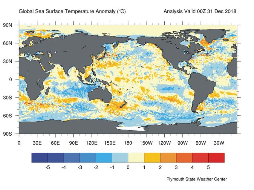
Sea surface temperature anomalies in the last three years
The three maps in Figure 17 show the situation after the El Niño in December 2016, the weak
La Niña episode in December 2017, and the present development towards a – until now –
weak El Niño at the end of December 2018.
Figure 18 shows all El Niño and La Niña episodes since 1950. The recent 2015–16 El Niño
episode is among the strongest since the beginning of the record in 1950. Considering the
entire record, however, recent variations in El Niño and La Niña episodes do not appear ab-
normal in any way.
14(a) December 2016 (b) December 2017
(c) December 2018
Figure 17: Recent changes in sea surface temperatures.
Sea surface temperature anomalies at the end of December 2016, 2017 and 2018, respectively
(top to bottom, degrees C). The maps show the current anomaly (deviation from normal) of the
surface temperature of Earth’s oceans. Reference period: 1977–1991. Dark grey represents land
areas. Map source: Plymouth State Weather Center.
15Figure 18: The long-term ENSO record.
Warm and cold episodes for the Oceanic Niño Index (ONI), defined as 3-month running mean of
ERSSTv4 SST anomalies in the Niño 3.4 region (5°N-5°S, 120°-170°W). Anomalies are centred on
30-year base periods updated every 5 years.
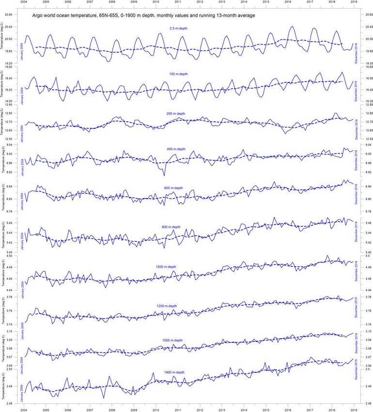
Global ocean average temperatures to 1900 m depth
Figure 19 shows that, on average, the temperature of the global oceans down to 1900 m
depth has been increasing since about 2011. Furthermore, it is seen that this increase since
2013 is mostly due to oceanic changes occurring near the equator, between 30°N and 30°S.
In contrast, for the circum-Arctic oceans north of 55°N, depth-integrated ocean tempera-
tures have been decreasing since 2011. Near the Antarctic, south of 55°S, temperatures have
essentially been stable. At most latitudes, a clear annual rhythm is seen.
Global ocean temperatures at different depths
Figure 20 shows global average oceanic temperatures at different depths. An annual rhythm
can be traced down to about 100 m depth. In the uppermost 100 m, temperatures have in-
creased since about 2011, although the near-surface waters apparently passed a tempera-
ture peak in 2016. At 200–400 m depth, temperatures have experienced little change during
the observation period.
For water depths larger than 400 m, however, temperatures again increased from 2004 to
2018. The diagram suggests that this increase first commenced at 1900 m depth around year
2009, and from there gradually spread upwards. At 600 m depth, the present temperature
increase began around 2012, about three years later than at 1900 m depth. The timing of
these dynamic changes shows that average temperatures in the upper 1900 m of the oceans
are not only influenced by conditions playing out at or near the ocean surface, but also by
processes operating at depths greater than 1900 m. Thus, part of the present ocean warming
16Figure 19: Ocean temperature changes in different latitudinal bands.
Average ocean temperatures January 2004 – December 2018 at 0–1900 m depth in selected
latitudinal bands, using Argo-data (Roemmich and Gilson 2009). The thin line shows monthly
values and the thick line shows the running 13-month average.
Source: Global Marine Argo Atlas.
17Figure 20: Ocean temperatures at different depths.
Global ocean temperatures January 2004 – December 2018 at different depths between 65°N
and 65°S, using Argo data. The thin line shows monthly values and the stippled line shows the
running 13-month average. Source: Global Marine Argo Atlas.
18appears to be due to circulation features that are not directly related to processes operating
at or near the surface.
This development is confirmed by Figure 21, which shows the net change of global ocean
temperature at different depths, calculated as the net difference between the 12-month av-
erages of 2004 and 2018, respectively. The largest net changes are seen to have occurred in
the uppermost 250 m of the water column. However, average values, as shown in this dia-
gram, although useful, also hide many interesting regional details, as discussed in the next
section.
Figure 21: Global ocean net temperature change since 2004 from surface to 1900 m depth.
Source: Global Marine Argo Atlas.
Regional ocean temperature changes temperatures 0–1900 m depth
Figure 22 shows the latitudinal variation of oceanic temperature net changes for January–
December 2004 versus January–December 2018 for various depths, calculated as in the pre-
vious diagram. The three panels show the net changes in the Arctic oceans (55–65°N), equa-
torial oceans (30N-30°S), and Antarctic oceans (55–65°S), respectively.
The maximum surface net warming (down to about 150 m depth) affects the equatorial
and Antarctic oceans, but not the Arctic oceans. In fact, net cooling down to 1400 m depth is
pronounced for the northern oceans. However, the major part of Earth’s land areas is in the
Northern Hemisphere, so the surface area (and volume) of ‘Arctic’ oceans is much smaller
than that of the ‘Antarctic’ oceans, which in turn is smaller than the equatorial oceans. In
fact, half of the planet’s surface area (land and ocean) is located between 30°N and 30°S.
Nevertheless, the contrast in net temperature change experienced in the period 2004–
2018 for the different latitudinal bands is instructive. For the two polar oceans, the Argo
data appear to demonstrate the existence of a bi-polar seesaw, as described by Chylek et al.
(2010). No less interesting is the fact that the near-surface ocean temperature in the two
19Figure 22: Regional changes in ocean temperatures.
Net temperature change since 2004 from surface to 1900 m depth in different parts of the
global oceans, using Argo data. Source: Global Marine Argo Atlas.
20polar oceans contrasts with the overall development of sea ice in the respective polar regions
(see Section 5).
Ocean temperature net change 2004–2018 in selected sectors
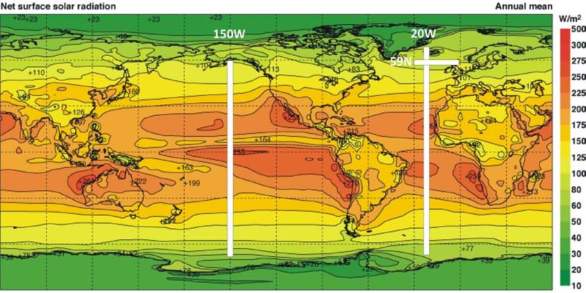
This section considers changes in ocean temperatures along two longitudinal transects, at
20°W and 150°W, representing the Atlantic and Pacific Oceans respectively, and one short
latitudinal one, at 59°N, 30–0°W. These are shown in Figure 23.
The two Atlantic Ocean diagrams in Figure 24 show the net changes for 2004–2017 and
2004–2018 along 20°W, using data obtained from the Argo-floats. To prepare the diagrams,
annual average ocean temperatures for 2017 and 2018 were compared to annual average
temperatures for 2004, representing the first year in the Argo-record. To enable insight
into the most recent changes, the net change in annual average temperatures is shown for
both 2004–2017 (on top) and 2004–2018. Warm colours indicate net warming from 2004
to 2017/18, and blue colours cooling. Due to the spherical form of the Earth, northern and
southern latitudes represent only small ocean volumes compared to latitudes near the equa-
tor. With this reservation in mind, the diagrams for the Atlantic 20°W transect nevertheless
reveal several interesting features.
Figure 23: Map showing average annual mean net surface solar radiation, and the location
of the three profiles discussed below.
The most prominent feature in the Atlantic profile for 2004–2018 (Figure 24b) is a marked
net cooling at the surface north of the equator, and especially beyond 30°N, where deeper
layers (down to 1500 m depth) are also involved. South of the equator, warming domi-
nates at the surface, although cooling dominates at 50–200 m depth. The maximum Atlantic
Ocean net warming during 2004–2018 has taken place between 40 and 55°S, affecting the
uppermost 200 m of the water column. Below 200 m, and south of 20°S, depths down to
1300 m have been affected by net warming since 2004. At depths greater than 1500 m, a
slight net warming has also taken place north of 30°N in the 20°W Atlantic profile. The warm-
ing in the South Atlantic is more pronounced in the 2004–2018 diagram than was the case for
21(a) 2004–2017
(b) 2004–2018
Figure 24: Temperature changes in the Atlantic Ocean.
Net temperature change since 2004 from 0–1900 m depth at 20°W, using Argo data.
Source: Global Marine Argo Atlas.
the 2004–2017 diagram. Also, the net cooling north of 30°N is somewhat less pronounced
in 2018 than in 2017.
Of special interest is the temperature dynamics displayed within a 59°N transect across
the North Atlantic current, just south of the Faroe Islands (Figure 25a), as this is important
for weather and climate in much of Europe. The diagram below shows a time series at 59°N,
from 30°W to 0°W, from 0-800 m water depth, basically representing a section across the
water masses affected by the North Atlantic Current. Ocean temperatures higher than 9 ◦ C
are shown by red colours.
This time series, although still relatively short, also displays interesting dynamics. The
prominence of warm water (above 9◦ C) apparently peaked in early 2006; it gradually re-
duced until 2016. Since then, a partial temperature recovery has taken place in the sec-
tor analysed. The observed change from peak to trough playing out over approximately
22(a) Temperatures
(b) Depth-integrated average ocean temperature
Figure 25: Temperature variation along 59°N.
Time series since January 2004 of ocean temperatures at 59°N, 30–0°W, from 0–800 m depth,
using Argo data. Source: Global Marine Argo Atlas.
11 years might conceivably suggest the existence of an about 22-year temperature vari-
ation, but we will have to wait until the Argo series is longer before it will be possible to
conclude anything on this. Figure 25b shows the same time series (59°N, 30–0°W, 0–800 m
depth, 2004–2018) as a graph of the depth-integrated average ocean temperature.
23Figure 26 is the equivalent view along the transect for the Pacific Ocean. Again, northern
and southern latitudes represent only relatively small ocean volumes, compared to latitudes
near the equator. The most prominent feature for 2018 is a marked net cooling affecting
nearly all water depths down to 1900 m south of 20°S. Compared to the 2004–2017 diagram
the cooling is becoming more pronounced and widespread. Net cooling 2004–2018 is espe-
cially pronounced in two bands down to about 500 m depth, south and north of the equator
(at 25°S and 20°N), respectively. Net warming is taking place in two bands north and south
of the equator, centred at 50°S and 50°N, affecting water depths down to about 500 and
1000 m, respectively.
Neither of the Atlantic and Pacific longitudinal diagrams above show to what extent
some of the net changes displayed are caused by ocean dynamics operating east and west
of the two profiles considered; they only display net changes 2004–2017/18 along the longi-
tudes chosen. For that reason, the diagrams should not be overinterpreted. The two longitu-
dinal profiles suggest an interesting contrast, with the Pacific Ocean mainly warming north
of equator, and cooling in the south, while the opposite trends characterise the Atlantic pro-
file: cooling in the north and warming in the south.
(a) 2004–2017
(b) 2004–2018
Figure 26: Temperature changes in the Pacific Ocean.
Net temperature change since 2004 from 0–1900 m depth at 150°W, using Argo data. Source:
Global Marine Argo Atlas.
243 Oscillations
Southern Oscillation Index
The Southern Oscillation Index (SOI) is calculated from the monthly or seasonal fluctuations
in the air pressure difference between Tahiti and Darwin. Sustained negative values often in-
dicate El Niño episodes. Such negative values are usually accompanied by sustained warm-
ing of the central and eastern tropical Pacific Ocean, a decrease in the strength of the Pacific
trade winds, and a reduction in rainfall over eastern and northern Australia. Figure 27 shows
annual values of the SOI since 1951.
Figure 27: Southern Oscillation Index anomaly since 1951.
The thin line represents annual values, while the thick line is the simple running 5-year average.
Source: National Oceanographic and Atmospheric Administration (NOAA) Climate Prediction
Center (CPC).
Positive values of the SOI are associated with stronger Pacific trade winds and higher
sea surface temperatures to the north of Australia, indicating La Niña episodes. Waters in
the central and eastern tropical Pacific Ocean become cooler during this time. Eastern and
northern Australia usually receive increased precipitation during such periods.
Pacific Decadal Oscillation
The Pacific Decadal Oscillation (PDO) (Figure 28) is a long-lived El Niño-like pattern of Pacific
climate variability, with data extending back to January 1900. The causes of the PDO are
not currently known, but even in the absence of a theoretical understanding, PDO climate
information improves season-to-season and year-to-year climate forecasts for North Amer-
ica because of its strong tendency for multi-season and multi-year persistence. The PDO, as
25shown in Figure 28, also appears to be roughly in phase with global temperature changes.
Thus, from a societal impacts perspective, recognition of the PDO is important because it
shows that ‘normal’ climate conditions can vary over time periods comparable to the length
of a human lifetime.
Figure 28: Annual values of the Pacific Decadal Oscillation.
The thin line shows the annual PDO values, and the thick line is the simple running 7-year
average. Please note that the annual value of PDO is not yet updated beyond 2017. Source:
Joint Institute for the Study of the Atmosphere and Ocean.
A Fourier frequency analysis (not shown here) shows the PDO record to be influenced by
a 5.7-year cycle, and possibly also by a longer cycle of about 53 years’ duration.
Atlantic Multidecadal Oscillation
The Atlantic Multidecadal Oscillation (AMO) is a mode of variability occurring in the North
Atlantic Ocean sea surface temperature field. The AMO is basically an index of North Atlantic
sea surface temperatures and is shown in Figure 29.
The AMO index appears to be correlated to air temperatures and rainfall over much of the
Northern Hemisphere. The association appears to be high for North Eastern Brazil, African
Sahel rainfall and North American and European summer climate. The AMO index also ap-
pears to be associated with changes in the frequency of North American droughts and is
reflected in the frequency of severe Atlantic hurricanes.
As one example, the AMO index may be related to past occurrence of major droughts
in the US Midwest and the Southwest. When the AMO is high, these droughts tend to be
more frequent or prolonged, and vice-versa for low values of the AMO. Two of the most
severe droughts of the 20th century in the US occurred during the peak AMO values between
1925 and 1965: the Dust Bowl of the 1930s and the 1950s’ droughts. On the other hand,
26Figure 29: The Atlantic Multidecadal Oscillation.
Detrended and unsmoothed index values since 1856. The thin blue line shows annual values,
and the thick line is the simple running 11-year average. Data source: Earth System Research
Laboratory, NOAA, USA.
Florida and the Pacific Northwest tend to be the opposite; here, a high AMO is associated
with relatively high precipitation.
A Fourier analysis (not shown here) shows the AMO record to be controlled by an ap-
proximately 67-year cycle, and to a lesser degree by a 3.5-year cycle.
4 Sea level
Sea-level from satellite altimetry
Satellite altimetry is a new and valuable type of measurement, providing unique insights into
the detailed surface topography of the oceans. However, it is not a precise tool for estimating
changes in global sea level due to several assumptions made when interpreting the original
satellite data.
One of the assumptions made during the interpretation of satellite altimetry data into
sea level changes (Figure 30) is the amount of correction made locally and regionally for
the glacial isostatic adjustment (GIA). The GIA relates to large-scale, long-term mass transfer
from the oceans to the land, in the form of rhythmic waxing and waning of the large Qua-
ternary ice sheets in North America and North Europe. This enormous mass transfer causes
rhythmic changes in surface load, resulting in viscoelastic mantle flow and elastic effects in
the upper crust. No single technique or observational network can give enough information
on all aspects and consequences of GIA, so the assumptions adopted for the interpretation
of satellite altimetry data are difficult to verify. The GIA correction introduced in the inter-
pretation of data from satellite altimetry depends upon the type of deglaciation model (for
the last glaciation) and upon the type of crust-mantle model that is assumed. Because of
27this (and additional factors), interpretations of modern global sea-level change based on
satellite altimetry vary from about 1.7 mm/year to about 3.2 mm/year.
Figure 30: Global sea level change since December 1992.
The blue dots are the individual observations, and the purple line represents the running
121-month (ca. 10-year) average. The two lower panels show the annual sea level change,
calculated for 1- and 10-year time windows, respectively. These values are plotted at the end of
the interval considered. Source: Colorado Center for Astrodynamics Research at University of
Colorado at Boulder.
Sea level from tide gauges
Tide-gauges are located directly at coastal sites and record the net movement of the local
ocean surface in relation to land. Measurements of local relative sea-level change (Figure 31)
are vital for coastal planning, and tide-gauge data are therefore directly applicable for plan-
ning of coastal installations, unlike satellite altimetry.
In a scientific context, the measured net movement of the local sea-level is composed of
two local components:
• the vertical change of the ocean surface
• the vertical change of the land surface.
For example, a tide gauge may record an apparent sea-level increase of 3 mm/year. If geode-
tic measurements show the land to be sinking by 2 mm/year, the real sea level rise is only
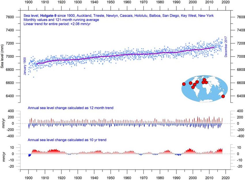
28Figure 31: Holgate-9 monthly tide-gauge records.
Holgate (2007) suggested the nine stations listed in the diagram to capture the variability
found in a larger number of stations over the last half century studied previously. For that
reason, average values of the Holgate-9 group of tide-gauge stations are interesting to follow.
The blue dots are the individual average monthly observations, and the purple line represents
the running 121-month (ca. 10-year) average. The two lower panels show the annual sea level
change, calculated for 1- and 10-year time windows, respectively. These values are plotted at
the end of the interval considered. Data from PSMSL Data Explorer.
1 mm/year (3 minus 2 mm/year). In a global sea-level change context, the value of 1 mm/year
is relevant, but in a local coastal planning context the 3 mm/year value obtained by the clas-
sical tide gauge is the relevant factor for local authorities.
To construct time series of sea level measurements at each tide gauge, the monthly and
annual means must be reduced to a common datum. This reduction is performed by the
Permanent Service for Mean Sea Level (PSMSL) making use of the tide-gauge datum history
provided by the supplying national authority. The Revised Local Reference (RLR) datum at
each station is defined to be approximately 7000 mm below mean sea level, with this arbi-
trary choice made many years ago to avoid negative numbers in the resulting RLR monthly
and annual mean values.
Few places on Earth are completely stable, and most tide gauges are located at sites ex-
posed to tectonic uplift or sinking (the vertical change of the land surface). This widespread
vertical instability has several causes, but of course affects the interpretation of data from
the individual tide gauges, although much effort is put into correcting for these effects.
Data from tide gauges located at tectonically stable sites is therefore of special inter-
29est in estimating real short- and long-term sea-level change. One example of a long record
obtained from such a site is shown in the diagram below (Figure 32). This record indicates a
stable sea level rise of about 0.84 mm per year, without any indication of recent acceleration.
Figure 32: Korsør (Denmark) monthly tide-gauge data.
The blue dots are the individual monthly observations, and the purple line represents the
running 121-month (ca. 10-year) average. The two lower panels show the annual sea level
change, calculated for 1- and 10-year time windows, respectively. These values are plotted at
the end of the interval considered. Data from PSMSL Data Explorer.
Data from tide gauges all over the world suggest an average global sea-level rise of 1–
1.5 mm/year, while the satellite-derived record (Figure 30) suggests a rise of 3 mm/year, or
more. The noticeable difference (at least 1:2) between the two data sets has no broadly
accepted explanation.
5 The cryosphere
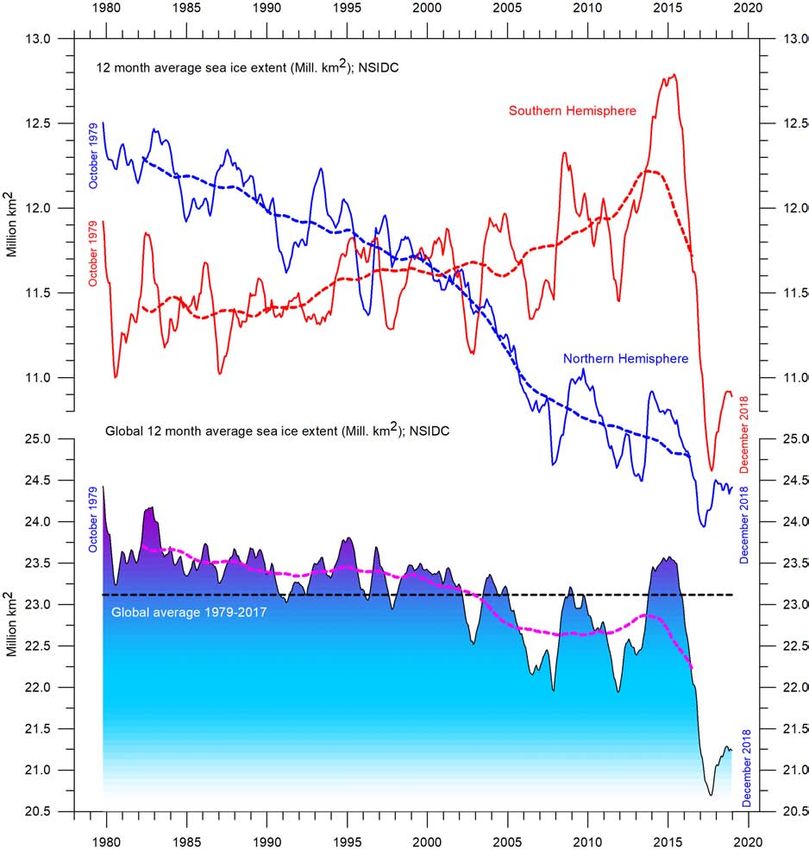
Global, Arctic and Antarctic sea ice extent
The two 12-month average sea ice extent graphs in Figure 33 show the contrasting develop-
ments in the Northern and Southern Hemispheres. The Northern Hemisphere trend towards
reduced sea ice extent is clearly displayed by the blue graph, and so is the trend towards si-
multaneous increase of Southern Hemisphere sea ice extent.
30Figure 33: Global and hemispheric sea ice extent in the satellite era.
12-month running average. The October 1979 value represents the monthly average of
November 1978–October 1979, the November 1979 value represents the average of December
1978–November 1979, etc. The stippled lines represent a 61-month (ca. 5 years) average. Last
month included in the 12-month calculations is shown to the right in the diagram. Data source:
National Snow and Ice Data Center.
The Antarctic sea ice extent (Figure 33) decreased extraordinary rapidly during the South-
ern Hemisphere spring 2016, much faster than in any previous spring season during the
satellite era (since 1979). Strong retreat occurred in all sectors of the Antarctic but was great-
est in the Weddell and Ross Seas. In these sectors strong northerly (warm) surface winds
pushed the sea ice back towards the Antarctic continent. The background for the special
wind conditions in 2016 has been discussed by various authors (e.g. Turner et al. 2017 and
Phys.org 2019) and appears to be a phenomenon related to natural climate variability. The
31satellite sea ice record is still short, and does not fully represent natural variations playing
out over more than a decade or two.
What can be identified from the record is nevertheless interesting. Both 12-month aver-
age graphs (Figure 33) are characterised by recurring variations, superimposed on the over-
all trends. For the Arctic sea ice, this shorter variation is strongly influenced by a 5.3-year
periodic variation, while for the Antarctic sea ice a periodic variation of about 4.5 years is im-
portant. Both these variations reached their minima simultaneously in 2016, which at least
partly explains the global minimum in sea ice extent.
In the coming years, the natural variations described above (Arctic 5.3-year; Antarctic 4.5-
year) may again induce an increase in sea ice extent at both poles, with a resultant increase
in the 12-month average global sea ice extent as the likely result. In fact, this development
already appears to have started (see diagram above). However, future minima and maxima
for these variations will not occur synchronously because of their different period lengths,
and global minima (or maxima) may therefore be less pronounced than in 2016.
Figure 34 illustrates the overall development of the Arctic sea ice from the end of 2017
to the end of 2018. The most conspicuous change has been an overall increase in very thick
sea ice along parts of the Canadian coast. The new and relatively thick ice seen near the New
Siberian Islands (Novosibirskiye Ostrova) and the North Pole had, by the end of 2018 moved
towards Canada and Greenland. By the end of 2018, thicker ice than in 2017 was present in
the Beaufort Sea, Chukchi Sea, East Siberian Sea north of Alaska and Siberia, as well as in the
Svalbard–Franz Josef Islands sector of the Arctic Ocean.
(a) 31 December 2017 (b) 31 December 2018
Figure 34: Arctic sea ice.
Recent changes in extent and thickness, and seasonal cycles of the calculated total Arctic sea
ice volume. The mean sea ice volume and standard deviation for the period 2004–2013 are
shown by grey shading in the insert diagrams. Source: Danish Meteorological Institute.
32Northern Hemisphere snow cover extent
Variations in the global snow cover extent are mainly the result of changes in the Northern
Hemisphere (Figure 35), where all the major land areas are located. The Southern Hemi-
sphere snow cover extent is essentially controlled by the Antarctic Ice Sheet, and therefore
relatively stable.
(a) 31 December 2017 (b) 31 December 2018
Figure 35: Recent changes in Northern Hemisphere snow cover and sea ice.
Snow cover, white; sea ice, yellow. Source: National Ice Center (NIC).
The Northern Hemisphere snow cover extent is subject to large local and regional varia-
tions from year to year. However, the overall tendency (since 1972) has been towards stable
Northern-Hemisphere snow conditions, as illustrated by Figure 36.
Figure 36: Northern hemisphere weekly snow cover extent since January 1972.
The thin blue line is the weekly data, and the thick blue line is the running 53-week average
(approximately 1 year). The horizontal red line is the 1972–2017 average. Source: Rutgers
University Global Snow Laboratory.
33During the Northern Hemisphere summer, the snow cover usually shrinks to about 2.4 mil-
lion km2 (basically controlled by the size of the Greenland ice sheet). During the Northern
Hemisphere winter, the snow-covered area increases to about 50,000,000 km 2 , representing
about 33% of planet Earth’s total land area (Figure 36).
Considering seasonal changes (Figure 37), the Northern Hemisphere snow cover extent
during the autumn is slightly increasing, the mid-winter extent is basically stable, and the
spring extent is slightly declining. In 2018, the Northern Hemisphere snow cover extent was
similar to that recorded for 2017.
Figure 37: Northern Hemisphere seasonal snow cover since 1972.
Source: Rutgers University Global Snow Laboratory.
346 Extreme weather
Tropical storm and hurricane accumulated cyclone energy (ACE)
Accumulated cyclone energy (ACE) is a measure used by the National Oceanic and Atmo-
spheric Administration (NOAA) to express the activity of individual tropical cyclones and en-
tire tropical cyclone seasons. ACE is calculated as the square of the wind speed every 6 hours
and is then scaled by a factor of 10,000 for usability, using a unit of 104 knots 2 . The ACE of
a season is the sum of the ACE for each storm and therefore represents the total hurricane
activity.
The damage potential of a hurricane is proportional to the square or cube of the maxi-
mum wind speed, and ACE is therefore not only a measure of tropical cyclone activity, but
also a measure of the damage potential of an individual cyclone or a season. Existing records
(Figures 38 and 39) suggest there has been no abnormal cyclone activity in recent years.
Figure 38: Global tropical storm and hurricane accumulated cyclone energy.
Top, monthly; bottom, running 12-month sums, the latter plotted at the end of the time interval
considered. Data source: Maue ACE data. Please note that these data are not yet updated
beyond September 2017.
The global ACE data display a variable pattern over time (Figure 38), but without any clear
trend. The diagrams for the Northern and Southern Hemispheres (Figure 39) are similar in
35(a) Northern Hemisphere
(b) Southern Hemisphere
Figure 39: The Maue ACE data series by hemisphere.
Details as per Figure 38.
36this respect. The period 1992–1998 was characterised by high values; other peaks were seen
2004–2005 and in 2016, while the periods 1973–1990 and 2002–2015 were characterised by
low values. The peaks in 1998 and 2016 coincide with strong El Niño events in the Pacific
Ocean. The ACE data and ongoing cyclone dynamics are detailed in Maue (2011).
The Northern Hemisphere ACE values (Figure 39a) dominate the global signal (Figure 38)
and therefore show similar peaks and lows as the global data, with no clear trend for the
entire observational period. The main Northern Hemisphere cyclone season is from June–
November. The Southern Hemisphere ACE values (Figure 39b) are lower than for the North-
ern Hemisphere, and the main cyclone season is December–April.
The Atlantic Oceanographic and Meteorological Laboratory ACE data series goes back to
1850. A Fourier analysis for the Atlantic Basin (Figure 40) shows the ACE series to be strongly
influenced by a periodic variation of about 60 years’ duration. Since 2002, the Atlantic ACE
series has displayed an overall declining trend, but with large interannual variations. The
North Atlantic hurricane season often shows above-average activity when La Niña condi-
tions are present in Pacific during late summer (August–October), as was the case in 2017
(Johnstone and Curry, 2017).
Figure 40: Accumulated cyclonic energy in the Atlantic Basin since 1850 AD.
Thin lines show annual ACE values, and the thick line shows the running 7-year average. Data
source: Atlantic Oceanographic and Meteorological Laboratory (AOML), Hurricane Research
Division. Please note that these annual data are not yet updated beyond 2016.
37You can also read