User Interaction & Experience - ENTERPRISE ARCHITECT User Guide Series - CREATED WITH - Sparx Systems
←
→
Page content transcription
If your browser does not render page correctly, please read the page content below
ENTERPRISE ARCHITECT

            User Guide Series

User Interaction & Experience

                Author: Sparx Systems

                  Date: 2022-01-07

               Version: 16.0

          CREATED WITH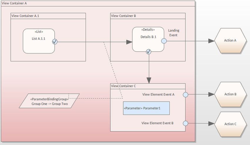
Table of Contents

 User Interaction & Experience              3
   Getting Started                          4
   Interaction Flow Models IFML             5
   Android Wireframe Toolbox                7
   Apple iPhone/Tablet Wireframe Toolbox   15
   Windows Phone Wireframe Toolbox         23
   Dialog Wireframe Toolbox                30
   Webpage Wireframe Toolbox               40
User Interaction & Experience                                                                            7 January, 2022

User Interaction & Experience
Visualize User Interfaces for Smart Phones, Tablets and Notebooks Using Wireframes

The Wireframe Toolbox pages provide a wide range of icons that you can use in wireframe modeling to represent the
appearance of a device at a particular point in the execution of an application. Devices you can model include:
·    Android Phones and Tablets
·    Apple iPhones and Tablets
·    Windows Phones
·    Screen dialogs
·    Web pages - to model how the web pages work

Access

On the Diagram Toolbox, click on        to display the 'Find Toolbox Item' dialog and specify 'Wireframing', 'Android',
'Apple', 'Dialog', 'Windows Phone' or 'Webpage'.

    Ribbon                         Design > Diagram > Toolbox

    Keyboard Shortcuts             Ctrl+Shift+3

Notes

·    Each of the Wireframing Diagram Toolboxes provides one or more Patterns that you can drag onto a diagram as an
     illustration of what you might achieve, or to act as the basis of the model you are developing
·    The 'Properties' dialog for Wireframe elements automatically opens to either a top-level 'Wireframe' tab on which
     you can edit the element rendering directly, or a second-level 'Wireframing' Tagged Values tab if you define the
     element rendering by editing the XML for the properties of that element type
·    Some of the elements you create from the 'Wireframe' Toolbox pages are properly rendered after you edit the
     Tagged Values that define their characteristics
·    As you develop your Interface diagrams you can establish the positions and layout of the elements freehand by
     dragging and 'nudging' the elements, or impose some regularity using the 'Snap To Grid' diagram options

(c) Sparx Systems 2022                            Page 3 of 43                          Created with Enterprise Architect
User Interaction & Experience 7 January, 2022
Getting Started
Selecting the Perspective
Enterprise Architect partitions the tool's extensive features into Perspectives, which ensures that you can focus on a
specific task and work with the tools you need without the distraction of other features. To work with the User
Experience Modeling features you first need to select this Perspective:
> UX Design> Wireframes
Setting the Perspective ensures that the Wireframe diagrams, their tool boxes and other features of the Perspective will
be available by default.
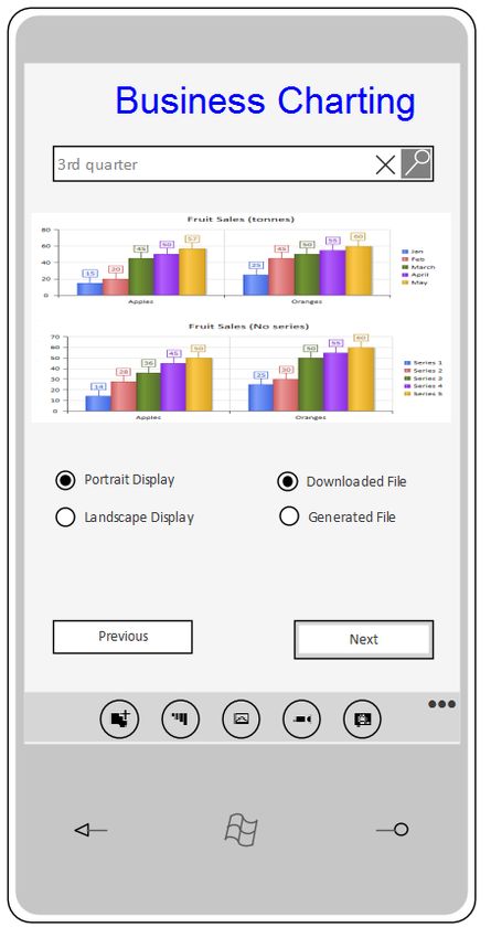
Example Diagram
An example diagram provides a visual introduction to the topic and allows you to see some of the important elements
and connectors that are created in specifying or describing the way a wireframe, dialog or web page is defined including:
Android, Apple and Windows Phones and Tablets, Dialogs and Web Pages with Buttons, Combo Boxes and Radio
Buttons.
(c) Sparx Systems 2022 Page 4 of 43 Created with Enterprise ArchitectUser Interaction & Experience 7 January, 2022
Interaction Flow Models IFML
The Interaction Flow Modeling Language (IFML) provides system architects, software engineers, and software
developers with tools that support the platform independent description of graphical user interfaces for applications
accessed or deployed on such systems as desktop computers, laptop computers, PDAs, mobile phones, and tablets. The
language was developed by the Object Management Group; the IFML specification (version 1.0. February 2015) is
available from the OMG website.
The MDG Technology for IFML provides access to the OMG's UML Profile for IFML within Enterprise Architect.
IFML in Enterprise Architect
In Enterprise Architect you can model application interaction flows quickly and simply through use of the MDG
Technology integrated with the Enterprise Architect installer. The IFML facilities are provided in the form of:
· Eleven IFML model patterns for Information Entry, Interaction and Wireframe, Searches and Desktop Applications,
available through the 'Interaction Flow IFML' page of the 'Create from Pattern' tab (the Model Wizard) of the Start
Page
· Two IFML diagram types - IFML diagram and IFML Domain Model diagram - accessed through the 'New Diagram'
dialog
· IFML 'Essential Concepts', 'Core' and 'Extensions' pages in the Diagram Toolbox
You can, if you wish, make the IFML Technology your default by selecting it in the MDG Technologies window and
clicking on the Set Active button.
Example Diagram
IFML Toolbox Pages
The objects defined by the IFML Specification can be created in your model using the icons from these pages of the
(c) Sparx Systems 2022 Page 5 of 43 Created with Enterprise ArchitectUser Interaction & Experience 7 January, 2022 Diagram Toolbox: Some objects from the IFML Specification are configured by Tagged Values on the main element type. For example, the View Container element can be set as a Default, Landmark or XOR View Container by setting the appropriate Tagged Value on the element to 'True'. (c) Sparx Systems 2022 Page 6 of 43 Created with Enterprise Architect
User Interaction & Experience                                                                           7 January, 2022

Android Wireframe Toolbox
The 'Android Wireframing' pages of the Diagram Toolbox provide the templates for modeling the physical appearance of
an Android tablet or phone at a given state of execution of an application. They also provide Patterns for generating a
standard model structure for each Android appliance.

Access

On the Diagram Toolbox, click on       to display the 'Find Toolbox Item' dialog and specify 'Wireframing' or 'Android'.

  Ribbon                           Design > Diagram > Toolbox

(c) Sparx Systems 2022                          Page 7 of 43                          Created with Enterprise Architect
User Interaction & Experience                                                                              7 January, 2022

  Keyboard Shortcuts            Ctrl+Shift+3

Android Screen Types

 Item                           Description

  Android Phone                 Generates a frame for the face of the Android Phone you are modeling. A prompt
                                displays for you to specify portrait or landscape orientation.
                                Child controls will be contained within the area of the screen.
                                Tagged Values:
                                ·   MenuButtons - click on the drop-down button and select to 'Show' or 'Hide' the
                                    menu button bar at the bottom of the screen
                                ·   NotificationBar - click on the drop-down button and select to 'Show' or 'Hide'
                                    the Notification bar at the top of the screen

  Android Tablet                Generates a frame for the Android Tablet you are modeling. A prompt displays for
                                you to specify portrait or landscape orientation.
                                Child controls will be contained within the area of the screen.
                                Tagged Values:
                                ·   MenuButtons - click on the drop-down button and select to 'Show' or 'Hide' the
                                    menu button bar at the bottom of the screen
                                ·   NotificationBar - click on the drop-down button and select to 'Show' or 'Hide'
                                    the Notification bar at the top of the screen

  Client Area                   Generates a frame element that represents the client area of the device.
                                Tagged Values:
                                ·   Border Style - click on the drop-down arrow and select to render the border as
                                    a solid line or a dashed line, or to have no border at all (None)
                                ·   ScrollbarH - click on the drop-down arrow and select to place a horizontal
                                    scrollbar at the top or bottom of the client area, or to have no horizontal
                                    scrollbar ()
                                ·   ScrollbarV - click on the drop-down arrow and select to place a vertical
                                    scrollbar on the left or right of the client area, or to have no vertical scrollbar
                                    ()

Composite

 Item                           Description

  Expandable List View          Generates an element that represents a two-level grouped list that can be expanded
                                to show one or both levels of item.
                                Double-click on the element to display the 'Properties' dialog at the 'Wireframe'
                                page, which shows the root node (the Expandable List element name), the group
                                heading items (directly under the element name) and the group items (under the
                                group headings).

(c) Sparx Systems 2022                         Page 8 of 43                             Created with Enterprise Architect
User Interaction & Experience 7 January, 2022
· To add a new item click on the level above (the element name or the group
heading names) and on the Add button, and in response to the prompt type in
the name of the item, which adds the name to the bottom of the section of the
list you have created it in
To position the item on the list, click on it in the list and click on the
buttons
· To remove an item from the list, click on it and click on the Remove button;
the item is immediately removed from the list
Click on the Item Name (the first-level list item directly underneath the element
name).
· Name - type in the name for this item group
· Expanded - click on the drop-down arrow and select True to show the
sub-items for this item, or False to hide the sub-items
Click on a sub-item name (the second-level list item) directly under an Item name.
Sub-item nodes do not have any child nodes.
· Name - type the name of the sub-item
· Selected - click on the drop-down arrow and select True to highlight the item
as selected, or False to omit the highlight
Table Generates a Table element with labeled columns, rows and cells.
Double-click on the table to bring up the element 'Properties' dialog at the
'Wireframe' page, which provides the facilities for editing the table (adding,
renaming and deleting columns and rows, changing the column width and editing
the cell text) through context menu options and buttons. Note that the editor does
not provide a true image of the table's appearance on the screen.
· Draw Lines - click on the drop-down arrow and select True to display
horizontal and vertical lines between the table cells, or False to hide the lines
· Highlight Headers - click on the drop-down arrow and select True to highlight
the header of each column, or False to leave the table columns a uniform color
Tab Host Generates a tab control element on the diagram. You can name the tabs and mark
them as selected; however, child elements will not 'switch' when changing tabs (that
is, setting a different tab as selected will still display the same child items in the tab
space).
Tagged Values:
· Tabs - click on the drop-down arrow and click on the tab that is to be
highlighted as selected
You can name the tabs, and add more to the list, by editing the 'Values:' list in
the Tagged Value notes
If you reduce the size of the element so that all tabs cannot be shown, a scroll icon
( ) automatically displays in the top right corner of the element.
Simple List Generates a list box containing a list of items with no sub-items.
Double-click on the element to display the 'Properties' dialog at the 'Wireframe'
page. To:
· Change an item to different text, overtype the 'Item' text in the 'Name' field
· Highlight the item as selected, in the 'Selected' field click on the drop-down
arrow and select True
· Add another item, click on the element name and on the Add button, and type
in the item name
· Remove an item from the list, click on it and click on the Remove button
(c) Sparx Systems 2022 Page 9 of 43 Created with Enterprise ArchitectUser Interaction & Experience 7 January, 2022
· Move an item to a different position in the list, click on it and click on one of
the buttons as appropriate
2 Lane List Generates a list box as for a Simple List, but each item name is in bold and can
have a description underneath the item name.
Double-click on the element to display the 'Properties' dialog at the 'Wireframe'
page.
· To add the description, click on the item name and, in the 'Text' field, type the
description text
Other options are the same as for the Simple List.
Checklist Generates a list box as for a Simple List, but each item name has a tick outline to
the right of it. For selected items, the outline is filled.
Double-click on the element to display the 'Properties' dialog at the 'Wireframe'
page.
· To set a tick to selected (filled) click on the 'Checked' drop-down arrow and
click on True; to change the tick to unselected (outline), set the field to False
Other options are the same as for the Simple List.
Single Choice List Generates a list box as for a Simple List, but each item name has a radio button
outline to the right of it. For a selected item, the outline is filled.
Double-click on the element to display the 'Properties' dialog at the 'Wireframe'
page.
· To set a radio button to selected (filled) click on the 'Selected' field drop-down
arrow and click on True; to change the radio button to unselected (outline), set
the field to False
All items can be set to False (unselected), but if more than one item is set to
True (selected) only the item lowest on the list displays as selected
Other options are the same as for the Simple List.
Form Widgets
Item Description
Switch Generates an element representing a simple Android switch. The switch can have
two states (such as On and Off) and a label taken from the name of the element.
Tagged Values:
· States - click on the drop-down arrow and select the switch position depicted
by the element
You can edit the 'Values:' field in the Tagged Value Notes to change the text of
the state values
You can add more than two values, but you can only toggle the 'States' field
between the first two values in the list; the other values are ignored if selected
Rating Control Generates an element depicting a star-rating band. The element always shows five
stars, and the number of filled stars indicates the rating.
Tagged Values:
· Rating - click on the drop-down arrow and select the number of stars to show
(c) Sparx Systems 2022 Page 10 of 43 Created with Enterprise ArchitectUser Interaction & Experience 7 January, 2022
filled (the rating)
You can only re-size the element horizontally; the vertical dimension adjusts
automatically to always depict five uniformly-shaped stars.
Toggle Button Generates an element depicting a single-celled switch with no label (the element
name is not shown).
You can edit the depicted state in the same way as for the 'Switch' element.
Progress Bar (Large) Generates an element representing the circular Android progress icon.
Progress Bar (Horizontal) Generates an element representing the progress of a process, defaulted to 30%
complete.
Tagged Values:
· Progress - type the percentage completion of the progress to depict on the
element
Button Generates a simple labeled Button element, the label text being the name of the
element.
Radio Button Generates a labeled radio button element, the label text being the name of the
element.
Tagged Values:
· State - click on the drop-down arrow and select the state to depict - 'Selected'
(filled) or 'Unselected' (outline)
Checkbox Generates a labeled checkbox element, the label text being the name of the element.
Tagged Values:
· State - click on the drop-down arrow and select the state to depict - 'Checked'
(tick icon) or 'Unchecked' (box outline)
Seek Bar Generates an element representing the progress in playing through an audio or
video file.
Tagged Values:
· Progress - type the percentage progress to depict on the element
Keyboard Generates an element that depicts a keyboard for Android applications.
Tagged Values:
· Type - switches the image between a text (QWERTY) keyboard and a numeric
keyboard
Spinner Generates an element representing the Android version of a drop-down combo box.
Tagged Values:
· Expanded - click on the drop-down arrow and select True to depict the combo
box in use, displaying all values, or False to depict the combo box with a single
selected value
· Values - click on the drop-down arrow and select the value to depict as
currently selected in the combo box
You can change the text of the values, and add more to the list, by editing the
'Values:' list in the Tagged Value notes
(c) Sparx Systems 2022 Page 11 of 43 Created with Enterprise ArchitectUser Interaction & Experience 7 January, 2022
Text Fields
Item Description
Plain Text Generates a text element with no border, the text being the element name.
Tagged Values:
· Align Text - click on the drop-down arrow and select to align the text to the
left, center or right of the element frame
· Multiline - click on the drop-down arrow and select True to allow the text to
wrap around onto more than one line (automatically increasing the element
depth), or False to only show the text that fits on one line within the current
element width
Multiline Text Generates a text element with no border, but that can contain multi-line text with
basic HTML formatting.
Tagged Values:
· Align Text - click on the drop-down arrow and select to align the text to the
left, center or right of the element frame
· Text - click on the button to edit the Tagged Value Note screen, on which
you can create the text to depict on the diagram; this can use HTML formatting
tags such as for bold or for underlined - not all HTML
formatting is supported
Image_Media
Item Description
Image Generates a place holder to indicate where an image will be placed on the phone or
tablet.
You can display an actual image by assigning an alternative image to the element.
Video Player Generates an element that represents a video player control on the phone or tablet.
Audio Player Generates an element that represents an audio player control on the phone or tablet.
Time_date
Item Description
Calendar Generates an element depicting a calendar (the default image), showing the current
month, day and year based on the system date.
Tagged Values:
· DateFormat - click on the drop-down arrow and select the date format to
(c) Sparx Systems 2022 Page 12 of 43 Created with Enterprise ArchitectUser Interaction & Experience 7 January, 2022
display if spinners are shown:
- d/m/y
- m/d/y
- y/m/d (not possible if the calendar is also displayed)
· ShowCalendar - defaults to True to display the calendar; if spinners are also
displayed, the calendar will force the spinner display to show the year at the
right-hand end, and will replace the year spinner
If set to False, the day, month and year spinners display regardless of the
'ShowSpinners' value
· ShowSpinners
- If set to True AND 'ShowCalendar' is True, displays spinner
controls for the day and month (the calendar acts as a year
marker)
- If set to False AND 'ShowCalendar' is True, no spinners are
shown with the calendar
- If 'ShowCalendar' is set to False, the day, month and year
spinners are automatically displayed in the format defined in
'DateFormat', showing the system date
You cannot resize this element.
Date Picker Generates an element that depicts a set of spinners showing today's date, derived
from the system date.
Tagged Values:
· Date - click on the drop-down arrow and select a different date from the
calendar; if the current date is not today, you can reset it to today's date by
clicking on the Today button, or by simply clearing the 'Date' value field
· DateFormat - as for the Calendar element
· ShowCalendar - defaults to False to hide the calendar; otherwise, as for the
Calendar element
· ShowSpinners - as for the Calendar element
You cannot resize this element.
Time Picker Generates an element that depicts a pair of spinners showing the current time, in
hours and minutes, derived from the system clock.
Tagged Values:
· 24 Hour View - click on the drop-down arrow and set to True to show the time
in 24-hour format, or False to display the time in 12-hour format with AM or
PM to the right of the time
· Time - overtype the hours, minutes and AM/PM setting to display a time other
than the system time (you can only set the time in 12-hour format); to revert to
the system time, overtype the field with '12:00 AM'
You cannot resize this element.
Clock Generates an element that represents an analog clock face with hour and minute
hands and no numerals, displaying the system time. You can change the rendition to
a digital display.
Tagged Values:
· 24 Hour View - if you set the 'Type' to 'Digital', click on the drop-down arrow
and select True to display the time in 24-hour format, or False to display the
time in 12-hour format with AM or PM to the right, as appropriate
· Time - overtype the hours, minutes and AM/PM setting to display a time other
than the system time (you can only set the time in 12-hour format); to revert to
the system time, overtype the field with 12:00 AM
(c) Sparx Systems 2022 Page 13 of 43 Created with Enterprise ArchitectUser Interaction & Experience 7 January, 2022
· Type - click on the drop-down arrow and select 'Digital' to display the time as a
digital display, or 'Analog' to display the time as the clock face
You can resize the element in 'Analog' format, but not in 'Digital' format.
Android Patterns
Item Description
Android Phone / Android These Patterns create example models of the two Android product configurations.
Tablet You can use them as your examples of how the elements are designed, as basic
components of a larger model, or as the starting point to develop a more detailed
model of one or more of the products.
(c) Sparx Systems 2022 Page 14 of 43 Created with Enterprise ArchitectUser Interaction & Experience 7 January, 2022 Apple iPhone/Tablet Wireframe Toolbox The 'Apple Wireframing' Diagram Toolbox pages provide the templates for modeling the physical appearance of an Apple iPhone or tablet at a given state of execution of an application. They also provide a number of Patterns for generating model structures for different versions of the iPhone or iPad. Access On the Diagram Toolbox, click on to display the 'Find Toolbox Item' dialog and specify 'Wireframing' or 'Apple'. Ribbon Design > Diagram > Toolbox (c) Sparx Systems 2022 Page 15 of 43 Created with Enterprise Architect
User Interaction & Experience                                                                             7 January, 2022

  Keyboard Shortcuts            Ctrl+Shift+3

Apple Screen Types

 Item                           Description

  iPad Air, iPad Mini, iPhone   These icons each generate a frame for the device type you have selected. A prompt
  4s, iPhone 5c, iPhone 5s,     displays for you to specify portrait or landscape orientation. (The main illustration
  iPhone 6, iPhone 6 Plus       shows a landscape iPhone 5s frame and a portrait iPhone 4s frame.)
                                Tagged Values:
                                ·   ShowStatusBar - click on the drop-down button and select to 'Show' or 'Hide'
                                    the status bar image on the element

Controls

 Item                           Description

  Check Box                     Generates a labeled checkbox element, the label text being the name of the element.
                                Tagged Values:
                                ·   State - click on the drop-down arrow and select the state to depict - 'Checked'
                                    (tick icon) or 'Unchecked' (box outline)

  Radio Button                  Generates a labeled radio button element, the label text being the name of the
                                element.
                                Tagged Values:
                                ·   State - click on the drop-down arrow and select the state to depict - 'Selected'
                                    (filled) or 'Unselected' (outline)

  Combo Box                     Generates an element representing a drop-down combo box.
                                Tagged Values:
                                ·   DropDownState - click on the drop-down arrow and select 'Open' to depict the
                                    combo box in use, displaying all values, or 'Closed' to depict the combo box
                                    with a single selected value
                                ·   Items - click on the drop-down arrow and select the item to depict as currently
                                    selected in the combo box and, if the list of items is expanded, highlighted in
                                    the list
                                    You can change the text of the items, and add or remove items in the list, by
                                    editing the 'Values:' list in the Tagged Value notes

  Label                         Generates a Label text element. The name of the element is the text of the label.
                                Tagged Values:
                                ·   Align Text - sets the alignment of the text to either left, centered or right
                                ·   Multiline - sets the label to display text over multiple lines

  List                          Generates a List box element.

(c) Sparx Systems 2022                         Page 16 of 43                            Created with Enterprise Architect
User Interaction & Experience 7 January, 2022
Tagged Values:
· Items - click on the drop-down arrow and select the item to show highlighted in
the list
You can add, remove and rename items by editing the 'Values:' list in the
Tagged Values Notes
· ListType - click on the drop-down arrow and select to display the list as
'Simple', 'Numbered' or 'Bulleted'
Table Generates a Table element with labeled columns, rows and cells.
Double-click on the table to bring up the element 'Properties' dialog at the
'Wireframe' page, which provides the facilities for editing the table (adding,
renaming and deleting columns and rows, changing the column width and editing
the cell text) You can either edit the text by clicking on it, or by right-clicking and
selecting an option. Note that the editor does not provide a true image of the table's
appearance on the screen.
Tagged Values:
· Draw Lines - hides (or shows) the lines on all cells under the column headings
so the table resembles a List element instead
· Highlight Headers - highlights the header of each column so that it is easily
distinguishable
· Properties - displays the HTML of the table
Image Generates a place holder to indicate where an image will be placed on the dialog.
You can display an actual image by assigning an alternative image to the element.
Apple Controls
Item Description
Address Bar Generates a URL Address Bar element.
Tagged Values:
· Address - defines the text displayed in the address bar
App Icon Generates an App Icon element.
Tagged Values:
· Image - specifies the name of an image held in the Image Manager, which is
displayed as the appearance of the App icon (simply type in the name of the
image as listed in the 'Name' column of the Image Manager)
· Notification count - indicates the number of notifications this app has waiting;
the number is displayed in the circle in the top right corner of the element
Button Generates a labeled Button element. The label text is the name of the element.
Tagged Values:
· Button Style - sets the element shape:
- 'Normal' draws a rectangle with rounded edges
- 'Previous' draws a pennant shape pointing to the left
- 'Next' draws a pennant shape pointing to the right
· Text Alignment - defines the alignment of the button text within the element;
(c) Sparx Systems 2022 Page 17 of 43 Created with Enterprise ArchitectUser Interaction & Experience 7 January, 2022
left aligned, centered or right aligned
Date/Time Picker Generates a Date and Time display element.
Tagged Values:
· Date - sets the date that the element displays; if no date is specified this will be
the current system date
· Expanded - if True, draws the element as a section of calendar with the current
date and/or time selected (as defined by the 'Type' Tagged Value); if False,
draws the element as a simple text string showing the date and/or time
· Time - sets the time displayed on the element; overtype the hour, minute and
AM/PM segments as necessary
If no time is specified it will display the current system time (non-specified
time is displayed as 12:00 AM)
· Type - draws the element showing the Date, the Time or both Date & Time
Group List Generates a grouped list element with two levels of entry.
Double-click on the element to open the 'Properties' dialog at the 'Wireframe' page.
Use this page to compose the list entries.
Click on the root node (the element name).
· Show Groups - click on the drop-down arrow and select True to show the
first-level list items, or False to hide them; the second-level list items display in
either case but must belong to a group item whether it is shown or not
Click on the Group node (the first-level list item) directly underneath the root node.
· Name - type in the text for the first-level list item (the item group name)
Click on an item node (the second-level list item) directly under a Group node. Item
nodes do not have any child nodes.
· Name - type the name of the list item
· Text - type any additional text to be displayed (by default) under the item name
· Text near link - click on the drop-down arrow and select True to display the
additional text opposite the item name, where you can also add a link, or False
to keep the text underneath the item name
· Image - select an image name from the drop-down list or simply type in the
name as listed in the 'Name' column of the Image Manager, to display the
image to the left of the item name
· Is Link - click on the drop-down arrow and select True to indicate that the item
links to another page or additional information by displaying a '>' character to
the right of the item name; select False to hide the link character
· Link Image - select an image name from the drop-down list or simply type in
the name as listed in the 'Name' column of the Image Manager, to display the
image (if 'Is Link' is True) as the link icon instead of the > character
· Selected - click on the drop-down arrow and select True to highlight the item
name as selected, or False to not highlight the item
Keyboard Generates an element that depicts a keyboard.
Tagged Values:
· Type - switches the image between a text (QWERTY) keyboard and a numeric
keyboard
Loading Icon Generates an element that depicts the Apple loading icon.
Page Control Generates an element rendered as a row of gray circles, indicating the number of
(c) Sparx Systems 2022 Page 18 of 43 Created with Enterprise ArchitectUser Interaction & Experience 7 January, 2022
pages available and which of those represents the currently-displayed page.
Tagged Values:
· Current page - draws a white circle in the sequence of gray circles to indicate
which represents the current page displayed
· Pages - the number of circles to draw, indicating the number of pages this
control moves through (resize the element manually to display all the specified
number of circles)
Search Bar Generates an element representing a search field.
Tagged Values:
· DrawStyle - toggles the element's appearance between the default app search
with a query spyglass, and a web search on an Apple device
· Placeholder - type in the text that will be displayed in the control, to prompt the
user to enter the search term
· Prompt - type the prompt text to display above the query field, such as a
reminder of what to search for; for example, if the search is to look up
movies/recorded videos on the device, you might type 'Search for Videos'
('DrawStyle' must be set to default)
· Scope - click on the drop-down arrow and select which search location is
highlighted in the Scope Bar ('DrawStyle' must be set to default and 'Show
Scope Bar' must be set to True)
· Show Bookmarks - when set to True will draw a small book symbol on the
right side of the query field, to indicate that this search control will store
previous searches and can use them again ('DrawStyle' must be set to default)
· Show Cancel Button - displays a Cancel button to the right of the query field
('DrawStyle' must be set to default)
· Show Scope Bar - displays a row of scope options for this search control,
underneath the query field ('DrawStyle' must be set to default)
· Show search results - displays a drop down arrow on the right side of the
search area, to indicate that the query will display the search results (overrides
the Bookmark icon if both are set to display) ('DrawStyle' must be set to
default)
· Text alignment - aligns the Placeholder text to the Left, Right or Center of the
query field
Segment Control Generates an element depicting a set of tabs (defaulted to three tabs).
Tagged Values:
· Tabs - click on the drop-down arrow and select the number of the tab to
highlight to indicate the current tab; open and edit the Tagged Value Notes to
add, remove or rename tabs
Spinner Control Generates an element representing a spinner control with a list of items that can be
selected from.
Tagged Values:
· Check Selected Item - when set to True will draw a tick on the left hand side of
the item defined as selected
· Items - click on the drop-down arrow and select the item to indicate as
selected; you can open and edit the Tagged Value Notes to add, rename or
remove items from the list
· Rounded Edges - click on the drop-down arrow and select the side(s) that show
rounded corners; you can use this property to dock multiple spinner controls
next to each other to create more complex spinner control selections, such as a
(c) Sparx Systems 2022 Page 19 of 43 Created with Enterprise ArchitectUser Interaction & Experience 7 January, 2022
page displaying a selection for Country, State, City and Suburb - set:
- Both to set rounded corners on both sides, if the spinner
control is on its own
- Left to set rounded corners on the left edge and sharp corners
on the right edge, if this spinner is the first in a row of docked
spinner controls
- Right to set rounded corners on the right edge and sharp corners
on the left edge, if this spinner is the last in a row of docked
spinner controls, or
- None to set sharp corners on both sides, if this spinner is
docked between two others
· Text alignment - click on the drop-down arrow and select where to align the
item text - to the left, right or center of the control
Stepper Generates an element depicting a decrement/increment (minus/plus) control.
Switch Generates an element representing a sliding on/off switch.
Tagged Values:
· DisplayText - toggles between displaying and hiding the two state text values
· State - toggles between the 'on' state (gray background with white circle on the
right and - if DisplayText is True - the 'on' text) and the 'off' state (white
background with white circle on the left and - if DisplayText is True - the 'off'
text)
The state text values default to On and Off; you can edit the Tagged Value
Notes to change these to any other pair of values (you can add more values but
only the first two are applied)
Text Field Generates a text field in which the end user can type free text, such as the name for
a login page. The field contains the text 'TextField' and a crossed circle.
Tagged Values:
· Border Style - click on the drop-down arrow and select the border style for the
element:
- Rounded Rect - a rectangle with rounded corners
- Bezel - a rectangle with bevelled top and left edges
- Line - a rectangle with sharp corners and single-line edges
- None - a rectangle with no borders
· Text alignment - click on the drop-down arrow and set the text to align to the
left, right or center of the control
Title Generates an element that represents the title for a page, the element name being
the title text (such as 'Settings'). The element is a rectangle with gray background
and white text.
Toolbar Generates an image that represents a Toolbar with default icons, which you can add
to or replace with images from the Image Manager.
Double-click on the element to display the 'Properties' dialog at the 'Wireframe'
page, which lists the icons displayed in the frame of the Toolbar element.
· To add a new icon click on 'Toolbar' and on the Add button, and in response to
the prompt type in the name of the icon, which adds the name to the bottom of
the list; click on the name and in the 'Image' Property field type the name of the
icon file, as displayed in the 'Loaded Image' panel of the Image Manager
You can add a 'Separator' (displayed as |) to the list, to separate different
groups of icons on the toolbar; simply type the name 'Separator' in the name
prompt
To position the icon on the toolbar, click on it in the list and click on the
(c) Sparx Systems 2022 Page 20 of 43 Created with Enterprise ArchitectUser Interaction & Experience 7 January, 2022
buttons
· To remove an icon from the list, click on it and click on the Remove button;
the icon is immediately removed from the list and, when you close the dialog,
from the Toolbar
Tab Bar Generates an element that depicts a row of tabs represented by images.
Double-click on the element to display the 'Properties' dialog at the 'Wireframe'
page, which shows the root node (the TabBar element itself) and the items
contained in the TabBar (as images).
· To add a new icon click on 'TabBar' and on the Add button, and in response to
the prompt type in the name of the item, which adds the name to the bottom of
the list
To position the item on the TabBar, click on it in the list and click on the
buttons
· To remove an item from the list, click on it and click on the Remove button;
the item is immediately removed from the list and, when you close the dialog,
from the TabBar
Root node Properties:
· Show Text - displays (True) or hides (False) the item names as text underneath
the tab images
· Background Color - click on the drop-down arrow and select the background
color of the TabBar
· Selected Font Color - click on the drop-down arrow and select the font color of
the text if the item is selected
· Non Selected Font Color - click on the drop-down arrow and select the font
color of the text if the item is not selected
Item node Properties:
· Name - the name of the item, which can be displayed underneath the image in
the TabBar (see Show Text)
· Image - the name of the image file to show if the item is not selected; the file
name is as listed in the Image Manager
· Selected Image - the name of the image file to show if the item is selected; the
file name is as listed in the Image Manager
Select the 'General' page of this Tab Bar element's 'Properties' dialog, and click on
the 'Tags' tab.
Element Tagged Value:
· SelectedTab - Click on the drop-down arrow and select the name of the item to
represent as selected
Apple Patterns
You can use any of these Patterns as examples of how the elements are used, as basic components of a larger model, or
as the starting point to develop a more detailed model of one or more of the products.
Item Description
Apple iPad Air Creates an example model for the Apple iPad Air.
(c) Sparx Systems 2022 Page 21 of 43 Created with Enterprise ArchitectUser Interaction & Experience 7 January, 2022 Apple iPad Mini Creates an example model for the Apple iPad Mini. Apple iPhone 4s Creates an example model for the Apple iPhone 4s. Apple iPhone 5c Creates an example model for the Apple iPhone 5c. Apple iPhone 5s Creates an example model for the Apple iPhone 5s. Apple iPhone 6 Creates an example model for the Apple iPhone 6. Apple iPhone 6 Plus Creates an example model for the Apple iPhone 6 Plus. (c) Sparx Systems 2022 Page 22 of 43 Created with Enterprise Architect
User Interaction & Experience                                                                          7 January, 2022

Windows Phone Wireframe Toolbox
The 'Windows Phone' Diagram Toolbox pages provide the templates for modeling the physical appearance of a Windows
8.1 Phone at a given state of execution of an application.

Access

On the Diagram Toolbox, click on        to display the 'Find Toolbox Item' dialog and specify 'Wireframing' or 'Windows
Phone'.

  Ribbon                           Design > Diagram > Toolbox

  Keyboard Shortcuts               Ctrl+Shift+3

(c) Sparx Systems 2022                            Page 23 of 43                        Created with Enterprise Architect
User Interaction & Experience                                                                           7 January, 2022

Windows Screen Types

 Item                           Description

  Windows Phone                 Generates a frame with a screen area for the Windows 8 Phone device. A prompt
                                displays in which you specify portrait or landscape orientation.
                                Elements created within the screen area cannot be resized or moved to sit outside
                                the borders of the screen. Elements created outside the frame can be dragged onto
                                and off the frame, and can be as large as the view or element properties permit.

Text

 Item                           Description

  Text Block                    Generates an element that represents dominant text such as headings and labels.
                                The element name is the displayed text.
                                Double-click on the element to open the 'Properties' dialog at the 'Wireframe' page.
                                This displays a default set of six levels of heading styles. Click on a style name to
                                populate the 'Properties' panel on the right of the dialog, and click on the
                                down-arrow for each property and select the appropriate settings for the style. If
                                you prefer, you can also change the name of the style in the 'Name' property.
                                If necessary, you can add further styles to the list. Click on the style group name
                                and on the Add button. In the 'Enter name for item' prompt, type a name for the
                                style and click on the OK button. The new style is added to the end of the list; if
                                you want to move it further up the list, click on it and on the    icon. Again, you
                                define the style using the 'Properties' panel.
                                If you want to remove styles from the list, click on the style name and on the
                                Remove button.
                                When you have set the styles that can be used for this text, click on the 'General'
                                page of the 'Properties' dialog and, in the 'Header Type' Tagged Value, click on the
                                drop-down arrow and select the style to apply to the text of this specific Text Box.

  Text Box                      Generates a simple text field with a border, into which you can type any text you
                                require. The element name is the displayed text, and does not wrap.

Controls

 Item                           Description

  Button                        Generates a rectangular icon representing a screen button, with the element name as
                                the button text.
                                Tagged Values:

(c) Sparx Systems 2022                         Page 24 of 43                            Created with Enterprise Architect
User Interaction & Experience 7 January, 2022
· State: click on the drop-down arrow and select the button state to represent:
- Normal - the unselected button
- Focused - the button when the cursor is passed over it
- Selected - the button when it is clicked on
- Disabled - the button grayed out, when it is not available
Checkbox Generates an element representing a labeled checkbox, the element name being the
label.
Tagged Values:
· Enabled: click on the drop-down arrow and select True to show the checkbox
enabled for selection, or False to show the checkbox disabled and unavailable
· State: click on the drop-down arrow and select 'Unchecked' to show the
checkbox empty and unselected, or 'Checked' to show the checkbox selected
with a tick inside it
Hyperlink Button Generates a text element with the element name as the underlined text displayed,
representing a hyperlink on the screen.
Double-click on the element to open the 'Properties' dialog at the 'Wireframe' page,
which lists the three hyperlink states of normal 'Link', 'Visited' and 'Hover'. Click
on a state name to populate the 'Properties' panel on the right of the dialog, and
click on the down-arrow for each property and select the appropriate settings for the
style to apply to that state. If you prefer, you can also change the name of the state
in the 'Name' property.
If necessary, you can add further states to the list. Click on the state group name
and on the Add button. In the 'Enter name for item' prompt, type a name for the
state and click on the OK button. The new state is added to the end of the list; if you
want to move it further up the list, click on it and on the icon. Again, you
define the style using the 'Properties' panel.
If you want to remove states from the list, click on the state name and on the
Remove button.
When you have set the states that the hyperlink can have, click on the 'General'
page of the 'Properties' dialog and, in the 'State' Tagged Value, click on the
drop-down arrow and select the state in which this hyperlink is to be depicted.
Image Generates a rectangular object containing an 'X', to indicate the location of an
image on the screen. There are no properties to set.
Radio Button Generates an element representing a labeled radio button, the element name being
the label.
Tagged Values:
· Enabled: click on the drop-down arrow and select True to show the radio
button enabled for selection, or False to show the radio button disabled and
unavailable
· State: click on the drop-down arrow and select 'Unselected' to show the radio
button empty, or 'Selected' to show the radio button with a filled circle inside it
Tiles
Tile elements add to the phone screen a panel that, depending on type, shows an image and/or some text. The panel
cannot be resized, and if it displays text the text occupies the top half of the element only. The amount of text displayed
is influenced by the tile type, so you will need to experiment with the required type to see how much meaningful text you
(c) Sparx Systems 2022 Page 25 of 43 Created with Enterprise ArchitectUser Interaction & Experience 7 January, 2022
can display.
Item Description
Collection Tile Adds a tile with a random pattern, to represent a Windows Collection Tile.
Tagged Values:
· Header: type a suitable text string as the tile heading; the text is displayed
when 'Show Back' is set to True and if the 'Tile Type' supports it
· Show Back: click on the drop-down arrow and select True to display the back
of the tile instead of the front; for some tile types the back does not display
regardless of this setting
· Text: a Tagged Value in which you type the text to display on the
back of the tile; the format and font of the displayed text depends on the 'Tile
Type'
· Tile Type: click on the drop-down arrow and select the type of the collection
tile; this will only affect the display of the back of the tile, the front will always
remain the same (see the Windows Tile Template Type Descriptions web page
for more information on tile types)
Image Tile Adds a tile that initially displays as a box with an 'X' in the center, but is intended to
show an image that you select.
Tagged Values:
· Image: click on the icon and select the image to display for this tile, from
the 'Image Manager' dialog
· Text: type in the text that will be displayed in white at the bottom of the image,
dependent on the 'Tile Type'
· Tile Type: click on the drop-down arrow and select the type of Image tile to
display; this will either be an image only, or an image with text (see the
Windows Tile Template Type Descriptions web page for more information on
tile types)
Peek Tile Adds a tile similar to an Image Tile, except that it can display the back of the tile to
show more information.
Tagged Values:
· Header: type a suitable text string as the tile heading; the text is displayed
when 'Show Back' is set to True and if the 'Tile Type' supports it
· Image: click on the icon and select the image to display on the front of
this tile, from the Image Manager window
· Show Back: click on the drop-down arrow and select True to display the back
of the tile instead of the front
· Text: a Tagged Value in which you type the text to display on the
back of the tile; the format and font of the displayed text depends on the 'Tile
Type'
· Tile Type: click on the drop-down arrow and select the type of Peek tile to
display (see the Windows Tile Template Type Descriptions web page for more
information on tile types)
Text Tile Adds a tile that displays text only. Depending on tile type, you can show a text
string in the top half of the panel and two text items in the bottom right corner of
the panel.
Tagged Values:
· Block Text: type in a two-part text string to display at the bottom right of the
(c) Sparx Systems 2022 Page 26 of 43 Created with Enterprise ArchitectUser Interaction & Experience 7 January, 2022
tile, comprising a longer string that will be displayed in a small font, followed
by a shorter string that will be displayed in a large font, the two strings
separated by a semicolon; the short string will only display two characters in a
square tile, or up to 5 characters in a wide tile, whilst the longer string can
contain many more characters, for example: Messages;16
· Text: type in some additional text to display at the top of the tile (dependent on
tile type) such as a description or definition of the object identified in the lower
text
· Tile Type: click on the drop-down arrow and select the type of Text tile to
display (see the Windows Tile Template Type Descriptions web page for more
information on tile types)
Windows Phone Controls
Item Description
App Bar Generates an element that represents the 'Windows App Bar', which is displayed at
the bottom of the phone screen to supply additional commands. This can include up
to a maximum of five icons and six strings. When you drag the icon onto the
diagram, you are prompted to select the orientation of 'Portrait' or 'Landscape' to
match the screen orientation.
Double-click on the element to display the 'Properties' dialog at the 'Wireframe'
page, displaying the element name at the top as the root node.
Click on the element name and, in the right-hand 'Properties' panel, click on the
drop-down arrow in the value field for the 'Mode' property and select:
· 'Mini' - to represent the App Bar as a thin bar with just the expand menu icon
( ) in the top right, with no other icons or text
· 'Default' - to represent the App Bar as a thin bar unless it contains items, in
which case it will display just the icon in a circle, with no text or icon names
· 'Expanded' - to show the App Bar containing each icon in a circle, the name of
the item under the circle and up to six text strings representing additional menu
options
You might prefer to set the App Bar properties after you have added some icons to
it as child nodes. To add a child node, click on the root node and on the Add button
and type in the name of the icon or object. In the right-hand panel, set the properties
of the child node:
· 'Name': displays the name of the item, which you can edit if necessary; if the
App Bar is rendered in 'Expanded' mode, the name of a symbol or font item
will be displayed below the icon, whilst for a text item it will be displayed
below and to the left of the icons in a vertical list
· 'Type': click on the drop-down arrow and select from the list of item types; the
type you select will determine what other property prompts are displayed:
- 'SymbolIcon': displays the item as a symbol icon
- 'FontIcon': displays the item as a glyph, using a font
- 'BitmapIcon': draws a selected image as the icon
- 'Text': (applies only in 'Expanded' mode) displays the item
name as a member of a vertical list below and to the left
of the icons; a maximum of six items can be listed at once
- 'Separator': draws a vertical line between icons, which counts
as one of the five available spots for icons on the App Bar;
Separator items do not display names
(c) Sparx Systems 2022 Page 27 of 43 Created with Enterprise ArchitectUser Interaction & Experience 7 January, 2022
· 'Symbol': (displays if the 'Type' is set to 'SymbolIcon') click on the drop down
arrow and select the symbol from the list
· 'FontFamily': (displays if the 'Type' is set to 'FontIcon') type in the name of the
font to draw with, such as 'Segoe UI Symbol'
· 'Glyph': (displays if the 'Type' is set to 'FontIcon') type in the Hex value of the
glyph to draw - for example, for the © symbol you can set 'FontFamily' to
'Arial' and type the Hex code '00A9'; font codes in Windows can be found via
'Control Panel | Fonts | Find a Character'
· 'Bitmap': (displays if the 'Type' is set to 'BitmapIcon') click on the drop-down
arrow and select a bitmap (as listed in the Image Manager)
Date Picker Generates an element that depicts three blocks showing today's day and date, month
and year, derived from the system date.
Tagged Values:
· Date - if necessary, click on the drop-down arrow and select a different date
from the calendar; if the displayed date is not today, you can reset it to today's
date by clicking on the Today button
· DateFormat - click on the drop-down arrow and select the date format to
display:
- d/m/y
- m/d/y
- y/m/d
Password Box Generates an element that represents a password field on the screen.
Tagged Values:
· Password: a text string that represents a password
· Password Character: a character that replaces each character of the 'Password'
string when the password is hidden (when either 'Reveal Button' or 'Show Text'
are set to False)
· Reveal Button: if set to True (the default) draws a button that displays the
'Password' text string; if set to False the button is not displayed and the
password string is represented by a string consisting of the 'Password
Character'
· Show Text: when 'Reveal Button' is set to True, setting 'Show Text' to True
will display the 'Password' text string; otherwise a string displays composed of
just the 'Password Character'
Progress Bar Generates an element representing a 'process in progress' status bar, showing a
number of 'dot' stages.
Progress Ring Generates an element depicting the Windows 'processing in progress' circle of dots.
Search Bar Generates an element representing a Windows search field, with the start search
'magnifying glass' icon at the end of it.
Tagged Values:
· Placeholder Text - defaults to the word 'Search'; if necessary, overtype this
with an alternative text string
Slider Generates an element representing a slide control switch, with the slider 50% of the
way across.
Tagged Values:
· Fill amount - overtype the field with a value between 1 and 100, to set the
percentage of the icon shown dark behind the slider
(c) Sparx Systems 2022 Page 28 of 43 Created with Enterprise ArchitectUser Interaction & Experience 7 January, 2022
Time Picker Generates an element that depicts two blocks showing the time in hours and
minutes, in either 12-hour or 24-hour clock format.
Tagged Values:
· 24 Hour Display - click on the drop-down arrow and select True to display the
time in 24-hour format, or False (the default) to display the time in 12-hour
format
· Time - displays the time in three sections - hours, minutes and AM/PM; click
on and overtype each section with the required value for the time
Toggle Switch Generates an element depicting a slide-over toggle switch with the switch on the
left, representing the 'off' state.
Tagged Values:
· State - click on the drop-down arrow and select 'On' to represent the On state
with the switch on the right of the icon, or 'Off' to move the switch back to the
left of the icon to represent the Off state
(c) Sparx Systems 2022 Page 29 of 43 Created with Enterprise ArchitectUser Interaction & Experience 7 January, 2022
Dialog Wireframe Toolbox
The 'Dialog Wireframing' Diagram Toolbox pages provide the templates for modeling the physical design, appearance
and operation of a screen dialog. You can see and build on an example of how to model the dialog interface by dragging
the 'Dialog Pattern' icon onto a diagram.
Access
Ribbon
Design > Diagram > Toolbox : > Specify 'Wireframing - Dialog' in the 'Find
Toolbox Item' dialog
Keyboard Shortcuts
Ctrl+Shift+3 : > Specify 'Wireframing - Dialog' in the 'Find Toolbox Item'
dialog
Other You can display or hide the Diagram Toolbox by clicking on the or icons at
the left-hand end of the Caption Bar at the top of the Diagram View.
Screen Types
Item Description
Dialog Generates an element that represents a dialog outline, with a title (the element
name). This has several components that you can expose and define in the element
'Properties' dialog, some using the Tagged Values on the 'Wireframing' tab of the
'General' page, and some using the 'Wireframe' page of the dialog.
Tagged Values:
· Close Button - defaults to True to show a 'close dialog' icon in the top right
corner of the dialog; click on the drop-down arrow and select False to omit the
icon
· Maximize Button - defaults to False to omit a 'maximize dialog' icon from the
top right corner of the dialog; click on the drop-down arrow and select True to
(c) Sparx Systems 2022 Page 30 of 43 Created with Enterprise ArchitectYou can also read


