Passenger Flow in the Tube - Sponsored by Transport for London/London Underground - Worcester Polytechnic Institute
←
→
Page content transcription
If your browser does not render page correctly, please read the page content below
WORCESTER POLYTECHNIC INSTITUTE

                    Passenger Flow in the Tube
Sponsored by Transport for London/London Underground

                                          Author
                                  Li-Yang (Edward) Chiang
                                      Robert Crockett
                                        Ian Johnson
                                       Aidan O’Keefe

                                             Date
                                        June 21st, 2017

                                     Report Submitted to
                                                                   Professor Dominic Golding
                                                                   Professor Jennifer deWinter
                                                               Worcester Polytechnic Institute

                                                                Sponsor Liaison: Steve Walling
                                                                       London Underground

This report represents work of WPI undergraduate students submitted to the faculty as evidence
of a degree requirement. WPI routinely publishes these reports on its web site without editorial
         or peer review. For more information about the projects program at WPI, see
                           http://www.wpi.edu/Academics/Projects.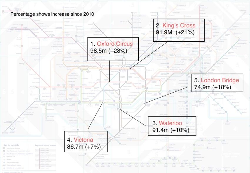
Abstract
       With 400 km of rails, 270 stations, and more than 1.3 billion passenger journeys each
year, quickly and safely moving passengers through stations and onto trains is an ongoing
priority for the London Underground. The goal of this project was to analyze passenger flow and
recommend ways to alleviate crowding and congestion. We gathered qualitative and quantitative
data, through interviews with London Underground employees, CCTV observation, and analysis
of customer satisfaction data. Our findings suggest that the current patterns of passenger flow
and congestion are unsatisfactory and unsustainable and we propose a number of
recommendation that London Underground and Transport for London might pursue to alleviate
the problems in the future.

                                                                                                  i
Acknowledgments
       We would like to thank Professor Dominic Golding and Professor Jennifer deWinter for
providing clear guidance and continued support to help us completing the project. We offer
special thanks to our sponsor, Steve Walling from London Underground, for giving us insight
into the complex problems and making human connections for us to complete our project
objectives.
       Furthermore, we would also want to thank Mike Donnithorne, Custom Service Manager
at Euston Station, and Cassius Powell, Custom Service Manager at Liverpool St. Station, for
giving us access to the stations and CCTV footage. We also appreciated all interviewed staff
members at both Euston Station and Liverpool St. Station for giving us good insight to problem
areas at the stations. Last but not least, we want to thank Dr. Taku Fujiyama, professor at UCL,
for giving us more information to supplement our background research on passenger flow.

                                                                                                   ii
Executive Summary
       Use of the Tube has grown over time to provide millions of trips in a single day, leading
to congestion issues. At its peak, more than 28 million trips were made in one week. Despite the
sheer number of passengers serviced, delays can account for over 25 million lost hours in
productivity in a single year. One of the key causes of delays that this paper explores is delays
due to congestion and passenger overcrowding.
       Poor passenger flow and congestion does not only result in lost hours for travelers, but
also results in customer complaints and can contribute to safety issues. Transport for London
(TfL) has expressed concern about the congestion in stations before, targeting some of the most
travelled stations with renovation projects. Beyond this, passenger congestion on platforms can
lead to unsafe circumstances where passenger push too close to incoming trains. Crowded
platforms and trains also result in lower passenger satisfaction, a metric that TfL seeks to
maximize across all modes of transportation.
       This project was designed to conduct a detailed analysis of congested stations and
customer satisfaction data to provide us with a basis to suggest potential improvements. We
started with an in-depth literature review based not only on the science behind passenger flow,
but also international approaches to congestion relief. We created station selection criteria,
evaluating eight stations recommended to us by station staff and settling on two primary stations
to focus our work on- Euston and Liverpool Street. After identifying our target stations, we
conducted employee interviews to gain insight on problem areas in the station and common
questions and concerns that passengers had, then performed CCTV analysis on these stations
during peak and off-peak times.
       After our CCTV observation was complete, we performed research into data collected
previously by Transport for London in order to look for a correlation between congestion and
passenger satisfaction. Previous passenger surveys did not collect data based on station, but the
data for each line was used to analyze their associated stations. We did not find a strong
correlation between congestion and overall satisfaction, but did notice that some lines suffered
more from congestion than the signage and information issues that were also prevalent.
       We found that congestion and passenger flow were poor during peak hours of travel on
the London Underground. Level of service measurements in ticket halls were consistently poor,
as were the areas around escalators. We found that off-peak hours were much more manageable,

                                                                                                    iii
and do not need to be looked at outside of abnormal operation situations. We also found that
passengers were unsatisfied in many ways with signage and congestion in the stations.
Passengers were frequently confused as to where they need to go and did not know about delays
that occurred during their travels. These conclusions led us to make recommendations that the
London Underground should take into account while planning their improvements in the future.
        We recommend that some measures be taken system-wide on the London Underground
to improve service at all stations. We recommend that CCTV systems be upgraded and
standardized system wide to facilitate ongoing analyses of passenger flow and congestion. We
also recommend that LU take on a large-scale, one time analysis of congestion to develop short-,
medium-, and long-term strategies for congestion relief around the system. Changes to the
Oyster system to allow for one-station passes for contractors and cleaning staff to be able to enter
and exit fare-controlled areas where they work will help staff members be more efficient across
the board. In addition, changes to transfers, help points, and implementing more escalators will
improve quality of life at all stations.
        We believe that a widespread implementation of dynamic signage is also required to
better inform passengers about delays and alternative routes through the station. Currently, the
dynamic signage in ticket halls and on platforms is inadequate and does not help passengers find
their way to the platform. We believe that most, if not all, static signage should be replaced with
programmable signs that can display more relevant information to customers. Beyond this, we
would like to see changes in signage to incorporate color-coded lines on the floor to guide
passengers, and to move away from the current confusing platform numbering system altogether.
        Euston requires many improvements to be able to handle the increased traffic due to
projects like Crossrail 2 and High-Speed 2. We believe that Euston should be revamped and
renovated to bring disused entrances and tunnels into service in order to provide relief at the
cramped ticket hall area and the packed escalators. We hold that increasing the width of major
passageways and adding escalators to the current ticket hall will improve the passenger flow
enough in the short term to avoid major backups in the station. Moving maps to areas where they
are accessible but not in main thoroughfares, eliminating confusing signage, and changing the
Northern line into two separate lines for each branch will allow customers to find their way more
easily and avoid causing congestion while looking at Tube maps. We would also consider a full
station rebuild, moving the glass cubicle in the main ticket hall, and adjusting Network Rail

                                                                                                   iv
schedules to avoid surges as viable options for improving flow in the station.
       Liverpool Street, much like Euston, requires adjustments to avoid becoming a major
bottleneck for commuters and tourists. In the event of a shutdown at Ticket Hall B, Ticket Hall C
is unable to accommodate the sheer amount of tourists who are trying to purchase tickets to ride
the Tube. We believe that adding more ticket machines to Ticket Hall C, the fallback ticket hall,
is the best solution to the throngs of passengers who will otherwise line up at the four ticket
machines that exist there currently. Expanding each train platform by a meter in depth will allow
passengers to wait safely and more comfortably for their trains while abating issues with
passengers waiting too close to the tracks. Alternatively, implementing the platform door system
from the Jubilee line can also fix the current overcrowding issues. Adding an additional bridge to
Ticket Hall A that crosses the tracks can also relieve congestion issues in the station.

                                                                                                    v
Table of Authorship

Section                    Primary Author(s)           Primary Editor(s)

1. Introduction            Edward                      All

2. Background              Edward                      All

2.1                        Ian                         Robbie, Ian, Aidan

2.1.1                      Ian                         All

2.1.2                      Ian                         All

2.2                        Aidan                       Ian, Aidan

2.2.1                      Aidan                       Edward, Ian, Aidan

2.2.2                      Aidan                       Ian, Aidan

2.2.3                      Aidan                       Edward, Ian, Aidan

2.2.4                      Aidan                       Ian, Aidan

2.3                        Robbie                      Ian

3. Methods                 Edward                      Edward, Ian, Aidan

3.1                        Robbie                      Robbie, Ian, Aidan

3.1.1                      Robbie                      All

3.1.2                      Aidan                       Edward, Ian

3.1.3                      Robbie                      All

3.1.4                      Robbie                      Ian, Robbie

3.2                        Aidan                       Ian, Aidan

3.2.1                      Aidan                       Ian, Aidan

3.3                        Aidan                       Aidan, Ian

4. Findings and Analysis   Aidan                       Ian, Aidan, Robbie

4.1                        Aidan                       Ian, Aidan, Robbie

5. Conclusions             Aidan                       Ian, Aidan, Robbie

                                                                            vi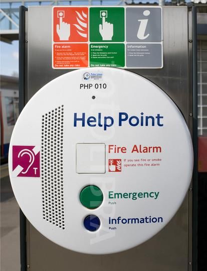
Table of Contents
Abstract                                                                             i

Acknowledgments                                                                     ii

Executive Summary                                                                  iii

Table of Authorship                                                                vi

Table of Contents                                                                  vii

List of Figures                                                                    ix

List of Tables                                                                     xi

1. Introduction to Congestion in the London Underground                             1

2. Background on Congestion and the London Underground                              3

  2.1. Passenger Flow                                                               6

     2.1.1. Standards and Measurements Used to Define and Measure Passenger Flow    8

     2.1.2. Measuring Passenger Flow                                                8

  2.2. Improving Passenger Flow                                                    11

     2.2.1. Signage/Messaging Analysis                                             12

     2.2.2. Operation                                                              14

     2.2.3. Responses to Congestion                                                15

     2.2.4. Encouraging Good Flow                                                  17

  2.3. Conclusion                                                                  17

3. Methods of Measuring Congestion and Effects on Passenger Flow                   18

  3.1. Passenger Flow Observation                                                  18

     3.1.1. Station Selection and Preliminary Interviews                           18

     3.1.2. Employee Interview                                                     20

     3.1.3. CCTV Observation                                                       20

     3.1.4. Data Analysis                                                          21

                                                                                   vii
3.2. Passenger Satisfaction Measurements                      25

    3.2.1. Data Analysis                                        25

  3.3 Vetting Preliminary Analysis                              25

4. Findings and Analysis                                        27

5. Conclusions                                                  39

6. Recommendations                                              41

6. References                                                   47

7. Appendices                                                   53

       Appendix A: Sponsor Description                          53

       Appendix B: Tables of Recommendations                    57

       Appendix C: Interview Instrument for Experts             59

       Appendix D: Interview Instrument for Station Employees   60

       Appendix E: Group Discussion Questions                   61

       Appendix F: Extra Data Visuals                           62

                                                                viii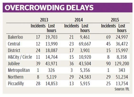
List of Figures
Figure 1: Lines and Station of the Tube (“Big Map,” n.d.) ............................................................ 3
Figure 2: Change in Average Trips Annually Per Person, by Mode of Transportation (Sullivan et
      al., 2015) ................................................................................................................................. 4
Figure 3: Top Five Busiest Tube Station (Parmenter, 2015) .......................................................... 4
Figure 4: Cumulative Passenger Hours Lost Due to Overcrowding Delays on Each Line (Smith,
      2017) ....................................................................................................................................... 5
Figure 5: Liverpool Street Station Layout, TH A (left), Escalators 1,2,3 (top), TH B (Center) .... 7
Figure 6: Euston Station Layout, Escalators 7,8 (top left), Escalators 5,6, (top right), Main TH
      (center) .................................................................................................................................... 7
Figure 7: Pedestrian Space and Stairs (Fruin, 1971)..................................................................... 10
Figure 8: Speed-Density and Flow-Density Relationship (Hankin and Wright, 1958) ................ 10
Figure 9: Example of a London Underground Help Point (London Particulars, 2011) ............... 13
Figure 10: Timeline of Improvements for Chicago's Red/Purple Line Modernization ("Red &
      Purple Modernization," 2016)............................................................................................... 15
Figure 11: Chart of Frequency of Delays on NYC Metro (>1,500 instances) (Ballaban, 2015) .. 16
Figure 12: Example of Passenger Density Graph with Normalization ......................................... 21
Figure 13: Early Design for Data Representation ......................................................................... 22
Figure 14: Example of Histogram displaying LOS Data .............................................................. 22
Figure 15: Example Graph Comparing Density Over Time with Reference to Operational
      Maximum .............................................................................................................................. 23
Figure 16: Euston Ticket Hall Major Disruption .......................................................................... 24
Figure 17: Histogram of Euston Ticket Hall................................................................................. 24
Figure 18: Example of Unclear Signage at Euston Station........................................................... 28
Figure 19 and 20: Unclear Signage Examples at Liverpool Street- Way Out Lighting (19), Low
      Signage (20) .......................................................................................................................... 28
Figure 21: Liverpool Street Ticket Office C, Morning Peak Level of Service Frequency ........... 29
Figure 22: Ticket Hall B Density Comparison: Morning Peak, top; Off-peak, middle; Evening
      Peak, bottom ......................................................................................................................... 30
Figure 23: Liverpool Street Ticket Hall B Morning Peak Level of Service Frequency ............... 31
Figure 24: Ticket Hall B Morning Peak Passenger Density, 1.4/m Line in Red .......................... 31

                                                                                                                                                  ix
Figure 25: Liverpool Street Passenger Density Comparison: Ticket Hall C, top; Escalators 1,2,3,
middle; Bridge, bottom ......................................................................................................... 32
Figure 26: Liverpool Street Escalators 1, 2, and 3 Morning Peak Level of Service Frequency... 33
Figure 27: Liverpool Street Escalators 4, 5, and 6 Morning Peak Level of Service Frequency... 33
Figure 28: Liverpool Street Escalators 7, 8, and 9 Morning Peak Level of Service Frequency... 34
Figure 29: Liverpool Street Ticket Hall C Morning Peak Level of Service Frequency ............... 35
Figure 30: Liverpool Street Bridge Morning Peak Level of Service Frequency .......................... 35
Figure 31: Liverpool Street Ticket Hall B, Weekend Peak Level of Service Measurement ........ 36
Figure 32: Glass Cubicle at Euston ............................................................................................... 45
Figure 33: All Lines and Stations of the Tube ("Big Map," n.d.) ................................................. 53
Figure 34: Population and Journey by Mode ("Underground, Overground," 2013) .................... 54
Figure 35: Funding Breakdown by Source ("Funded," n.d.) ........................................................ 54
Figure 36: Subsection of the Tube Map, Central London ("Tube: Getting here," n.d.) ............... 55
xList of Tables
(Table 1: Station selection criteria) 19
(Table 2: LOS Values) 21
(Table 3: Overcrowding Delays) 56
xi1. Introduction to Congestion in the London Underground
Passenger congestion at underground stations has been one of the major concerns London
has faced in recent years. With more people taking the London Underground (LU), also known
as the Tube, upwards of a million of people could be congesting the Tube every week. For
example, the week ending October 31st, 2015, there were 28.76 million journeys made in the
week (McAteer, 2015). In addition, more than 26 million customer hours were lost in 2015/16
(time lost was calculated by customers’ waiting time on delayed train for more than two minutes;
Blunden et al. 2016). Poor passenger flow not only results in huge loss of productivity but also
gives rise to customer complaints and safety issues.
Seeing the severity of the congestion problems, the LU has tried measurements, such as
station renovation, increasing train frequency, etc., to mitigate the situation. Hence our project
provides further insight into passenger congestion issues at congested stations, Euston and
Liverpool St. stations to be exact, as well as helps in LU’s efforts to tackle congestion problems.
We aim to find out what contributes to congestion the most in Tube stations. We then determined
options for ameliorating any problems. All of the stations we focus on contain multiple lines and
are used frequently to transfer between lines in order to reach a specific destination. Interchange
stations in central London struggle with overcrowding due to the sheer number of passengers—
upwards of ridiculous number inserted here—that pass through them every day.
The goal of the project is to conduct a thorough analysis of passenger flows at specific
interchange stations in the London Underground and to provide detailed suggestions on how to
improve passenger flow. In order to reach the goal, we have three main objectives.
● Conduct a detailed analysis of passenger flows at selected interchange stations to identify
major areas and causes of congestion.
● Evaluate passenger opinions about congestion to determine links between public opinion
and congestion.
● Recommend approaches to better alleviate passenger congestion.
In order to get into the discussion about main objectives, we provide the background on
passenger congestion and the nature of its effect in Chapter 2. We then discuss our key
objectives in our path to achieving this goal in Chapter 3, starting with an assessment of the state
of the art in passenger management. Through interviews with experts and an expansion of our
literature review, we have identified the process by which passenger flow in the London
1Underground is controlled and influenced. For example, in Section 3.1, we measure passenger
flow at specific interchange stations through CCTV observation, direct platform observation, and
station concourse observation. We then analyze survey data from previous Transport for London
surveys in Section 3.2. Finally, in Section 3.3, we discuss how we vetted our solutions and
refined them through our work with Transport for London employees.
Section 4 encompasses the analysis and findings that we have determined from our work
in Section 3. First, we discuss our findings from all the elements of our research combined. We
then combine all of our methods into one complete analysis of the problems involving passenger
flow in our primary stations in Section 5. Finally, we propose recommendations to address these
problems in Section 6. Each suggestion has a succinct explanation of its purpose and how it will
benefit the station.
22. Background on Congestion and the London Underground
This section describes the Tube and passenger flow to give context for the rest for the
report. The Tube is a public railway transit system that serves Greater London and its nearby
counties. Opened in 1863, the Tube is the oldest railway system in the world. It began with one
line and only six stations, from Paddington Station to Farringdon Station (“London
Underground,” n.d.). During 150 years of operation, the Tube has expanded across the city to be
able to meet the demand of the city, and now runs eleven different lines traveling on 402
kilometers of rail, servicing 270 stations across London (“Facts and Figures,” n.d.) (See Figure
1).
Figure 1: Lines and Station of the Tube (“Big Map,” n.d.)
London continued to grow as the Tube developed. Today, London has become a large
metropolis, boasting a population of 8.7 million and attracting 35.1 million international tourists
who travel to tourist attractions through the Tube (Coldwell, 2016). Each person in London
makes, on average, 921 trips over the course of a year, and 86% of those trips are in a vehicle
(primarily cars and vans). Recently, Londoners have been changing their commuting habits,
shifting away from private vehicles to public transportation. Compared to transportation mode in
2002, the distance traveled by car has decreased by 649 miles. As can be seen in Figure 2 below,
the use of rail, including both surface rail and the Tube, has increased in distance by 158 miles,
and 7 trips (Sullivan, J., Kershaw, K., and Cummings, J., 2016). In 2015, the week leading up to
3October 31st, broke London’s record for numbers of trips made in a week: 28.76 million trips
(McAteer, 2015). In 2015/16, approximately 1.35 billion passenger journeys were made by the
Tube (“Facts and Figures,” n.d.). With so many passengers, most of the stations in the Tube
suffered excessive passenger volume and the consequences of congestion at some point. For
example, passenger volumes at increased by 28% at Oxford Circus (Figure 3) and by 21% at
King’s Cross between 2010 and 2015 (Parmenter, 2015).
Figure 2: Change in Average Trips Annually Per Person, by Mode of Transportation (Sullivan et al., 2015)
Figure 3: Top Five Busiest Tube Station (Parmenter, 2015)
4As one of the busiest railway systems in the world, the Tube has faced numerous
instances of overcrowding at stations, especially at interchange stations. For instance, at Victoria
station, where five tracks come together, about 90,000 passengers pass through between 7am and
10am on weekdays, and getting in and out of the station during peak hours can be difficult
(Topham, 2014). Passenger congestion in the station is one of the main causes of train delay.
As Figure 4 shows, the Jubilee, Central, and Northern lines suffer most from passenger
delays due to overcrowding. In the year 2016, Londoners riding the Jubilee Line lost 147,451
hours due to passenger congestion, followed by the Central Line with 60,695 hours (Smith,
2017). A significant portion of the hours lost due to delays are caused by incidents involving
passengers, or overcrowding in stations by passengers (London Underground Performance
Report, 2017). Congested platforms may also be a major safety concern. For example, in March
2015, The Rail, Maritime and Transport (RMT) Union reported that a woman fell off the
platform when her coat was jammed into the door. She was dragged by the train for 60 feet at
Clapham South station during morning rush hour, and suffered a black eye and broken arm
(RMT, 2016).
Figure 4: Cumulative Passenger Hours Lost Due to Overcrowding Delays on Each Line (Smith, 2017)
Due to all of the consequences caused by severe congestion at Tube stations, TfL has
implemented policies to help reduce problems. One of the plans to reduce congestion on
5Underground lines is to install the Crossrail line (rebranded as the Elizabeth line in 2016). The
new line is estimated to reduce peak crowding in the morning by eight percent (Barber, 2016).
Ongoing research and work in London Underground stations, including some experiments on
passenger flow, also continue to improve passenger flows through the station and alleviate
congestion. Section 7 of TfL’s 2016/2017 Budget and Business Plan Efficiencies Programme
outlines their intention to be transparent about their spending and savings through a quarterly
report, with their revised savings and efficiencies to be included in the Mayor’s 2017/2018
budget (“Efficiency Plans,” n.d.). In addition to transparency about spending, TfL has also
committed to having their data be accessible to developers who wish to use it to provide services
or products to customers to improve their experience. This will help ensure that the passengers
are receiving the information they need to get to their destination efficiently and without
confusion (“Open Data Policy,” n.d.).
2.1. Passenger Flow
Passenger flow is the number of passengers that move through a given transportation
system, such as to or from buses or train carriages (“Quality of Service Manual,” 2013). In
Section 2.1.1, we provide some background on passenger flow standards, detailing how flow is
categorized and why. Passenger flow also encompasses the way that those passengers move
about, and includes such components as the number of passengers traveling through a system
and the time and routes taken to travel through a system (Loukaitou-Sideris, Taylor, and
Voulgaris, 2015). In Section 2.1.2, we discuss measurement of these phenomena. The
determinants of passenger flow are extremely complex as the flow depends not only on each
individual passenger’s entry point and destination but also on how that passenger interacts with
other passengers and objects in the station. Labelled in Figures 5 and 6 are the locations in
Euston and Liverpool Street stations that we focused our observations on, and they are problem
areas such as escalators and ticket halls. In Section 2.1.3, we explore how flow can be analyzed
using comparison to established properties of passenger flow in order to extrapolate more
information.
6Figure 5: Liverpool Street Station Layout, TH A (left), Escalators 1,2,3 (top), TH B (Center)
Figure 6: Euston Station Layout, Escalators 7,8 (top left), Escalators 5,6, (top right), Main TH (center)
72.1.1. Standards and Measurements Used to Define and Measure Passenger Flow
Due to its inherent variance, passenger flow can be hard to measure consistently. Even
attempting to keep all conditions the same, passenger flow can vary dramatically from hour to
hour, day to day. The first foray into measuring passenger flow was done in the late 1950s when
Hankin and Wright conducted experiments and made observations that led to the development of
some empirical relationships between passenger density, speed, and flow rates. Their work was
later expanded upon by John Fruin in 1971, when he observed similar relations in passenger flow
and developed a system to categorize the conditions of the flow called the Level of Service
(LOS). LOS gives a ranking from A to F based on the space available to an individual, with A
being the highest and F the lowest. There are different LOS values for each letter for walking,
queueing, and stairs (Loukaitou-Sideris et al., 2015). These standards of measuring passenger
and pedestrian flow are still in use today, and forms the basis for our measurements as well.
As passenger flow changes, three main types of peaks appear:
1. directional peaks occur where many passengers are heading a single direction (e.g., narrow
corridors);
2. spatial peaks occur where many passengers accumulate in particular locations (e.g., at the
bottom of escalators or at ticket barriers); and
3. temporal peaks occur at different times of the day and week (e.g., during rush hour or special
events).
Our report focused on spatial and temporal peaks more than directional peaks, although all three
peaks tend to occur simultaneously.
2.1.2. Measuring Passenger Flow
To measure passenger flow, already established systems, such as ticket counters and
turnstiles, can be used to record passenger throughput without further experimental
measurement. However, this is often either infeasible or simply insufficient. The simplest way to
measure passenger flow is by hand—both by counting the number of passengers that flow
through a system in a given time frame and by measuring how long it takes passengers to travel
through the system. While these methods don’t require a lot of equipment, they require a lot of
effort to obtain sizeable amounts of data.
Visually recorded data is a useful way for people to better picture the problem areas and
8to get real time data. Previous studies have utilized cell phone data to analyze passenger flow and
throughput (Aguilera et al, 2014), although such a system raises concerns about privacy and can
therefore be difficult to implement. A less invasive method of measuring passenger flow is
through analysis of video footage. CCTV footage can be used alongside human observation to
make it easier to collect large amounts of data–video may be sped up, and the flow of a whole
day can be recorded in only a few hours. More ambitiously, computer analysis of CCTV footage
can be used to not only measure passenger flow but also to identify problems and blockages that
are causing congestion (Zhengyu, 2015). Microsimulation models can be used to better visualize
movements and interaction of diverse passengers under highly congested scenarios and
emergency evacuation. However, due to time and budget constraints, we do not consider these
methods to be our source of analysis.
2.1.3. Analysis of Poor Passenger Flow
Poor passenger flow can often be attributed in part to insufficient vertical transportation,
such as stairs or escalators, or suboptimal hallway width. In underground stations, vertical
movement needs to be considered just as horizontal movement is; passengers will often need to
move up or down in order to traverse the station, and halting either vertically or horizontally will
impede flow. According to Hankin and Wright, “Movement on stairs is slower than movement
on a level passageway, and movement up stairs is slower than movement down stairs” (Hankin
and Wright, 1958). This means that stairs will often cause bottlenecks. Hallway width will also
affect passenger flow: past 1.2 meters, flow increases linearly with the size of the passageway.
As passageways become more crowded, pedestrians increasingly slow down to avoid contacting
other pedestrians (Loukaitou-Sideris et al., 2016). The rate of this slowdown is well studied, and
relationship graphs can be seen in Figures 6 and 7. Figure 5 demonstrates the relationship
between passenger speed up a set of stairs or an escalator, and the space available per person.
9Figure 7: Pedestrian Space and Stairs (Fruin, 1971)
Figure 8: Speed-Density and Flow-Density Relationship (Hankin and Wright, 1958)
10As the red line indicates, when people get closer together, they slow down dramatically,
especially around at ten square feet per person. Figure 7 contains two charts: the first shows the
relationship between passenger flow (speed) and space per person, and the second shows the
relationship between flow and concentration (in passengers per square foot) for various sizes of
passageway. Much like Figure 5, these charts show that as the number of passengers per area
increases, passenger speed decreases.
Horizontal flows through passageways follow a fairly common-sense pattern, where the
rate of passengers per minute increases until it reaches a critical density of passengers, at which
point traffic grinds to a halt. Flow rate will increase up until passenger density reaches
approximately 0.1 passengers per square foot (1.07 passengers per square meter). The flow rate
then plateaus until a small bump in flow rate at 0.4 passengers per square foot (4.28 passengers
per square meter), after which the flow rate plummets to a passenger per minute value close to 0.
Since the rate of passengers per minute is directly correlated to passengers per square foot, the
data suggests that Level of Service, a measure of approximate passenger density in an area, is a
good representation of the congestion and approximate flow rate of a system. We can also see
that the size of a passageway will increase the absolute amount of passengers per minute flowing
through the system but will maintain the same pattern no matter the size.
Quantified passenger flow in an area may seem acceptable, but even slightly suboptimal
passenger flow can cause untold effects on the system as a whole. Poor flow might cause more
passengers to be grouped up on one end of the station rather than spread out evenly along the
station. This would cause passenger discomfort due to overcrowding, which would in turn lead to
more delays in passenger loading and unloading, with some carriages packed full and some
almost empty. In a system as large as the London Underground, small delays quickly add up.
Recently, passengers in the Tube wasted almost 400,000 hours in the last twelve months because
of delays to their journeys due to overcrowding (Jones, 2017).
2.2. Improving Passenger Flow
The London Underground, while one of the oldest mass transit systems, has made a lot of
progress since its founding over 100 years ago. Looking at similar transit systems, including the
Hong Kong Mass Transit Railway, the New York City Subway, and Chicago’s “L,” our group
can find some developments that may be adaptable to the London Underground. There have also
11been in-depth studies on passenger flow in other jurisdictions, such as the Mineta Report and
Hankin and Wright’s work, that provide many general suggestions and conclusions that can be
applied elsewhere. Some of the recommendations presented the Mineta Report were also present
in our final recommendations, and the Mineta Report’s full table of recommendations can be
found in Appendix B. Transport for London has already implemented many changes of their own
to improve stations, such as performing preliminary passenger flow analysis and renovating
problematic stations, including notably the Victoria station, which is currently undergoing
renovation. More information about Transport for London’s improvements can be found in both
Appendix A: Sponsor Description and section 4.3.
2.2.1. Signage/Messaging Analysis
Improving station signage, including announcements, and information kiosks, has proven
to affect passenger satisfaction. It may help to assist tourists and travelers who are unfamiliar
with the location and prevent them from impeding others.
Stations around the world have moved into using dynamic digital signage systems in
order to provide passengers with more up-to-date information. Providing information about
delays and issues on lines through better signage can make passengers feel more at ease
compared to stations with only static signage (Loukaitou-Sideris et al., 2015). The London
Underground has implemented dynamic signage and announcements on many of its stations, and
staff members are frequently available to help out passengers who require assistance
(“Improving customer service,” n.d.). Hong Kong also has dynamic signage, but announcements
are made in multiple languages both over the intercom system (Yu, 2015) and on information
panels and screens to help passengers know where the next stop will be (“Special Needs
Booklet,” n.d.). Support for multilingual signage is the next step to improving passenger flow
through informing tourists where to go.
New York City has taken a modern approach to signage, replacing maps of stations with
a digital “Help Point” system. The Help Points are easily visible communication stations that
allow passengers to be helped by attendants and station staff upon activation (“Help Points,”
2011). The Help Point system was designed by Motorola, who looked at the resources currently
present in NYC subway stations and improved on them to provide more reliable service.
Available intercom and speaker systems allow passengers that don’t need emergency or
12immediate service to talk to station operators remotely. Help Points are also compliant with
Americans with Disabilities Act regulations, which helps to make the stations more accessible to
passengers that might have disabilities that would otherwise preclude them from being able to
use the station in a normal manner (Motorola, 2014).
Transport for London, notably, already have Help Points in many of their stations to
assist with passengers, but the understated appearance of these stations can lead to them being
overlooked by passengers who don’t know what they’re looking for (See Figure 9).
Figure 9: Example of a London Underground Help Point (London Particulars, 2011)
On the Go Stations
New York City’s implementation of “On The Go Stations” in addition to the Help
Points in their subway system to allow commuters and passengers to view train delays at a
glance. These small kiosks allow passengers to check their trip information and receive
directions to their next train or a station to walk to. The stations also provide elevator and
escalator statuses, which may help disabled guests to navigate the stations more easily. Like the
“Help Points,” On The Go stations are designed with tourists in mind (Nelson, 2011). This
system is very similar to Transport for London’s existing “TfL Journey Planner” but has the
added benefit of being a permanent installation and working without needing a cell phone or
other Wi-Fi-enabled device. Tourists are a significant cause of delays and other complications on
the London Underground, with an average of 5.1 passengers with luggage causing delays on a
train for every 10 trains in service (Kelley, Ko, Mazza, & Robinson, 2016).
13Handicap-accessible Improvements
Hong Kong’s Mass Transit Railway also offers a significant amount of signage aimed at
disabled riders, some of which is completely missing from London Underground stations.
Station layout maps are available for visually impaired riders to enable them to navigate most, if
not all stations, on a given line. Transport for London does offer a guide to step-free station
access and an audio train map, but no equivalent for finding your way through the station itself.
They also provide guide paths along walls to help blind passengers navigate between stations and
down to the platform level (“Special Needs Booklet,” n.d.).
2.2.2. Operation
The construction of the train station is one of the most important factors in passenger
flow. Insufficient exits, entrances, or vertical transportation sites can bottleneck passenger flow.
Improvements in train station architecture and layout have contributed to alleviating poor
passenger flow and congestion in New York City and Chicago. The goal of New York City’s
system is to relieve the crowding around terminals and MetroCard stations by providing alternate
entrances to busy stations, including opening entrances that were previously closed. By turning
some currently exit-only areas into entrances as well, New York City may be able to relieve
congestion at many stations, at a lower cost than creating a completely new entrance (NYC
Transit Riders Council, 2001).
Chicago has addressed overcrowding in a similar way through renovation, but as it is an
even older system than New York City, Chicago has generally resorted to complete overhauls of
stations as opposed to gradual changes. The Red Line, in particular, was singled out in 2011 for
having a long-awaited renovation to several stations along the line, with many stations being
entirely demolished and replaced. Some other changes in Chicago include overhauls of already
in-place routes, adding modern stations in lieu of some older stations in a slightly different area.
The overhauls are to be carried out over a long period of time- large scale improvements to
existing systems can cause delays; they must be planned meticulously before they can be
implemented. As can be seen in Figure 10, which contains the timeline for the first phase of
Chicago’s Red Line overhaul, completed in 2015. Even the first phase took several years to
complete. The London Underground takes special care to ensure that their upgrades and
14overhauls do not impede service where possible. The Washington/Wabash station is an example
of a successful but pricey upgrade and was created to replace two stations that were over a
century old, Randolph and Madison, and should provide better, more modern infrastructure, but
it came at a high cost overall (Hilkevitch, 2011).
Figure 10: Timeline of Improvements for Chicago's Red/Purple Line Modernization ("Red & Purple Modernization,"
2016)
A good analogue to the London Underground’s ongoing Victoria renovation project—
which aims to install more escalators, increase handicapped accessibility, and optimize
efficiency for passengers travelling through the station—is the largest project in Chicago’s mass
rail transit history, the renovation of Wilson Station. This renovation resulted in a complete
rebuild of a station that was first built in 1923. The renovation was sought as the old Wilson
Station had deteriorated past the point of repair and needed to be updated to comply with ADA
standards. By adding elevator and wheelchair access as well as providing more spacious facilities
and stairless entryways, passengers that must pass through the station will be able to do so more
freely. Wilson Station will also sport wider stairwells, as well as three entrances (as compared to
the more typical single entrance found on subway stations) and signage improvements, which
should overall, improve the flow of traffic through the station to a significant degree (“Wilson
Station,” 2013).
2.2.3. Responses to Congestion
Cities around the world have mixed approaches to dealing with congestion on their mass
transit system. All of these approaches must be revamped before they can be considered for use
in the London Underground. New York City has yet to undergo a major overhaul in passenger
management since 2005, when they began to implement computerized train operation starting on
the “L” line (Chan, 2005). Instead, passengers have been packed into overcrowded subways for
years, resulting in safety concerns and uncomfortable riders as far back as 2007. Urban planners
15even believe that many lines may be years away from being fixed or renovated so that they may
resume operating under capacity (Neuman, 2007). The throughput of New York City’s subway
system has ballooned in recent years. Ridership is the highest it has been since 1948, resulting in
increased delays for commuters and disgruntled passengers (Fitzsimmons, 2016) (See Figure
11). Overall, New York City appears to be unable to approach the issue without major
expenditure, and as the city expands every year, they grow closer to a very expensive problem.
Figure 11: Chart of Frequency of Delays on NYC Metro (>1,500 instances) (Ballaban, 2015)
Hong Kong’s Mass Transit Railway has taken a more productive approach to addressing
congestion on the metro. Hong Kong employs a set of by-laws to specifically disallow
overcrowding on trains. Passengers who are found to be pushing onto trains that are already at
capacity will be subject to punishment (MTR By-Laws, n.d.). However, this may leave
passengers stranded to wait on the platform for another train. Passengers are also prohibited from
bringing large luggage onto trains as the process of embarking with oversized bags can lead to
delays. The removal of buskers, smokers, and loiterers in the Mass Transit Railway system may
also lead to better passenger flow, but this has not been explored in full yet (MTR By-Laws,
n.d.). During instances of extremely high congestion, the station’s Customer Service Manager
will ask incoming trains to skip their station in order to provide some relief. Occasionally,
congestion will be so severe that the station must be evacuated to a nearby street or concourse,
where passengers will slowly be let back in. On the train itself, as more than a third of passengers
in the morning rush hour have to stand, the introduction of flip-up seats helps provide more
space for standing passenger. According to London-based transport consultancy firm
PriestmanGoode, these designs boost passenger capacity by thirty percent (Holmes, 2016).
162.2.4. Encouraging Good Flow
Passenger flow can be improved in a variety of ways, from the obvious, such as stairways
and rails, to the more subtle, such as ambient temperature differences in the air that might make
it more preferable to be in one part of the station as opposed to another (Kelley, Ko, Mazza, &
Robinson, 2016). Maintenance of efficient, effective passenger flow can be accomplished
through changes to a rail station’s operating procedures and layout. Frequent, audible
instructions and readily available transit staff can help passengers find their way through a
station much more effectively, reducing the number of blockages or congestion incidents due to
lost passengers (Loukaitou-Sideris et al., 2015). Changes to the vertical flow of passengers in
order to induce more people to use escalators or elevators in a shorter amount of time also
encourages better flow and can reduce congestion (Loukaitou-Sideris et al., 2015). Station
platforms should also provide passengers with enough space to comfortably group on the
platform and within the train, as passenger congestion within a train can negatively affect
people’s outlooks (Seriani, Fujiyama and Holloway, 2016). We took into account these
previously proposed ideas for improving passenger flow when we performed our own analysis.
2.3. Conclusion
As more people use public transportation each year, Transport for London faces a serious
problem with passenger congestion. With this information informing us of the state of the
London Underground and various approaches to similar projects around the world, we are
prepared to begin looked into passenger congestion. With knowledge of previous studies and
their results, we formulated a set of methods to define our data collection and analysis.
173. Methods of Measuring Congestion and Effects on Passenger Flow
The goal of this project is to assess the issue of passenger congestion and flow in the
London Underground and suggest potential solutions and improvements. Our main objectives
were:
● Conduct a detailed analysis of passenger flows at selected interchange stations to identify
major areas and causes of congestion;
● Evaluate passenger opinions about congestion to determine links between public opinion
and congestion; and
● Recommend approaches to better manage passenger congestion.
We initially expanded our understanding of the nature of passenger management by consulting
with transportation experts at TfL and London universities. We conducted detailed assessments
of passenger flow at the Euston and Liverpool Street stations by interviewing employees from
Transport for London (TfL), and by analyzing CCTV footage and on-site observational data. We
supplemented our analysis of passenger flow by analyzing survey information from Transport for
London’s databases. We finalized our recommendations following a focus group discussion with
TfL employees to identify potential improvements in controlling overcrowding and congestion.
3.1. Passenger Flow Observation
We conducted an in-depth analysis of passenger flow at selected stations to define the
scope of the problem. Our analysis was informed by staff interviews, observation of CCTV
footage, and real-time observation of passengers in stations. Our first task was to identify the
sample of stations for our analysis, which we discuss below.
3.1.1. Station Selection and Preliminary Interviews
Station Selection Criterion: Initially, our sponsor identified a list of eight possible
stations to analyze (Table 1). Due to time and other constraints, we determined a set of criteria in
conjunction with our sponsor to select a subset of these stations for data collection. First, stations
that we identified as having serious ongoing construction were immediately ruled out as being
unsuitable for our experiments, as construction can significantly affect our results. Next, we
determined which stations had severe congestion to divide them into two groups. After
18determining the likelihood that we would get CCTV access at each of the stations, we looked to
focus on stations with a Network Rail station attached, as these would receive significantly more
traffic than a normal interchange station.
(Table 1: Station selection criteria)
Interchange Construction Severe CCTV Handicap Network Rail
station Congestion Accessible Interface
Bank/Monu Y Y Y N N N
ment
Embankment Y N N N N N
Euston Y N Y Y Y Y
Liverpool Y N N Y N Y
Street
Oxford Y N N N N N
Circus
Paddington Y N Y N Y Y
Victoria Y Y Y Y N Y
Waterloo Y Y Y N N Y
Our final decision narrowed down our primary focus to two stations. Our primary stations
are Euston and Liverpool Street, which we determined based on discussion with our sponsor, our
ability to access CCTV footage, and their position as stations that interface with network rail.
These stations have many similarities, but differ in handicapped accessibility and congestion
level, and provide us with suitably diverse data to get a better view of the London Underground
as a whole.
193.1.2. Employee Interview
Employee interviews targeted employees who have hands-on jobs, such as standing
beside barriers answering passengers’ questions, at Euston Station and Liverpool St. Station. At
each station, we interviewed ten staff members on the spot during off-peak hours throughout the
station and asked a series of questions, found in Appendix C, about the station and the customers
inside. We took many precautions to ensure that we protected the identities of the employees that
we interviewed. Interviews were conducted in pairs, with one group member asking the
questions and conducting the interview, and the other group member taking notes digitally.
Employees that were too busy to answer questions or that did not want to answer questions were
skipped over and only full interviews were taken into account for this project.
Questions were revised after an initial set of test interviews to become less redundant and
to provide us with more pointed areas of observations. The data from these interviews helped
select primary areas of observation for the CCTV observation that took place afterward. Our
primary conclusions were that escalators were trouble points, and that most questions were by
tourists looking for tourist destinations. These answers also were the foundation of the
suggestions that we have provided in our conclusions.
3.1.3. CCTV Observation
We determined which locations to observe (limited by the locations of the cameras) using
data gathered from employees about highly congested choke points in the station and from the
Mineta Report. Eventually, we aimed to look at choke points at escalators and ticket hall because
these are where queues happen at our primary stations. We utilized CCTV recordings covering
the peak times, according to information received during employee interview, which are 07:00 to
09:00 and 17:30 to 19:00 on Friday, and 09:30 to 12:30 and 17:30 to 19:00 on Saturday at
Euston Station, 06:30 to 09:30 and 16:30 to 19:30 on Tuesday, and 0930 to 12:30 on Saturday at
Liverpool street Station, to ensure that we were able to see the stations at their most congested.
CCTV cameras provided data, which we collected at each station during multiple time
periods for each camera view. We collected data at both peak and off peak times to provide a
point of comparison between each camera. Density data was collected by screenshotting the
CCTV per minute and counting the number of passengers in a given area for 90 minutes or 180
minutes (varied with weekdays and weekends). Given privacy concerns, we deleted every
20screenshot after finishing counting the numbers and no data was retained aside from aggregate
counts. This density data was plotted over time and compared with other areas of the station, as
well as with itself at peak or off-peak times. The density data was then compared with data on
the conditions of the station of the time in order to explain anomalous data and establish a cause
and effect relationship with regards to congestion. The data was plotted in various line graphs,
with moving averages and trend lines plotted alongside them to show the flow of passengers
through the day that can be seen in Figure 12.
Figure 12: Example of Passenger Density Graph with Normalization
3.1.4. Data Analysis
Data analysis was handled through applying Level of Service (LOS) measurements
(Fruin, 1971) to the data collected about passenger congestion and through comparing passenger
satisfaction per line with known ridership data for each line. The LOS letter grades and their
corresponding values can be seen in Table 2. First, we determined the average LOS in various
areas in the station using our passenger density data.
(Table 2: LOS Values)
21Figure 13: Early Design for Data Representation
Figure 14: Example of Histogram displaying LOS Data
22This was done by taking the data points for number of passengers passing through a location and
dividing by the area through which they were moving. We considered using a graph of passenger
density over time with the different bars for each LOS labelled on the graph as shown in Figure
13, but due to the clustered and confusing nature of such a graph we opted for a histogram style
of data visualization.
Using spreadsheet software to calculate the frequency of each LOS value, the frequency
data was used to create a histogram with uneven bins which can be seen above in Figure 14.
Each bin is color coded according to its LOS, and the values used are reported in Table 2. The
height of the bar corresponds to the number of minutes that the location the graph represents was
at that LOS, and all of the heights sum to 180 total. Averages were taken using the set of LOS
data arranged and put in order. If a location had a poor average LOS, which would be an average
of D or lower as in Table 2, cited above, we knew that that area would need to be targeted for
emergency or short-term improvements to help the stations manage the increasing numbers of
passengers coming through each year. In addition, we plotted peak values of congestion and
passenger density at each area of Euston and Liverpool Street against the theoretical maximum
functional density in each area of the station based on the values in Loukaitou-Sideris, et al.,
(2016), as can be seen in Figure 15 below. The data represented is passenger density versus time
for Euston ticket hall on a weekday peak and a weekend off peak. The red line represents the
“recommended maximum concentration for design purposes” which was indicated in Hankin and
Wright’s work and cited in Loukaitou-Sideris et al.
Figure 15: Example Graph Comparing Density Over Time with Reference to Operational Maximum
23The line represents 1.4 passengers per meter squared, which corresponds to a LOS of E.
If an area is consistently near or exceeding this recommended maximum, then we concluded that
that area of the station is operating at or near their maximum capacity and may need an
additional focus in relieving the passenger flow in their area. For example, as can be seen in
Figure 15 and Figure 16, the Euston ticket hall greatly exceeded this maximum design capacity
for several minutes starting at 7:39 on Friday morning, finally returning below the maximum at
7:48. During that time, the LOS was an average of F. This can be seen on the histogram in Figure
17 by the height of the red and orange bars, which represent almost the entirety of this time. This
means that the passengers were packed tightly together and were not moving, leading to more
people piling up behind them as they entered the area. When compared to the graph of Saturday
at the same time, the values hardly exceed 50% of the design maximum, while on Friday the data
regularly reaches 60% or more.
Figure 16: Euston Ticket Hall Major Disruption
Figure 17: Histogram of Euston Ticket Hall
243.2. Passenger Satisfaction Measurements
In order to supplement the data gathered on congestion, our next focus was on the
public’s reaction to congestion in various areas, to predict how they might respond to various
congestion relief procedures. We analyzed prior customer surveys, and we gathered their existing
data from TfL sources regarding crowdedness of stations, ease of use, clarity of signage, and
station preference in order to identify other problem areas to better suggest improvements.
3.2.1. Data Analysis
Passenger satisfaction data was taken from a Transport for London survey conducted in
Q1 2016/17 (herein referred to as Customer Satisfaction Survey, or CSS) and analyzed with
regards to the system averages. Each line was compared to the London Underground as a whole
on sets of metrics involving every part of the operation of the train lines. The areas this report
focuses on are primarily areas of satisfaction relating to signage and station operations. This
report also takes into account frequency of delays and train operations, but these are not as much
of a priority.
Passenger satisfaction data was also compared to annual lineload summaries, also taken
from Transport for London, in order to determine if there is a correlation between customer
satisfaction and congestion. Annual lineloads refer to the number of trips taken on a line over the
course of a year and do not necessarily all come in and out of the stations we are looking at.
Again, overall satisfaction for each line going into Euston and Liverpool Street was compared to
the annual lineload in order to determine if there were any matching trends. Individual areas of
train and station operations regarding congestion satisfaction were also compared to the lineloads
to find any correlation.
3.3 Vetting Preliminary Analysis
The ultimate goal of this project is to develop a set of potential solutions that will
potentially aid in reducing the problems with passenger flow in the stations we observed as well
as the London Underground as a whole. In addition, our report includes graphical representations
of our results in order to easily show how we formed our conclusions. This section discusses
how those solutions were formed and then selected as our final recommendations for this project.
After we performed our testing and data collection, we tapped into the expertise of TfL
25You can also read