1.7 Look and Feel - Copyright 2021 Agiloft Inc. All Rights Reserved. HELP-31Mar2021
←
→
Page content transcription
If your browser does not render page correctly, please read the page content below
1.7 — Look and Feel

 © Copyright 2021 Agiloft Inc. All Rights Reserved.   HELP-31Mar2021
CONTENTS
1. Look and Feel . . . . . . . . . . . . . . . . . . . . . . . . . . . . . . . . . . . . . . . . . . . . . . . . . . . . . . . . . .   3
    1.1 Power User Look and Feel . . . . . . . . . . . . . . . . . . . . . . . . . . . . . . . . . . . . . . . . . . .                 6
    1.2 End User Look and Feel . . . . . . . . . . . . . . . . . . . . . . . . . . . . . . . . . . . . . . . . . . . . . .             13
    1.3 Required Field Display . . . . . . . . . . . . . . . . . . . . . . . . . . . . . . . . . . . . . . . . . . . . . . .           18
    1.4 Navigation Menu Setup . . . . . . . . . . . . . . . . . . . . . . . . . . . . . . . . . . . . . . . . . . . . . .              19
    1.5 General Preferences . . . . . . . . . . . . . . . . . . . . . . . . . . . . . . . . . . . . . . . . . . . . . . . .            23
    1.6 Mobile and ADA Interface . . . . . . . . . . . . . . . . . . . . . . . . . . . . . . . . . . . . . . . . . . . .               24
    1.7 Email Schemes . . . . . . . . . . . . . . . . . . . . . . . . . . . . . . . . . . . . . . . . . . . . . . . . . . . . .        25
Look and Feel
The Look and Feel wizards allow the customization of virtually every aspect of the End User and Power User
interface. Most customizations offer a preview of the effect while you edit. Any number of Look and Feel
schemes may be created and assigned to different teams. The look and feel a particular user sees is based on
their primary team, which allows custom branding for different users. The customizations include variations in
font, hover over effects, scroll bars, borders, graphics, headers, footers, and placement preferences.
To access the Look and Feel wizards, go to Setup > Look and Feel:
Power User Look and Feel: Customizes a large number of elements on the Power User Interface.
End User Look and Feel: Customizes a number of elements on the End User Interface not controlled by
EUI templates.
Required Field Display: Customizes the look and feel of required fields.
Email Schemes: Customizes the appearance of emails sent from the system, as well as the fields and
embedded tables included with those emails.
Left Pane Setup: Customizes the left pane on a team-wide basis.
General Preferences: Customizes general system preferences, such as whether records are edited in a
new window, whether the table title is displayed in table views, and whether tables should remember
the last search.
Mobile and ADA Interface: Customizes the interface on a team-wide basis when a user accesses the
system on a mobile device.
Customize the Interface
The following table indicates where you can customize different elements of the interface using the main Look
and Feel wizards for the End User and Power User interfaces.
Customization Wizard Tab
Tabs Toolbar
Fonts, colors, border, etc
Hover over effects
Left Pane Customization - Power User interface only Left Pane
Menu color
Hover over effects
Pane body style
© 2021 Agiloft Inc. 3Page Layout Body
Text font, style, colors, background, etc
Scroll bars
Hyperlink style
Titles
Table records Tables
Text font, style, color
Odd/Even row background
Table headers
Hyperlink style
Data input or view record forms Forms
Format for values, labels, buttons, help
Alternate row background colors
Button format
Dashboards and Widgets Dashboards
Background color and style
Alignment
Text font, size, style, etc.
Charts and Reports Charts/Reports
Header style
Legend style
Chart data color
Printed Content Printing
Record view background
Field label style
Headings and instructional text style
© 2021 Agiloft Inc. 4System Icons Icons
Help, Setup, Calendar, etc.
Website customization Content
Header and footer
Graphics
Scheme assignment to teams Apply
Power User Look and Feel
© 2021 Agiloft Inc. 5Power User Look and Feel
The Look and Feel wizard for the Power User Interface provides access to a wide range of options for changing
the look and feel of the knowledgebase for power users. You can add or remove header and footer HTML and
company logos; control text font, size, and color; and change the appearance of buttons, tabs, and other
interface elements.
The look and feel that a specific user sees is controlled by their primary team. You can save multiple look and
feel configurations, called "schemes," and apply them to different teams in the system. This allows you to, for
example, give each of your internal departments a unique appearance. You could also instead create a single
look and feel scheme in the style of your company and apply it to all power users.
There are separate Look and Feel wizards for the Power User and End User Interfaces, and options are
tailored to access permissions for these different user types. For information on the Look and Feel wizard for
end users, see End User Look and Feel.
Look and Feel Wizard: Power User
Interface
The Look and Feel wizard for the Power User Interface contains a number of tabs for customizing the
appearance of the knowledge for power users. Because this is a longer and more involved wizard than others,
remember that your changes won't be saved until you click Finish.
To access the Look and Feel wizard for the Power User Interface:
1. Go to Setup > Look and Feel > Power User Interface.
2. Edit an existing scheme, or click New to create a new scheme.
As you adjust each setting, you can preview the changes in the example shown on the left side of the
wizard. The example refreshes in real time as you work.
Global Tab
From the Global tab, you can define basic options that influence and control other aspects of the look and feel
scheme, such as the base scheme, font choices, and a global color palette to apply to various elements on
subsequent tabs. You can also set the logo and the icon that appears in the address bar.
© 2021 Agiloft Inc. 6Base Scheme
The Select Base Scheme drop-down provides a list of existing schemes, which function as a starting point for a
new look and feel scheme. Once you've selected a scheme, click Apply Scheme to apply its settings to the
current scheme.
Custom Fonts
The Upload Custom Fonts option is an attached file field that accepts multiple fonts in .ttf format. Once fonts
have been uploaded, they can be used as base fonts and are available for use in any of the Look and Feel
schemes in the knowledgebase. Fonts are not fully saved until you click Finish and close the wizard.
Font files are licensed software. When uploading custom fonts, use open source fonts or fonts for
which you have an appropriate distribution license.
Base Fonts
The primary font of the look and feel uses the Base Font 1 field. Optionally, define a second and third font.
Base fonts define the default font choices for the scheme. To use a custom font, start typing the name into the
Base Font fields, and then select the auto-complete option when it finds the font name. The selection is
confirmed with a checkmark icon.
This setting is referenced whenever you select Use Primary Font in other font display selections on other tabs
of the wizard. Changing the primary font in the Base Font 1 field allows you to quickly change the font across
many parts of your look and feel. If the user's browser does not have the primary font available, the system
substitutes the Base Font choices in order.
Base fonts will be available in the HTML field editor when they have been applied, including custom fonts.
To ensure users can view your fonts as intended, use only the most common fonts, such as Arial,
Verdana, Open Sans, etc.
Global Color Palette
© 2021 Agiloft Inc. 7Global Color Palette
The color palette lets you define up to 20 colors, either from a drop-down list or through hexadecimal color
codes. These colors can then be selected when setting the appearance of elements on the other wizard tabs.
To define a color, do one of the following:
Choose from the predefined list of colors.
Enter a hexadecimal code, such as #FFFFFF.
Click the color icon to open the Select Color window, and then manually select a color, or define RGB or
HSV values. Note that HSV and RGB are alternatives, so entering one type will automatically convert the
other.
To customize the colors of the interface, start by customizing the base color palette first, and then tweak how
individual interface elements reference those colors. To more easily tell which interface elements are
controlled by each setting in the color palette, refer the list below offers a general idea of how the out-of-the-
box system uses the 20 colors in the palette.
Color Number Color Use
Color 1 Main Color (background, larger buttons, and system)
Color 2 Modified Main Color (selected tab, hover text)
Color 3 Selection backdrop, contrast text
Color 4 Generic Background
Color 5 Not used in the out-of-the-box Look and Feel
Color 6 Unsaved warning backdrop
Color 7 Not used in the out-of-the-box Look and Feel
Color 8 Main Border
Color 9 Special text (calendar weekends, links)
Color 10 Main Link Hover
Color 11 Background, white space
Color 12 Standard instructional text
Color 13 Another modified main color (selected tab underline, hover effects)
Color 14 Unselected, unassuming text
Color 15 Passive Elements (borders, background, contrast text against main color backdrop)
© 2021 Agiloft Inc. 8Color 16 Not used in the out-of-the-box Look and Feel
Color 17 Warning Contrast (unsaved text, thin borders, hover effects)
Color 18 Subtle micro-elements
Color 19 Not used in the out-of-the-box Look and Feel
Color 20 Brighter micro-elements
When making a Look and Feel scheme, find good color options by browsing your organization’s or
client’s website. Pay close attention to the colors used in graphics, icons, logos, backgrounds, buttons,
text, headings, and hyperlinks.
Custom Logo
To use a custom logo, select Use Custom Logo, and then use the dialog to upload your image file. The logo
acts as a link to your default homepage.
Toolbar Tab
The Toolbar tab lets you set the appearance of the Toolbar elements, including tabs, menus, font faces and
sizes, colors, and borders. The Toolbar refers to the row of tabs that appear at the top of any wizard or record
form in the Power User Interface.
This tab also includes settings for the top nav bar, and the appearance of drop-down menus in action bars.
Left Pane Tab
The Left Pane tab controls the look and feel of the Calendar and other items specific to the left pane
navigation menu.
© 2021 Agiloft Inc. 9Body Tab The Body tab controls various aspects of the interface, including background color, fonts, scrollbars, hyperlinks, and status messages. Tables Tab The Tables tab controls elements on the table view, such as the style of action bars, Quick Search, and the table rows. Forms Tab The Forms tab controls the appearance of a variety of elements, such as record forms, error messages, input forms, labels, buttons, comments, and code snippets. Dashboards Tab The Dashboards tab manages the appearance of Dashboards and widgets. Charts/Reports Tab The Charts/Reports manages the appearance of charts and reports. © 2021 Agiloft Inc. 10
Printing Tab
The Printing tab controls the display of elements selected for printing. These elements include the background
color used in viewing a record for printing, the label displays, and the field displays.
Icons Tab
The Icons tab controls icons used throughout the system, such as the Edit, Search, or Print icons. Table icons
are controlled on the Graphics tab of the Table wizard.
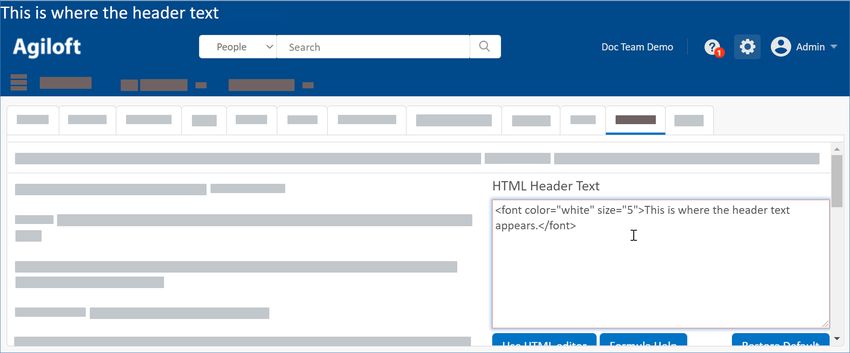
Content Tab
The Content tab lets you create custom headers and footers using HTML. You can use the built-in HTML editor
to enter text directly into the text box, upload HTML text created in an editor of your choice, or insert an
image.
To create a custom header or footer, click Use HTML Editor or enter HTML directly in the text box.
Use the buttons to customize your header or footer:
Insert system variables by clicking Formula Help to open the Formula Help wizard and inserting the
desired variables.
Upload HTML text created outside the system by clicking Choose File, browsing for the file, and then
clicking Upload.
Insert an image by clicking Select / Manage Images... and selecting an existing image or uploading your
own. Once you've chosen an image, click the file name to append the image with the appropriate HTML
to the text box.
© 2021 Agiloft Inc. 11Apply Tab
The Apply tab controls the scheme name and which teams see the Look and Feel scheme. Checking the "and
their subteams" option will also apply this scheme to the users whose primary team is a subteam of any of the
selected teams. Checking the "Apply changes to me now" option will apply the scheme to you immediately,
without having to logout first.
By defining a different look and feel for separate teams, you can allow each of your major customers to see
their own logo, provide visually impaired staff with a larger font, and apply a variety of other customizations
for specific sets of users.
Best Practice Tip
When you want to modify a Look and Feel scheme, it's best to first create a new scheme by saving an
existing scheme under a new name. This allows you to test your changes and then either revert or
refer to the original scheme. You can still use the existing scheme as a base by clicking Apply Scheme
on the Global tab.
End User Look and Feel
© 2021 Agiloft Inc. 12End User Look and Feel
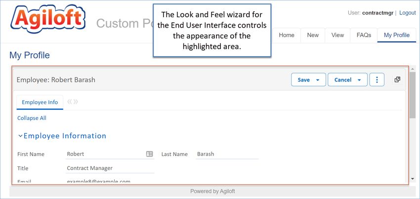
The Look and Feel wizard for the End User Interface provides options for customizing several areas of the
knowledgebase for end users. You can adjust the look and feel of table views, record forms, the advanced
search interface, and the FAQ interface.
Everything else on the End User Interface (EUI) is defined with EUI templates in the EUI Templates table. The
overall look and feel of the EUI is therefore determined by a combination of settings in this Look and Feel
wizard and the CSS and HTML contained in the EUI templates.
The look and feel that a specific user sees is controlled by their primary team. You can save multiple look and
feel configurations, called "schemes," and apply them to different teams in the system. This allows you to, for
example, give end users in different companies a unique appearance. You could also instead create a single
look and feel scheme that's applied to all end users.
There are separate Look and Feel wizards for the Power User and End User Interfaces, and options are
tailored to access permissions for these different user types. For more information on customizing the Power
User Interface, see Power User Look and Feel.
Look and Feel Wizard: End User Interface
The Look and Feel wizard for the End User Interface contains a number of tabs for customizing the
appearance of the knowledgebase for end users. Because this is a longer and more involved wizard than
others, remember that your changes won't be saved until you click Finish.
To access the Look and Feel wizard for the End User Interface:
1. Click the Setup gear in the top-right corner and go to Look and Feel > End User Schemes.
2. Edit an existing scheme, or click New to create a new scheme.
© 2021 Agiloft Inc. 13As you adjust each setting, you can preview the changes in the example shown on the left side of the
wizard. The example refreshes in real time as you work.
Global Tab
From the Global tab, you can define basic options that influence and control other aspects of the look and feel
scheme, such as the base scheme, font choices, and a global color palette to apply to various elements on
subsequent tabs. You can also set the logo and the icon that appears in the address bar.
Base Scheme
The Select Base Scheme drop-down provides a list of existing schemes, which function as a starting point for a
new look and feel scheme. Once you've selected a scheme, click Apply Scheme to apply its settings to the
current scheme.
Custom Fonts
The Upload Custom Fonts option is an attached file field that accepts multiple fonts in .ttf format. Once fonts
have been uploaded, they can be used as base fonts and are available for use in any of the Look and Feel
schemes in the knowledgebase. Fonts are not fully saved until you click Finish and close the wizard.
Font files are licensed software. When uploading custom fonts, use open source fonts or fonts for
which you have an appropriate distribution license.
Base Fonts
The primary font of the look and feel uses the Base Font 1 field. Optionally, define a second and third font.
Base fonts define the default font choices for the scheme. To use a custom font, start typing the name into the
Base Font fields, and then select the auto-complete option when it finds the font name. The selection is
confirmed with a checkmark icon.
© 2021 Agiloft Inc. 14This setting is referenced whenever you select Use Primary Font in other font display selections on other tabs
of the wizard. Changing the primary font in the Base Font 1 field allows you to quickly change the font across
many parts of your look and feel. If the user's browser does not have the primary font available, the system
substitutes the Base Font choices in order.
Base fonts will be available in the HTML field editor when they have been applied, including custom fonts.
To ensure users can view your fonts as intended, use only the most common fonts, such as Arial,
Verdana, Open Sans, etc.
Global Color Palette
The color palette lets you define up to 20 colors, either from a drop-down list or through hexadecimal color
codes. These colors can then be selected when setting the appearance of elements on the other wizard tabs.
To define a color, do one of the following:
Choose from the predefined list of colors.
Enter a hexadecimal code, such as #FFFFFF.
Click the color icon to open the Select Color window, and then manually select a color, or define RGB or
HSV values. Note that HSV and RGB are alternatives, so entering one type will automatically convert the
other.
To customize the colors of the interface, start by customizing the base color palette first, and then tweak how
individual interface elements reference those colors. To more easily tell which interface elements are
controlled by each setting in the color palette, refer the list below offers a general idea of how the out-of-the-
box system uses the 20 colors in the palette.
Color Number Color Use
Color 1 Main Color (background, larger buttons, and system)
Color 2 Modified Main Color (selected tab, hover text)
Color 3 Selection backdrop, contrast text
Color 4 Generic Background
Color 5 Not used in the out-of-the-box Look and Feel
© 2021 Agiloft Inc. 15Color 6 Unsaved warning backdrop
Color 7 Not used in the out-of-the-box Look and Feel
Color 8 Main Border
Color 9 Special text (calendar weekends, links)
Color 10 Main Link Hover
Color 11 Background, white space
Color 12 Standard instructional text
Color 13 Another modified main color (selected tab underline, hover effects)
Color 14 Unselected, unassuming text
Color 15 Passive Elements (borders, background, contrast text against main color backdrop)
Color 16 Not used in the out-of-the-box Look and Feel
Color 17 Warning Contrast (unsaved text, thin borders, hover effects)
Color 18 Subtle micro-elements
Color 19 Not used in the out-of-the-box Look and Feel
Color 20 Brighter micro-elements
When making a Look and Feel scheme, find good color options by browsing your organization’s or
client’s website. Pay close attention to the colors used in graphics, icons, logos, backgrounds, buttons,
text, headings, and hyperlinks.
Body Tab
The Body tab controls the appearance of various aspects of the interface, including background color, fonts,
scrollbars, hyperlinks, and status messages.
© 2021 Agiloft Inc. 16Tables Tab The Tables tab controls elements on the table view, such as the style of action bars, the search button, and the table rows. Forms Tab The Forms tab controls the appearance of a variety of elements, such as record forms, error messages, input forms, labels, buttons, comments, and code snippets. Dashboards Tab The Dashboards tab manages the appearance of Dashboards and widgets on the legacy EUI. Printing Tab The Printing tab controls the display of elements selected for printing. These elements include the background color used in viewing a record for printing, the label displays, and the field displays. Content Tab The Content tab lets you create custom headers and footers in the legacy EUI using HTML. You can use the built-in HTML editor to enter text directly into the text box, upload HTML text created in an editor of your choice, or insert an image. In the current EUI, the header and footer are controlled by EUI templates. You can also use HTML to adjust the look and feel of the Support Home screen for the legacy EUI. Apply Tab © 2021 Agiloft Inc. 17
Apply Tab
  The Apply tab controls the scheme name and which teams see the Look and Feel scheme. Checking the "and
  their subteams" option will also apply this scheme to the users whose primary team is a subteam of any of the
  selected teams. Checking the "Apply changes to me now" option will apply the scheme to you immediately,
  without having to logout first.

  By defining a different look and feel for separate teams, you can allow each of your major customers to see
  their own logo, provide visually impaired staff with a larger font, and apply a variety of other customizations
  for specific sets of users.

        Best Practice Tip

        When you want to modify a Look and Feel scheme, it's best to first create a new scheme by saving an
        existing scheme under a new name. This allows you to test your changes and then either revert or
        refer to the original scheme. You can still use the existing scheme as a base by clicking Apply Scheme
        on the Global tab.

  Required Field Display
  Control the presentation of required fields using the Required Field Display settings in the Setup menu. The
  settings apply to all users, and are divided by record fields and wizard fields.

     1. Click the Setup gear in the top-right corner and go to Look and Feel > Required Field Display.
     2. In the User-record fields, set up the appearance of required fields in all user-facing record forms. You
        can use all, some, or none of the options. The left side of the wizard shows a preview for your settings.
               Select the Place checkbox to add an asterisk to required fields. If you select this option, you must
               also select the location of the asterisk.
               Use the Place text section if you want to add a different character instead of an asterisk, or if you
               want to use a longer text indicator for required fields. For example, you could use this setting to
               add "(Required)" after the field label instead of an asterisk.
               Select "Set the color of the label" to change the font color of the field label to the color you select.
               Choose whether to show these settings in view mode.

     3. In the Wizard fields, set up the appearance of required fields in wizards. This section includes the same
        settings as the User-record fields section, with a few options not available here.
     4. Click Finish to apply the changes.

  Required Field Display
© 2021 Agiloft Inc.                                                                                             18
Navigation Menu Setup
The Navigation Menu wizard controls the appearance of the navigation menu on a personal or team-wide
basis. Individual users can use Preferences under the User Menu to access the wizard and personalize their
navigation menu without affecting other users; administrators can use the Look and Feel menu to access the
wizard and apply changes to multiple selected teams.
Admins can create any number of navigation menu configurations and apply them to teams, and they can
decide whether changes should forcibly override personalized menus, be offered as an optional change, or
not be shown to users at all.
Navigation Menu Wizard
The wizard contains four tabs for customizing the availability of menu items on the left pane, the order of
those items, and which tables appear on the left pane.
To access the Navigation Menu wizard...
1. Go to Setup > Look and Feel > Navigation Menu Setup.
2. Edit an existing configuration or click New to create a new configuration.
General Tab
On the General tab, you can add a label, a name, and a description for the configuration, and choose whether
to show it as a toolbar on the top of the screen or a left pane on the side of the screen.
If you choose to show the navigation menu as a left pane, the Content tab includes different settings, and a
Tables tab also appears.
© 2021 Agiloft Inc. 19Content Tab
Use the Content tab to determine the items, tables, and table groupings that appear in the navigation menu.
In the Top style nav bar, groupings are accessed from the bento menu.
If you choose to show the navigation menu as a left pane, the settings described here are instead
relocated to the Tables tab, and the Content tab is used to select menu items that aren't tables or
table groupings, such as My Assigned and Last Opened. Select the items you want to include, and click
and drag to change the order in which they appear. Click each selected item to check for additional
available settings.
On the left-hand side, use the drop-down to see either the list of System Items or the list of Tables. This filters
the options that appear for selection. The Tables list on this tab shows all tables in the knowledgebase,
regardless of additional group permissions. If a group has the option "Show table on the Toolbar?" set to No in
the Table Permissions wizard for a particular table, and they access the wizard from the Preferences menu,
they will still see that table on the list.
You can drag items on the right-hand list to reorder their placement. You can add or remove items from the
navigation menu by selecting the table in the appropriate list and clicking Add or Remove. The Table wizard
also contains a Navigation Menu tab that allows you to choose whether to add or remove the table from
specified navigation menu configurations.
© 2021 Agiloft Inc. 20Add a Grouping
You can choose to group items, tables, or both under a common heading by placing them in a grouping:
1. Click New Grouping, add a name, and click Finish.
2. Drag items into the new grouping header to include them in that grouping. The same item can be
added to multiple groupings, so you can design the groupings to serve many different workflows.
3. If you add system items like Home, My Assigned, or Last Opened, select each one in the right-hand list
to show additional options in the Configuration column. You can use different settings on each instance
of the item. For example, you could add Home to each grouping and select a specific dashboard that is
most relevant to the grouping.
4. If you have the navigation menu set to show as a left pane, you can also add separators to demarcate
between tables or groupings.
Remove a Grouping
© 2021 Agiloft Inc. 21Remove a Grouping
To remove a grouping, select it and click Remove. A warning message appears to confirm you want to remove
it and all the items inside the grouping. Click OK to remove it.
Tables that are removed use a different text style from the other tables.
Apply Tab
Use the Apply tab to apply the left pane configuration to the selected teams.
1. Select the "Apply changes to me now" checkbox to apply the new configuration to you. Clear this
checkbox to apply the changes to other teams without overriding your personalized settings.
2. Choose whether to keep the existing default menu settings, or to set this menu configuration as the
main default for selected teams. Changing the settings makes this configuration the default for users
whose primary team is selected in the list. Here, you can also apply this configuration to subteams of
the selected teams, and set it as the default for any new teams that are created.
3. Choose whether to override personalized preferences with this configuration. This "Push to users"
setting has three options:
Do not push changes to users. This option doesn't push any changes to existing users, but it
still allows you to save updates to the configuration for future use.
Force changes upon users. This updates the navigation menu for all affected users
automatically.
Notify users about optional changes. This notifies users that updates were made to their
navigation menu configuration, and they can choose to accept those updates or leave their menu
the way it is. For users without permission to modify their own preferences, this option works the
same way as "Force changes upon users," and the changes are made automatically. If you choose
this option, you must enter a message to show with the notification.
© 2021 Agiloft Inc. 22General Preferences
General Preferences control a variety of interface options on a team-wide basis. Changes made here appear
for all selected teams, unless a user has customized their own preferences in their own Preferences menu.
You can create multiple configurations and apply them to different teams.
Setting General Preferences
The General Preferences wizard allows you to manage existing preference configurations or create new
configurations.
To access the General Preferences wizard:
1. Click the Setup gear in the top-right corner and go to Look and Feel > General Preferences.
2. Edit an existing preference configuration, or click New to create a new configuration.
3. On the General tab, add a label, a name, and description for the configuration.
4. On the Preferences tab, set the general interface options, such as:
Requiring confirmation before closing a form or window
Which actions open a new window
Using browser tabs instead of windows when opening a new window
What users see when logging in
Showing all records or the most recent search results in table views
Showing the table title is displayed in table views
Applying new Quick Search filters automatically or requiring the Apply button
5. On the Apply tab, you can assert the current configuration for selected teams and users. This replaces
the current general preferences for any team members who haven't personalized their general
preferences.
The "Apply changes to me now" option applies the new configuration to you. If this is deselected,
the changes apply to the selected teams, but they don't override your personalized preferences.
The "Make this main default Left Pane for" option makes this configuration the default for users
whose primary team is selected in the list. Here, you can also apply this configuration as the
default for any new teams that are created.
The "Push to users" option controls if and how you offer the updates to affected users.
Do not push changes to users: This option doesn't push any changes to existing users,
but it still allows you to save updates to the configuration for future use.
Force changes upon users: This updates the preferences for all affected users
automatically.
Notify users about optional changes: This notifies users that updates were made to
their team's preferences, and they can choose to accept those updates or leave their
preferences unchanged. For users without permission to modify their own preferences,
this option works the same way as "Force changes upon users," and the changes are made
automatically. If you choose this option, you must enter a message to show with the
notification.
© 2021 Agiloft Inc. 23Mobile and ADA Interface
The Mobile/ADA (Americans with Disabilities Act) interface area lets you configure preferences on a team-wide
basis for when users access the system on a mobile device or require an ADA compliant interface on their
PC. Changes made here will appear for all selected teams, unless a user has customized their own
preferences in their Preferences menu. You can create multiple configurations and apply them to teams.
The Mobile/ADA interface is selected automatically when users access the system from a mobile device, or
you can force its use by appending &gui=LowRes to the login URL.
Configuring the Mobile/ADA Interface
Mobile/ADA interface configurations are customized with the Mobile/ADA Interface wizard. The wizard
contains three tabs for customizing the configuration.
To access the Mobile/ADA Interface wizard:
1. Click the Setup gear in the top-right corner and go to Look and Feel > Mobile/ADA Interface.
2. Edit an existing configuration, or click New to create a new configuration.
3. Use the General tab to add a label, name, and description for the current configuration.
4. On the Preferences tab, set the options for configuring the Mobile/ADA interface:
Maximum number of saved searches shown in the Recent Searches and Search Box windows
Maximum width of an input field when editing a record
Whether to show empty fields when viewing a record
Whether the field label is above or to the left of the input box
Which tables and saved searches appear on the Home window as favorites
5. On the Apply tab, you can assert the current configuration for selected teams and users. This replaces
the current general preferences for any team members who haven't personalized their general
preferences.
The "Apply changes to me now" option applies the new configuration to you. If this is deselected,
the changes apply to the selected teams, but they don't override your personalized preferences.
The "Make this main default Left Pane for" option makes this configuration the default for users
whose primary team is selected in the list. Here, you can also apply this configuration as the
default for any new teams that are created.
The "Push to users" option controls if and how you offer the updates to affected users.
Do not push changes to users: This option doesn't push any changes to existing users,
but it still allows you to save updates to the configuration for future use.
Force changes upon users: This updates the preferences for all affected users
automatically.
© 2021 Agiloft Inc. 24Notify users about optional changes: This notifies users that updates were made to
their team's preferences, and they can choose to accept those updates or leave their
preferences unchanged. For users without permission to modify their own preferences,
this option works the same way as "Force changes upon users," and the changes are made
automatically. If you choose this option, you must enter a message to show with the
notification.
Email Schemes
The look and feel of emails can be customized based on the recipient's primary team. Any number of
configurations, called "schemes," can be created and applied to different teams. This allows you to change the
way an email looks based on the team that receives it. Customization options include base fonts, colors,
hyperlinks, and table appearance.
Example
Sometimes, you might have end user teams whose companies use a certain branding or style. In these
cases, you can customize a team's email scheme to match a company's style.
Email Schemes
© 2021 Agiloft Inc. 25Configuring Email Schemes
Email schemes are created and edited with the Email Schemes wizard. The wizard contains four tabs for
customizing the scheme.
To access the Email Schemes wizard:
1. Click the Setup gear in the top-right corner and go to Look and Feel > Email Schemes.
2. Edit an existing scheme, or click New to create a new scheme.
3. On the Global tab, select another scheme to use as a base, and click Apply. If you don't have any other
schemes defined, you can't use this.
4. Choose at least two common base fonts. If a user's browser can't display the first font, it uses the
remaining fonts as backup options.
5. Set the global color palette. The palette makes it easy to reuse the same colors throughout the scheme.
You can save time by using the default scheme's palette as a guideline, replacing dark colors with dark
colors and light with light.
6. On the Body tab, set the appearance of email text and hyperlinks.
7. On the Tables tab, set the appearance of fields, labels, and embedded tables that might be included in
an email.
8. On the Apply tab, name or rename the scheme as needed, and select teams who should use this
scheme. You can also choose to make the scheme the default for new teams. Keep in mind that only
one email scheme is used at a time, so whichever scheme you apply to a user's primary team applies to
all that user's outgoing emails.
© 2021 Agiloft Inc. 26You can also read


