The Big Picture Global Asset Allocation 2021 Q2 - Quarterly update From Invesco's Global Market Strategy Office
←
→
Page content transcription
If your browser does not render page correctly, please read the page content below

The Big Picture
Global Asset Allocation 2021 Q2
Quarterly update
From Invesco’s Global Market Strategy Office

For professional/qualified/accredited investors only

14 March 2021
Data as of 26 February 2021 unless stated otherwise
The Big Picture
Global Asset Allocation 2021 Q2
Our preference for cyclical assets with a focus on Europe and emerging markets (EM) has
worked well since publication of the 2021 outlook. Should we stick with the same allocations,
twist (go even more aggressive) or fold (become more defensive)? Our answer is to stick,
with a continued preference for the same set of assets and regions within our Model Asset
Allocation. However, we are reducing the allocation to commodities (to Neutral) and adding to
government bonds (still Underweight). We also temper the bias towards Europe and EM,
while reducing the Underweight to US assets.
Model asset allocation
In our view:
Equities offer good returns as the global economy recovers. We stay at slightly Overweight.
Real estate has the potential to produce the best returns. We stay at Maximum.
Corporate high-yield (HY) is favoured among fixed income assets. We remain Neutral.
Corporate investment-grade (IG) now holds no advantage over cash. We stay at zero.
Government debt outlook has improved but is still unattractive. We add but remain Underweight.
Cash returns are low but stable and de-correlated. We stay at Maximum.
Commodities are supported by the cycle but some are expensive. We reduce to Neutral.
Gold is threatened by rising yields and a stronger USD. We remain at zero.
Regionally, we favour Europe and EM (and are Underweight US assets) but less than before
Our best-in-class assets (based on 12m projected returns)
UK equities
EM real estate
US high-yield
USD cash
Figure 1 – Projected 1-year returns for global assets and neutral portfolio
Based on annualised local currency returns. Returns are projected but standard deviation of returns is based on 5-year historical data. Size of
bubbles is in proportion to average pairwise correlation with other assets. Cash is an equally weighted mix of USD, EUR, GBP and JPY.
Neutral portfolio weights shown in Figure 3. As of 26 February 2021. There is no guarantee that these views will come to pass. See
Appendices for definitions, methodology and disclaimers. Source: BAML, MSCI, GSCI, FTSE, Refinitiv Datastream and Invesco
March 2021 For professional/qualified/accredited investors only 1
Global Market Strategy Office
                                                                                                                                          The Big Picture

Table of contents

Summary and conclusions: Stick, twist or fold? ................................................................................................. 3
Model asset allocation* ........................................................................................................................................... 5
Since we last wrote ................................................................................................................................................. 6
The economic cycle favours cyclical assets ........................................................................................................ 7
What could possibly go wrong #1? The pandemic doesn’t go away................................................................. 9
   What could possibly go wrong #2? Collateral damage dampens the recovery ................................................... 10
   What could possibly go wrong #3? Inflation rises and central banks tighten ...................................................... 11
   What could possibly go wrong #4? Correlation regimes change......................................................................... 12
   What could possibly go wrong #5? A lot is already in the price........................................................................... 13
Taking a step back: focusing on the next decade using Invesco’s CMAs ...................................................... 17
Projections for the next year ................................................................................................................................ 18
Model Asset Allocation: stick, twist or fold? ...................................................................................................... 20
Appendices ............................................................................................................................................................ 21
   Appendix 1: Global valuations vs history ............................................................................................................. 21
   Appendix 2: Asset class total returns................................................................................................................... 22
   Appendix 3: Invesco 10-year Capital Market Assumptions (USD version) .........................................................23
   Appendix 4: Key assumptions ............................................................................................................................. 24
   Appendix 5: Methodology for asset allocation, expected returns and optimal portfolios ..................................... 25
   Appendix 6: Definitions of data and benchmarks ................................................................................................ 26
   Appendix 7: IIS Capital Market Assumptions methodology (Figure 25 and Appendix 3) .................................... 28
Important information ........................................................................................................................................... 29

March 2021                          For professional/qualified/accredited investors only                                                                               2
Summary and conclusions: Stick, twist or fold?
We stick with the Our preference for cyclical assets with a focus on Europe and emerging markets (EM)
preference for cyclical has worked well since publication of the 2021 outlook. Should we stick with the same
assets but temper the
allocations, twist (go even more aggressive) or fold (become more defensive)? Our
allocations
answer is to stick, with a continued preference for the same set of assets and regions
within our Model Asset Allocation. However, we are reducing the allocation to
commodities (to Neutral) and adding to government bonds (still Underweight). We also
temper the bias towards Europe and EM, while reducing the Underweight to US assets.
Vaccines and policy Given the apparent success of vaccine rollouts in the developed world, we believe the
support suggest the global economy will show solid growth in 2021, partly as a function of a rebound from
global economy will deep recession, partly due to a gradual release of pent-up demand and also due to fiscal
continue to recover support (especially in the US). At the same time, we expect major central banks to
continue providing generous support (via low interest rates and asset purchases).
Cyclical assets are easy This makes it easy to continue favouring cyclical assets and we could end the analysis
to favour in this scenario there. However, we worry that it may be a little too easy (and consensus) and therefore
but what could go discuss five ways in which it could go wrong:
wrong? The pandemic doesn’t go away and economic disruption continues
Collateral damage dampens the economic recovery
Inflation rises and central banks tighten
Correlation regimes change (especially between equities and bonds)
A lot of recovery is already in the price
We have become more Each of these could lead us to adjust our preferences, usually in a more defensive
aggressive in our direction. We think the most likely problem is that markets have priced in a lot of
assumptions (helped by recovery. If we are to remain positive about cyclical assets, we need to become even
the US fiscal package) more aggressive in our assumptions about growth and future spreads/valuation
multiples. We are happy to do this, given that we now feel more comfortable about the
global recovery (helped recently by news that Congress had approved President Biden’s
$1.9trn fiscal package), but it has the downside of forcing us to accept that government
bond yields will rise more than we previously thought.
Strong growth will bring Underpinning our projections for the next 12 months are the following assumptions:
the risk of central bank Central bank rates remain stable and asset purchases continue but tapering looms
tapering over the next Yield curves steepen as tapering approaches; US yields rise more than most
12 months
IG and HY spreads approach historical tights and default rates decline
USD strengthens as bond yield spreads move in its favour
Equity dividends rebound but yields rise slightly (with bond yields)
Real estate (REIT) dividends bottom and yields stabilise
Commodities consolidate recent gains (and gold falls due to rising yields/dollar)
The full set of assumptions are shown in Appendix 4, while the resultant market targets
10-year treasury yield to
are shown in Figure 27 and projected returns for global assets are shown in Figure 2.
rise to 2.00% and USD
to strengthen Perhaps the most important forecast is that the 10-year US treasury yield will rise to
2.00% and that consequently the US dollar will strengthen slightly. This suggests to us
some recent trends will continue (outperformance of value versus growth, weakness of
gold and defensive fixed income assets). However, it also suggests that commodity
prices may find it harder to advance from here (especially given that many of them are
now expensive, in our view) and that EM assets may face a headwind.
Critically, we do not expect the rise in bond yields to undermine equity markets (we
But we expect real
expect a continuation of the positive correlation between equity prices and bond yields
estate and equities to
perform well witnessed since the turn of the century). Similar thinking permits us to remain optimistic
about the outlook for real estate, where yields remain generous compared to other
assets. Of course, the rise in yields will penalise government bonds and will dampen
returns on investment-grade credit (IG) and high-yield credit (HY), though we suspect
credit spreads can tighten further and we expect a decline in default rates. Figure 1
shows how these assumptions and projections translate into risk-return space for global
assets.
March 2021 For professional/qualified/accredited investors only 3
Optimisation favours           Not surprisingly, given the information in Figure 1, our optimisation process favours cash
real estate and cash           and real estate and accords zero allocations to gold and IG (see Figure 29). More
                               surprisingly, it suggests a zero allocation to commodities, no doubt due to the volatility of
                               the asset class. The results are less clear for other assets and depend on whether we
                               maximise the Sharpe Ratio or returns.

Commodities reduced to         In determining our Model Asset Allocation, we follow the optimisation results where they
Neutral after a rebound        are clear cut, except that we have chosen to reduce commodities to a Neutral 2%,
                               rather than go all the way to zero (see Figure 2). Though we feel that commodity prices
                               are high (except agriculture), we suspect the economic cycle may push them higher. We
                               have reduced the energy position to Neutral and industrial metals to zero, while
                               remaining Overweight agriculture and zero allocated to precious metals (Figure 3 shows
                               the detailed Model Asset Allocation).

We add to government           The flip side of that reduction to commodities is to add marginally to government
bonds but remain               bonds, while remaining Underweight. Though we remain Overweight EM within the
Underweight                    asset class, we have reduced the position (by eliminating the China exposure). This,
                               and the reduction in the UK allocation, enables us to boost the exposure to US treasuries
                               (though we expect US yields to rise the most, we think dollar strength will boost
                               unhedged returns on US bonds). We also raise the exposure to Japanese government
                               bonds, on the assumption that those yields will rise the least.

Cash is favoured among
                               Cash remains our defensive asset of choice (low returns but also low volatility and low
defensive assets               correlation to other assets). We think gold will struggle in an environment of rising yields
                               and a strengthening dollar and believe that IG yields are too low to mitigate against the
                               rise in benchmark government yields (both are zero-weighted).

Real estate is the             Among cyclical assets, we favour real estate and then equities, largely based on
favoured cyclical asset        valuations. Real estate may suffer a loss of demand for office and retail space as a
                               result of Covid-19 but we find the yields to be attractive (a lot of bad news is in the price,
                               in our opinion) and expect growth to resume as economies recover. Even if cash flows
                               bounce less strongly than for equities, yields are high and we expect them to be stable.
                               We remain at the maximum 16% allocation but are boosting the US and Japan positions,
                               while reducing the UK (the latter has outperformed since we last published).

The UK is our favoured         The allocation to equities is unchanged at an Overweight 50% but we have reduced
equity market                  Japan and China (we think the latter will continue to suffer as bond yields rise), while the
                               UK is boosted (based on valuations and the exposure to resource and financial stocks).
US HY now preferred            We remain Neutral on HY but are now focused entirely on the US rather than Europe
                               (based on the view that dollar strength will help our unhedged positions).
Regional preferences
are dampened                   From a regional perspective, we remain Overweight European and EM assets and
                               Underweight the US but have reduced the extent of the deviations from neutral.

 Figure 2 – Expected total returns (annualised, local currency) and Model Asset Allocation*
                        Expected 1-year          Neutral        Policy              Model                                        Position
                             Total Return      Portfolio       Range     Asset Allocation                                        Vs Neutral
 Cash & Gold                        -6.7%             5%        0-10%                10%                                         Overweight
 Cash                               -0.1%          2.5%         0-10%                10%                                         Overweight
 Gold                              -13.2%          2.5%         0-10%                 0%                                         Underweight
 Government Bonds                   -2.1%           25%       10-40%            ↑    17%                                         Underweight
 Corporate IG                       -0.2%           10%         0-20%                 0%                                         Underweight
 Corporate HY                        2.3%             5%        0-10%                 5%                                         Neutral
 Equities                            7.0%           45%       25-65%                 50%                                         Overweight
 Real Estate                        12.8%             8%        0-16%                16%                                         Overweight
 Commodities                         4.6%             2%         0-4%            ↓    2%                                         Neutral
 *This is a theoretical portfolio and is for illustrative purposes only. It does not represent an actual portfolio and is not a recommendation of
 any investment or trading strategy. Arrows show direction of change in allocations. See appendices for definitions, methodology and
 disclaimers. There is no guarantee that these views will come to pass. Source: Invesco Global Market Strategy Office

March 2021                    For professional/qualified/accredited investors only                                                                  4
Model asset allocation*

Figure 3 – Model asset allocation (14/03/2021)

*This is a theoretical portfolio and is for illustrative purposes only. It does not represent an actual portfolio and is not a recommendation of any
investment or trading strategy. **China is included in Emerging Markets allocations. Cash is an equally weighted mix of USD, EUR, GBP and
JPY. Currency exposure calculations exclude cash. Arrows show direction of change in allocations. See appendices for definitions,
methodology and disclaimers. Source: Invesco Global Market Strategy Office

March 2021                     For professional/qualified/accredited investors only                                                               5

Global Market Strategy Office
The Big Picture
Since we last wrote
When we published our 2021 Outlook we had started to receive good news about
vaccines and President Biden had just been elected (see Light at the end of the tunnel
published on 19 November 2020). Anticipating further economic recovery in 2021 we
favoured cyclical assets (commodities, equities and real estate) and had a regional bias
in favour of Europe and EM. Figure 4 shows how global assets have performed since
then (as of 26 February 2021). Full regional detail is shown in Appendix 2.
Cyclical assets have Most assets delivered positive returns in USD but returns were particularly strong for
outperformed, especially commodities (excluding gold), real estate and equities. Appendix 2 shows that EM and
in EM and Europe European assets were among the better performers, helped by currency gains. For
once, our Model Asset Allocation worked well in the short term.
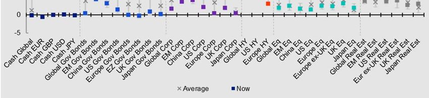
Figure 4 – Global asset class total returns since 30/10/20 (USD, %) *
*30/10/20 to 26/02/21. Colours represent model allocations during this period. See appendices for definitions
and disclaimers. Past performance is no guarantee of future results. Source: Refinitiv Datastream and Invesco
Yields have moved in The challenge now is to know whether to stick, twist or fold (to stick with/increase our
favour of defensive cyclical bias or to reallocate toward more defensive assets). On one hand, asset class
assets. Should we fold? yields have moved in favour of defensive assets (see Figure 5) and many assets have
now surpassed the end-2021 targets we published in November. However, the faster
than expected rollout of vaccines and continued policy support pushes us to continue
favouring cyclical assets. While we accept that much of the good news may already be
in the price of cyclical assets, we fear that some “defensives” may still face downside
risk. We remain bullish but use later sections to explore what could go wrong.
Figure 5 – 4m change in global yields (bps)
From 30/10/20 to 26/02/21. See appendices for definitions and disclaimers. Past performance is no guarantee
of future results. Source: Refinitiv Datastream and Invesco
March 2021 For professional/qualified/accredited investors only 6
Global Market Strategy Office
                                                                                                                     The Big Picture

                              The economic cycle favours cyclical assets
                              Most economies experienced a dramatic recession in the first half of 2020, followed by
                              an impressive rebound in the second half of the year. Overall, and with few exceptions
                              (such as China), 2020 saw a dramatic decline in GDP and business profits.

We assume that vaccine        The recovery that started in the middle of 2020 may have taken a breather (or even
rollouts will reduce the      reversed) during the Northern Hemisphere winter given the need for further lockdown
spread and fatality rate      measures in many countries. Though infections appear to have bottomed in some parts
of Covid-19                   of the world (and even started to rise again in Europe), we are assuming the rollout of
                              vaccines will reduce both the spread of the virus and the hospitalisation and fatality rates
                              among those who become infected (based on evidence from Israel and the UK).

As lockdowns become           Hence, we are supposing that broad lockdowns become increasingly rare and that
less common, we expect        economies can continue their recovery and transition from early to mid-cycle phases.
strong economic growth,       Our research suggests that during the early stages of the economic cycle, assets with
which should favour           cyclical characteristics tend to perform the best (equities, real estate, HY and industrial
cyclical assets               commodities). Figure 6 shows a schematic vision of the economic cycle, along with our
                              usual asset preferences for each phase (based on our research into historical asset
                              performance). We also show what we now consider the “best-in-class” from among
                              those preferences, based largely upon our assessment of current valuations.

Risk appetite appears to      Figure 7 gives an update of Invesco’s Global Risk Appetite Cycle Indicator (GRACI), as
have normalised               provided by colleagues in Invesco Investment Solutions. This adds to our conviction that
                              the global economic cycle is heading in the right direction (see the leading indicator
                              summary measure). It also shows that market sentiment has improved markedly since a
                              year ago, as does a glance at the 12-month returns in Appendix 2.

Figure 6 – The economic and asset class roller coaster

Chart shows a schematic portrayal of the global economic cycle. The selection of preferred assets is based on our research published in
“Asset allocation in pictures” in November 2017. “Best-in-class” shows our view of which parts of those preferred assets we would favour at
each stage of the cycle based on current valuations and projected returns. See appendices for definitions, methodology and disclaimers.
Source: Invesco Global Market Strategy Office

March 2021                    For professional/qualified/accredited investors only                                                            7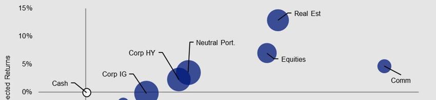
Global Market Strategy Office
                                                                                                                 The Big Picture

                          Figure 7 – Global risk appetite and the global business cycle

                          Note: monthly data from January 1992 to February 2021. Both Global LEI (Leading Economic Indicator) and
                          GRACI (Global Risk Appetite Cycle Indicator) are provided by Invesco Investment Solutions (IIS). Global LEI is
                          a weighted average of leading indicators for 23 countries (both developed and emerging). GRACI is a measure
                          of relative risk-adjusted performance between riskier and safer asset classes (it measures how much investors
                          have been rewarded, on average, for taking an incremental unit of risk in global financial markets on a trailing
                          medium-term basis). A rising index signals improving market sentiment and vice-versa. Past performance does
                          not guarantee future results. Source: Federal Reserve, BEA, Moody’s, Invesco Investment Solutions

Invesco’s GMS Office      It should not be surprising, then, that Invesco’s Global Market Strategy Office (GMS) has
continues to favour       a strong preference for cyclical assets. Figure 8 shows the outcome of a survey in
cyclical assets           which GMS team members (including the authors of this document) expressed their
                          views about relative performance over the next 12 months. Apart from a clear
                          preference for equities, real estate, commodities and HY versus IG, cash equivalents
                          and government debt, the team also favours EM assets. The preference among
                          developed market regions varies by asset class.

Job done but what could   Rarely is it so easy to decide what to do (in this case to leave allocations broadly
go wrong?                 unchanged). However, that same confidence also raises concerns. In particular, it
                          brings the risk of over-complacency and group-think. To make sure we are not falling
                          into that trap, we spend the next section looking at what could go wrong, before then
                          going on to finalise the Model Asset Allocation for the next 12 months.

                          Figure 8 – The wisdom of the GMS crowd (asset preferences for the next year)

                          The chart shows the opinions of the Global Market Strategy Office (GMS -- see back cover page for
                          membership) about asset returns over the next 12 months in USD. Each member of the team was asked to
                          give a score from -10 to +10 for each asset (-10 being large underperformance and +10 being large
                          outperformance versus the average of all assets). Those scores are then averaged across members of the
                          team and organised by asset category according to the average score across regions and then ranked within
                          each category. Abbreviations: Cash Eq. is cash equivalents; CTY is commodities; Asia ex-China includes only
                          emerging markets; Ind. Metals is industrial metals; Prec. Metals is precious metals. There is no guarantee that
                          these views will come to pass. Source: Invesco Global Market Strategy Office

March 2021                For professional/qualified/accredited investors only                                                          8
Global Market Strategy Office
The Big Picture
What could possibly go wrong #1? The pandemic doesn’t go away
We assume that 2021 will see a move toward economic normality, with strong economic
and profit growth throughout the year. This relies on the successful control of the Covid-
19 pandemic in ways that do not compromise economic growth (vaccines, say).
Vaccines appear to be Examples of successful vaccine rollouts can be seen in Israel and the UK (see Figure
effective… 9). Not only have they been quick off the mark, they have also provided good evidence
about the effectiveness of the Pfizer and Astra Zeneca vaccines. For example, data
from Public Health Scotland suggests that four weeks after the first dose, the reduction in
hospitalisations was 85% for Pfizer/BioNTech and 94% for Oxford Astra Zeneca.
Figure 9 – Number vaccinated as % of population
Based on daily data from 28 December 2020 to 10 March 2021. Data shows the number of people given at
least one dose of a Covid-19 vaccine expressed as a percent of population.
Source: Our World in Data, Refinitiv Datastream and Invesco
…but the speed of However, not all countries are in the same place as Israel and the UK. Figure 9 shows
rollout varies across that even among developed countries, there is a big difference in the speed of rollout
countries and full (partly due to differences in regulatory/procurement policies but also because of differing
normalisation may take
levels of vaccination scepticism). Even worse, as of mid-February more than 130
years…
countries had yet to receive a dose of any vaccine (according to the United Nations).
…and vaccines may be That makes it difficult to believe the global economy will be able to fully normalise during
reducing vigilance 2021, even before we worry about new variants that could render existing vaccines less
effective. Further, and surprisingly, after recent sharp declines in infections, we are now
seeing a flattening/increase in the number of cases across a range of regions (see
Figure 10). Maybe the return to normality will be more difficult than we thought.
Figure 10 – Daily Covid-19 cases (7-day moving average)
Based on daily data from 23 January 2020 to 10 March 2021.
Source: Reuters and Invesco
March 2021 For professional/qualified/accredited investors only 9Global Market Strategy Office
The Big Picture
What could possibly go wrong #2? Collateral damage dampens the recovery
High savings rates and We are supposing that high household savings rates are indicative of pent-up demand,
pent-up demand
some of which we expect to be released during 2021 (see Figure 11).
Figure 11 – Household savings rates (%)
Based on annual data from 1960 to 2020 (using OECD forecast for the latter). Data shows net savings rate for
household and non-profit organisations (except for France and UK which are gross savings rates).
Source: OECD, Refinitiv Datastream and Invesco
The release of pent-up However, there are reasons why the release of pent-up demand may be slow. First,
demand may be partial Figure 11 suggests that savings rates were on the up in many countries before the
and gradual pandemic struck, so may not fall back to pre-pandemic levels. Second, the history of
recent decades suggests that changes in savings behaviour tend to be gradual.
Although there was a sharp rise in savings rates in 2020, the decline could be gentler as
households worry about future pandemic related shocks, find overseas travel is
restricted and worry about future tax hikes.
What happens when More fundamentally, what will happen when governments scale back the support
government support provided to businesses and households over the last year? Amazingly, the IMF
ends? suggested in the January 2021 update to its World Economic Outlook that bankruptcies
declined during the Coronavirus recession (Figure 12). This is a big contrast to what
usually happens during recessions and may portend a rise in business failures once
government support ends. As a further example, UK unemployment was “only” 1.74m in
November 2020 but 4.7m were on furlough in January, some of whom are likely to
become unemployed when the job support scheme ends in September.
Figure 12 – Bankruptcies in recessions (indexed to 100 in pre-recession quarter)
Notes: quarterly data from 13 countries with varying coverage during 1990:Q1-2020:Q3. Quarter 0 is the last
pre-recession quarter. For the Great Lockdown, quarter 0 is 2019:Q4. For the Global financial crisis, quarter 0
is the country-specific peak of real GDP during 2007-08. Other recessions are country specific and identified by
two consecutive quarters of negative growth during 1990-2006 and 2009-19. Source: CEIC, national authorities
and IMF staff calculations (taken from the IMF World Economic Outlook Update January 2021)
March 2021 For professional/qualified/accredited investors only 10Global Market Strategy Office
The Big Picture
What could possibly go wrong #3? Inflation rises and central banks tighten
Could central bank Expansive central bank policies have generated a rapid acceleration in monetary
policies lead to higher
aggregates, as shown in Figure 13. Though the relationship between money supply
inflation?
growth and inflation has been distant in recent decades, such a change in the monetary
environment naturally leads to concern about the potential for accelerating prices.
Figure 13 – Global money supply growth and inflation
Note: monthly data from January 1980 to January 2021. Based on an aggregation of broad money supply
aggregates (usually M3) for the following countries: Australia, Brazil, Canada, Chile, China, Colombia, Costa
Rica, Czech Republic, Denmark, Eurozone, Hungary, Iceland, India, Indonesia, Israel, Japan, Mexico, New
Zealand, Norway, Poland, Russia, South Africa, South Korea, Sweden, Switzerland, Turkey, United Kingdom
and United States. “Global Money Supply” is based on an aggregation of national money supplies using
purchasing power parity (PPP) exchange rates to convert to US dollars (PPP exchange rates are those which
equalise spending power across countries and are usually more stable than market exchange rates). OECD
CPI is the consumer price index for the OECD group of countries.
Source: MSCI, OECD, Oxford Economics, Refinitiv Datastream and Invesco
If so, there are few We expect a technical jump in year-on-year headline inflation rates in the second quarter
places to hide (even of this year due to the collapse in oil prices a year earlier. However, that should be
gold has been transitory and we are talking here about the risk of something more sustained and
negatively correlated to substantial, with core OECD CPI inflation rising into the 3%-5% range, say. Such an
inflation expectations
outcome would likely provoke a reaction from central banks and we suspect it would
since the GFC)
bring the risk of market dislocations. Unfortunately, our research suggests that few
assets perform well when inflation is rising (see here) and even gold has tended to be
negatively correlated to inflation since the GFC (see our gold model in Figure 14).
Figure 14 – Gold versus model predicted values (USD per ounce)
Monthly data from January 2003 to February 2021 (as of 26 February 2021). Gold is modelled as a function of
real 10-year US Treasury yield, 10-year US inflation breakeven and trade-weighted USD. “Pre-2007 Model” is
based on data from 31 January 1997 to 31 December 2006. “Post-2007 Model” is based on data from 31
January 2007 to 30 April 2020. “President dummy” is a dummy variable that was set at zero prior to November
2016 (when President Trump was elected) and one thereafter. There is no guarantee that these views will
come to pass. Source: Refinitiv Datastream and Invesco
March 2021 For professional/qualified/accredited investors only 11Global Market Strategy Office
The Big Picture
What could possibly go wrong #4? Correlation regimes change
Will equity prices We are implicitly assuming that equity-like asset prices will rise with bond yields as
continue to rise along
economies recover. This is supported by the fact that US equity prices have been
with bond yields?
positively correlated to treasury yields for most of this century (see Figure 15).
Figure 15 – Correlation between US equities and bond yields
Notes: based on monthly data (month-end) from December 1964 to February 2021. Correlation at each
moment is calculated as the correlation between monthly percent changes in the S&P 500 and the US 10-year
treasury yield, over the previous 12 months. As of 26 February 2021. Past performance is no guarantee of
future results. Source: Refinitiv Datastream and Invesco
That correlation has This may seem paradoxical and was certainly not the experience of the latter decades of
been largely positive in the previous century. It seems that equity markets have recently been more focussed on
recent decades but is the growth that accompanies rising bond yields than on the multiple-contracting effects of
variable a rise in discount rates. However, Figure 15 shows that the correlation between equities
and bond yields is variable and there have been short periods this century when it has
turned negative. The faster that yields rise, the more likely would be a reversion to
negative correlation, in our opinion.
A change in the However, we suspect that would be temporary and we are more interested in what could
correlation regime spark a permanent change in the correlation regime. One answer may be contained in
unlikely until 10-year Figure 16. Though far from perfect, it seems there is a negative relationship between
treasury yield the equity/bond yield correlation and the level of bond yields. This seems to suggest that
approaches 5% the higher the bond yield, the more likely it is that rising bond yields will be associated
with falling equity prices. Based on the fitted trendline, we believe a permanent switch in
the correlation regime is unlikely until the 10-year treasury yield approaches 5%.
Figure 16 – Correlation between US equities and bond yields vs level of bond yield
Notes: based on monthly data (month-end) from December 1964 to February 2021. Correlation at each
moment is calculated as the correlation between monthly percent changes in the S&P 500 and the US 10-year
treasury yield, over the previous 12 months. The equation shows the details of the fitted trendline. As of 26
February 2021. Past performance is no guarantee of future results. Source: Refinitiv Datastream and Invesco
March 2021 For professional/qualified/accredited investors only 12Global Market Strategy Office
The Big Picture
What could possibly go wrong #5? A lot is already in the price
Valuations may limit Appendix 2 shows that yield remains elusive among fixed income assets. Even worse,
returns the yields on equity regions now appear to be below historical norms (prices are up and
dividends are down), while real estate yields have fallen to historical norms (on average).
Cyclical momentum is important but valuations can impose a limit on returns.
Figure 17 – US high yield spread and industrial production
Note: monthly data from January 1986 to February 2021 (as of 26 February). HY spread is the yield on the ICE
BofA US High Yield Index minus the US 10-year treasury yield.
Source: Global Financial Data, Refinitiv Datastream and Invesco.
Figure 5 showed that HY has seen most dramatic decline in yields in recent months and
The scope for narrowing
of HY spreads now Figure 17 puts this into a longer historical perspective. Even though the US economy is
seems limited still in recovery mode (industrial production is down versus a year ago), the HY spread is
close to historical lows. The historical relationship between those two variables suggests
spreads should be more generous than they are but we would expect defaults to decline
as the recovery progresses (though Figure 12 showed the unusual nature of this
recession). Spreads may narrow further but the scope seems limited.
Commodities are a Commodities have also done very well, except for precious metals. Nevertheless,
mixed bag Figure 18 suggests that commodity prices are broadly in line with the norms of recent
decades, when expressed in real (CPI adjusted) terms. There are, however, three
problems: first, there are differences across commodity groups (agriculture is the only
group cheaper than normal, whereas metals are more expensive); second, a longer
historical perspective may disagree and, third, this gives no comparison to other assets.
Figure 18 – Commodity prices deflated by US CPI versus historical norms
Abbreviations: “Ind Met” is industrial metals, “Prec Met” is precious metals and “Ag” is agriculture. Historical
ranges start on: All and Ag 31/12/69; Energy 31/12/82; Ind Met 3/1/77; Prec Met 2/1/73; Brent 1/6/87; gold
1/1/74; copper 1/1/74. As of 26 February 2021. See appendices for definitions, methodology and disclaimers.
Source: GSCI, Refinitiv Datastream and Invesco
March 2021 For professional/qualified/accredited investors only 13Global Market Strategy Office
The Big Picture
Figure 19 – Real US oil price (US$ per barrel, CPI adjusted)
Monthly data since January 1870. As of 26 February 2021. WTI is West Texas Intermediate. Real WTI is
calculated by dividing the price of WTI by an index of US consumer prices. Past performance is no guarantee
of future results. Source: Global Financial Data, Refinitiv Datastream and Invesco
Oil may appear cheap Figure 19 shows a 150-year perspective for US oil. Though WTI seems reasonable in
compared to recent the context of prices seen in the last 20 years, the longer history shows the abnormality
bubbles but not in the of those recent decades (they contained a bubble that we think was inspired by the rapid
context of longer history development of China and other EM countries). Over the full period since 1870, the
price of WTI has tended to be in the $20-$60 range when expressed in today’s prices
and periods above that range tend to be short lived (as new supply comes on stream).
The long-term prospects It is less than a year since WTI went negative (not visible in the chart because it is based
for oil appear limited on monthly data) and it has since made a remarkable recovery to above $60. Bearing in
mind the history and the long term need for the world to reduce carbon emissions, we
doubt that the current positive momentum in the price of oil will go much further.
Are commodities cheap When it comes to comparisons with other assets, the answer may depend upon which
or US equities asset is chosen. Figure 20 shows the long-term comparison with US equities. We
expensive? would expect equities to outperform over the long haul, which indeed has been the case
(note the logarithmic scale). However, there are long ebbs and flows in that relationship,
with equities having had the upper hand since mid-2008. Maybe that outperformance
has reached its limit, in which case commodities may now outperform US equities.
However, that may tell us more about US equities than it does about commodities.
Figure 20 – Commodities versus US equities since 1914
Note: monthly data from September 1914 to February 2021 (as of 26 February). The left-hand axis is
logarithmic. “Equities” is a total return index for US equities based on data from Robert Shiller (see Appendices
for detail) and “CTY” is a total return index based on the Reuters CRB index until December 1969 and the S&P
GSCI index thereafter. “10 yr MA” is a 10-year moving average. “Equities/CTY vs trend” shows the percentage
deviation of the Equities/CTY index from its 10-year moving average. Past performance is no guarantee of
future results. Source: Reuters CRB, S&P GSCI, Robert Shiller, Refinitiv Datastream and Invesco
March 2021 For professional/qualified/accredited investors only 14Global Market Strategy Office
The Big Picture
US equities appear Indeed, US equities would appear more expensive than counterparts elsewhere, both in
expensive compared to absolute terms and relative to its own history (see Figure 21). Hence, commodities may
other regions... not appear so cheap when compared to non-US equity markets.
Figure 21 – Historical ranges for CAPEs
Note: CAPE = Cyclically Adjusted Price/Earnings and uses a 10-year moving average of earnings. Based on
daily data from 3 January 1983 (except for China from 1 April 2004 and EM from 3 January 2005), using
Datastream indices. As of 26 February 2021. Source: Refinitiv Datastream and Invesco
…and previous supports The US equity market has benefitted from its concentration in technology and other
(falling bond yields and growth sectors. This is particularly useful when bond yields are falling, which we believe
weakening dollar) have boosts the fair-value of high growth companies relative to others. The fact that US
now reversed government yields fell relative to other countries in recent years also depressed the
dollar, in our view (see Figure 22), which may have added to US stock market
outperformance in local currency terms (via the translation effect on overseas earnings).
Now that bond yields are rising, we would expect the US equity market to be
USD is gaining support
from widening spreads
handicapped by its large weighting in growth sectors. Further, the fact that US yields are
but it isn’t cheap rising faster than those of other countries (and have been doing so for nearly a year)
suggests to us that the dollar might be bottoming and could strengthen (see Figure 22
for the example of EUR/USD, noting the delayed response from yield gap to currency
over recent years). That could further dampen the performance of US equities relative to
other markets via the effect on earnings.
Having said that, we don’t believe the dollar is cheap. Figure 23 shows that in real
effective terms it is about 10% more expensive than usual over recent decades.
Figure 22 – EUR/USD and bond yield gap
Based on daily data from 1 January 2010 to 5 March 2021. Past performance is no guarantee of future results.
Source: Refinitiv Datastream and Invesco
March 2021 For professional/qualified/accredited investors only 15Global Market Strategy Office
The Big Picture
JPY could get even We suspect that could limit potential USD upside, except for versus the Chinese yuan
cheaper if the “risk-on” which appears to be more expensive than the dollar. At the other end of the spectrum is
mood prevails the Japanese yen, which remains the cheapest among major currencies on this metric.
However, in a “risk-on” environment, we assume the yen could get even cheaper.
Figure 23 – Real effective exchange rates*
*Currency indices measured against a trade-weighted basket of currencies and adjusted for inflation
differentials. As of 26 February 2021. Source: OECD, Datastream and Invesco
If the dollar does strengthen, that could also dampen commodity prices. Note that the
An appreciating dollar
gold model shown in Figure 14 includes the trade weighted dollar as an explanatory
could dampen
commodity prices and variable. The damage inflicted upon gold in recent months by the rise in treasury yields
EM assets has been offset to some extent by the weakening of the dollar. That support from the
dollar may now be reversing.
It may also favour A strengthening dollar would tilt the odds in favour unhedged allocations to US assets
unhedged exposure to with no overseas exposure (fixed income and real estate, say). Equally, it could make
US fixed income and life more difficult for EM assets, partly because of the effect on commodity prices but
real estate assets also due to the effect on dollar denominated debt servicing costs. Our index of EM
currencies has rebounded sharply in recent months (+12% since June 2020 – see
Figure 24), in line with the rise in commodity prices, but further progress may be difficult.
Figure 24 – Emerging market currencies, commodities and the Fed
Note: monthly data from January 1976 to February 2021. Real trade-weighted EM FX index is a trade weighted
average of national currencies versus US dollar (trade weights are based on total trade flows for each country).
There are 18 currencies in the EM basket – those of China, Brazil, South Korea, Mexico, Singapore, India,
Russia, Poland, Thailand, Turkey, Czech Republic, Malaysia, Indonesia, Hungary, Philippines, South Africa,
Chile and Nigeria (ordered by size of trade flows). Real adjustments use national CPI indices versus that of the
US. Real commodity price index is based on the S&P GSCI Commodity Spot Price Index, adjusted by the US
CPI index. All indices rebased to 100 as of January 1976. As of 26 February 2021. Past performance is no
guarantee of future returns.
Source: IMF, OECD, Oxford Economics, S&P GSCI, Bloomberg L.P., Refinitiv Datastream and Invesco.
March 2021 For professional/qualified/accredited investors only 16Global Market Strategy Office
The Big Picture
Taking a step back: focusing on the next decade using Invesco’s CMAs
Invesco’s 10-year CMAs Before considering projections for the next year, it may be instructive to use longer term
have been published
return projections as a guide. Invesco Investment Solutions have just published their 10-
year capital market assumptions. Figure 25 shows their projected returns for global
asset classes in a range of currency bases (their framework differs from ours, so we
have had to adapt some of their categories – for instance, we use their US Treasury
Short category to represent cash and precious metals for gold). A more detailed version
showing regional detail is contained in Appendix 3.
Figure 25: Invesco 10-year capital market assumptions (global assets, % ann.)
USD EUR GBP CHF
Cash & Gold 1.3 -0.3 0.6 -0.2
Cash - US Treasury Short 0.5 -1.0 -0.2 -0.9
Gold 2.0 0.5 1.3 0.6
Government Bonds 1.5 0.1 0.8 0.1
Corporate IG 1.5 0.0 0.8 0.1
Corporate HY - US HY 3.1 1.6 2.4 1.7
Equities 6.4 4.9 5.7 5.0
Real Estate 9.0 7.5 8.3 7.6
Commodities 3.8 2.3 3.1 2.4
Note: Estimates as of 31 December 2020 and based on the 10-year capital market assumptions published by
Invesco Investment Solutions in Long-Term Capital Market Assumptions (February 2021). The USD version of the
CMAs is reproduced in Appendix 3. The above table uses the geometric expected return version for global asset
classes (“gold” is based on the projections for precious metals and the “Cash & Gold” category shows the average
of those two assets). These estimates reflect the views of Invesco Investment Solutions, the views of other
investment teams at Invesco may differ from those presented here. There is no guarantee that these views will
come to pass. Source: Invesco Investment Solutions
Real estate and equities Not surprisingly, the further we move along the risk spectrum, the higher the projected
dominate 10-year CMA returns. There is one exception: commodities. The latter is the only cyclical asset class
based optimal portfolios that hardly features in the optimal solutions (see Figure 26). Though results vary by
currency base and depend on what is maximised (Sharpe Ratio or returns), there are
some broad themes: real estate is maximised in all cases, while IG, HY and commodities
are mainly zero allocated; equities are usually Overweight, while government bonds are
mainly Underweighted. The combination of cash and gold is largely Overweight but the
preference for cash or gold varies (they are never present at the same time). Let’s see
how shortening the time horizon and allowing for the cycle impacts the conclusions.
Figure 26: Optimised global allocations based on Invesco’s 10-year CMA projected returns
Neutral Policy Maximise Sharpe Ratio Maximise Return
Portfolio Range USD EUR GBP CHF USD EUR GBP CHF
Cash & Gold 5% 0-10% 10% 8% 10% 10% 0% 7% 0% 10%
Cash 2.5% 0-10% 10% 0% 10% 0% 0% 0% 0% 0%
Gold 2.5% 0-10% 0% 8% 0% 10% 0% 7% 0% 10%
Government Bonds 25% 10-40% 40% 11% 19% 10% 34% 23% 10% 13%
Corporate IG 10% 0-20% 0% 0% 0% 0% 0% 0% 0% 0%
Corporate HY 5% 0-10% 2% 0% 0% 0% 0% 0% 5% 0%
Equities 45% 25-65% 32% 65% 55% 64% 50% 54% 65% 61%
Real Estate 8% 0-16% 16% 16% 16% 16% 16% 16% 16% 16%
Commodities 2% 0-4% 0% 0% 0% 0% 0% 0% 4% 0%
Note: optimisations are based on the 10-year projected returns published by Invesco Investment Solutions in Long-Term Capital Market
Assumptions (February 2021), as shown in Figure 25 above. Optimisations are performed by the Asset Allocation Research team using our
historical 10-year covariance matrices (for each currency). “Gold” is based on the projections for precious metals and the “Cash & Gold” category
shows the sum of allocations for those two assets). “Maximise Sharpe Ratio” optimisations are performed by maximising the Sharpe Ratio subject
not violating the constraints implied by the policy ranges shown in the table. “Maximise Return” optimisations are performed by maximising return
subject to the policy range constraints but also subject to the standard deviation of returns not exceeding that of the Neutral Portfolio (as shown in
Figure 3). Though based on the projected returns provided by Invesco Investment Solutions, these optimal allocations do not represent their
views, nor those of any other investment team at Invesco. See appendices for definitions, methodology and disclaimers.
Source: Invesco Investment Solutions, Invesco
March 2021 For professional/qualified/accredited investors only 17Global Market Strategy Office
The Big Picture
Projections for the next year
Underlying assumptions Though we got the direction right in most cases, many of our end-2021 projections have
revised up
already been surpassed. This leaves us with the choice of revising up our projections or
sticking with the original forecasts. Given that we now have more faith in the recovery,
we have chosen to revise up our cycle-based assumptions such as bond yields and
equity indices. We are also now more optimistic about the US dollar.
Underpinning our projections for the next 12 months are the following assumptions:
Central bank rates remain stable and asset purchases continue but tapering looms
Yield curves steepen as tapering approaches; US yields rise more than most
IG and HY spreads approach historical tights and default rates decline
USD strengthens as bond yield spreads move in its favour
Equity dividends rebound but yields rise slightly (with bond yields)
Real estate (REIT) dividends bottom and yields stabilise
Commodities consolidate recent gains (and gold falls due to rising yields/dollar)
10-year treasury yield
The assumptions behind our projections are laid out in Appendix 4, while Figure 27
rises to 2.00% and dollar shows how they translate into market targets. Perhaps the single most important
strengthens forecast is that the 10-year US treasury yield will rise to 2.00% (based largely on an
increase in the real yield as Fed tapering approaches). As seen already this year, this
could have a number of important implications: stronger dollar, underperformance of
growth stocks (and markets heavily biased to that factor), downward pressure on gold, a
tempering of enthusiasm for other commodities and renewed doubts about the ability of
EM countries to finance their debt burdens.
We like cyclical assets
Though we believe the cycle will favour equity-like assets, we find that many of them
but see less upside require heroic assumptions to see them going higher. For example, though we expect a
potential than four dividend rebound in the US, the dividend yield is extremely low and unless we assume it
months ago stays there, the projected returns will be limited (hence the small upside that we forecast
for the S&P 500). Though we still imagine upside for cyclical assets, we believe the
potential is less than it was when we published the 2021 outlook four months ago.
Figure 27 – Market forecasts
Current Forecast
(26/2/21) 12-month
Central Bank Rates US 0.25 0.25
Eurozone -0.50 -0.50
China 4.35 4.35
Japan -0.10 -0.10
UK 0.10 0.10
10yr Bond Yields US 1.45 2.00
Eurozone -0.29 0.10
China 3.29 3.50
Japan 0.16 0.15
UK 0.86 1.10
Exchange Rates/US$ EUR/USD 1.21 1.15
USD/CNY 6.48 6.80
USD/JPY 106.60 112.00
GBP/USD 1.39 1.35
USD/CHF 0.90 0.98
Equity Indices S&P 500 3811 3900
Euro Stoxx 50 3636 4000
FTSE A50 18317 19000
Nikkei 225 28966 29000
FTSE 100 6483 7300
Commodities (US$) Brent/barrel 66 70
Gold/ounce 1727 1500
Copper/tonne 9139 9750
Notes: There is no guarantee that these views will come to pass. See Appendices for definitions, methodology
and disclaimers. Source: Refinitiv Datastream and Invesco Global Market Strategy Office
March 2021 For professional/qualified/accredited investors only 18Global Market Strategy Office
The Big Picture
Figure 28 – Projected 12m return versus risk for global assets
Based on local currency returns. Returns are projected but standard deviation of returns is based on 5-year
historical data. Size of bubbles is in proportion to average pairwise correlation with other assets. Cash is an
equally weighted mix of USD, EUR, GBP and JPY. Neutral portfolio weights shown in Figure 3. As of 26
February 2021. There is no guarantee that these views will come to pass. See Appendices for definitions,
methodology and disclaimers. Source: BAML, MSCI, GSCI, FTSE, Refinitiv Datastream and Invesco
We expect real estate to Our own return projections are roughly in line with the GMS rankings shown in Figure 8,
be the most with the best returns expected on equities, real estate, commodities and HY (see Figure
remunerative asset 28). However, we are more optimistic on real estate as we believe that elevated REIT
yields will mitigate against the upward pressure from bond yields. Conversely, we
expect rising government yields to result in negative government debt returns and a
near-zero return on IG credit. The anticipated rise in US treasury yields, along with an
associated appreciation of the US dollar, leads us to predict negative returns on gold.
Optimisation helps to Trying to construct a diversified multi-asset portfolio on the back of those returns requires
balance risk and reward more than simply choosing the assets expected to perform the best: after all, we may be
(cyclical assets and wrong. We use an optimisation process to help us do that and Figure 29 shows the
cash are preferred)
results. There is a preference for cyclical assets, while cash is the diversifier of choice.
We reduce commodities We largely follow the suggestions of the optimiser when they are clear: we continue to be
and add to government maximum allocated to real estate and cash, and zero allocated to IG and gold within our
bonds Model Asset Allocation. However, we have only reduced commodities to a Neutral 2%
(and not to the zero suggested by the optimiser). Elsewhere, we maintain an
overweight allocation to equities and an underweight allocation to government bonds
(though we add a small amount to the latter, given recent underperformance). We have
maintained the neutral allocation to HY.
Figure 29 – Optimised allocations for global assets (using local currency returns)
Optimisations Model
Neutral Policy Projected Sharpe Max Asset
Portfolio Range Returns Ratio Return Allocation*
Cash & Gold 5% 0-10% -6.7% 10% 10% 10%
Cash 2.5% 0-10% -0.1% 10% 10% 10%
Gold 2.5% 0-10% -13.2% 0% 0% 0%
Govt Bonds 25% 10-40% -2.1% 10% 25% ↑ 17%
Corporate IG 10% 0-20% -0.2% 0% 0% 0%
Corporate HY 5% 0-10% 2.3% 3% 10% 5%
Equities 45% 25-65% 7.0% 61% 39% 50%
Real Estate 8% 0-16% 12.8% 16% 16% 16%
Commodities 2% 0-4% 4.6% 0% 0% ↓ 2%
Notes: Based on local currency returns (for both the one-year projected returns and five-year historical
covariance matrix). Cash is an equally weighted mix of USD, EUR, GBP and JPY. “Sharpe Ratio” shows the
results of maximising the Sharpe Ratio. “Max Return” maximises returns while not exceeding the volatility of
the Neutral Portfolio. *This is a theoretical portfolio and is for illustrative purposes only. It does not represent
an actual portfolio and is not a recommendation of any investment or trading strategy. See appendices for
definitions, methodology and disclaimers. Source: Invesco Global Market Strategy Office
March 2021 For professional/qualified/accredited investors only 19Global Market Strategy Office
The Big Picture
Model Asset Allocation: stick, twist or fold?
We stick with the Believing that the global economy will grow strongly in 2021, we are sticking with our
preference for cyclical
preference for cyclical assets. However, we fear that a lot of good news is already in the
assets but tone it down
price and, as already suggested in Figure 29, we have reduced the allocation to
commodities (to Neutral), while adding to government bonds (though remaining
Underweight). Those changes are small in nature but we have made a number of
regional changes within various asset classes (see Figure 3 for the full regional detail).
Industrial commodities Though we favour cyclical assets, we worry that some commodities are now expensive.
reduced Hence, we have reduced the allocation from the maximum allowed 4% to a Neutral 2%.
This is done by reducing the allocations to energy (to a Neutral 1%) and industrial metals
(to zero). We maintain the zero allocation to precious metals and the Overweight
allocation to agriculture, which we think is the only commodities group that looks cheap.
Government bonds The flipside is that we have boosted the allocation to government bonds from 15% to
increased slightly after 17% (Underweight versus the neutral 25%). We have added to the US position (though
recent weakness remain Underweight), despite the concern that yields will rise more than elsewhere (we
suspect the dollar will appreciate and we are unhedged). We are also adding slightly to
the position in Japan because we expect yields to remain depressed by BOJ policies,
though again we remain Underweight. After the rebound in sterling in recent months, the
UK position is reduced to Neutral. Though we continue to like EM debt, we are reducing
the extent of the Overweight (by eliminating the allocation to China).
More focus on US within Among other fixed income groups, we remain zero allocated to IG credit and Neutral in
HY credit HY credit. Given the expectation of dollar appreciation, we are now focused entirely on
US HY and have reduced Europe to zero.
Real estate unchanged The real estate allocation remains at the maximum 16% but the allocations to the US
but UK reduced after and Japan have been boosted (to further Overweight), while that to the UK is reduced (to
strong rebound
Neutral). The UK was the best performing real estate market since we last published
(judged by REITS), especially when currency movements were considered (see
Appendix 2). Our favoured markets are now EM, Europe ex-UK and Japan.
Equities unchanged but The allocation to equities also remains unchanged (at an Overweight 50%). After the
China and Japan strong performance during 2020 and the importance of technology stocks, we have
reduced; UK increased reduced the allocation to China to Neutral (while leaving the overall EM allocation
unchanged and still Overweight). We have also reduced the allocation to Japan, while
increasing that to the UK (both remain Overweight). Though the UK has been the best
performing market over the last four months (Appendix 2), we think it has the best
potential over the next 12 months (helped by valuations and the large weighting of
resource related and financial sectors). We remain Underweight US equities due to our
belief that they are extended from a valuation perspective and that technology and other
growth sectors will struggle as bond yields rise.
Cash is the diversifier of Cash remains our diversifier of choice and is our favourite among cash equivalents.
choice Though policy rates are extremely low (and negative in some cases), the lack of volatility
and low correlation to other assets explains why it is favoured by our optimisation
processes (see Figures 28 and 29). We remain at the maximum 10% allocation.
Gold will struggle under Gold performed extremely well during 2020 but we suspect it will decline as bond yields
our scenario and the dollar rise (as we expect). We remain zero-weighted.
Europe and EM When it comes to regional exposures, Figure 3 shows that our Model Asset Allocation
favoured but less so; US favours regions that we think have most to gain during an expansionary phase of the
exposure increased global economy: EM and Europe (including the UK). However, we have reduced the
extent of those Overweight positions in favour of US exposures, where we have reduced
the Underweight (we expect the dollar to appreciate slightly but are wary of US equities).
We continue with the policy of not hedging currency exposures – the dollar strength that
we expect is not enough to justify such action, in our opinion.
March 2021 For professional/qualified/accredited investors only 20You can also read