2019 THE STATE OF THE CLIMATE - Ole Humlum - The Global Warming Policy ...
←
→
Page content transcription
If your browser does not render page correctly, please read the page content below

T H E STAT E OF THE CL IMATE

                       2019
                          Ole Humlum

 The Global Warming Policy Foundation
 Report 42
The State of the Climate 2019
Ole Humlum
Report 42, The Global Warming Policy Foundation

ISBN 978-1-8380747-0-8
© Copyright 2020, The Global Warming Policy Foundation

Contents
The Climate Noose: Business, Net Zero and the IPCC's Anticapitalism
Rupert Darwall
About   the
Report 40,   author
           The Global Warming Policy Foundation                                             iii
Executive summary; the ten key facts	                                                       v
1.     General overview 2019
ISBN 978-1-9160700-7-3                                                                       1
© Copyright 2020, The Global Warming Policy Foundation
2.     Atmospheric temperatures	                                                            3
3.     Ocean temperatures	                                                                 18
4.     Oceanic cycles	                                                                     28
5.     Sea level	                                                                          31
6.     Sea-ice extent	                                                                     35
7.     Snow cover	                                                                         37
8.     Storms	                                                                             40
Notes	                                                                                     45
References	                                                                                45
About the Global Warming Policy Foundation	                                                48

About the author
Ole Humlum is former Professor of Physical Geography at the University Centre in Svalbard, Nor-
way, and Emeritus Professor of Physical Geography, University of Oslo, Norway.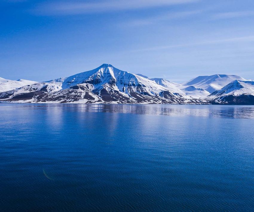
Executive summary; the ten key facts

1. According to the instrumental tempera- North Atlantic, net cooling at the surface
ture record (since about 1850), 2019 was a has been pronounced since 2004.
very warm year, but cooler than 2016.
                                            7. Data from tide gauges all over the world
2. In 2019, the average global air tempera- suggest an average global sea-level rise of
ture was affected by a moderate El Niño 1–1.5 mm/year, while the satellite record
episode, interrupting a gradual global suggests a rise of about 3.2 mm/year, or
air temperature decrease following the more. The noticeable difference in rate (a
strong 2015–16 El Niño.                     ratio of at least 1:2) between the two data
                                            sets still has no broadly accepted explana-
3. Since 1979, lower troposphere tempera- tion.
tures have increased over both land and
oceans, but more so over land areas. The 8. Since 1979, Arctic and Antarctic sea-ice
possible explanations include insolation, extents have had opposite trends, decreas-
cloud cover and land use.                   ing and increasing, respectively. Superim-
                                            posed on these overall trends, however,
4. The temperature variations recorded variations of shorter duration are also
in the lowermost troposphere are gener- important in understanding year-to-year
ally reflected at higher altitudes too. In variations. In the Arctic, a 5.3-year periodic
the stratosphere, however, a temperature variation is important, while for the Antarc-
‘pause’ commenced in around 1995, 5–7 tic a variation of about 4.5-years’ duration
years before a similar temperature ‘pause’ is seen. Both these variations reached their
began in the lower troposphere near the minima simultaneously in 2016, which ex-
planet’s surface. The stratospheric temper- plains the simultaneous minimum in glob-
ature ‘pause’ has now persisted for about al sea-ice extent. This particularly affected
25 years.                                   Antarctic sea-ice extent in 2016.

5. The 2015–16 oceanographic El Niño was       9. Northern Hemisphere snow cover ex-
among the strongest since the beginning        tent undergoes important local and re-
of the record in 1950. Considering the en-     gional variations from year to year. Since
tire record, however, recent variations be-    1972, however, snow extent has been
tween El Niño and La Niña are not unusual.     largely stable.

6. Since 2004, when detailed recording         10. Tropical storms and hurricanes have
of ocean temperatures began, the global        displayed large annual variations in accu-
oceans above 1900 m depth have, on av-         mulated cyclone energy (ACE) since 1970,
erage, warmed somewhat. The strongest          but there has been no overall trend to-
warming (between the surface and 200 m         wards either lower or higher activity. The
depth) mainly affects the oceans near the      same applies for the number of continen-
Equator, where the incoming solar radia-       tal hurricane landfalls in the USA, in a re-
tion is at its maximum. In contrast, for the   cord going back to 1851.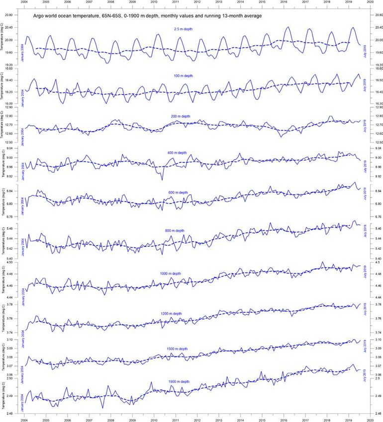
1.     General overview 2019                                  Many diagrams in this report focus on the
                                                         period since 1979 – the satellite era – in which
The focus in this report is on observations, and
                                                         we have a wide range of observations with
not on output from numerical models. All refer-
                                                         nearly global coverage, including temperature.
ences and data sources are listed at the end.
                                                         These data provide a detailed view of tempera-
Air temperatures                                         ture changes over time at different altitudes in
Air temperatures measured near the planet’s              the atmosphere. These observations reveal that
surface are at the core of many climate delibera-        while the relatively well-known lower tropo-
tions, but the significance of short-term warm-          sphere temperature pause began around 2002,
ing or cooling in surface air temperatures should        a similar stratospheric temperature plateau had
not be overstated. Whenever the Earth experi-            already begun back in 1995, several years be-
ences warm El Niño or cold La Niña episodes,             fore the start of a similar plateau in surface tem-
major heat exchanges take place between the              peratures.
Pacific Ocean and the atmosphere above, even-                 Since 1979, lower troposphere tempera-
tually showing up as a signal in the global air          tures have increased over both land and oceans,
temperature. However, such a change does not             but most clearly over land. The most uncompli-
reflect a change in the total heat content of the        cated explanation for this is that much of the
ocean–atmosphere system, instead chiefly re-             warming is caused by solar insolation, but there
flecting redistribution of energy between the            may well be several supplementary reasons,
ocean and atmosphere. Evaluating the dynam-              such as, changes in cloud cover and land use.
ics of ocean temperatures is therefore at least as
                                                         Ocean temperatures
important as evaluating changes in surface air
temperatures.                                            The Argo program has now achieved 15 years
                                                         of global coverage, growing from a relatively
     Considering the entire surface air tempera-
                                                         sparse array of 1000 floats in 2004 to more than
ture record since 1850 or 1880, 2019 was a very
                                                         4000 in early 2020. Deployment of new floats
warm year, but in all global temperature records
                                                         continues at the rate of up to 800 per year. The
it was cooler than 2016. However, the decrease
                                                         floats have delivered a unique ocean tempera-
in temperatures characterising 2017 and 2018
                                                         ture dataset for depths down to 1900 m (al-
was interrupted by a renewed, moderate El
                                                         though the oceans are much deeper than that).
Niño episode, underlining the importance of
                                                         Despite this limitation and the fact that the data
ocean–atmosphere exchanges.
                                                         series is still relatively short, interesting features
     Many Arctic regions experienced record              are now emerging from the observations.
high air temperatures in 2016, but since then,
                                                              Since 2004, the upper 1900 m of the oceans
including in 2019, conditions have generally
                                                         have experienced net warming, considering the
been cooler. The Arctic temperature peak in
                                                         global average. The maximum warming (0.08–
2016 may have been affected by ocean heat re-
                                                         0.23°C) affects the uppermost 200 m of the
leased from the Pacific Ocean during the strong
                                                         oceans, and mainly in regions near the Equator,
2015–16 El Niño and subsequently transported
                                                         where the greatest amount of solar radiation
northwards. This underscores how Arctic air
                                                         is received. At greater depths, a small (about
temperatures may not only be affected by vari-
                                                         0.02°C) net warming occurred between 2004
ations in local conditions, but also by changes
                                                         and 2019.
far away.
                                                         The warming mainly affected the Equatorial

                                                     1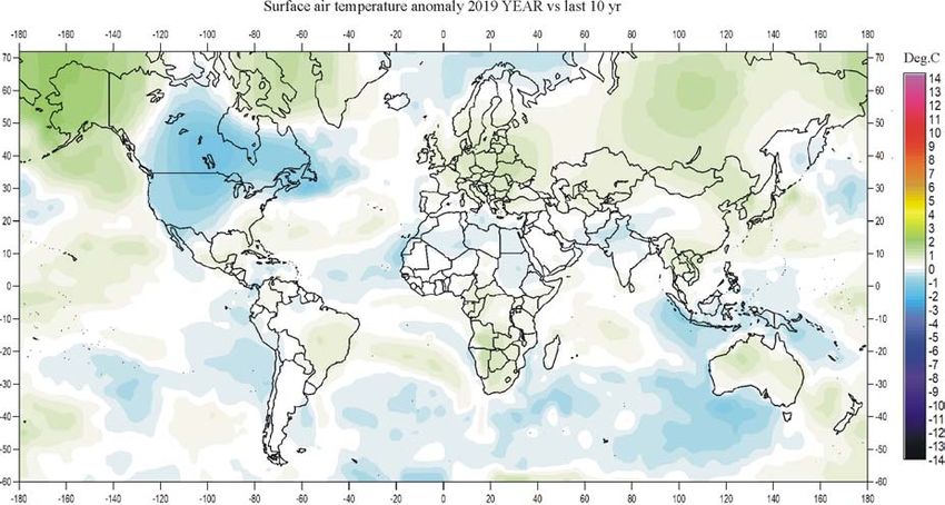
oceans between 30°N and 30°S, which, due to        spring extent has been slightly decreasing. In
the spherical form of the planet, represent a      2019, the Northern Hemisphere seasonal snow-
huge surface area. Simultaneously, the north-      cover extent was close to that of the preceding
ern oceans (55–65°N) have, on average, experi-     years.
enced a marked cooling down to 1400 m, and
slight warming at greater depths. The southern
                                                   Sea level
oceans (55–65°S) have seen slight warming at      Sea level is monitored by satellite altimetry
most depths, but most clearly near the surface.   and by direct measurements using tide gauges
However, averages may be misleading, and          along coasts. While the satellite-derived record
quite often better insight is obtained by study-  suggests a global sea-level rise of about 3.2 mm
ing the details (see Section 3).                  per year or more, data from tide gauges along
                                                  coasts all over the world suggest a stable, av-
Sea ice                                           erage global sea-level rise of less than 1.5 mm
In 2019, the global sea-ice extent remained well per year. Neither of the two types of measure-
below the average for the satellite era (since ments indicate any modern acceleration in sea-
1979), but exhibited stability or a slightly ris- level rise. The marked difference (at least 2:1)
ing trend over the year. At the end of 2016, the between the two datasets still has no broadly
global sea-ice extent reached a marked mini- accepted explanation, but it is known that satel-
mum. In the Antarctic, wind conditions played a lite observations of sea-level changes are sub-
part, but the global minimum was at least partly ject to several complications in coastal areas.1
caused by the operation of two different natural In addition, for local coastal planning it is only
sea-ice cycles, one in the Northern and one in tide-gauge data that is relevant, as will be de-
the Southern Hemisphere. These cycles had si- tailed later in this publication.
multaneous minima in 2016, with resulting con-
sequences for global sea-ice extent. The minima
                                                  Storms and hurricanes
have now passed, and a trend towards stable or The most recent data on global tropical storm
higher ice extent at both poles may have begun and hurricane accumulated cyclone energy
during 2019.                                      (ACE) is well within the range experienced since
                                                  1970. The ACE data series displays considerable
Snow cover                                        variability, but without any clear trend towards
Variations in global snow-cover are mainly higher or lower values. A longer series for the
caused by changes in the Northern Hemi- Atlantic Basin (since 1850) suggests a natural cy-
sphere, where all the major land areas are locat- cle of about 60 years’ duration in tropical storm
ed. Southern Hemisphere snow cover is essen- and hurricane ACE. In addition, modern data on
tially controlled by the Antarctic ice sheet, and hurricanes landfalling in the continental USA
is therefore relatively stable. Northern Hemi- suggests these remain within the normal range.
sphere average snow-cover extent has also
been stable since the onset of satellite observa-
tions, although local and regional interannual
variations may be large. Considering seasonal
changes since 1979, the Northern Hemisphere
snow cover autumn extent is slightly increasing,
the mid-winter extent is largely stable, and the

                                              2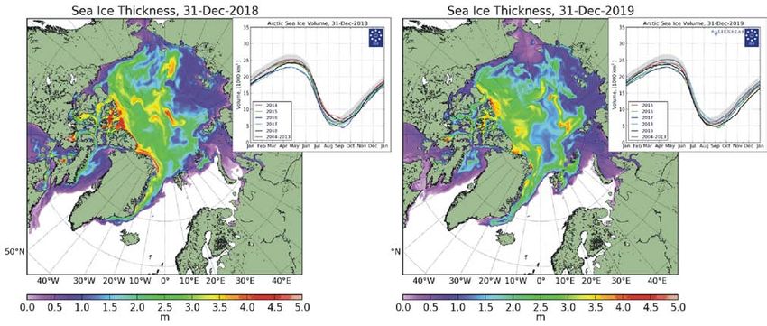
2.      Atmospheric temperatures
  Surface: spatial pattern
  The global surface air temperature for 2019 was, on average,
  somewhat higher than the average of the past ten years. 2017
  and 2018 were affected by the aftermath of the major El Niño ep-
  isode that culminated in early 2016. By 2017, the global surface
  air temperature was already slowly dropping back towards the
  pre-2015–16 level, a gradual change that continued throughout
  2018, but in 2019 was interrupted by a renewed global surface
  air temperature increase. The main reason for this change was a
  new, moderate El Niño episode (see Section 3).
        In 2019, Northern Hemisphere surface air temperatures
  were characterised by regional contrasts, influenced by the
  dominant jet stream pattern. The most pronounced develop-
  ment was the continuation from 2018 of relatively cold condi-
  tions in much of North America. In contrast, most of Europe, Rus-
  sia, and especially Alaska were relatively warm. Near the Equator,
  surface air temperatures were generally near the average for the
  previous 10 years. This was the case in the Southern Hemisphere
  too, but with a contrast between the oceans, where surface air
  temperatures were below average, and land areas, where they
  were above or near average. The relatively low ocean tempera-
  ture was pronounced in regions between 20°S and 55°S, particu-
  larly in the South Atlantic and the Indian Ocean.

Figure 1: 2019 surface air temperatures compared to the average for the previous 10 years.
Green-yellow-red colours indicate areas with higher temperature than the average, while blue colours indicate lower
than average temperatures. Data source: Goddard Institute for Space Studies (GISS) using Hadl_Reyn_v2 ocean surface
temperatures, and GHCNv4 land surface temperatures.

                                                          3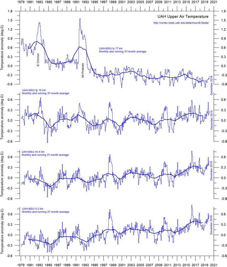
In the Arctic, the Baffin Island–West Greenland sector had
 surface air temperatures above the average of the previous 10
 years. The Siberian and Alaskan sectors also had above-aver-
 age temperatures, in contrast to 2018, when they had been
 relatively cold. The European sector of the Arctic was relatively
 cold, although the Arctic temperature record north of 80°N is
 somewhat implausible, as a result of an interpolation artefact
 in the record produced by NASA.
      The Antarctic was mainly characterised by near-average
 temperatures in 2019, with no regions being significantly
 warmer or colder than the average for the past 10 years. A
 similar interpolation artefact is also in play south of 80°S.
      Summing up for 2019, global average air temperatures
 were higher than during the past 10 years, mainly because of a
 moderate El Niño. Once again, the dynamics of the equatorial
 Pacific Ocean have demonstrated their importance for global
 surface air temperatures, among many other climatic drivers.

                        (a) Arctic                                                 (b) Antarctic

−14            −10              −6            −2            2                  6              10             14
                                           Temperature change (°C)

Figure 2: 2019 polar surface air temperatures compared to the average for the previous 10 years.
Green-yellow-red colours indicate areas with higher temperature than the average, while blue colours indicate lower
than average temperatures. Data source: Goddard Institute for Space Studies (GISS) using Hadl_Reyn_v2 ocean surface
temperatures, and GHCNv4 land surface temperatures.
                                                       4
Lower troposphere: monthly and annual
There are two main temperature records for the lower
troposphere, prepared by the University of Alabama,
Huntsville (UAH) and Remote Sensing Systems Inc
(RSS). Both records clearly show a temperature spike
associated with the 2015–16 El Niño, and a subse-
quent gradual drop, followed by the onset of a new
spike due to the moderate 2019 El Niño (Figure 3). The
annual means tell the same story (Figure 4)
All temperature series are adjusted as new ver-
sions are introduced from time to time. A comparison
between the latest (December 2019) record and the
May 2015 record (red line in Figure 3) shows that only
a few small adjustments have since been made to the
UAH series, but that the RSS series has been subject to
large adjustments, warming temperatures from 2002
onwards by about +0.1°C. This adjustment of the RSS
series was introduced in 2017.
The overall temperature variation in the dia-
grams (Figure 4) is similar for the two data series, but
the overall temperature increase 1979–2019 is larger
for RSS than for UAH. Before the 2017 adjustment of
the RSS series, the temperature increase was almost
identical in the two series.
Figure 3: Global monthly (a)
average lower tropo-
sphere temperatures
since 1979.
(a) UAH and (b) RSS. These
represent conditions at
about 2 km altitude. In
each case, the thick line
is the simple running
37-month average, nearly
corresponding to a running
3-year average.
(b)
5(a) UAH (b) RSS
Figure 4: Global mean annual lower troposphere air temperatures since 1979.
(a) UAH (b) RSS
−0.95 −0.70 −0.45 −0.2 0.05 0.30 0.55 0.80 1.05 1.30
Temperature anomaly (°C)
Figure 5: Temporal evolution of global lower troposphere temperatures since 1979.
Temperature anomaly versus 1979–2008. The effects of the El Niños of 1998, 2010 and 2015–2016 are clearly visible, as
are the tendency for many El Niños to culminate during the Northern Hemisphere winter. As the different temperature
databases are using different reference periods, the series have been made comparable by setting their individual 30-year
average 1979–2008 as zero value.
6Surface: monthly
In this paper, I consider three of the available surface temperature
records:
• HadCRUT4, a collaborative effort of the Hadley Centre for
Climate Prediction and Research and the University of East
Anglia’s Climatic Research Unit
• NCDC, the record prepared by the US National Climatic
Data Center
• GISS, the record prepared by NASA’s Goddard Institute for
Space Studies.
All three surface air temperature records clearly show the temper-
ature spike associated with the 2015–16 El Niño, the subsequent
temperature drop, and the renewed temperature increase due to
the moderate 2019 El Niño episode (Figure 6).
The comparison between the most recent (December 2019)
record and the May 2015 record (red in Figure 6) shows that few
adjustments have been made to the HadCRUT record over that
period, while numerous and relatively large changes have been
made to both the NCDC and GISS records. All three surface re-
cords, however, confirm that the recent major El Niño episode cul-
minated in early 2016, and that there was a subsequent gradual
return towards pre-2015 conditions, before a renewed tempera-
ture increase in 2019. This development is also shown in Figure 7,
which shows the temporal evolution of monthly temperatures.
Figure 6: Global mean
annual surface air tem-
peratures since 1979.
(a) HadCRUT4 (b) NCDC
(c) GISS.
(a) HadCRUT4
(b) NCDC (c) GISS
7Figure 7: Temporal evo-
(a) HadCRUT4 lution of global mean
annual surface air tem-
peratures.
(a) HadCRUT4 (b) NCDC
(c) GISS. Temperature anomaly
(°C) versus 1979–2008.
(b) NCDC
(c) GISS
Temperature anomaly (°C)
−0.95 −0.70 −0.45 −0.2 0.05 0.30 0.55 0.80 1.05 1.30
8Surface: annual means
All three series show the year 2016 to be the warmest on record,
although, as already noted, 2016 saw a strong El Niño episode
(Figure 8).
(a) HadCRUT4
(b) NCDC
(c) GISS
Figure 8: Global surface air temperatures: annual means.
(a) HadCRUT4 (b) NCDC (c) GISS.
9Surface versus lower troposphere
Even though in general there is fair agreement between the dif-
ferent temperature records, there remains a difference between
the surface and satellite records, as illustrated in Figure 9. In the
early part of the record, the satellite-based temperatures were of-
ten somewhat higher than the surface observations. Since 2004,
however, the surface records have slowly drifted away from the
satellite-based ones, in a warm direction. The major adjustment
of the RSS satellite record in 2017 reduced this difference signifi-
cantly.
Figure 9: Surface temperatures versus lower troposphere temperatures.
Plot showing the average of monthly global surface air temperature estimates (HadCRUT, NCDC and GISS) and satel-
lite-based lower troposphere temperature estimates (UAH and RSS). The thin lines indicate the monthly value, while the
thick lines represent the simple running 37-month average, nearly corresponding to a running 3-year average. The lower
panel shows the monthly difference between surface air temperature and satellite temperatures. As the base period
differs for the different temperature estimates, they have all been normalised by comparing to the average value of the
30 years from January 1979 to December 2008.
10Lower troposphere: over land and ocean
Since 1979, the lower troposphere has warmed much more over land
than it has over the oceans (Figure 10). The possible reasons for this
difference include variations in incoming solar radiation, cloud cover
and land use.
Figure 10: Lower troposphere: over land and ocean.
Global monthly average lower troposphere temperature since 1979 measured over land and oceans, shown in red and
blue, respectively, according to University of Alabama at Huntsville (UAH), USA. The thin lines represent the monthly aver-
age, and the thick line the simple running 37-month average, nearly corresponding to a running 3-year average.
Upper atmosphere: by altitude
The temperature variations recorded in the lower troposphere are
generally reflected at higher altitudes, up to about 10 km (Figure 11).
The temperature plateau since about 2002 that is seen in the lower
troposphere record is also found at all these altitudes, as is the El Niño
induced temperature increase from 2015.
At high altitudes, near the tropopause, the pattern of variations
recorded lower in the atmosphere can still be recognised, but for the
duration of the record (since 1979) there has been no clear trend to-
wards higher or lower temperatures.
Higher in the atmosphere, in the stratosphere (17 km altitude),
two pronounced temperature spikes are visible before the turn of the
century. Both of these can be related to major volcanic eruptions as
indicated in the diagram. Ignoring these spikes, until about 1995 the
stratospheric temperature record shows a persistent decline, ascribed
by various scientists to the effect of heat being trapped by carbon di-
11oxide in the troposphere below. However, the marked stratospheric temperature
decline essentially ends around 1995–96, since when there has been a long tem-
perature plateau. Thus the stratospheric temperature ‘pause’ began 5–7 years be-
fore the start of the similar ‘pause’ in the lower troposphere. Since 2015, roughly
in concert with the El Niño induced tropospheric temperature increase, a small
temperature decrease has taken place in the stratosphere.
Figure 11: Temperatures by altitude.
Global monthly average temperature in different altitudes according to University of Alabama at Huntsville (UAH), USA.
The thin lines represent the monthly average, and the thick lines the simple running 37-month average, nearly corre-
sponding to a running 3-year average.
12Atmospheric greenhouse gases
Water vapour is the most important greenhouse gas in the trop-
osphere. The highest concentration is found within a latitudinal
range from 50°N to 60°S. The two polar regions of the troposphere
are comparatively dry.
Figure 12 shows the specific atmospheric humidity to be sta-
ble or slightly increasing up to about 4–5 km altitude. At higher
levels in the troposphere (about 9 km), the specific humidity has
been decreasing for the duration of the record (since 1948), but
with shorter variations superimposed on the falling trend. A Fou-
rier frequency analysis (not shown here) shows these variations
to be particularly influenced by a periodic variation of about 3.7
years’ duration.
The persistent decrease in specific humidity at about 9 km al-
titude is noteworthy, as this altitude roughly corresponds to the
level at which the theoretical temperature effect of increased at-
mospheric carbon dioxide is expected initially to play out.
Figure 12: Humidity.
Specific atmospheric humidity (g/kg) at three different altitudes in the troposphere since January 1948. The thin lines
show monthly values, while the thick lines show the running 37-month average (about 3 years). Data source: Earth System
Research Laboratory (NOAA).
13Carbon dioxide (CO2) is an important greenhouse gas, although
less important than water. For the duration of the record (since
1958), an increasing trend is clearly visible, with an annual cycle
superimposed. At the end of 2019, the amount of atmospheric
CO2 was close to 410 ppm (Figure 13). Carbon dioxide is usually
considered a relatively well-mixed gas in the troposphere.
Figure 13: CO2 concentration.
Monthly amount of atmospheric CO2
since March 1958, measured at the
Mauna Loa Observatory, Hawaii. The
thin line shows the monthly values,
while the thick line is the simple run-
ning 37-month average, nearly corre-
sponding to a running 3-year average.
The annual change in tropospheric CO2 has been increasing,
from about +1 part per million (ppm) per year in the early part
of the record to more than 2.5 ppm/year towards the end of the
record (Figure 14). A Fourier frequency analysis (not shown here)
shows the annual change of tropospheric CO2 to be influenced by
periodic variations of 2.5- and 3.8-years’ duration.
Figure 14: Growth in CO2 con-
centration.
Annual (12-month) growth rate (ppm)
of atmospheric CO2 since 1959, calcu-
lated as the average amount of atmo-
spheric CO2 during the last 12 months,
minus the average for the preceding
12 months. The graph is based on data
measured at the Mauna Loa Observa-
tory, Hawaii. The thin blue line shows
the value calculated month by month,
while the dotted blue line represents
the simple running 3-year average.
14It is instructive to consider the variation of the annual change
rate of atmospheric CO2 together with the annual change rates
for global air and sea surface temperatures (Figure 15). All three
change rates clearly vary in concert, but with sea surface tempera-
tures leading – a few months ahead of the global temperature and
11–12 months ahead of the change rates for atmospheric CO2.
Figure 15: CO2 versus temperature.
Annual (12-month) change of global atmospheric CO2 concentration (Mauna Loa; green), global sea surface temperature
(HadSST3; blue) and global surface air temperature (HadCRUT4; red). All graphs are showing monthly values of DIFF12, the
difference between the average of the last 12 months and the average for the previous 12 months for each data series.
Figure 16 shows the visual association between the annual change
of atmospheric CO2 and La Niña and El Niño episodes, emphasis-
ing the importance of oceanographic dynamics for understanding
changes in atmospheric CO2.
Figure 16: CO2 and El Niño.
Visual association between an-
nual growth rate of atmospheric
CO2 (upper panel) and the Oce-
anic Niño Index (lower panel).
See also Figures 14 and 15).
15Lower troposphere: by latitude
Figure 17 shows that the ‘global’ warming experienced after 1980
has predominantly been a Northern Hemisphere phenomenon,
and that it mainly played out as a marked change between 1994
and 1999. This apparently rapid temperature change was, how-
ever, influenced by the Mt. Pinatubo eruption of 1992–93 and the
subsequent 1997 El Niño episode.
The figure also reveals how the temperature effects of equa-
torial El Niños – strong ones in 1997 and 2015–16 and the moder-
ate one in 2019 – apparently spread to higher latitudes in both
hemispheres, although with some delay. This El Niño temperature
effect was mainly seen in the Northern Hemisphere.
Figure 17: Zonal air temperatures
Global monthly average lower troposphere temperature since 1979 for the tropics and the northern and southern extra-
tropics, according to UAH. Thick lines are the simple running 37-month average, nearly corresponding to a running 3-year
average.
16Lower troposphere: polar
In the Arctic, warming mainly took place between 1994 and 1996,
and less so subsequently (Figure 18). In 2016, however, tempera-
tures peaked for several months, presumably because of oceanic
heat emitted to the atmosphere during the 2015–16 El Niño (see
also Figure 16) and then advected to higher latitudes. A tempera-
ture decrease has characterised the Arctic since 2016.
In the Antarctic, temperatures have remained almost stable
since the onset of the satellite record in 1979. In 2016–17, a small
temperature peak is visible in the monthly record. This may be in-
terpreted as the subdued effect of the recent El Niño episode.
Figure 18: Tropospheric temperatures above the poles.
Global monthly average lower troposphere temperature since 1979 for the North Pole and South Pole regions, according
to UAH. Thick lines are the simple running 37-month average, nearly corresponding to a running 3-year average.
173. Ocean temperatures
Surface: spatial patterns in recent years
Figure 19 shows the spatial patterns of ocean temperatures for De-
cember 2017, 2018 and 2019. December 2017 was a weak La Niña
episode, December 2018 was approximately neutral, as was De-
cember 2019, following the moderate El Niño characterising most
of that year.
(a) 2017
Temperature change (°C)
5
(b) 2018 4
3
2
1
0
−1
−2
−3
(c) 2019
−4
−5
Figure 19: Spatial patterns of ocean surface temperatues, 2017–2019.
Sea surface temperature anomalies at the end of December 2017, 2018 and 2019, respectively. The maps show the cur-
rent anomaly (deviation from normal) of the surface temperature of Earth’s oceans. Reference period: 1977–1991. Dark
grey represents land areas. Map source: Plymouth State Weather Center.
18Figure 20 shows all El Niño and La Niña episodes since 1950. The
2015–16 El Niño is among the strongest recorded. Considering the
entire record, however, recent variations between El Niño and La
Niña episodes do not appear abnormal in any way.
Figure 20: Warm and cold episodes on the Oceanic Niño Index.
Warm and cold episodes for the Oceanic Niño Index, defined as 3-month running mean of ERSSTv4 SST anomalies in the
Niño 3.4 region (5°N–5°S, 120°–170°W). Anomalies are centred on 30-year base periods updated every 5 years.
Average temperature to 1900 m depth, by region
Based on observations by Argo floats,2 Figure 21 shows that, on
average, the temperature of the global oceans down to 1900 m
depth has been increasing since about 2011. It also shows that
since 2013 this increase has mostly been manifested in changes
near the Equator, between 30°N and 30°S. In contrast, for the cir-
cum-Arctic oceans north of 55°N, depth-integrated ocean tem-
peratures have been decreasing since 2011. Near the Antarctic,
south of 55°S, temperatures have essentially been stable. At most
latitudes, a clear annual rhythm is seen.
19Figure 21: Average ocean temperatures in selected latitudinal bands.
Average ocean temperatures January 2004–July 2029 at 0–1900 m depth in selected latitudinal bands The thin line shows
monthly values and the thick stippled line shows the running 13-month average. Source: Global Marine Argo Atlas..
20Global average: by depth
Figure 22 shows global average ocean temperatures at different depths. An annual
rhythm can be seen, down to about 100 m depth. In the uppermost 100 m, tempera-
tures have increased since about 2011. For 200–400 m depth, temperatures have ex-
hibited little change during the observation period.
For depths below 400 m, however, temperatures are again seen to be increas-
ing. Interestingly, the diagram suggests that this increase first began at 1900 m depth
around 2009, and from there gradually spread upwards. At 600 m depth, the temper-
ature increase began in around 2012; that is, about three years after it was seen at
1900 m. The timing of these changes shows that average temperatures in the upper
1900 m of the oceans are not only influenced by conditions playing out at or near the
ocean surface, but also by processes operating at greater depths than 1900 m.
Figure 22: Global Ocean temperatures at different depths.
Global ocean temperatures January 2004–July 2019 at different depths between 65°N and 65°S. The thin line shows
monthly values and the stippled line shows the running 13-month average. Source: Global Marine Argo Atlas.
21Thus part of the present ocean warming appears to be due to cir-
culation features operating in the depths of the oceans; they are
not directly related to processes operating at or near the surface.
This can also be seen in Figure 23, which shows the net
change of global ocean temperatures at different depths, calcu-
lated as the difference between the 12-month averages for Janu-
ary–December 2004 and August 2018–July 2019, respectively. The
largest net changes occurred in the uppermost 200 m. However,
average values, as shown in this diagram, although valuable, also
hide many interesting regional details, as shown in Figure 24.
Figure 23: Global ocean net temperature change since 2004 from surface to 1900 m depth.
Source: Global Marine Argo Atlas.
Regional, 0–1900 m depth: changes 2004–2019
Figure 24 shows the latitudinal variation of ocean temperatures
net changes, January–December 2004 versus August 2018–July
2019, for various depths, calculated as in the previous diagram.
The three panels show the net change for the Arctic oceans (55–
65°N), equatorial oceans (30N–30°S), and Antarctic oceans (55–
65°S), respectively.
The global surface net warming shown in Figure 23 affects
the equatorial and Antarctic oceans, but not the Arctic oceans
(Figure 24). In fact, net cooling is pronounced down to 1400 m
depth for the northern oceans. However, the major part of Earth’s
land areas is in the Northern Hemisphere, so the surface area (and
volume) of Arctic oceans is much smaller than that of the Antarctic
22oceans, which in turn is smaller than the equatorial oceans. In fact,
half of the planet’s surface area (land and ocean) is located be-
tween 30°N and 30°S.
Nevertheless, the contrast in net temperature change over
2004–2019 for the different latitudinal bands is instructive. For the
two polar oceans, the Argo data appears to demonstrate the exist-
ence of a bi-polar seesaw, a phenomenon that was described by
Chylek et al. in 2010. It is no less interesting that the near-surface
ocean temperatures in the two polar oceans contrasts with the
trends in sea ice in the two polar regions (see Section 6).
Figure 24: Net temperature change since 2004 from surface to 1900 m depth in different parts of
the global oceans, using Argo data.
Source: Global Marine Argo Atlas.
23Change 2004–2019 in selected sectors
In this section, I consider net temperature changes for the period
2004–2018/19 along two north–south transects, one along 20°W,
representing the Atlantic Ocean, and the other along 150°W, rep-
resenting the Pacific. (In passing, I also look at a short east-west
transect, representing the North Atlantic Current.) The locations of
the transects are shown in Figure 25, and the temperature chang-
es in Figures 26–28. To prepare the latter, 12-month average ocean
temperatures for January–December 2018 and August 2018 – July
2019 were compared to annual average temperatures for 2004,
representing the initial 12 months in the Argo-record. To give an
insight into the most recent changes, the net change in 12-month
average temperatures is shown for both 2004–2018 (on top) and
2004–2018/19. Warm colours indicate net warming from 2004 to
2018/19, and blue colours cooling. Due to the spherical shape of
the Earth, northern and southern latitudes represent only small
ocean volumes compared to latitudes near the Equator.
Figure 25: Annual mean net surface solar radiation (W/m2), and the location of three profiles.
24The Atlantic
Figure 26, for the Atlantic transect, reveals several interesting fea-
tures, in particular a marked net cooling at the surface north of the
Equator, and especially north of 25°N, where deeper layers (down
to 1500 m depth) are also involved. At the Equator, and south of it,
warming dominates at the surface, although cooling dominates
at 50–250 m depth. The maximum Atlantic Ocean net warming
over this period is found between 10 and 55°S, mainly affecting
water depths between 200 and 1100 m. The warming in the South
Atlantic is decreasing compared to the 2004–2018 diagram. Like-
wise, the net cooling north of 30°N is somewhat less pronounced
in 2019 than in 2018.
Figure 26: Net temperature change since 2004 from surface to 1900 m depth at 20°W in the Atlan-
tic Ocean, using Argo data.
Top: 2004–2018, bottom: 2004–2019. See Figure 25 for geographical location of transect. Data source: Global Marine Argo
Atlas.
25The North Atlantic Current
Before moving on to the Pacific Ocean transect, it is also interesting to look at a short
transect along the latitude 59°N, which crosses the North Atlantic Current, just south of
the Faroe Islands (see Figure 25). This is important for weather and climate in much of Eu-
rope. Figure 27a shows a time series from 30°W to 0°W along that line, from the surface to
800 m depth. It thus represents a section across the water masses affected by the North
Atlantic Current. Ocean temperatures higher than 9°C are shown by red colours.
This time series, although still relatively short, displays interesting dynamics. Warm
water (above 9°C) apparently peaked in early 2006 and was followed by a gradual reduc-
tion until 2016. Since then, a partial temperature recovery has taken place. The observed
change from peak to trough, playing out over approximately 11 years, might conceivably
suggest the existence of an approximately 22-year temperature variation, but we will
have to wait until the Argo series is somewhat longer before it will be possible to draw
conclusions.
Figure 27b shows the same data (59°N, 30–0°W, 0–800 m depth, 2004–2018), plotted
as a graph of depth-integrated average ocean temperature, in which the apparent cycle
is clearer.
(a) Temperature pro-
file by depth
(b) Depth-integrated
average ocean tem-
perature
Figure 27: Temperature profile across the North Atlantic current.
Time series January 2004–July 2019 of ocean temperatures at 59°N, 30–0°W, from surface to 800 m depth, using Argo
data. See Figure 25 for geographical location of transect. Source: Global Marine Argo Atlas.
26The Pacific
Figure 28 shows the net changes 2004–2018/19 along 150°W, representing the Pacific, equiv-
alent to Figure 26 for the Atlantic, prepared in the same way, and with the same caveats.
One prominent feature for 2019 is net cooling south of 35°S, affecting nearly all water
depths down to 1900 m. However, compared to the 2004–2018 diagram, the cooling is be-
coming less pronounced and less widespread in the 2004–2019 diagram. Net cooling for
2004–2019 is especially pronounced in two bands, one north and one south of the Equator
(at 25°S and 20°N), respectively, and both extending from the surface to 500 m. Net surface
warming is taking place in three regions, centred on 50°S, the equator and 50°N, and espe-
cially affecting water depths down to about 500 m.
Neither the Atlantic or Pacific transects show to what extent any of the net changes are
caused by ocean dynamics operating east and west of the two profiles considered. For that
reason, the diagrams should not be overinterpreted. The two longitudinal transects suggest,
however, an interesting contrast, with the Pacific Ocean mainly warming north of Equator,
and cooling in the south, with the opposite happening in the Atlantic.
Figure 28: Net temperature change since 2004 from surface to 1900 m depth at 20°W in the Atlan-
tic Ocean, using Argo data.
Top: 2004–2018, bottom: 2004–2019. See Figure 25 for geographical location of transect. Data source: Global Marine Argo
Atlas.
274. Oceanic cycles
Southern Oscillation Index
Sustained negative values of the Southern Oscillation Index (SOI),
as shown in Figure 29, often indicate El Niño episodes. Such nega-
tive values are usually accompanied by persistent warming of
the central and eastern tropical Pacific Ocean, a decrease in the
strength of the Pacific trade winds, and a reduction in rainfall over
eastern and northern Australia.
Positive values of the SOI are usually associated with stronger
Pacific trade winds and higher sea surface temperatures to the
north of Australia, indicating La Niña episodes. Waters in the cen-
tral and eastern tropical Pacific Ocean become cooler during this
time. Eastern and northern Australia usually receive increased pre-
cipitation.
Figure 29: Annual Southern Oscillation Index (SOI) anomaly since 1866.
The Southern Oscillation Index (SOI) is calculated from the monthly or seasonal fluctuations in the air pressure difference
between Tahiti and Darwin. The thin line represents annual values, while the thick line is the simple running 5-year aver-
age. Source: Climatic Research Unit, University of East Angila.
28Pacific Decadal Oscillation
The Pacific Decadal Oscillation (PDO), shown in Figure 30, is a long-lived El Niño-
like pattern of Pacific climate variability, with data extending back to January 1900.
The causes of the PDO are not currently known, but even in the absence of a theo-
retical understanding, information about the oscillation improves season-to-season
and year-to-year climate forecasts for North America because of its strong tendency
for multi-season and multi-year persistence. The PDO also appears to be roughly in
phase with global temperature changes. Thus, from a societal-impacts perspective,
recognition of the PDO is important because it shows that ‘normal’ climate conditions
can vary over time periods comparable to the length of a human lifetime.
The PDO nicely illustrates how global temperatures are tied to sea surface tem-
peratures in the Pacific Ocean, the largest ocean on Earth. When sea surface tem-
peratures are relatively low (the negative phase of the PDO), as they were from 1945
to 1977, global air temperature decreases. When sea surface temperatures are high
(the positive phase of the PDO), as they were from 1977 to 1998, global surface air
temperature increases (Figure 30).
A Fourier frequency analysis (not shown here) shows the PDO record to be in-
fluenced by a 5.7-year cycle, and possibly also by a longer cycle of about 53 years’
duration.
Figure 30: Annual values of the Pacific Decadal Oscillation (PDO).
The thin line shows the annual PDO values, and the thick line is the simple running 7-year average. Please note that the
annual value of PDO is not yet updated beyond 2017. Source: Joint Institute for the Study of the Atmosphere and Ocean
(JISAO), a cooperative Institute between the National Oceanic and Atmospheric Administration and the University of
Washington, USA.
29Atlantic Multidecadal Oscillation
The Atlantic Multidecadal Oscillation (AMO; Figure 31) is a mode
of variability occurring in the North Atlantic Ocean sea surface
temperature field. The AMO is basically an index of North Atlantic
sea surface temperatures.
The AMO index appears to be correlated to air temperatures
and rainfall over much of the Northern Hemisphere. The associa-
tion appears to be high for north-eastern Brazil, rainfall in the Afri-
can Sahel, and the summer climate in North America and Europe.
The AMO index also appears to be associated with changes in the
frequency of North American droughts and is reflected in the fre-
quency of severe Atlantic hurricanes.
As one example, the AMO index may be related to the past
occurrence of major droughts in the US Midwest and Southwest.
When the AMO is high, these droughts tend to be more frequent
or prolonged, and vice-versa for low values. Two of the most se-
vere droughts of the 20th century in the US – the Dust Bowl of the
1930s and the 1950s droughts – occurred during periods of high
AMO values. On the other hand, Florida and the Pacific Northwest
tend to be the opposite; high AMO in these areas is associated
with relatively high precipitation.
A Fourier-analysis (not shown here) shows the AMO record
to be controlled by an 67-year cycle and, to a lesser degree, by a
3.5-year cycle.
Figure 31: Annual Atlantic Multidecadal Oscillation.
Detrended and unsmoothed index values since 1856. The thin blue line shows annual values, and the thick line is the
simple running 11-year average. Data source: Earth System Research Laboratory, NOAA, USA.
305. Sea level
Introduction
Global (or eustatic) sea-level change is measured relative to an idealised
reference level, the geoid, which is a mathematical model of planet Earth’s
surface.3 Global sea-level is a function of the volume of the ocean basins
and the volume of water they contain. Changes in global sea-level are
caused by – but not limited to – four main mechanisms:
• changes in local and regional air pressure and wind, and tidal
changes introduced by the Moon;
• changes in ocean basin volume caused by tectonic (geological)
forces;
• changes in ocean water density caused by variations in currents,
water temperature and salinity;
• changes in the volume of sea water caused by changes in the
mass balance of terrestrial glaciers.
In addition, there are subsidiary mechanisms influencing sea-level, such
as storage of ground water, storage in lakes and rivers, evaporation, and
so on.
31Satellite altimetry measurements
Satellite altimetry is a relatively new and valuable type of measurement, with nearly
global coverage. It provides unique insights into the detailed surface topography
of the oceans and how it changes. However, it is probably not a precise tool for es-
timating absolute changes in global sea level due to assumptions that have to be
made when interpreting the raw data. One of these (Figure 32) is the glacial isostatic
adjustment (GIA). The GIA relates to large-scale, long-term mass transfer from the
oceans to the land, in the form of rhythmic waxing and waning of the large Quater-
nary ice sheets in North America and North Europe. This enormous mass transfer
causes rhythmic changes in surface load, resulting in viscoelastic mantle flow and
elastic effects in the upper crust of the Earth. No single technique or observation-
al network can give adequate information to allow a precise GIA to be estimated,
so various assumptions have to be made. These assumptions are difficult to verify.
They depend on the deglaciation model used (for the last glaciation) and upon the
model of the crust-mantle used. Because of this (and additional factors), interpreta-
tions of modern global sea-level change based on satellite altimetry vary from about
1.9 mm/year to about 3.5 mm/year.
Figure 32: Global sea-level change since December 1992.
The blue dots are the individual observations, and the purple line represents the running 121-month (ca. 10-year) average.
The two lower panels show the annual sea level change, calculated for 1- and 10-year time windows, respectively. These
values are plotted at the end of the interval considered. Source: Colorado Center for Astrodynamics Research at University
of Colorado at Boulder.
32Tide-gauge measurements
Tide gauges, located at coastal sites, record the net movement of the local ocean
surface in relation to the land. Measurements of local relative sea-level change (Fig-
ure 33) are vital for coastal planning, and it is tide-gauge data, rather than satellite
altimetry, that are relevant for planning purposes in coastal areas.
In a scientific context, the net movement of the local sea-level, as measured by
the tide gauges, comprises two components:
• the vertical change of the ocean surface
• the vertical change of the land surface.
For example, a tide gauge may record an apparent sea-level increase of 3 mm/year. If
geodetic measurements show the land to be sinking by 2 mm/year, the real sea level
rise is only 1 mm/year (3 minus 2 mm/year). In a global sea-level change context, the
value of 1 mm/year is relevant, but in a local coastal planning context the 3 mm/year
value obtained from the tide gauge is the only relevant factor.
Figure 33: Holgate-9 monthly tide gauge data.
Source: PSMSL Data Explorer. Holgate (2007) suggested the nine stations listed in the diagram captured the variability
found in a larger number of stations over the last half century. For that reason, average values of the Holgate-9 group of
tide gauge stations are interesting to follow, even though Auckland (New Zealand) has not reported data since 2000, and
Cascais (Portugal) since 1993. Unfortunately, because of this data loss, the Southern Hemisphere is underweighted in the
Holgate-9 series since 2000. The blue dots represent individual average monthly observations, and the purple line rep-
resents the running 121-month (ca. 10-year) average. The two lower panels show the annual sea level change, calculated
for 1- and 10-year time windows, respectively. These values are plotted at the end of the interval considered.
33To construct a time series of sea-level measurements at each tide gauge, the monthly
and annual means must be reduced to a common datum. This reduction is performed by
the Permanent Service for Mean Sea Level, using the tide gauge datum history provided by
the supplying national authority. The Revised Local Reference datum at each station is de-
fined to be approximately 7000 mm below mean sea level, with this arbitrary choice made
many years ago to avoid negative numbers in the resulting monthly and annual mean val-
ues.
Few places on Earth are completely stable, and most tide gauges are located at sites ex-
posed to tectonic uplift or sinking (the vertical change of the land surface). This widespread
vertical instability has several causes, but of course affects the interpretation of data from
individual tide gauges. Much effort is put into correcting for local tectonic movements.
Data from tide gauges located at tectonically stable sites is therefore of particular inter-
est for determining real short- and long-term sea-level change. One long record from such
a site comes from Korsør, Denmark (Figure 34). This record indicates a stable sea-level rise of
about 0.83 mm per year since January 1897, without any indication of recent acceleration.
Data from tide gauges all over the world suggest an average global sea-level rise of
1.0–1.5 mm/year, while the satellite-derived record (Figure 32) suggests a rise of about
3.2 mm/year, or more. The noticeable difference (at least 1:2) between the two datasets is
remarkable but has no broadly accepted explanation. It is, however, known that satellite
observations are subject to several complications in areas near the coast.4
Figure 34: Korsør (Denmark) monthly tide gauge data.
Source: PSMSL Data Explorer. The blue dots are the individual monthly observations, and the purple line represents the
running 121-month (ca. 10-year) average. The two lower panels show the annual sea-level change, calculated for 1- and
10-year time windows, respectively. These values are plotted at the end of the interval considered.
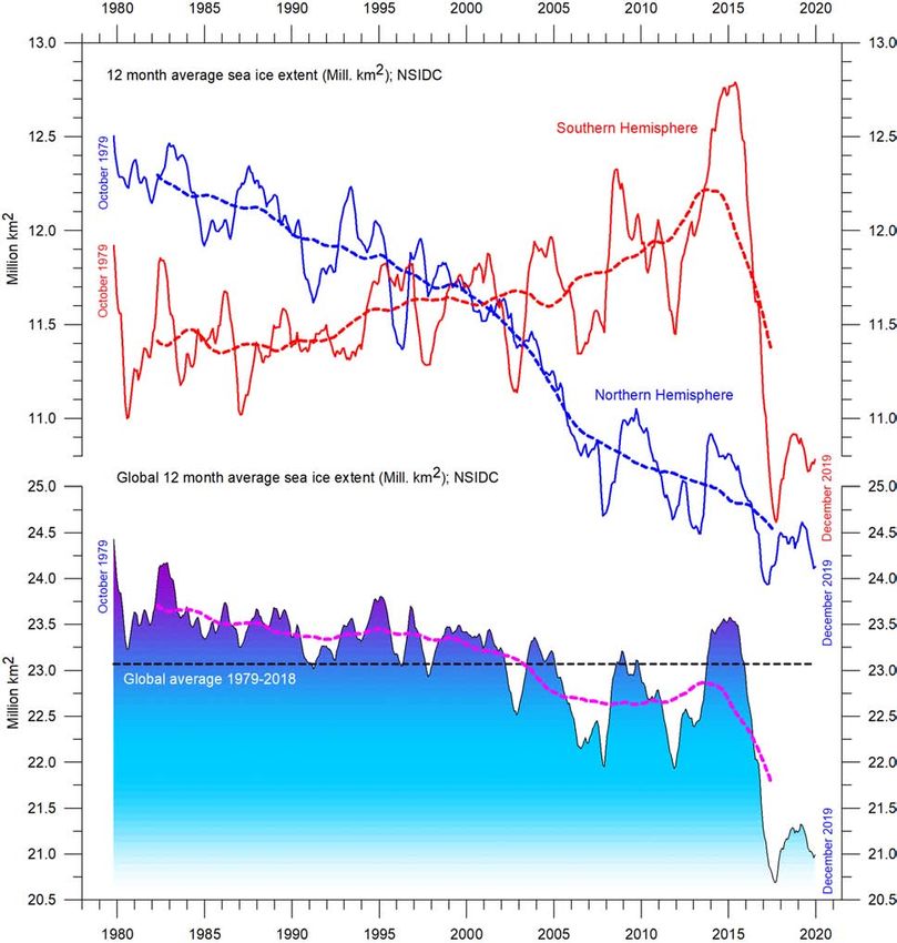
346. Sea-ice extent
Figure 35 shows average sea-ice extent graphs for the two poles in
the period 1979–2019. There are contrasting trends in the Arctic and
Antarctic. The Northern Hemisphere has tended towards lower sea-
ice extent, but there was a simultaneous increase in the Southern
Hemisphere, at least until 2016, after which there was an extraor-
dinarily rapid decrease during the Southern Hemisphere spring of
2016. The reduction was much faster than in any previous spring
season during the satellite era, and was seen in all sectors of the
Figure 35: Global and hemispheric 12-month running average sea-ice extent since 1979.
The October 1979 value represents the monthly average of November 1978–October 1979, the November 1979 value
represents the average of December 1978–November 1979, etc. The stippled lines represent a 61-month (ca. 5-year)
average. The last month included in the 12-month calculations is shown to the right in the diagram. Data source: National
Snow and Ice Data Center (NSIDC).
35Antarctic, but particularly in the Weddell and Ross Seas. In these sectors,
strong northerly (warm) surface winds pushed the sea ice back towards
the Antarctic continent. The unusual wind conditions in 2016 have been
discussed in the literature,5 and appear to be related to natural climate vari-
ability. The satellite sea-ice record is still short, and does not fully represent
natural variations playing out over more than a decade or two.
What can be identified from record is nevertheless instructive. Both
12-month average graphs (Figure 35) exhibit recurring variations that are
superimposed on the overall trends. The Arctic sea ice is strongly influ-
enced by a 5.3-year periodic variation, and the Antarctic sea ice by a pe-
riodic variation of about 4.5 years. Both of these variations reached their
minima simultaneously in 2016, which at least partly explains the simulta-
neous minimum in global sea-ice extent.
In the coming years these cycles may induce an increase in sea-ice ex-
tent at both poles, with a consequent increase in the global total. In fact,
this trend may already have started (Figure 35). However, in coming years,
the minima and maxima for these variations will not occur synchronously
because of their different periods, and the global minimum (or maximum)
may therefore be less pronounced than in 2016.
Figure 36 shows the overall extent and thickness of the Arctic sea ice
from the end of 2018 to the end of 2019, as published by the Danish Me-
teorological Institute. The most conspicuous change has been an overall
increase in sea ice in parts of the Europe–Russia sector of the Arctic Ocean.
In addition, relatively thick sea ice moved into the Svalbard-Franz Josef Is-
lands sector in 2019, compared to the situation at the end of 2018. North of
Canada and Greenland, however, thick ice has partly drifted away.
Figure 36: Arctic sea-ice extent and thickness.
31 December 2018 (left) and 2019 (right) and the seasonal cycles of the calculated total arctic sea-ice volume, according
to the Danish Meteorological Institute (DMI). The mean sea-ice volume and standard deviation for the period 2004–2013
are shown by grey shading in the insert diagrams.
367. Snow cover
Variations in global snow cover are mainly a function of changes
in the Northern Hemisphere (Figure 37), where all the major land
areas are located. The Southern Hemisphere snow cover extent
is essentially controlled by the Antarctic Ice Sheet, and therefore
relatively stable.
31 December 2018 31 December 2019
Figure 37: Arctic sea-ice extent and thickness.
Source: National Ice Center (NIC).
The Northern Hemisphere snow-cover extent is subject to large
local and regional variations from year to year. However, the over-
all tendency since 1972 is stability, as illustrated in Figures 38 and
39.
During the Northern Hemisphere summer, the snow cover
usually shrinks to about 2,400,000 km2 (principally controlled by
the size of the Greenland Ice Sheet), and during the Northern Hem-
isphere winter it increases to about 50,000,000 km2, representing
no less than 33% of planet Earth’s total land area (Figure 38).
37Since January 2000
Since January 1972
Figure 38: Northern Hemisphere weekly snow cover extent.
Source: Rutgers University Global Snow Laboratory. The thin blue line is the weekly data, and the thick blue line is the
running 53-week average (approximately 1 year). The horizontal red line is the 1972–2018 average.
38Figure 39 shows trends in seasonal snow cover in the Northern
Hemisphere. Autumn extent is increasing slightly, mid-winter ex-
tent is basically stable, and spring extent is decreasing slightly.
In 2019, Northern Hemisphere snow-cover extent was similar to
2018.
Figure 39: Northern Hemisphere weekly snow cover extent.
Source: Rutgers University Global Snow Laboratory.
398. Storms
Tropical storms and hurricanes
Accumulated cyclone energy (ACE) is a measure used by the US
National Oceanic and Atmospheric Administration to express the
activity of individual tropical cyclones and entire tropical cyclone
seasons. ACE is calculated as the square of the wind speed every
6 hours and is then scaled by a factor of 10,000 for usability, using
a unit of 104 knots2. The ACE of a season is the sum of the ACE for
each storm and thus encapsulates the number, strength, and du-
ration of all the tropical storms in the season.
The damage potential of a hurricane is proportional to the
square or cube of the maximum wind speed, and thus ACE is
therefore not only a measure of tropical cyclone activity, but also
a measure of the damage potential of an individual cyclone or a
season. Existing records (Figure 40) do not suggest any abnormal
cyclone activity in recent years.
Figure 40: Global hurricane ACE since January 1970.
Top: monthly and bottom: running 12-month sums. The running 12-month sum (lower panel) is plotted at the end of
the time interval considered. Data source: Updated from Maue (2011) ACE data. Please note that these data are not yet
updated beyond September 2017.
40The global ACE data display a variable pattern over time (Fig-
ure 40), but again without any clear trend. This is also true of the
equivalent records for the Northern and Southern Hemispheres
(Figures 41 and 42). The period 1992–1998 was characterised by
high values; other peaks were seen in 2004–2005, and in 2016,
while the periods 1973–1990 and 2012–2015 were characterised
by low values. The peaks in 1998 and 2016 coincided with strong
El Niño events in the Pacific Ocean (see Section 3).6
The Northern Hemisphere ACE (Figure 41) dominates the
global signal (Figure 40) and therefore exhibits similar peaks and
troughs as the global data, without any clear trend for the entire
observational period. The Northern Hemisphere’s main cyclone
season is June–November.
Figure 41: Northern Hemisphere hurricane ACE since January 1970.
Top: monthly and bottom: running 12-month sums. The running 12-month sum (lower panel) is plotted at the end of the
time interval considered. Source: Updated from Maue (2011) ACE data. Please note that these data are not yet updated
beyond September 2017.
41You can also read