Instructions for "Joekit" and "Tallykit"; Spreadsheets to Google Earth maps
←
→
Page content transcription
If your browser does not render page correctly, please read the page content below
MSF-OCA GIS Toolkit

Instructions for “Joekit” and “Tallykit”;
Spreadsheets to Google Earth maps
Before you start
1) Ensure you have downloaded the latest version of Joekit.jar and Tallykit.jar from
   http://code.google.com/p/joekit/downloads/list

   a) Note: Joekit gets updated often, particularly when someone informs us of a
      problem. Even after you’ve downloaded the program, check periodically for
      new versions.

   b) To report a problem please email medical.datafeedback@amsterdam.msf.org

2) Ensure Google Earth is installed on your computer. If you are working offline
   (without internet) please ensure the local imagery has been downloaded at a site
   that has internet access (see the Guide to Google Earth in the GIS Toolkit)

What are Joekit and Tallykit?
Both tools take spreadsheet data in Excel format and convert them into KML files
which display in Google Earth. Joekit converts line list data to KML files and Tallykit
converts tally sheets into KML files. They can do more sophisticated actions like
animations, changing the size or colour of points based on information in the
spreadsheet, or looking up points for which you have the place name but not the
geographical coordinates in a “gazetteer” file.

Joekit
How does Joekit work?
Joekit takes a spreadsheet with lines representing each point to be mapped (such as
individual patients, health clinics or water points), columns representing the place
(e.g. latitude and longitude coordinates) and columns containing any additional
information you want to display for each point; and creates an interactive map that
anyone can see with free, widely-used software (Google Earth).

                                                                                     1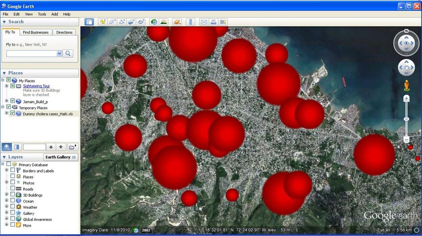
MSF-OCA GIS Toolkit

What does a line list look like?
A line list can be as simple as a list of names and latitude and longitude coordinates
as long as there is one line per person or object (Figure 1).

Figure 1: Simple line list format for mapping

Note that the top row (row 1) must contain the column labels and the labels can
only be in a single row. Joekit assumes the spreadsheet data starts in the second
row. Joekit will not work if there is no label row or if there are multiple label rows.

If you call one column “Name”, its contents will become the default label text in the
map. Similarly, columns called “lat” or “latitude” or “long” or “longitude” will become
the default geographical coordinate columns. Please see the Frequently Asked
Questions (FAQ) section for alternative column labels.

Here’s what this simple spreadsheet looks like as a Google Earth map (Figure 2):

                                                                                     2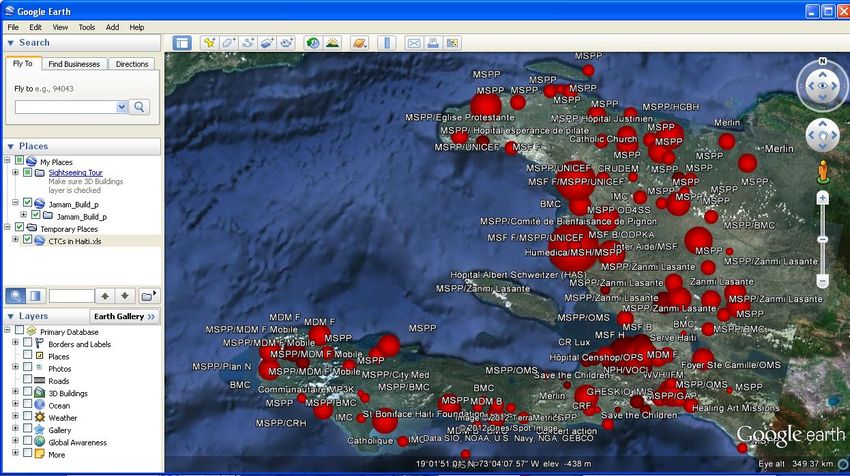
MSF-OCA GIS Toolkit

Figure 2: Google Earth map of simple spreadsheet data (Qatar)

How did you create that map?
This simple map was created by Joekit using the following steps:

1) Double-click the “Joekit.jar” program to open it. The Joekit display window
   appears with a section for mapping options on the left and a preview window on
   the right (Figure 3)

                                                                               3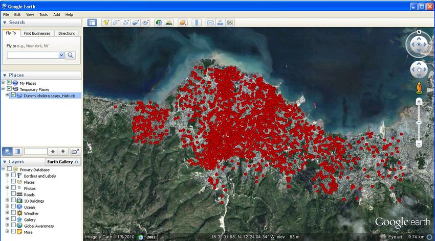
MSF-OCA GIS Toolkit

                                                                    Input button

Figure 3: The Joekit display window (with input button indicated)

2) Click the “Input” button at the top, and navigate to the spreadsheet file
   (Template example workbook for Joekit.xls) you wish to map. A very simple
   preview will appear in the window on the right (Figure 4)

Figure 4: Simple preview of mapped data points

3) Click the “Create KML” button at the bottom (the KMZ button will be explained
   later)
                                                                                   4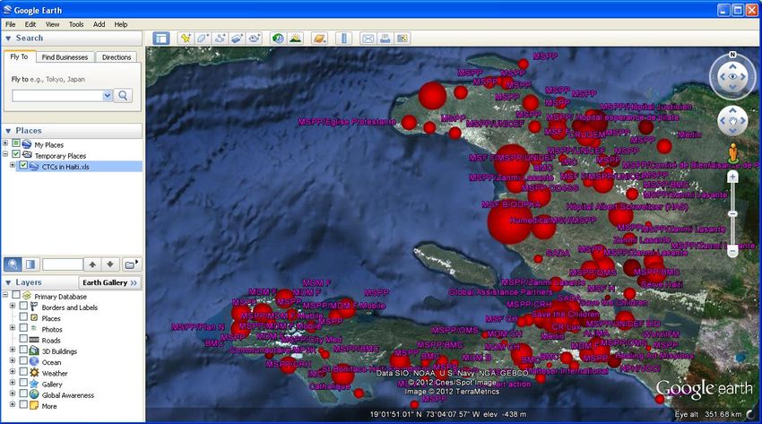
MSF-OCA GIS Toolkit

4) A map is created! By default it is saved in the same folder as the spreadsheet, and
   has the same name but with the extension “…map.kml” instead of “.xls”

Figure 5: Message indicating location of the KML file created

5) Double-click the .kml file to open it in Google Earth

What if my spreadsheet doesn’t have geographical coordinates?
You can use a “Gazetteer” to build your map. A gazetteer is a file combining place
names with geographical coordinates. Please contact the GIS team in the Manson
Unit who will try to produce an appropriate gazetteer or you can produce a
gazetteer yourself (see the Guide to Gazetteers in the GIS Toolkit).

Open the file ‘Dummy cholera cases_Haiti.xls’. You will see that the spreadsheet of
individual cholera patient data does not contain any longitude or latitude
coordinates. Instead there is an ‘Address’ column containing place names. Note this
is fake/dummy data.

                                                                                    5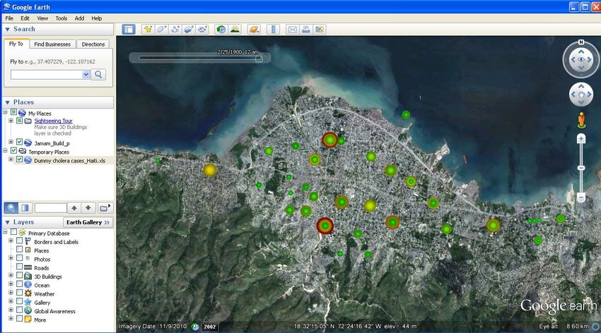
MSF-OCA GIS Toolkit

Figure 6: Cholera linelist data (fake) for Carrefour, Haiti

Open Joekit and input the file ‘Dummy cholera cases_Haiti.xls’. The following
message will appear ‘None of the rows of this spreadsheet successfully generated a
point. Please check your lat/long columns, or consider using a gazetteer!’ (Figure 7)

                                                               Gazetteer check box

Figure 7: Message indicating that a gazetteer is needed to map the data

                                                                                     6
MSF-OCA GIS Toolkit

To add a gazetteer, click OK and check the box ‘Use a gazetteer, match locations
from names in column’ and select the column label from the drop-down list
corresponding to the place names in your spreadsheet (‘Address’). It does not
matter what is selected in the latitude and longitude boxes as the gazetteer
overrides this. Click on the gazetteer button and select the file ‘Carrefour
Neighborhood Polygons.kml’. Gazetteers should be .kml files (see the Gazetteer
guide in the GIS Toolkit). Joekit looks for these place names in the gazetteer and
maps the spreadsheet data. Any points that cannot be mapped are listed in an error
window (Figure 8). However the reason for the error is not given. Please check
these data lines in your spreadsheet (see FAQs for common errors). You can copy
and paste this list into MS Word.

Figure 8: Error window indicating the data points that could not be mapped

Click OK to preview the mapped points (Figure 9).

                                                                                7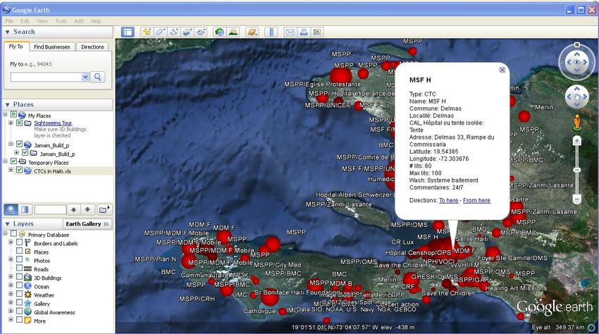
MSF-OCA GIS Toolkit
Spreadsheet: (no location data)
Gazetteer: (locations data)
Map with spreadsheet data in the right place!
Figure 9: Using a gazetteer within Joekit to map data
As before, click on the ‘Preview KML’ button to preview the mapped points and the
‘Create KML’ button to create the Google Earth KML file (Note: to remove labels,
deselect the label points tick box)
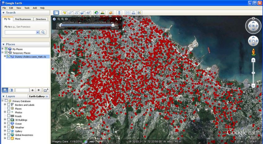
Figure 10: Cholera cases in Carrefour, Haiti mapped in Google Earth as ‘jitterdots’
8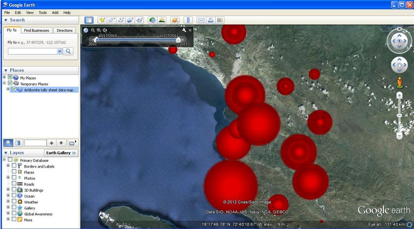
MSF-OCA GIS Toolkit

Alternatively you can create variable size points at the centroid of each polygon. In
the example above check the box “Variable Icon Sizes” and for ‘Choose the column
whose contents will determine icon size’ select the variable “Instances” from the
drop-down box (this is not an actual column in the excel spreadsheet but simply
tells Joekit to apply the number of cholera cases per quartier (polygon) to the icon
size). ‘Click ‘Create KML’ and view the cumulative cholera cases as variable sized
dots (Figure 11).

Figure 11: Cholera cases in Carrefour, Haiti mapped in Google Earth as variable icon sizes

But how can I put more information on the map?
To illustrate, here is a more complicated spreadsheet that shows some information
about Cholera Treatment Centres in Haiti in 2010 (Figure 12).

                                                                                             9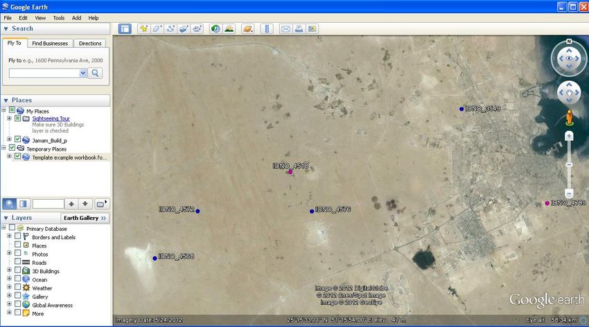
MSF-OCA GIS Toolkit

Figure 12: Spreadsheet of cholera treatment centres (CTCs) in Haiti

Input this file (CTCs in Haiti.xls) into Joekit. Verify that Joekit has selected the
correct columns for latitude, longitude and name in the drop-down lists, we can
check the box “Variable Icon Sizes” and for ‘Choose the column whose contents will
determine icon size’ we select the column “# lits” (number of beds).

How can I change the appearance of the dots and labels?

The dots are too big
If we click the ‘preview’ button the dots are large and difficult to distinguish (Figure
13).

                                                                                     10
MSF-OCA GIS Toolkit
Select variable icon sizes
Select column to determine icon size
Increase or decrease icon size
Figure 13: Variable icon sizes to represent the relative sizes of spreadsheet data
For ‘Specify an adjustment factor for icon size’ type 0.1000 (ten times smaller) and
click the ‘preview’ button. We can now see the individual Cholera Treatment Centres
(Figure 14). Note for very large numbers you can select the log scale box.
Figure 14: Adjusting the icon sizes using the adjustment factor
11MSF-OCA GIS Toolkit
If we click the ‘Create KML’ button and open the resulting map in Google Earth, we
can see the coverage of Cholera Treatment Centres in Haiti (Figure 15). The more
beds the bigger the dot.
Figure 15: Cholera Treatment Centre coverage in Haiti using Google Earth
How can I see additional information for each dot
By clicking on any dot, we can see all of the information that was in the spreadsheet
row for that particular CTC (Figure 16).
12MSF-OCA GIS Toolkit
Figure 16: Information window for each data point displayed in Google Earth
I want to change the labels of the dots
In addition we can edit the colour and size of the labels. Click on the label colour
button in Joekit and select a colour from the panel. Sample text is indicated below
the panel (note the labels do not appear in the preview window with the dots but
only when the KML file is opened in Google Earth).
Similarly the label sizes can be varied in the ‘label size’ window (note there is no
maximum size, there are no units and the sizes are dependent on the computer and
Google Earth settings).
To remove labels, deselect the label points checkbox
13MSF-OCA GIS Toolkit
Figure 17: Change label colour and size
I want to change the shape of the dots
You can even use a different symbol (instead of the standard dot generated by
Joekit). Click on the ‘icon file’ button and select the file ‘MSF logo without text.png’
(almost any image file can be used here). The default icon file is
http://maps.google.com/mapfiles/kml/shapes/shaded_dot.png which all Google
Earth programs can access. Open the resulting KML file in Google Earth (note if you
already have the previous map open in Google Earth, you can click on ‘File’ and then
‘Revert’ in Google Earth to refresh the map with the new data. The CTCs should now
appear with the MSF icon (These were not all MSF CTCs. This is simply an exercise).
14MSF-OCA GIS Toolkit
Figure 18: Altering the icon type
If you wish to email a ‘.kml’ file in which you have changed the icon, you will need to
save the file as a file with the extension ‘.kmz’ in Google Earth (File→Save→Save
place as). You can then send this file in which the new icon is embedded.
I want to change the colours of the dots
You can even use different colours to represent different types or values in your
data. Reopen Joekit and input ‘Template example workbook for Joekit.xls’ verifying
that Joekit has selected the correct columns for latitude (‘Lat’), longitude (‘Long’)
and name (‘Name’) in the drop-down lists.
Check the ‘Variable icon colours’ box. For a variable with two categories you can
choose a colour for each. For the drop down box ‘Choose the column whose contents
will determine icon colour’ select the variable ‘sex’. The min, mid and max values
will automatically choose 1, 1.5 and 2 respectively. If not, select these values. Click
the ‘Default icon colour’ and select a colour from the panel (the colour for males). Do
the same for the ‘Max icon colour’ (the colour for females). The ‘Mid icon colour’ is
not important for this example (but the value must lie between the min and max).
Click ‘Create KML’ and view in Google Earth (Figure 19).
15MSF-OCA GIS Toolkit
Figure 19: Using different colours for binary categorical variables (sex)
For a continuous variable you can vary the icon colour through a range. For example
for the drop down box ‘Choose the column whose contents will determine icon
colour’ select the variable ‘age’. For the min, mid and max values choose 0, 5 and 15
respectively. Click the ‘Default icon colour’ and select a colour from the panel (e.g.
red). Do the same for the ‘Mid icon colour’ (e.g. yellow) and the ‘Max icon colour’ (e.g
blue). The icon colours will vary between these colours according to the age value.
Create KML and view the different age groups in Google Earth (Figure 20). The
selection of colours and value cut-offs can be quite tricky so consider creating
categorical data (e.g. age groups) instead.
16MSF-OCA GIS Toolkit
Figure 20: Varying icon colour with variable values (age)
For a variable for which you already have categories, Joekit will automatically assign
a colour to each value. For example select the categories checkbox and for the drop
down box ‘Choose the column whose contents will determine icon colour’ select the
variable ‘outcome’. A window appears with the automatic icon colours. Create KML
and view the different outcomes in Google Earth (Figure 21). You could also select
age group as a category instead of using age as a continuous variable.
17MSF-OCA GIS Toolkit
Figure 21: Representation of categorical data by icon colour (outcome)
I want to add a legend to the map
To add a legend, please select the legend checkbox. The automatic legend will
appear as a pop-up window in Joekit. Create KML and view the automatic legend in
Google Earth (Figure 22). Note the legend option only works for variable icon
colours not variable icon size. An automatic folder called ‘files’ is created in the same
location as the spreadsheet containing the legend image file (legend.png).
18MSF-OCA GIS Toolkit
Figure 22: Automatic legend for categorical data created by Joekit for Google Earth
Animation
Joekit will also create time series animations of your spreadsheet data.
For the cholera example, check the ‘Animate’ box and for the drop down box ‘Start
date column’ and ‘End date column’ select Date. Deselect the “no end dates” box if
there is only a start date for the data. If you wish to observe the data daily, select the
‘No end date, just this many days per item’ checkbox and choose 1 day. For weekly
data, choose 7 days etc . You may wish to deselect the ‘variable icon colours’ box so
that all patients are a single dot colour.
19MSF-OCA GIS Toolkit
Select animate
Select no end date
Choose daily (1) or weekly (7)
Figure 23: Animation options in Joekit
‘Click ‘Create KML’ and view the time series animation in Google Earth. To play the
time-series movie, please see the Guide to Google Earth in the GIS Toolkit.
Figure 24: Time-series animation of cholera cases in Carrefour, Haiti
20MSF-OCA GIS Toolkit
You can also create animations with icon size and colour proportional to the
number of daily cholera cases per quartier. To do this, replace the gazetteer with
‘Carrefour Neighborhood Points.kml’. Check the box “Variable Icon Sizes” and for
‘Choose the column whose contents will determine icon size’ select the variable
“instances” (this does not exist as a column in the spreadsheet but simply tells Joekit
to apply the number of cholera cases per quartier to the icon size). In addition you
can vary the icon colour by checking the ‘Variable icon colours’ box. For the drop
down box ‘Choose the column whose contents will determine icon colour’ select the
variable ‘instances’. The min, mid and max values will automatically be chosen but
you can change these. Click the ‘Default icon colour’ and select a colour from the
panel (the colour indicating a low number of cases per quartier). Do the same for the
‘Mid icon colour’ (the colour indicating a moderate number of cholera cases per
quartier) and the ‘Max icon colour’ (the colour indicating a high number of cases per
quartier). Select animate (based on “Date”). Click ‘Create KML’ and view in Google
Earth (Figure 25).
Figure 25: Time-series movies with variable icon sizes and colours to distinguish quartiers with high
weekly numbers of cholera cases in Carrefour, Haiti
21MSF-OCA GIS Toolkit
Tallykit
What does a tally sheet look like?
A tally sheet usually merges line lists into daily or weekly data (Figure 26). Tally
sheets do not contain geographic coordinates as they merge many individual data
points. Therefore tally sheets will always need a gazetteer.
Figure 26: Tally sheet of weekly cholera cases in the Artibonite delta, Haiti
How to create maps from tally sheets?
1) Double-click the “Tallykit.jar” program to open it. The Tallykit display window
appears with a section for mapping options on the left and a preview window on
the right (Figure 27). Tallykit is much more straightforward to use than Joekit
and has a simpler display window.
22MSF-OCA GIS Toolkit
Figure 27: The Tallykit display window
2) Click the “Input” button at the top, and navigate to the spreadsheet file you wish
to map (please select ‘Artibonite tally sheet data.xls’).
3) Select the gazetteer ‘Communes Artibonite.kml’ and click on ‘Preview KML’. A
simple preview will appear in the window on the right.
4) Click ‘Create KML’ and double-click the resulting file (that will be called
‘Artibonite tally sheet data map.kml’ and found in the same folder as the tally
sheet).
5) Tally kit has automatically created a time-series of weekly cholera cases as
variable sized dots that can be viewed in Google Earth (Figure 28)
23MSF-OCA GIS Toolkit
Figure 28: Cholera cases in the Artibonite delta, Haiti presented as variable sized icons per commune per
week in a time series movie in Google Earth
24MSF-OCA GIS Toolkit
Frequently Asked Questions (FAQ)
Spreadsheet format
1. Joekit will also recognise some alternative column labels automatically:
a. Latitude = "lat", "latitude", "north" or "northing"
b. Longitude = "long", "longitude", "east" or "easting"
c. Names to link to gazetteer = "name", "id", "place name", "placename",
"address" or "location"
d. Names to use as default label = "name", "id", "label", "place name" or
"placename"
e. Size = "size"
f. Color = "color" or "colour"
g. Date (or start date) = "date", "start date", "startdate", "start", "begin",
"time" or "week"
h. End date = "end date", "enddate", "finish" or "end"
2. For the latitude and longitude columns, the negative sign (‘-‘) is important as
South (S) and West (W) labels cannot be read by Joekit
3. Spreadsheets should only have a single header row as Joekit cannot handle more
than 1 header row.
4. Dates should always be in the European format (dd/mm/yyyy). Epidemiological
weeks are not currently recognised so please ensure there is a date column
5. Potential errors. Joekit may not recognise data containing symbols, accents,
quotation marks and non-roman letters.
Joekit screen format
1. If the preview window disappears, simply click the ‘Preview KML’ button again
2. If the dots seem to disappear each time another window overlaps the Joekit
window, do not worry. This is a flaw seen on some PCs only but no data has been
lost. Simply click the ‘Preview KML’ button again
25MSF-OCA GIS Toolkit
3. If you are inputting different files into Joekit it can sometimes apply formatting
from a previous action or jam on a ‘please wait while I consider your request’
window. Simply close Joekit and reopen.
4. If you are inputting spreadsheets that do not require a gazetteer, please ensure
the box ‘Use a gazetteer, match locations from names in column’ is deselected,
otherwise Joekit will still ask for a gazetteer.
5. Remember for data that requires a polygon gazetteer, the dots generated are
‘jitterdots’ i.e. dots randomly located within the ‘placename’ polygon. They DO
NOT indicate the exact location of the patients or spreadsheet data.
Google Earth formatting
1. If, after viewing your data in Google Earth, you wish to make changes to the
formatting of that data (e.g. icon or label sizes), make the changes in Joekit, click
the ‘Create KML’ button and instead of double-clicking on the new KML file, in
Google Earth (which is currently displaying the old KML file) go to File→Revert
and the newly formatted data will appear
26You can also read