Tutorial: Background and Guidance for Using the ANSI/IES TM-30 Method for Evaluating Light Source Color Rendition
←
→
Page content transcription
If your browser does not render page correctly, please read the page content below
Tutorial: Background and Guidance for Using the
ANSI/IES TM-30 Method for Evaluating Light
Source Color Rendition
Michael P Royer1,2

1
 Pacific Northwest National Laboratory
620 SW 5th Avenue, Suite 810
Portland, OR 97204
michael.royer@pnnl.gov
Oregon State University
2

School of Civil and Construction Engineering

This is an archival copy of an article published in Leukos. Please cite as:
Royer M. 2021. Tutorial: Background and Guidance for Using the ANSI/IES TM-30 Method for Evaluating
Light Source Color Rendition. Leukos; Online before print. DOI: 10.1080/15502724.2020.1860771
Abstract
This tutorial article provides a comprehensive overview of the development and use of ANSI/IES TM-30-20,
an American National Standard method for evaluating light source color rendition that is published by the
Illuminating Engineering Society. Five years since its initial publication, TM-30 is increasingly used by lighting
producers, specifiers, and researchers due to its superior accuracy and the expanded scope of provided
information compared to predecessor tools for assessing color rendition. Making the most of these
improvements requires people who use the method to be more knowledgeable and intentional, and this
tutorial consolidates a range of information to assist with best practices. The article, arranged as a series of
questions, includes information about the development of the standard, color rendering fundamentals, TM-
30 measures and their meaning, TM-30 calculation details, and application of TM-30. The document does
not provide instructions for performing TM-30 calculations, which is the purpose of the ANSI/IES TM-30-20
standard, which is freely available.

Keywords
TM-30, Color Rendering, Color Perception, Color Preference, CRI

Learning Outcomes:
After studying this article, it is anticipated that the reader will:

    1. understand how TM-30 was developed and how it has evolved over time;
    2. have basic conceptual knowledge of color rendition as an important part of lighting quality,
       including how different aspects of color rendition—such as color fidelity, gamut area, and gamut
       shape—can be summarized and communicated;
    3. be able to describe the components of the core calculation framework of TM-30 and how the
       system is used to calculate a variety of outputs of the method;
    4. know the correct interpretation of values for the 149 numerical output measures and 1 graphic
       defined in the standard;
    5. know what is and is not included in the standardized method and understand how the principles can
       be applied to a unique or custom situation;
    6. feel confident in applying TM-30 to specify the performance characteristics of a light source;
    7. understand how TM-30 differs from alternative methods, particularly the CIE General Color
       Rendering Index, Ra (CRI).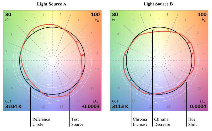
1. Introduction
  ANSI/IES TM-30-20 [IES 2020], commonly called TM-30, documents a method for evaluating light source
  color rendition that was developed by the Illuminating Engineering Society (IES) following American National
  Standards Institute (ANSI) procedures. The voluntary standard specifies a calculation framework that leads
  to numerous measures and graphics that can be used together to evaluate and communicate a light source’s
  color rendition properties. It also includes recommendations for using the method to create specification
  criteria and guidance for reporting calculated data.

  Color rendition, or the influence of a light source on the color appearance of objects and surfaces, is an
  important part of lighting quality that arises from the spectrum of the emitted light, which is reflected by
  surfaces and processed by the human visual system. Poor color rendition can make the colors of objects look
  unpleasant or distorted, reducing environmental satisfaction and potentially influencing task performance.
  Importantly, luminous efficacy—another attribute dependent on a light source’s spectrum—is maximized
  with very poor color rendition. Thus, all light source development must balance color rendition with
  competing performance characteristics, making accurate and thorough quantification of color rendition
  critical to optimization of performance and energy use.

  Attempts to quantify the color rendition performance of light sources began in the 1930s with the
  introduction of fluorescent lamps, which had a different spectrum than the incandescent lamps that were
  then predominant. Following an earlier recommendation called the spectral bands method [CIE 1948], the
  International Commission on Illumination (CIE) standardized the Method of Measuring and Specifying Colour
  Rendering Properties of Lighting Sources, identified as document 13 in 1965. The method was updated soon
  after as CIE 13.2 in 1974 and republished without change as CIE 13.3 in 1995 [CIE 1995]. The CIE 13.3
  method includes the General Color Rendering Index Ra, colloquially referred to as CRI, and a set of 14 Special
  Color Rendering Indices, Ri, for which the subscript indicates one of 14 color samples. The method is
  narrowly focused on color fidelity—simplistic by modern standards—but was sufficient for distinguishing
  between the limited number of light sources available at the time, and so it was widely used for commercial
  purposes.

  Beginning in the 1970s, researchers from all over the world developed dozens of alternatives that better
  characterized various aspects of color rendition in ways that were more rooted in human perception, but
  the conflicting interests of scientific accuracy and commercial expediency thwarted many attempts to reach
  consensus within the CIE to recommend a new standard method [CIE 1999; Pointer 2004; Sandor and
  Schanda 2006]. The onset of the solid-state lighting era in the 2000s brought renewed interest in the topic
  and increased motivation to standardize better methods for evaluating light source color rendition. This
  situation ultimately led the IES to pursue standardization of a new method for evaluating light source color
  rendition. The initial development of TM-30, occurring in 2013 and 2014, was a consensus-driven endeavor
  of the IES Color Committee to synthesize multiple related research efforts and combine existing ideas into a
  single, cohesive system of objective information recommended for use in specifying and rating color
  rendition performance. ANSI/IES TM-30-20 is the latest iteration of the standard.

  TM-30 is a culmination—but not the end—of decades of work to develop better methods to evaluate light
  source color rendition. It remedies flaws and limitations of the older CIE 13.3 method (CRI), providing both
  more accurate and more comprehensive information that better meets the needs of lighting manufacturers,
  specifiers, researchers, and users in the era of solid-state lighting. TM-30 is now widely used and is the
recommended method of the IES [2018] but efforts continue to educate members of the lighting community
  on how to make the most of the method. This document consolidates basic information about TM-30, which
  is arranged as a set of frequently asked questions grouped in six categories: development of the TM-30
  standard, color rendering fundamentals, TM-30 measures and their meaning, TM-30 calculation
  considerations, and application of TM-30.

2. Development of the TM-30 Standard
  This section provides background information on the development of TM-30: who, what, how, when, and
  why.

  2.1 What is TM-30?
  ANSI/IES TM-30-20 is a voluntary standard document—part of the IES technical memorandum (TM) series—
  that describes the IES recommended method for evaluating light source color rendition (see Section 3.1 for
  more background on color rendition). The document specifies:

  1. A core calculation framework—which consists of a model of color perception, a representative set of
     surface colors (defined as spectral reflectance functions), and defined reference conditions—that is used
     to determine color shifts (the difference between the test and reference conditions) given the input of a
     light source’s spectral power distribution (SPD), defined as the relative amount of energy a light source
     emits at each wavelength.
  2. Ways to summarize the color shifts with outputs consisting of numerical measures and graphics that
     complement one another and provide a comprehensive prediction of how the light source will influence
     the color appearance of objects in an architectural environment.
  3. Recommendations for how to present the calculated information.
  4. Recommendations for how to use the numerical measures to establish color rendition specification
     criteria that help ensure that the calculated color rendition performance is appropriate for achieving a
     desired effect and meeting the needs of occupants.

  2.2 When was TM-30 developed?
  The development of TM-30 began in 2013 and the first version of the standard, IES TM-30-15, was published
  in 2015. An update was published in 2018 to harmonize the document with CIE 224:2017 [CIE 2017], which
  adopted the TM-30 calculation framework with minor modifications but only addressed part of the output.
  The 2018 update, during which TM-30 became an American National Standard, included three mostly
  inconsequential technical changes [Royer 2017b; IES 2020] while providing additional detail on many of the
  measures and graphics specified in the document. ANSI/IES TM-30-18 also added Annex D, covering
  recommended layouts for specification material. Annex E and Annex F, establishing methods and
  recommendations for TM-30-based specification criteria, were added in 2019. The document was
  republished as ANSI/IES TM-30-20 in 2020, with no changes to the technical content. Refer to Section 6.1 for
  additional discussion of the differences between the versions. A timeline of the development process is
  provided in Figure 1.

  2.3 Who developed TM-30?
  IES TM-30-15 was drafted by the Color Metrics Task Group of the IES Color Committee, with the underlying
  details the result of decades of work by dozens of lighting researchers. The Task Group was comprised of
  seven voting members with backgrounds in lighting research, production, or specification. The full IES Color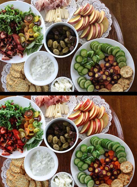
Figure 1. Timeline of the development of TM-30. †Modified to align core calculation framework with CIE 224:2017. ‡No technical
changes (republication with IES online lighting library).

Committee has handled all revisions and additions to the document directly. The IES Color Committee
follows ANSI guidelines that define the balance of interest groups (e.g., producers, researchers, users,
government) and geographic considerations, as well as procedures for balloting and developing consensus
documents.

2.4 Why was TM-30 developed?
The incumbent color rendering metric that has been widely used in the lighting industry, CRI, has existed for
more than 50 years. Although it served a vital purpose, its limitations have been widely recognized by
researchers, specifiers, and even the CIE [CIE 1995; van Trigt 1999; CIE 2007; Davis and Ohno 2009; Davis
and Ohno 2010; de Beer et al. 2015; David et al. 2015; Houser et al. 2016; CIE 2017]. By 2013, dozens of new
metrics for evaluating light source color rendition had been developed, but none was adopted by the CIE—
despite decades of committees focused on replacing CRI. A key divide, dating to at least the 1990s and
perhaps the 1980s, was the competing desires of scientific accuracy and commercial expediency (or
reluctance to change) [CIE 1999; Pointer 2004; Sandor and Schanda 2006].

Two classes of deficiencies with CRI and the broader CIE 13.3 method have been identified over decades of
investigation. First, the underlying calculation framework—never updated despite advances in color
science—relies on an inaccurate model of color vision that is officially considered obsolete by the CIE [2018]
and a small set of color samples that are not capable of capturing the full effect of a light source. Second, CRI
and the broader CIE 13.3 method only attempt to address color fidelity (see Section 3.8). Measures of
average color fidelity do not convey how different colors change in appearance or distinguish between
desirable and undesirable changes to color appearance, as was recognized even when CIE 13.2 was
published in 1974. Combined, these technical and breadth deficiencies became an impediment to the
development and specification of more efficient and higher quality solid-state lighting devices. When
performance ratings do not match visual assessments, and when performance is not accurately
distinguished by specification criteria, it creates unnecessary challenges for lighting producers and specifiers.
TM-30 was developed to address this situation and provide a practical solution to a decades-old issue,
enabling higher-quality lighting and reducing energy use.

2.5 How was TM-30 developed?
With the issues to be addressed identified (Section 2.4), the plan of the working group was to establish the
core calculation framework based on the latest color science research and then establish a suite of measures
derived from the calculation framework to address various aspects of color appearance. The first step was to
examine and synthesize the research of numerous other groups—the novelty of the method lies primarily in
the combination of ideas, rather than any one aspect. Among other details, the group examined the
performance of available models of color vision [Luo et al. 2006; Sandor and Schanda 2006; Luo et al. 2015;
Smet et al. 2015c; Xu et al. 2016; Gu et al. 2017; Royer 2017b; Jost et al. 2018; Royer 2018; Wei et al. 2019]
and the effect of the quantity and type of color samples [Davis and Ohno 2010; Whitehead and Mossman
2012; David 2013; Smet et al. 2013; Smet et al. 2015c; Smet et al. 2016b; Royer 2017b; Royer 2018]. In each
case, the best available options were merged into the core calculation framework of TM-30, with each
decision made via consensus vote. More details are provided in Section 4. The various outputs of TM-30
were also informed by existing approaches, with the goal of providing as much information as possible. Each
output is described further in Section 5.

With the initial publication of TM-30-15, the method only specified how to perform the calculations to
determine the outputs and excluded any guidance on what performance thresholds should be set.
Intentionally, the method focused on establishing a vocabulary of quantifications that could be used to
perform psychophysical experiments, as well as benchmark existing and future products, all while providing
an opportunity for users to test the method. With new experimental evidence, it was possible for
specification guidance to be formalized in 2019, when Annex E and Annex F were added to TM-30. This
guidance again followed the consensus process, utilizing data, experience, and negotiation to establish a
system suitable for a wide range of users. More information is provided in Section 7.

2.6 Who are the intended users of TM-30?
TM-30 was developed for the benefit of lighting producers, specifiers, researchers, and users. It is intended
to be used in all situations where quantification of color rendition is necessary. This includes companies
working to engineer and produce lighting equipment, people specifying lighting equipment, organizations or
government agencies setting performance standards, researchers conducting experiments, and end users
trying to select a lighting product.

2.7 Is TM-30 approved by the CIE?
TM-30 was developed by the IES. IES documents are analogous to CIE documents, and either can be
developed as, or incorporated into, national or international standards like those of ANSI or ISO
(International Standards Organization).

CIE 224:2017 and ANSI/IES TM-30-20 share the same core calculation framework, meaning there is one such
framework recognized as scientifically accurate by both organizations. As of 2020, CIE has only adopted the
Fidelity Index (Rf), described in Section 5.3, for accurate scientific use and has been unable to agree on one
or more characterizations of color rendition focused on aspects other than color fidelity, or make any new
recommendations for lighting practice. CIE Technical Committee 1-90 has been attempting to address
measures beyond color fidelity for more than eight years, but is not expected to formally endorse any
method, leaving the choice up to users.

2.8 Does TM-30 replace CRI?
ANSI/IES TM-30 and CRI, as defined in CIE 13.3-1995, are published by different organizations and therefore
one cannot officially replace the other. What becomes the predominant method for rating the performance
of lighting products and specifying color rendition characteristics is ultimately up to the broader lighting
community. Neither are mandatory standards themselves, but they may be included in mandatory or
voluntary standards established by governments or other organizations.
TM-30 includes a measure, Rf (see Section 5.3), that is analogous to CRI in that both are intended to be
  measures of average color fidelity (see Section 5.4 for a detailed comparison). The IES recommends that
  users transition from CRI to Rf [IES 2018]. Simultaneously, it is important to understand that TM-30 goes far
  beyond color fidelity to convey important information that should be considered in most lighting
  applications.

  2.9 How is TM-30 being used today?
  TM-30 has been used by lighting producers to engineer new light sources, by energy efficiency and
  government organizations to establish specifications for color rendition performance (see Section 7.9), by
  lighting specifiers to choose products, and by researchers to investigate visual assessments of color
  rendition qualities. TM-30 is supported by a wide range of users [Ashdown et al. 2015], and is expected to
  increase its reach and use in the coming years [Boyce and Stampfli 2019].

  2.10 Will TM-30 continue to evolve over time?
  It is expected that TM-30 will evolve over time. This may include the addition of new output measures
  derived from the same calculation framework or updates to the underlying calculation framework as other
  branches of color science advance. For example, a new metric based on the TM-30 calculation framework,
  the Metameric Uncertainty Index (Rt), was recently proposed [David et al. 2019], and new models of color
  vision have been established [Li et al. 2017]. For now, there is no recommended notation system to indicate
  the specific version used in calculation, partially because changes to values with the revisions have been
  minimal and generally in the positive direction.

3. Color Rendering Fundamentals
  This section provides a brief overview of the basics of color science that are pertinent to color rendition. For
  more background, see David, Smet, and Whitehead [2019b] or Houser et al. [2016]. Additional background
  and historical record is provided by Wyszecki and Stiles [1982].

  3.1 What is color rendering?
  Objects or surfaces do not have an inherent color, but rather reflect different proportions of energy over the
  visible spectrum. When the spectrum emitted by a light source changes, the light reflecting off a surface (the
  visual stimulus reaching the eye) also changes, which alters how the stimulus is interpreted by the brain.
  Figures 2 and 3 provide two examples of how color rendition can influence appearance using digitally
  manipulated images that simulate real color rendition conditions. Officially, the IES and CIE define color
  rendering as the “effect of an illuminant on the color appearance of objects by conscious or subconscious
  comparison with their color appearance under a reference illuminant.” CIE also defines color rendition as
  the “effect of an illuminant spectral power distribution on the color appearance of objects” [CIE 2017],
  which provides a less restrictive definition, even though rendering and rendition are typically considered
  synonyms.

  Methods for evaluating color rendition are used by producers to assign quantitative ratings to light sources
  and by specifiers to establish suitable performance for a given installation. They utilize standardized
  parameters to facilitate comparison while predicting performance in unknown real settings. Methods for
  evaluating color rendition are a way to communicate performance without visually assessing every product-
  application combination. Although some alternative approaches exist, methods for evaluating light source
  color rendition typically rely on three fundamental components:
1. a standardized model of average human color vision,
    2. a set of standardized color samples,
    3. and a scheme to define a reference(s) to which calculated colors for a given test light source can be
       compared.

In this way, color rendition can be determined purely mathematically, even if it is a simplification of a more
complex issue. In order to establish color rendition as a property of a light source, it must be disassociated
from a specific scene and viewer. That is, methods for evaluating light source color rendition predict the
influence of a light source without knowledge of the specific objects that will be illuminated or their
arrangement. Some known phenomena that influence the appearance of objects, such as the surrounding
field, are held constant across calculations so that they are effectively unaccounted for. Likewise, the
intensity of the light (that is, the illuminance or luminance) is disregarded in existing methods, although it
can strongly influence color appearance [Hunt 1952; Bao and Wei 2019; Kawashima and Ohno 2019; Wei et
al. 2020] and has potential to be integrated into specification criteria or more advanced methods. While
methods for evaluating light source color rendition play an important role in the lighting industry, it is
important to remember that they are not calculations of how a specific room or object will appear, but
rather an educated prediction. To understand the color appearance of a specific object in a specific viewing
condition, a color appearance model is used, as covered by Fairchild [2013].

Methods for evaluating light source color rendition can focus on one or more aspects of color rendition,
including color fidelity, gamut area, color naturalness, color preference, color vividness, chroma shifts, or
hue shifts, each of which is described in subsequent sections. There are different approaches that can be
taken to quantify some of these concepts. For more background information on previously proposed
measures of color rendition, see Guo and Houser [2004], Pointer [2004], Davis and Ohno [2009], or Houser
et al. [2013].

      Figure 2. Theoretical illustration of the effect of color rendition on human complexion. Variations in wood tone are
      also notable.

3.2 Why is color rendition important?
Color rendition, particularly its accurate quantification, is important because it can influence occupant
wellbeing, task performance, and energy efficiency. Varying color rendition has been demonstrated to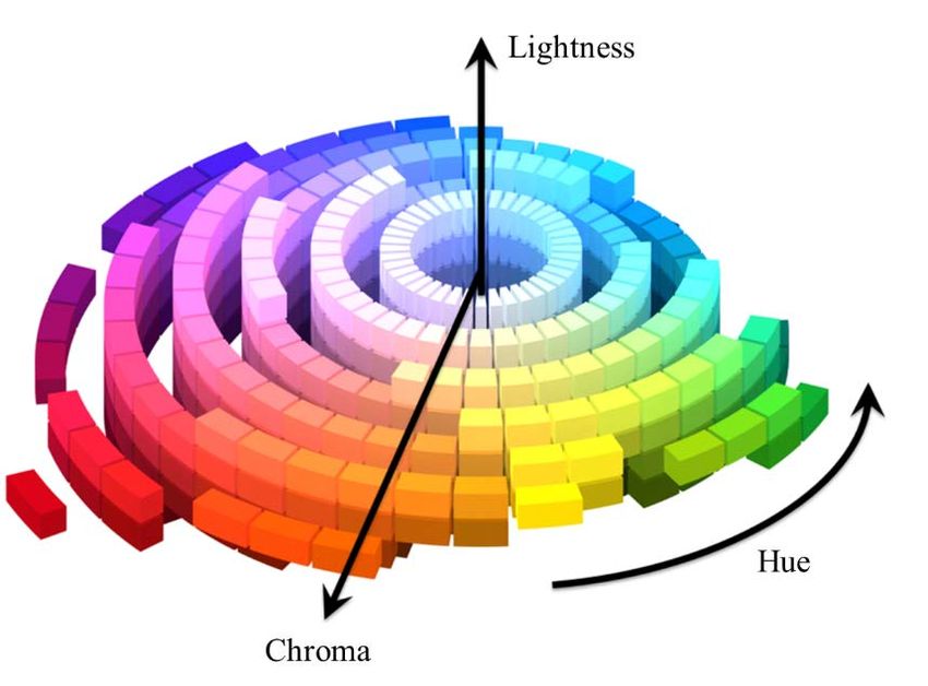
influence the acceptability of an illuminated
environment [e.g., Royer et al. 2018c; Royer et al.
2019d]. Other research has linked environmental
satisfaction with productivity [e.g., Veitch et al. 2008;
Veitch et al. 2011].

Fundamentally, delivering appropriate color
rendition is at odds with maximizing luminous
efficacy. Maximizing lumen output suggests
maximizing energy around 555 nm (nominally green-
yellow light), but a light source optimized for
luminous efficacy alone is unsuitable for almost all
visual tasks and uncomfortable for habitation—an
example is the low-pressure sodium lamp.
Establishing minimum performance thresholds for
color rendition helps to balance lighting quality with
energy efficiency, ensuring the light is appropriate
for the tasks to be performed by providing color
contrast, enabling object identification, and creating
a pleasant and comfortable environment to occupy.
These characteristics ultimately can help energy-
efficient technologies to reduce energy use by
increasing their acceptance and use. Without
                                                            Figure 3. Illustration of the effect of color rendition on food.
accurate methods for evaluating color rendition,
assessing tradeoffs between color rendition and
energy efficiency, or other performance
characteristics, is more difficult and can result in non-optimized solutions that do not maximize the benefit
delivered per Watt.

3.3 What are chromaticity, CCT, and Duv?
Chromaticity is a numerical specification of color, regardless of luminance (brightness), and is defined as part
of the CIE system of colorimetry [CIE 2018; David et al. 2019b]. Its primary use is to determine if the light
from two or more sources match in appearance. When two spectra have the same chromaticity coordinates,
are of equal luminance, and are viewed under identical conditions, their perceived color is predicted to
match; however, chromaticity does not take into account the adaptive processes of the eye-brain system
that make color vision non-linear and context-dependent. For example, the light emitted by an incandescent
lamp can appear white when viewed alone, but yellowish when viewed simultaneously with midday
daylight. Importantly, two light sources with the same chromaticity—which are called metamers—may have
different spectral power distributions, and therefore render object colors differently.

Correlated color temperature (CCT) is calculated as the color temperature of the Planckian radiator nearest
the chromaticity coordinates of the test source. It is calculated in the CIE 1960 (u, v) chromaticity diagram,
which is a legacy of when it was developed as measure [Robertson 1968]. It indicates whether the apparent
color is warmer (lower CCT) or cooler (higher CCT). For interior architectural lighting applications, sources
typically range between 2700 K and 6500 K. Importantly, two light sources with the same CCT can have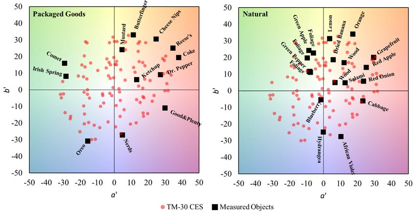
different chromaticities and not match in appearance, as illustrated in Figure 4. This is addressed with a
complimentary measure called Duv, which is a measure of the distance between the chromaticity of the light
source and that of the nearest Planckian radiator in the CIE 1960 (u, v) chromaticity diagram [Ohno 2013]—
the same Planckian radiator used to calculate CCT. Duv conveys the relative greenness (more positive values)
or pinkness (more negative values) of the light. CCT and Duv provide a complete specification of chromaticity,
with axes that are more closely linked to a visual perception.

        Figure 4. CCT and Duv in the 1960 (u, v) chromaticity diagram. All points along each of the lines perpendicular
        to the Planckian locus (dashed line) have the same CCT. Colored background for illustration only.

3.4 How is color vision modelled for the purpose of evaluating color rendition?
One of the most consequential components of a framework to evaluate light source color rendition is the
model of color vision, or the mathematical system that characterizes how humans see color. Although there
is considerable variation in color vision from person to person [Asano et al. 2014, 2016, 2016b; Murdoch and
Fairchild 2019], like other lighting characterizations a single average representation is used to evaluate color
rendition. The overall model has several important components, including color matching functions, a
mechanism to account for the adaptation of the visual system to different illumination (chromatic
adaptation), and a projective transformation and system of equations that establish a three-dimensional
coordinate system that intends to accurately describe perceived color differences.

Color matching functions are a way to represent the sensitivity of the human visual system; they can be
derived from psychophysical experiments and are also a linear transformation of the spectral sensitivity of
the three cone photoreceptors in the eye that are responsible for color vision. The set of three functions is
known as a Standard Colorimetric Observer [CIE 2018]. Color matching functions are used to calculate
tristimulus values by integrating the product of each function and the spectral power distribution of the
stimulus. The tristimulus values are then input to the remainder of the color vision model. The CIE has
standardized four sets of color matching functions: 1931 2°, 1964 10°, 2015 2°, and 2015 10° [CIE 2006; CIE
2015; CIE 2018]. They differ slightly based on the method and data used for derivation and the field of view
that they quantify. The 1931 2° color matching functions are the accepted standard for calculating
chromaticity, although proposals have been made to change this, and other methods, such as TM-30, use
alternatives (see Section 4).
One important visual phenomenon that must be addressed in methods for evaluating light source color
rendition is chromatic adaptation. Chromatic adaptation is the process by which the visual system attempts
to adapt to the color of the light to make it appear white and facilitate color constancy, whereby object
colors generally maintain their appearance across a wide range of illumination to assist with object
identification and evaluation [Smithson 2005; Foster 2011]. Color rendition is sometimes considered the
breakdown of color constancy, when the shifts exceed what the human visual system is capable of adapting
away. This occurs at least in part because the visual system features three broadband color detectors, and
therefore cannot distinguish individual wavelengths.
The final key component is the definition of the color coordinates that are derived from tristimulus values,
which determines the color space. As shown in Figure 5, the range of possible coordinates in a color space
forms a three-dimensional volume, which is described further in Section 3.7. Numerous such color spaces—
which are often optimized based on a specific set of color matching functions and have a native chromatic
adaptation transformation—have been standardized, including CIE U*V*W* (now deemed obsolete) [CIE
2018], CIE LAB [CIE 2018], and CAM02-UCS [Luo et al. 2006; CIE 2018]. More background is available from
Fairchild [2013]. New color spaces continue to be proposed, including CAM16-UCS [Li et al. 2017]. An
important, or perhaps defining, characteristic of a color space is its uniformity. Uniformity means that any
given Euclidian distance in the color space corresponds to the same degree of perceived color difference—
Luo et al. [2006] provided comparisons of different color spaces. Color difference spaces are typically
derived from and tested against extensive sets of data from psychophysical experiments, where participants
evaluated the magnitude of difference between two color samples. As explained by Smet, David, and
Whitehead [2015c] color space uniformity is important for accurately characterizing color rendition.
3.5 What are color samples?
Almost all methods for evaluating light source color
rendition are based on “color samples.” For the purpose
of color rendition calculations, these samples are not
physical specimens, but rather spectral reflectance
functions—defined as the percentage of light reflected
at each wavelength over the visible range—for
measured real or theoretical objects. Figure 6 illustrates
a measured object, a spectral reflectance function, and
a digitally rendered color swatch based on an estimated
appearance. Note that spectral reflectance functions,
and thus rendered swatches, have a uniform color,
which is based on the average spectral reflectance over
a small area; thus, they are a limited representation of
Figure 5. Illustration of the theoretical volume of visible
specific objects, for which color is often varied over the colors.Figure 6. A real object, a color swatch representing that object (an average of the color over a
small area), and a spectral reflectance function for the color swatch.
surface. The use of spectral reflectance functions allows color rendition to be repeatably calculated from a
spectral power distribution, without the need for visual evaluation or physical measurement of illuminated
swatches or objects.
The concept of using color samples to evaluate color rendition dates to at least the 1950s [Jerome and Judd
1953; Nickerson 1958, 1960; Ouweltjes 1960]; attempts prior to that focused on the amount of energy
within regions of the visible spectrum [Bouma 1937; CIE 1948; Winch and Ruff 1951; Barnes 1957]. At that
time, the color samples were chosen from the Munsell library so they physically existed and could be used
for visual evaluation too—visual experiments informed development of new methods and metrics. While
having physical color samples was important in the past for method development and validation, today
there is considerably more data available that support color space uniformity, so color rendition methods
can rely directly on the accuracy of the models, eliminating the need to have physically reproducible
samples.
Over time, considerable effort has been made to develop new sets of color samples by varying the quantity
or type of color samples [Opstelten 1980; Seim 1985; Van Kemenade and Van der Burgt 1988; van der Burgt
and van Kemenade 2010; Davis and Ohno 2010; Smet et al. 2010; Zukauskas et al. 2010; Whitehead and
Mossman 2012; Smet et al. 2013; Vick and Allen 2014; Smet et al. 2015c], with the ultimate goal being a set
that is representative of the built environment. A challenge, however, is that the built environment cannot
be completely characterized because there is no reasonable way to determine the statistical distribution of
colors. Further complicating the choice of color samples is the fact that lighting products are used in a
variety of environments, which are themselves comprised of surfaces with different color characteristics.
Consequently, there will always be mismatch between the influence of a light source on the color
appearance of a set of standardized color samples used for the purpose of rating product performance and
the color appearance of objects in an environment where the product is installed [Royer and Wei 2017c].
Nonetheless, there are important theoretical goals that have been established to help ensure that the color
samples selected for a method provide the greatest value [Smet et al. 2015c]. These include sampling of the
complete range of possible colors with sufficient resolution, and consideration for the “features” of thespectral reflectance functions so that sensitivity to changes in spectral power are approximately even across the visible wavelengths. 3.6 What is a reference-based color rendering measure? Most methods for evaluating color rendition, including CIE 13.3 and IES TM-30, are based on comparing how colors are rendered by a light source in question to how they are rendered by a reference condition, which is usually a mathematically defined light source, known as an illuminant, having the same CCT as the test source [Royer 2016]. In other cases, the reference is a single illuminant for all light sources, or a small number of illuminants. Reference illuminants are usually either a CIE D Series illuminant or a Planckian radiator. CIE D Series illuminants [CIE 2018] are mathematical representations of daylight that are calculated with a formula given the input of a color temperature between 4000 and 25000 K. A Planckian radiator, also called a blackbody radiator, is calculated using a formula known as Planck’s law based on the temperature of a black body. Incandescent lamp filaments are a close approximation of a Planckian radiator. The CCT-matched (i.e., relative) reference-based approach allows color rendering to be considered independent of CCT, because chromatic adaptation mechanisms do not completely address difference in appearance induced by changes in CCT [Pointer 2004; Royer 2016]. For example, a 5000 K source may be too cool in appearance for the atmosphere of a home furnishings store, so it may not be appropriate to compare a 2700 K light source to a 5000 K reference illuminant. Fixed-reference measures often result in inherent differences in ratings for products of different CCTs. Whether or not these effects are perceived by humans, they can create confusion because different CCTs have different possible ranges. Importantly, depending on the features of the method, the role of the reference illuminant can vary. For methods that assign the maximum value to the reference illuminant, like CIE 13.3, the reference serves as the gold standard and takes on increased importance [Davis and Ohno 2009]. For methods that provide a combination of values that can be used to describe the deviation from the reference, the reference serves more as an anchor or guidepost than an ideal. In the latter case, it is important that the reference illuminant(s) represent a common experience that can be recalled from memory. One alternative to reference-based methods is to evaluate the spectral power distribution directly, as has been proposed several times in the distant and recent past [Bouma 1937; CIE 1948; Kirkpatrick 2004; Holm et al. 2016; Acosta et al. 2018]. Another option is to examine the range of colors that can be created, measured with an area or volume, which does not require a reference for the initial calculation but often utilizes a reference for scaling the output values to a specific range. For more background, see Davis and Ohno [2009] or Houser et al. [2013]. 3.7 What are the dimensions of perceived color? Three dimensions are needed to describe human perception of color, given its trichromatic nature, although the exact terms can vary based on the color description model. For example, colors may be classified using hue, saturation, value (HSV) or hue, chroma, lightness (HCL), among others. Figure 7 illustrates hue, chroma, and lightness in a discretized diagram. Hue is a more precise term for what one might call “color”; it is the differentiation among red, yellow, green, blue, and the shades in between. Hue is typically described as an angle of rotation in a polar coordinate system—this is called the hue angle. Lightness is the brightness of an area judged relative to a similarly
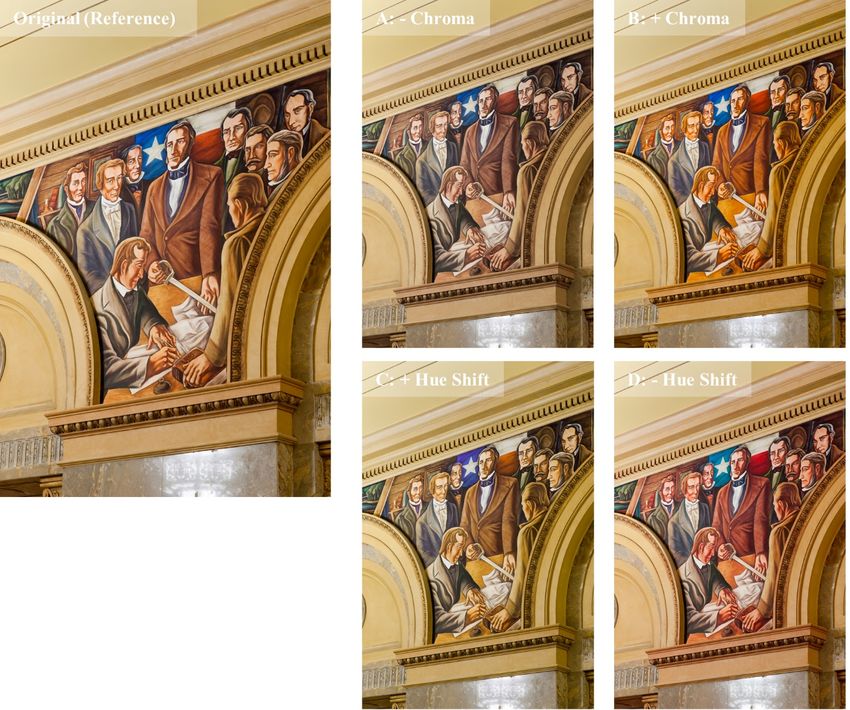
illuminated area that appears to be white.
Finally, chroma is defined as the
colorfulness of an area relative to a
similarly illuminated area that appears
white—it can be thought of as the
intensity of the color.

Changes to the color appearance of an
object in any direction can be
consequential. Some shifts in color can
influence object detection, either
enhancing or obscuring information about
an object, such as the ripeness of a fruit.
Other shifts can make a surface look old
and dull, as opposed to vibrant or vivid.
For any given color sample (or real object) Figure 7. Illustration of hue, chroma, and lightness.
the change in color appearance versus
the reference illuminant can be calculated in all three dimensions. The total magnitude of the color shift can
also be calculated.

Early concepts in color rendition focused on distilling all color shifts to a single number, discarding
information about the direction of the shifts. In the 1980s, several researchers proposed new methods
focused on describing, at least to some degree, the direction of color shifts, including Worthey [1982],
Pointer [1986; 2004], and van Kemenade and van der Burgt [Van Kemenade and Van der Burgt 1988; van
Kemenade and van der Burgt 1995; van der Burgt and van Kemenade 2010]. These ideas were later
expanded on by Zukauskus et al. [2009; 2010] and Davis and Ohno as part of the Color Quality Scale [2010].
TM-30 includes measures to describe the hue shift, chroma shift, and total magnitude of shift for color
samples with different hues: Local Hue Shift, Local Chroma Shift [Royer et al. 2018b], and Local Color
Fidelity, as described in Sections 5.7 to 5.9.

3.8 What is color fidelity?
Color fidelity refers to the degree of similarity between a color or colors rendered by a light source and a
reference Illuminant. Color fidelity describes only the magnitude of the color difference, not how the colors
are different. It is often formulated as an average, whereby the color differences for a set of color samples
are averaged to provide a single value characterizing the light source. For example, CRI (CIE General Color
Rendering Index Ra) is determined based on the average color difference for eight color samples. (The
average difference is multiplied by a scaling factor and subtracted from 100.)

Color fidelity, illustrated in Figure 8, is one of the older concepts in the field, originating in the 1950s and
standardized by the CIE in 1965. The benefit of calculating average color fidelity is the single number
facilitates easy product comparisons. Major downsides are that it does not convey the magnitude or
direction of any of the individual color shifts and that light sources with very different individual color shifts
can have the same average color fidelity value. CIE 13.3 states: “The importance of the directions of colour
shifts is recognized but not included in the Colour Rendering Indices” [CIE 1995].
Figure 8. Illustration of color fidelity. The images
  to the right all exhibit some form of color shift
  versus the reference. Given the approximately
  equal average magnitude of color shift, the
  altered images would all have the same average
  color fidelity. Original image courtesy of Randy
  Burkett Lighting Design.

Color fidelity has often been thought to characterize color naturalness and been used inappropriately as an
“overall color quality measure,” [CIE 2017] but most psychophysical experiments have found measures of
average color fidelity insufficient for these purposes. Nonetheless, characterizing color fidelity helps ensure
that colors are not too distorted compared to what we expect; if distortion is too great, the environment
may be uncomfortable or confusing. However, light sources with the same average color fidelity may make
surfaces appear vivid or dull, natural or unnatural, acceptable or unacceptable.

The color samples, color space, and reference illuminant scheme influence the accuracy and precision of
color fidelity measures, many variants of which have been proposed [Jerome 1974; Seim 1985; Pointer
1986; CIE 1999; Geisler-Moroder and Dur 2009; Zukauskas et al. 2009; Davis and Ohno 2010; Bodrogi et al.
2011; Smet et al. 2013; Smet et al. 2016b]. They also influence how applicable the results are to real
illuminated environments. For a systematic exploration of how these factors influence characterizations, see
articles from Royer [2016, 2017b].

Until the initial publication of TM-30 in 2015, CRI was the only standardized measure attempting to quantify
average color fidelity. TM-30 features a measure of average color fidelity, the Fidelity Index (Rf) (see Section
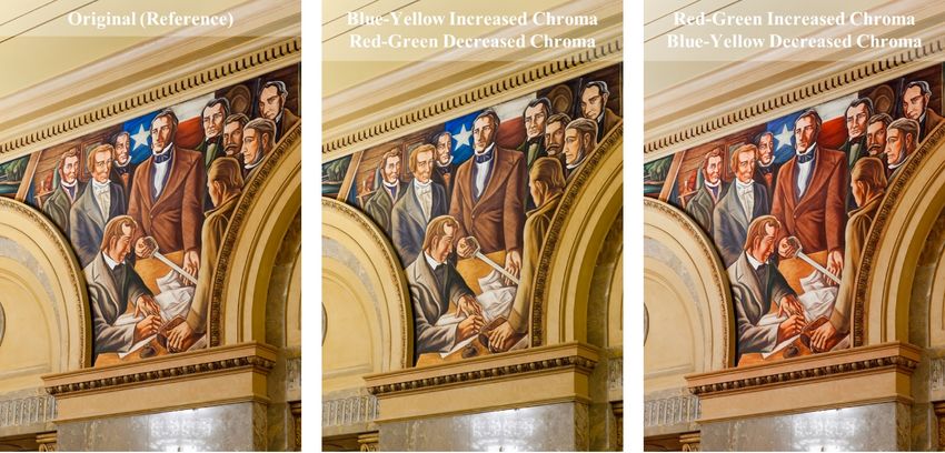
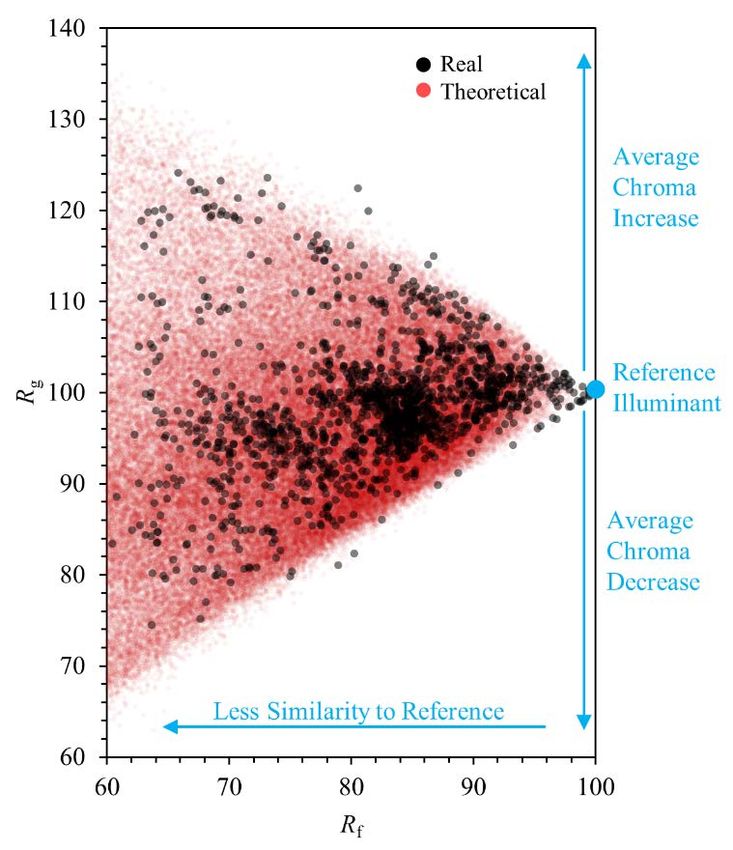
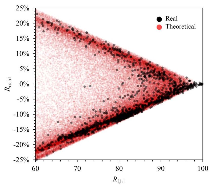
5.3), and specifies how to calculate color fidelity for each color sample (see Section 5.10) or small subsets of
samples grouped by hue angle (Local Color Fidelity) (see Section 5.9). Rf was also adopted by the CIE in 2017.

3.9 What is gamut area?
Gamut can mean different things depending on its specific use. In the printing and display industries, gamut
refers to the colors that can be created based on the inks or display primaries; that is, the points represent
primaries for color mixing. For color rendering measures, gamut refers to the area enclosed by the color
coordinates of a set of color samples and is unrelated to the number or range of visible colors. As with other
measures of color rendition, the behavior of the color samples is predictive of the effect of the light source
on real objects.

Unlike with print or display, there is no such thing as an object that cannot be rendered by a light source,
just various levels of difference in color appearance between the test and reference conditions. Gamut area
approximates the overall change in chroma: a larger area enclosed by the hue-chroma coordinates of a set
of color samples indicates an average increase in chroma across all hues. Given the nature of the calculation,
however, gamut area is not only influenced by changes in chroma, but also by hue shifts, especially when
large color shifts occur [Royer 2018]. Images A and B in Figure 8 illustrates the effect of decreasing or
increasing gamut area, respectively.

Gamut area can be a coarse indicator of vividness, and has also been linked to color discrimination
[Thornton 1972; Davis and Ohno 2009; Houser et al. 2013], visual clarity [Hashimoto and Nayatani 1994;
Hashimoto et al. 2007], and color preference [Hashimoto et al. 2007; Rea and Freyssinier-Nova 2008; Rea
and Freyssinier 2010; Liu et al. 2017]. Newer research has demonstrated that it can be insufficient to
completely describe these phenomena, however [Royer et al. 2017; Esposito and Houser 2017; Zhang et al.
2017; Esposito and Houser 2019]. Many light sources will increase the chroma compared to the reference
for some hues but decrease it for others, and these variations can lead to differences in perception. Figure 9
includes three images that illustrate potential color rendition conditions with equal gamut area resulting
from different shifts.

Although gamut area measures date to at least the 1970s, TM-30’s Gamut Index (Rg) is the only measure of
gamut area that is currently formalized by a lighting standards organization (see Section 5.5). Several other
measures, like the Color Discrimination Index (CDI) [Thornton 1972], Feelings of Contrast Index (FCI)
[Hashimoto and Nayatani 1994; Hashimoto et al. 2007], Gamut Area Index (GAI) [Rea and Freyssinier-Nova
2008], and Color Quality Scale Gamut Index (Qg) [Davis and Ohno 2010] have been proposed. Royer [2018]
provided a review of how different aspects of the calculation framework, including the color samples and
color space, influence quantification of gamut area.

Gamut area has been discussed as a complement to average color fidelity, and two-measure systems have
been described [Rea and Freyssinier-Nova 2008; Rea and Freyssinier 2010; Houser et al. 2013]. Whereas
color fidelity quantifies the magnitude of color shifts, gamut area partially quantifies the direction. However,
it has now been shown that light sources with the same average color fidelity and gamut area can be
perceived differently [e.g., Royer et al. 2016]. For complete characterization, more information is needed
about the color shifts for different hues than can be conveyed with two average values.

3.10 What is gamut shape?
As knowledge of the limitations of average measures of color rendition has grown among researchers, the
concept of gamut shape has become more prominent. Developed gradually since the late 1980s [van
Figure 9. Illustration of gamut area. These images were edited to theoretical show lighting with equal gamut area but appear
different because they have different color shifts for different hues. Original image courtesy of Randy Burkett Lighting Design.

Kemenade and van der Burgt 1988; van Kemenade and van der Burgt 1995; van der Burgt and van
Kemenade 2010; Davis and Ohno 2010; de Beer et al. 2015; David et al. 2015; Wei et al. 2017; Royer et al.
2018b; David et al. 2019], gamut shape refers to the pattern of hue and chroma shifts with changing hue—
that is, how do colors shifts vary with hue angle. It has often been captured pictorially rather than
numerically, although it has been demonstrated that the pattern can be fit with a polynomial equation, with
some variability overlaid [David, Esposito, et al. 2019]. Gamut shape is important because it distinguishes
between light sources with equal color fidelity and gamut area that render colors differently and can be
perceived differently. The center and right images in Figure 9 have opposing gamut shapes: the one in the
center shows increases in the chroma of blue and yellow objects relative to the reference on the left,
whereas the one on the right increases the chroma of red and green objects. Both show the accompanying
hue shifts toward the colors where chroma is being increased compared to the reference condition.

Although gamut shape is an important concept, it is difficult to distill to a single number. Some information
about gamut shape can be conveyed by using one or more value of chroma shift for a specific hue. It is also
possible to quantify using parameters of an ellipse fit to the pattern of shifts [Esposito and Houser 2019].
Work on this topic is ongoing. TM-30 conveys gamut shape through the Color Vector Graphic (see Section
5.6) as well as Local Chroma Shift and Local Hue Shift values.

3.11 What are Color Naturalness, Color Vividness, and Color Preference?
Color naturalness, color vividness, and color preference are examples of subjectively evaluated attributes of
an illuminated environment that are influenced by color rendition. Other variants include normalness,
acceptability, vibrancy, and appreciation, among others. A long-time goal of color rendition research has
been to develop metrics for these aspects of the visual environment, since they are the direct experience of
building occupants and potential goals for lighting specification. Several metrics developed from the 1950s
to 2010s have tried to directly quantify color preference with a single number [Sanders 1959; Judd 1967;
Jerome 1972; Thornton 1974; Szabó et al. 2009; Davis and Ohno 2010; Smet et al. 2010; Vick and Allen
2014]. However, other research has shown that there are several factors that can influence color
  preference, including the objects being illuminated [Lin et al. 2015; Wei et al. 2017; Tang and Teunissen
  2018], light level [Ohno et al. 2015; Bao and Wei 2019; Wei et al. 2020], and perhaps culture [Liu et al. 2013;
  Smet et al. 2014b; Tang and Teunissen 2018]. Undoubtedly, there is some individual variation in
  preferences, just as there is with food and artwork, for example.

  Color preference, color naturalness, and color vividness are not independent concepts. A large body of
  research has shown that at light levels typically found in architectural interiors, humans prefer and find
  more natural scenes that are also rated as slightly more vivid—although not too vivid [Sanders 1959b; Judd
  1967; Thornton 1974; Ohno 2005; Islam et al. 2013; Liu et al. 2013; Jost-Boissard et al. 2014; Szabó et al.
  2014; Wei et al. 2014; Ohno et al. 2015; Royer et al. 2016; Teunissen et al. 2016; Wei et al. 2017; Wei and
  Houser 2017b; Zhang et al. 2017; Royer et al. 2018c; Esposito and Houser 2019; Royer et al. 2019d]. The
  vividness (or chroma) of reds is particularly important, which aligns with color psychology research [Elliot
  and Maier 2014]. Maximum color preference tends to occur at a slightly higher vividness than maximum
  color naturalness, although color naturalness, color preference, and acceptability are all closely related.
  These relationships are dependent on illuminance level [Bao and Wei 2019; Wei et al. 2020].

4. TM-30 Calculation Framework Details
  This section describes the underlying components that are common to the calculation of all the outputs of
  TM-30. Please refer to ANSI/IES TM-30-20 for all calculation specifics; this document does not provide the
  information needed to perform the calculations. ANSI/IES TM-30-20 is a free download from the IES
  webpage.

  4.1 What is the TM-30 calculation framework?
  At the core of TM-30 is a calculation framework. which is a set of models that are used to calculate color
  shifts. The framework includes four components: the CIE 1964 10° color matching functions, the CAM02-UCS
  color space, a set of 99 color evaluation samples (CES), and the CCT-dependent definition of the reference.
  All outputs are determined using this framework. The four components of the calculation framework are
  independent, meaning any could be updated individually based on a new advancement of color science.
  Such a change could influence the values of the outputs, but it would not change their conceptual
  underpinnings. Some work has been done to examine how much different components influence output
  values [Royer 2016, 2017b, 2018]. For end-users of TM-30, it is not necessary to understand the calculation
  framework in detail; it is more important to understand the interpretation of the outputs, which is described
  in Section 5.

  4.2 What is CAM02-UCS?
  First introduced in 2006, CAM02-UCS [Luo et al. 2006; CIE 2018] is a color space based on the CIE CAM02
  color appearance model [Fairchild 2013]. In numerous experiments during and after its development, it has
  been shown to have greater uniformity than predecessor color spaces, such as CIE U*V*W* (1960) or CIE
  LAB (1976), meaning that it more correctly maps human assessments of color difference [Luo et al. 2006; Xu
  et al. 2016; Gu et al. 2017; Jost et al. 2018; Wei et al. 2019]. Improved uniformity can have substantial
  effects on all types of color rendition measures [Smet et al. 2015c; Royer 2017b, 2018]. CAM02-UCS was
  chosen for TM-30 because of this improvement. Using CAM02-UCS had previously been proposed as a way
  to update CRI [Li et al. 2012] without the other changes implemented in TM-30.
CAM02-UCS has coordinates J', a', b', where (a', b') characterizes the hue-chroma plane and J' specifies
lightness. These values modify the perceptual correlates of CIE CAM02 so that the resulting color space
better fits existing color difference data. The underlying CIE CAM02 model includes many adjustable
parameters that can be used to predict color appearance in specific circumstances. Because color rendition
is held to be a property of the light source and not an entire viewing scenario, these parameters, such as
luminance and adaptation factors, are held constant in all TM-30 calculations. Advanced users could
perform “custom” calculations by adjusting the parameters to better capture a specific viewing scenario, but
this is outside the scope of the ANSI/IES TM-30-20 standard.
4.3 What are the 99 Color Evaluation Samples?
The 99 color evaluations samples (CES) are spectral reflectance functions for real objects. These color
samples, or subsets of them, are used in calculating all the measures included in TM-30. This standardized
set of color samples allows for consistent product rating and effective predictions of how a light source will
influence color appearance when it is installed in a real environment. Figure 10 provides an approximate
visual representation of the color samples.
The 99 CES, developed specifically for TM-30, were downselected from a set of more than 100,000 object
spectral reflectance measurements previously documented in scientific literature. The large set of 100,000
measurements was considered to represent the extent of possible colors, but it is not an even sampling of
all colors because it is comprised of several specific databases (e.g., flowers, skin tones, and paints). Thus, a
process was established for generating a smaller set that evenly covered the volume of possible colors and
included a balanced set of spectral features. The process, described by David et al. [2015], generated a set of
approximately 4,880 spectral reflectance functions, called the reference set.
While the 4,880-sample reference set had desirable properties for being an average characterization of the
colors in the world, some felt it was too large for rapid calculations. A tolerance of plus or minus one point
for calculating average color fidelity for a smaller set versus the reference set, among other factors, was
established to guide further reduction in quantity. An optimization routine was used to establish the final set
Figure 10. Visual representation of
the 99 color evaluation samples used
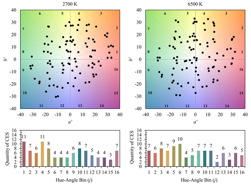
in TM-30.of samples, the 99 CES. Note that two reflectance functions representing human skin tones that provided the greatest correlation to a larger set of skin reflectance measurements were forced into the set of 99. The 99 CES were numbered according to their hue angle under the 5000 K reference illuminant of IES TM-30-15, which was an even blend of 5000 K Planckian radiation and CIE D50. The 99 CES represent a wide variety of objects, including paints, textiles, inks, skin tones, natural objects (e.g., food, flowers, foliage), and plastics. The CES cover a wide range of hue, chroma, and lightness, although some of the most saturated and darkest samples were excluded in the process of establishing the reference set to ensure the validity of color difference formulae, and to make sure the samples were representative of typical architectural environments. Still, Figures 10 and 11 show that the TM-30 samples cover a wide range of the hue-chroma plane of the color volume. They also cover a wide range of lightness, but that is not shown. TM-30 users must remember that the objects in any given environment will always differ from the 99 CES to some degree. Sometimes, measures for specific hues (e.g., red) may provide more useful information than average values (that is, average color fidelity or gamut area), due to an uneven balance of hues in the space or scene (e.g., a tomato display). Because each space is different and there is no way to characterize an average architectural space, a color sample set like the 99 CES that covers the likely range of colors and does not favor any spectral feature is appropriate for determining generalized predictions of color rendition of a light source. Sets of color samples that are small, do not evenly sample the color volume, or that favor certain spectral features are more likely to incorrectly predict performance in a real environment, and incentivize targeted optimization by light source developers; this was a common criticism of the eight pastel color samples from the Munsell library that are used to calculate CRI. Figure 11. Comparison of the (a', b') coordinates of the 99 color evaluation samples used in TM-30 calculations and the coordinates of measurements of familiar objects.
You can also read